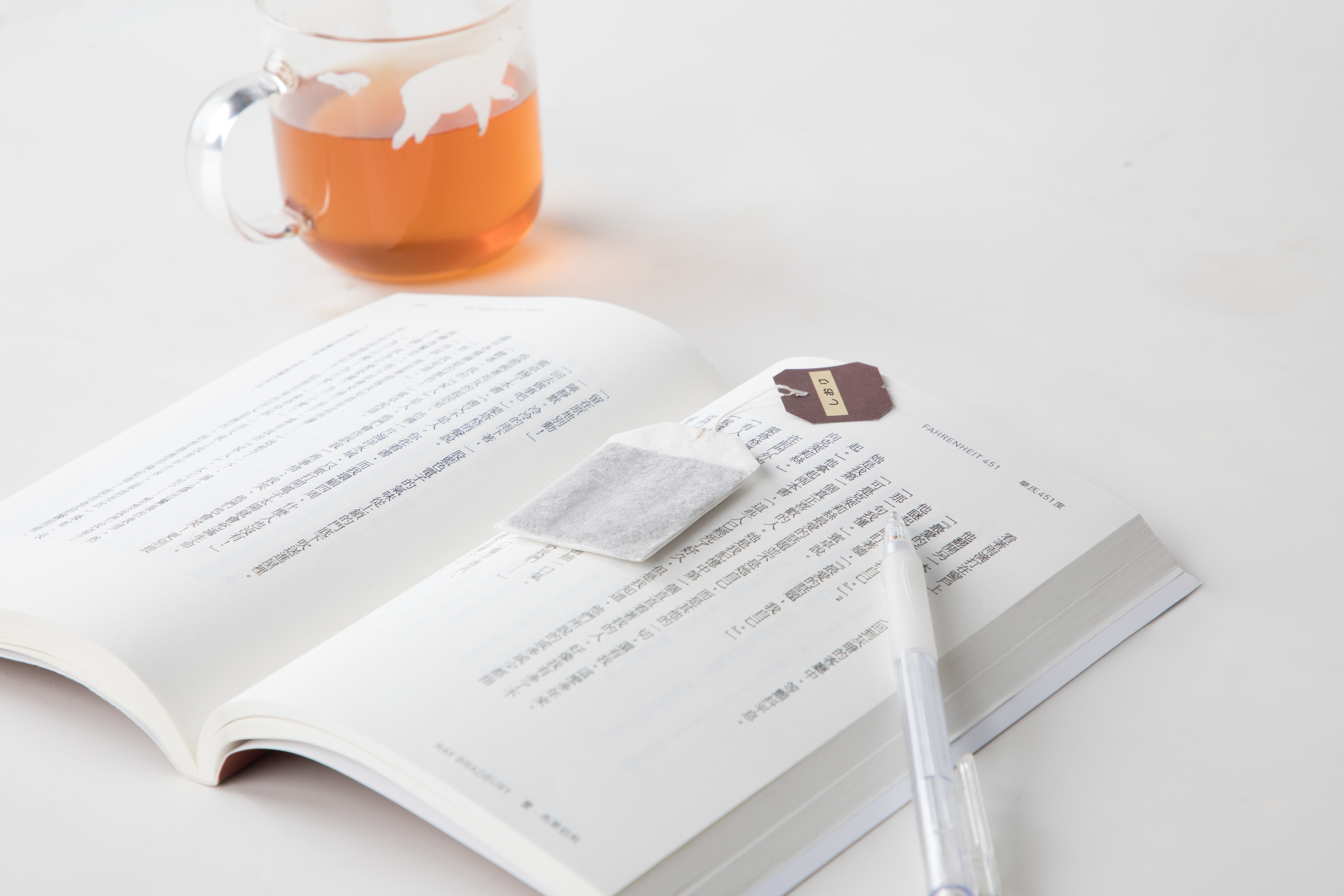
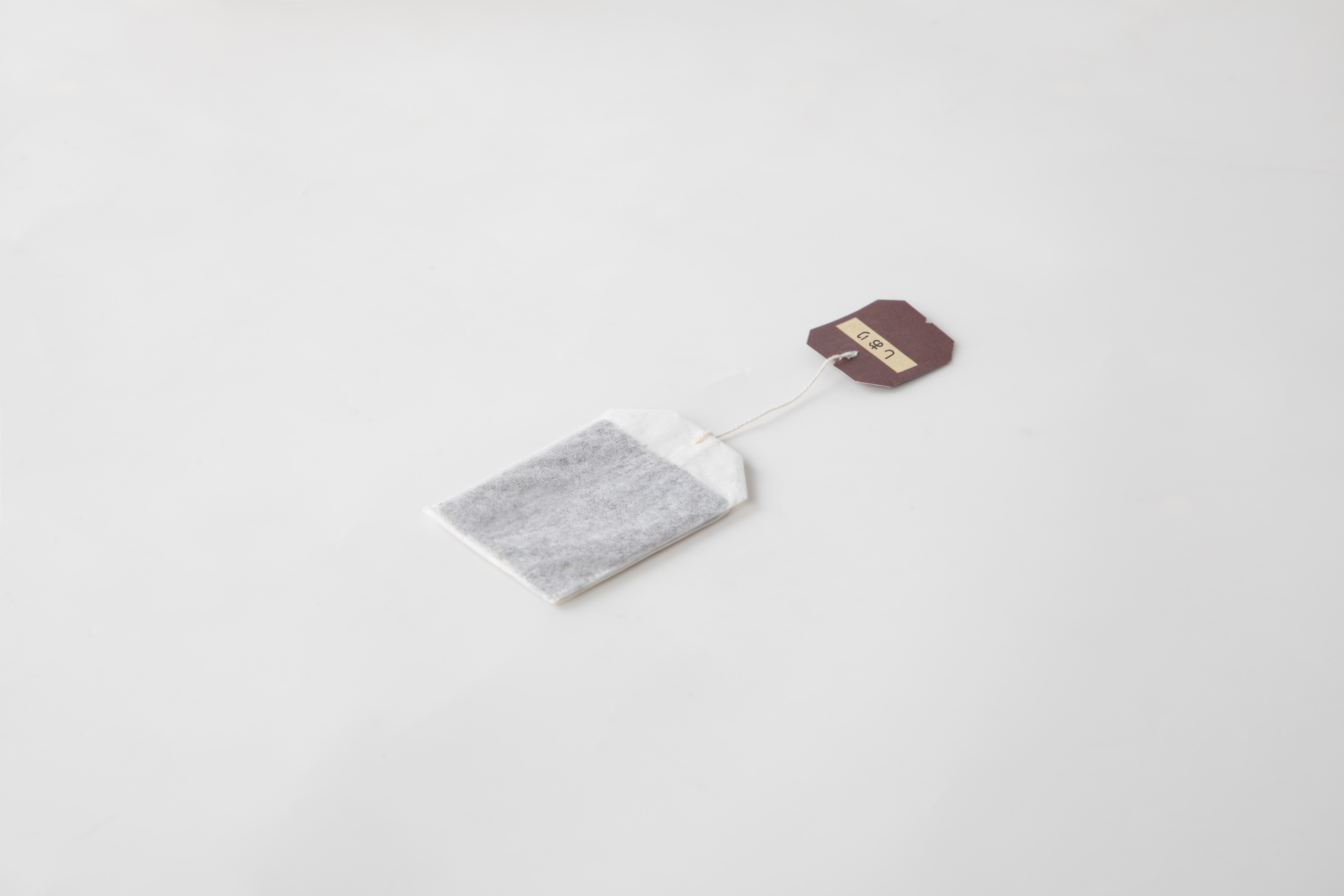
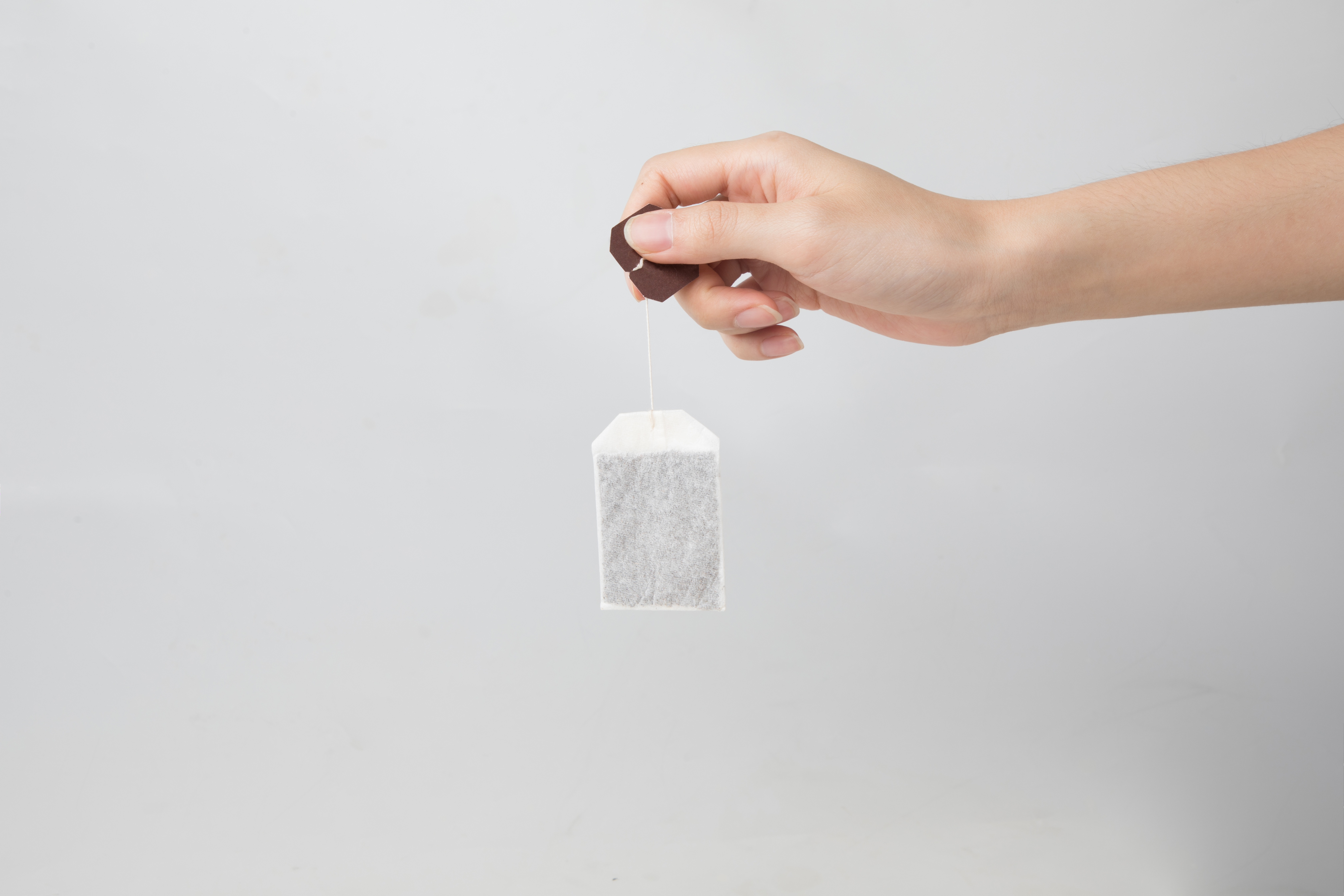
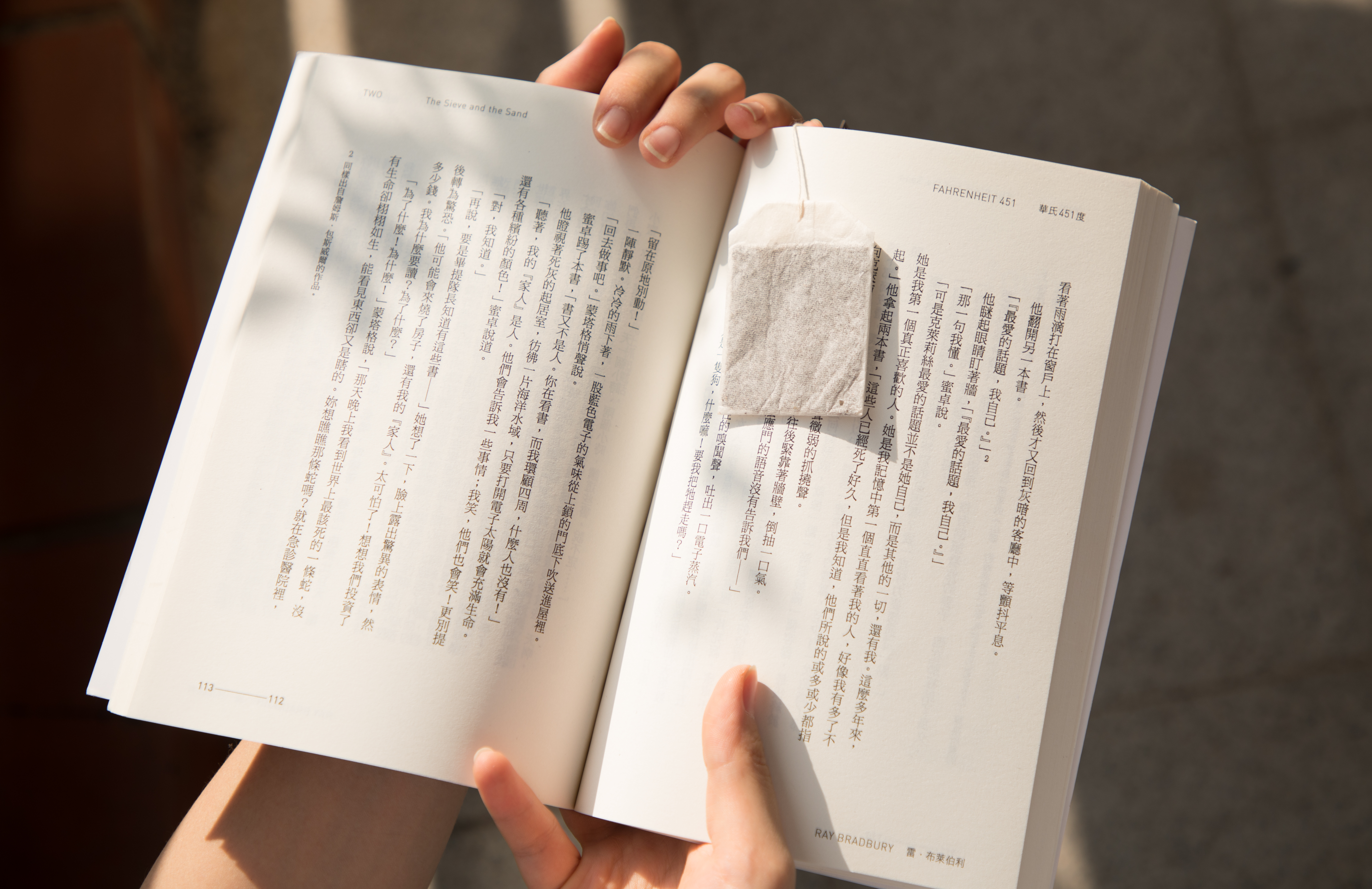
The designer designed the shape of the bookmark into a tea bag and filled it with refreshing spices, so that people can stimulate their vision and taste when opening the book, refreshing and refreshing. When the user picks up the work for the first time, he finds that the "tea bag" is flat and the label line is short, and he will wonder: is this a tea bag? If you happen to see the words "bookmark" printed on the label, you will realize that it is an inedible product. The act of putting the tea bag in the book is reminiscent of the scene of putting the tea bag in the cup, making people feel that the taste of the book is like being soaked by a bookmark.

本作品版权归 YT DESIGN 所有,禁止匿名转载及个人使用,任何商业用途均需联系原作者。

新用户?创建账号
登录 重置密码
请输入电子邮件以重置密码。


On how to eat knowledge quickly!
I don't understand. I think it is to change the application mode. Is it really OK as an independent design?
This is taken, isn't it
Ha, ha, ha, ha, ha, ha, ha, ha, ha, ha, ha, ha, ha, ha, ha, ha, ha, ha, ha, ha, ha, ha, ha, ha, ha, ha, ha, ha, ha, ha, ha, ha, ha, ha, ha, ha, ha, ha, ha, ha, ha, ha
It's hard to think of bookmarks like this, which is a clever application.
It has the taste of art, ha ha
It is generally recognized that there is a typo.
I feel that it has always been a tea bag, that is, the design of a flat tea bag, which does not think of bookmarks. Even if "bookmarks" are written on it, it is difficult for me to feel it. This is inconsistent with my cognition and will affect my instinctive feeling of "bookmarks. If he is a piece of paper in the shape of a tea bag, it can correspond to people's general seriousness of "bookmarks", and it will be more comfortable to explain it, a little personal opinion.