For the first time, many people use AI Agent as a more chatting box: enter a prompt word, get a picture, and start over. Of course, this approach works, but it also makes the brand the most likely to lose its focus and coherence.
This time, I tried a different testing method. I fixed the same ice cream brand AG-ENTS and let the Agent continuously handle the activity vision, packaging, mood board, social media adaptation, shed shooting product map, brand remodeling and store renovation. What is really worth seeing is not how amazing a picture is, but whether the same set of recognition can cross seven tasks and still make people recognize who it is.
Let’s first clarify what remains unchanged.
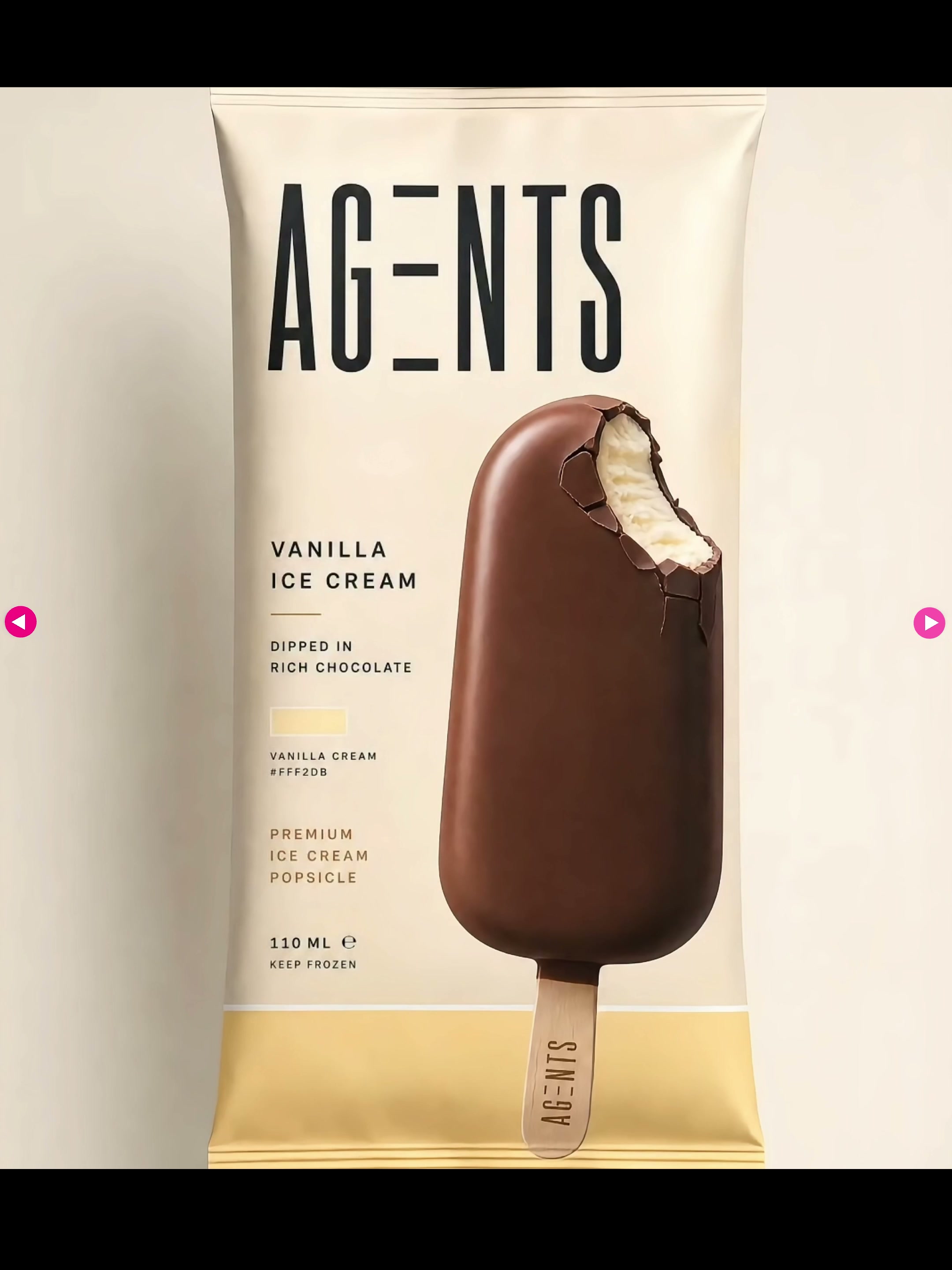
Before starting, I will first sort out a short "brand draft": what is the product, how to write the logo, what are the main and auxiliary colors, what temperament should the picture convey, and what elements cannot be changed. The core assets in the video are clear-the AG-ENTS narrow font, the restrained beige packaging, and the product memory points brought by purple soft-serve ice cream.
When I give the Agent a task, I usually write it in four layers: first, I say the task, then I list the brand assets that cannot be moved, then I explain the parts that can be changed this time, and finally I write down the delivery quantity and size. For example: "Make a group of multi-size campaign advertisements for AG-ENTS; Rereserve the wordmark, packaging and purple product color; Can change the composition, copy and ingredients elements; Output vertical, square and horizontal versions."
This order is very important. When there are no boundaries, it is easy to "redesign" each agent; when the boundaries are clear, it is more like continuing to work within the same brand.
01|Event Visuals: Create a complete set, rather than just a single piece.
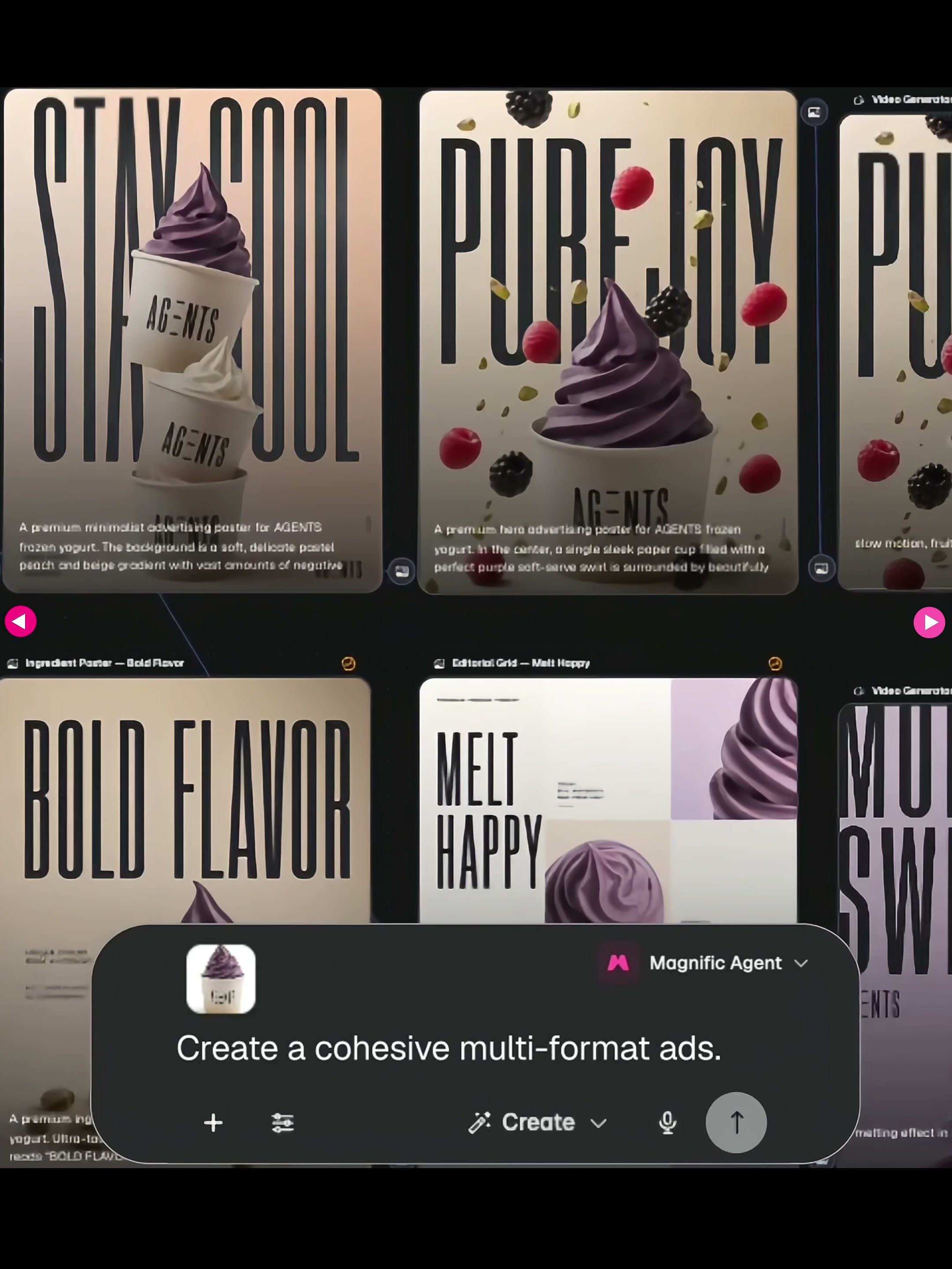
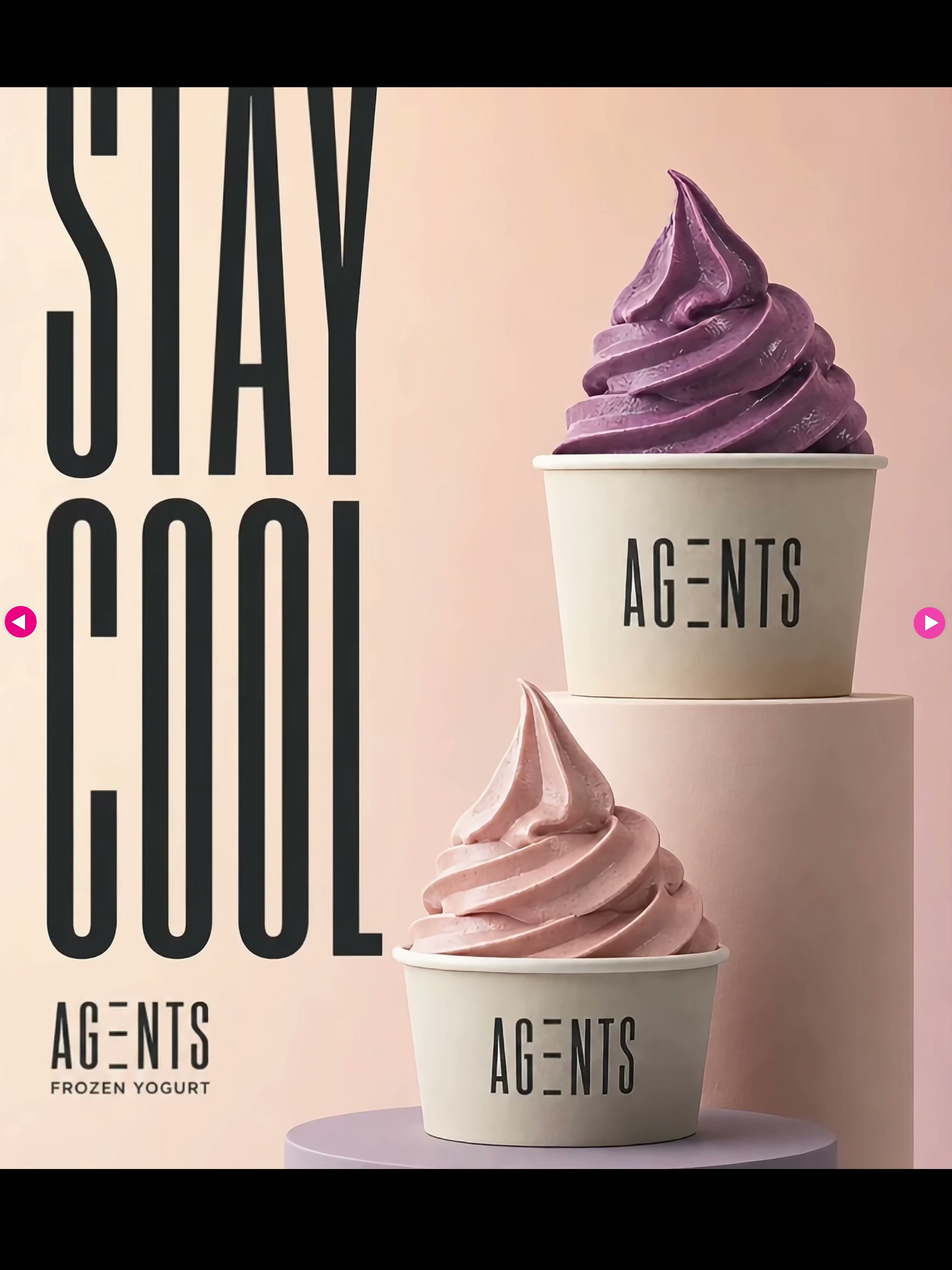
The first task in the video is to generate unified, multi-size ads. Agent did not stop at a single poster, but made different formats such as "Stay Cool", "Pure Joy" and "Bold Flavor" around the same cup of purple soft ice cream. The copywriting, composition and ingredients change, but the cup body, wordmark, tone and tall and thin font are always present.
I’ll start by letting it work in three to five directions, without rushing to achieve the final accuracy. The first round only looks at two questions: whether the brand identity is lost and whether there is a real difference between several directions. After selecting a direction, let it expand into horizontal, vertical, square and detailed page header maps, and the efficiency will be much higher than that of opening new tasks for each size.
02|Packaging Design: Expanding a Single Product into a Product Family
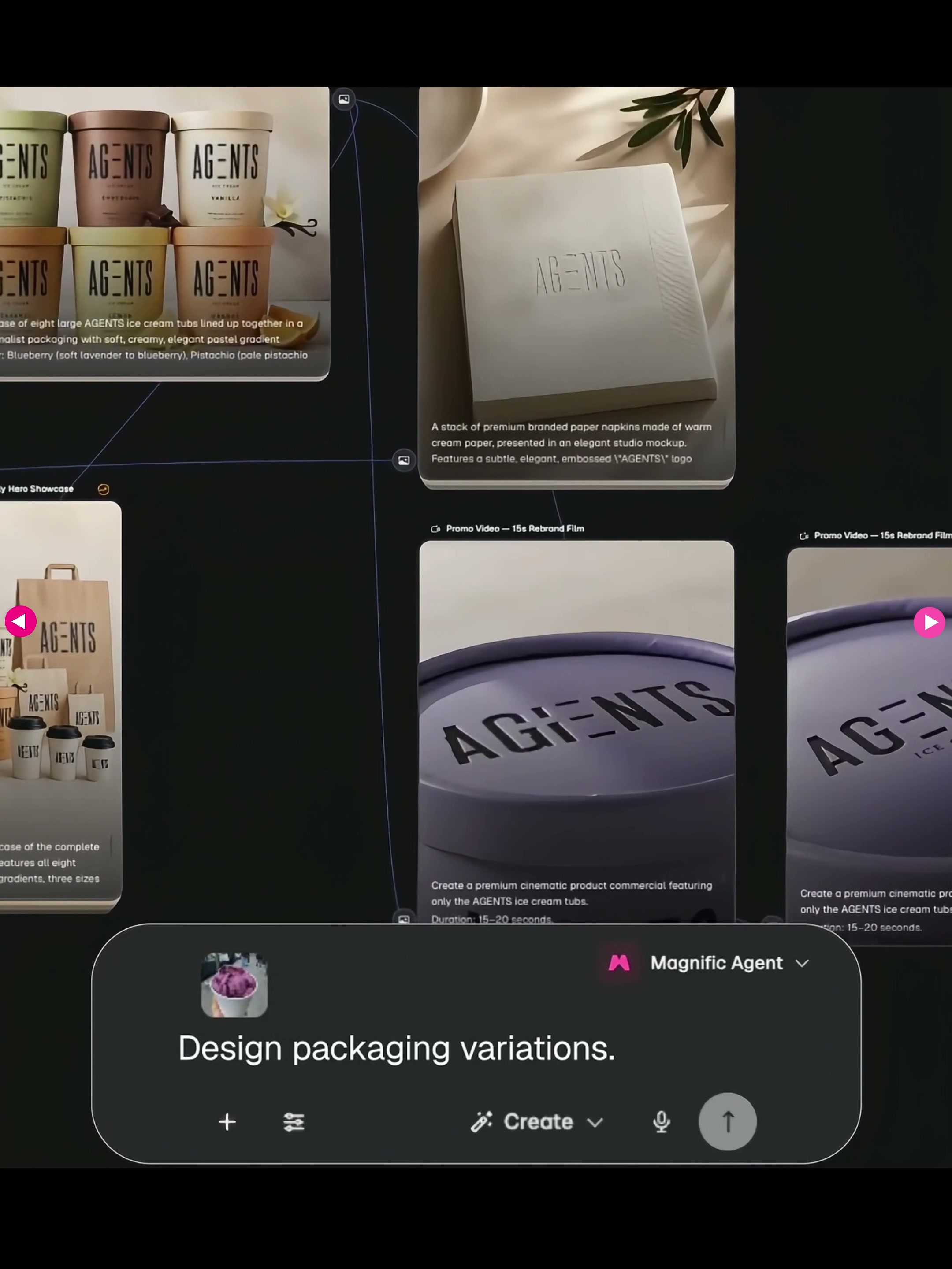
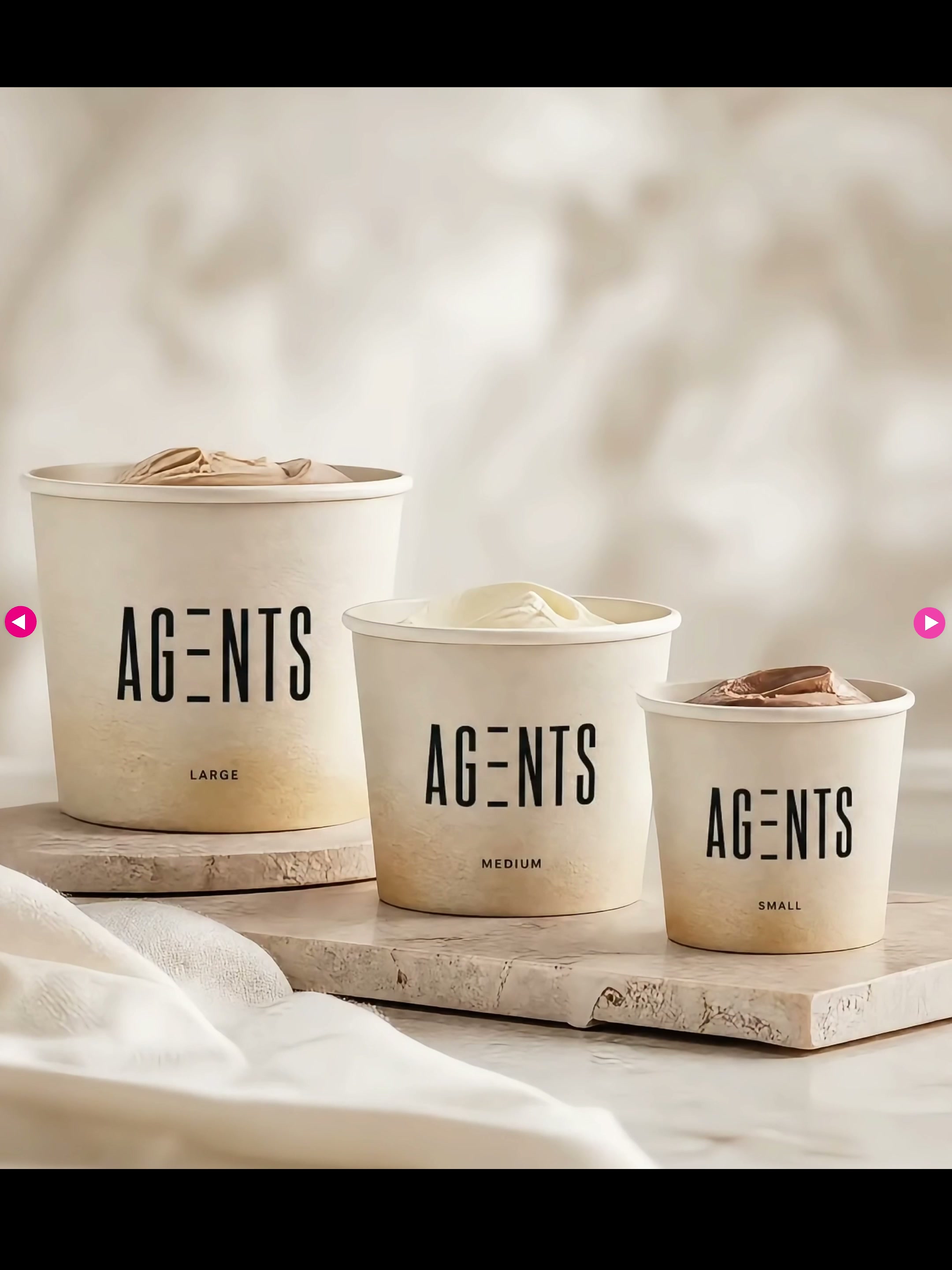
The second item is packaging changes. The demonstration starts from a paper cup and continues to extend to ice cream cups of different capacities, paper bags outside and multi-flavor combinations. The point here is not to "generate more boxes", but to make the shelves look like the same brand after changes in size, material and taste.
It’s best to directly specify the SKU, container type, and information level in the prompt. For example, large cup, medium cup and small cup are required to have one edition respectively. Vanilla, chocolate, lemon and berry are distinguished by different auxiliary colors, and the wordmark position and format skeleton are fixed at the same time. In this way, the agent is dealing with an integrated packaging system rather than several unrelated packaging renderings.
03|Mood Board: Compare Design Paths Before You Start Coding
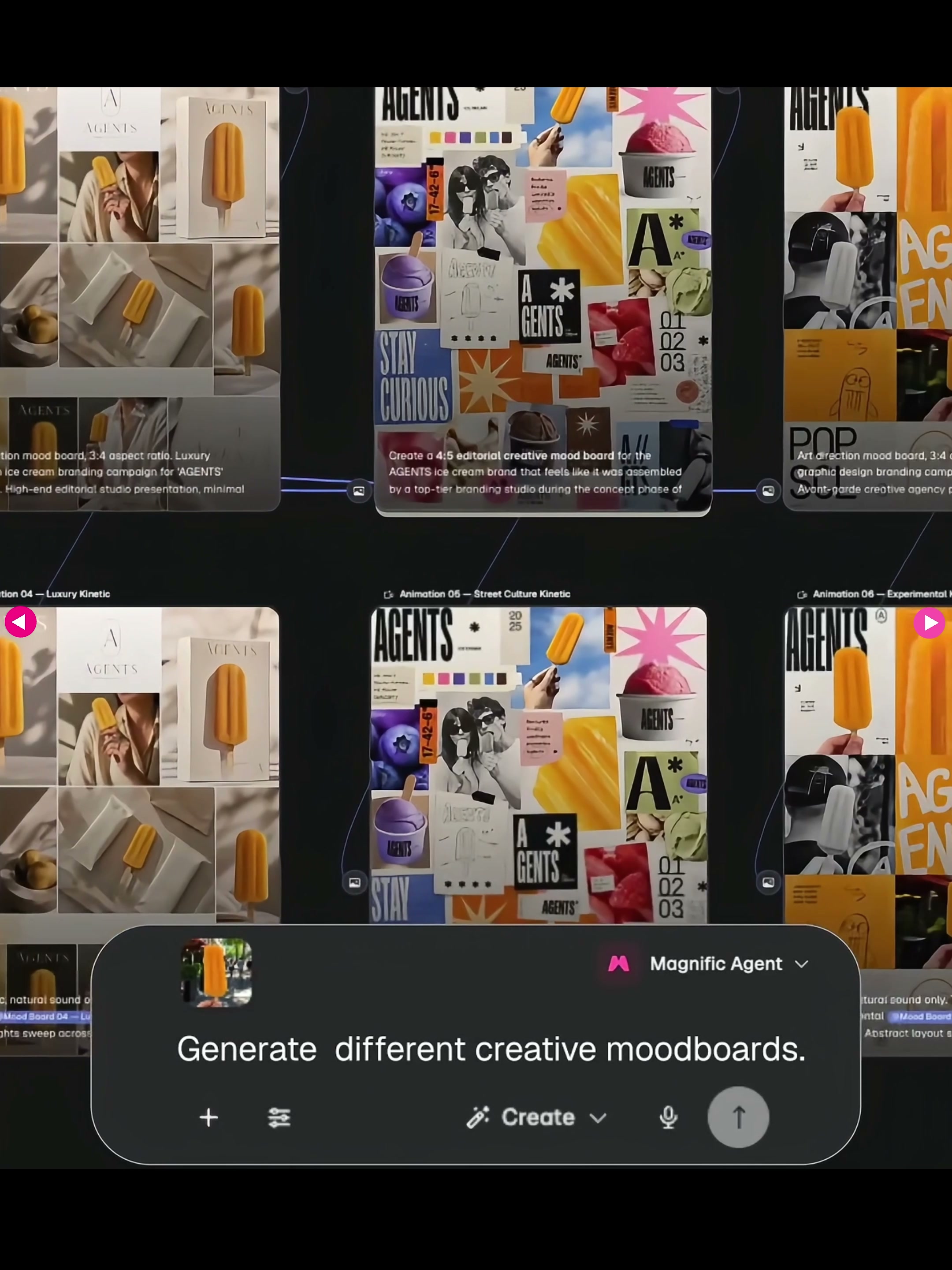
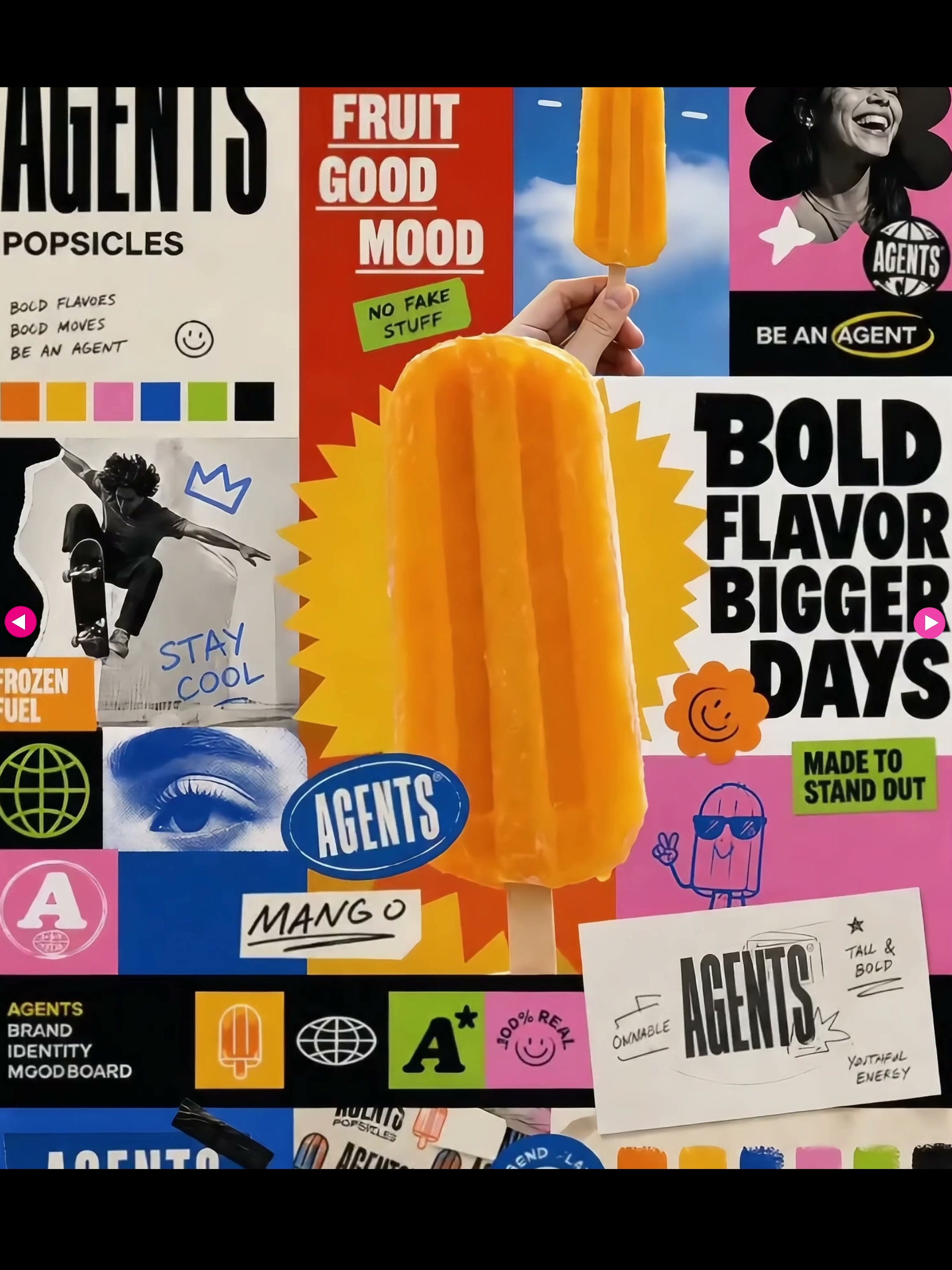
The third item is the mood board. Agent has generated several sets of very different visual directions around orange popsicles: editorially and lifestyle-oriented, bolder and more street-like collage-oriented, and clean, soft, lifestyle-oriented versions.
Mood boards are best used in the early stages of a project. Instead of letting the Agent make the finished product, it is better to ask for three directions first and write down the keywords of color, font, photography, composition and material for each direction. I’ll also add, “Don’t just change the color scheme”—push it to truly clarify the visual hierarchy. Review the route before starting execution; this usually significantly reduces rework.
04|Social Media Adaptation: Not Cropping, but Reformatting Information
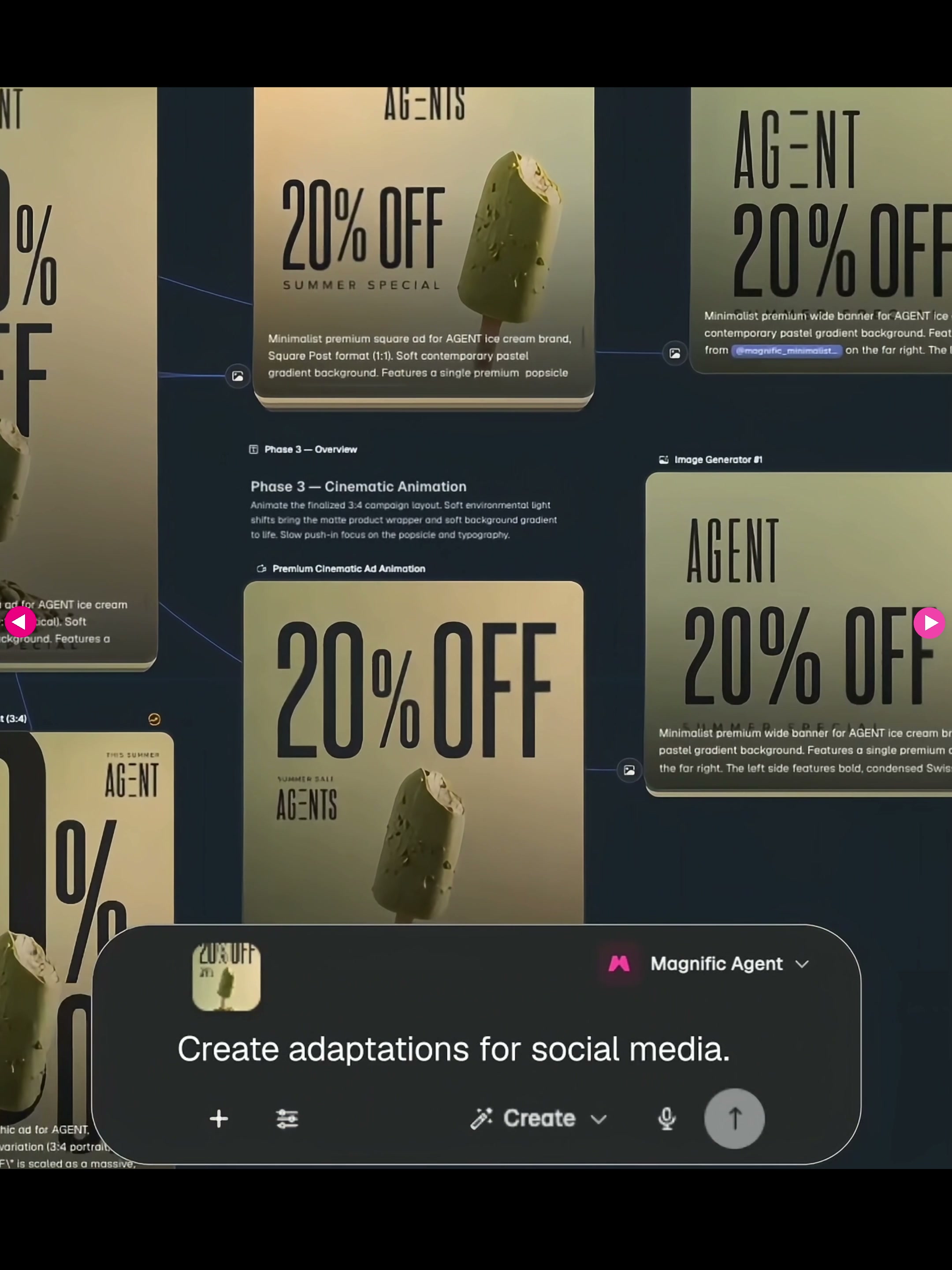
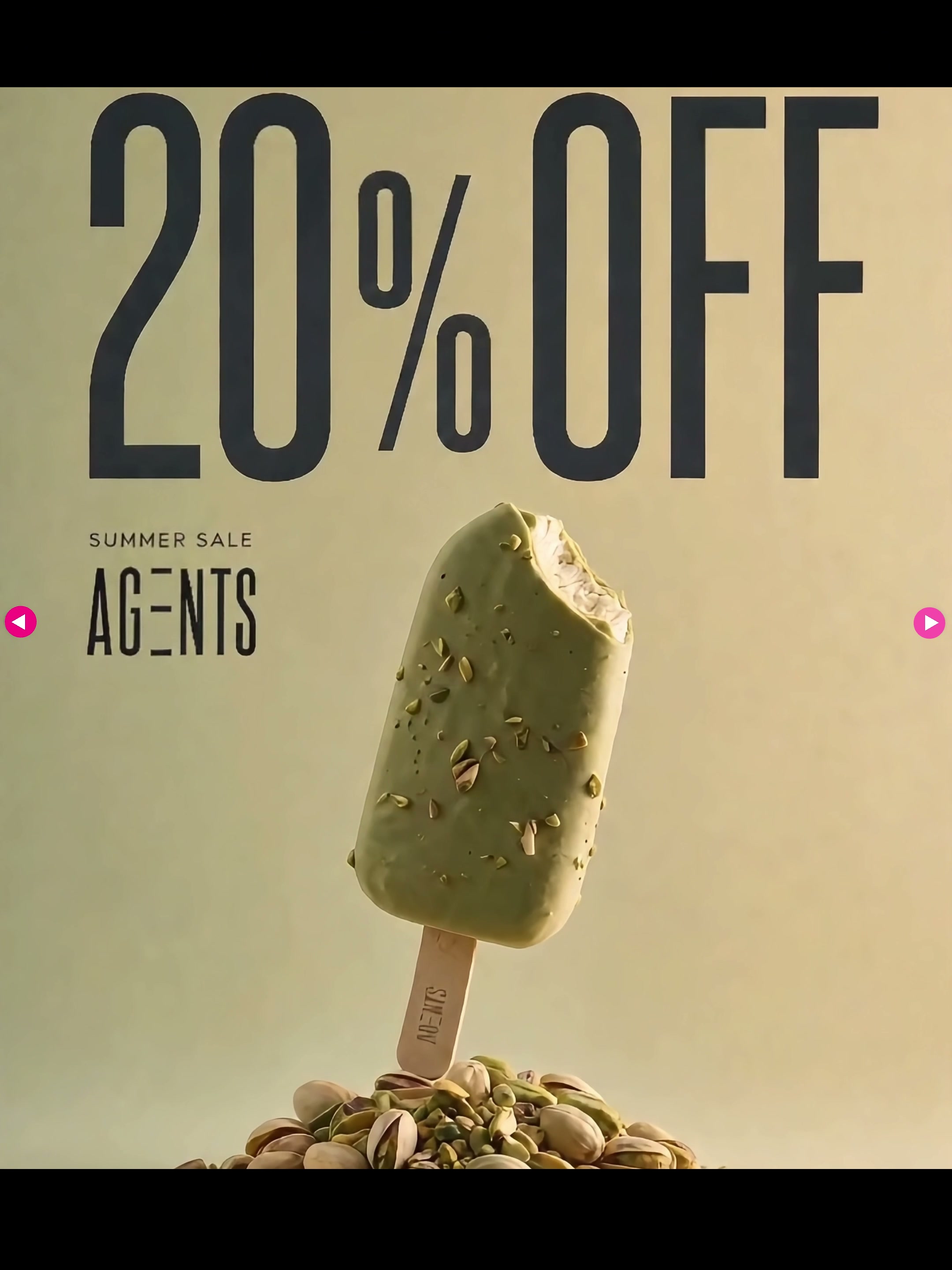
The fourth item is social media adaptation. The original picture is a promotional vision of a green popsicle, and Agent then gives horizontal, vertical and different information density versions. Products, discount numbers and brand names are retained, but their positions and proportions are redistributed with the frame.
In practice, I will write down the platform and size, such as 1080 × 1350, 1080 × 1920 and 1920 × 1080, and explain which information must be seen first. The vertical version needs a more concentrated visual focus, while the horizontal version needs to leave a left-right relationship between the title and the product. Finally, it is still necessary to manually check the small font size, edge safety zone and discount information, because "looks complete" does not mean "readable after release".
05 | Studio Product Photography: Transforming Ordinary References into Comparable Shooting Directions
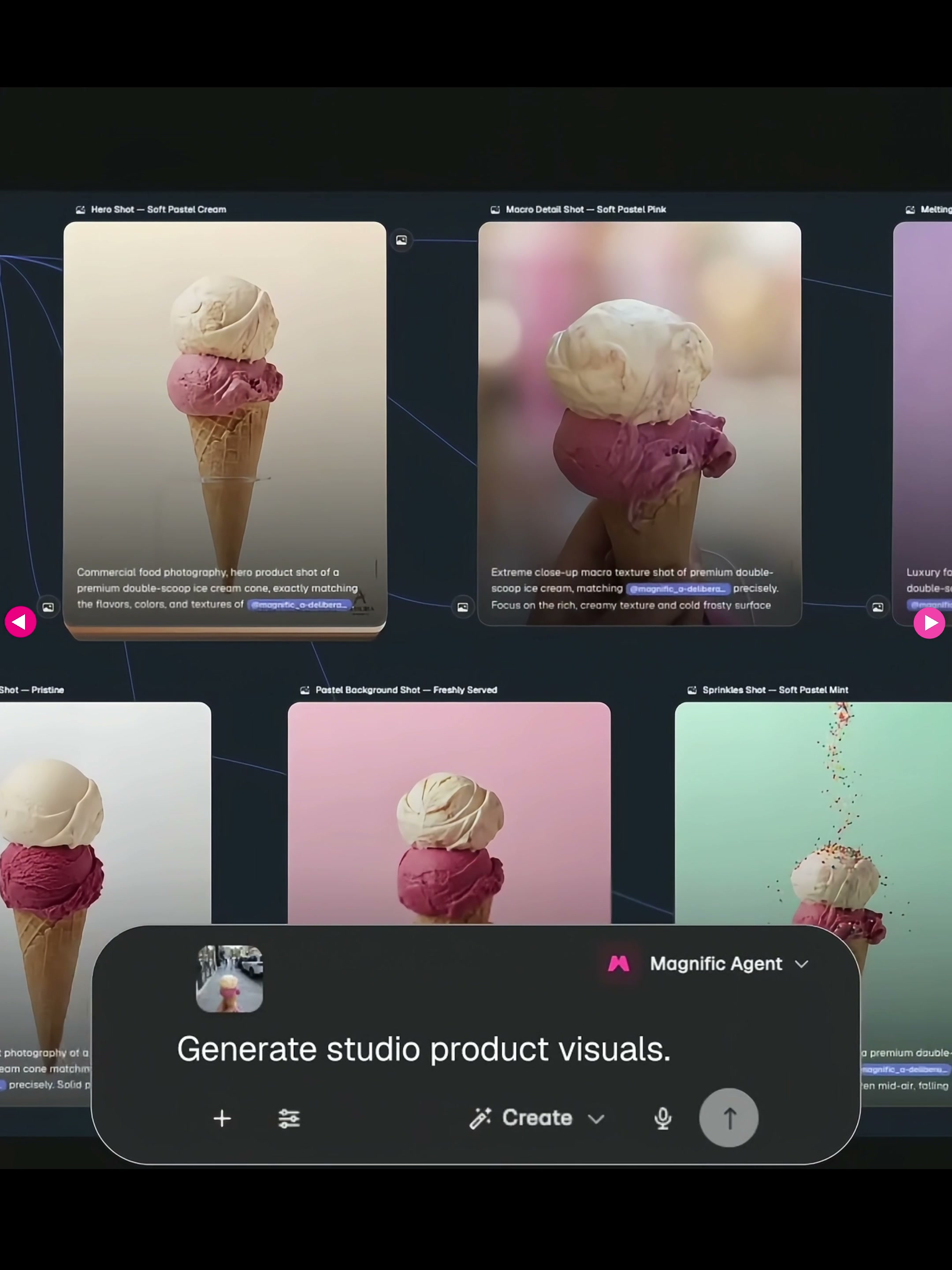
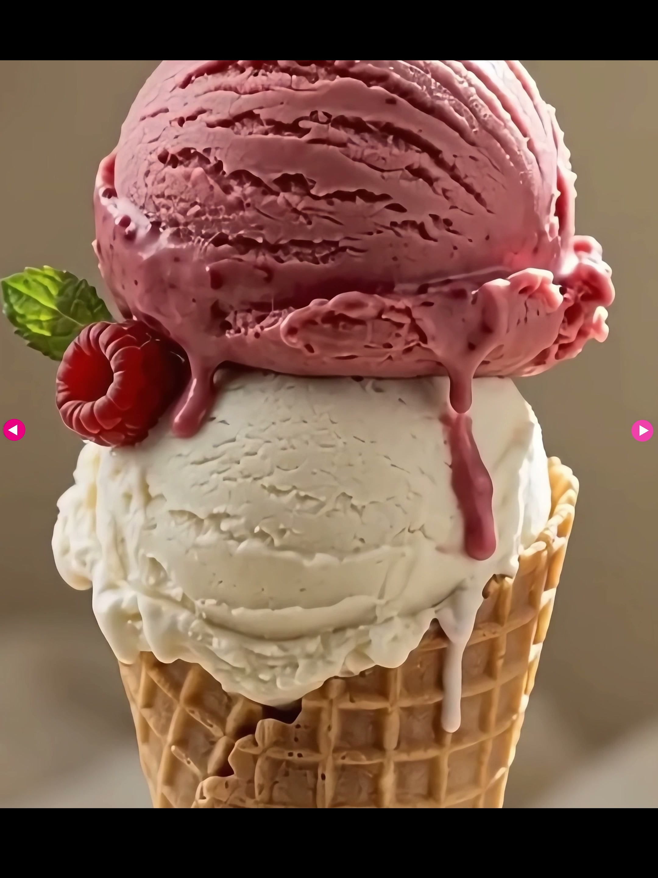
The fifth item starts with a street photograph of someone holding an ice cream. Agent put the same double ball cone into the background of light blue, pink, rice white and other shed shots. He also tried different shots such as chocolate sauce, sugar particles flying away, hand-held and still life display.
I prefer to treat this kind of result as a preview of the shooting, rather than directly as the final advertisement. The prompt words can be split into six items: background color, light direction, camera position, lens distance, whether hands appear, and whether ingredients are added. After generating multiple directions at once, photographers and designers can decide what to shoot more quickly, and they can also find out in advance that some compositions are only established in imagination.
06 | Brand Rebranding: Don’t Just Change the Logo
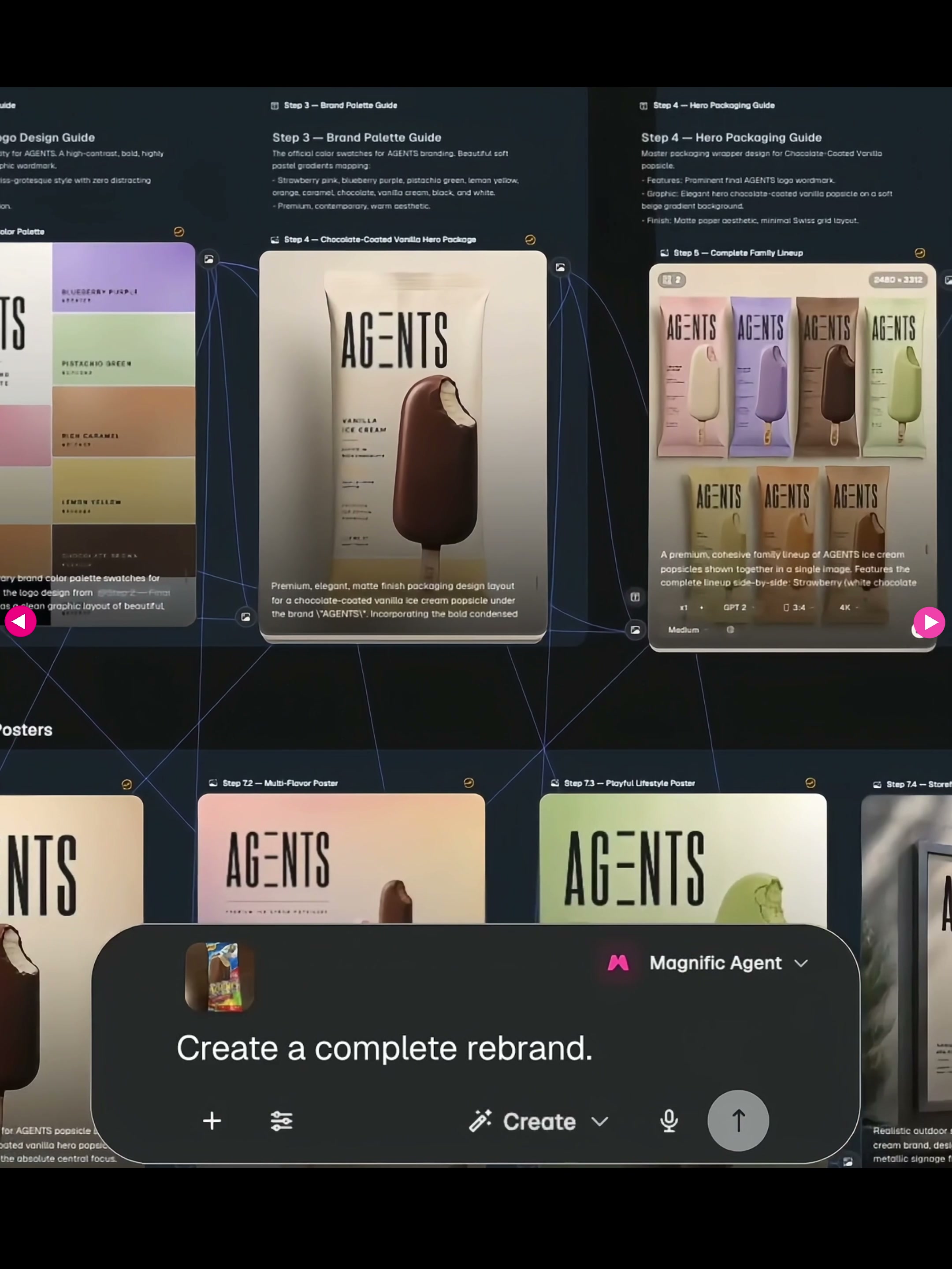
The sixth item is a complete brand rebranding. The demonstration rearranged an older, information-crowded ice cream package into a more restrained AG-ENTS system, and then continued to generate wordmarks, fonts, brand swatches, different flavor packages and advertising posters.
If you simply enter “Help me redesign the brand,” the results are usually quite vague. I will first write down what problems must be solved, such as the old packaging hierarchy is confusing, the product name is not prominent enough, and the taste distinction is not obvious. Then explain which assets are worth keeping, such as category memory, packaging structure or a certain color. The goal of remodeling is not to erase all the old things, but to establish a set of rules that can continue to expand later.
07|Store Renovation: Bringing Planar Recognition into the Real World
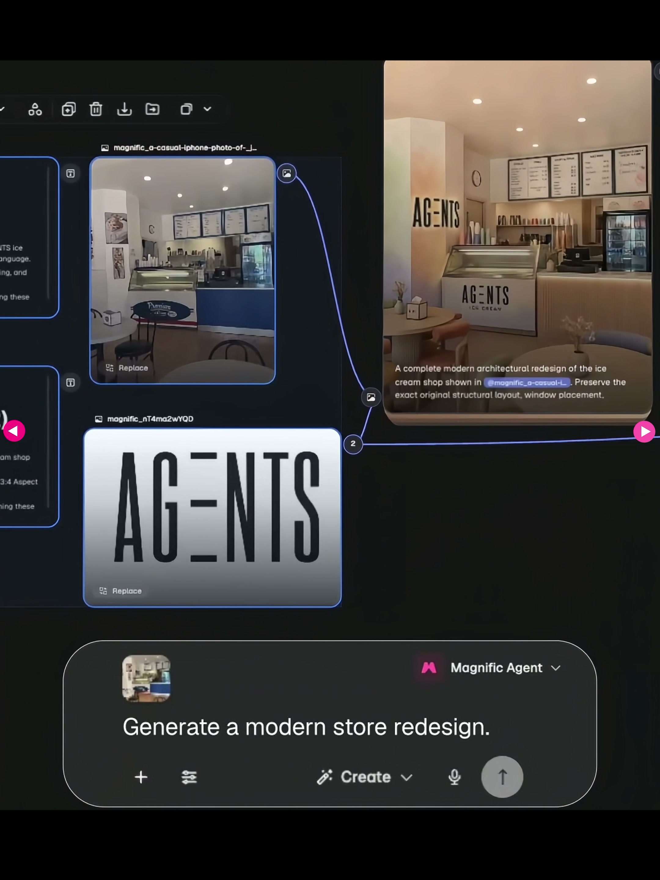
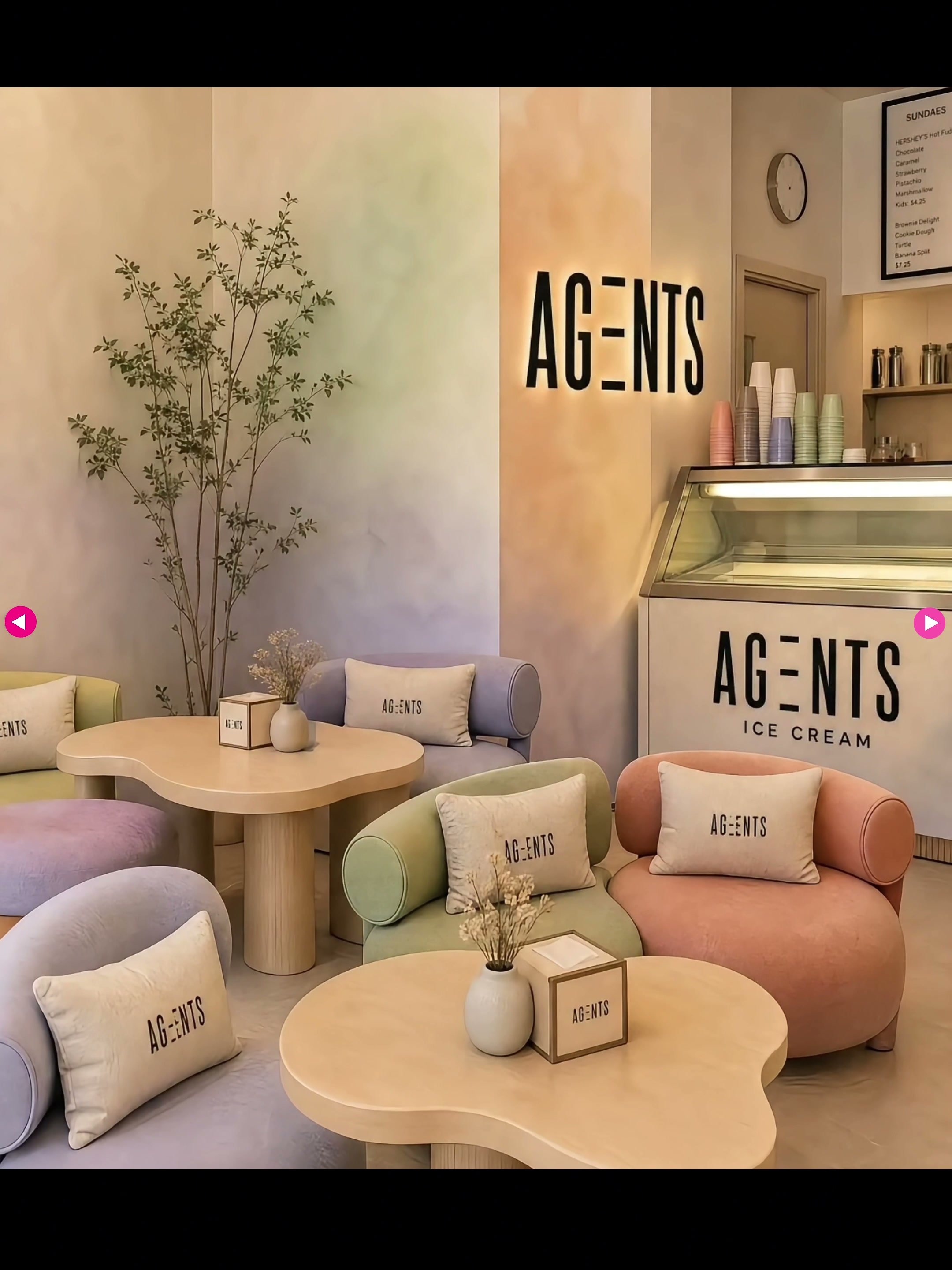
The final item is store space renovation. After the Agent reads the original store photo, it brings the AG-ENTS word mark, rice color tone and soft auxiliary color into the counter, wall, menu board, seat and soft clothing. The film is not only a sign, but also the material and color relationship of the whole space are adjusted together with the brand.
When doing space tasks, I will write "what to keep" more specifically than "what to change": keep the entrance, counter position and main moving line, and only adjust the surface material, lighting, furniture, signs and display. In this way, the generated results have the opportunity to fall to the real site, rather than become a new store that does not exist at all.
How would I apply this method to a real-world project?
If you really want to deliver, I will not run all seven types of tasks at once, but in three rounds. In the first round, only the direction was set and the visual language was found with the mood board and a small number of posters. In the second round, a system was established to fix the word mark, color, font, packaging skeleton and photography principles. Only in the third round did mass production of social media sizes, product maps and spatial applications.
After each round is completed, I will rearrange the confirmed results into the reference for the next round and will not let the Agent change them at will. Its most valuable place is not to make decisions for designers, but to remember the context, quickly roll out the options, and bring the confirmed rules to more touch points.
Therefore, the conclusion given to me by this test is very simple: don't just ask Agent "can you help me draw a picture", but ask it "can you continue to do a project along the same set of brand rules". When the tasks, boundaries, and delivery formats are clear, it really changes from a plotting tool to an executive partner in the design process.






Not bad
This ice cream looks delicious.