My junior product design major student hopes to find an internship opportunity in Chongqing and its surrounding areas.

新用户?创建账号
登录 重置密码
请输入电子邮件以重置密码。


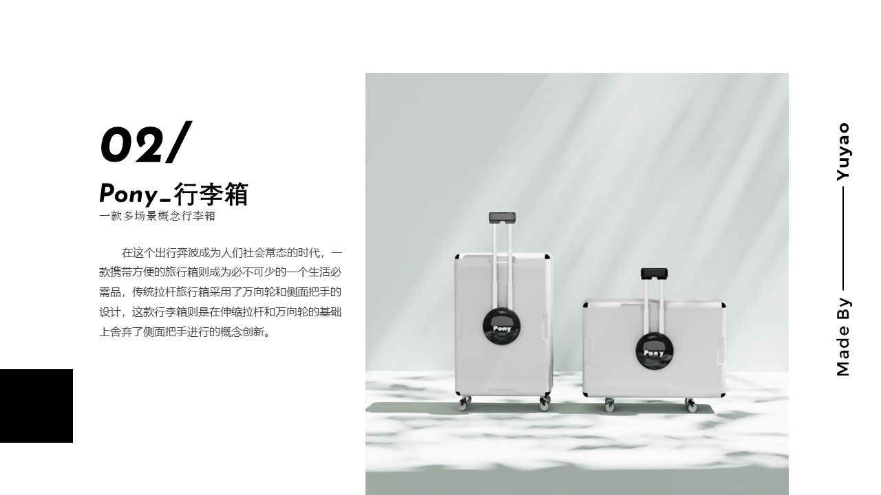
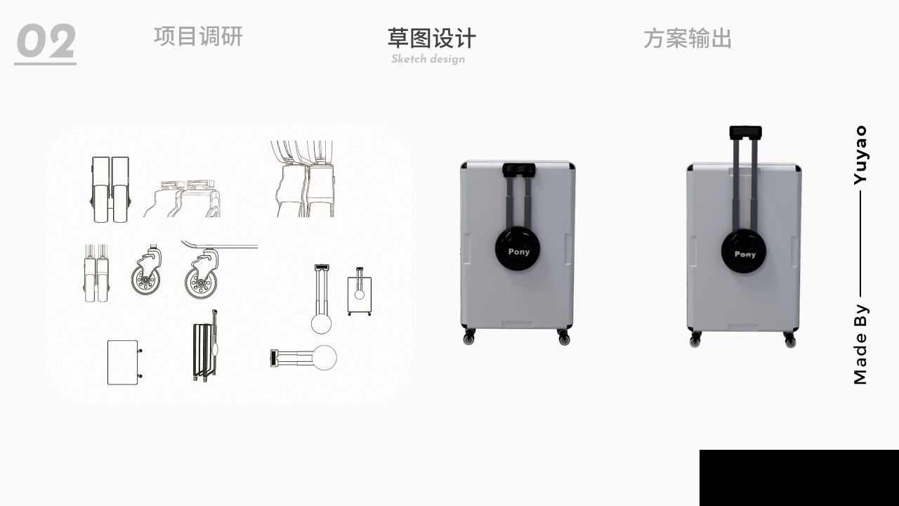
Luggage idea is especially good wow. But the middle part of the suitcase does not bear weight. If you pick up more heavy objects, they will fall into the other half and even the disc will split directly. The weight-bearing things should be symmetrical.
The idea of luggage is very good
The color matching of the product is too few. Almost all the black and white pages are not bright enough. The display effect is not outstanding, which will lead to a rough view but not impressive.
Unify the overall typesetting, don't mix and match Chinese and English, unless you go abroad, English is not a bonus item now, and the typesetting is chaotic.
Come on, there is still much room for improvement.
I still have to refuel.
The strokes are slightly immature.
Praise!
The whole page is a little rough.
Good overall