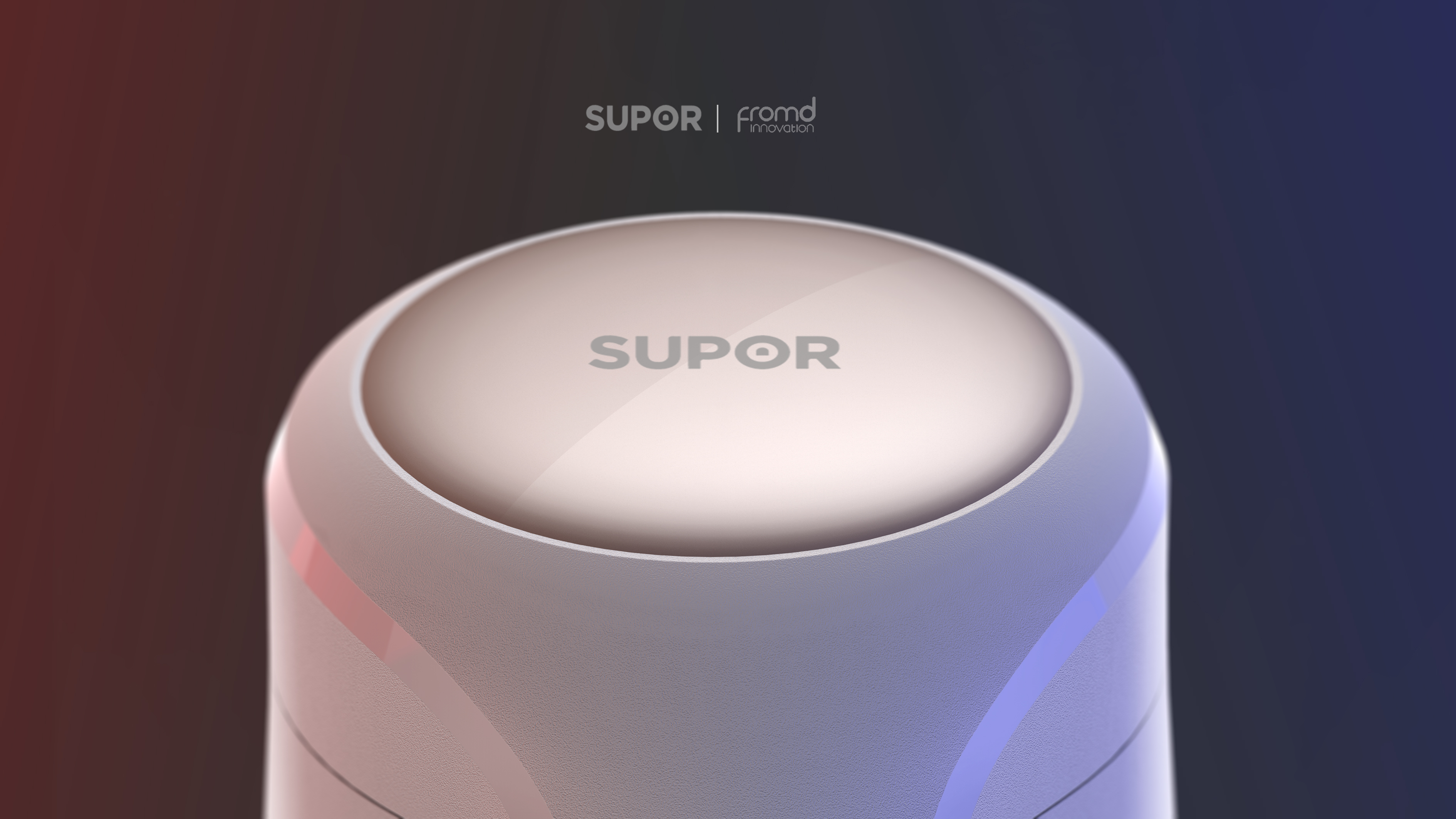
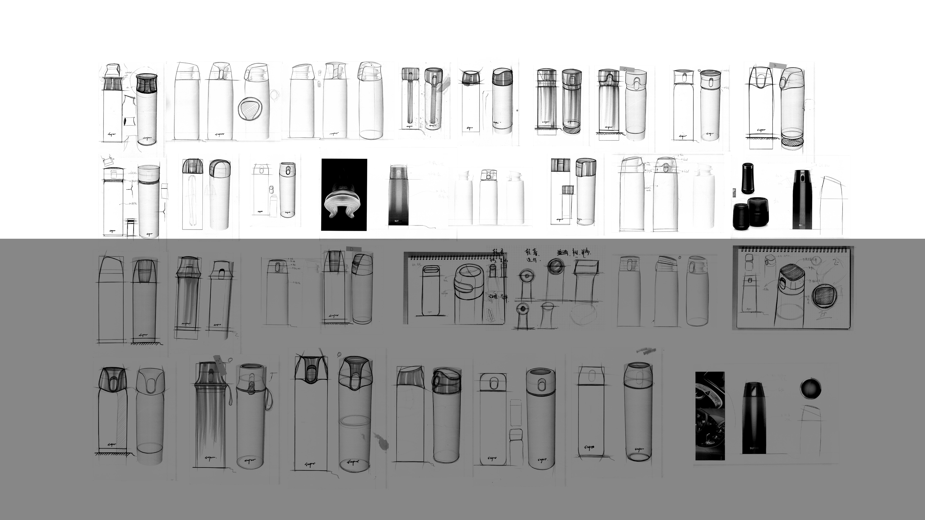
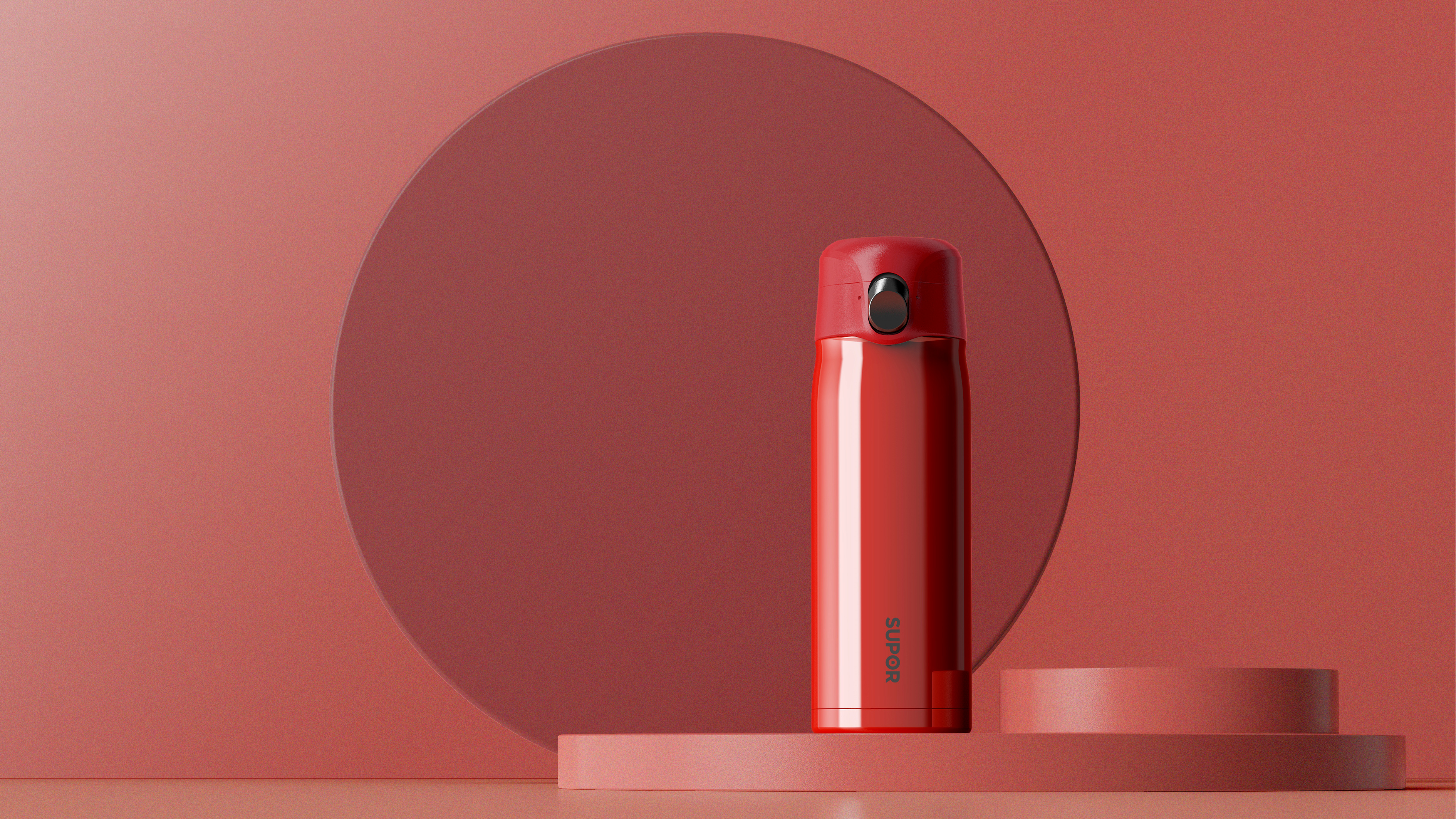
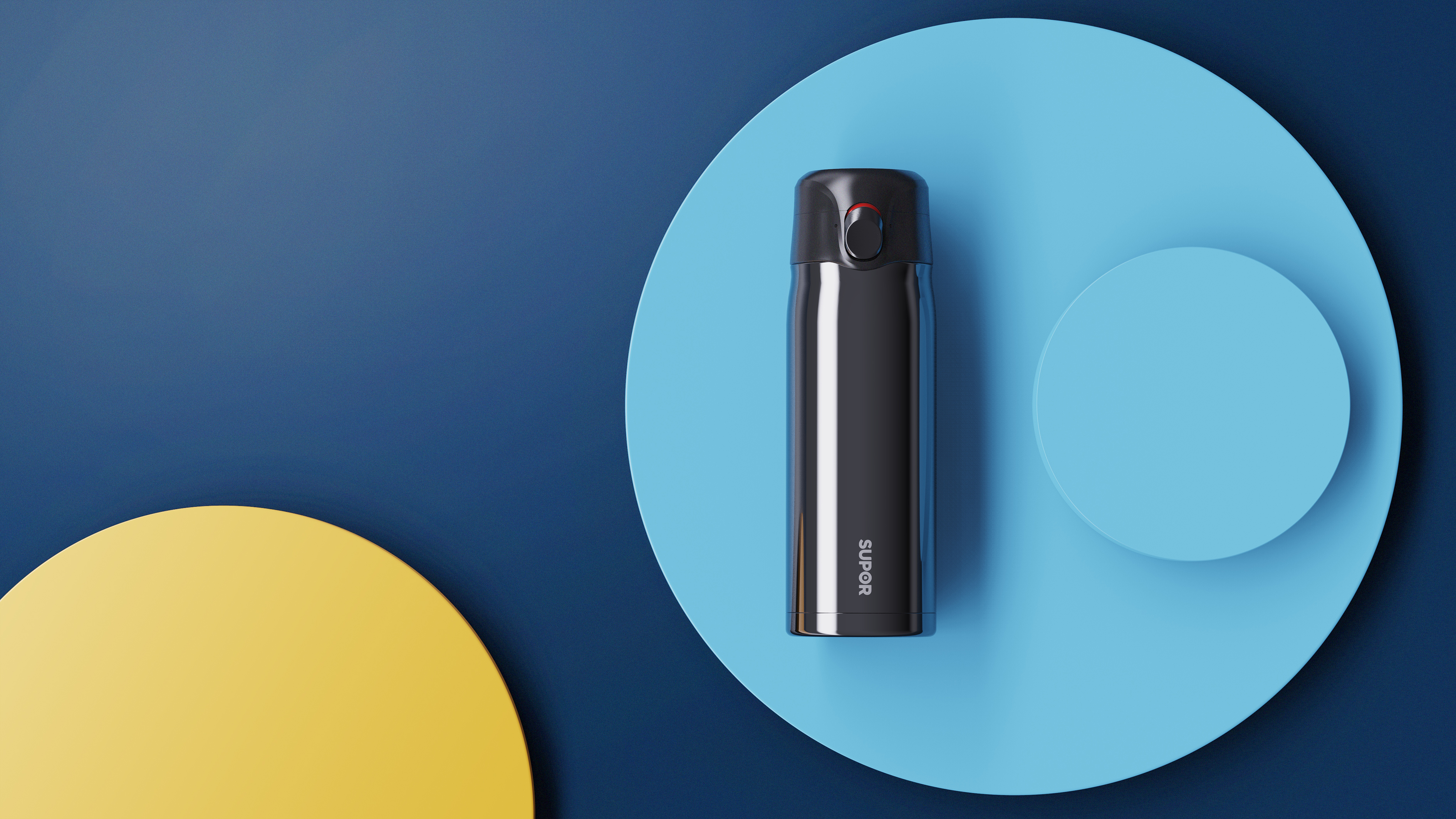
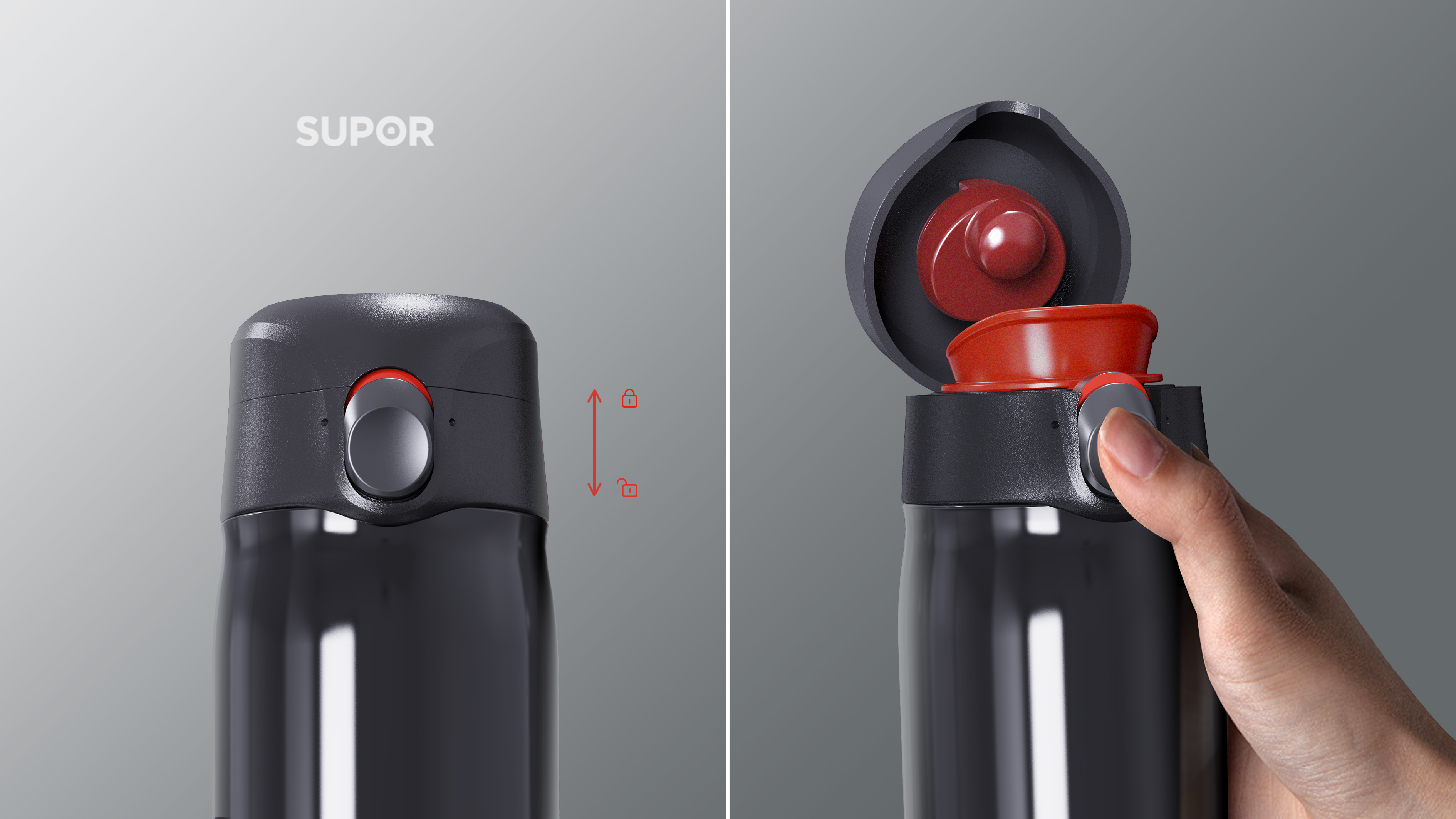
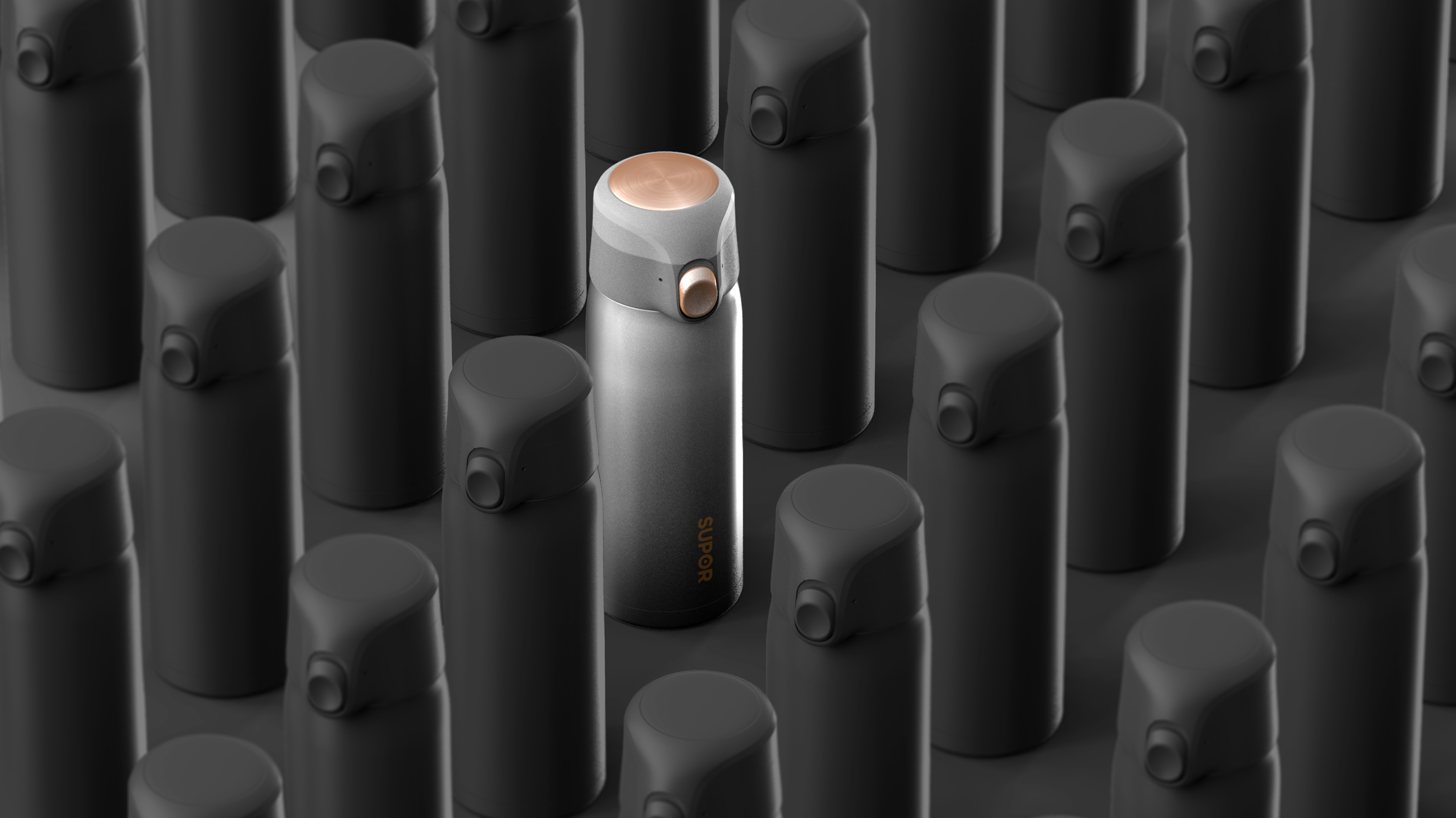
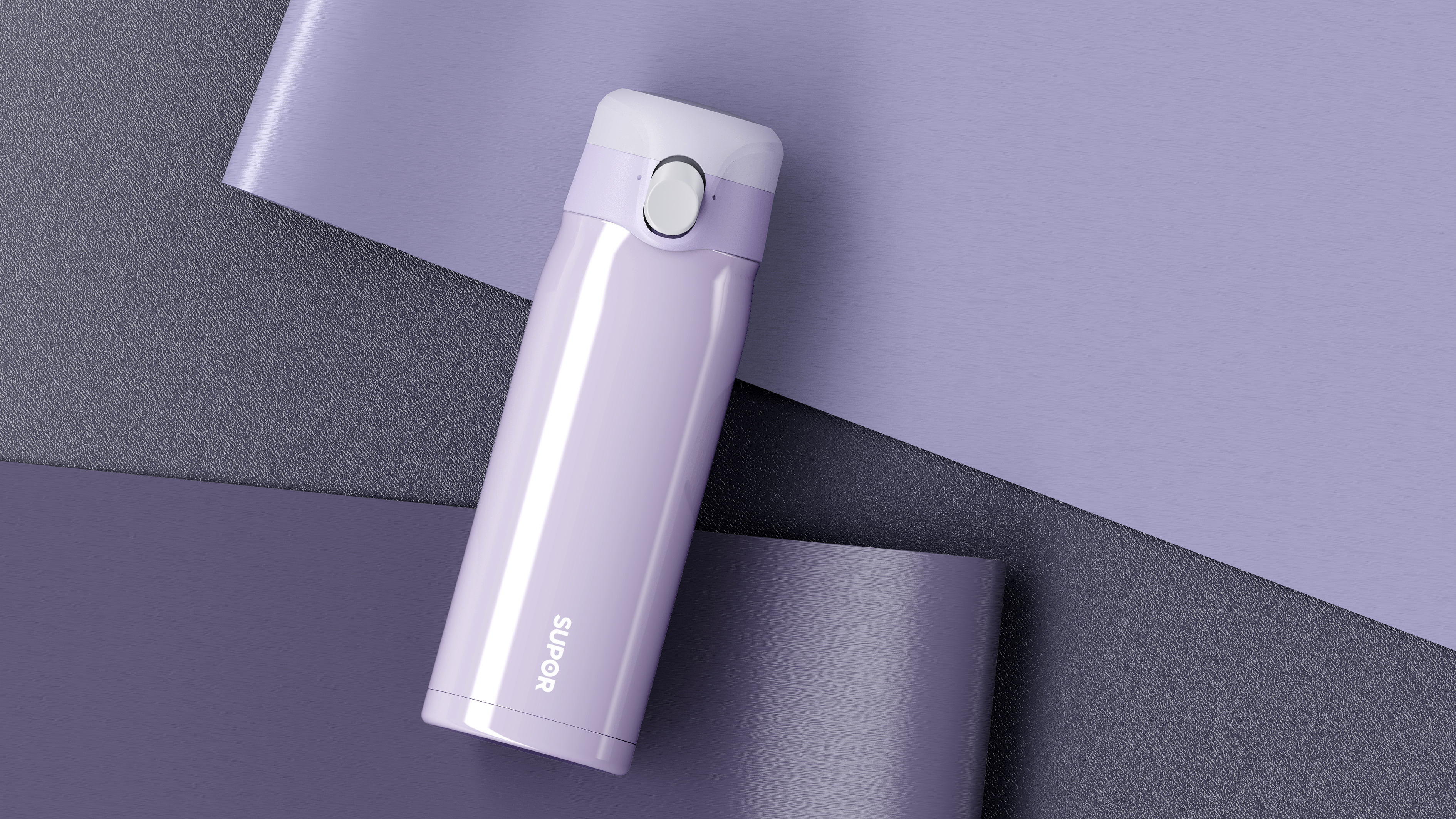
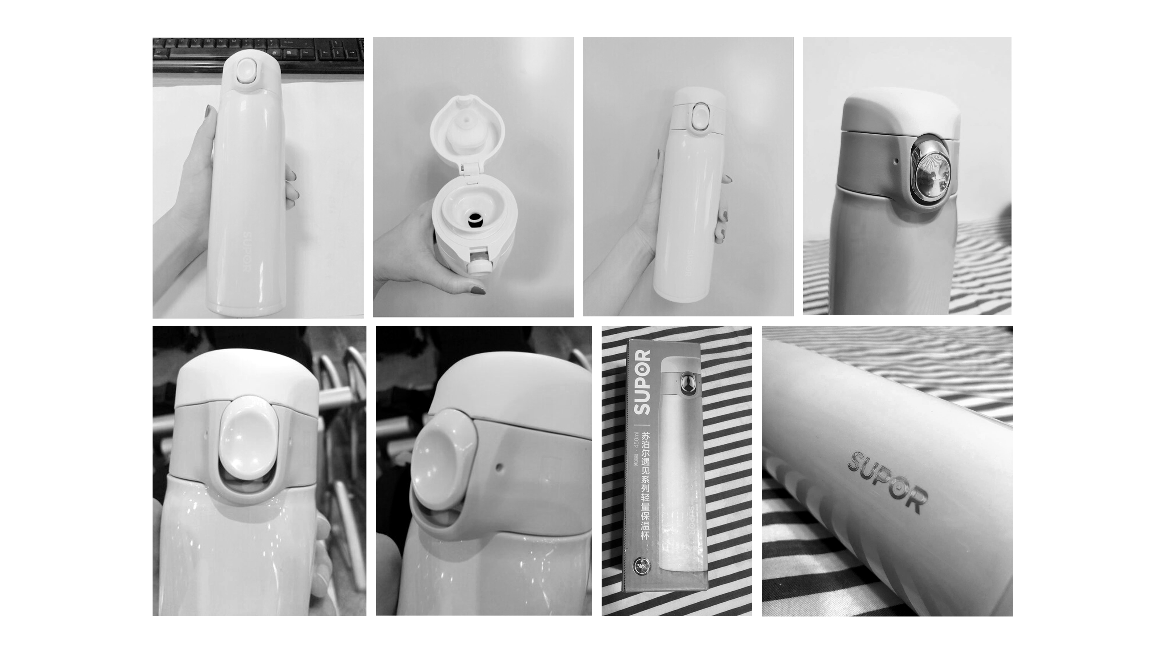
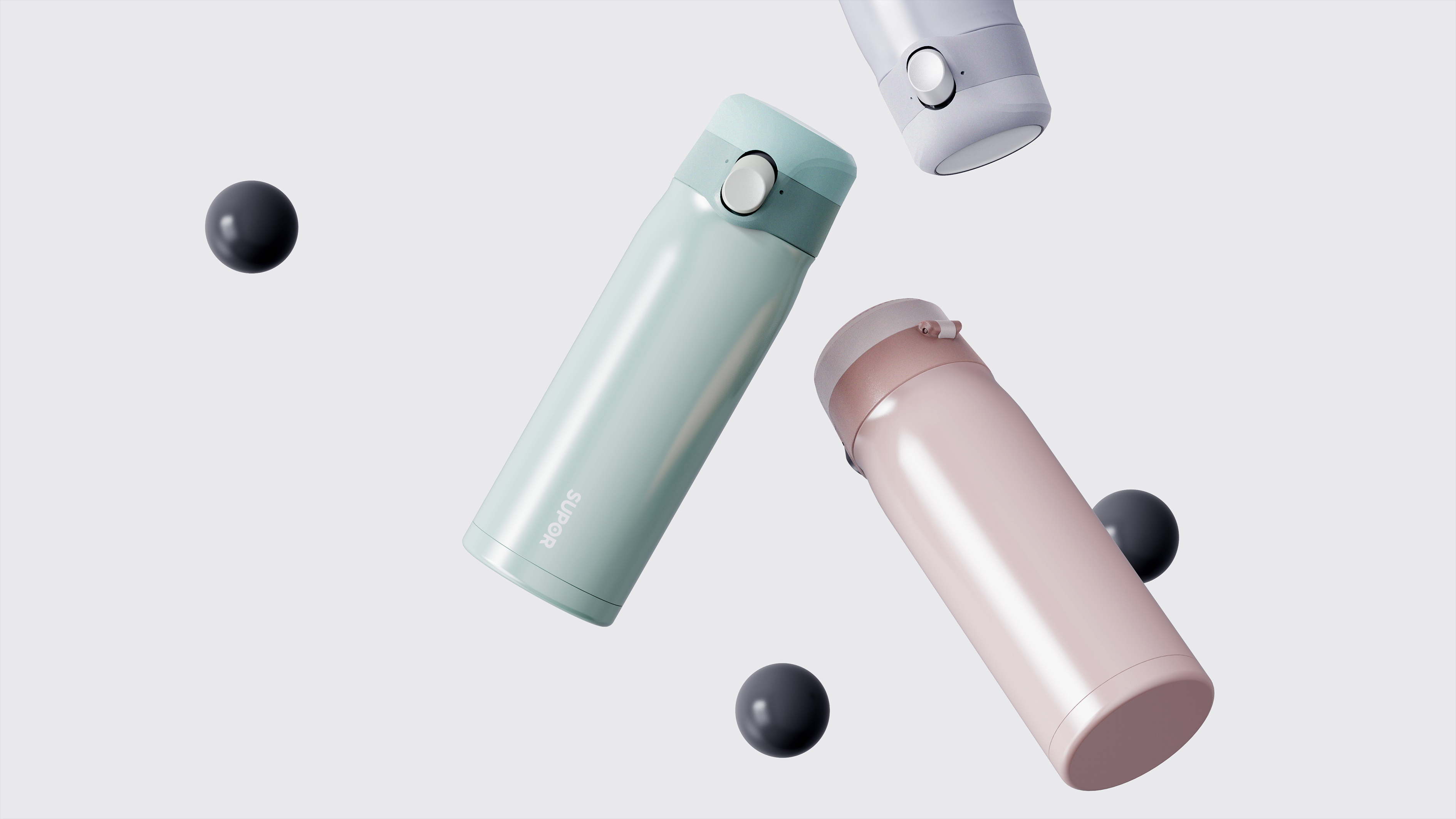
SUPOR's brand tone has long given Chinese users the feeling that it is popular, cost-effective and easy to use. Therefore, this project extends the younger user group on the basis of respecting SUPOR brand positioning. The appearance is based on mainstream public aesthetics, and CMF is used to make a fashionable and youthful feeling. Attract more young users. This project was designed in August 2018 and is now in mass production.

新用户?创建账号
登录 重置密码
请输入电子邮件以重置密码。


Didn't the inspiration really come from Star Wars Stormsoldier? The black and white one is too similar.
Haha, I bought a gradual color change one month ago ~ it looks good.
It's pretty
Supor's thermos?
In this life rendering... can be further improved ha ha
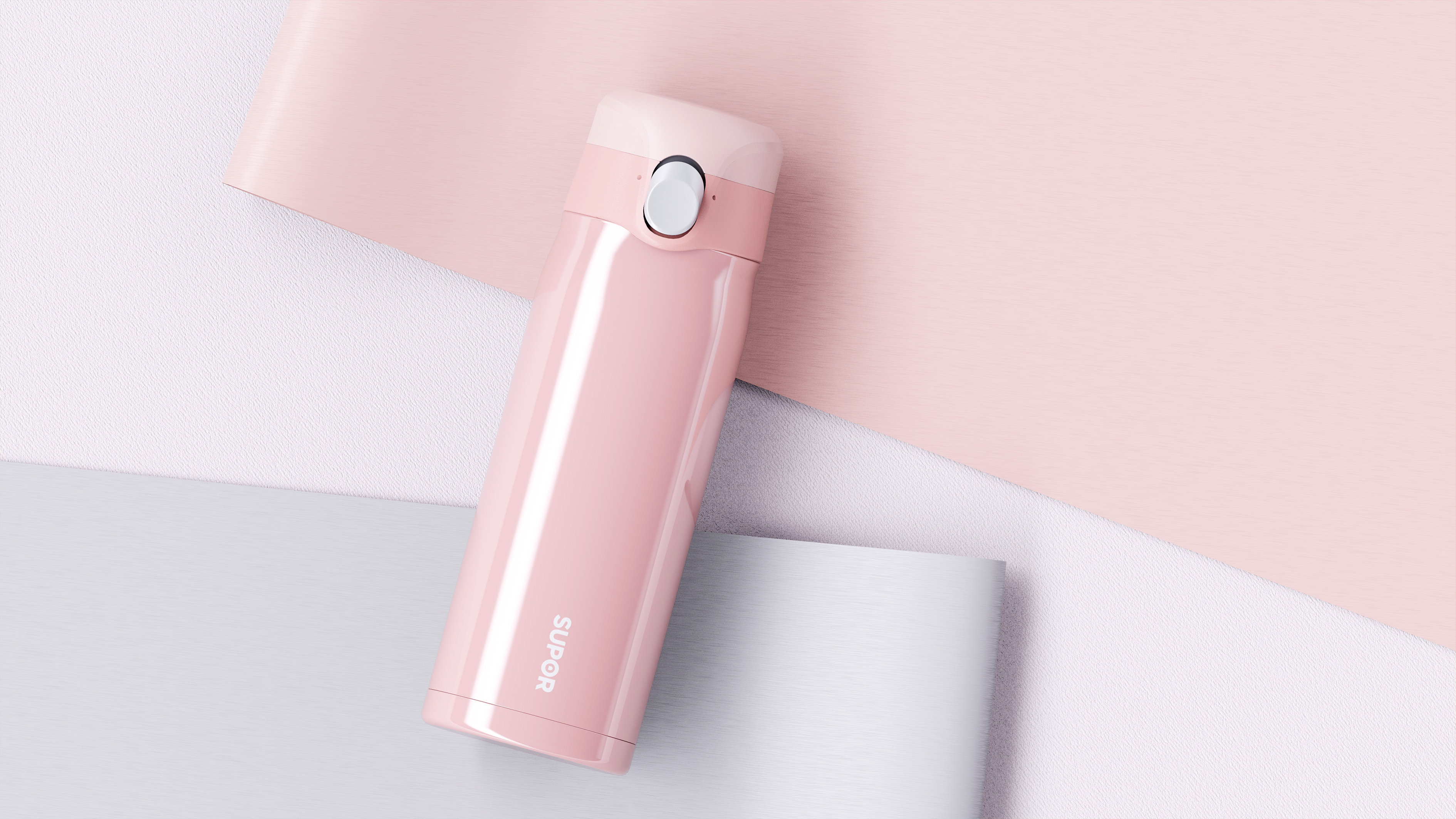
Good porridge pink, not tacky pink
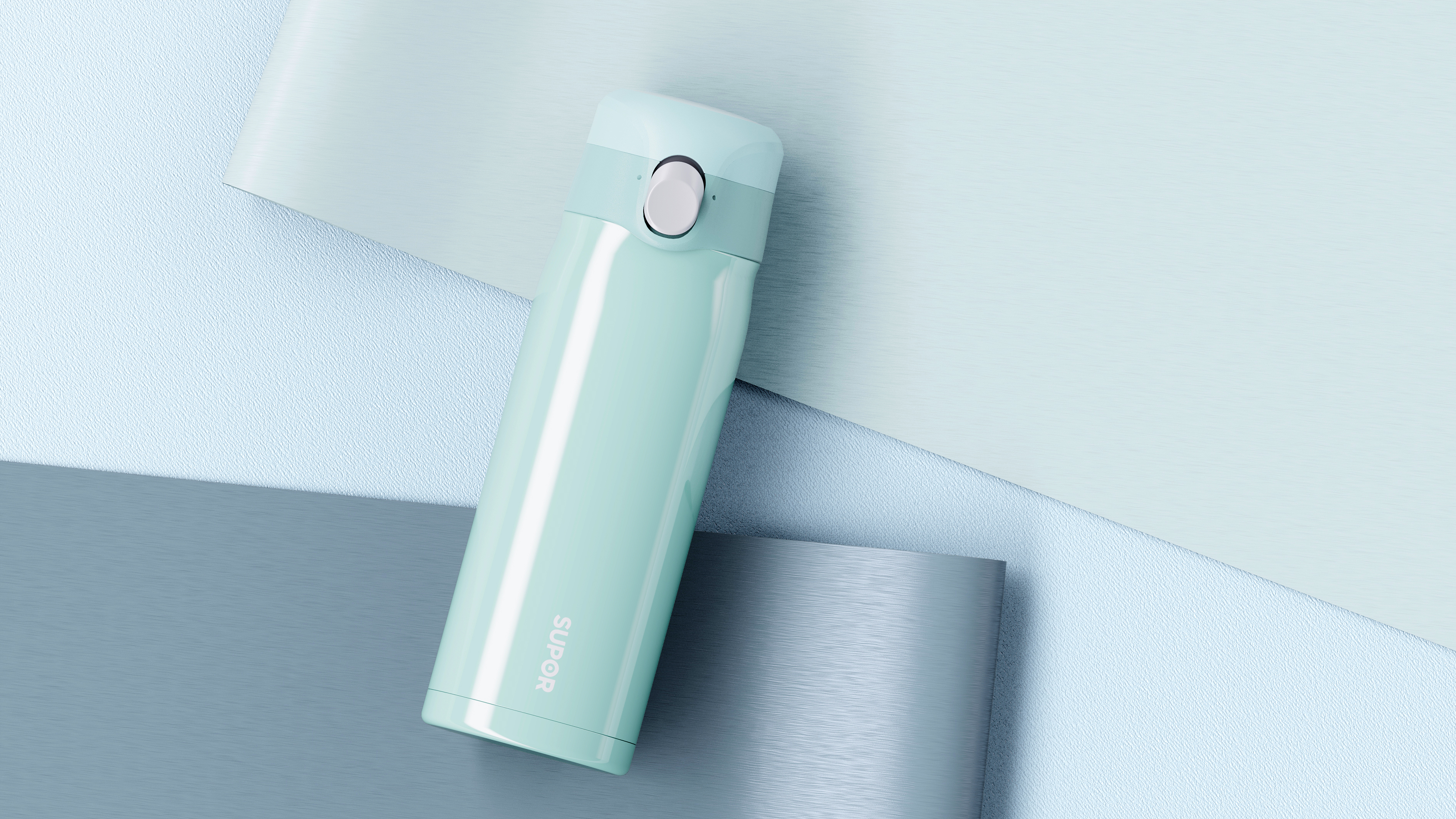
The color matching is very small and fresh ~