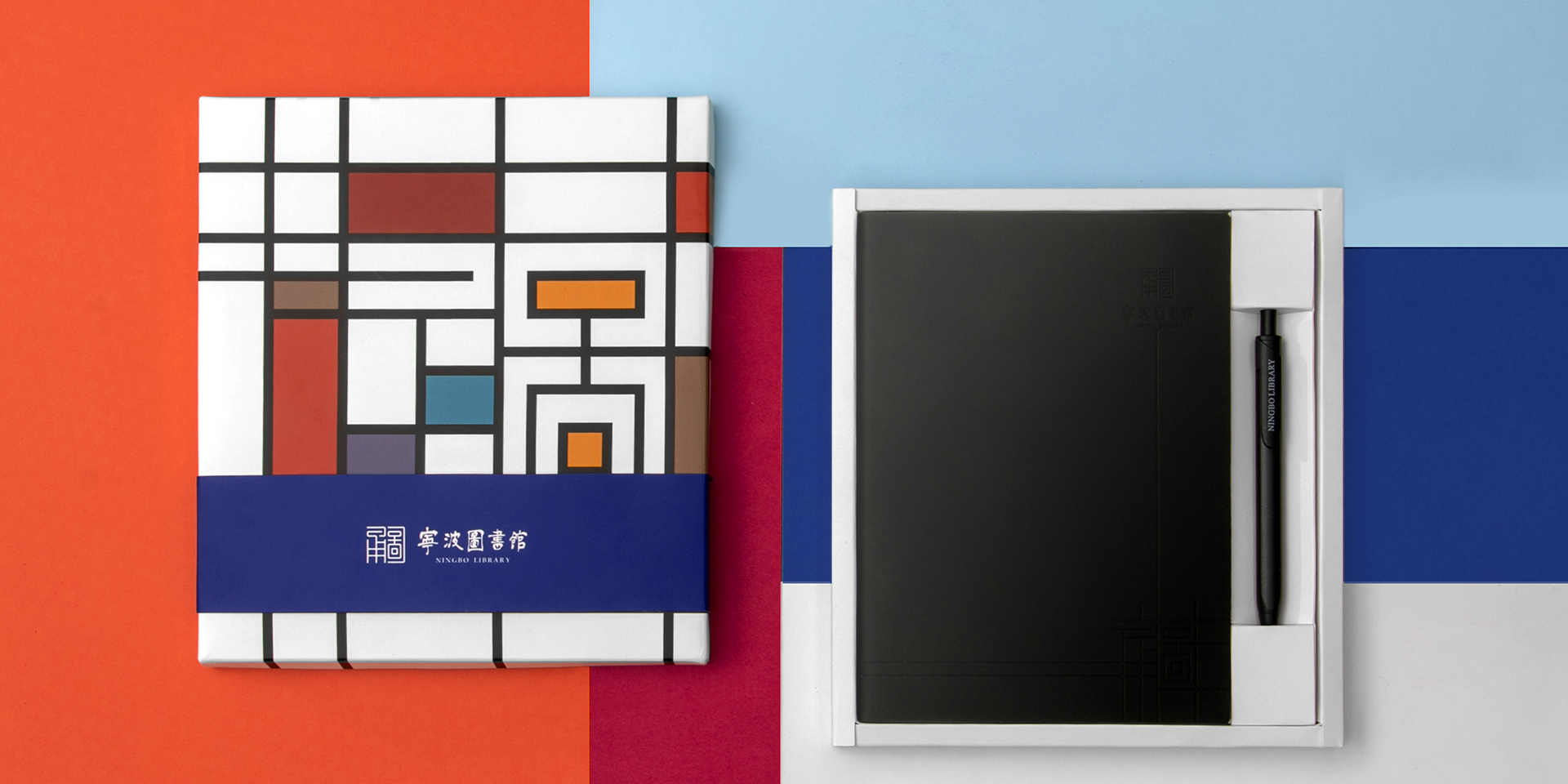
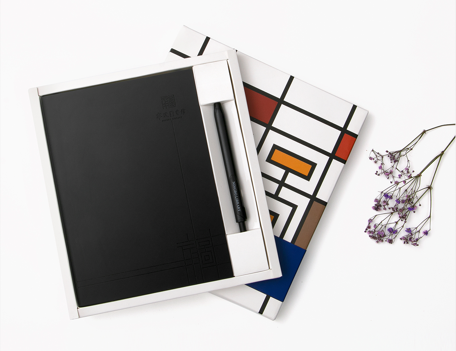
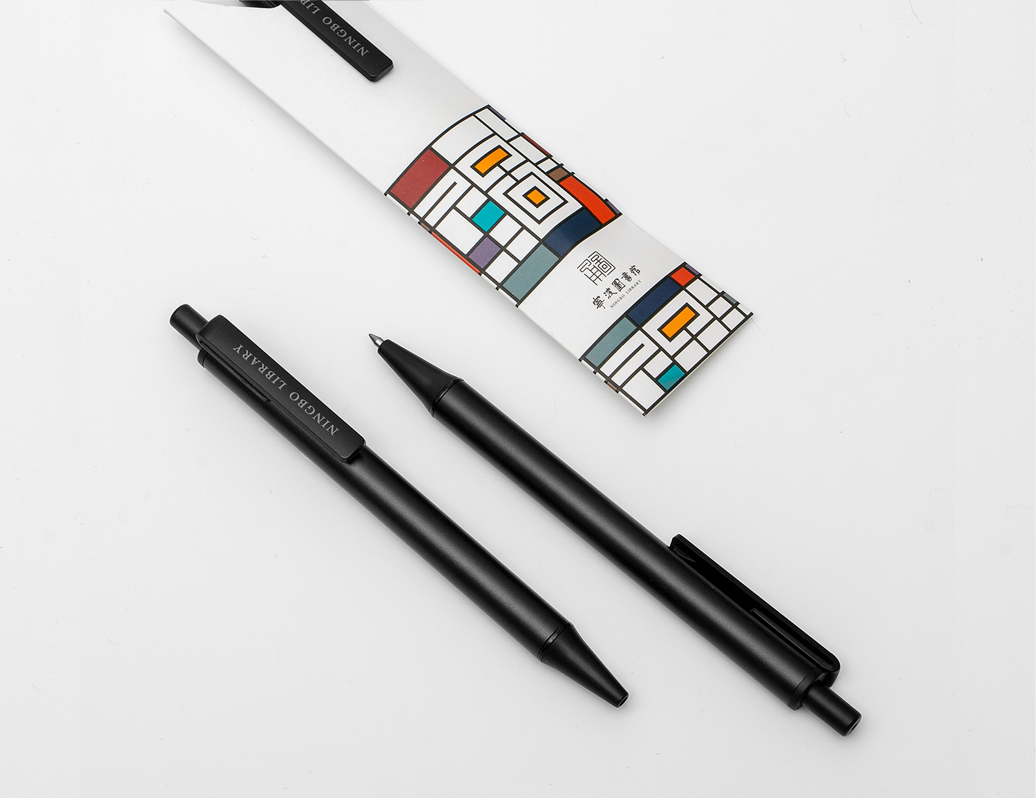
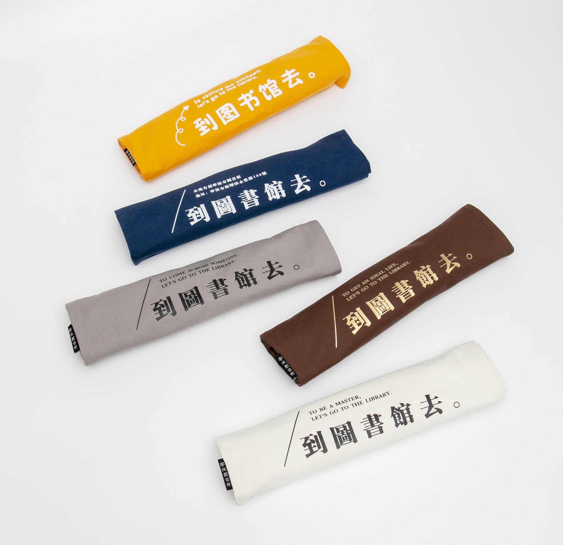
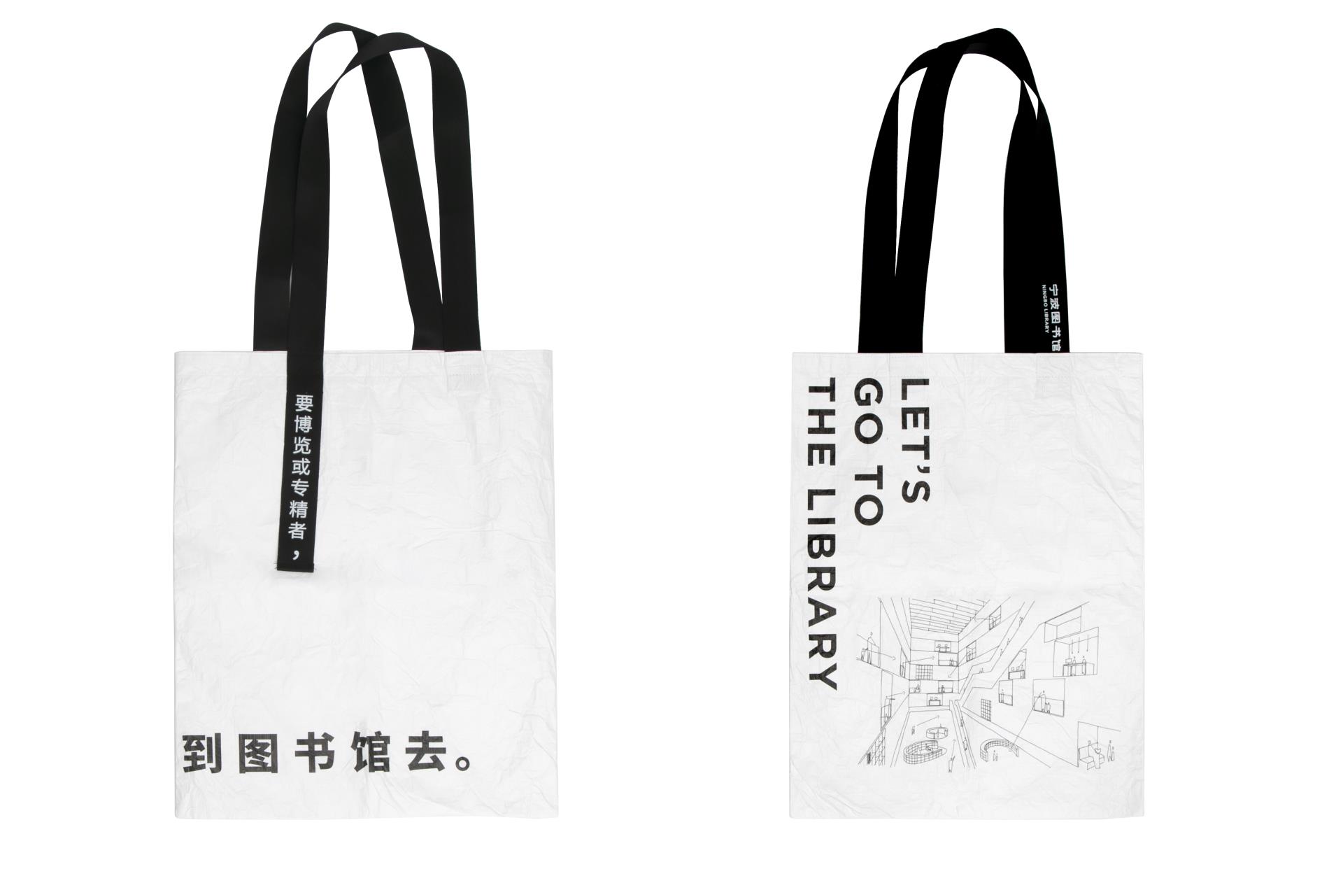
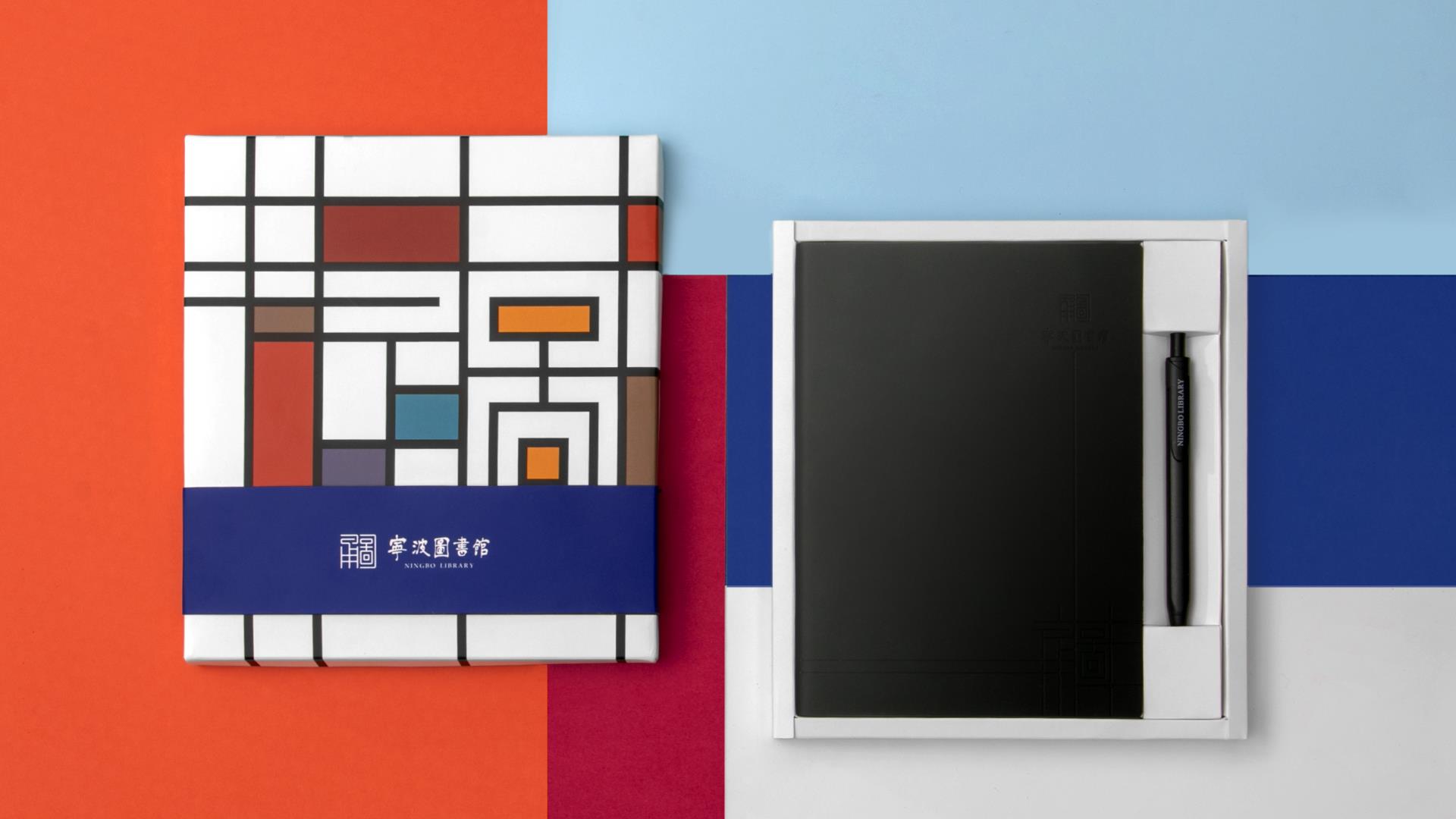
The image logo of Ningbo Library is mainly blue and gray, and the overall style combines traditional implication and modern style. The whole part of the logo is that the word "Yong Tu" is deformed by the "seal method", and the other part is the calligraphy font of "Ningbo Library". The designer uses modern techniques to restore the original appearance of Mr. Ren Jiyu's font to the greatest extent, making it more balanced and stable, which can be regarded...


Dany
China · Other Industries
宁波木马工业设计
China · Home Appliance
本作品版权归 Dany 所有,禁止匿名转载及个人使用,任何商业用途均需联系原作者。

新用户?创建账号
登录 重置密码
请输入电子邮件以重置密码。


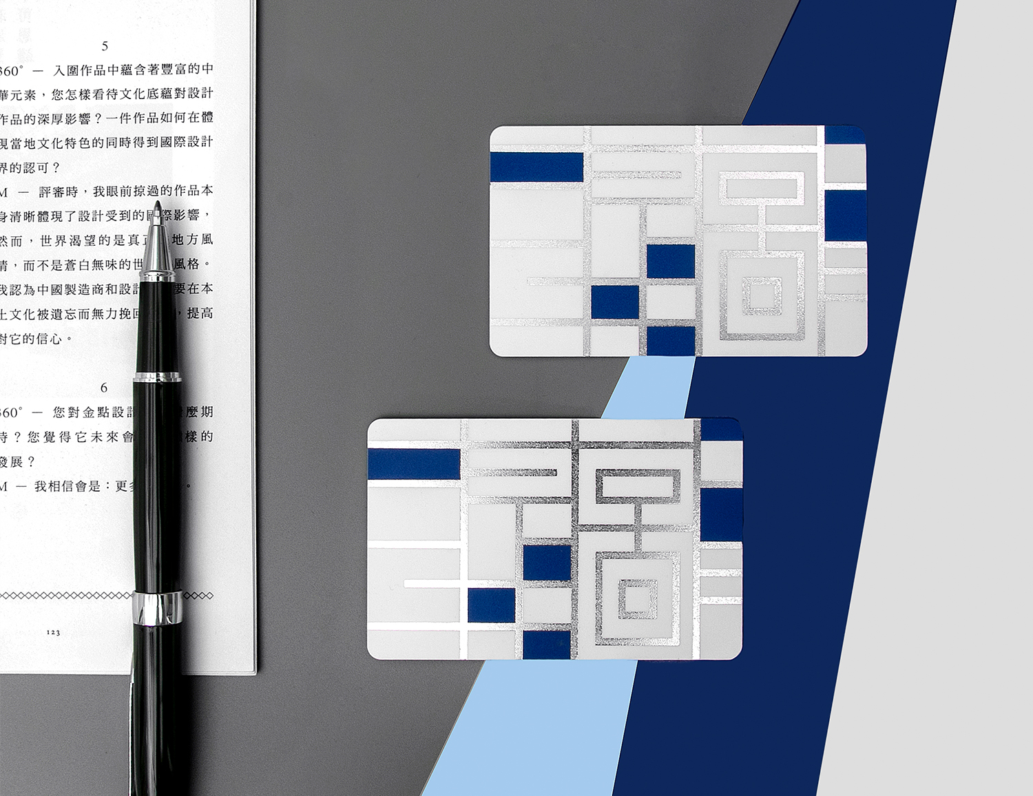
Isn't that Dutch style?
666
not bad
have characteristics
like it very much