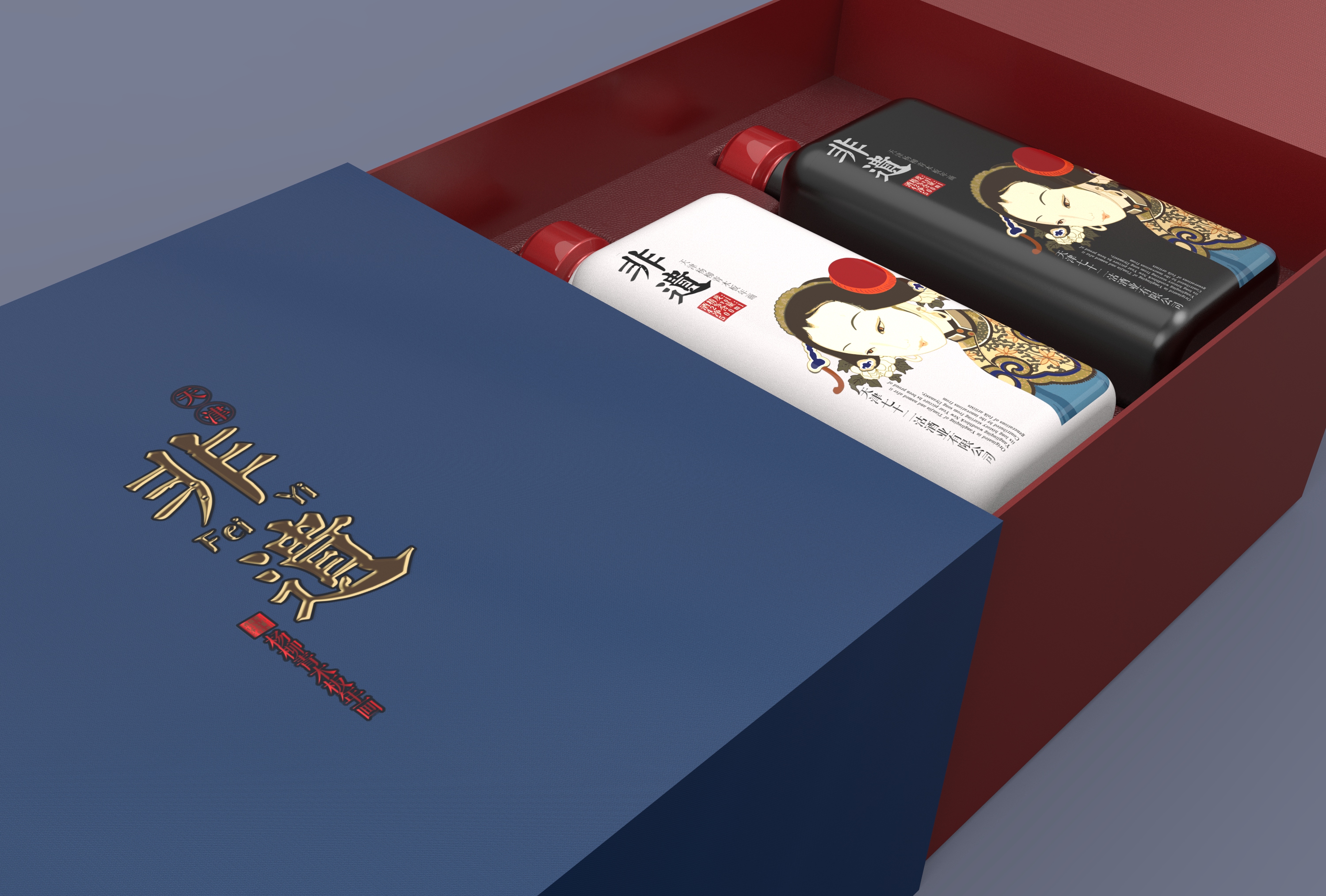
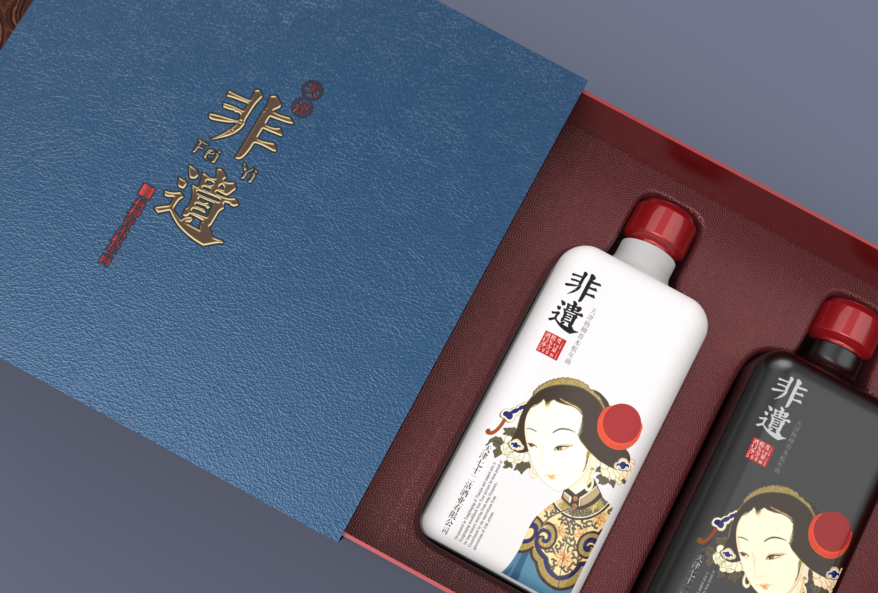
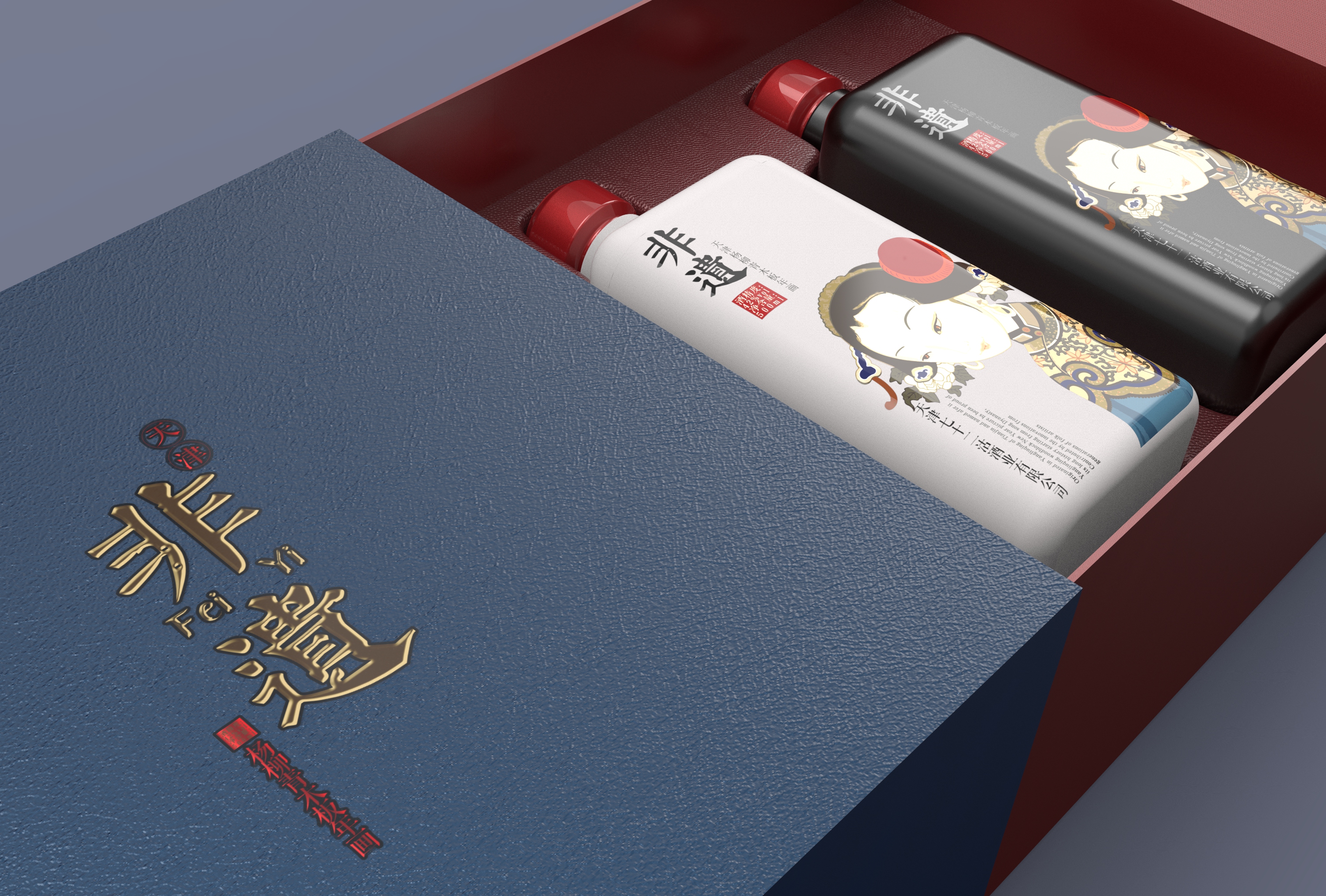
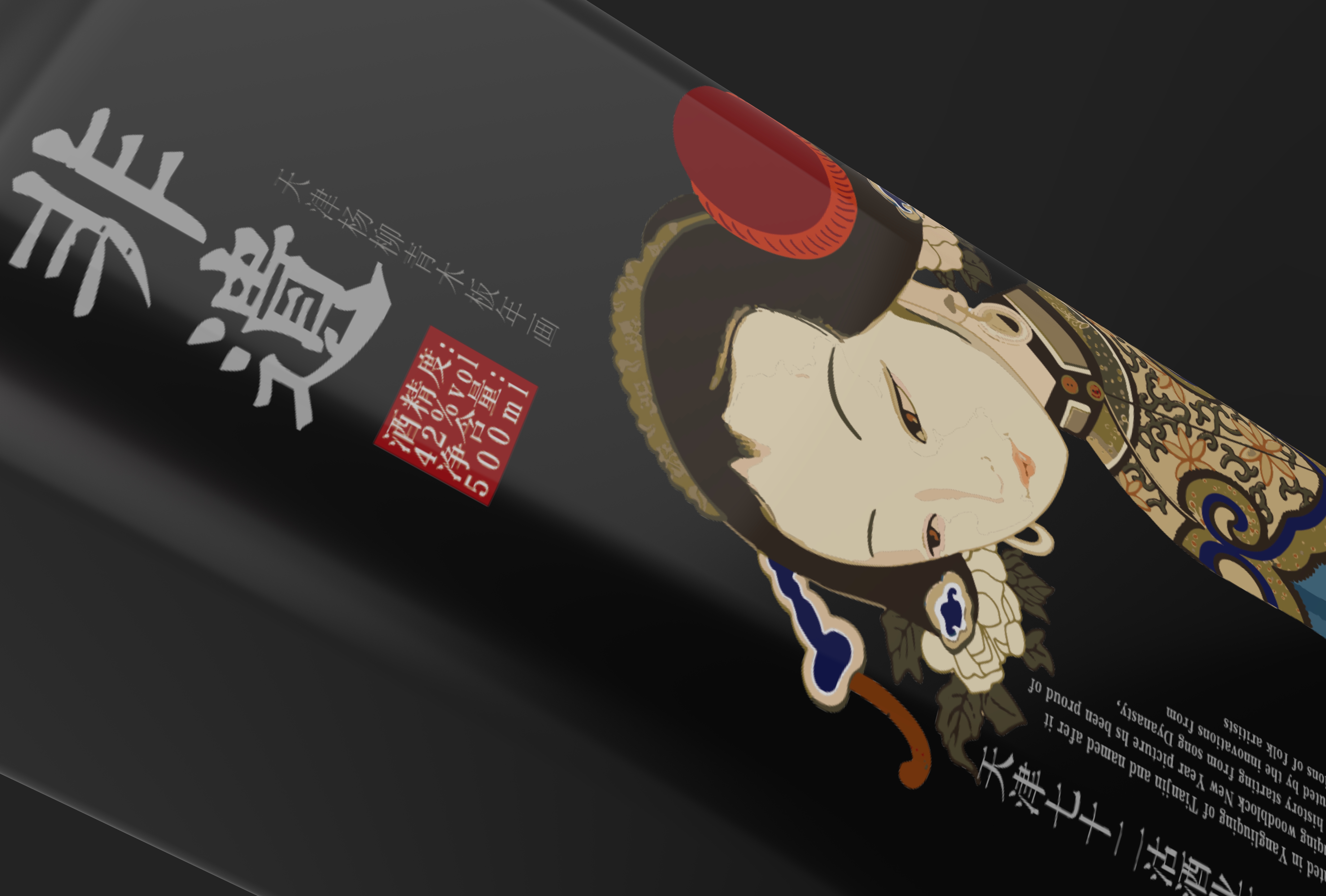
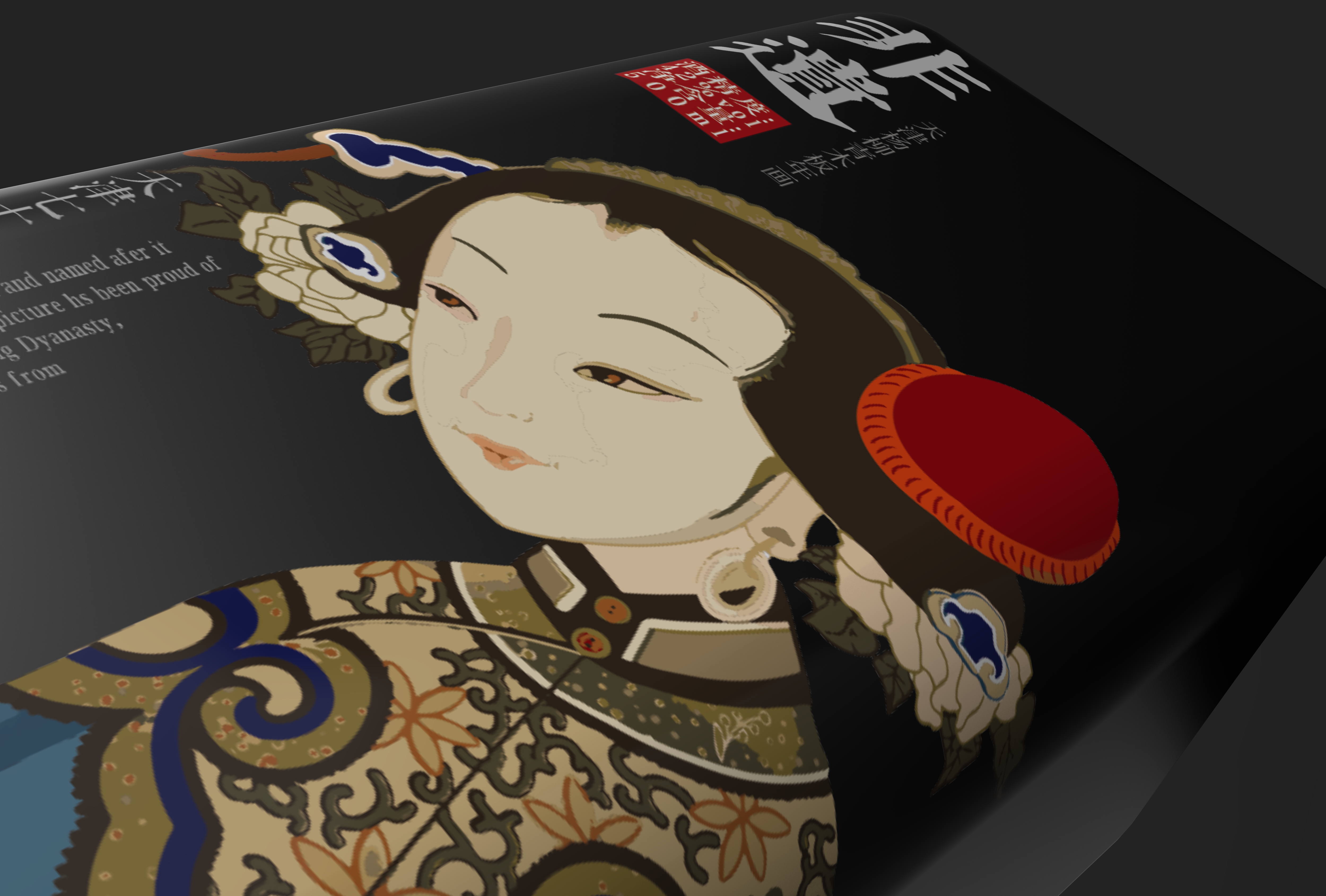
It is also suggested that the picture should not be tilted. You can enlarge and place it in half, then add some text descriptions and insert some illustrations related to the product into the base map, which is more like a creative product.
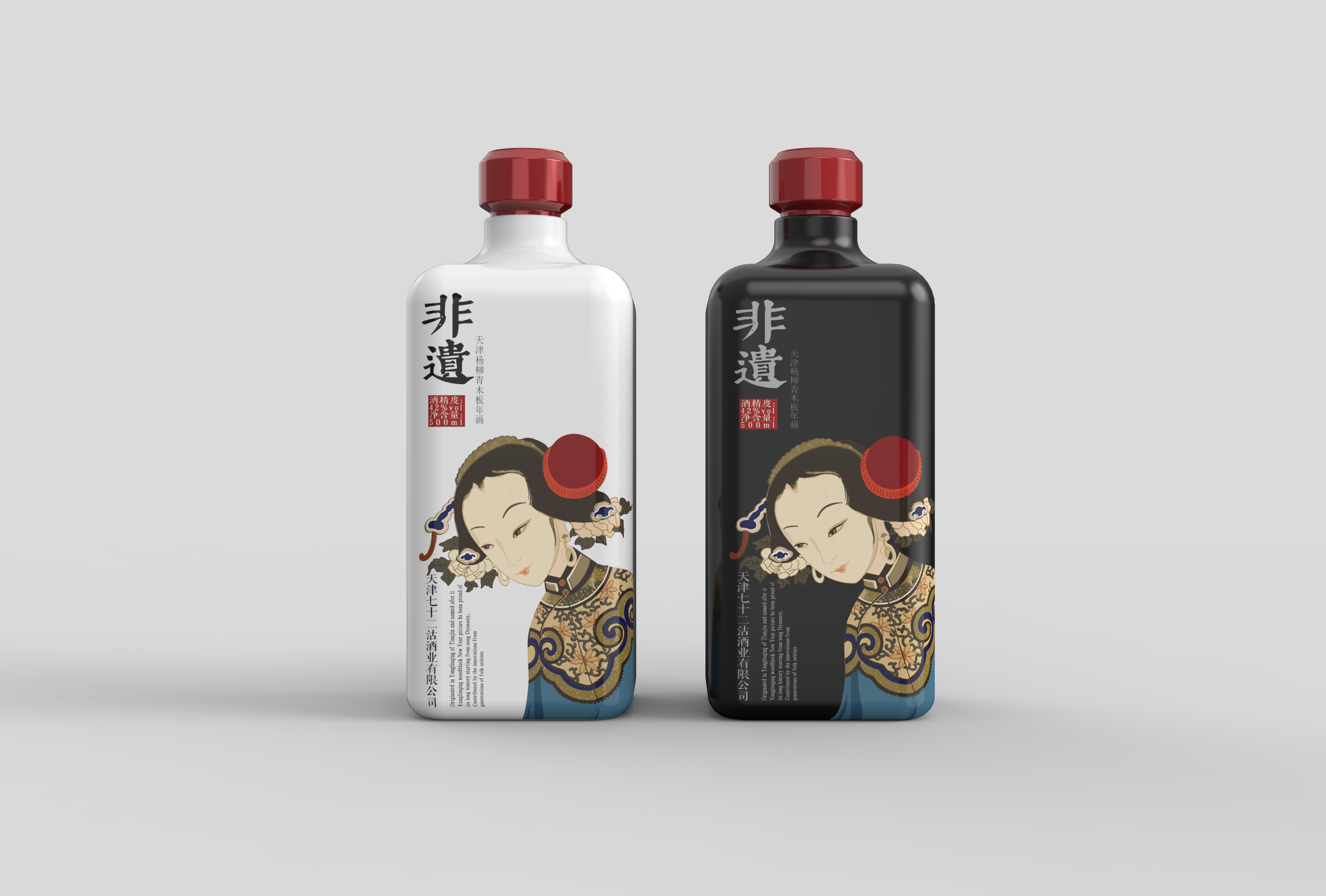
Blue is a bit abrupt, it is suggested that the picture color should not exceed three, the blue and red color is difficult to control, it is suggested that the shell is also red, consistent, so as to highlight the product more.
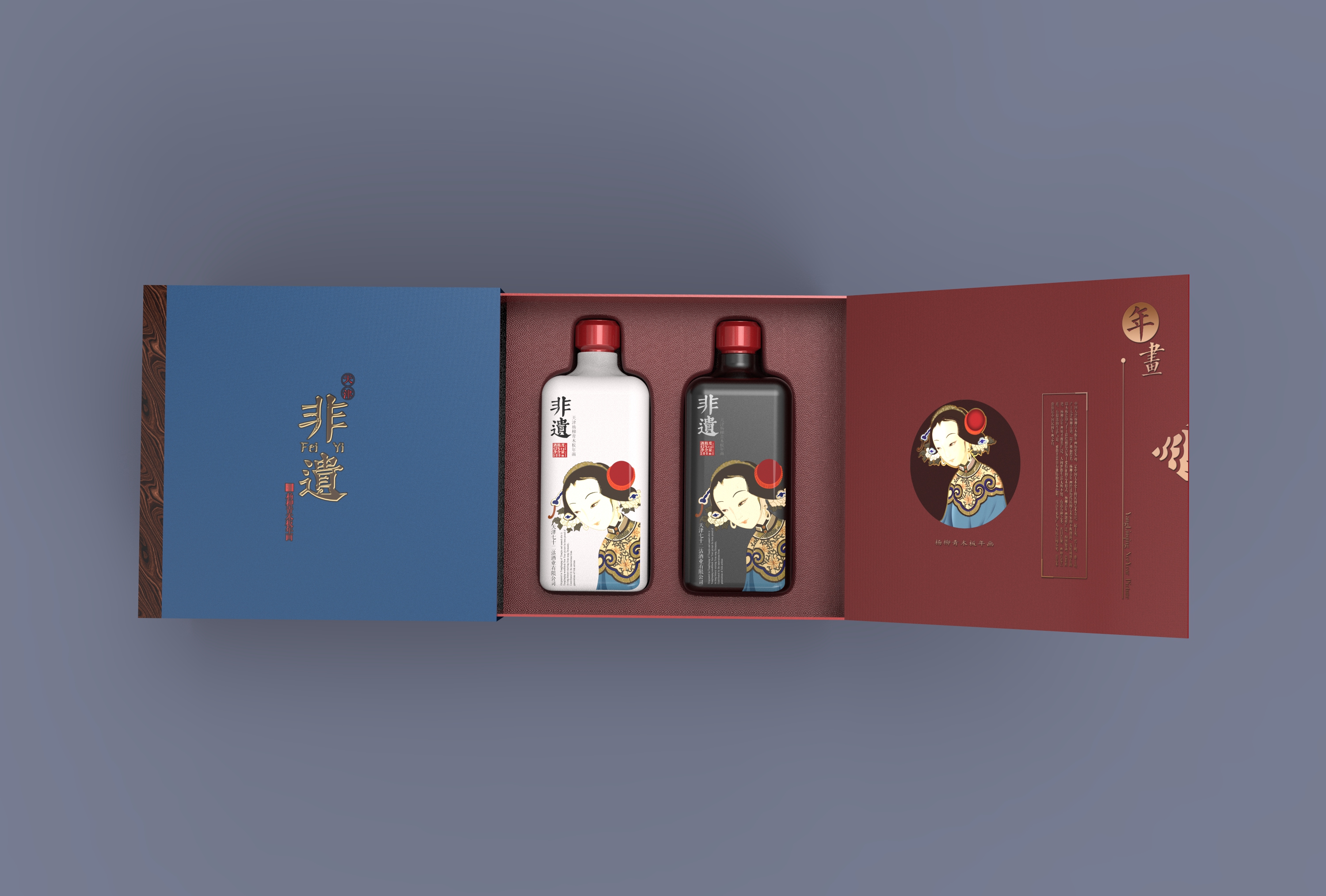
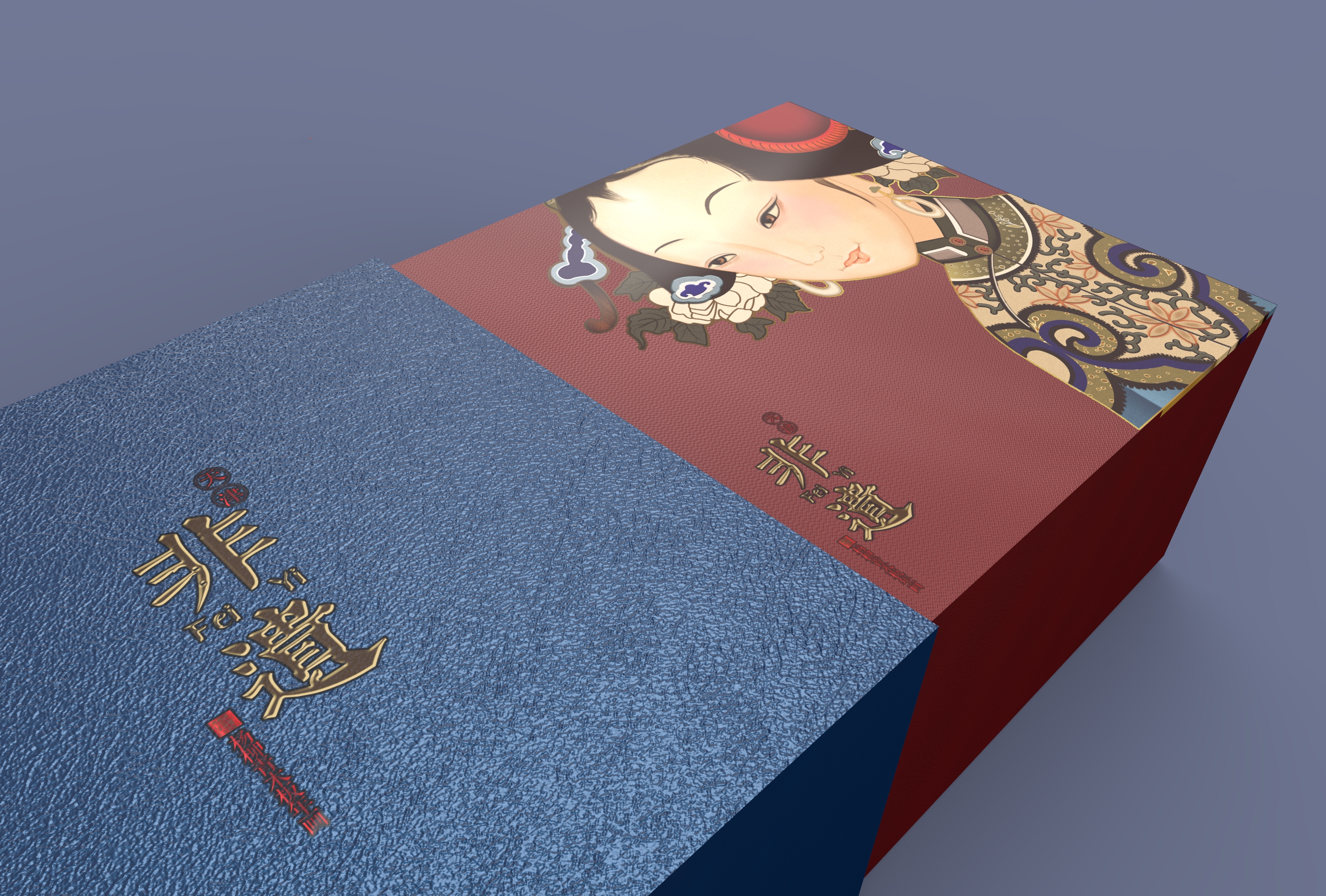
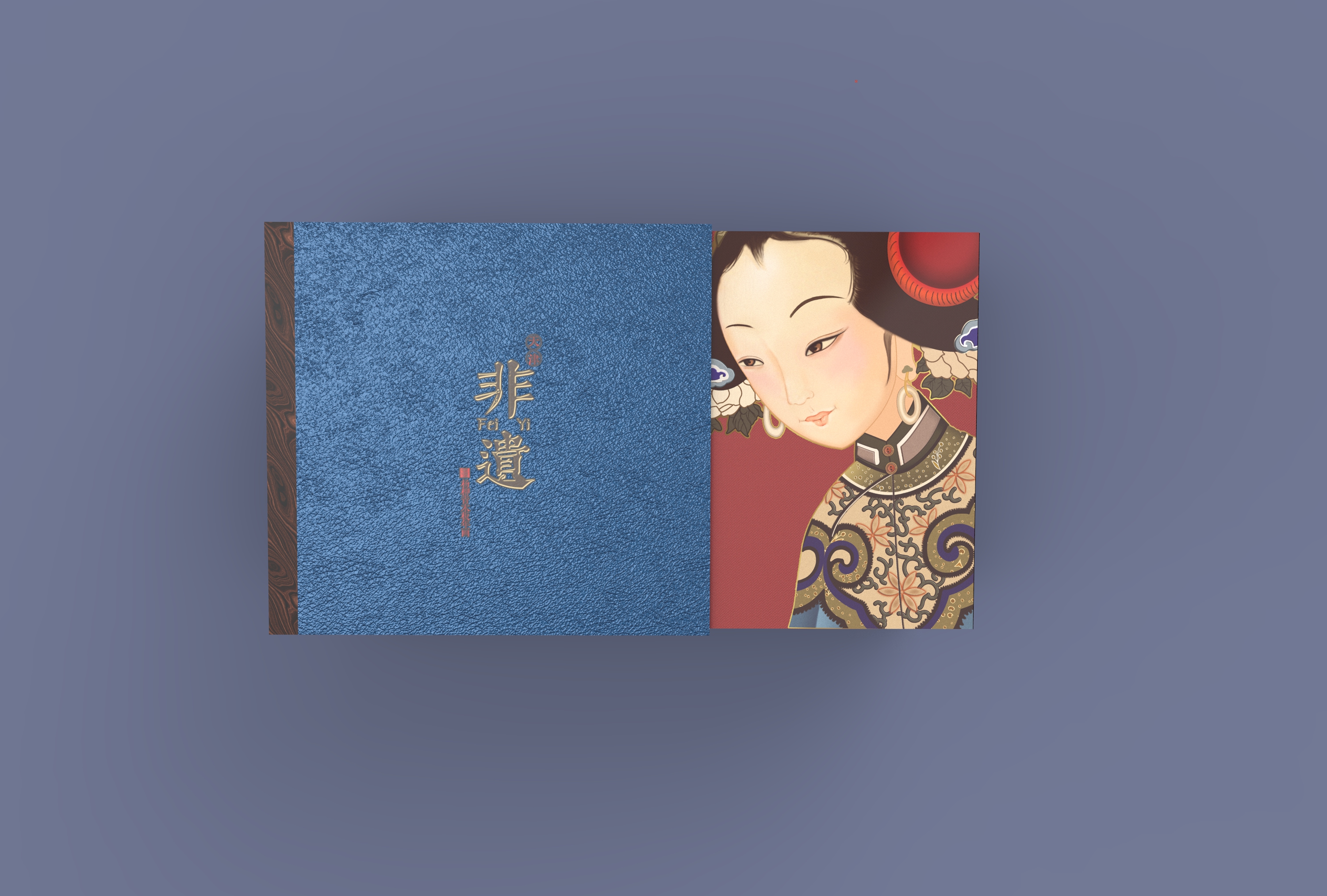
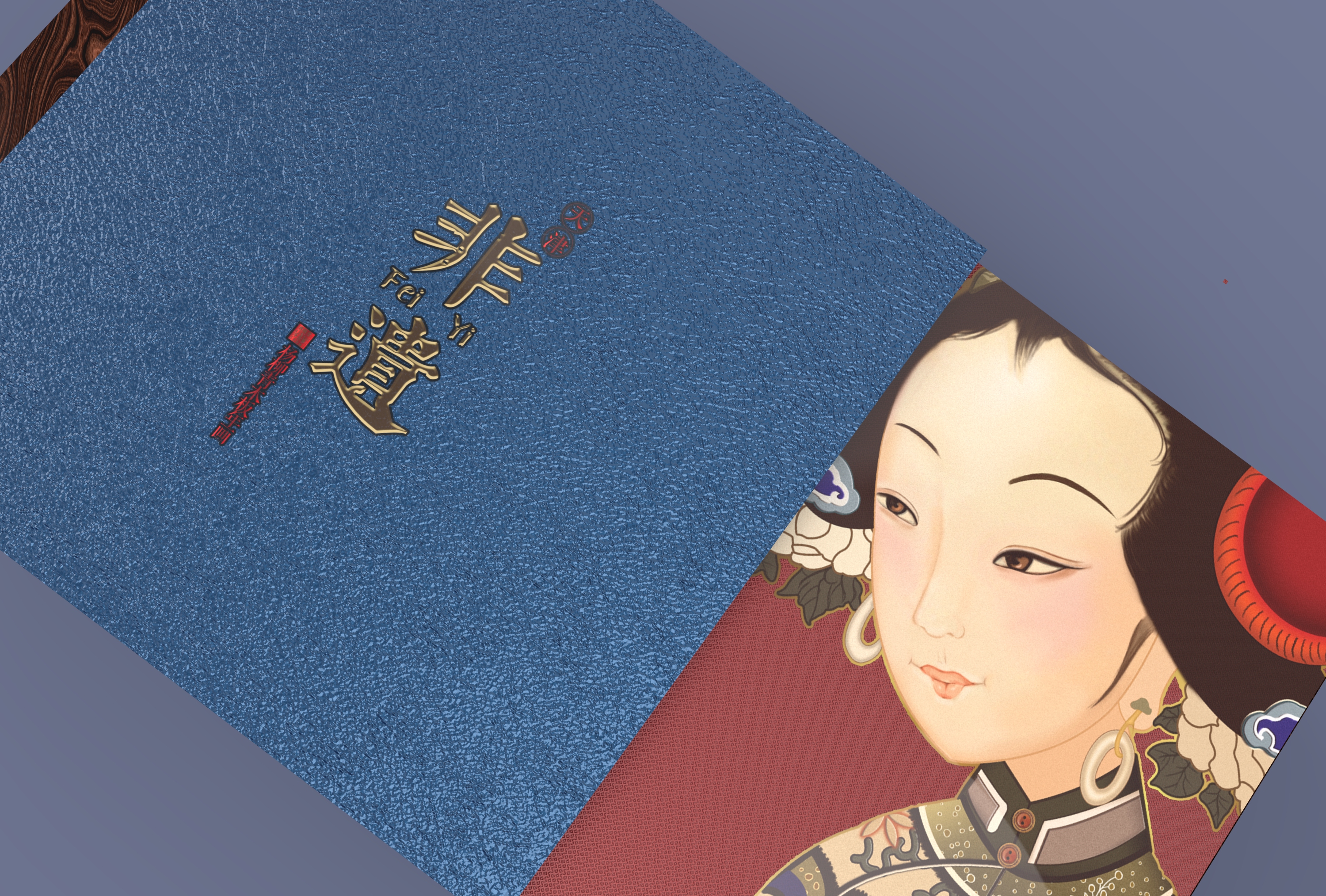
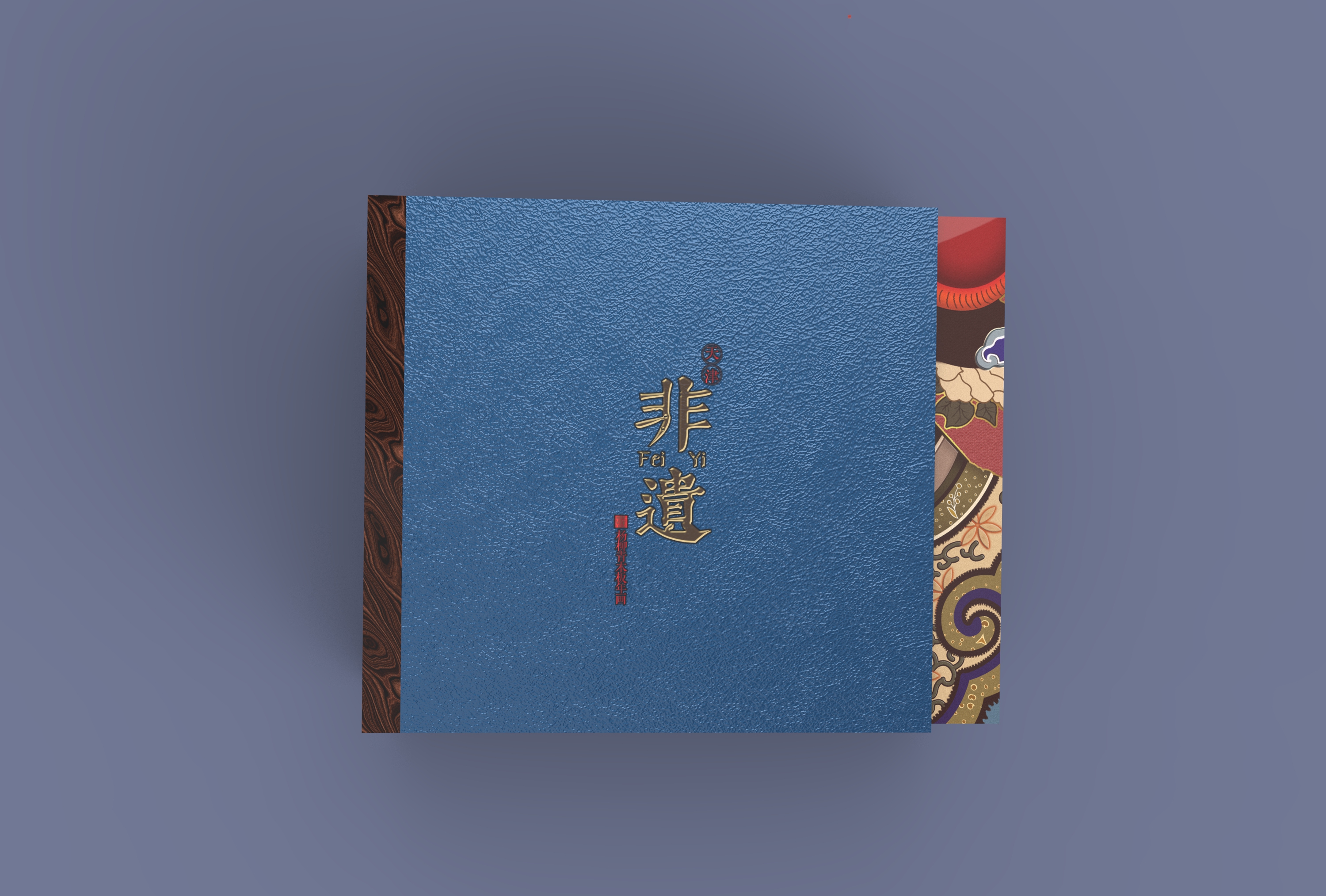
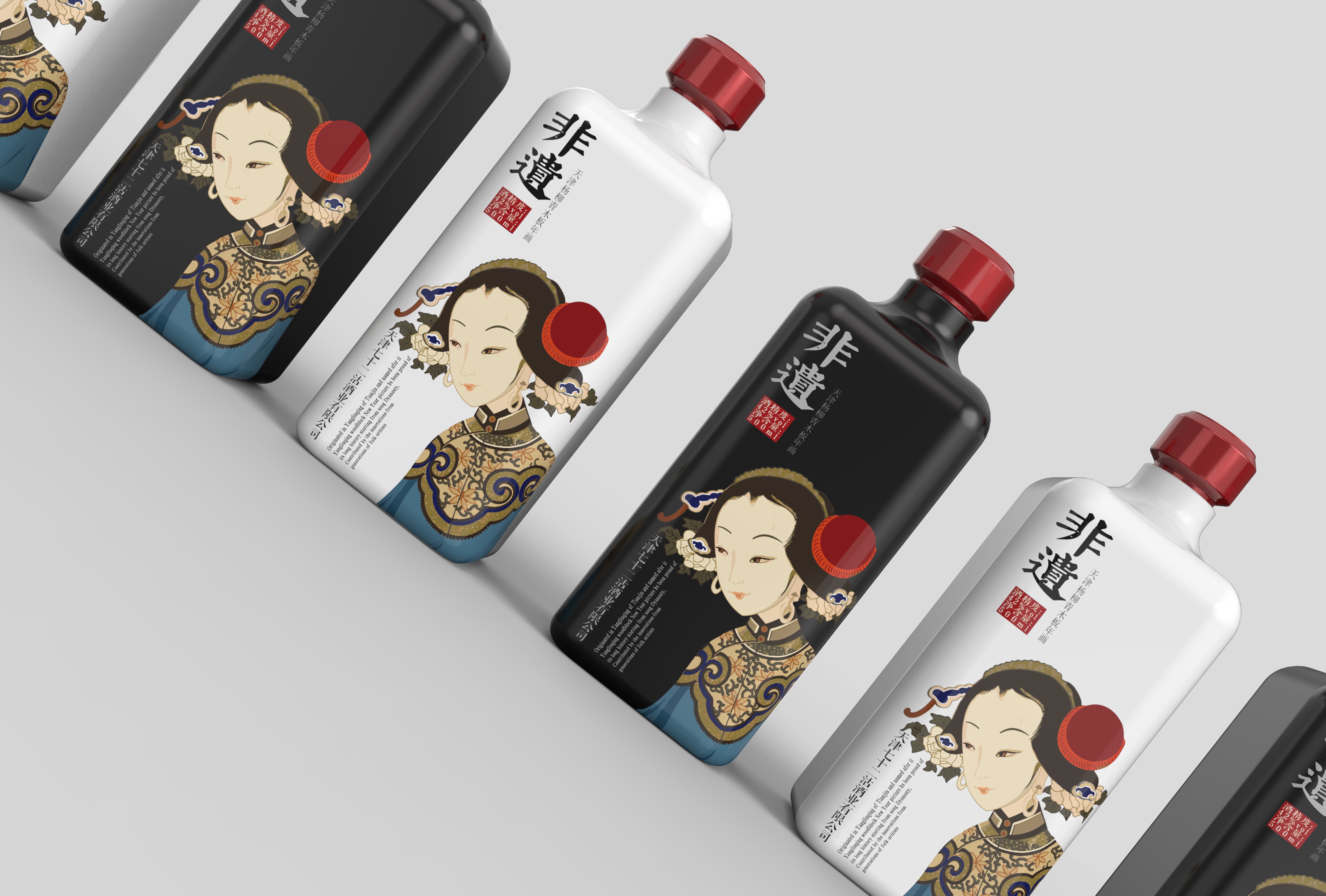
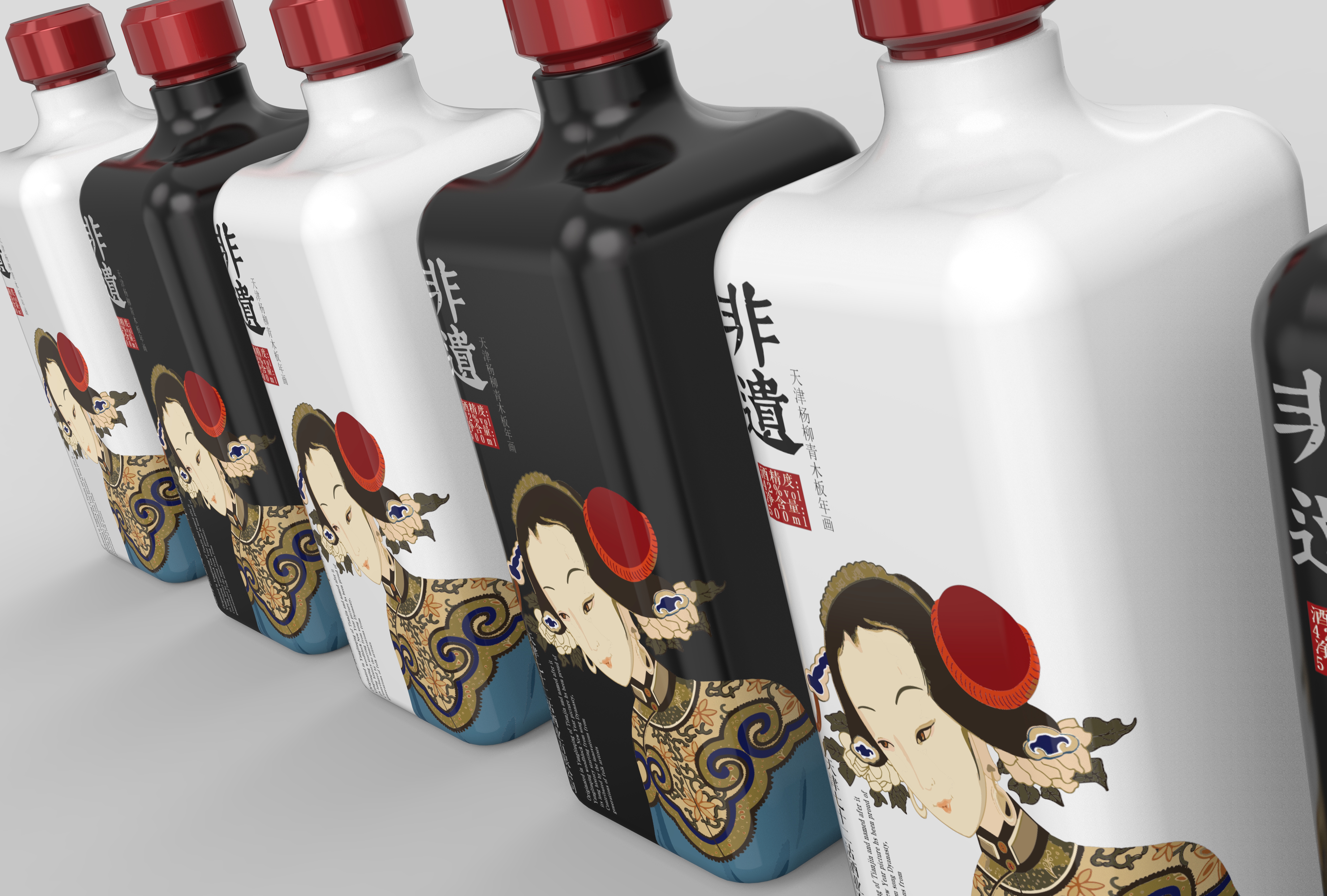


The pinyin of "fei yi" had better be removed, which is very abrupt.
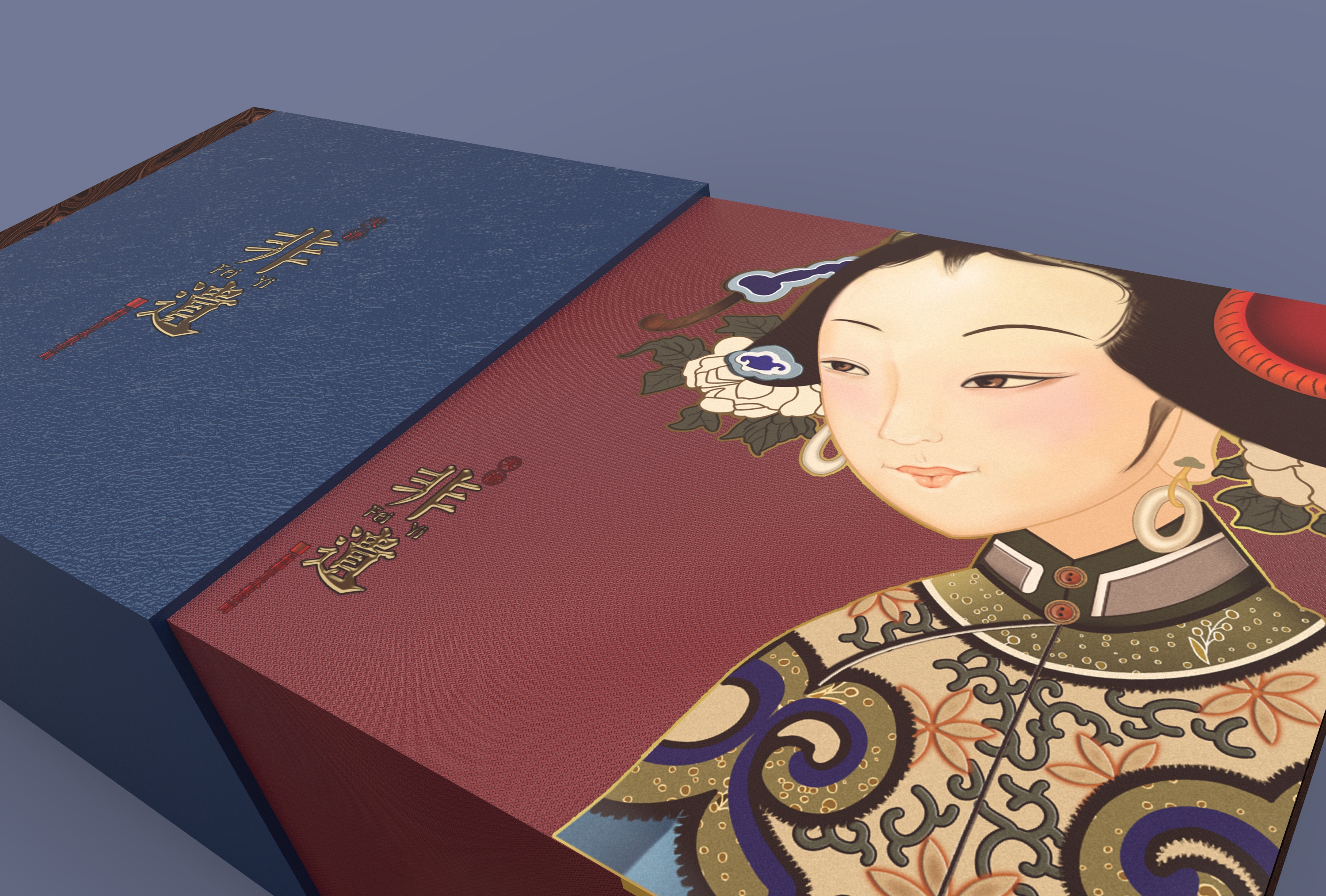
It is also suggested that the picture should not be tilted. You can enlarge and place it in half, then add some text descriptions and insert some illustrations related to the product into the base map, which is more like a creative product.
Blue is a bit abrupt, it is suggested that the picture color should not exceed three, the blue and red color is difficult to control, it is suggested that the shell is also red, consistent, so as to highlight the product more.
Thank you
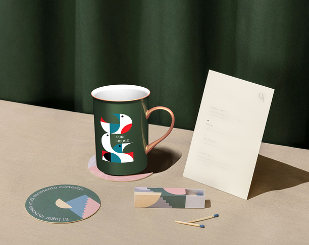
I like this color scheme very much.
A little taste