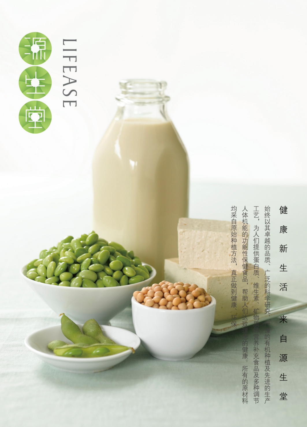
In the design process, we need to use visual language to explain the health concept of LIFEASE brand and establish a recognizable brand image. We take the tender green leaf buds as the basic element to give people a fresh and healthy visual experience. Then the center surrounds to form a circle, which is arranged in a vertical column with the words "source", "sheng" and "tang", representing the concept of two, two, three, invisible and endless life, which is reflected in the advocacy of the LIFEASE. People's diet level continues to improve. The overall brand image is fashionable and simple, and the application on all packaging, handbags and posters is clean and elegant, which is conducive to bringing more young consumers who pay attention to the quality of life to the brand.


Year
2016
Affiliation
Willer Design
Designer
Ma Hao, Li Shaochen
本作品版权归 K-DESIGN AWARD 所有,禁止匿名转载及个人使用,任何商业用途均需联系原作者。

新用户?创建账号
登录 重置密码
请输入电子邮件以重置密码。


留言板 (0)
评论为空