Decoding new language for prescription drug packaging, when "clock" meets "vitality color block"
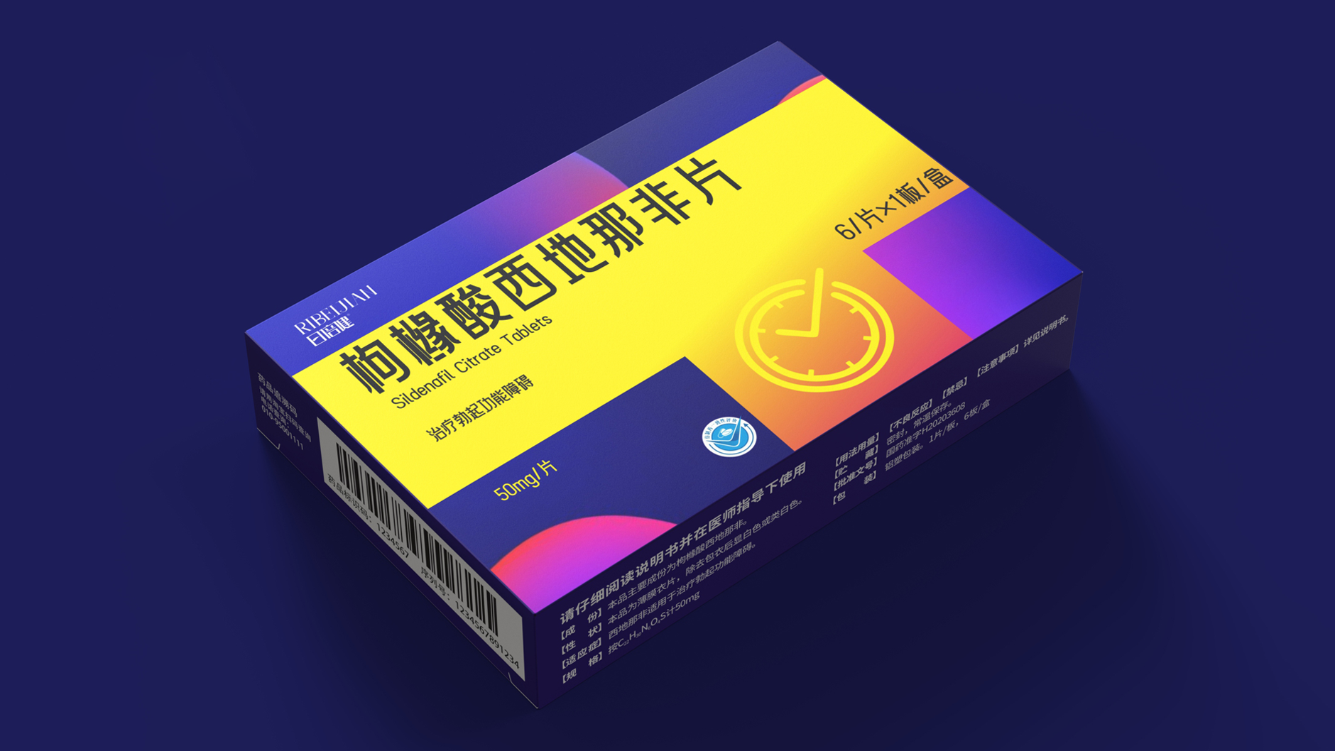
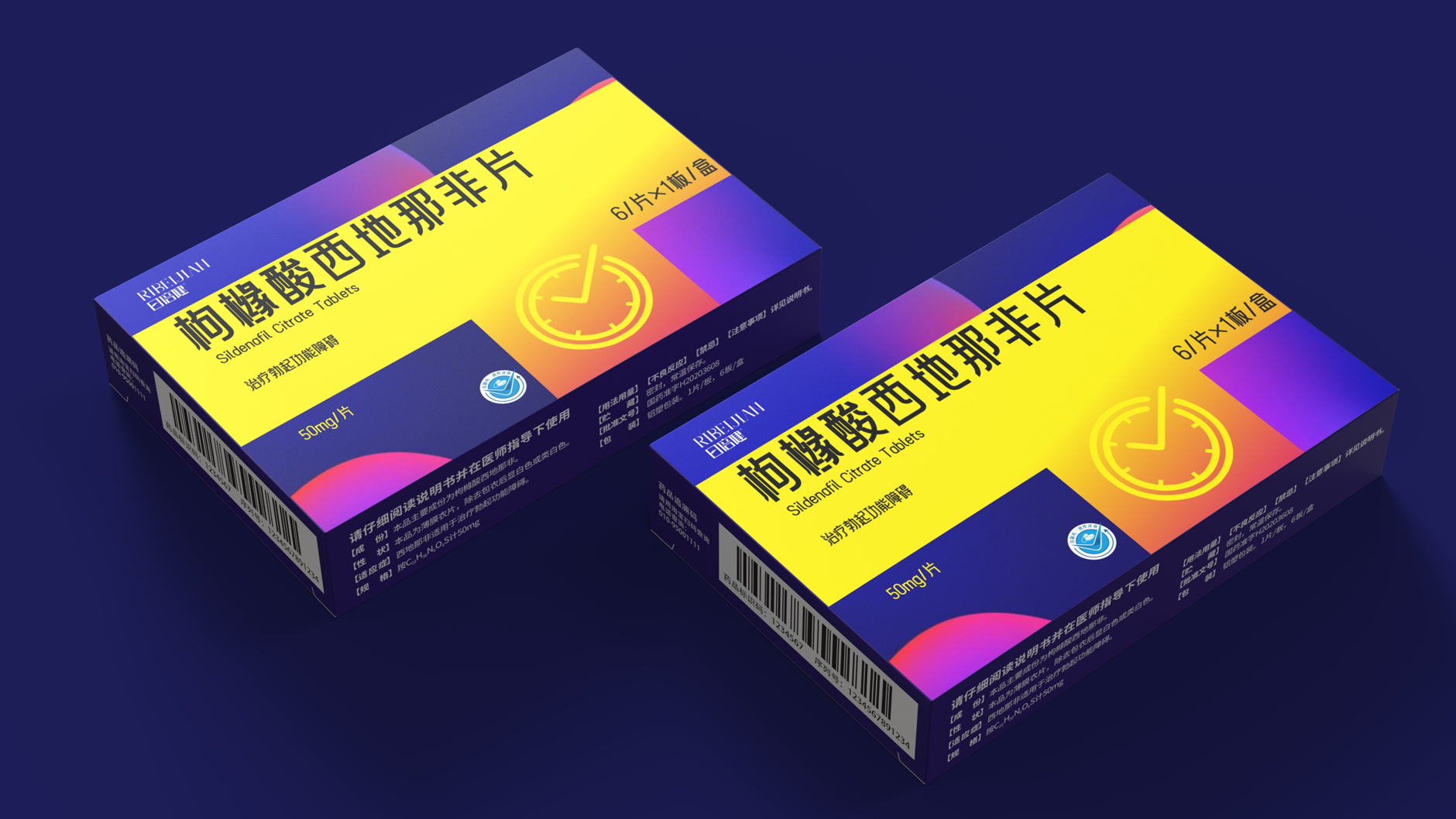
Sildenafil Citrate Tablets
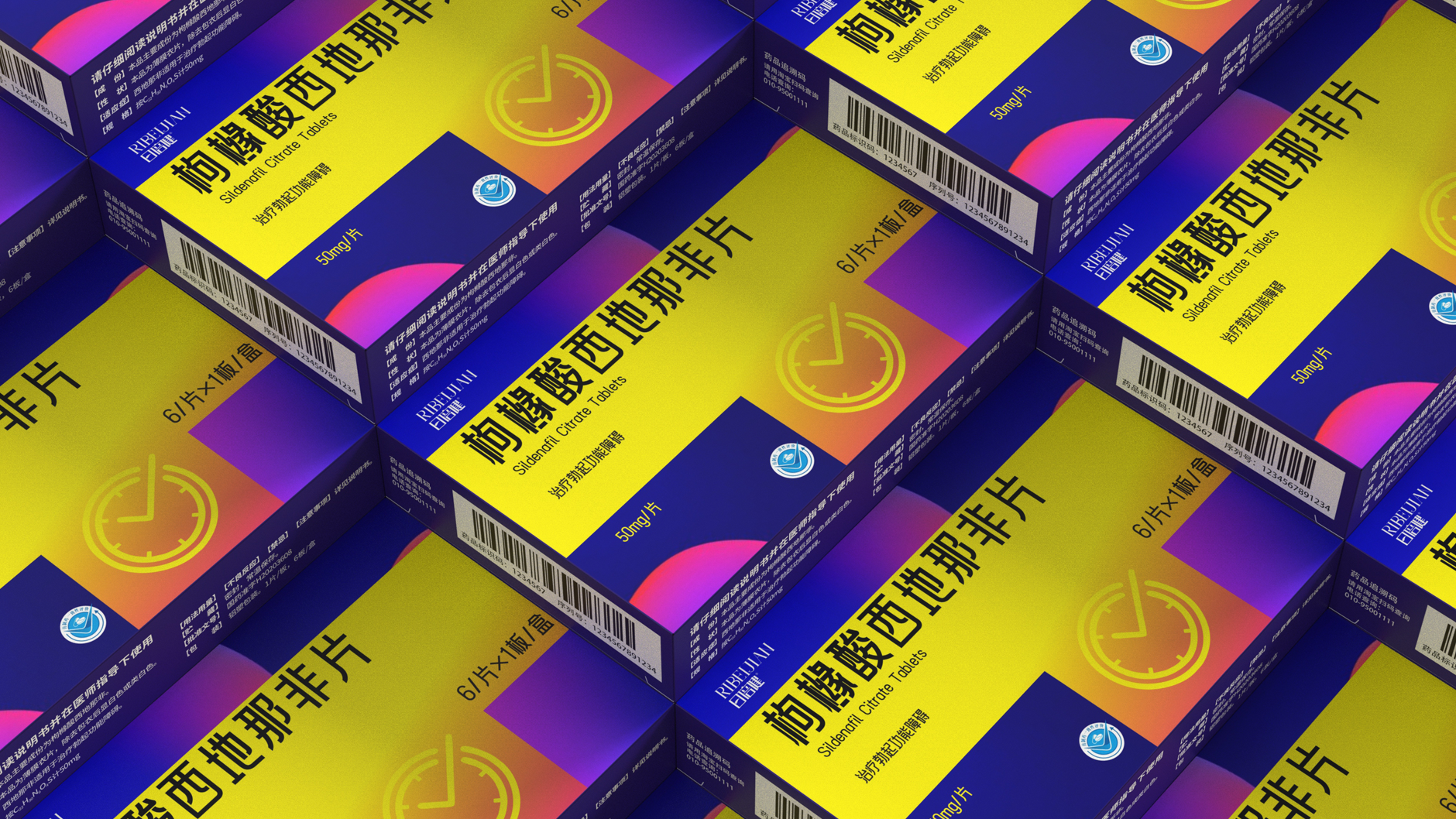
Use bright color blocks to match
Presents a stylish atmosphere of vitality
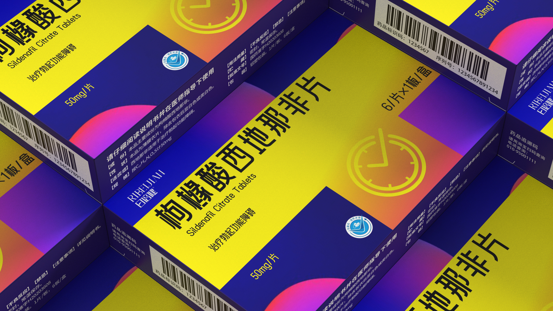
Blend into the clock element
Implicit in the efficacy of the packaging "enhanced delay"
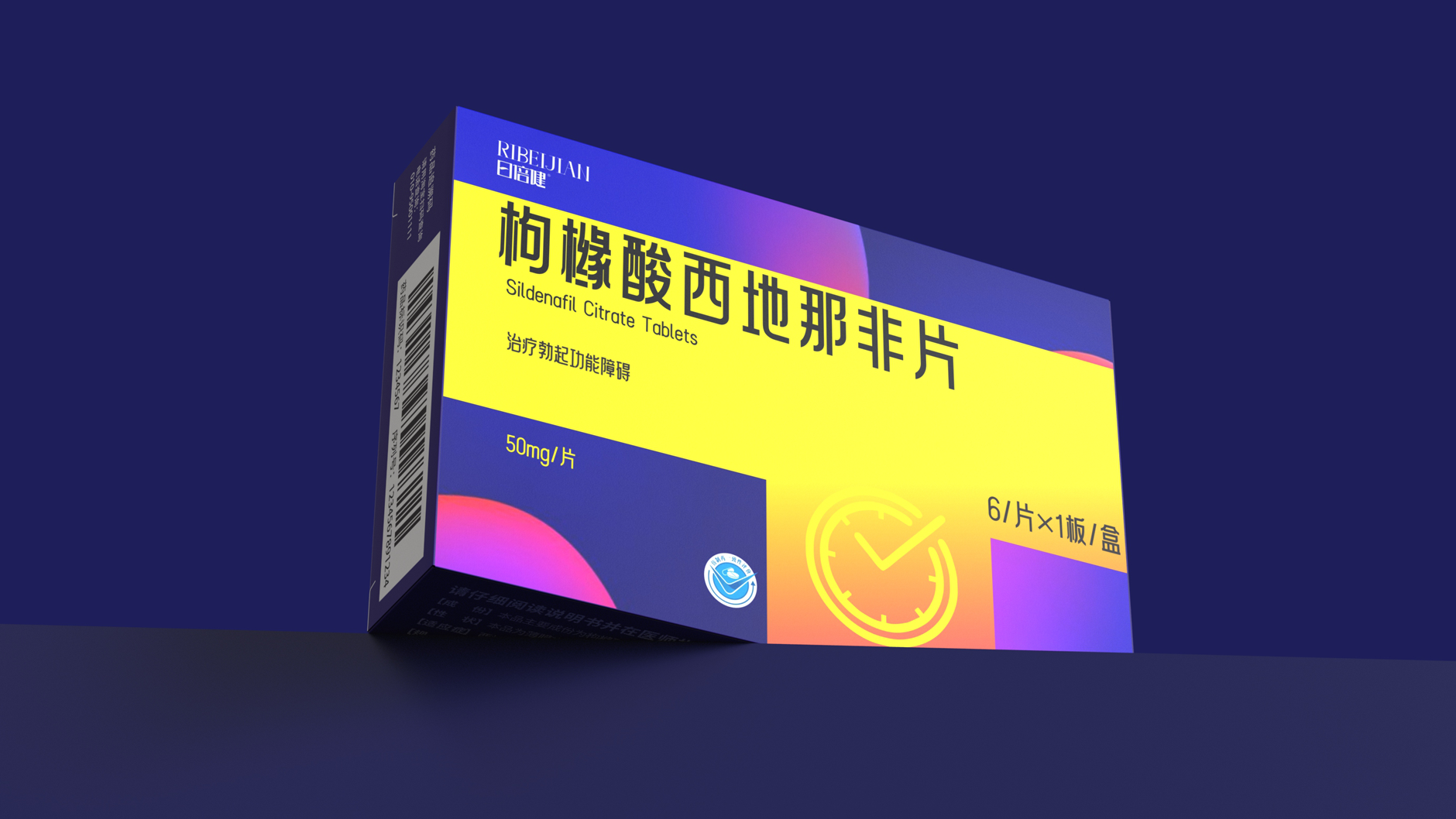
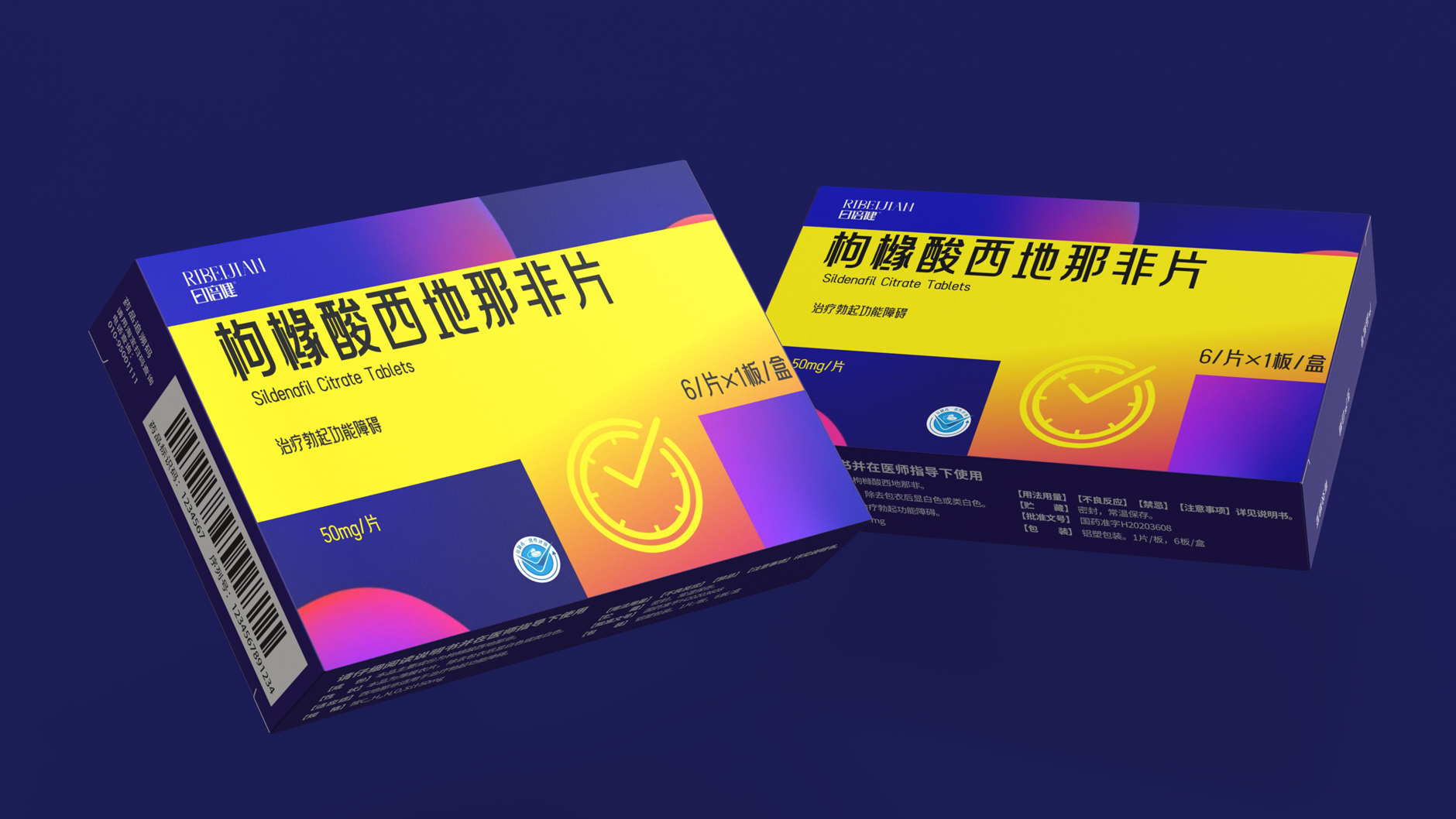
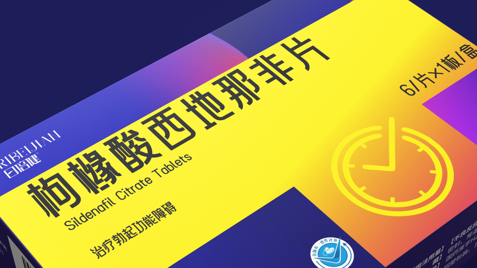
The packaging abandons the traditional white and blue medicine box and uses high saturation contrast color blocks. This design is not only highly recognizable on the shelf, but also understands color psychology. The scientific nature, reliability and security of drug delivery are the cornerstones of prescription drugs. Vitality Orange: symbolizes energy, warmth and improvement, and is intuitively associated with the state of positive stimulation of body functions after taking medicine.
Look carefully, the color blocks on the packaging cleverly form an abstract "clock" outline! This design is really unique. It conveys its core implicitly and accurately, accurately controlling intimate moments and allowing good times to continue. I give full marks for this way of telling stories with design!
本作品版权归 深圳智圆行方包装设计 所有,禁止匿名转载及个人使用,任何商业用途均需联系原作者。

新用户?创建账号
登录 重置密码

请输入电子邮件以重置密码。
This seems to have no delay effect, but vardenafil has a little bit. The real delay is Da (Poe) Paxetine.
Sildenafil (the drug is used to treat vasodilation and erectile dysfunction, and there is no time-delay effect) The time-delay effect is up (pox) Paxetine (oxetine drugs are used to inhibit the sensitivity of that sympathetic nerve region
good
This medicine is a big tonic
nice packaging