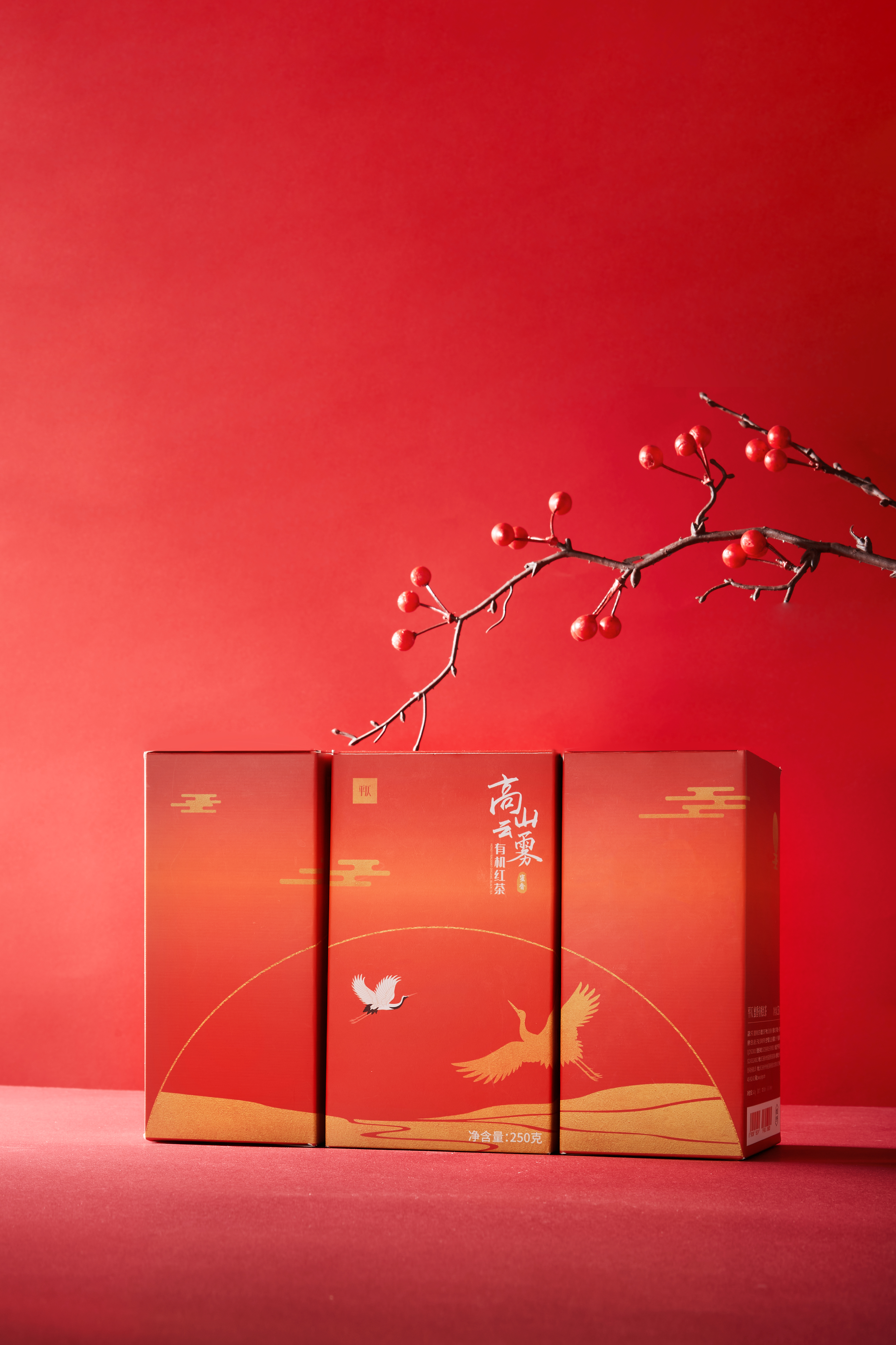
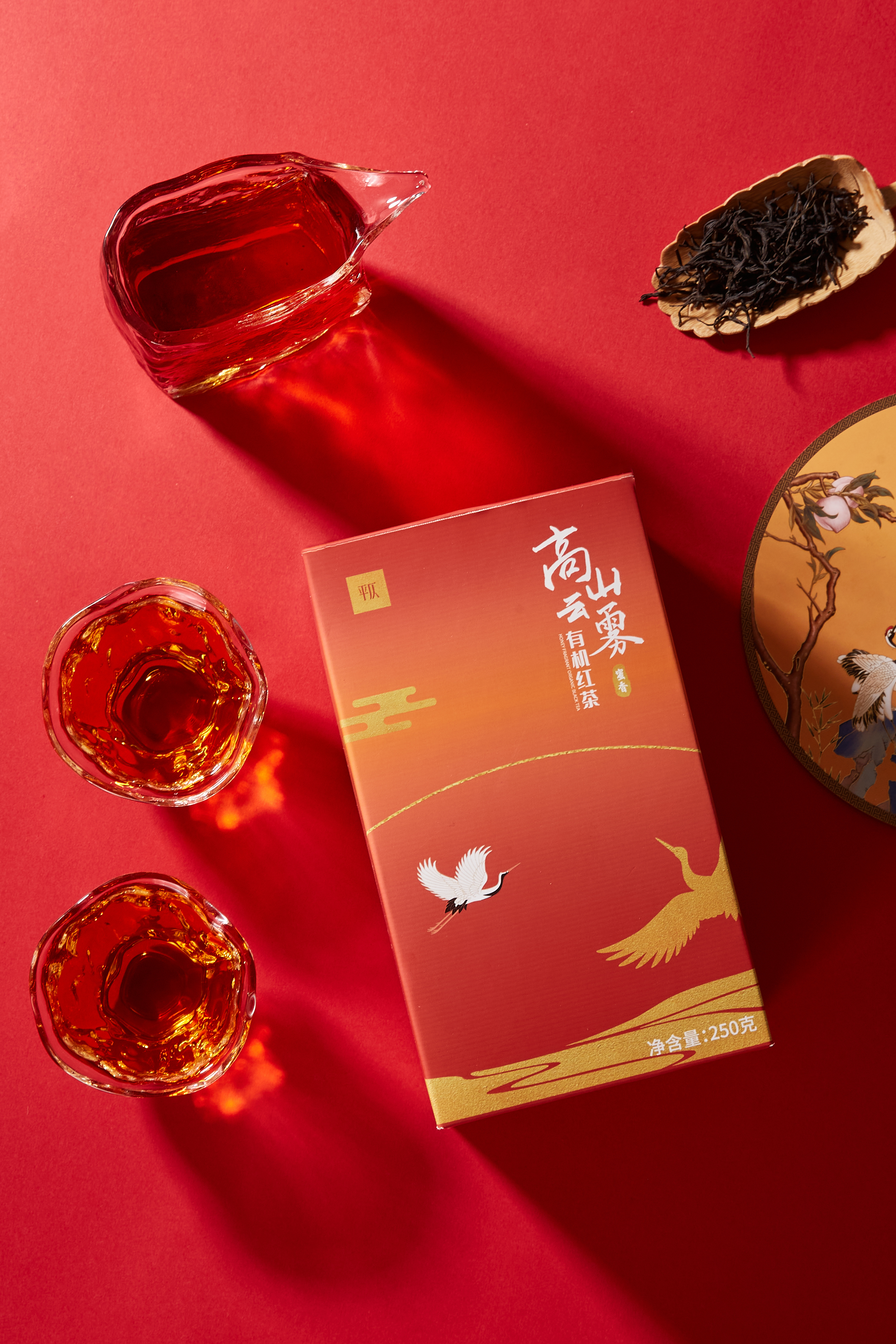
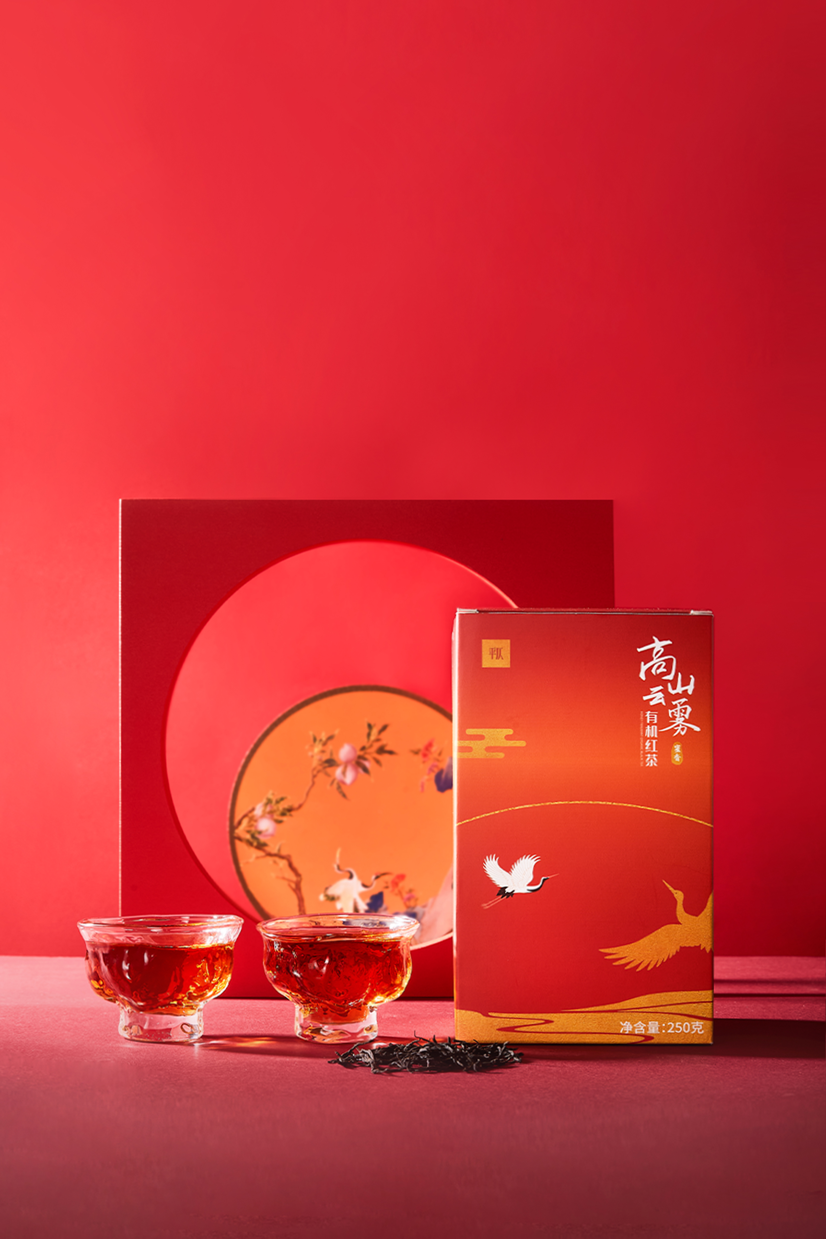
This organic black tea in the visual design, with gradient red as the main element, with the crane flying line drawing illustration. Red conveys the basic attributes of black tea, and gradually expresses the sense of hierarchy. The crane symbolizes longevity and peace in Chinese culture, echoing the health and purity of organic black tea.
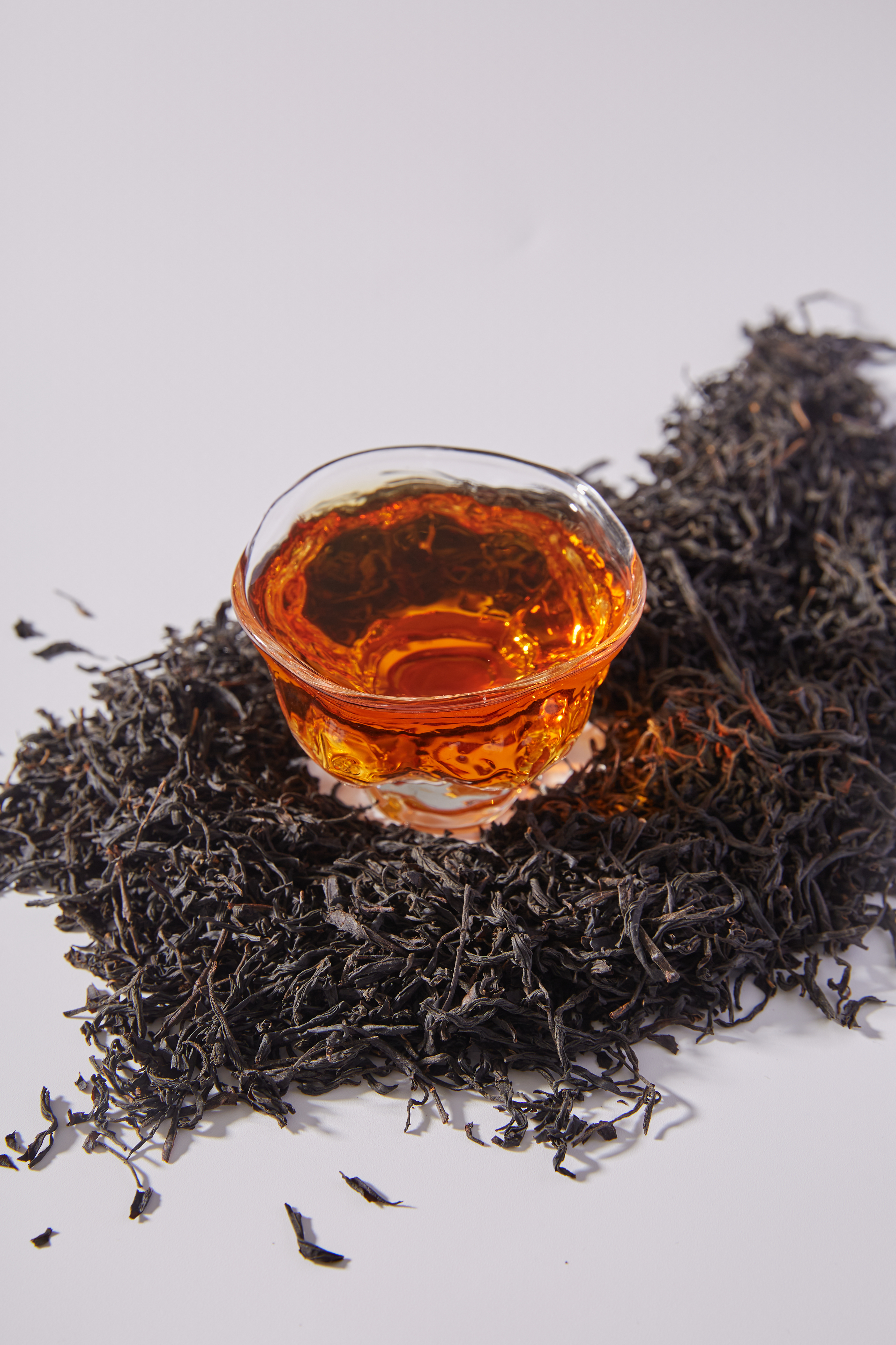
In the production process, the brand adheres to the concept of organic planting, does not use any synthetic substances such as chemical fertilizers and pesticides, and gives full play to the natural quality of the original ecology of black tea. This organic cultivation method is more in line with the authentic smell of black tea from the inside out.
The crane pattern drawn by simple lines is both modern and traditional. The lines are smooth and rhythmic, resonating with the mellow taste of black tea. The use of gradient color as a background, more highlight the dynamic beauty of the crane.
The whole package through the careful collocation of color and pattern, visually show the natural color of black tea; and through the concept of organic farming, emphasize its quality connotation from nature. The line drawing technique makes the pattern simple and atmospheric, and adds cultural and aesthetic value to the brand.


本作品版权归 胡静敏 所有,禁止匿名转载及个人使用,任何商业用途均需联系原作者。

新用户?创建账号
登录 重置密码
请输入电子邮件以重置密码。


Excellent
I like it very much
There is a feeling of cooking tea around the stove
666
nice