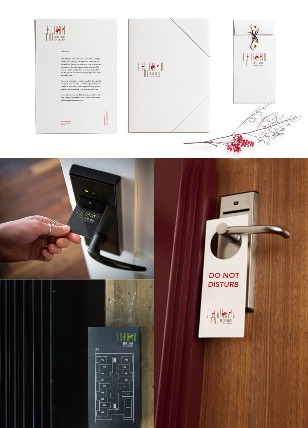
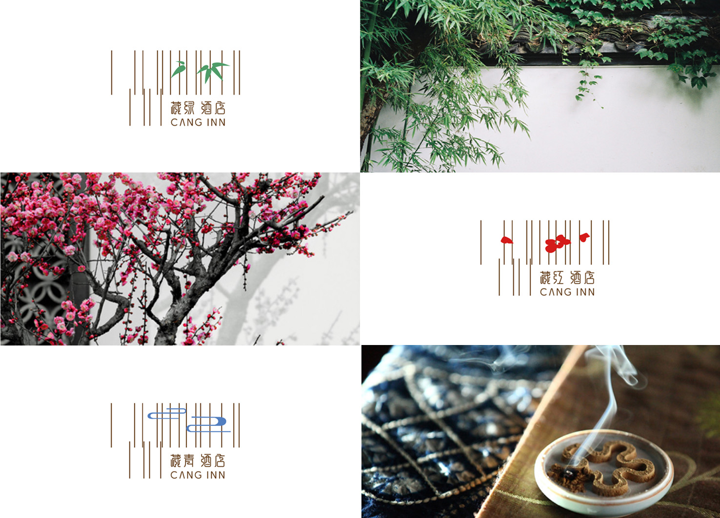
The inn is divided into three grades: "luxury, luxury, and comfort", named after "Tibetan Green", "Tibetan Green" and "Tibetan Red. "Tibetan" here means "collection" and "hidden", and the name is taken from ancient Chinese poetry. The "Tibetan" series has romantic oriental classicism feelings, and its design is positioned as the meaning of "quiet in the middle of the noise" and "a place to live in seclusion in the city. The logo design is an abstract architectural structure represented by a vertical line. The concise graphics emerging from such an abstract thin line are like extending from the window. In the logo of "Tibetan Green", the image design of "Water Pattern" is used. In the "Tibetan Green" logo, the image of "bamboo" is used for design. In the logo of "Tibetan Red", the image of "Plum Blossom" is used for design. The logo is full of oriental beauty, visual feeling is fashionable, and full of oriental Zen.

Country
China
Year
2017
Designer
Ming Mao, Dabin Yao
本作品版权归 K-DESIGN AWARD 所有,禁止匿名转载及个人使用,任何商业用途均需联系原作者。

新用户?创建账号
登录 重置密码
请输入电子邮件以重置密码。


留言板 (0)
评论为空