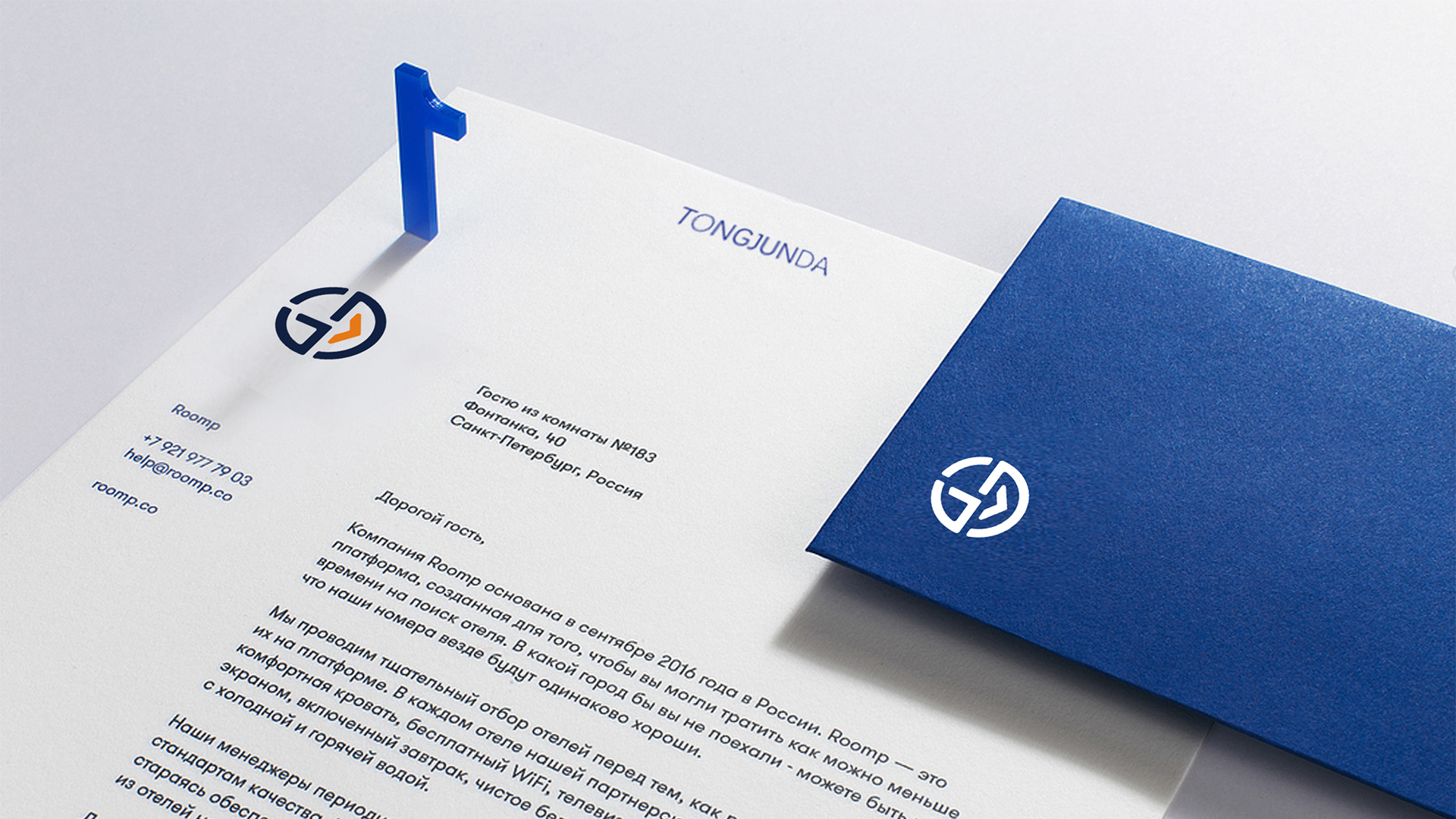
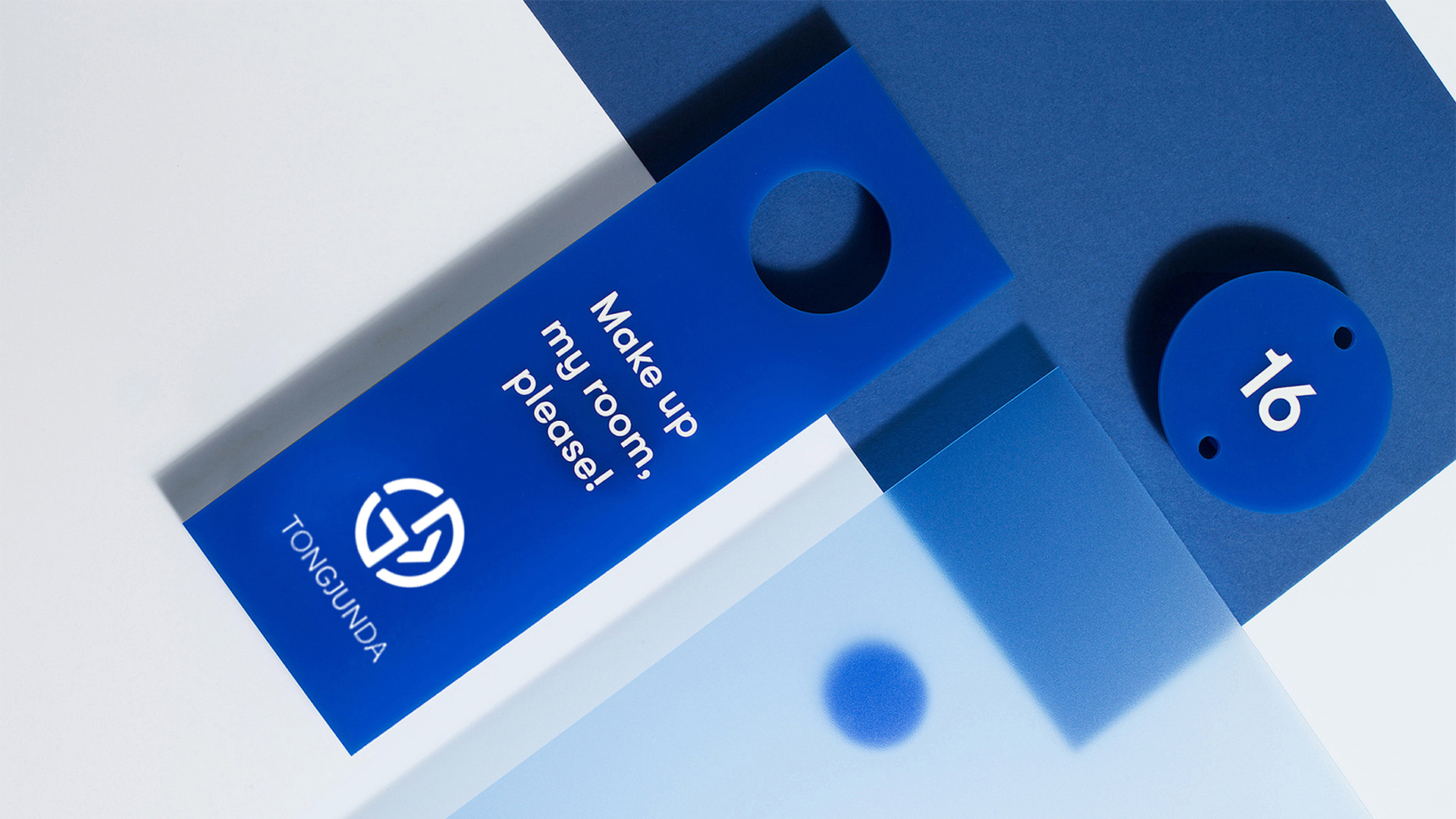
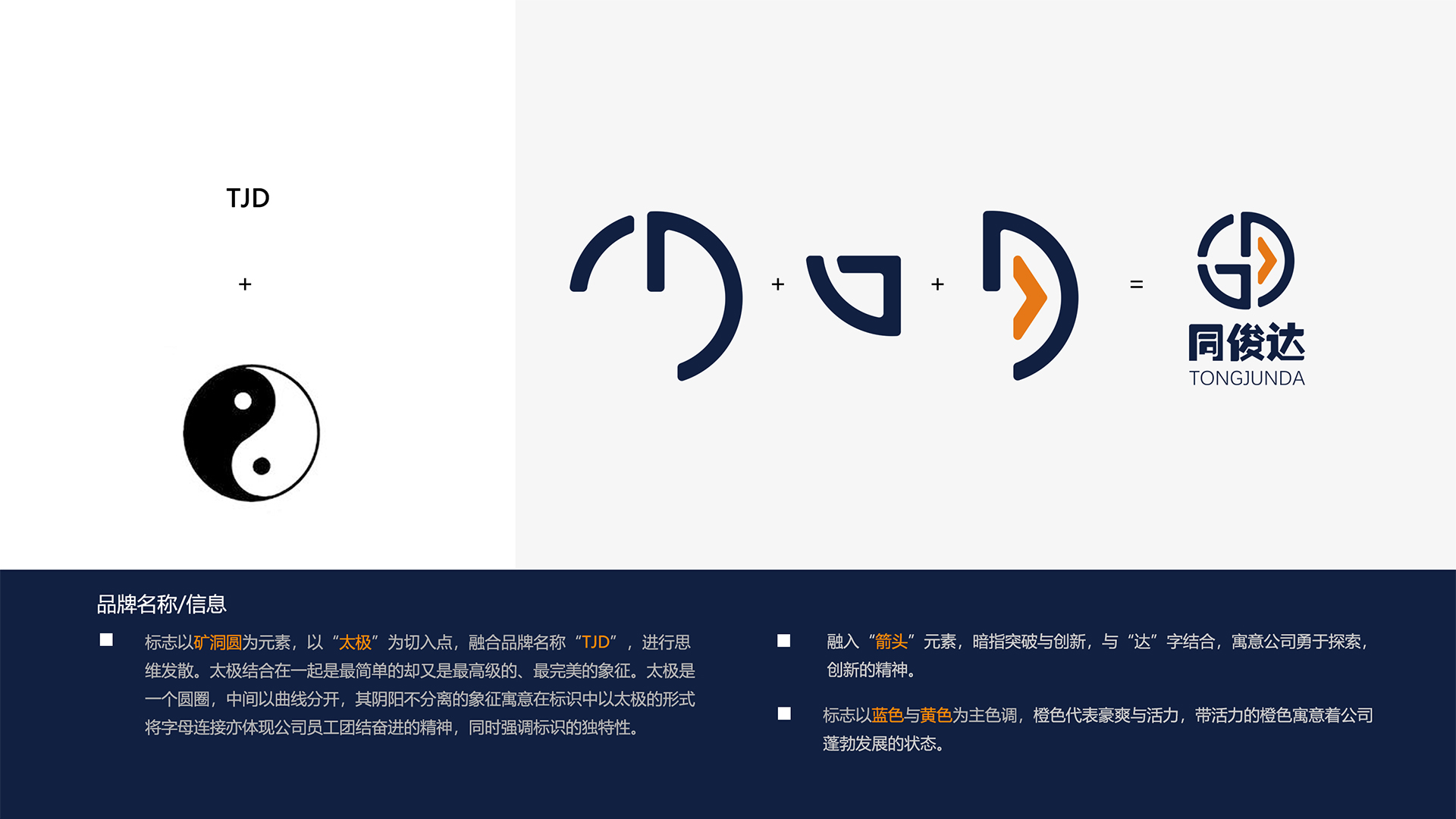
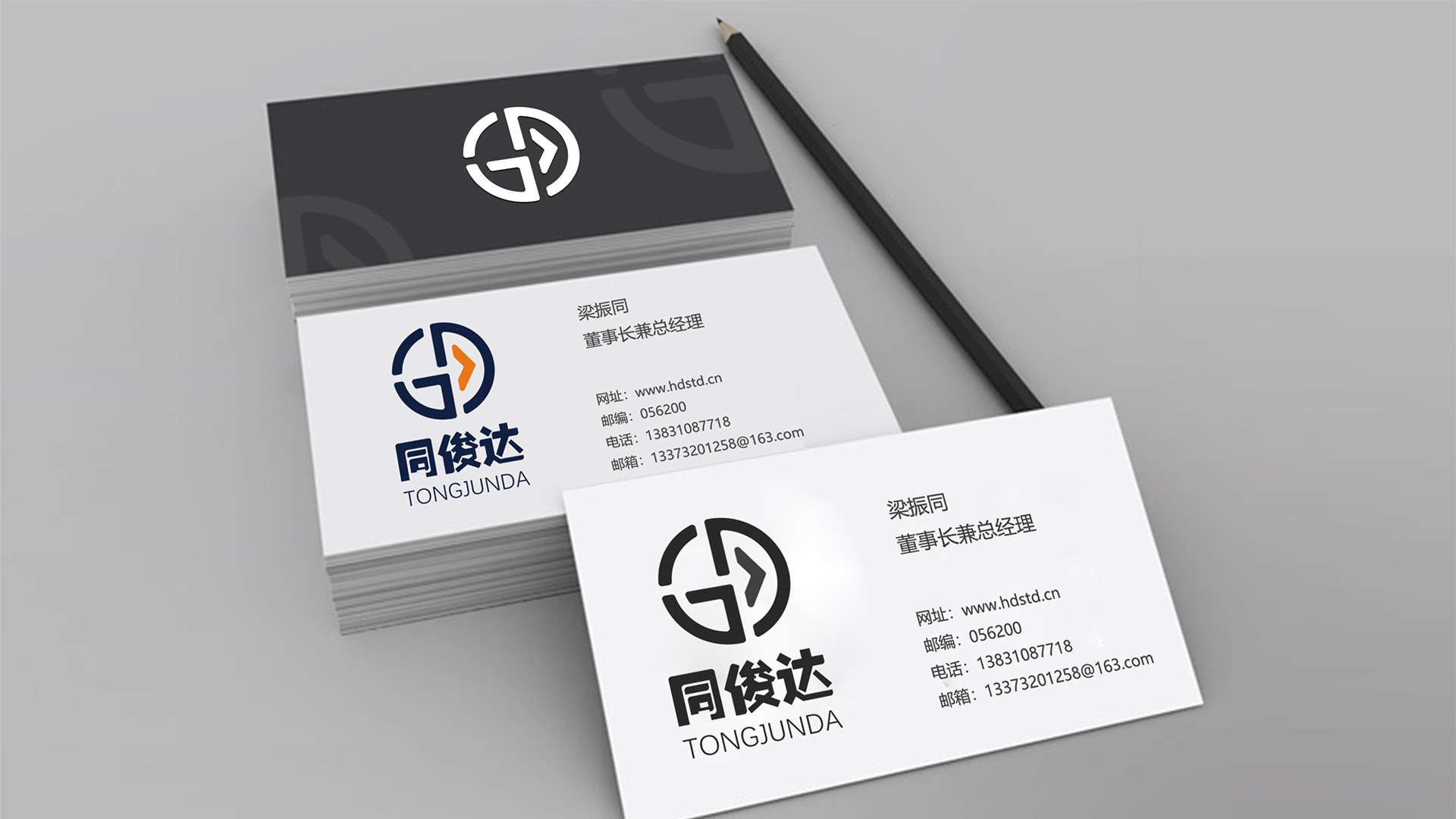
The logo takes "mine circle" as the element, takes "tai chi" as the starting point, and integrates the brand name "TJD" to diverge thinking. Combined with Tai Chi, it is the simplest but most advanced and perfect symbol. In the logo, Tai Chi has the symbolic meaning of "yin and yang are not separated". The connection of letters also reflects the spirit of unity and forge ahead of the company's employees, while emphasizing the uniqueness of the logo.
The logo incorporates the element of "arrow", implying breakthrough and innovation, combined with the word "da", implying the company's innovative spirit of exploration. The logo is mainly blue and yellow, orange represents boldness and vitality, and the vibrant orange implies the booming state of the company.

本作品版权归 韵博设计 所有,禁止匿名转载及个人使用,任何商业用途均需联系原作者。

新用户?创建账号
登录 重置密码
请输入电子邮件以重置密码。


Recognized
It's quite good
Not bad
This, the first picture, in what language?