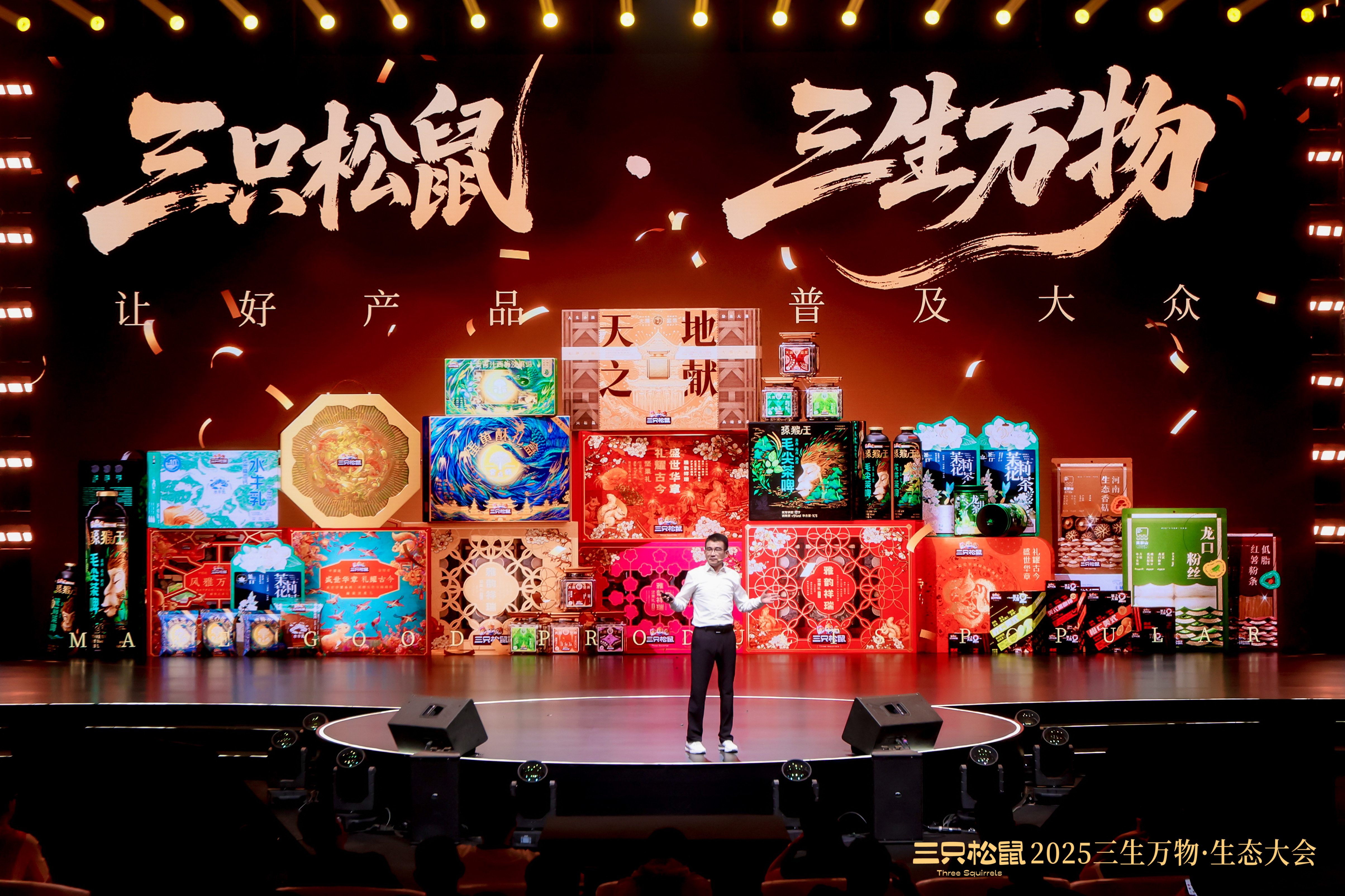
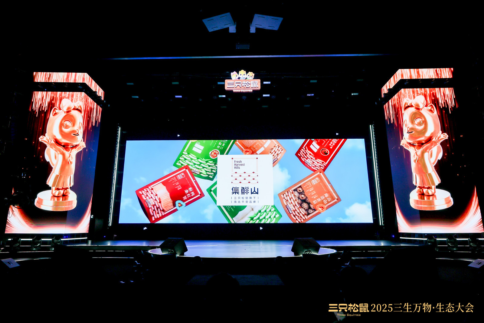
At this year's Sansheng All Things Ecological Conference, the three squirrels presented their brand matrix of all categories and multiple items for the first time. From nuts to baking, from tea to dry goods, this is a brand system building across multiple categories. As a design co-creator, Yuyi not only participated in the visual shaping, but also witnessed the co-construction of the brand's future.
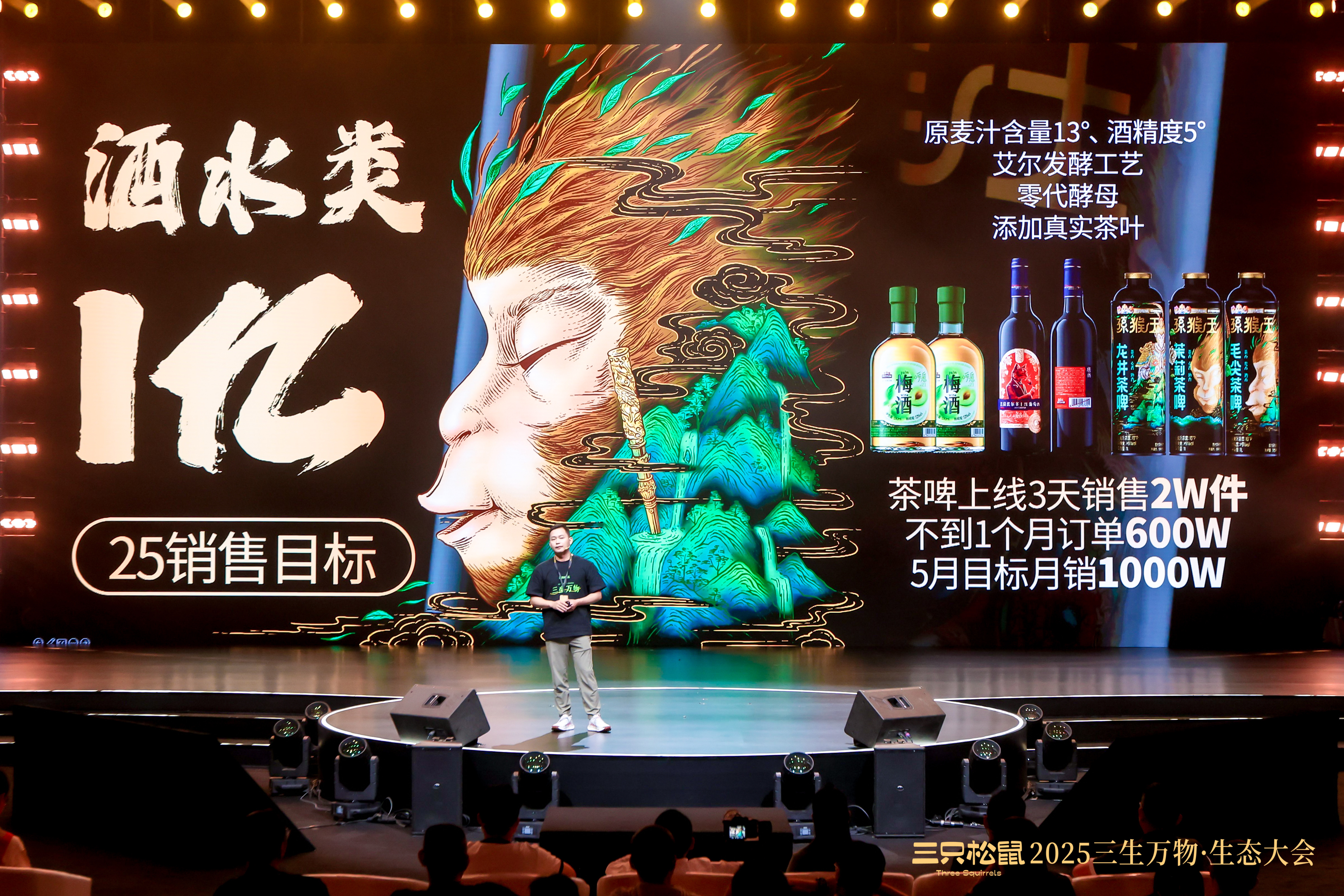
Three Squirrels Chairman Teacher Zhang gave a keynote speech. All the products in the picture were created by Yuyi Design Office.
001
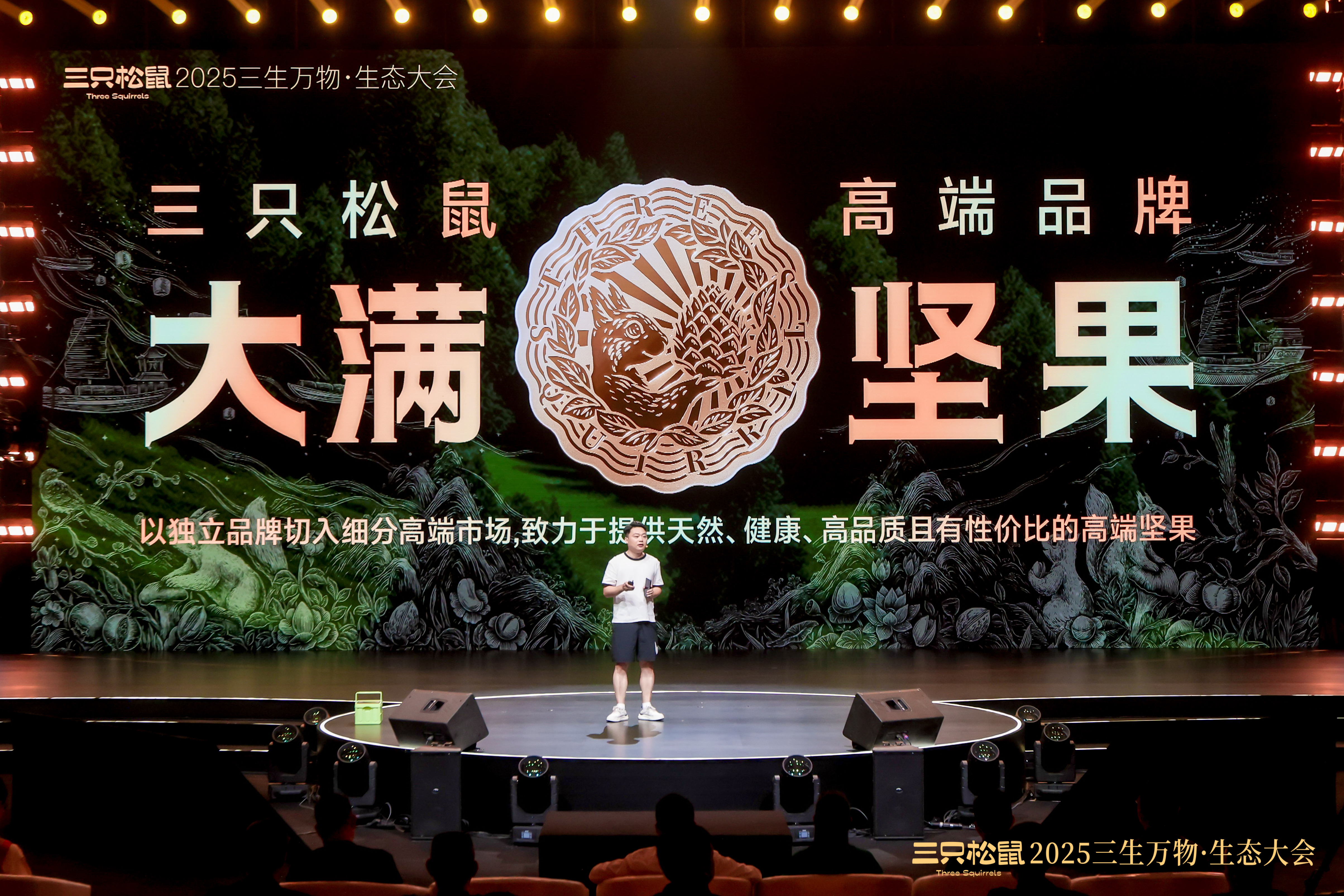
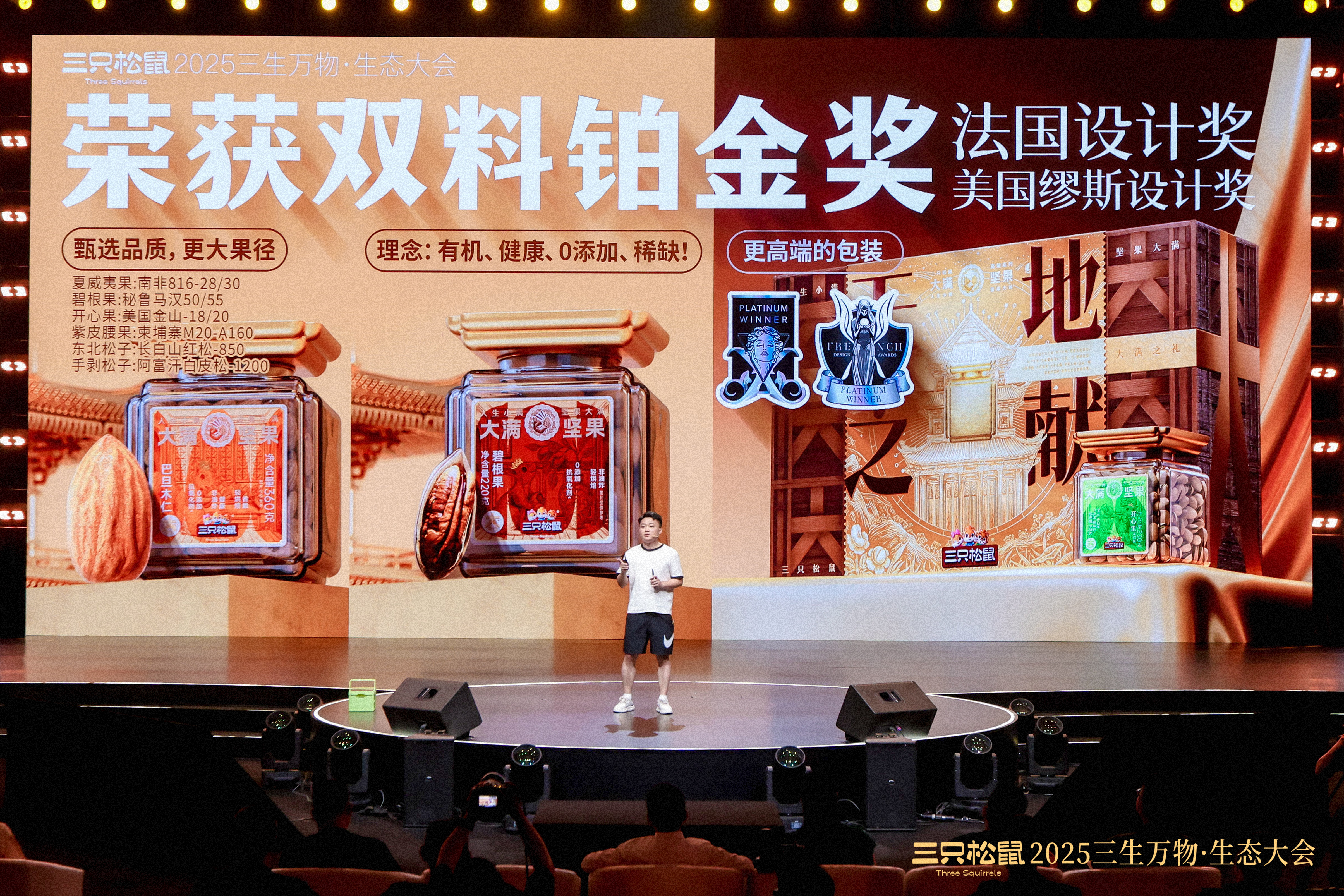
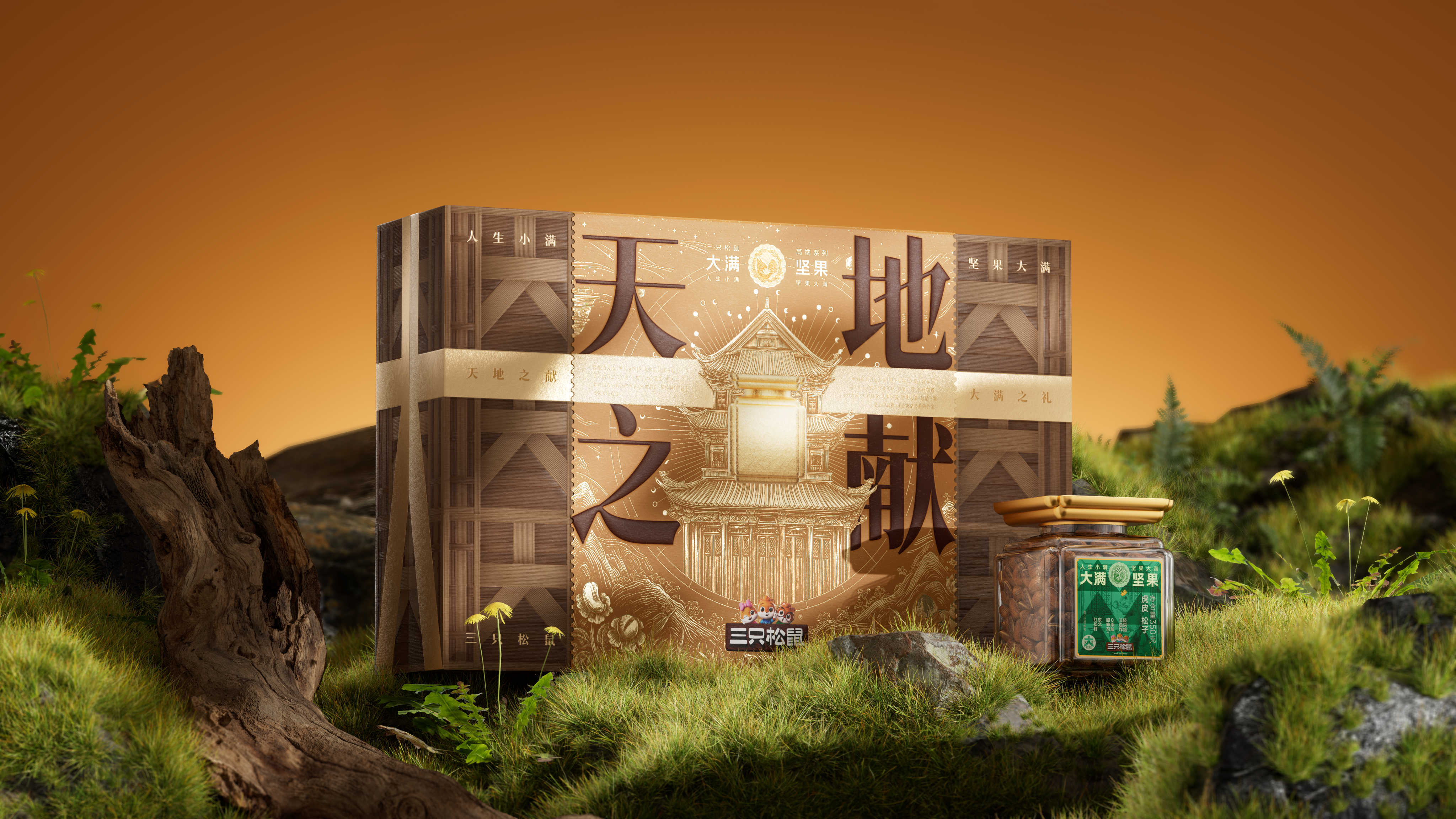
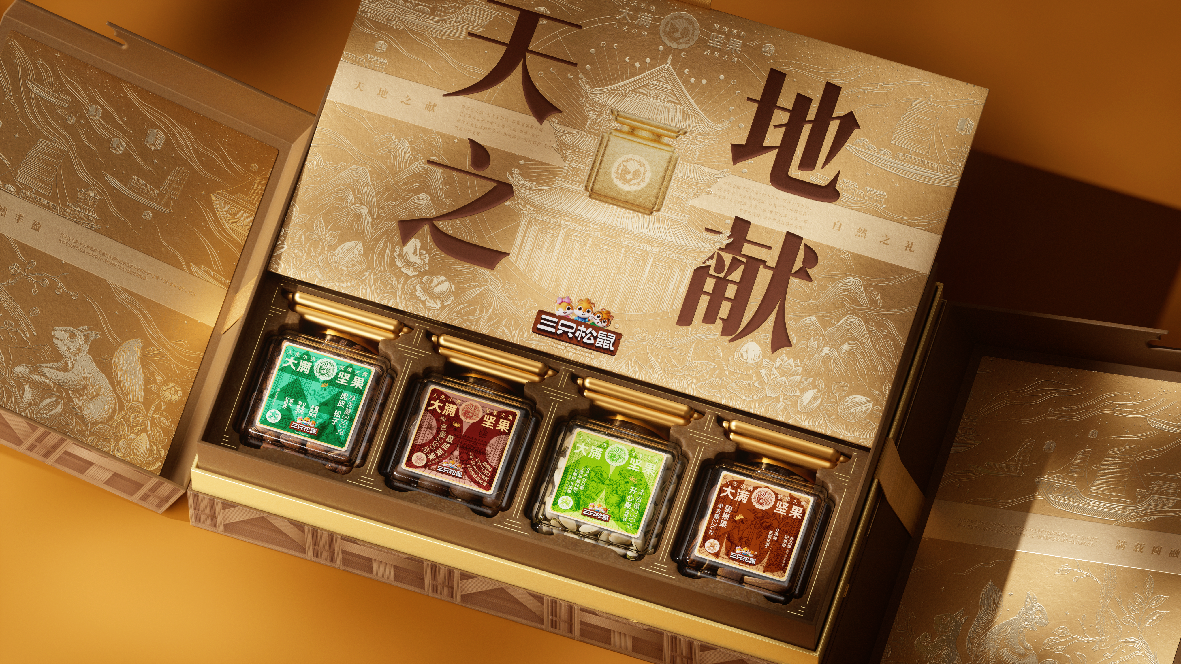
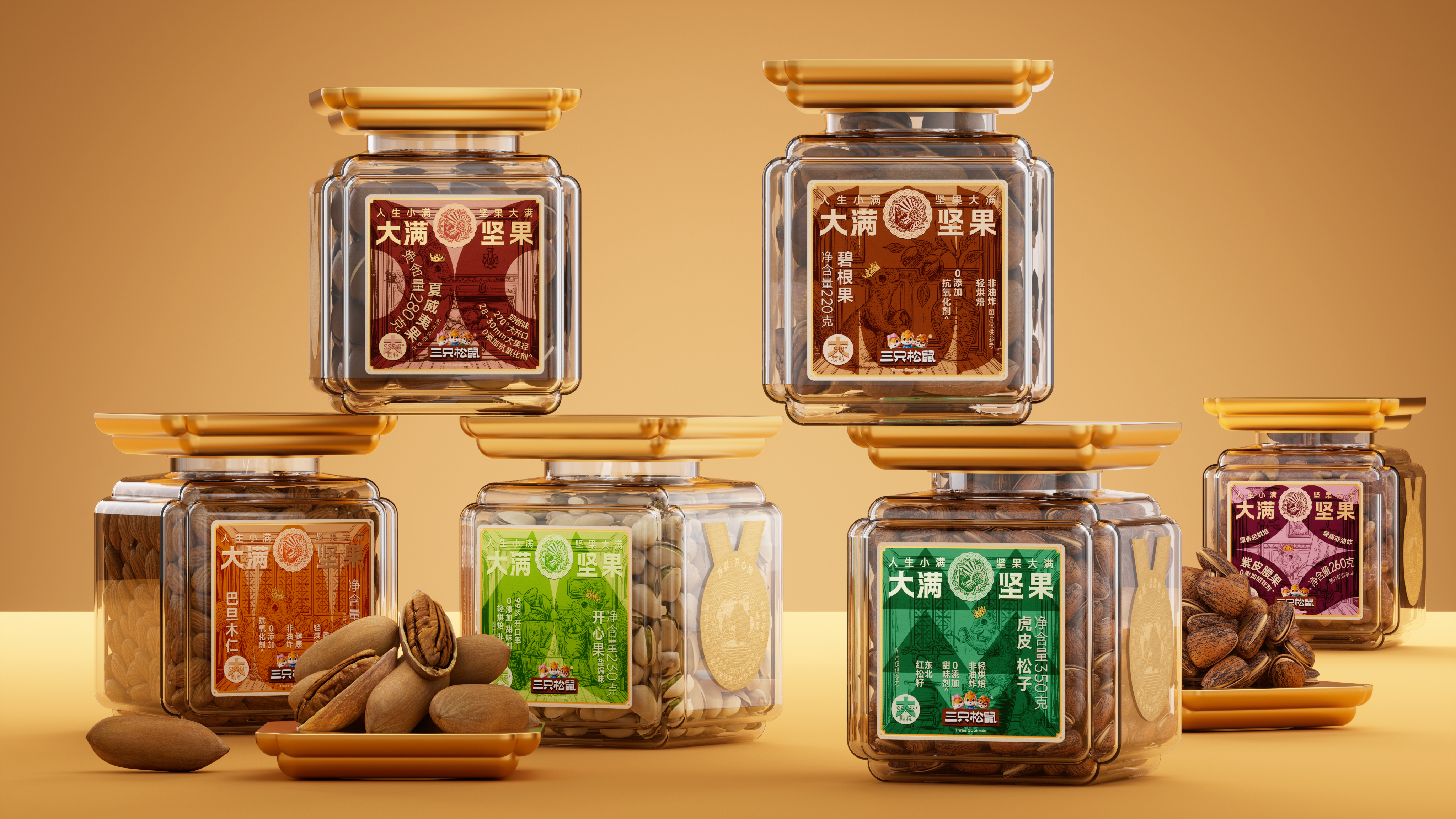
Daman nut high-end nut brand
Brand case design, packaging design, container development, box design, structure design, dynamic design, logo design, e-commerce details page design
To the joy of harvest in a natural way
The design of the tank combines the agility of nature with the dignity of Chinese architecture, and draws on the concept of "hiding wind and gathering gas. The design of the border octagonal is inspired by the mouth shape of the squirrel. The circular elements in the illustration and the full-load sailing boat symbolize the perfect integration of nuts and nature, spanning the landscape. The project won the platinum award of 2024 MUSE and French design award, and was the focus of the ecological conference.
002
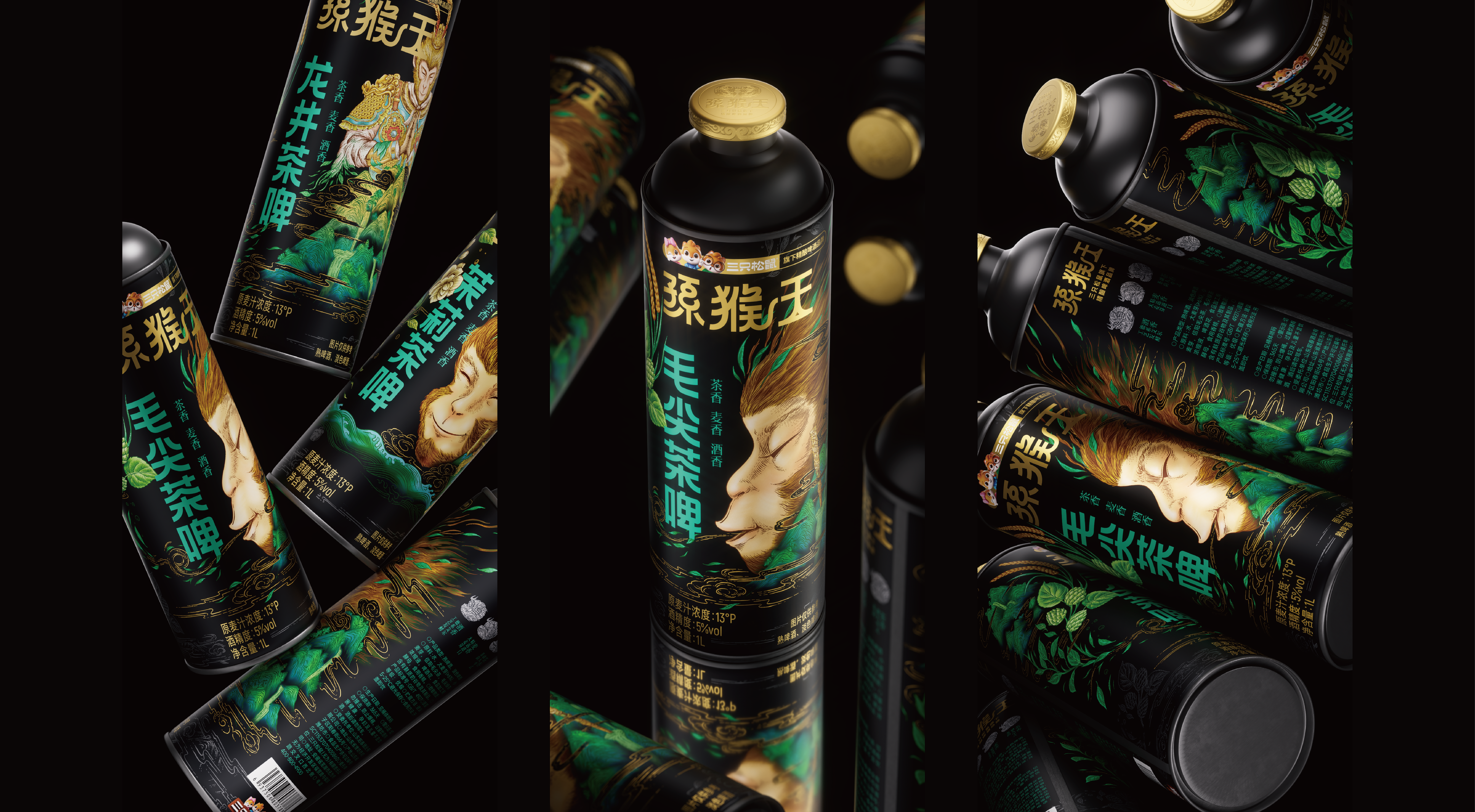
Sun Monkey King Fine Brewing Beer Category Brand
Brand design logo design packaging design font design logo design illustration design dynamic design
Tea and Wine Dynamic and Static
All things seek balance in the opposite. Wine is strong and tea is light. When we were young, we pursued the stimulation of strong liquor and drank it freely. After growing up, we know the return of tea and learn to savor it carefully. Monkey King Sun, it is in these two seemingly contradictory states that he is looking for the possibility of integration-let rebellion and Zen coexist, and let rigidity and restraint go hand in hand.
003
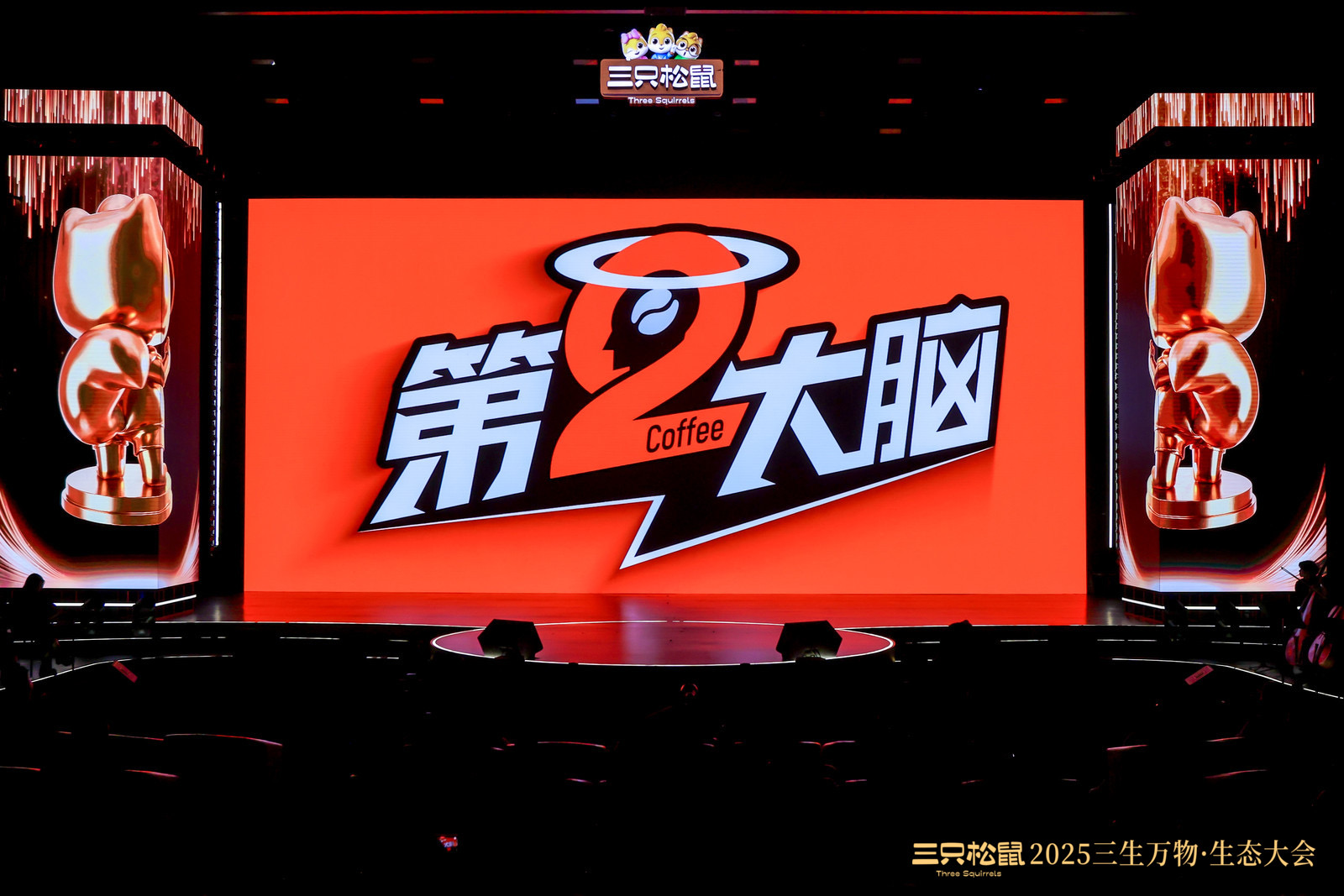
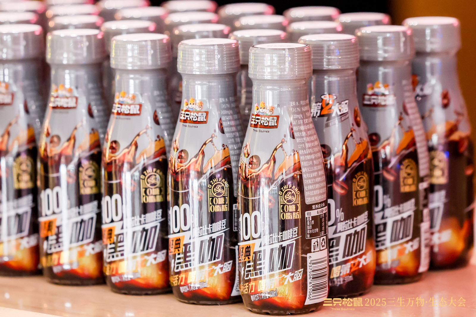
Second Brain Coffee Brand
brand design packaging design logo design font design
Instant awakening
The creative concept of "the second brain" is concretized into an energy core, with "instant awakening" as the core theme, and the creation is carried out around the super symbol of "2. The number "2" is not only a key element in the brand name, but also endowed with both visual and spiritual meanings: it represents "the second driving engine of the brain", symbolizing the energy supply and inspiration brought by coffee, in which the visual elements of coffee beans are integrated to strengthen category identification, and the halo at the top symbolizes the flash of inspiration, representing the spiritual awakening and creativity stimulation brought by coffee.
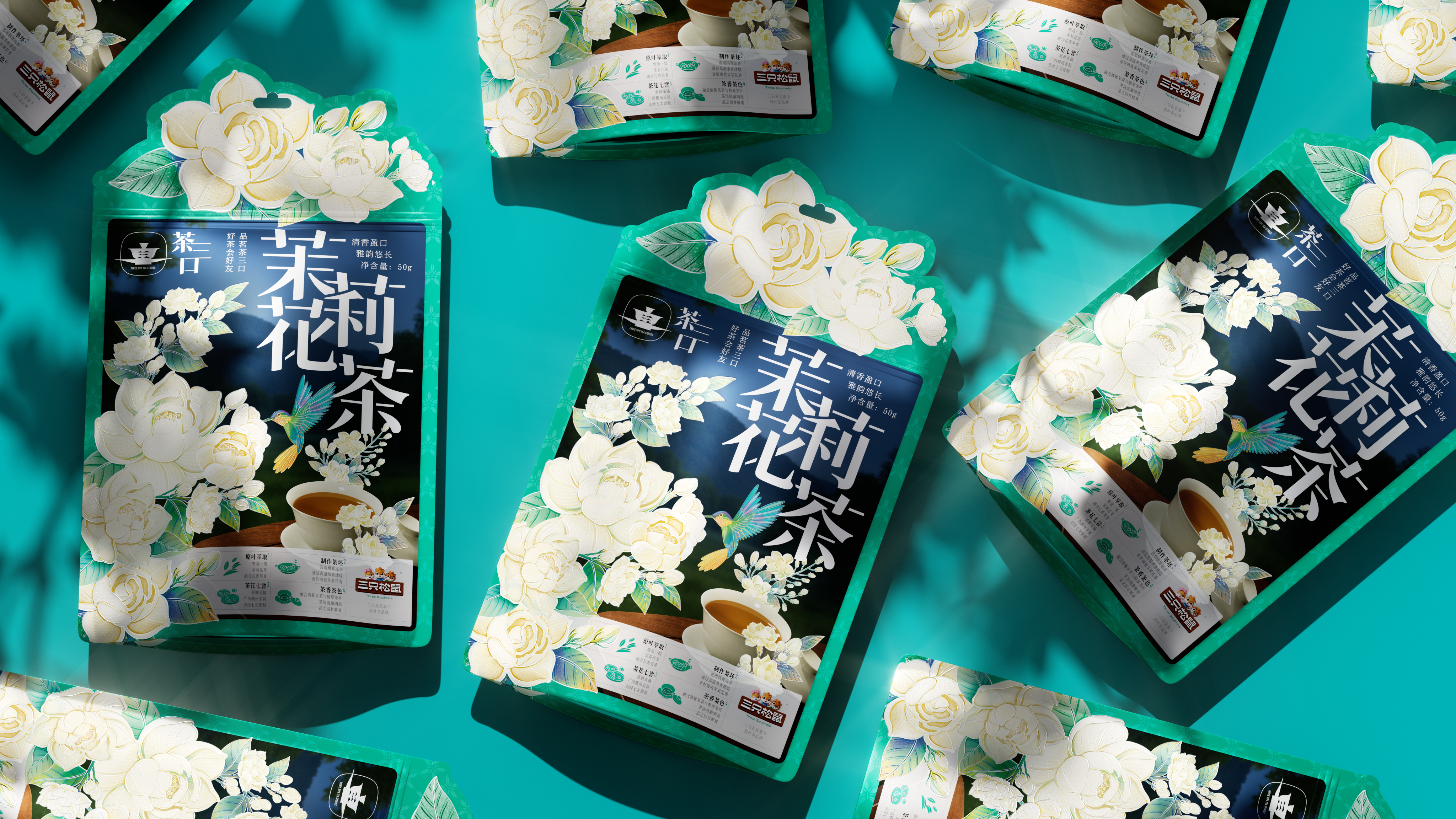
004
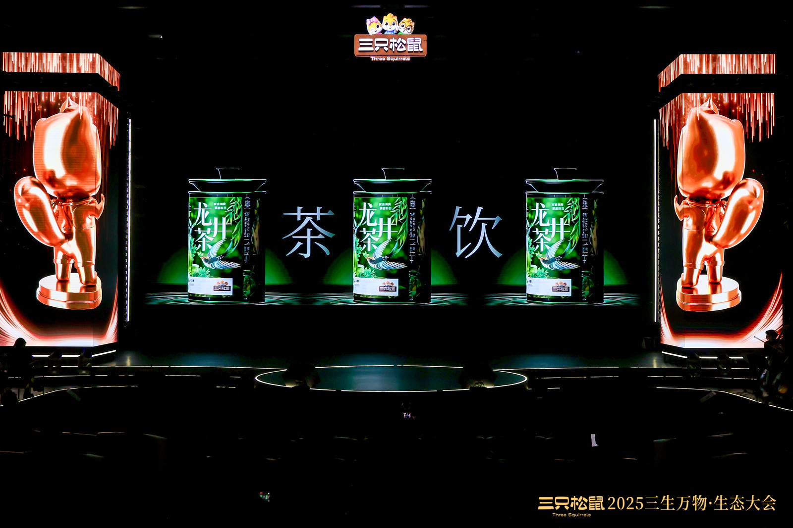
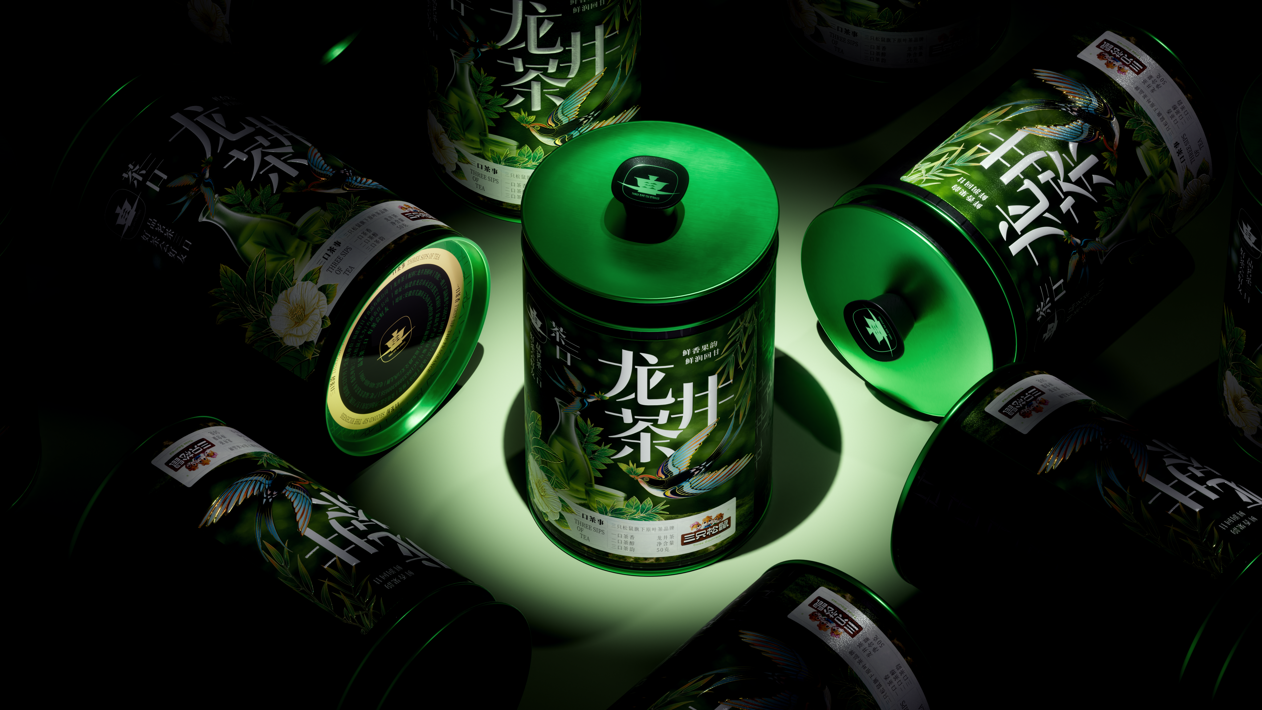
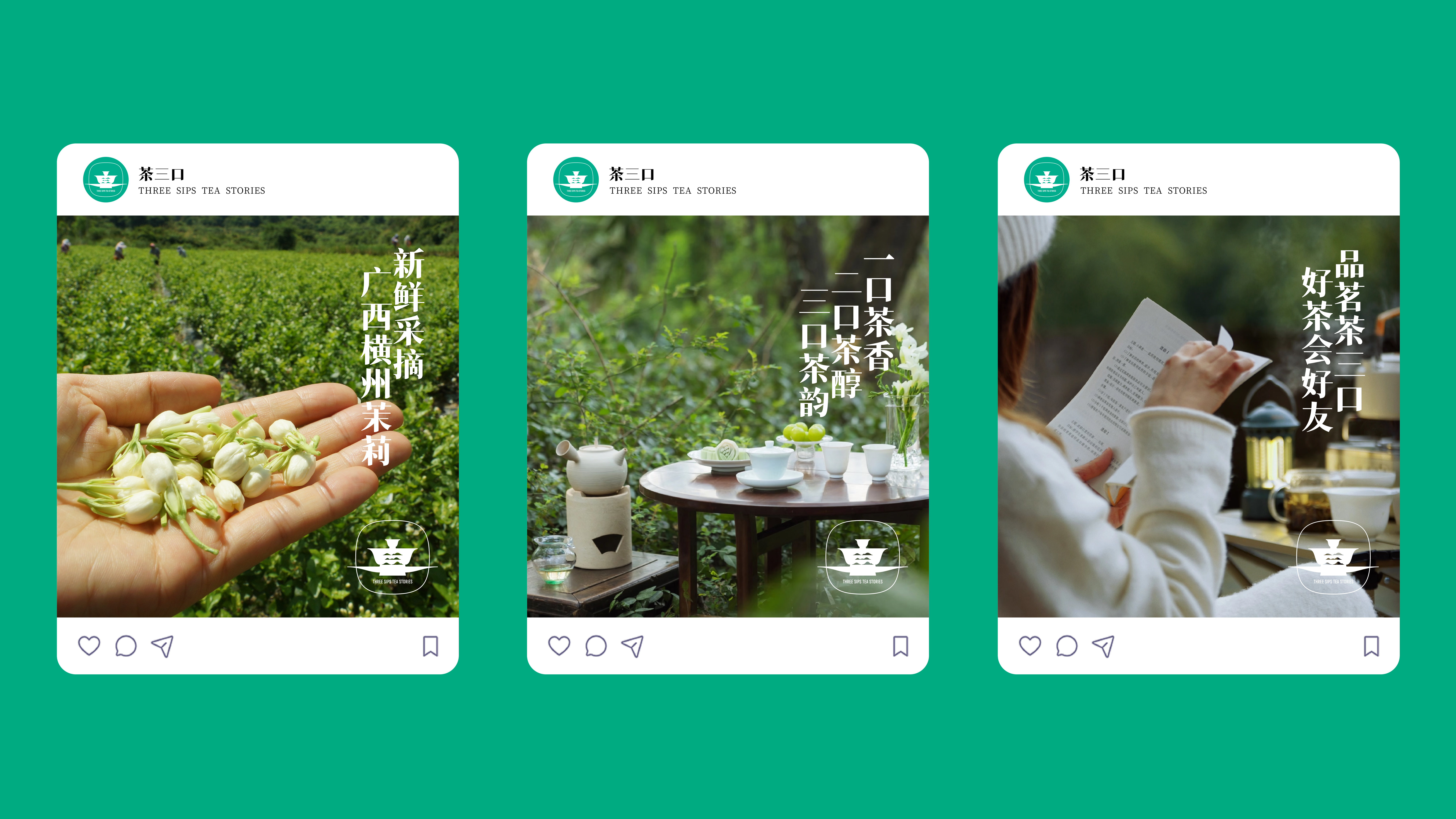
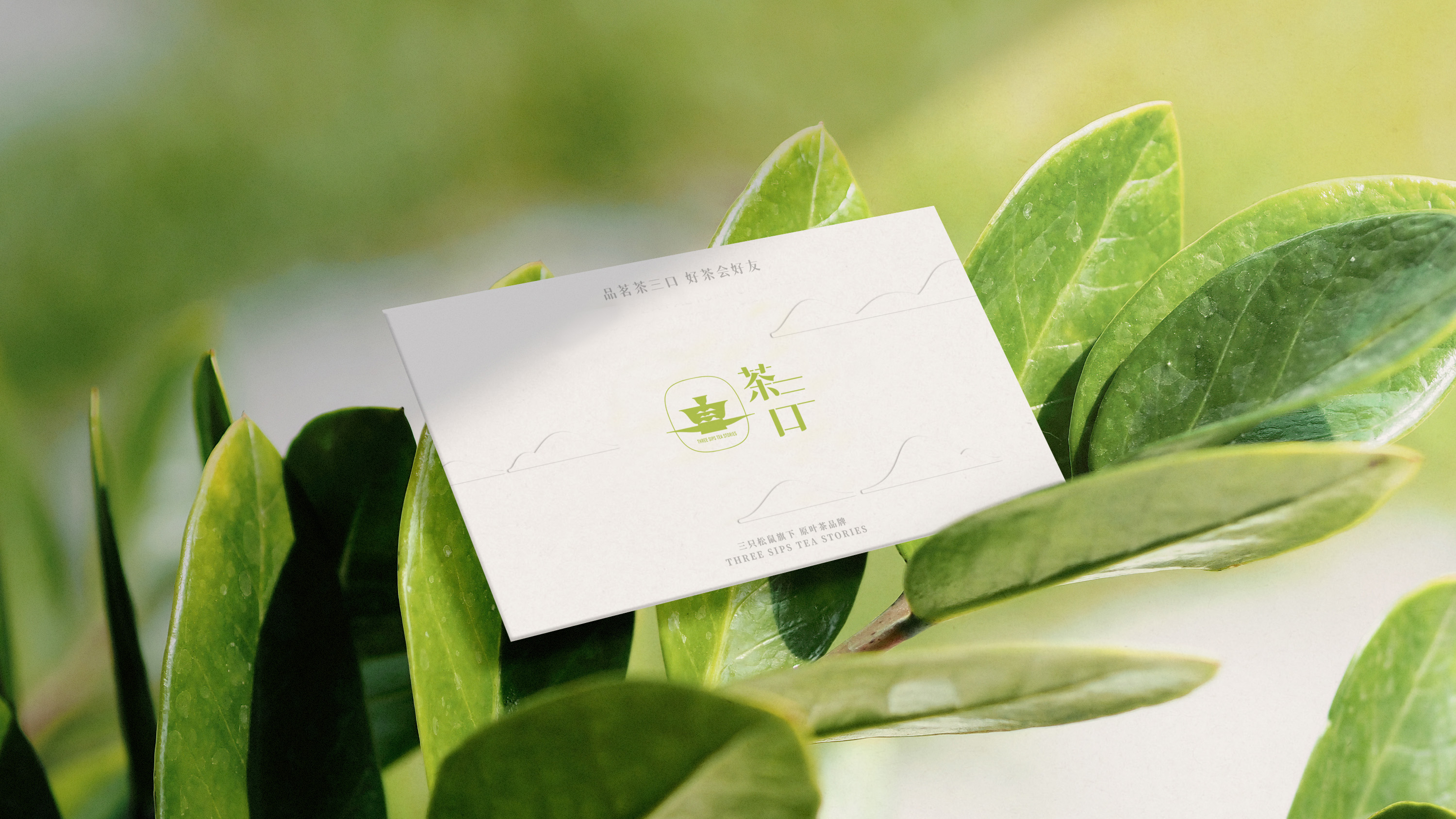
Tea three pure tea category brand
packaging design container development illustration design font design logo design
Easy Life Free Tea
Starting from the theme of "living at ease and drinking tea at ease", we return to the essence of drinking tea itself: it is not the burden of ceremony, but a moment of relaxation, a slow breath of body and mind. Using the combination of illustration and photography to create an oriental tea scene intertwined with reality and imagination. In the picture, the green is verdant, the birdsong is blooming, and the colorful feather birds are matched with the smart flying birds, which symbolize the harmonious coexistence of man and nature, and also symbolize the leisurely and clear mood when drinking tea.
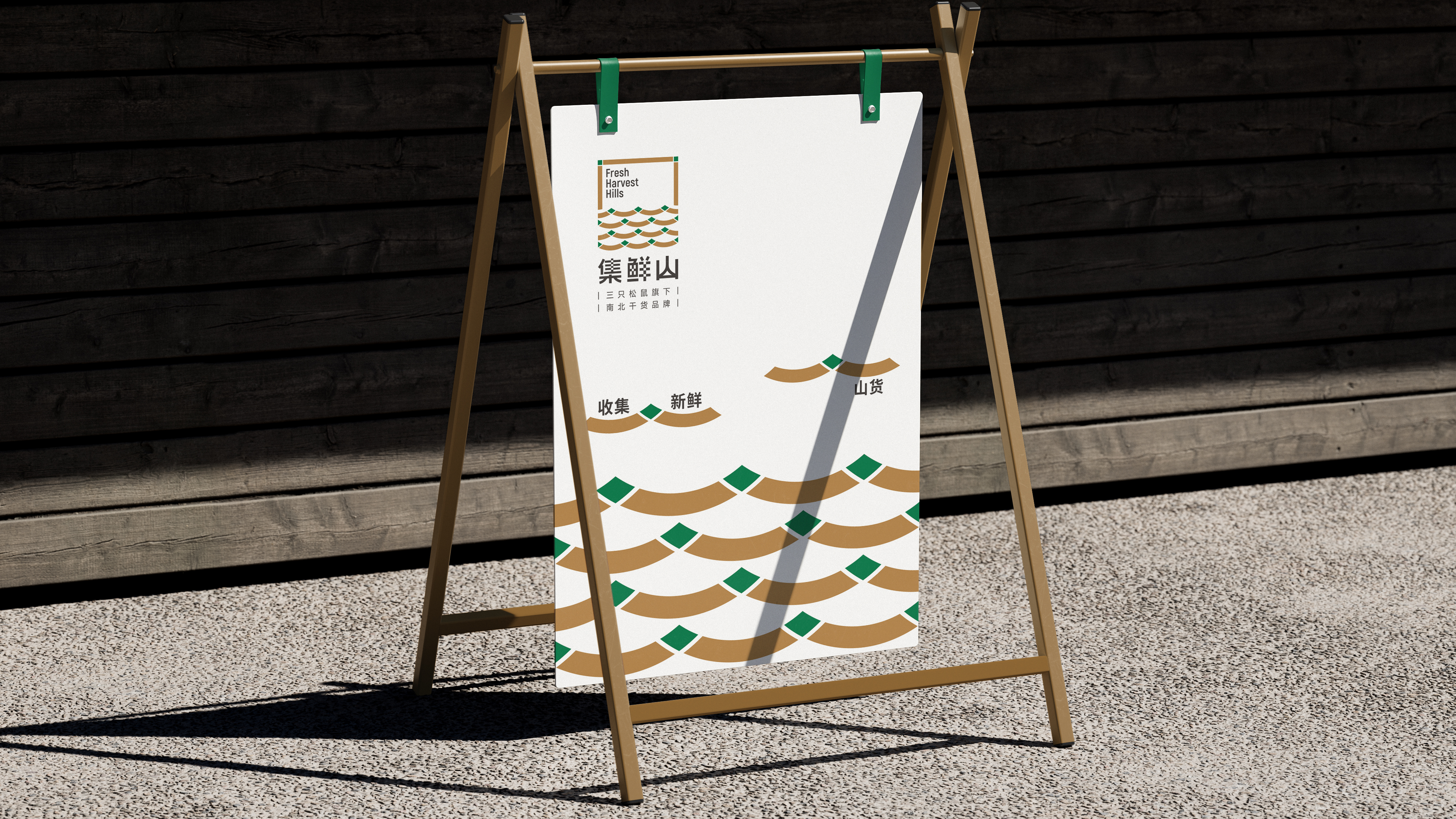
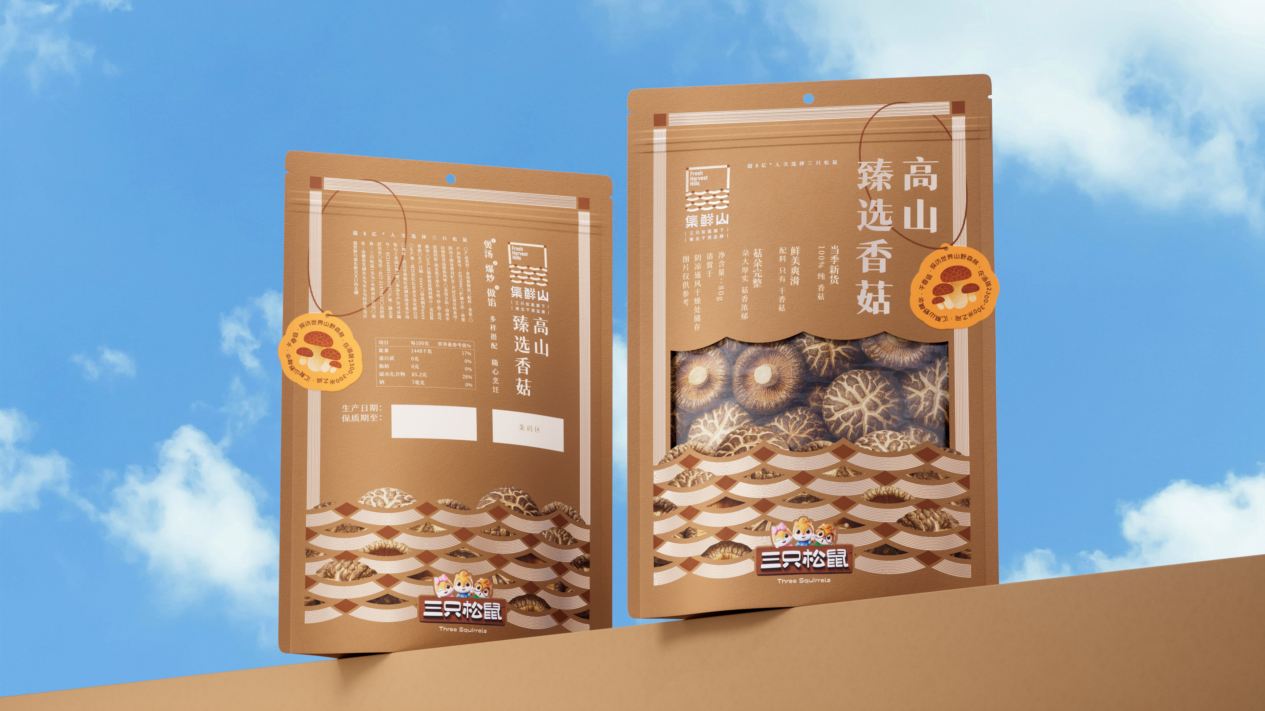
005
Set fresh mountain north and south dry goods brand
brand design logo design packaging design
Gathering fresh goods from the mountains
Starting from "collecting", which is a natural action with time and labor texture, we avoid redundant narration and focus on the structural expression of "nature" and "order. The frame design simulates the basket structure, which seems to be an embellishment of formal language, but in fact it constructs a transitional interface between man and nature: this is the food from the mountains, and it is also the life brought back from the mountains, returning to the simple and healthy quality, and paying attention to the interaction and yearning between man and nature.
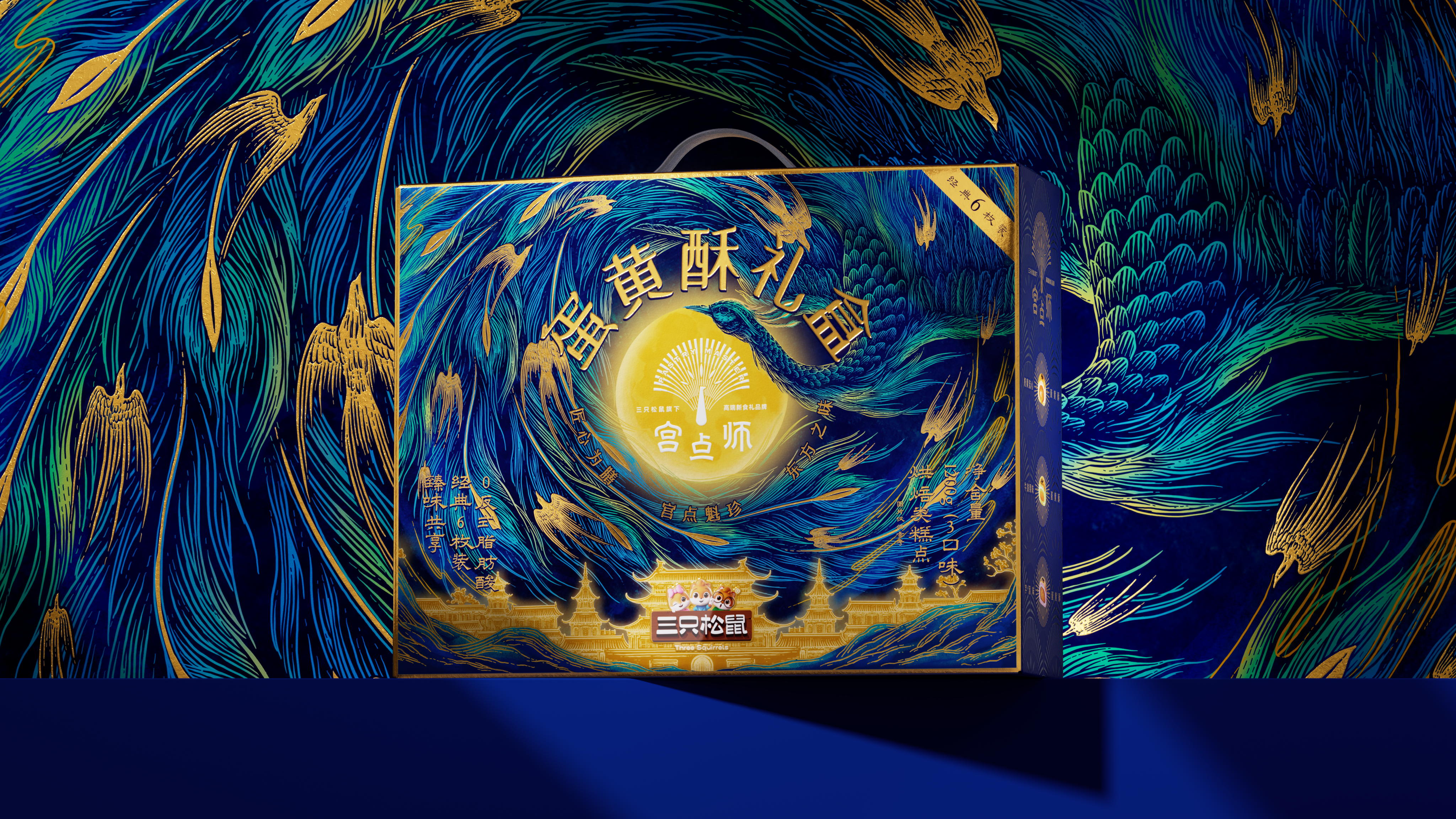
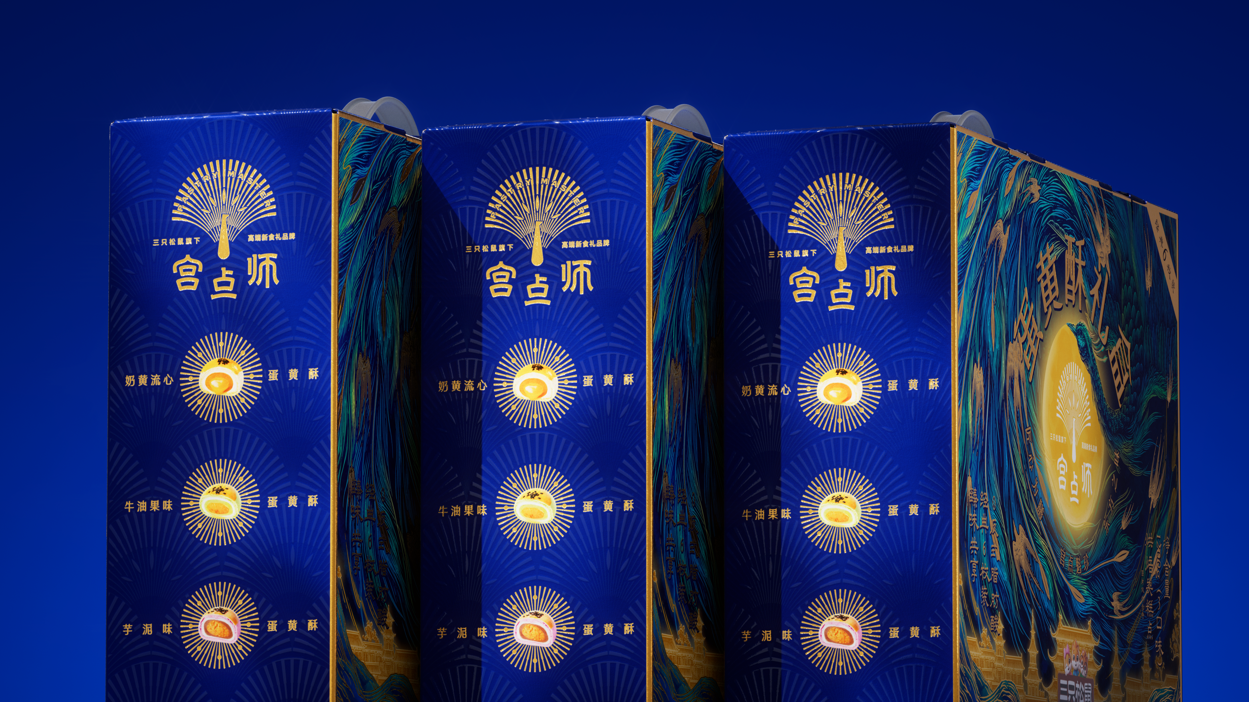
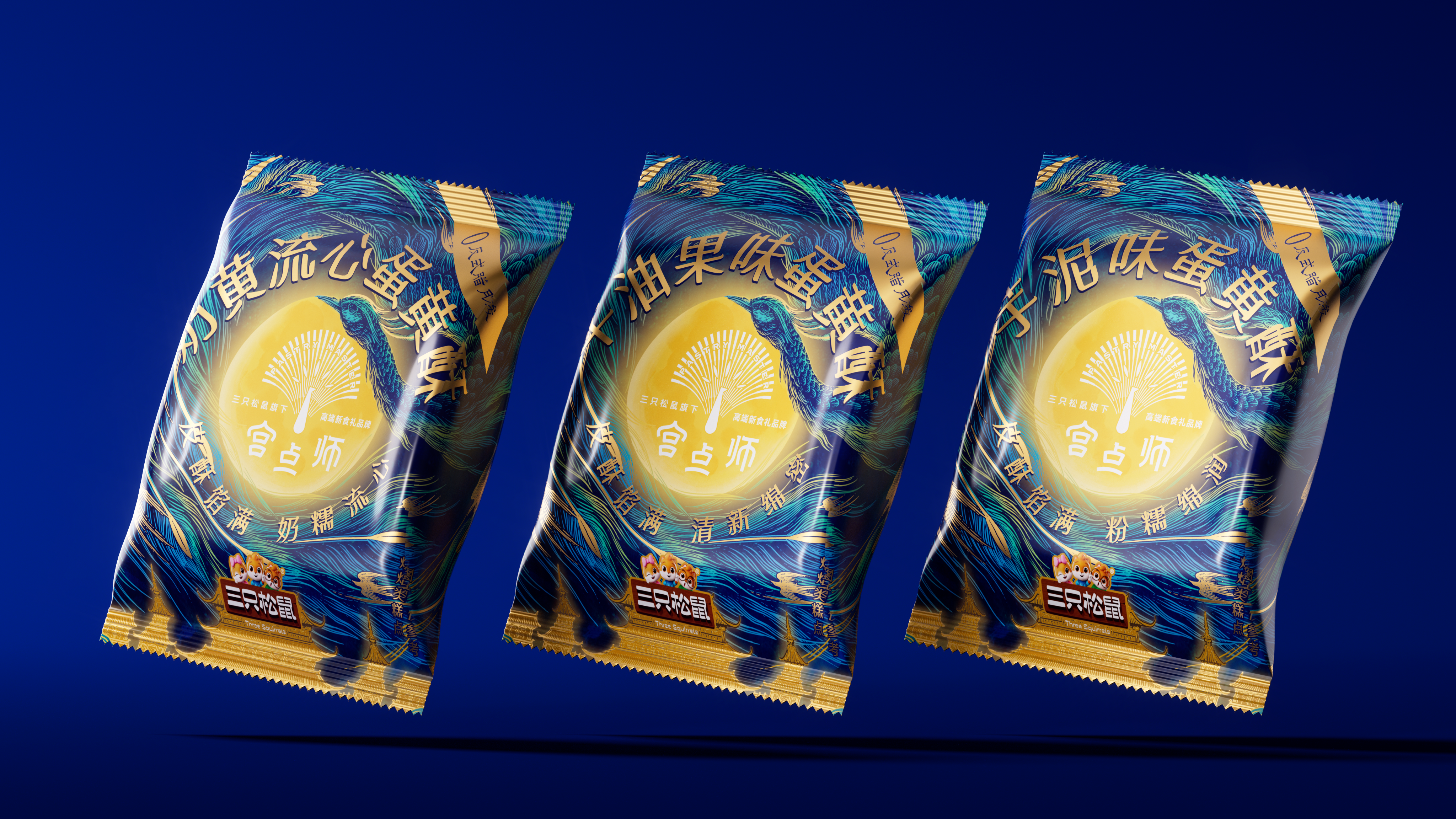
006
Miyagi high-end new food gift card
Brand Design Logo Design Packaging Design Illustration Design
Chinese Baking Confidence Opens Screen
With "self-confidence" as the spiritual anchor, the peacock is not a simple totem decoration, but a metaphor of identity-it is flamboyant but not noisy, elegant but not flinching. The movement of wings stretching is not only a gesture, but also a visual awakening of Chinese temperament: calm, confident and orderly. Visual expression integrates traditional court elements and modern graphic language, with gold line outline, birds soaring and moiré circulation, realizing the dual balance of oriental charm and contemporary aesthetics in the main tone of blue and gold.
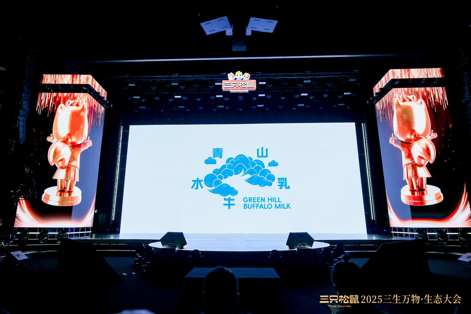
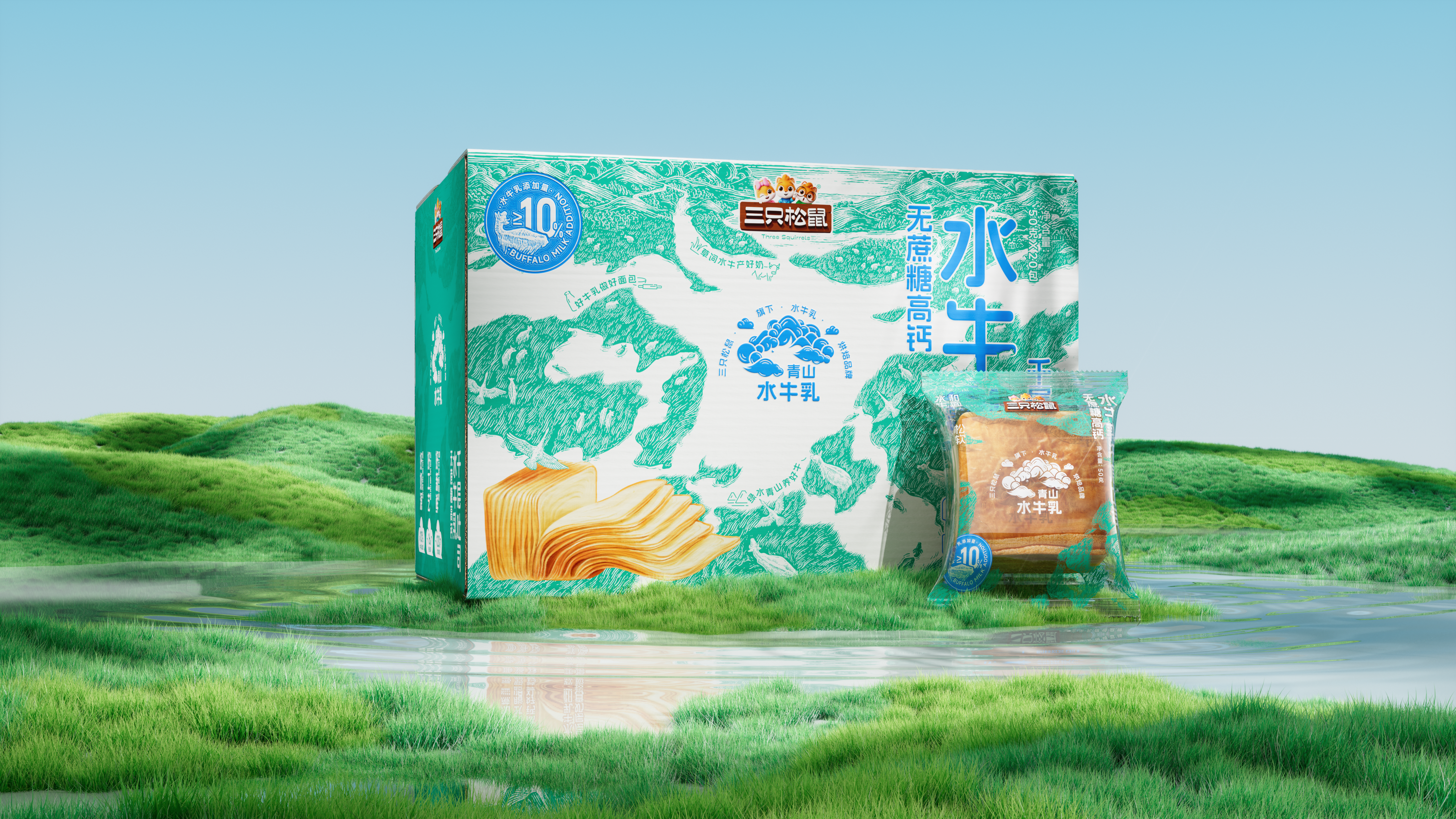
007
Qingshanshui Milk Buffalo Milk Baking Brand
Brand Design Logo Design Packaging Design Font Design
See you on the green hills and buffalo clouds
With the core theme of "green mountains and buffalo clouds", we will jointly build a natural, light and reliable brand image of buffalo milk baking. Signs to simplify the mountain, water, cattle constitute the totem language, figurative with abstract, natural Tibetan order. The packaging starts from the landform and narrates from the perspective of overlooking: the mountains rise and fall, the pasturelands are laid out, the water winds through them, and the cattle lie still or walk slowly on the green fields. In detail, the outline of water is also a buffalo, and the natural image and brand spirit quietly coincide.
In the whole category ecology of the three squirrels, what we undertake is not only visual shaping, but also systematic construction from 0 to 1, from perception to cognition, from concept to scene. We consider growth in design, respond to the market in expression, and look for aesthetic coordinates in strategy. We insist on "no theme, no creation". Every project must have a clear theme in order to establish a strong brand cognitive logic. The theme creation makes every visual expression carry meaning, making the brand story coherent and malleable. Theme-based design will give the brand the power of sustainable development. In the future, Yuyi looks forward to working with more visionary and attitude brands to promote the deep evolution of brand awareness.
Authoring information
Brand Holdings: Three Squirrels Co., Ltd.
Original Design: Yuyi Design Firm Lascaux Design Firm
Brand Fang: Rat Gui Qi
Original Design: Chen Yiwen and Xu Yingda
Visual Performance: Gan Ding Zhe Dong Tian Tao Zong Cheng
Project Promotion: Lv Yuxing and Wang Yu


本作品版权归 遇义设计事务所 所有,禁止匿名转载及个人使用,任何商业用途均需联系原作者。

新用户?创建账号
登录 重置密码
请输入电子邮件以重置密码。


Applause
good shape, excellent
nice packaging