Ulucky had the honor
"The mission of women seems to be born with one more layer than men. It is about growth, family and body." Ulucky is committed to providing solutions for women's palace health, specializing in women's palace health surrounding good things, scientific definition of professional, for women to provide multiple healing, distribution of health beauty.
We continue the design elements of the brand. The logo figure comes from the brand name "ULucky"-an abstract expression from the four-leaf clover representing luck. At the same time, the symbol "∞" representing infinity is deformed and integrated into it. The whole is symmetrically combined with each other, reflecting the light feeling fluttering like a ribbon. In view of ULucky's development strategy of caring and caring for women's health, ULucky's brand image of women's palace products has been better interpreted.

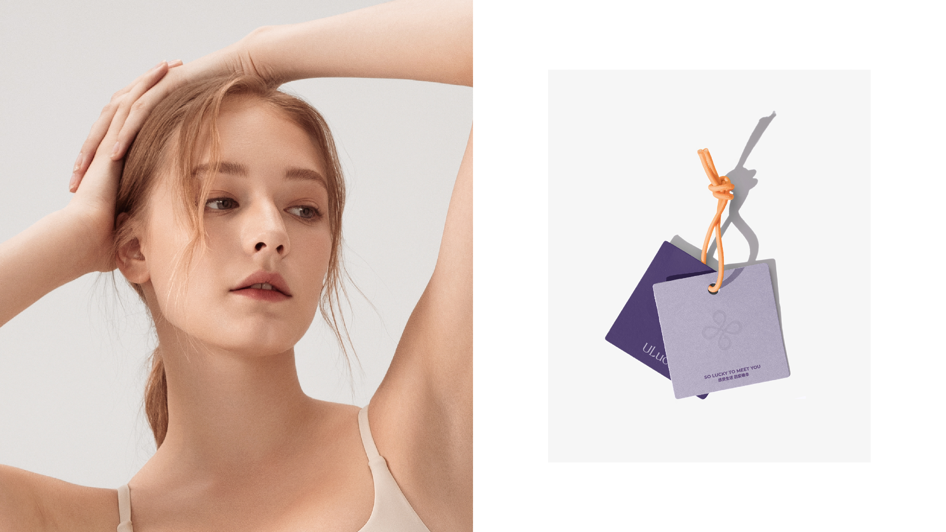
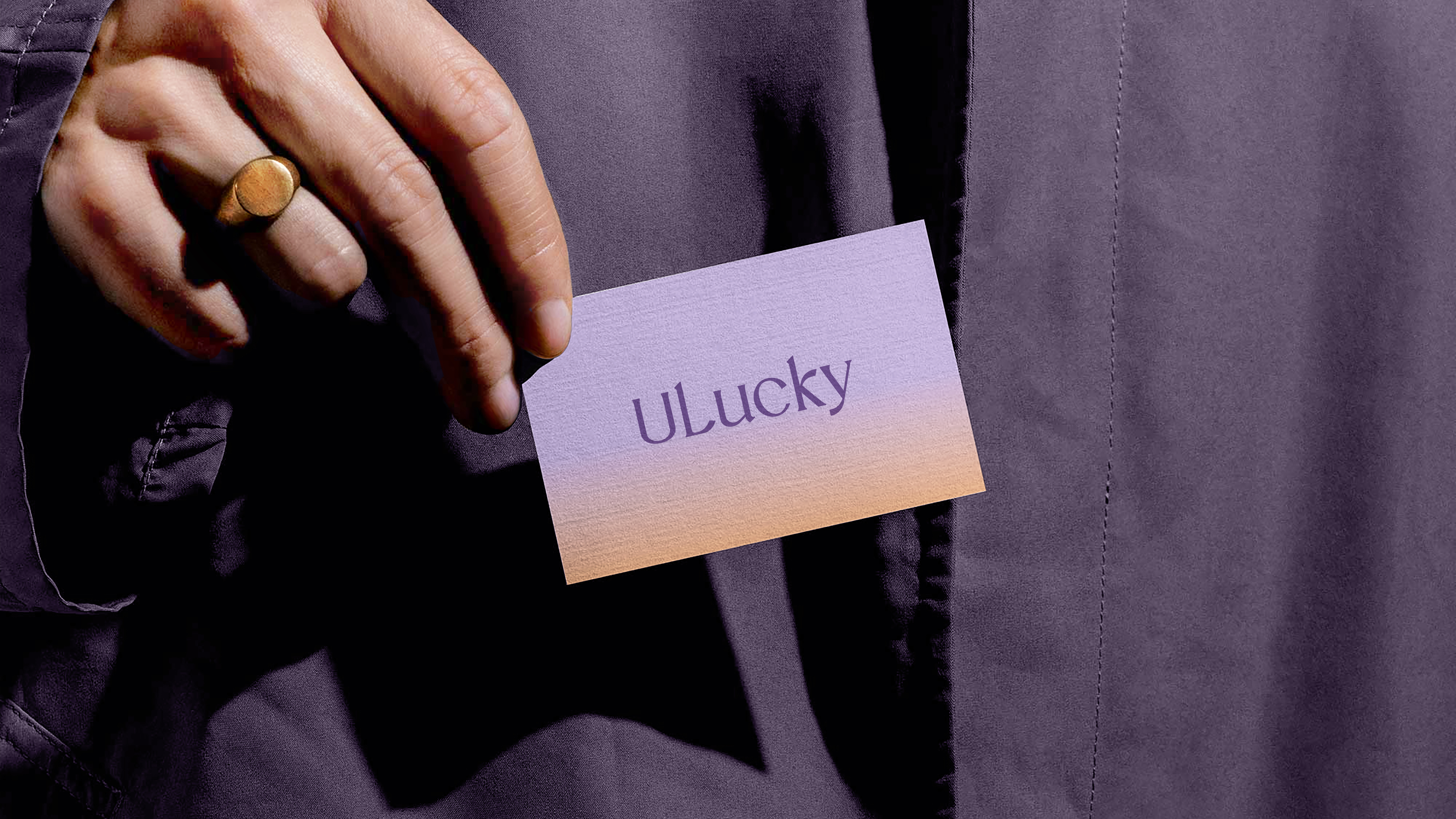
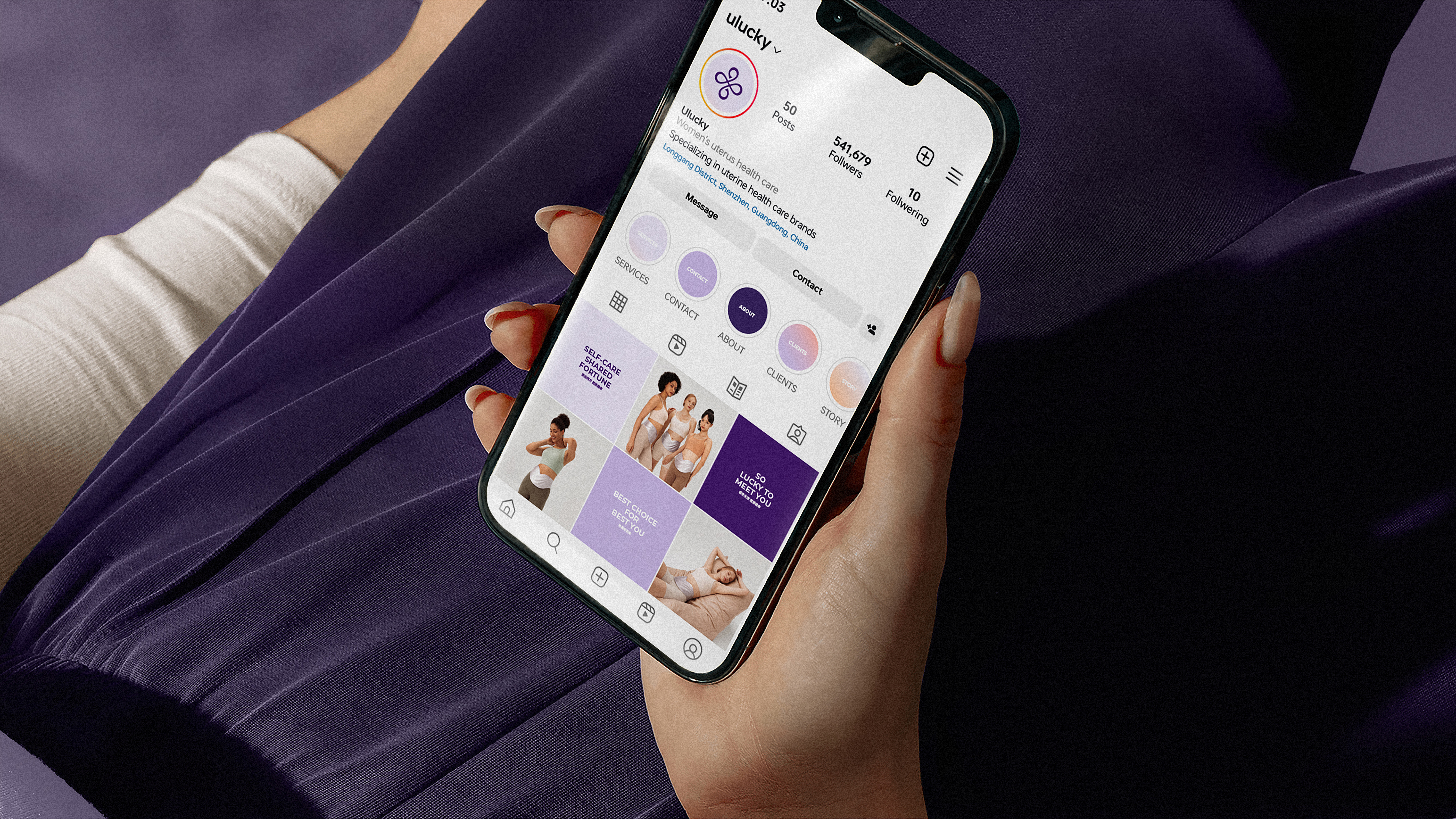

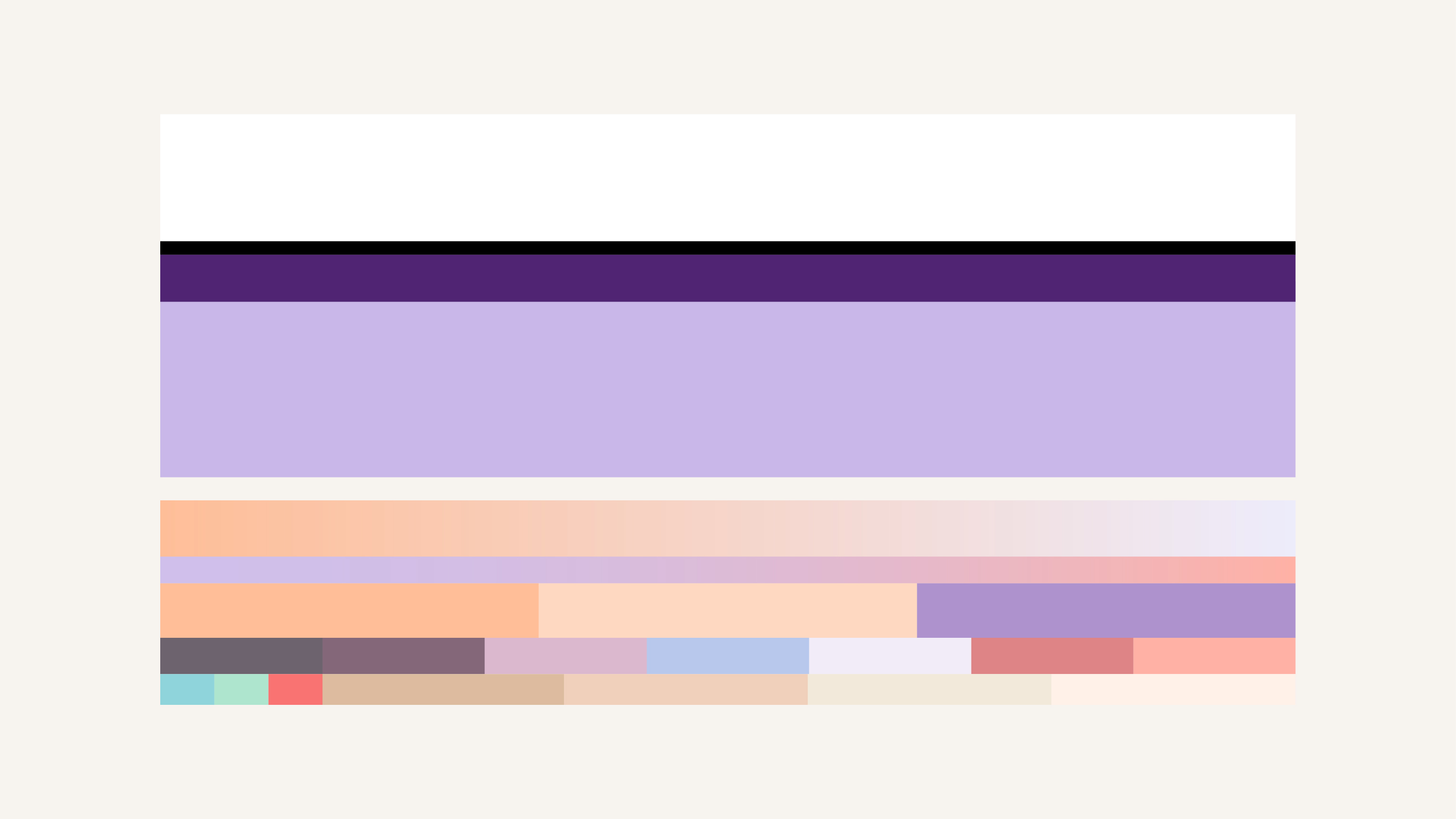
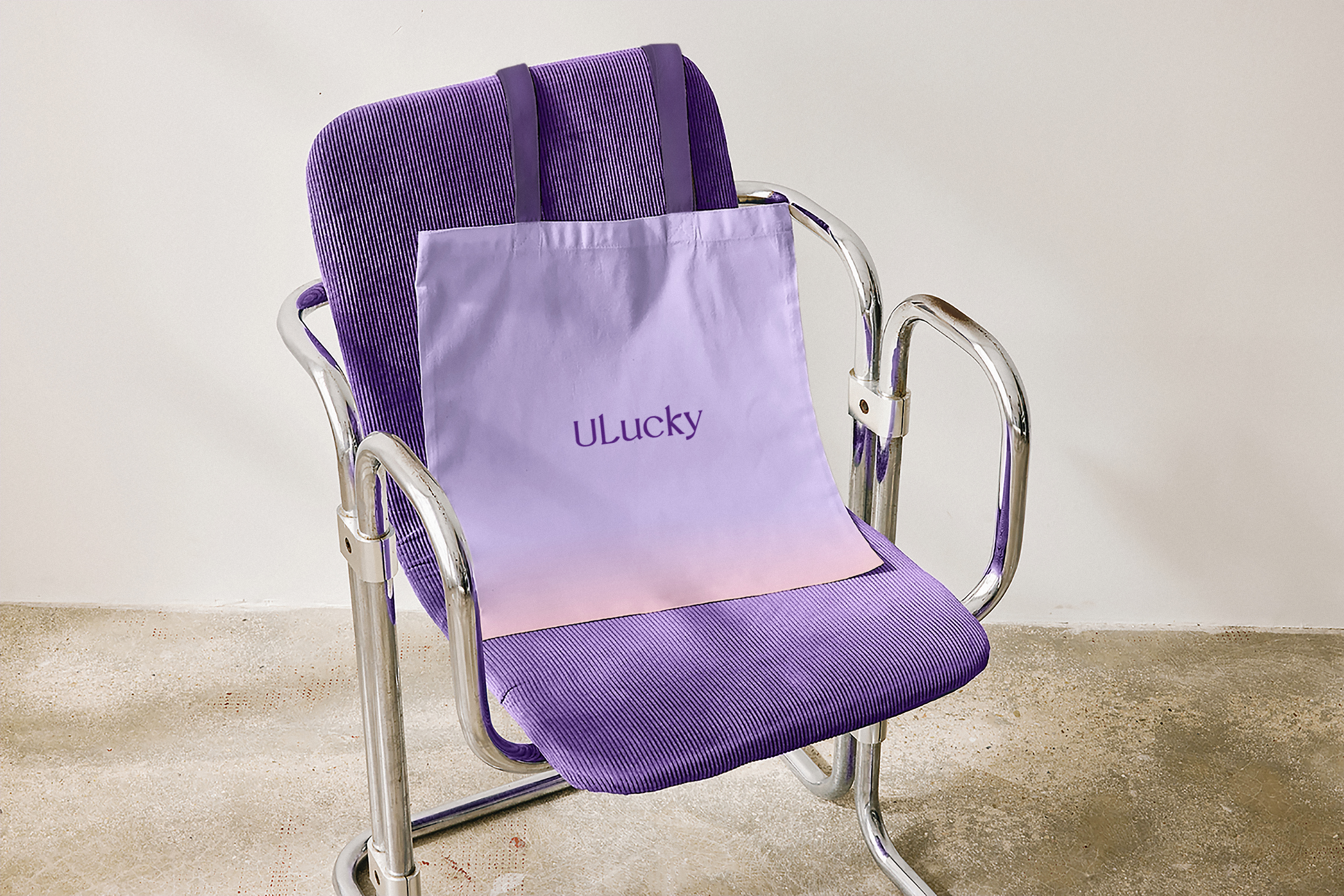
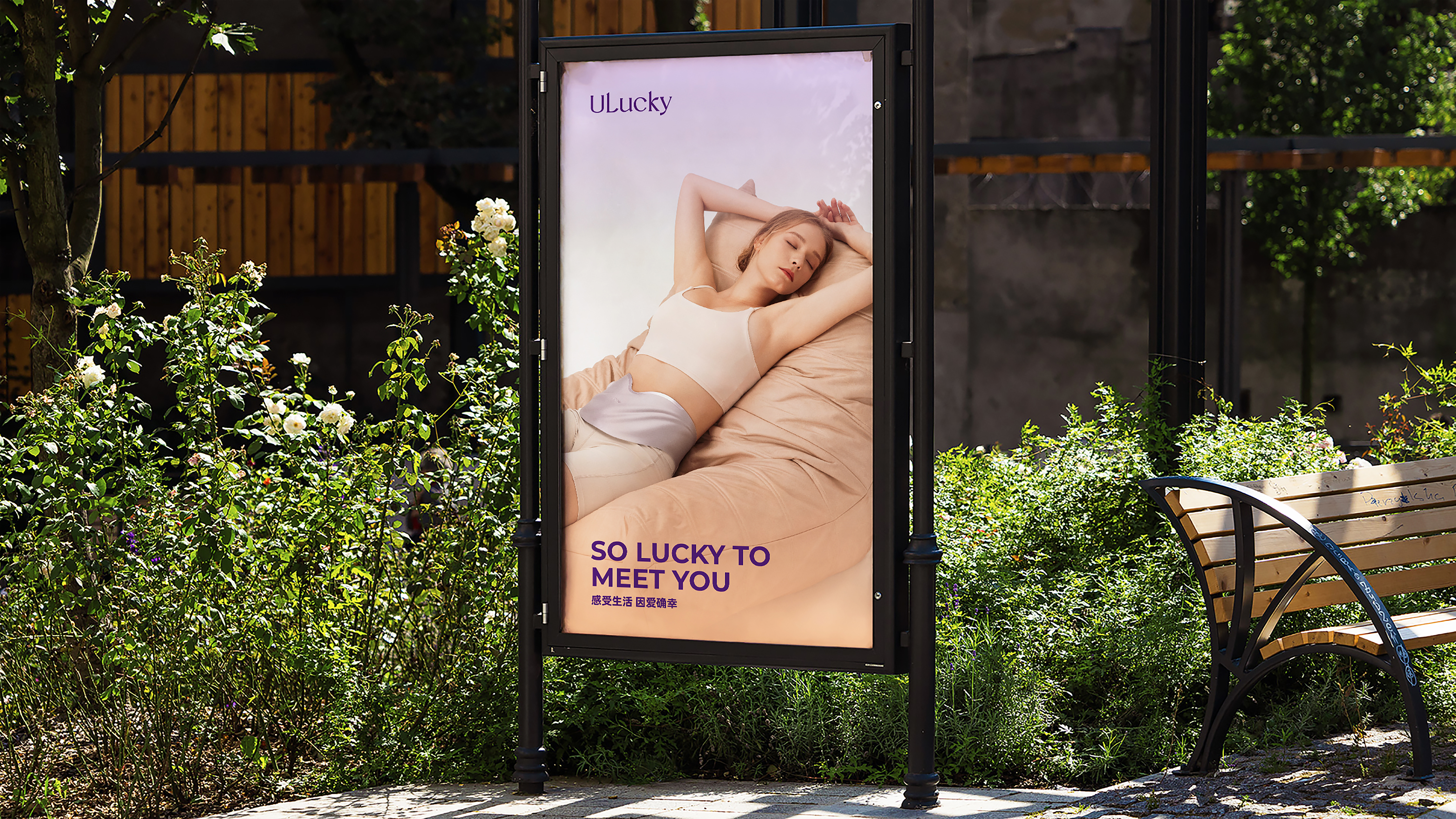
Color is an important component of Ulucky brand upgrade. We have redefined the brand palette for Ulucky. On the basis of purple, we have expanded more abundant female emotional colors. The bright orange embellished makes the whole color level by going up one floor. Especially in the advertising media and multimedia carriers, the diversity of the gradient to reconcile the brand more attractive.
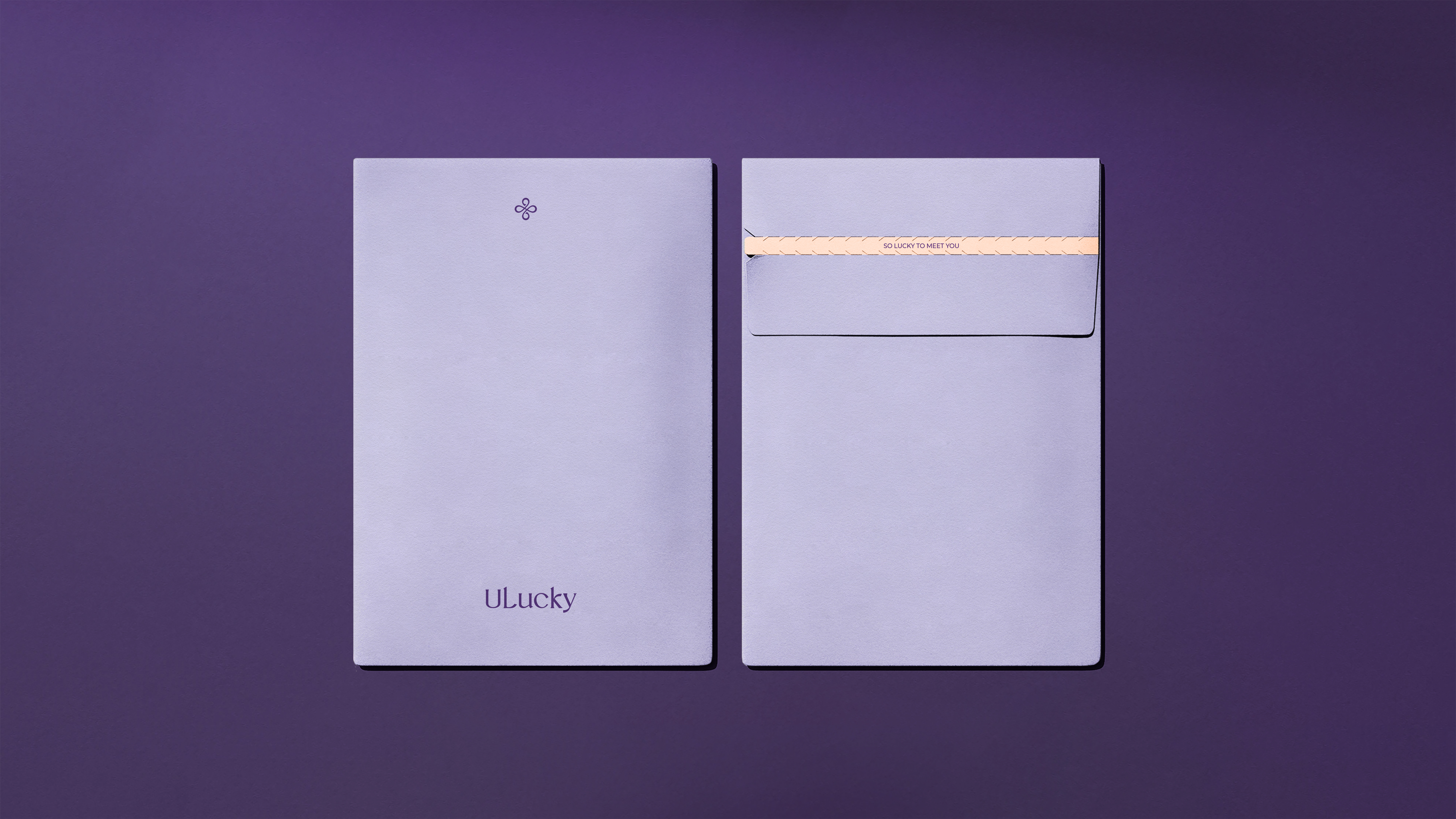
Color is an important component of Ulucky brand upgrade. We have redefined the brand palette for Ulucky. On the basis of purple, we have expanded more abundant female emotional colors. The bright orange embellished makes the whole color level by going up one floor. Especially in the advertising media and multimedia carriers, the diversity of the gradient to reconcile the brand more attractive.


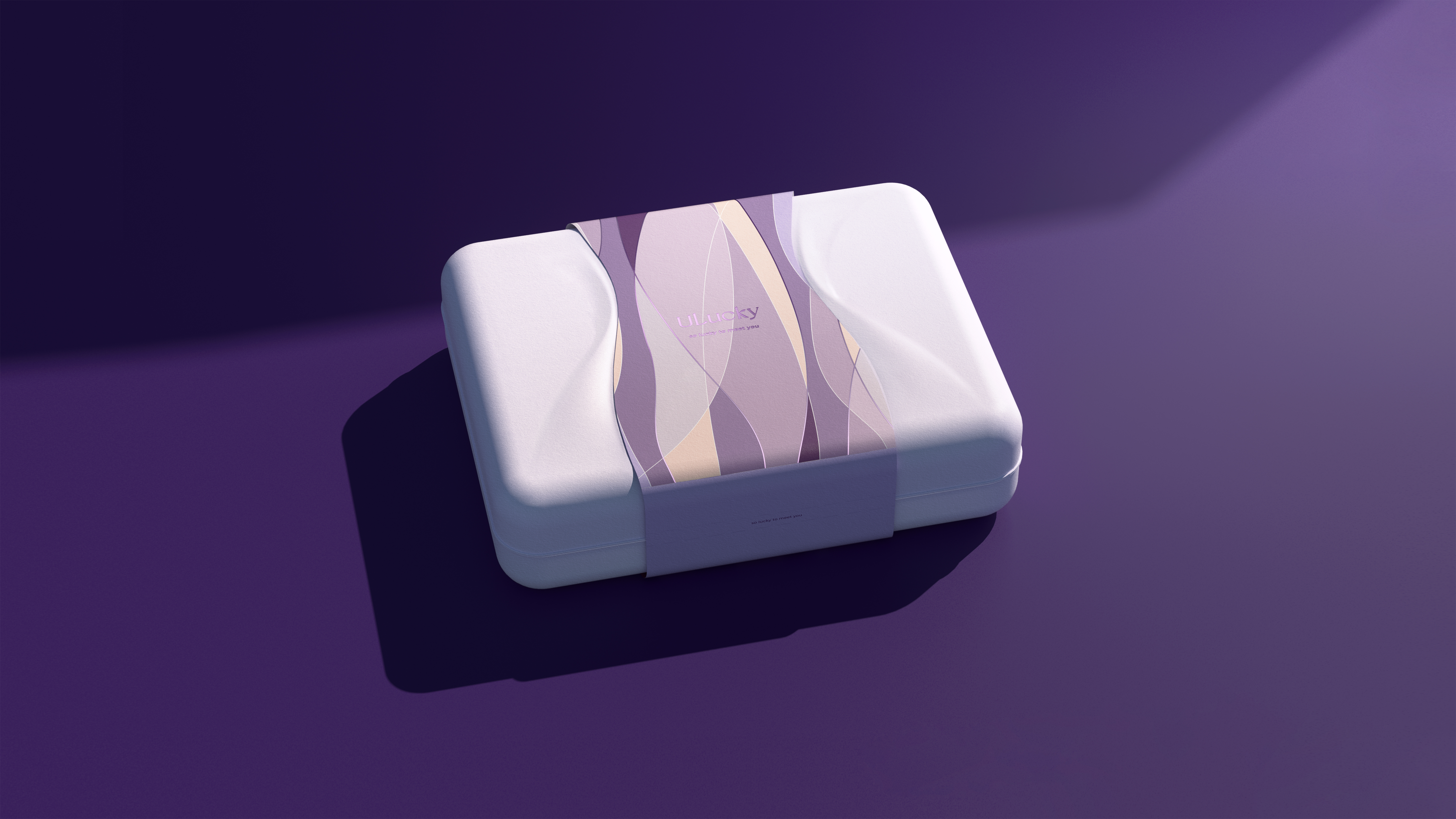
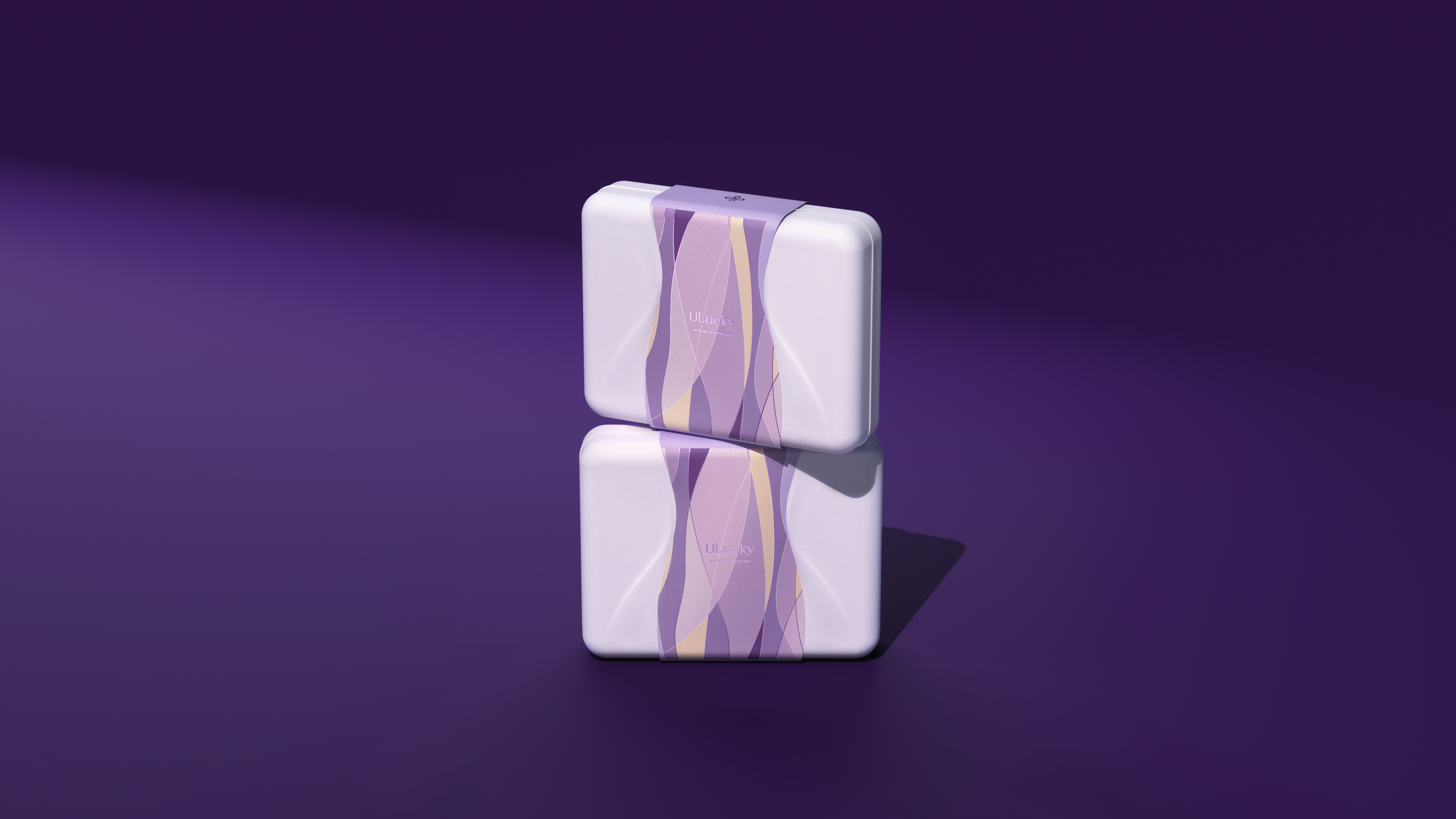
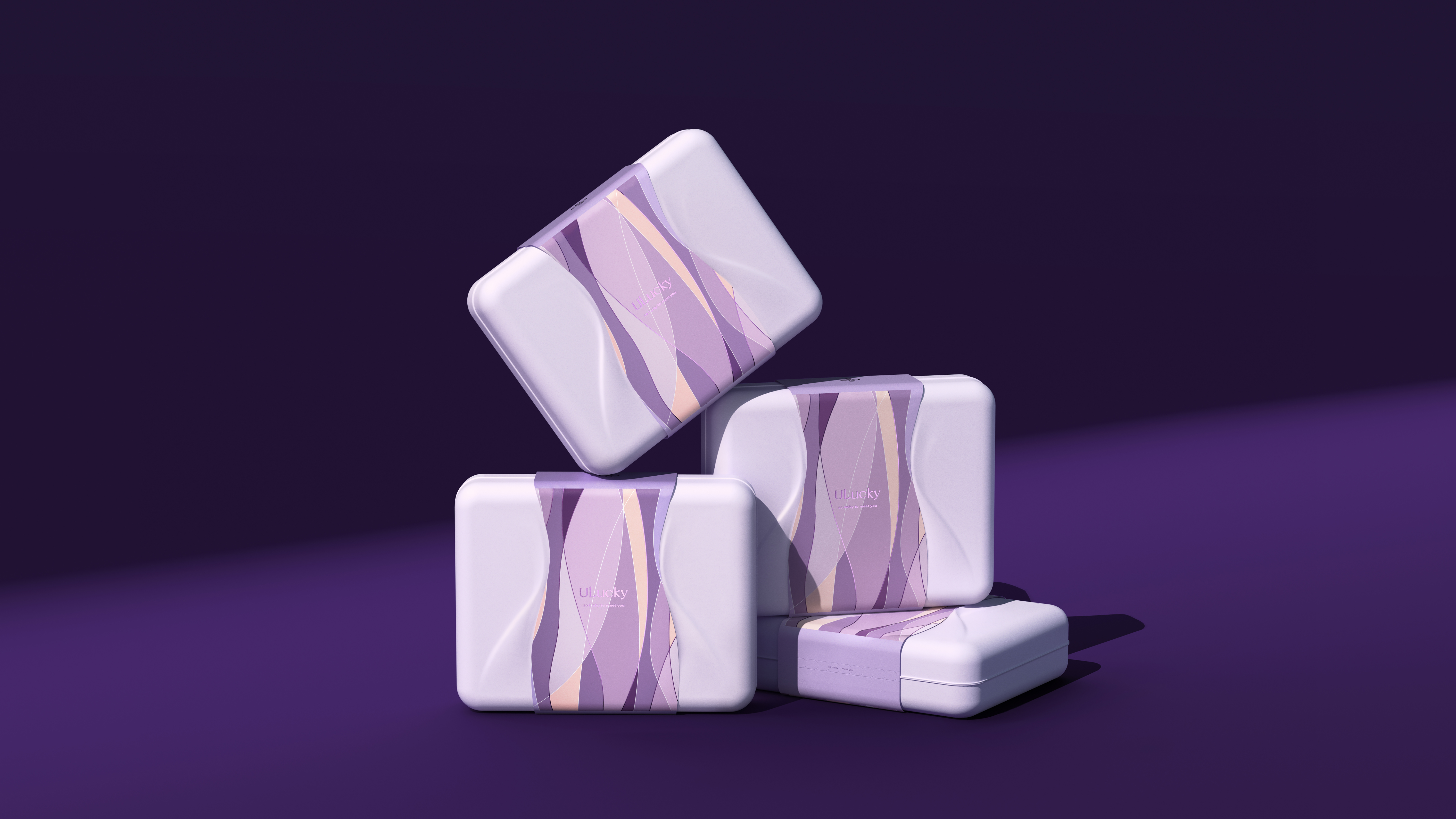
In the new product packaging, we chose a more environmentally friendly pulp material, mellow and soft body shape, using natural plant dyeing, in the design thinking and brand women, environmental protection, care concept complement each other. On the front, we abstract the female body curve, forming two layers of bumps on the original monotonous pulp box, adding a touch of sensibility to the packaging. The envelope that fits the bulge incorporates the auxiliary graphics of the ribbon into it, bringing a more ritual opening experience.

本作品版权归 后浪设计 所有,禁止匿名转载及个人使用,任何商业用途均需联系原作者。

新用户?创建账号
登录 重置密码

请输入电子邮件以重置密码。
Humanization, huh
very sweet
this is good