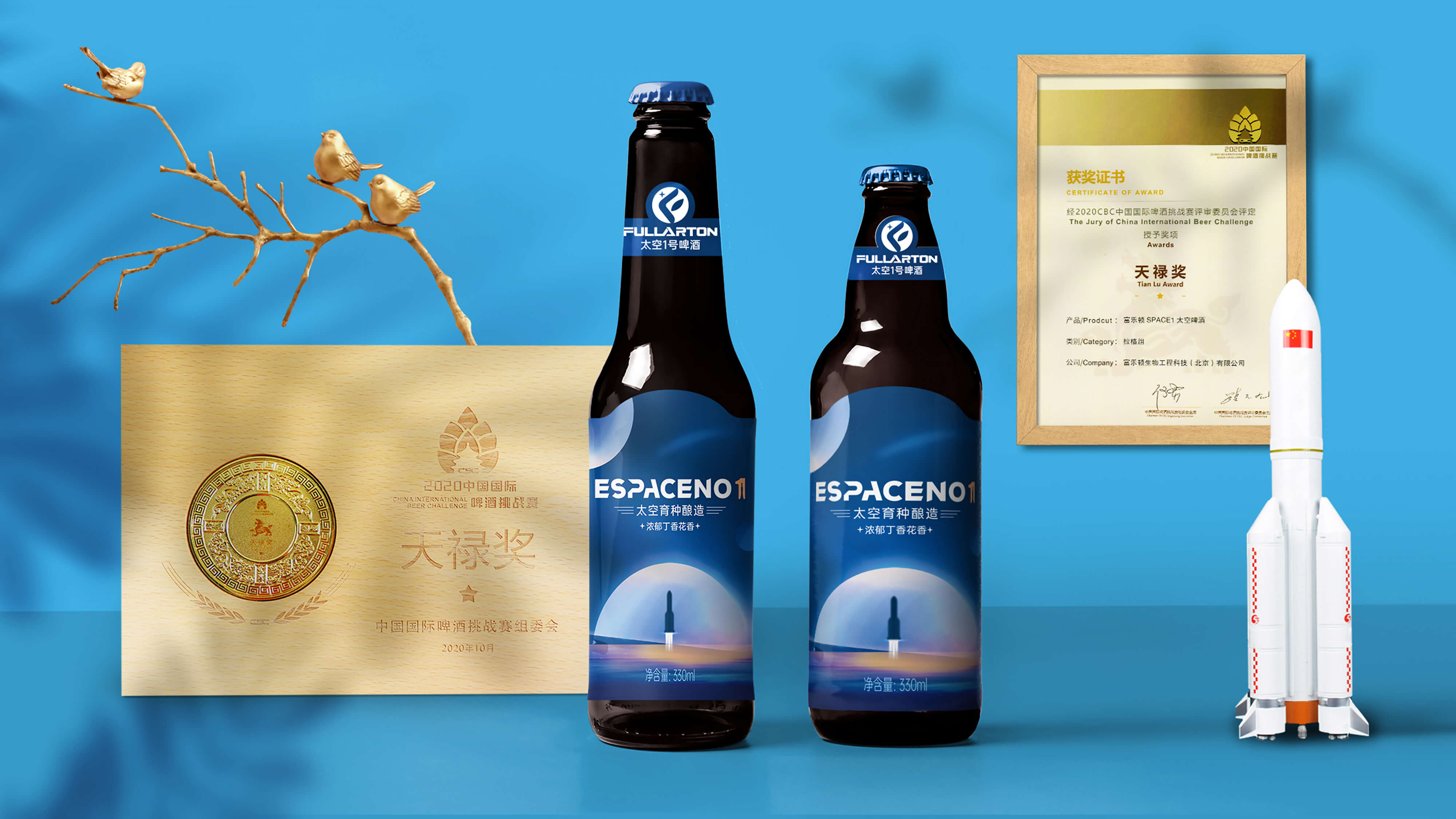
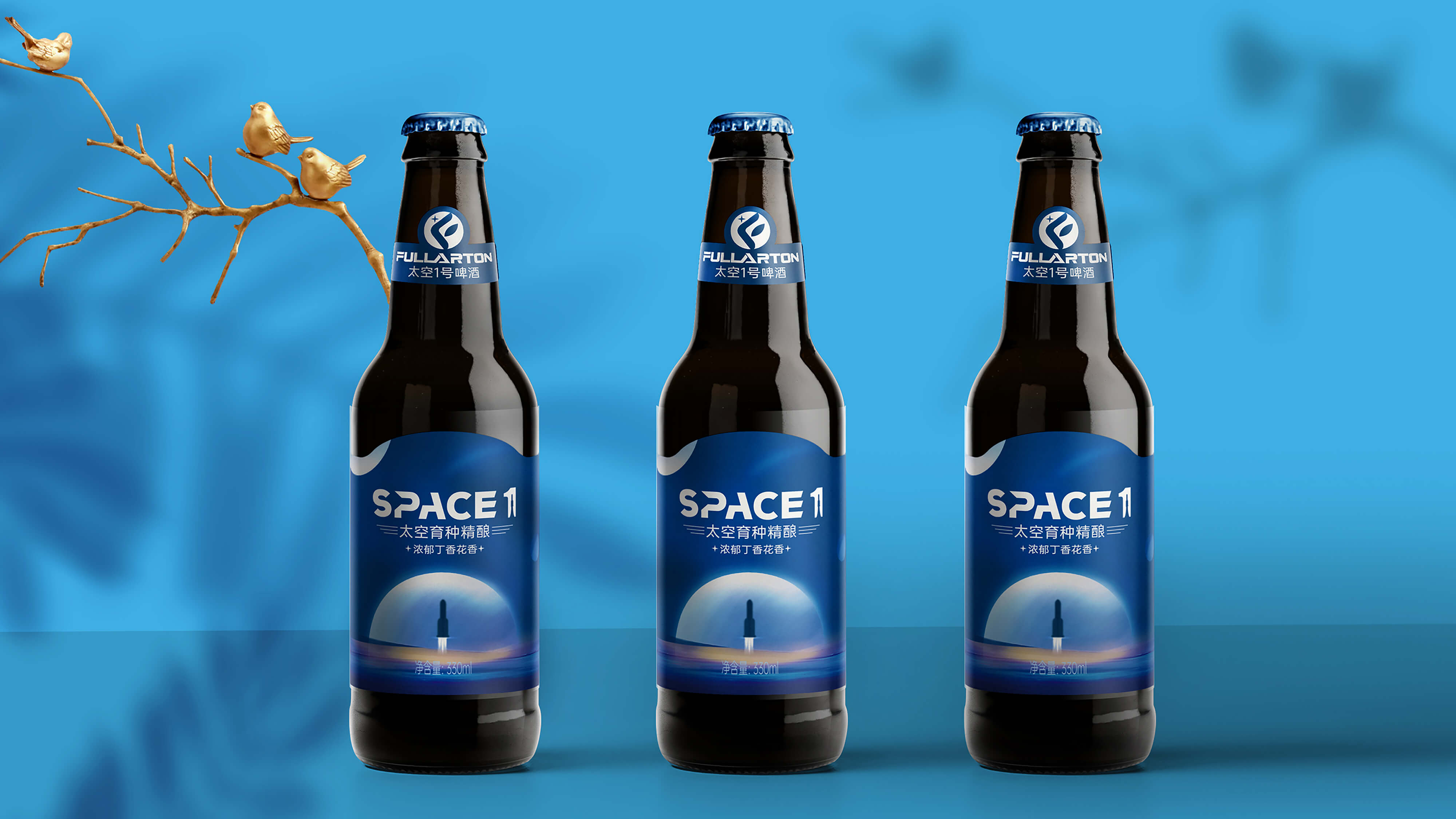
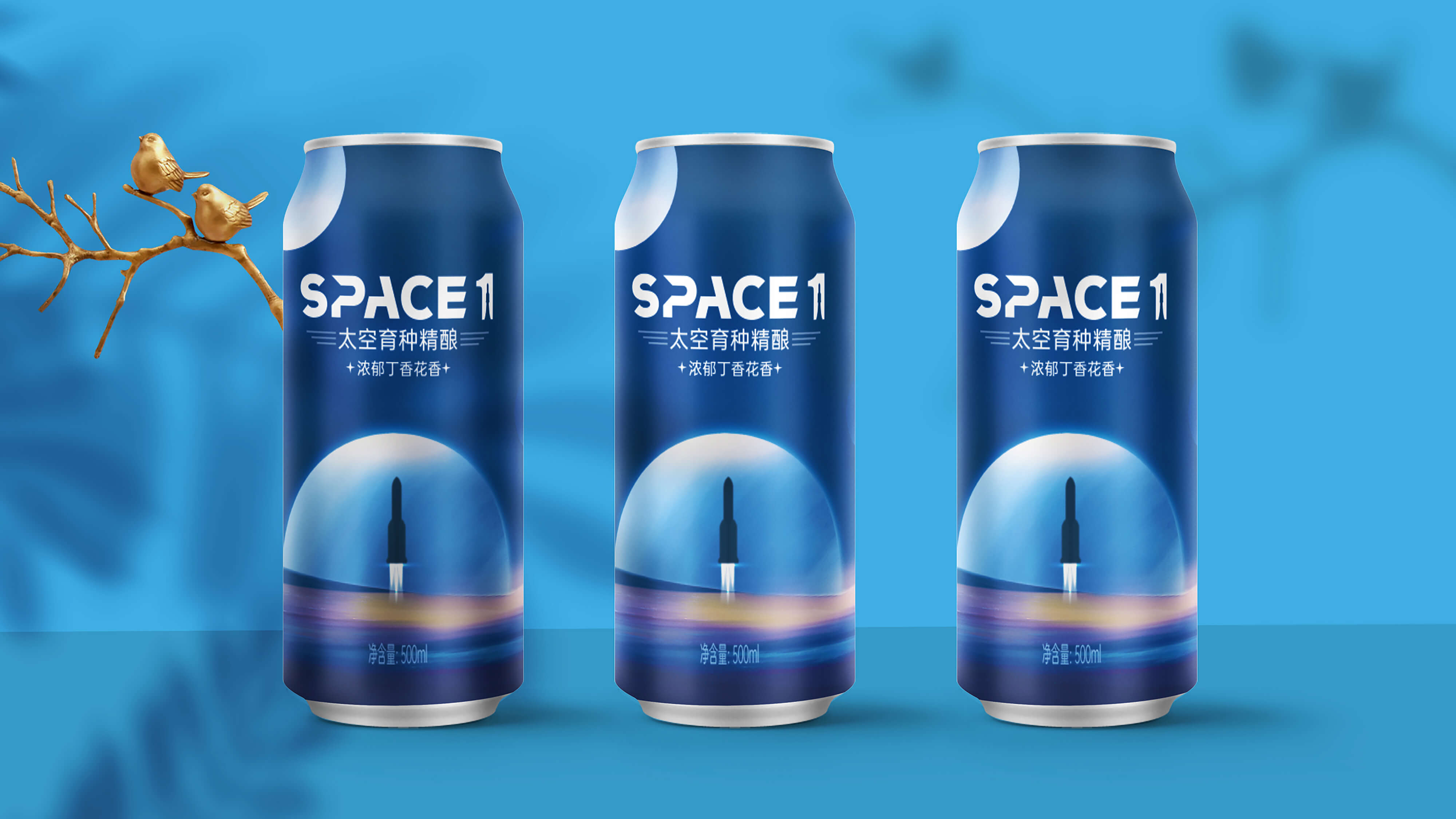
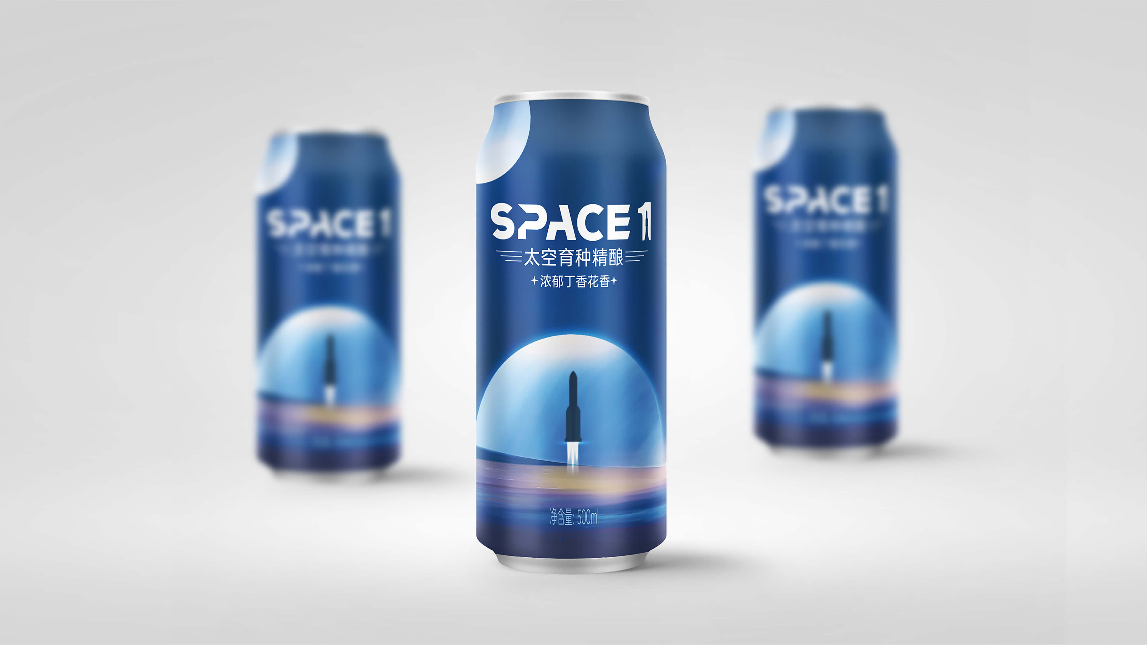
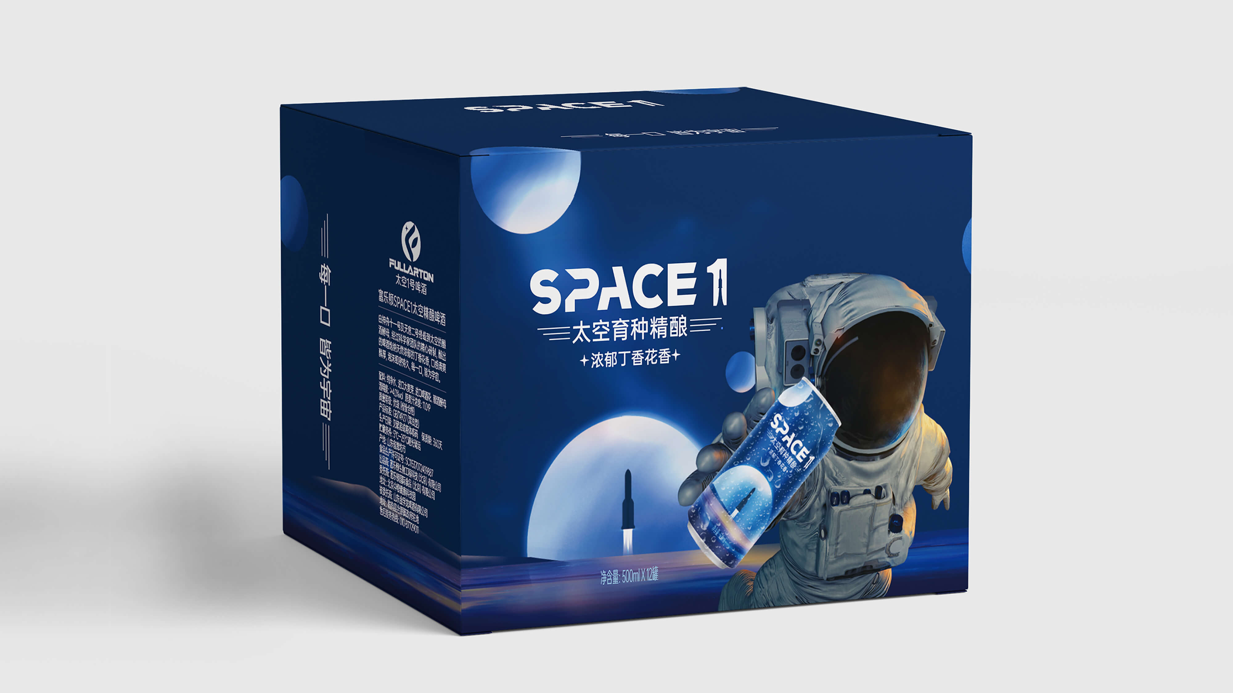
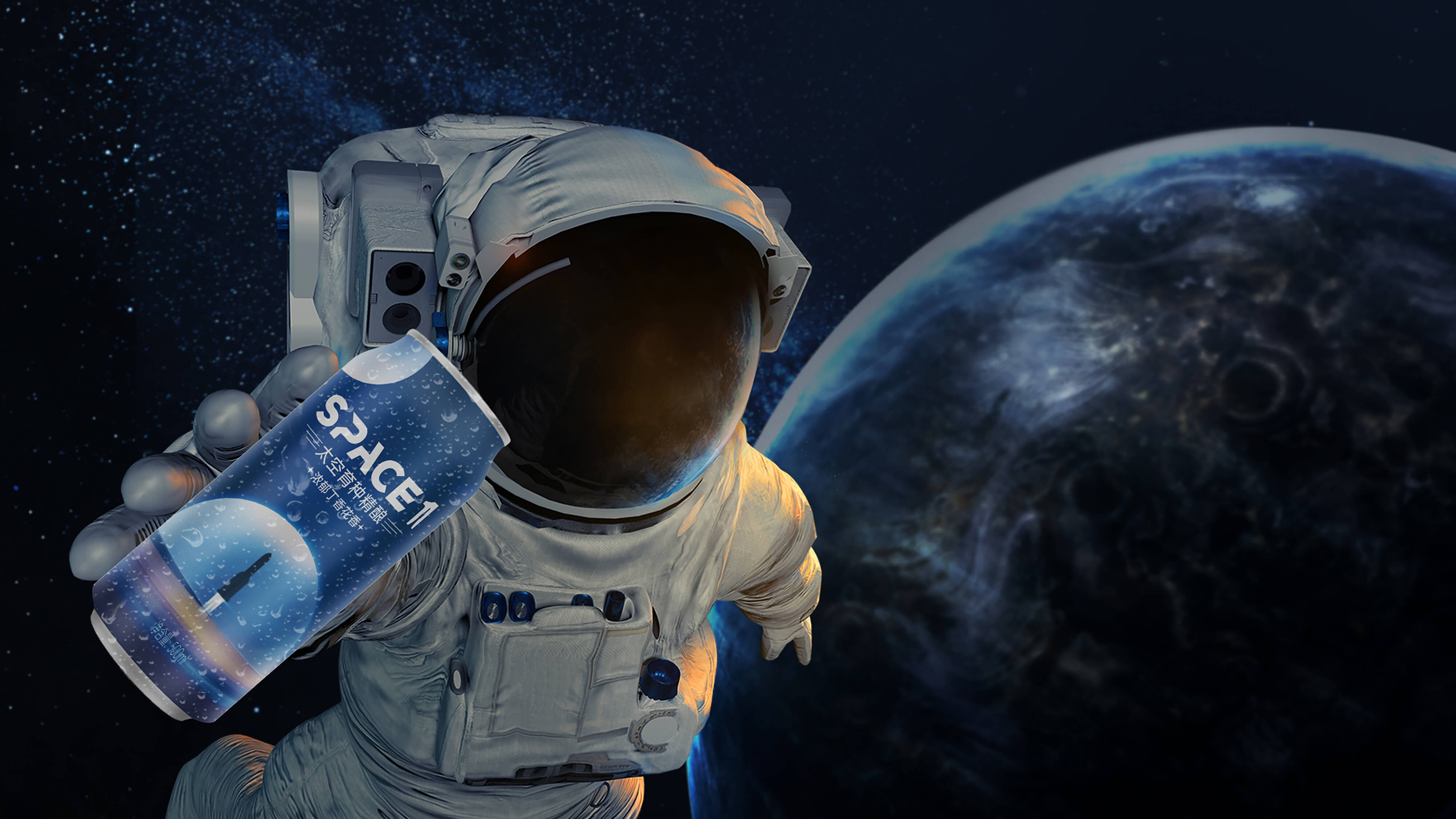
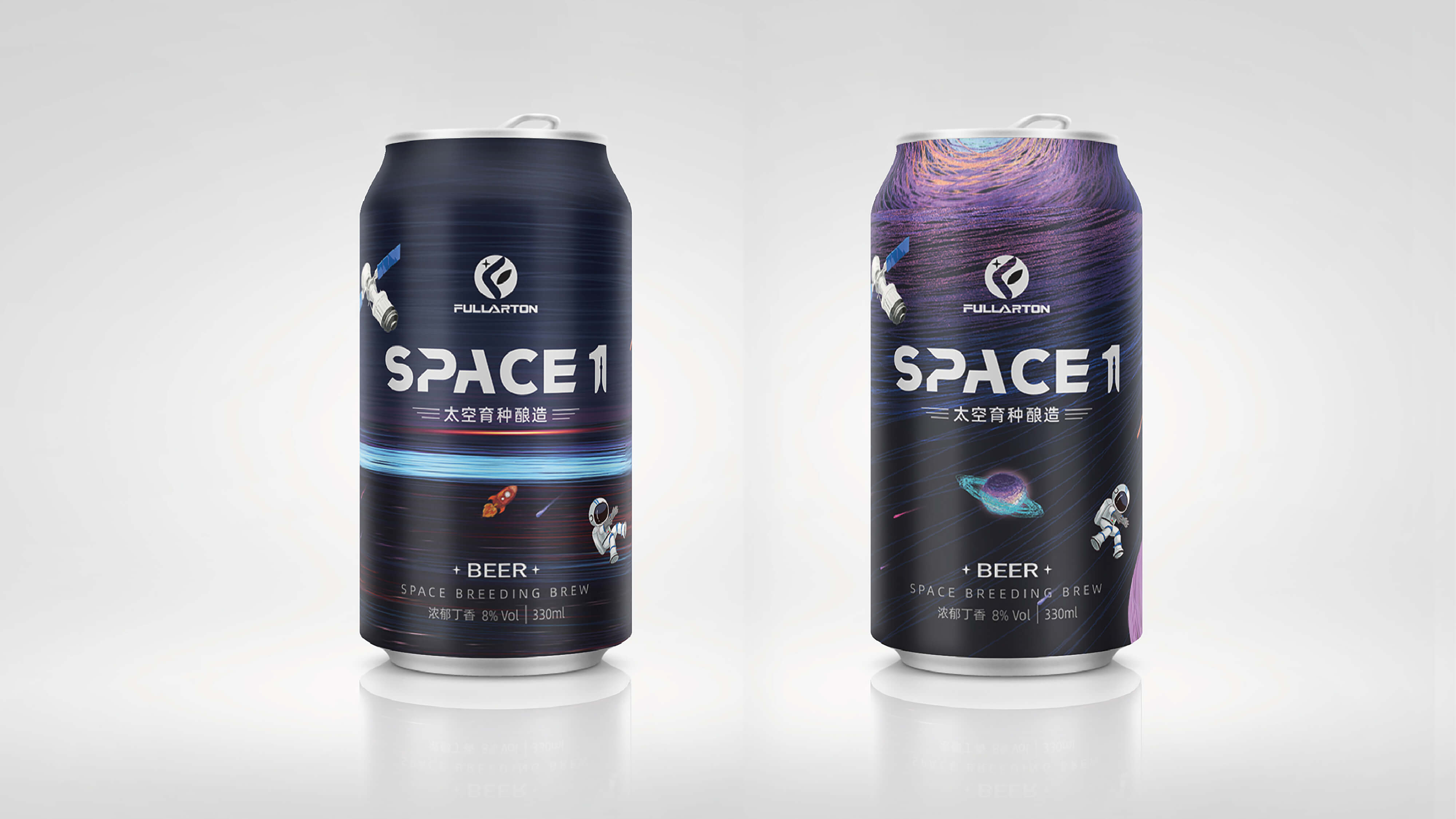
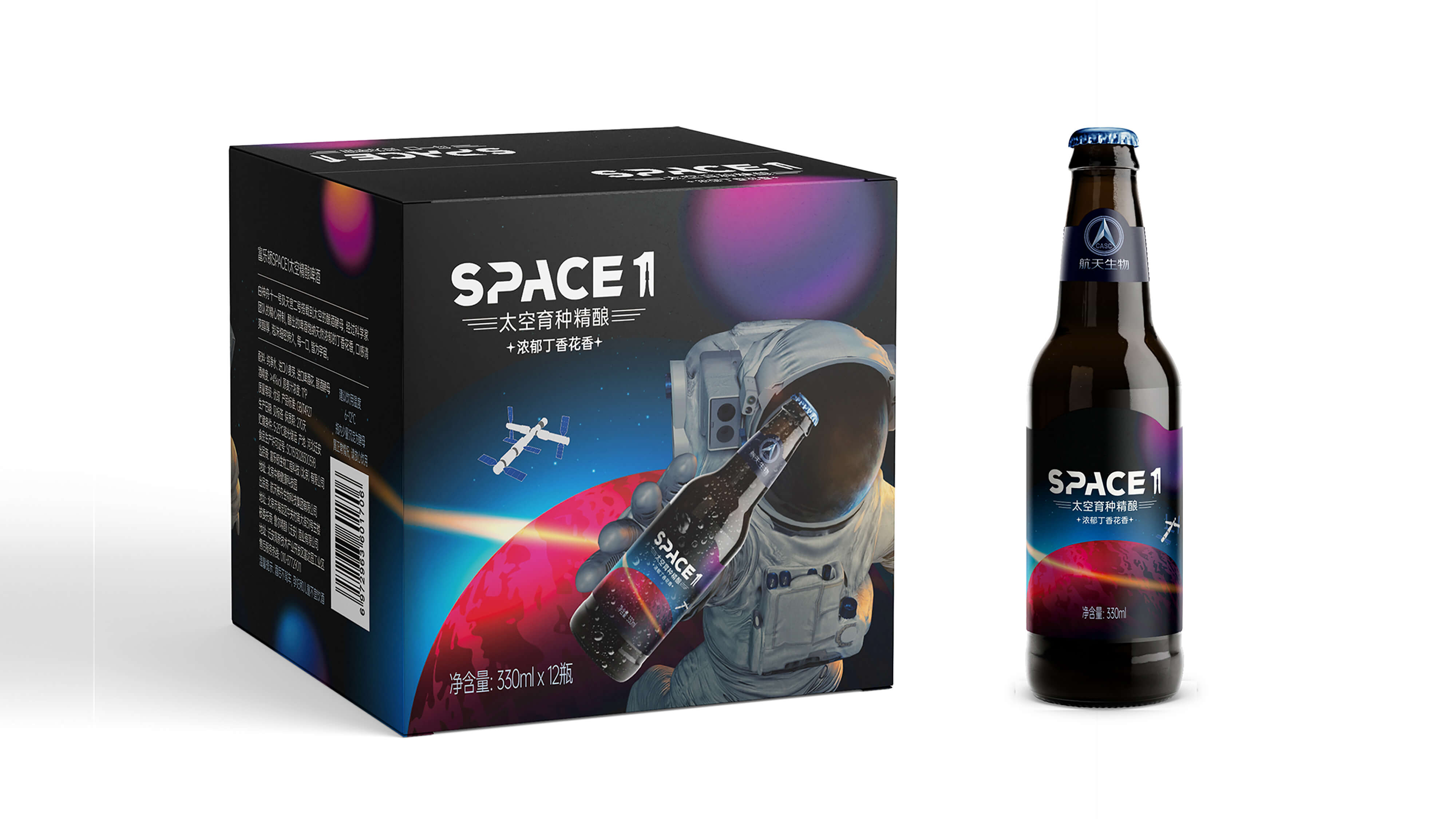
The packaging design of Fullerton Space Beer (SPACE1) is based on the theme of space exploration, emphasizing the sense of science and technology and the sense of the future. Its packaging design includes the following features:
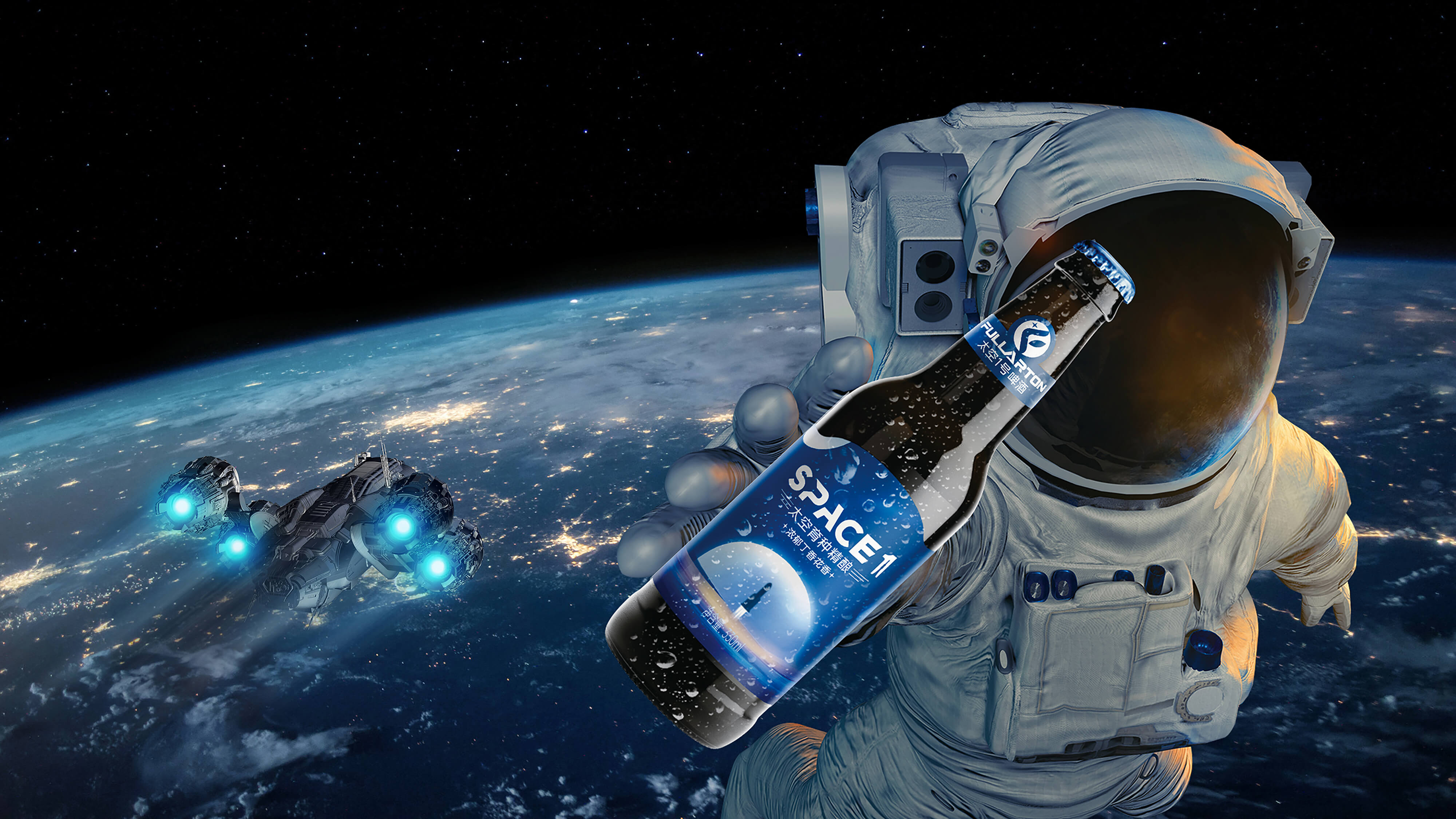
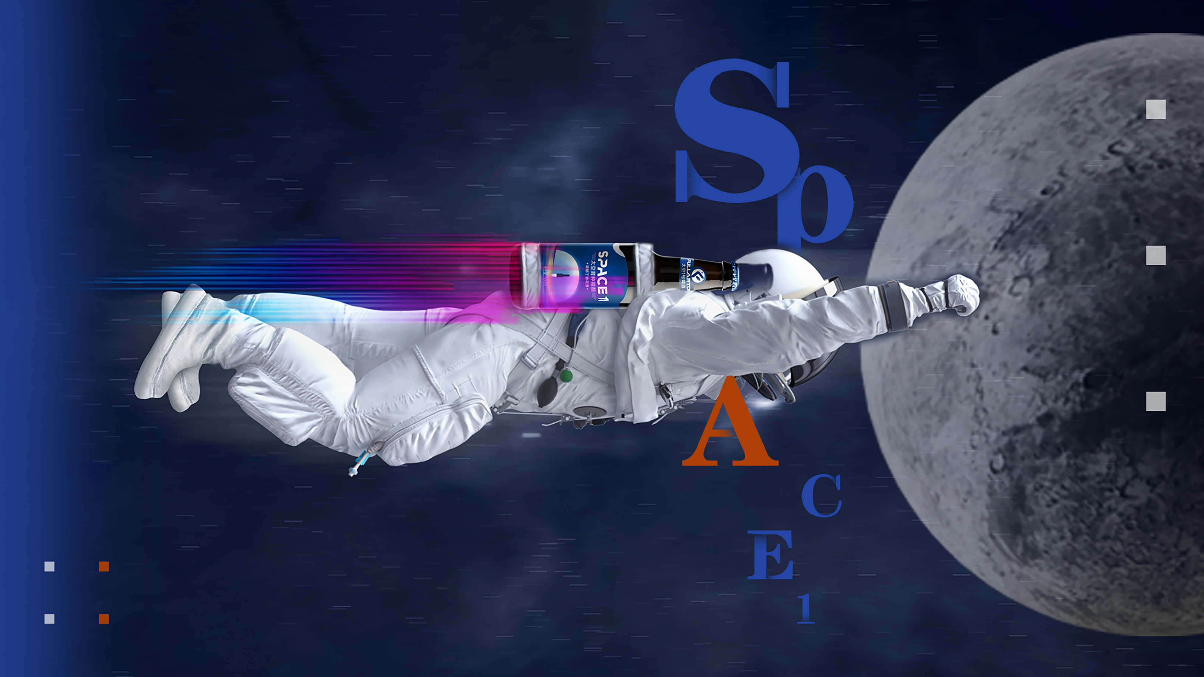
The use of astronauts and spacecraft elements, through the geometric cutting of the rocket power state modeling to reflect the sense of speed, strengthen the brand and space relevance. The packaging vision presents a fashion style that combines edges and curves, giving consumers an immersive experience of "walking in space when opening a can.
Visual Design
The brand logo adopts the geometric cutting design of "SPACE" letters, with smooth lines and a sense of science and technology, and forms a modern sense with angular lines. The new packaging creates a mysterious atmosphere through dark tones (such as dark blue and silver gray), which are combined with the aroma of lilacs to form a sensory linkage.
innovative application
The packaging adopts asymmetric modeling, breaking through the traditional beer bottle/can design framework, and forming a unique visual language through geometric cutting and surface combination. This design not only conforms to the young consumer group's preference for "cutting-edge technology sense", but also facilitates the formation of differentiated display effects when displaying shelves.
本作品版权归 若鱼文化创意 所有,禁止匿名转载及个人使用,任何商业用途均需联系原作者。

新用户?创建账号
登录 重置密码
请输入电子邮件以重置密码。


packaging is very personalized
packaging is very good
This wine tastes good at first sight