
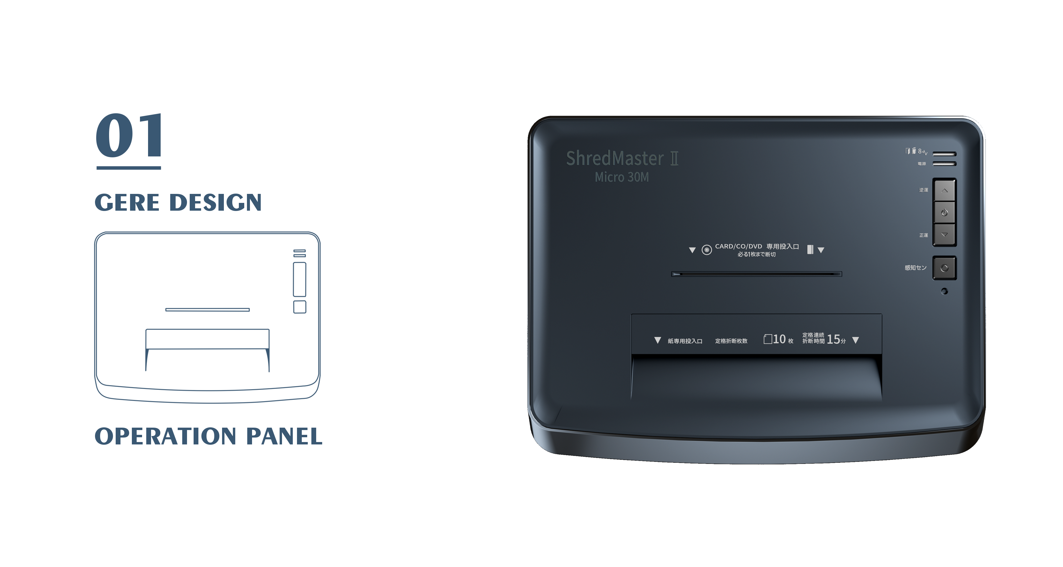
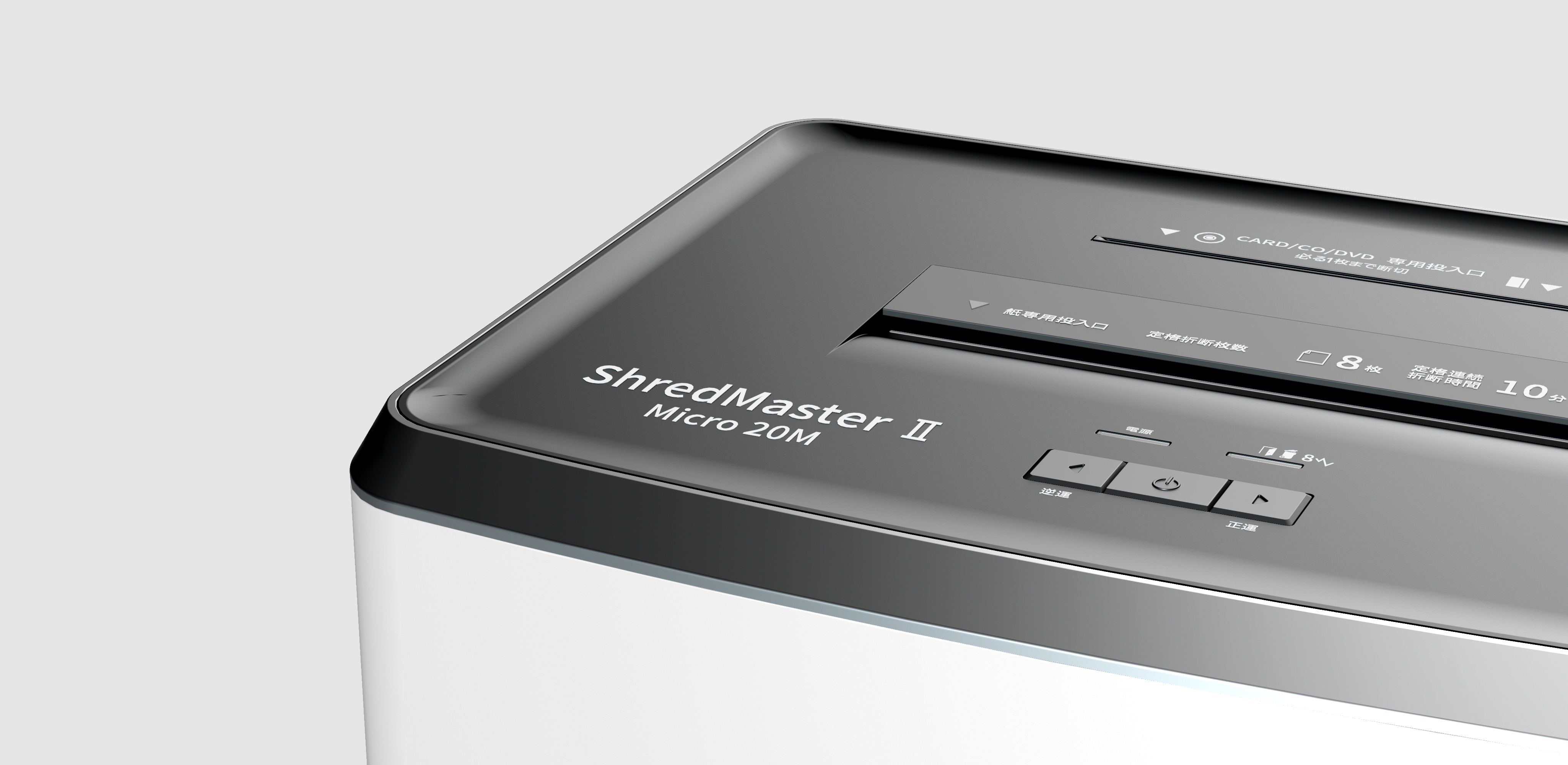
The operation panel is provided with two crushing entrances, and the frequently used paper inlet is set on the side close to the user. Several buttons are set in the upper right corner, which can effectively place false touches in use.
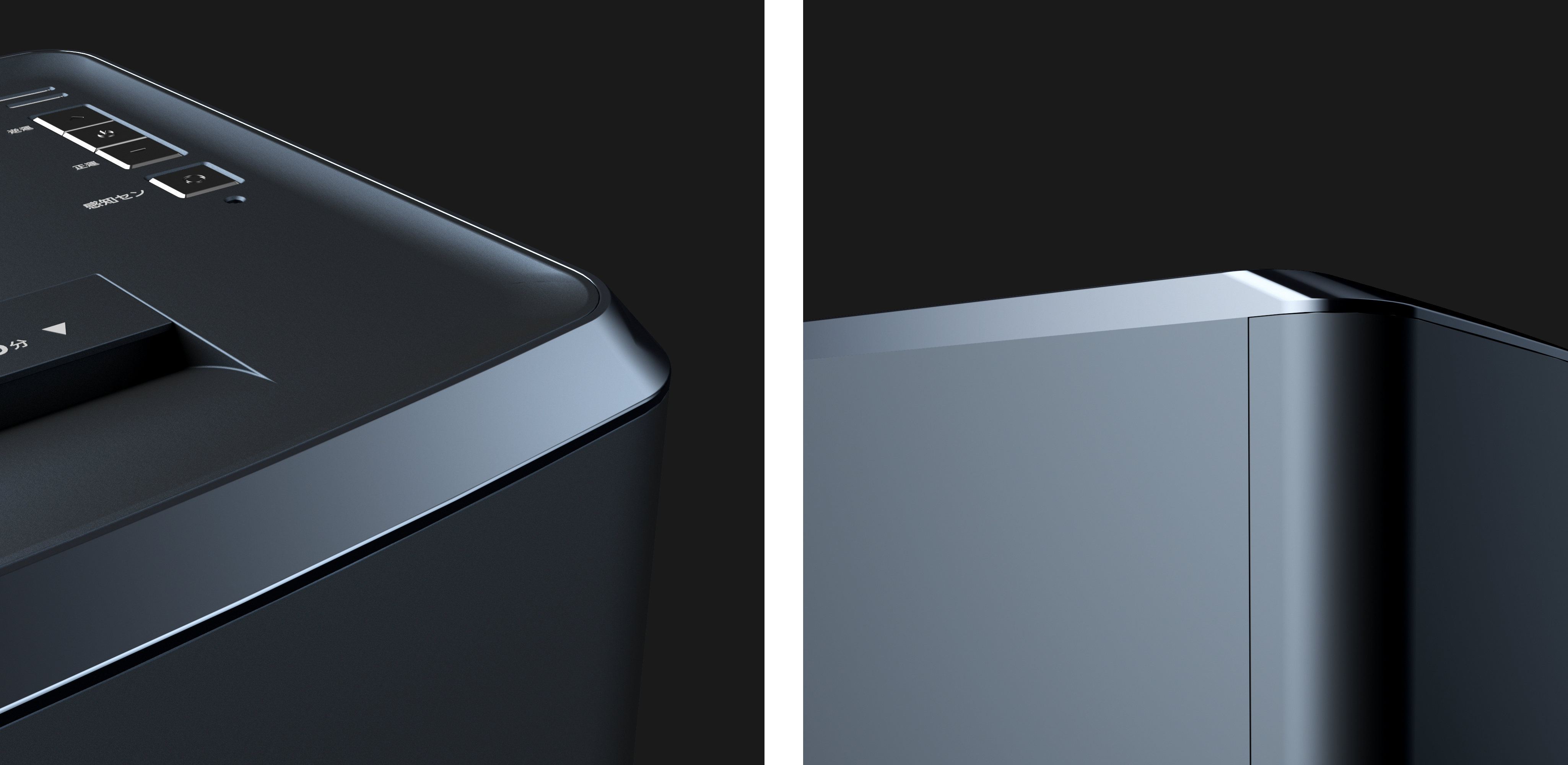
The combination design of angular plane and arc surface of shredder. The paper inlet discards the stiff, rigid square inlet. The arc at the entrance is round, which is convenient for paper to be put in smoothly.
The delicate frosted panel is clearly distinguished from the smooth keys, which makes it easy to control the keys.

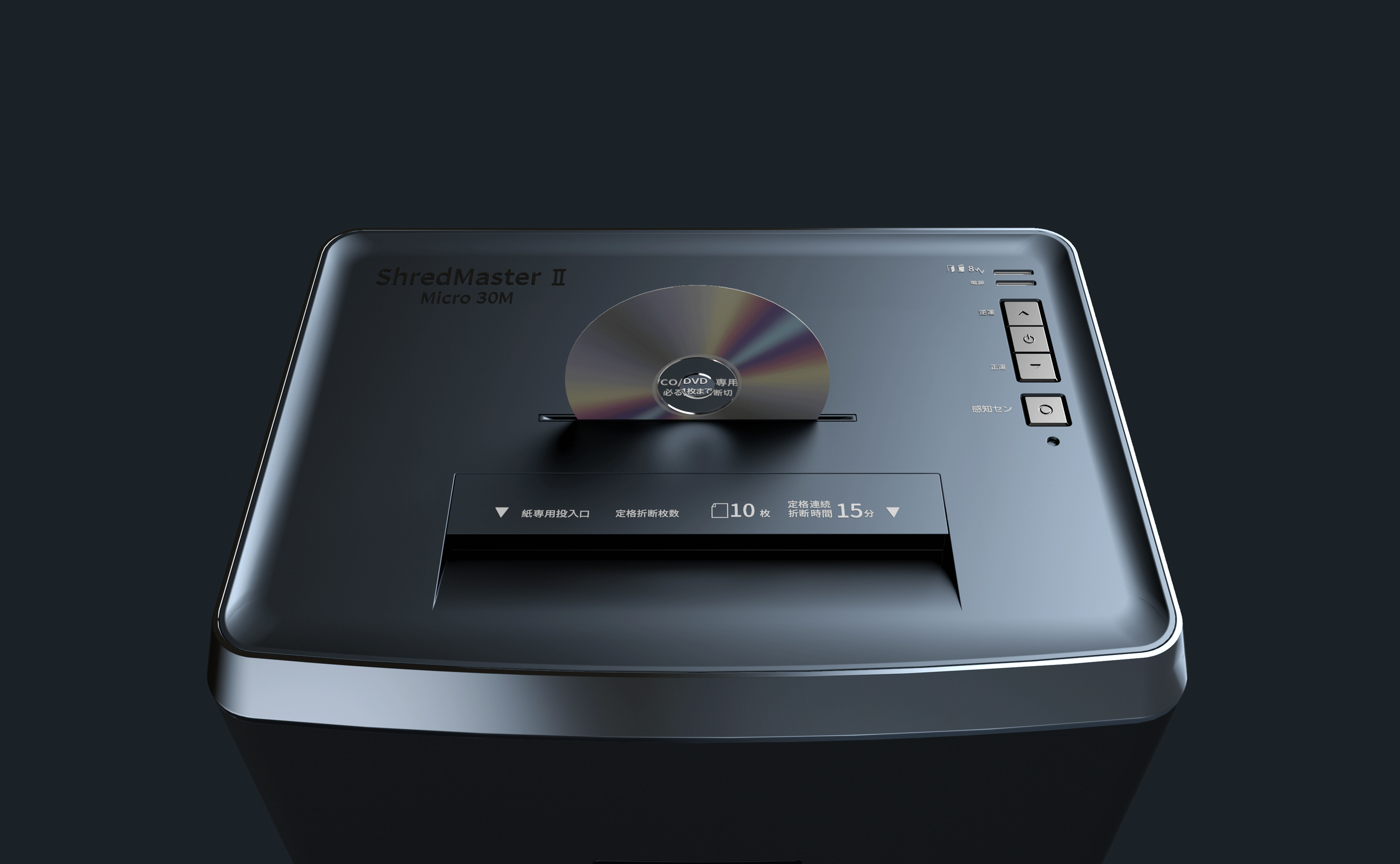
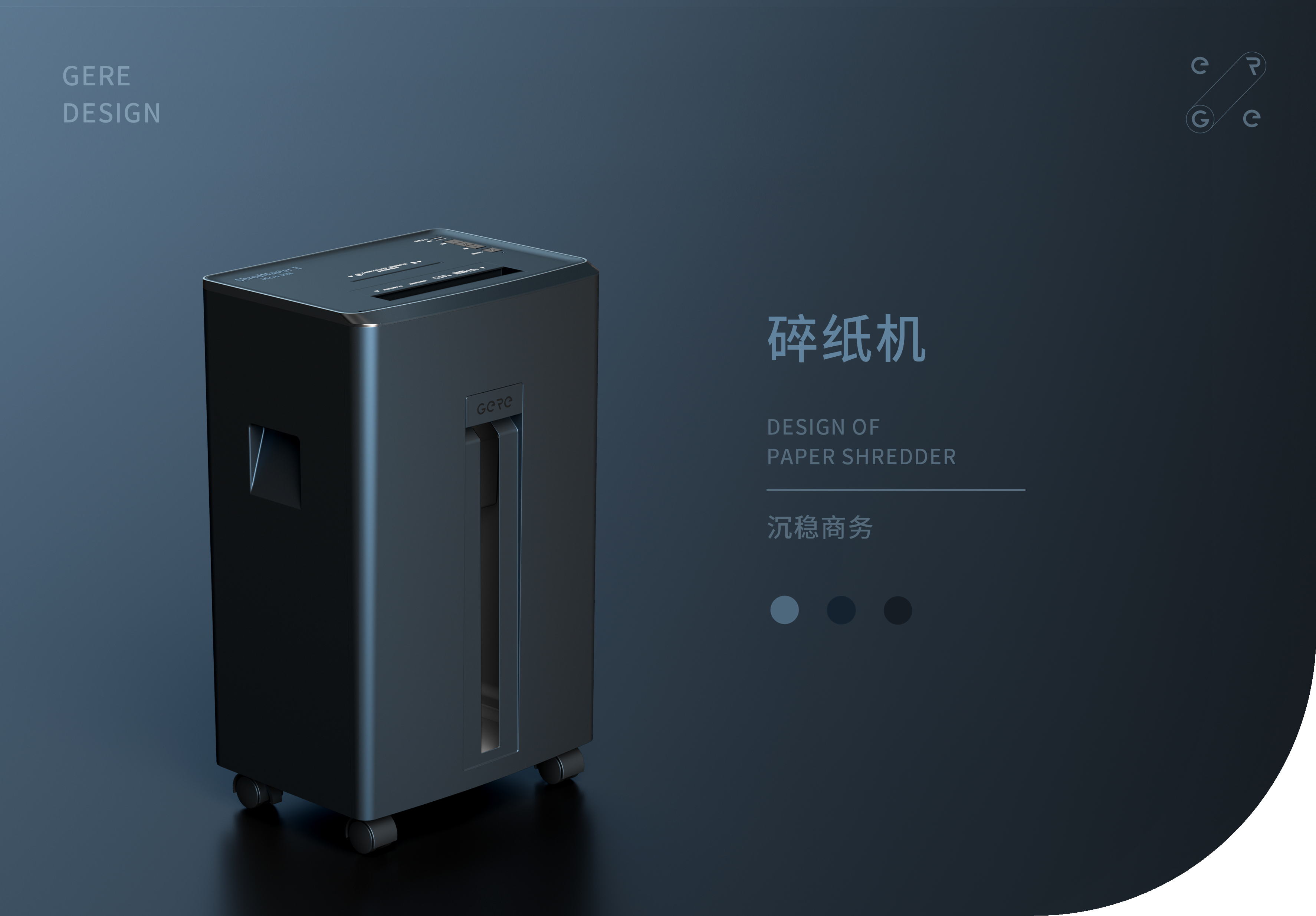
The shredder can crush three materials: paper, CD and bank card, protecting privacy in many ways.
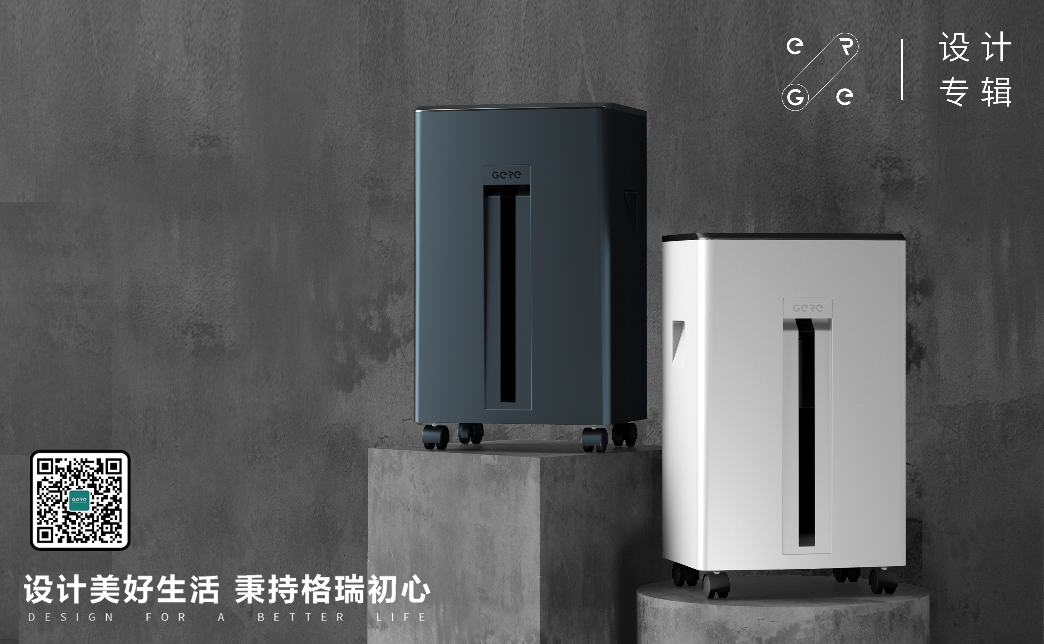
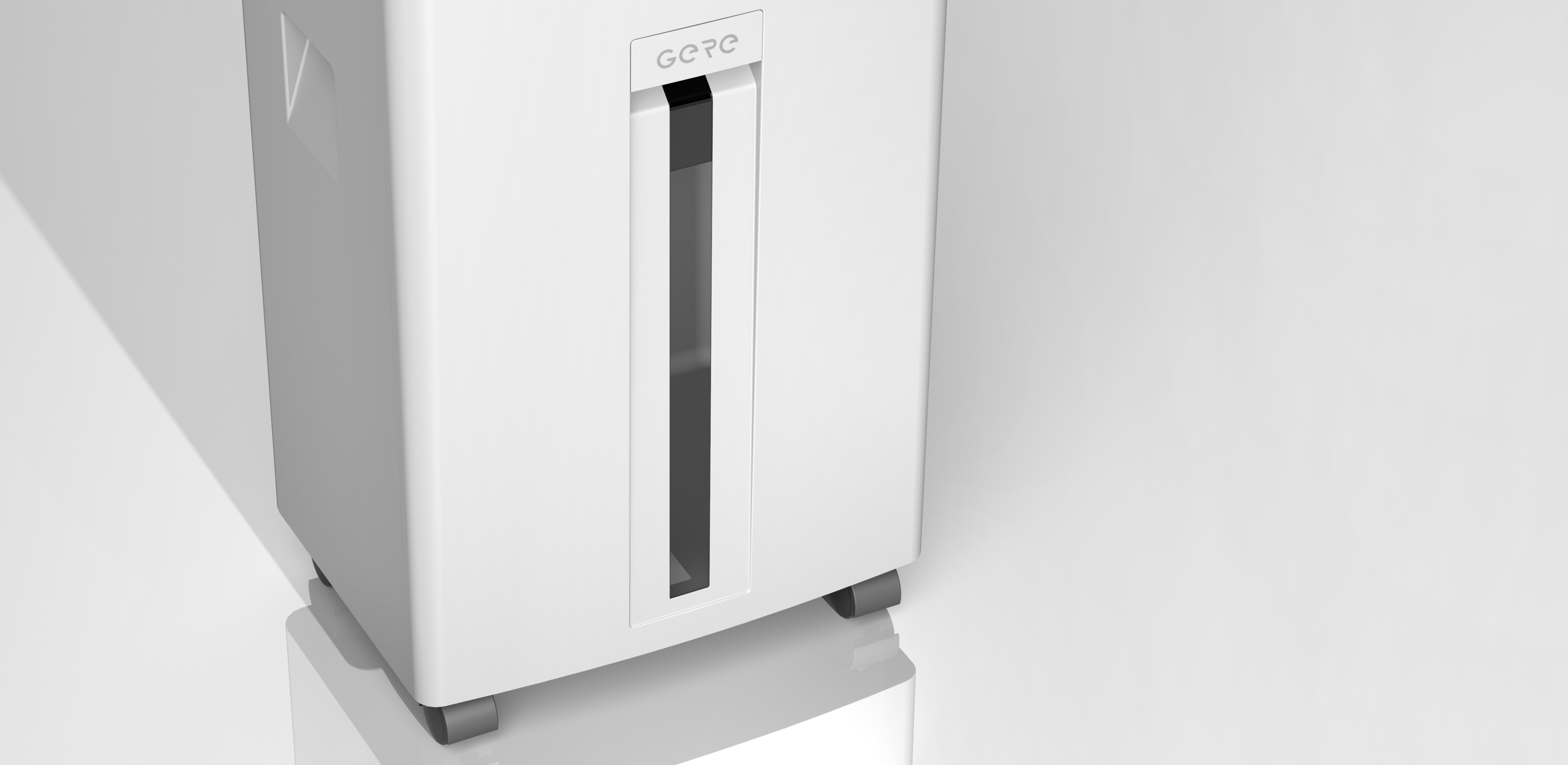
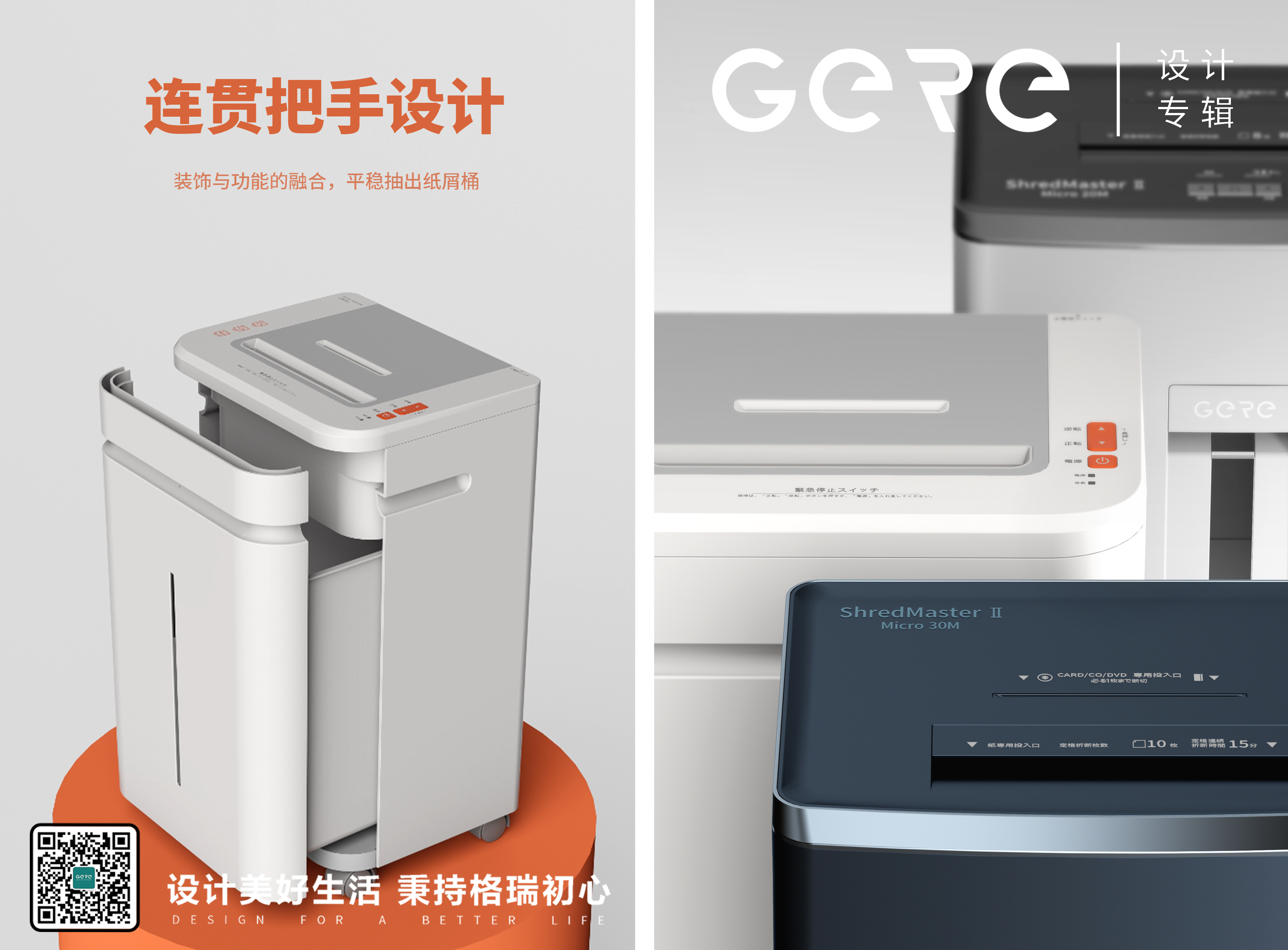
30L visual paper tube. Visual window, visible paper full state, convenient and timely cleaning. The window and the buckle groove can form a "T"-shaped design highlight, and the decoration and function are integrated.


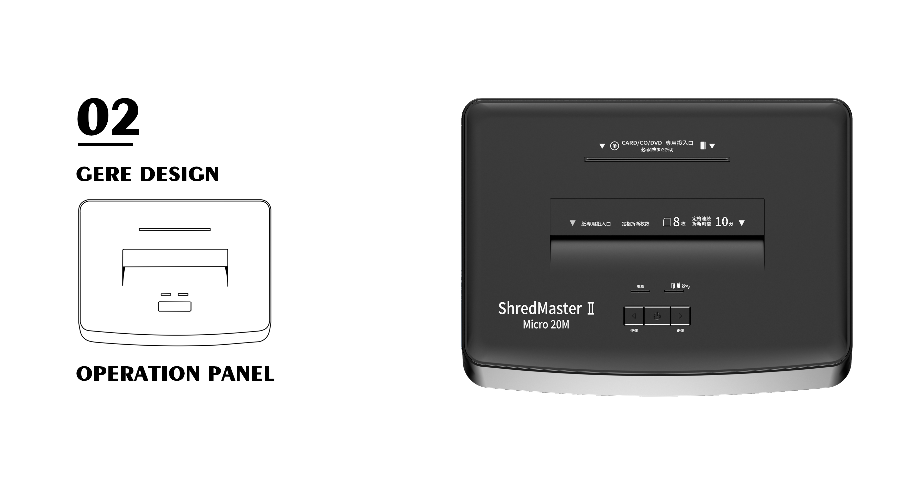
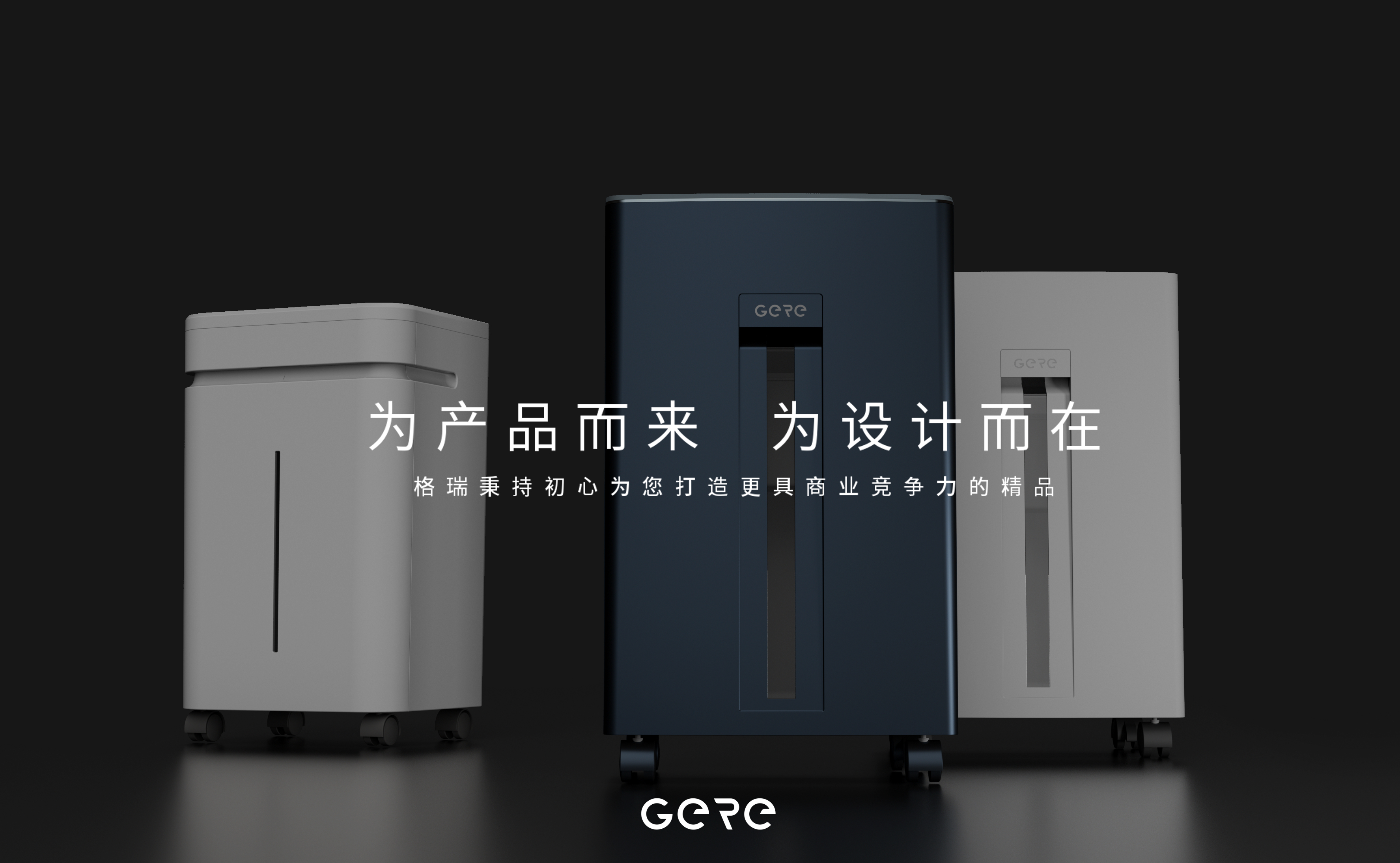
The same shredder body is designed with two different operating surface typesetting.
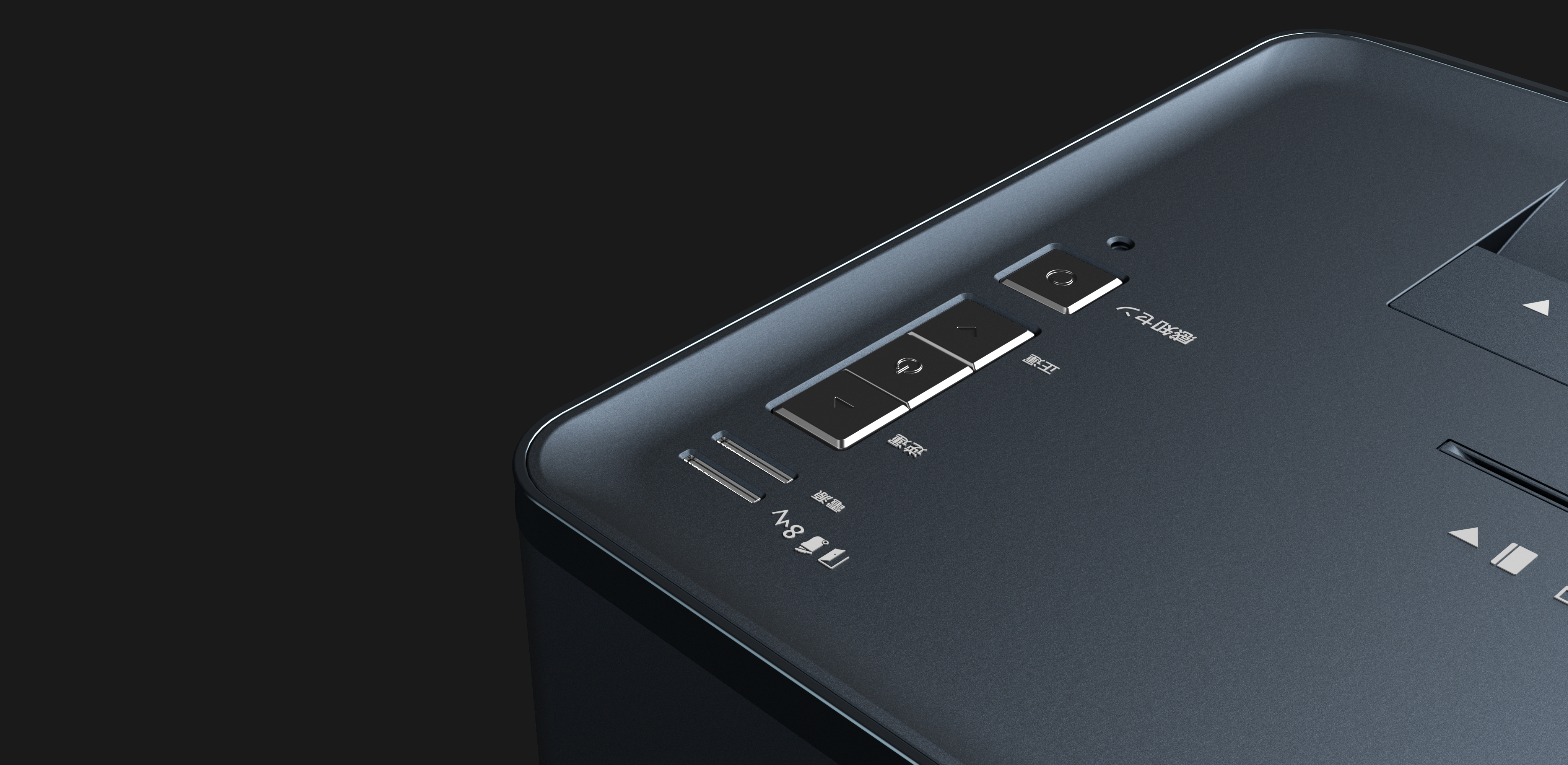
The paper shredding port, the dish shredding port and the switch keys are all set in the middle, which is the simple beauty of axisymmetric graphics. The key design close to the user better guarantees the convenience of use.
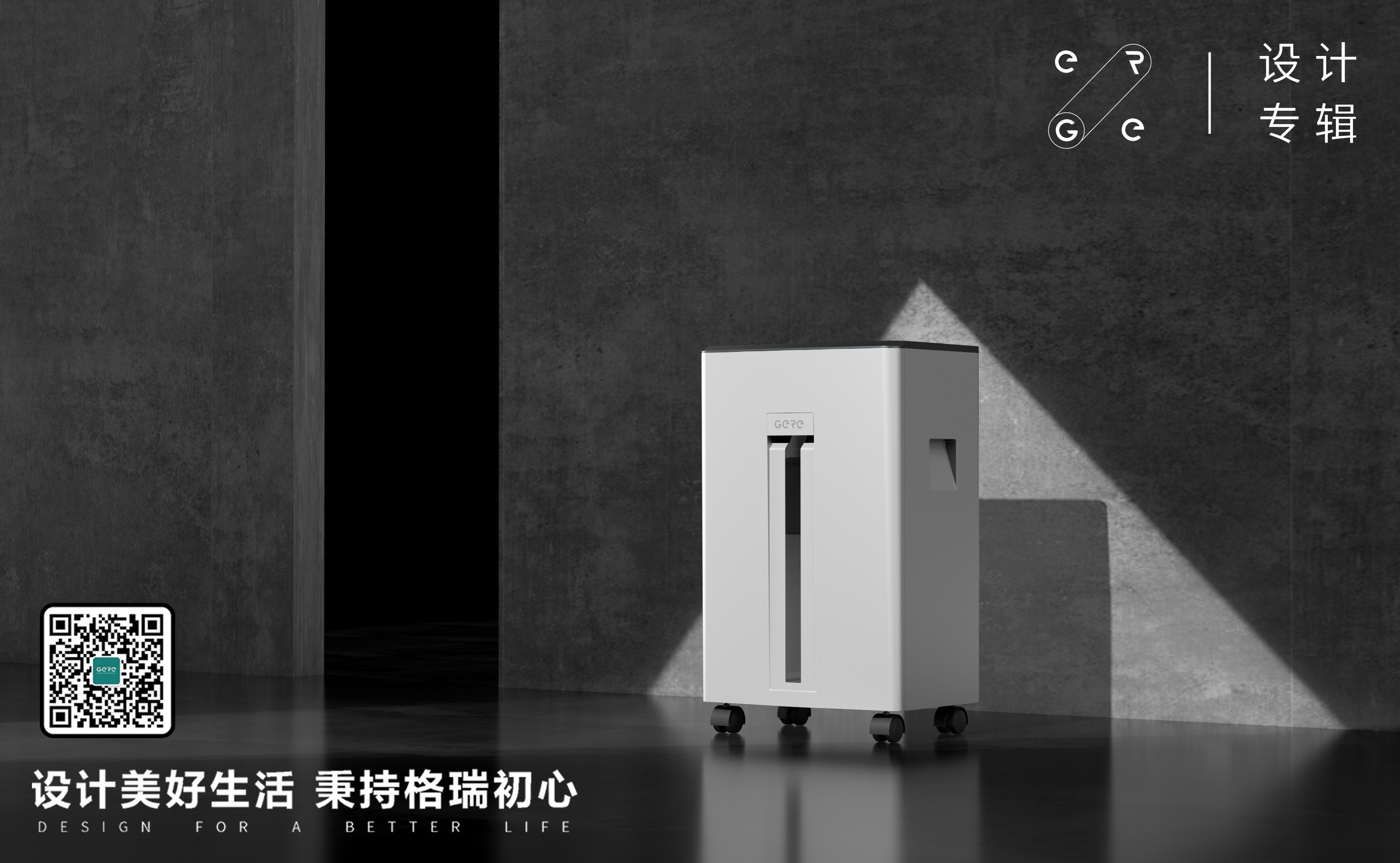
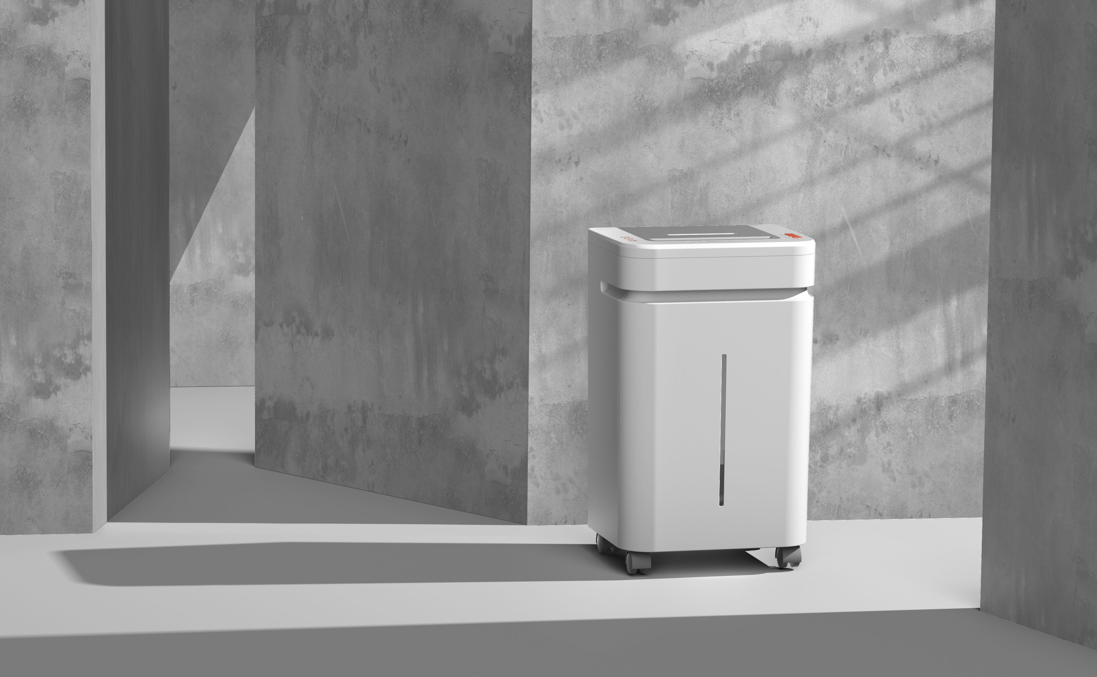
The universal wheel of the fuselage is designed to facilitate the moving shredder.
Black and white color matching can be freely matched with any style of interior decoration, classic does not disobey. Reflect design changes with texture.
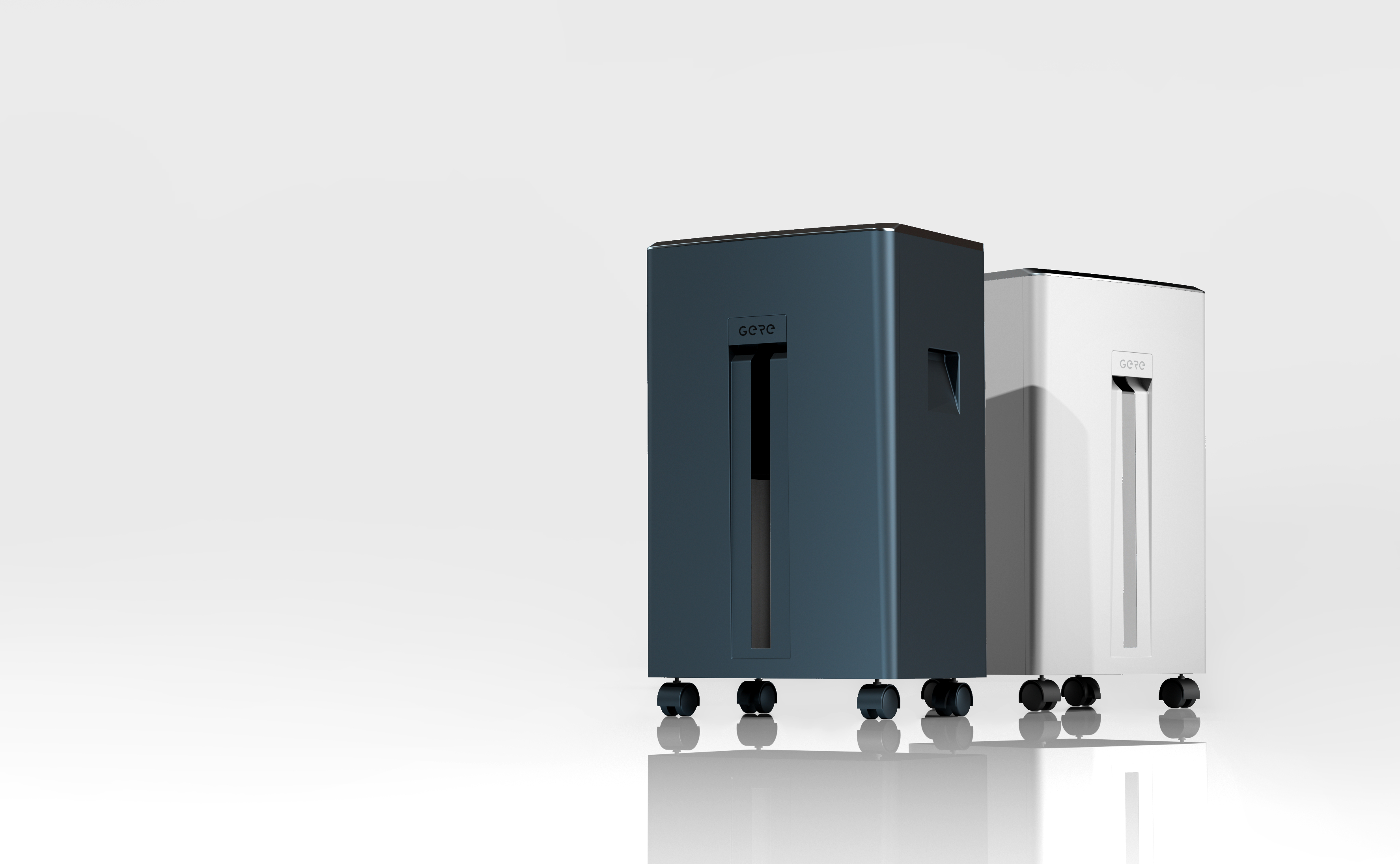
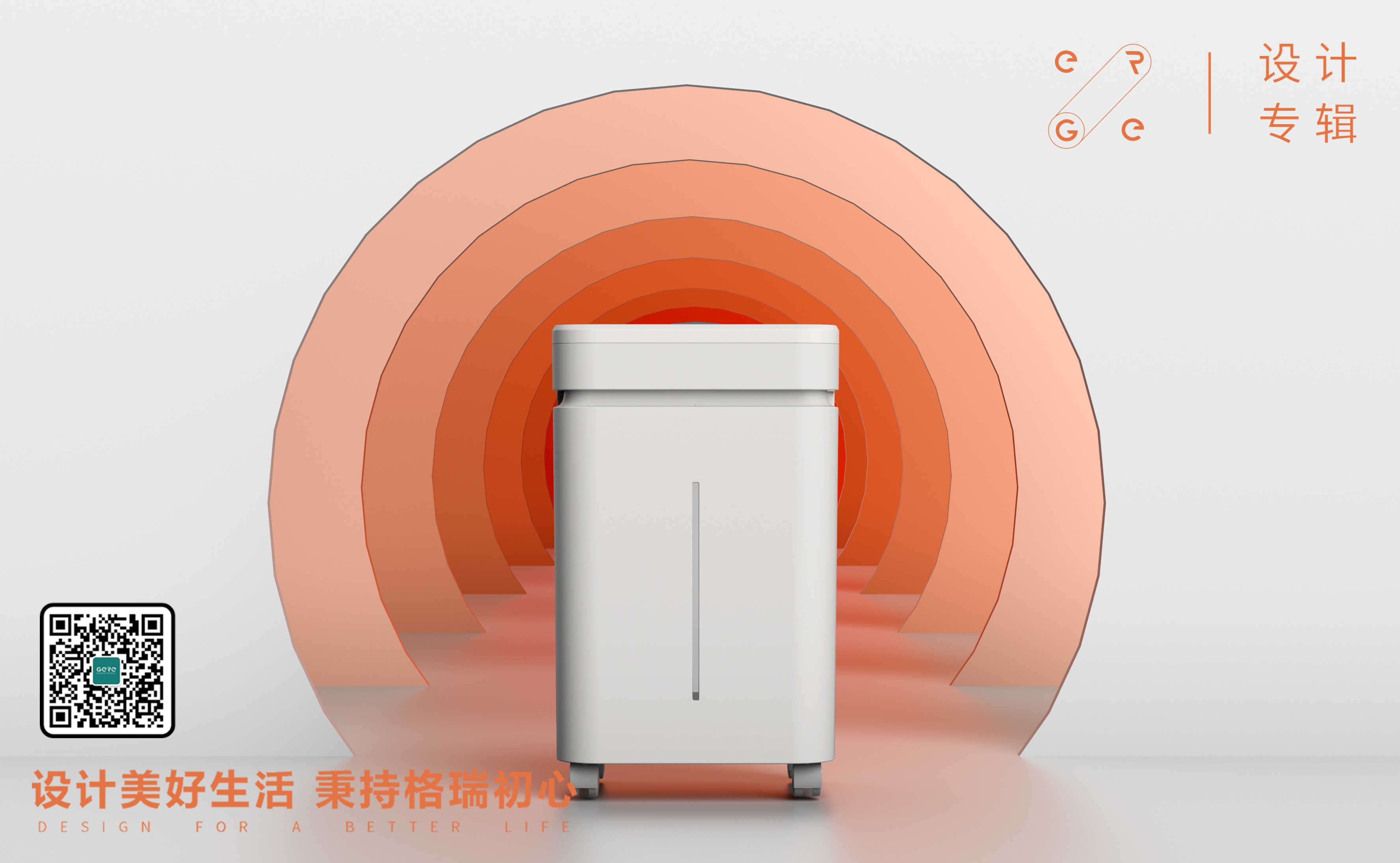
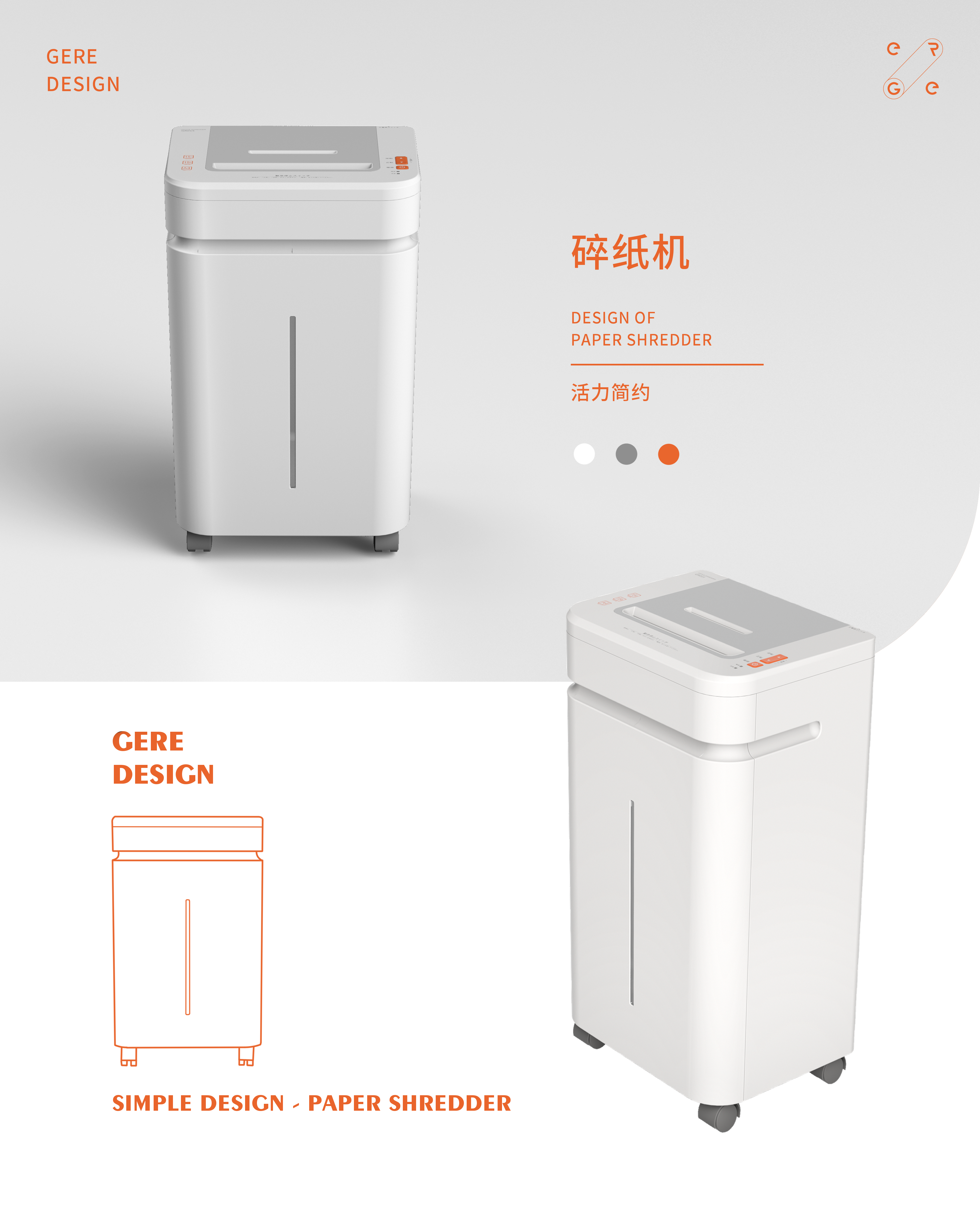
The gray body of the fuselage, with lively and bright orange, is more in line with the aesthetics of young people for color.
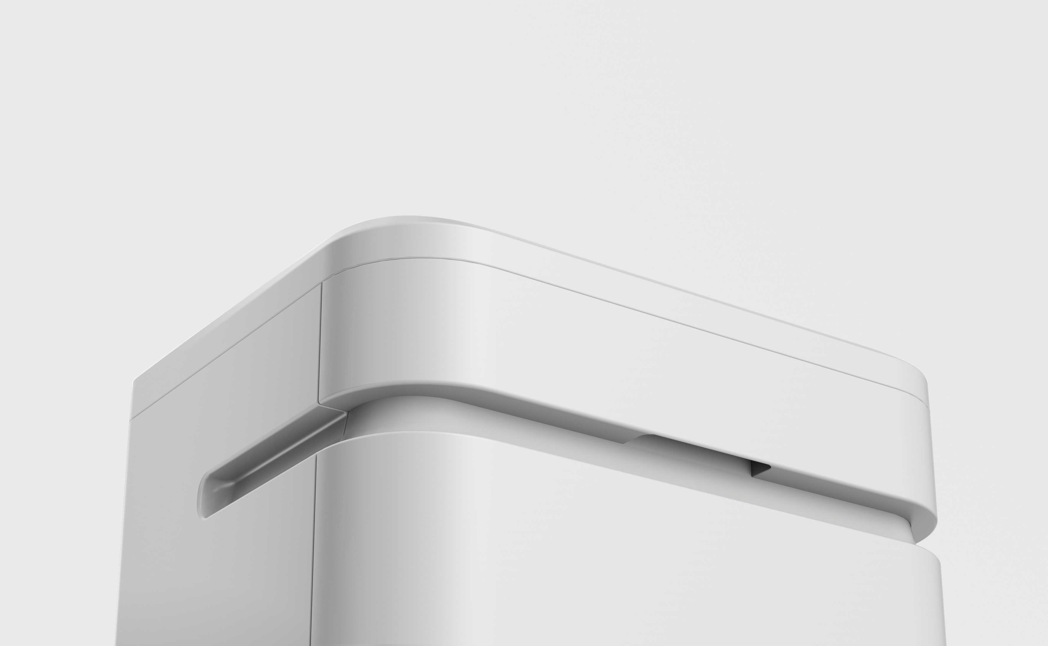
The oval groove that runs through three sides, that is, as a design point to break the whole, is also a shredded paper barrel and a handle for carrying on both sides.
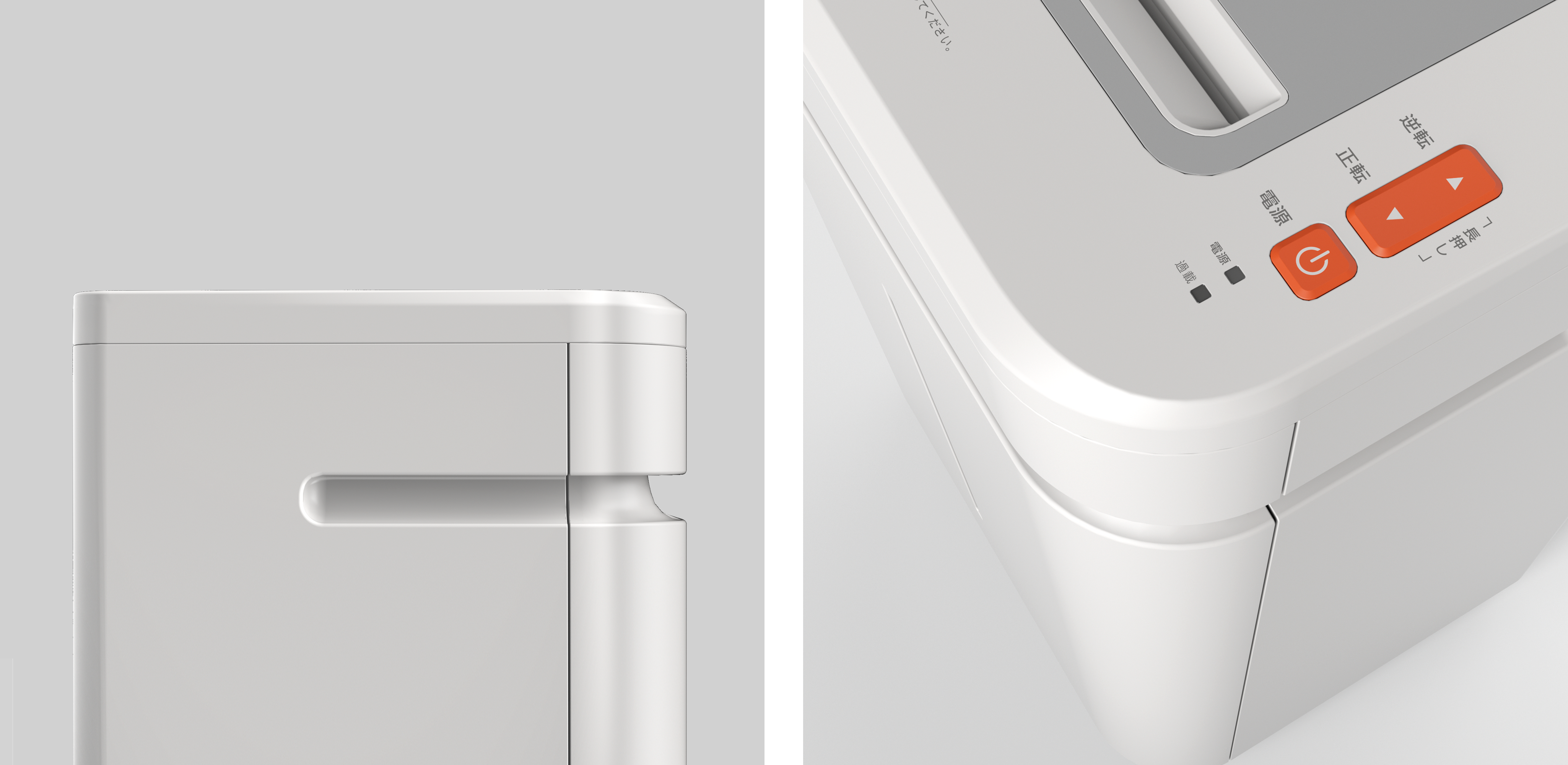
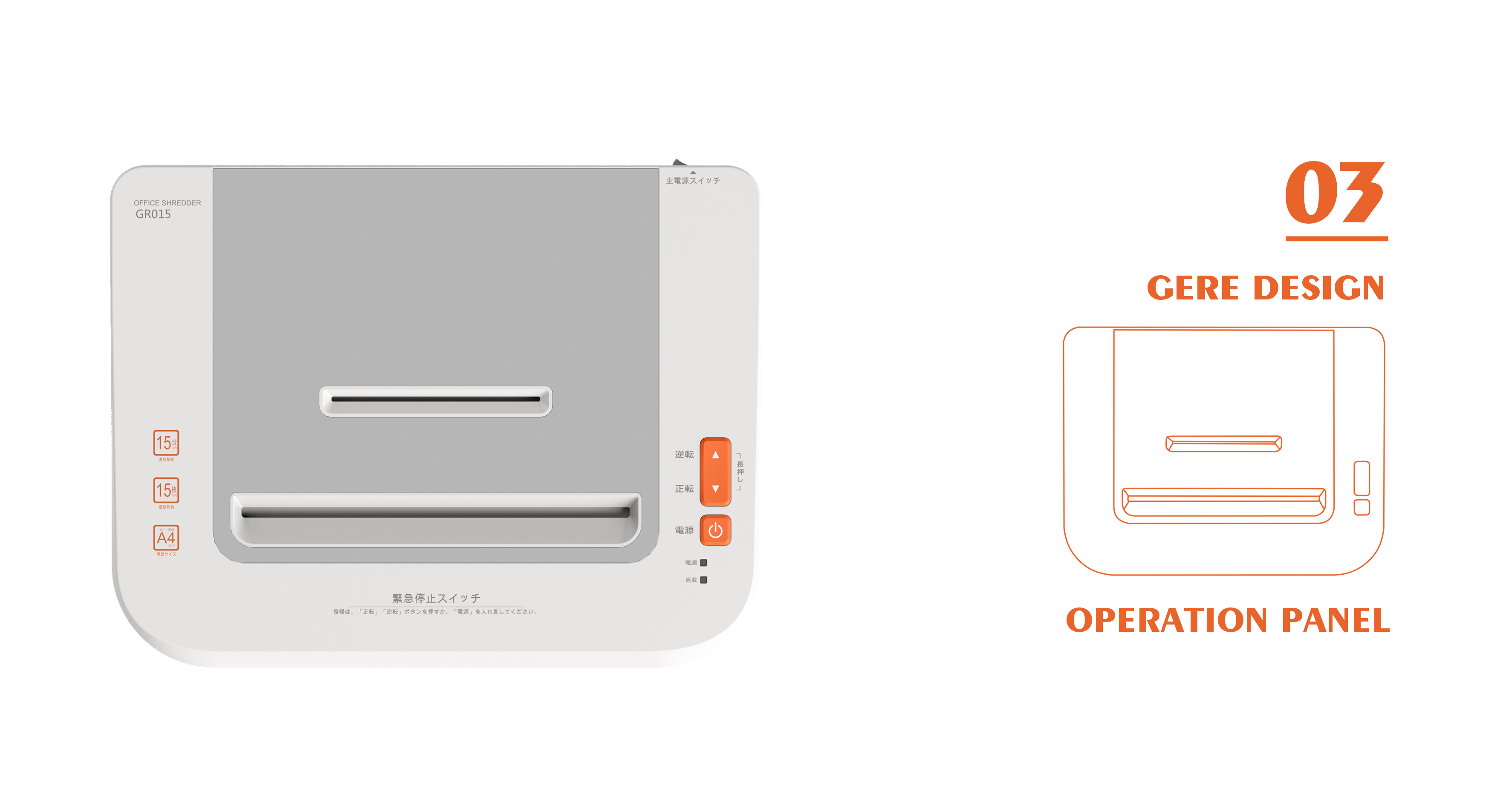
The operation panel divides the functional area by dividing gray and white color blocks.
Gray, gentle and concise, bright orange, bright and bright.
For more wonderful moving layout and excellent design sharing, please move to "Grey Public Number".
本作品版权归 格瑞工业设计 所有,禁止匿名转载及个人使用,任何商业用途均需联系原作者。

新用户?创建账号
登录 重置密码
请输入电子邮件以重置密码。


As a design company, you should design another "broken client"
On the whole, it is good, but it is less round.
The above is in traditional Chinese characters, is it produced in Hong Kong and Taiwan?
nice work!