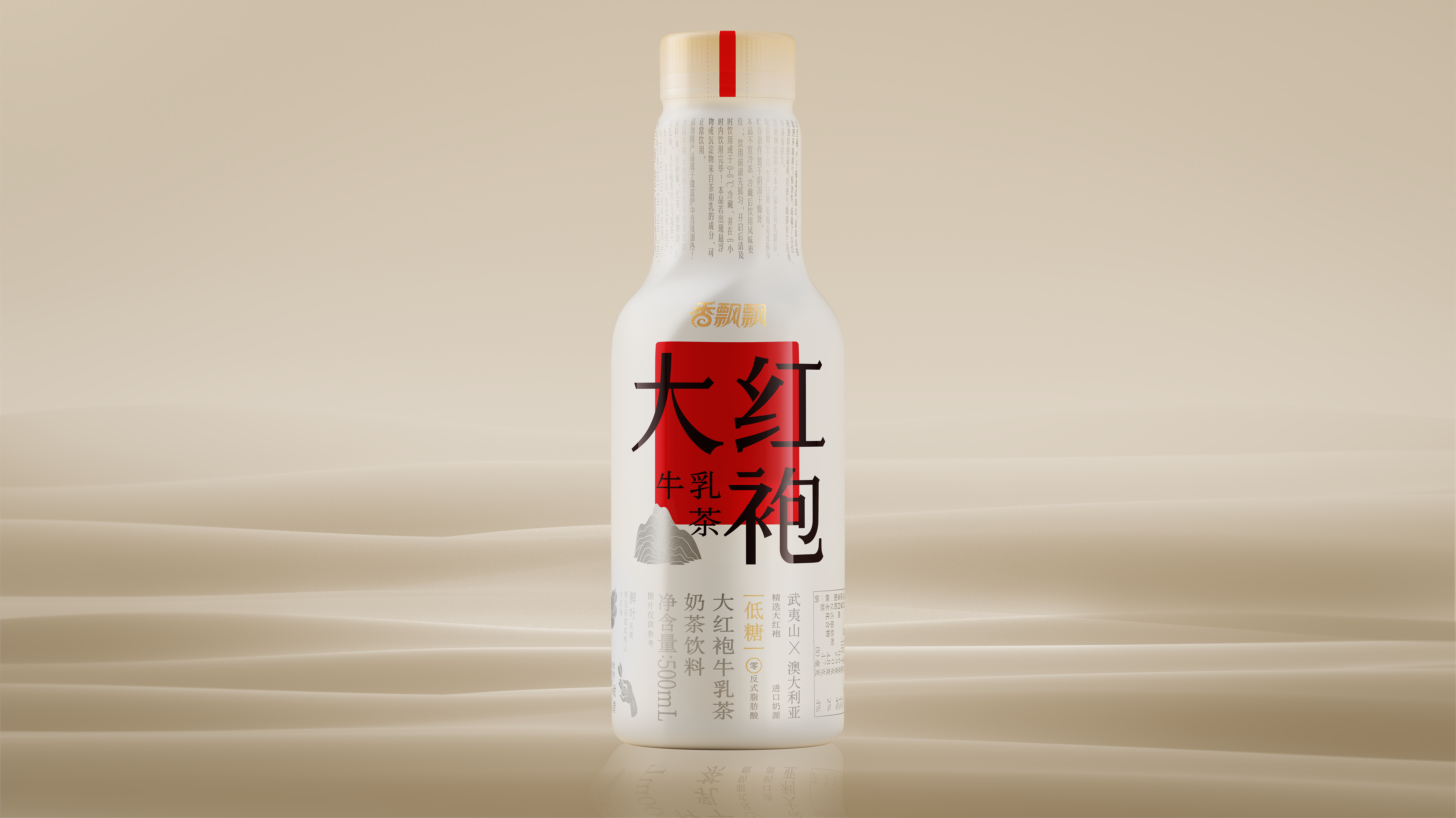
[fragrant Dahongpao milk tea] set off a new generation of bottled milk tea beverage revolution. Traditional oriental aesthetics collides with contemporary values, and how does Chinese tea use packaging as a carrier to realize the design expression of modernity in China.
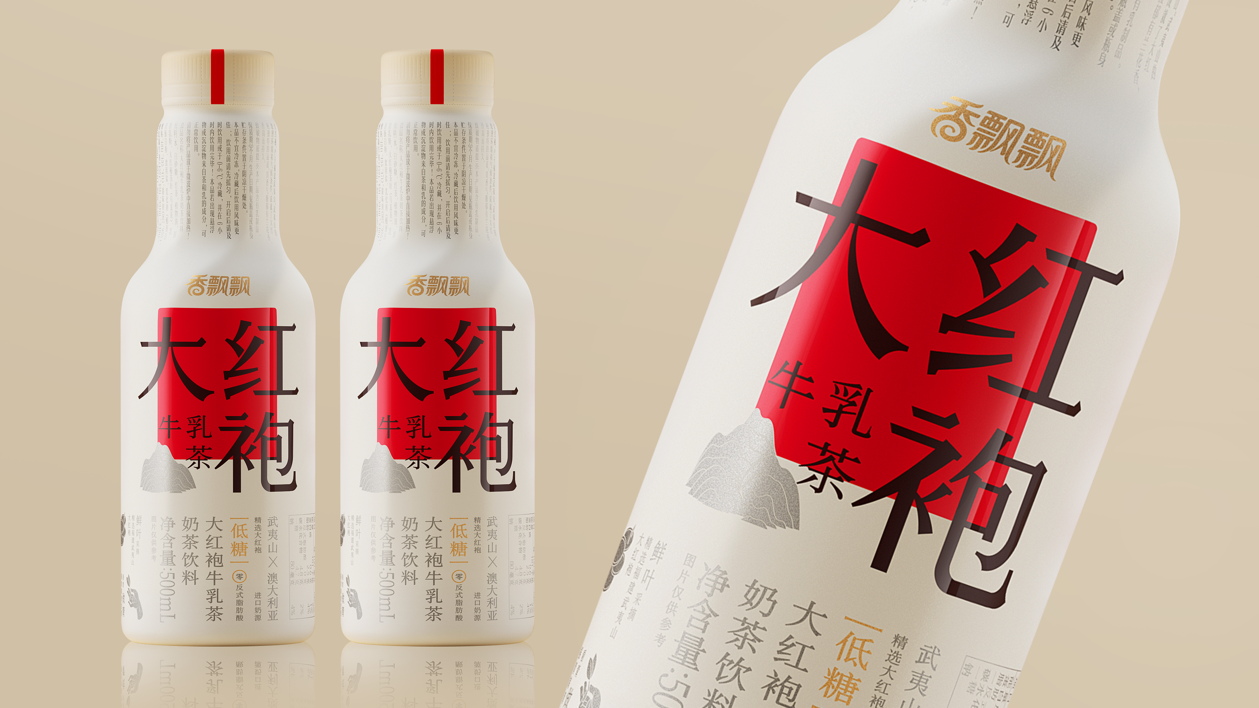
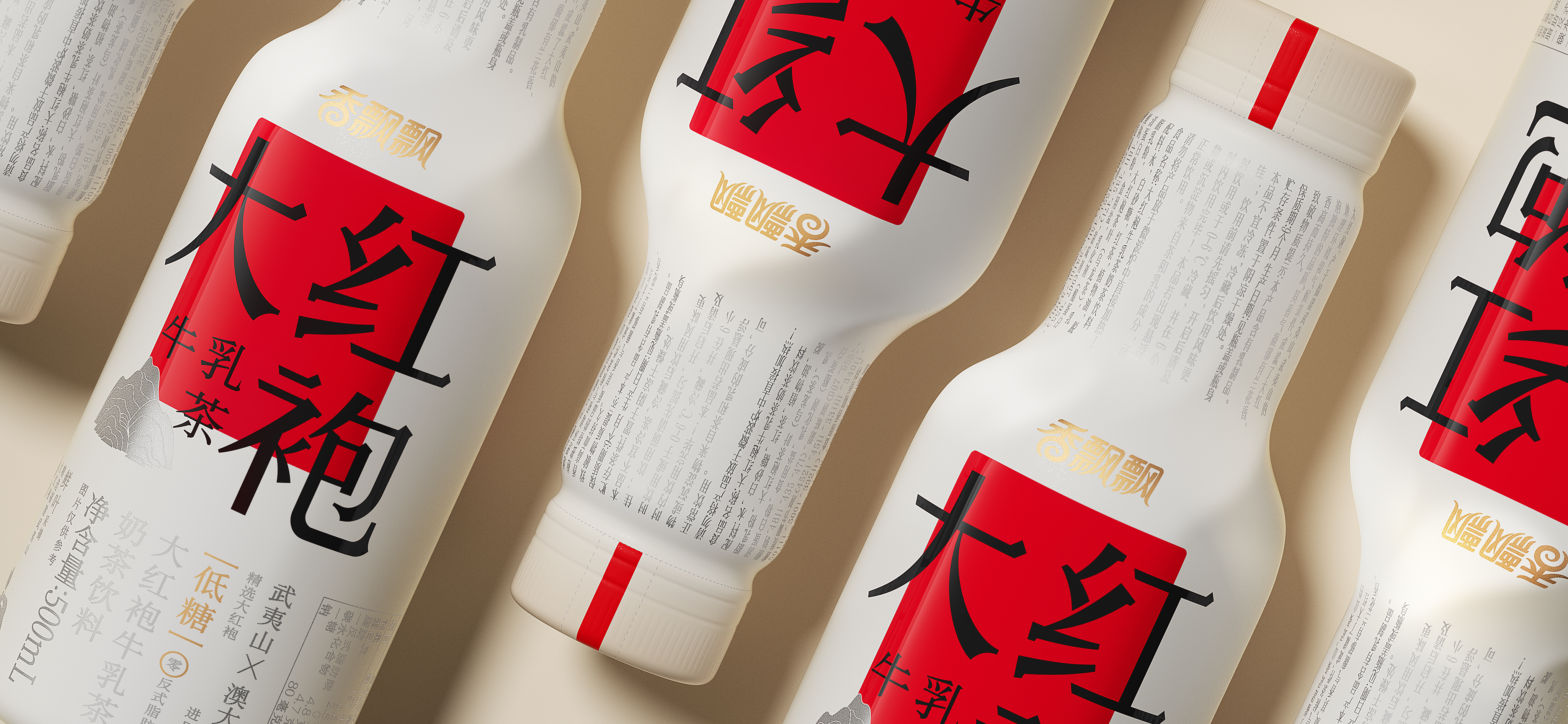
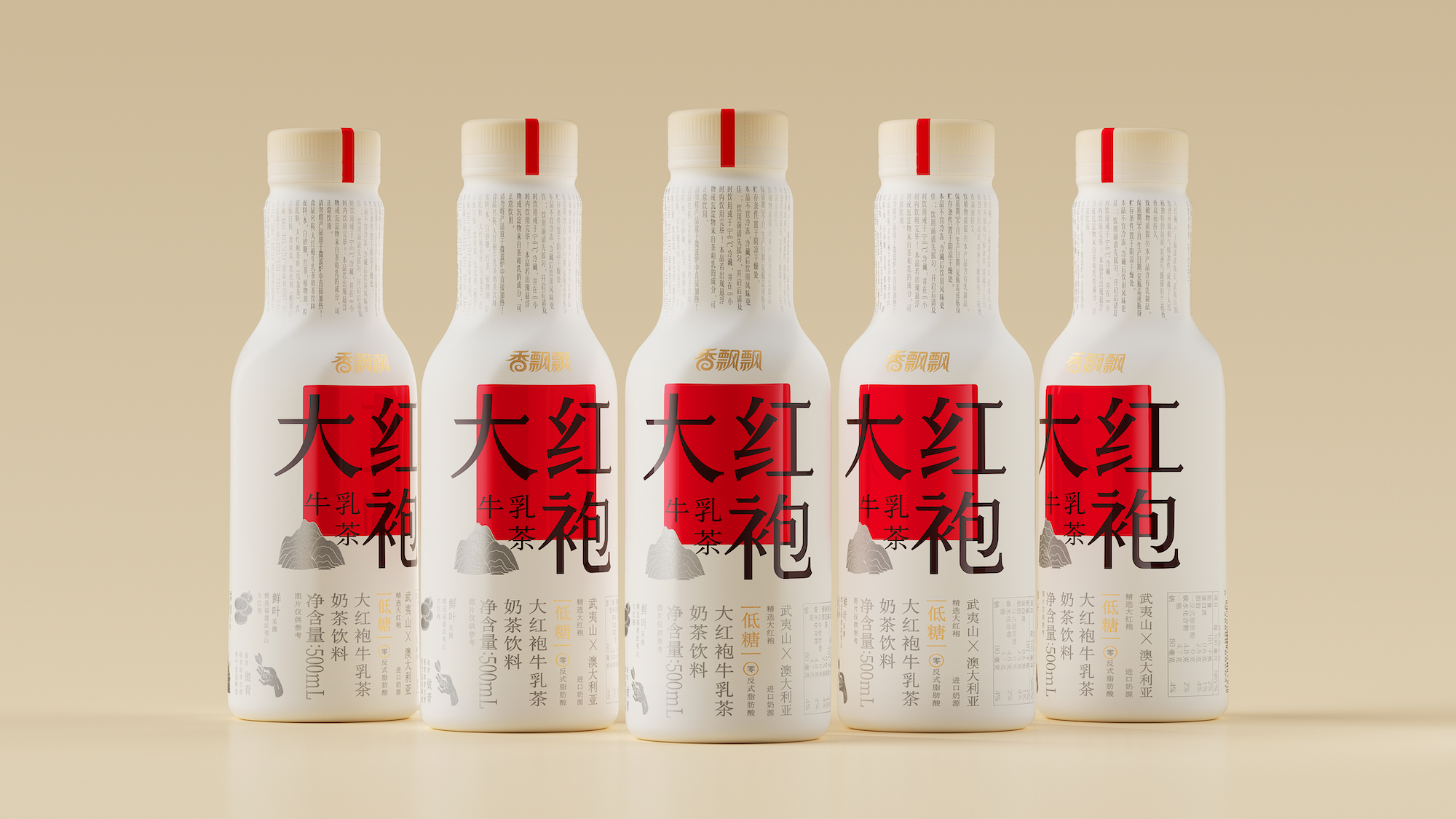
Our consumers [just look and don't listen]. Chinese characters are the most concise and powerful symbols of Chinese culture, retaining the Chinese vertical typesetting and reproducing the beauty of the movement.
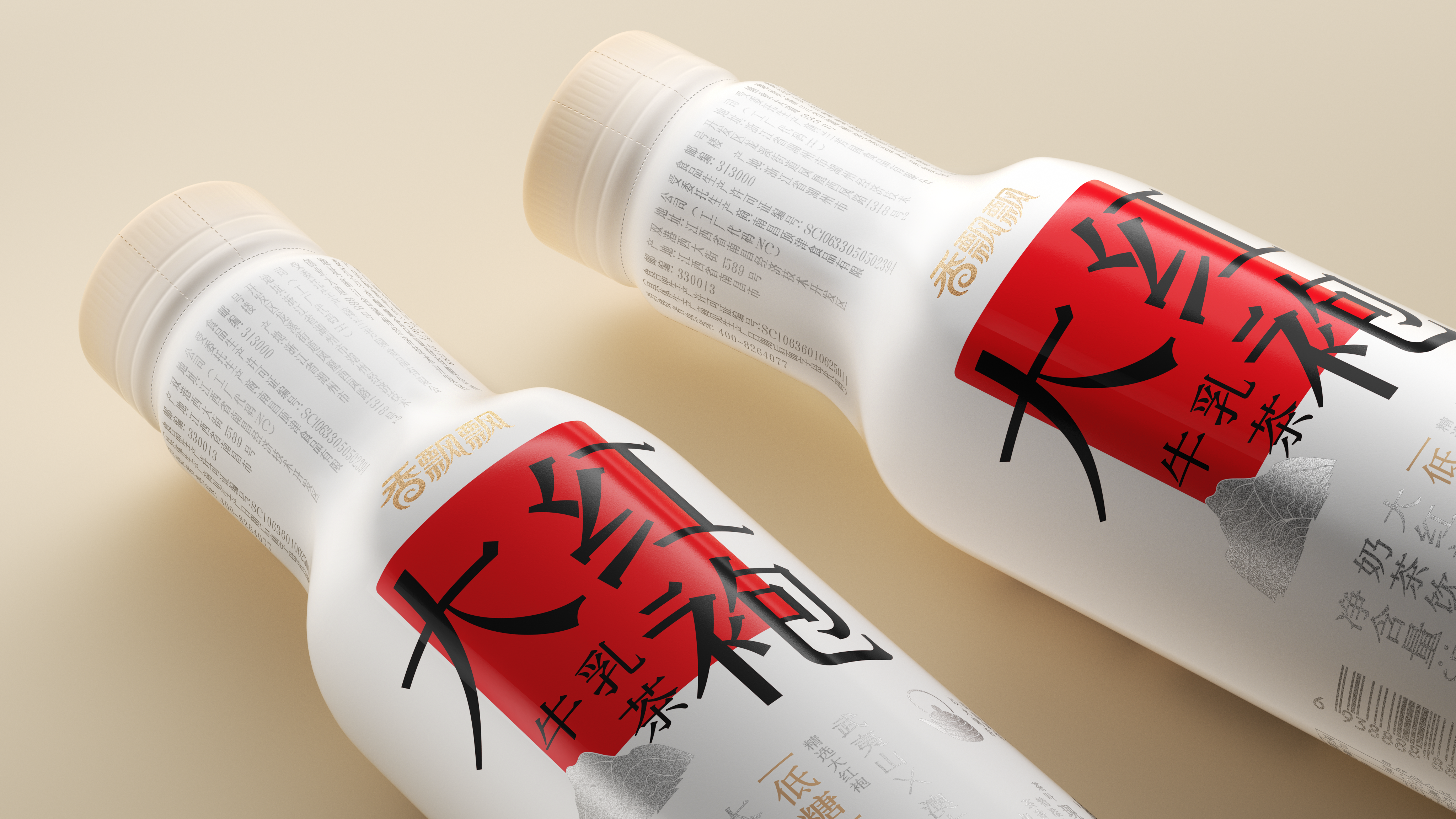
Less is more, flat graphic language highlights the core information more vivid and intuitive communication, the establishment of information level transmission of the beauty of Chinese white space, both the sense of large goods and innovative standards. Both milk and tea, looking for milk tea the most intuitive sense of silkiness. The whirlpool of extracted milk tea cleverly forms reinforcing ribs, and the three-dimensional expression becomes the original container symbol of fragrant and fluttering.
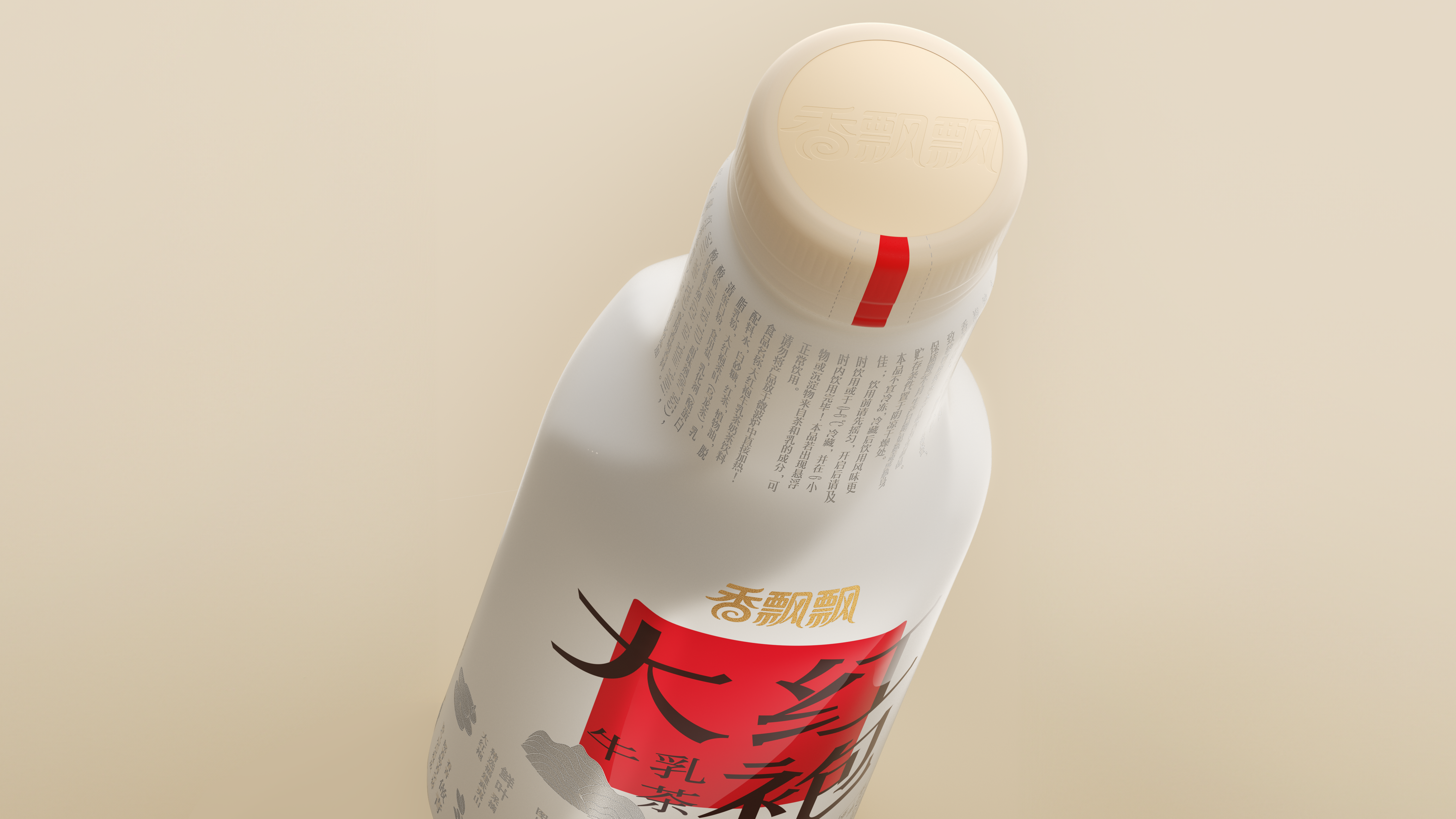
The user experience is maximized between square inches, and repeated experiments are carried out to shake hands. Add easy-to-tear mouth guidelines at the bottle wrap to provide consumers
More silky tea feeling.
Name of Work | Fragrant Dahongpao Milk Tea
Brand Holding | Xiangfluttering Food Co., Ltd.
Original Design | Pan Hu
Executive Design | Chen Yiwen Duan Ruochen
Visual Presentation | Ma Chao Zhu Yuling
Process Design | Xie Zhangkun
Project Management | General
Media Relations | Xiang Lingli
本作品版权归 潘虎设计实验室 所有,禁止匿名转载及个人使用,任何商业用途均需联系原作者。

新用户?创建账号
登录 重置密码
请输入电子邮件以重置密码。


The bottle cap is not easy to open. Why do you need to wrap a layer of plastic when you can open it directly? Moreover, after the bottle cap is opened, the plastic is not neat and the visual elements of the bottle body are ugly.
The Japanese taste is too heavy, and the red ones are too stingy.
Is it good to drink
It's so interesting
Chinese wind