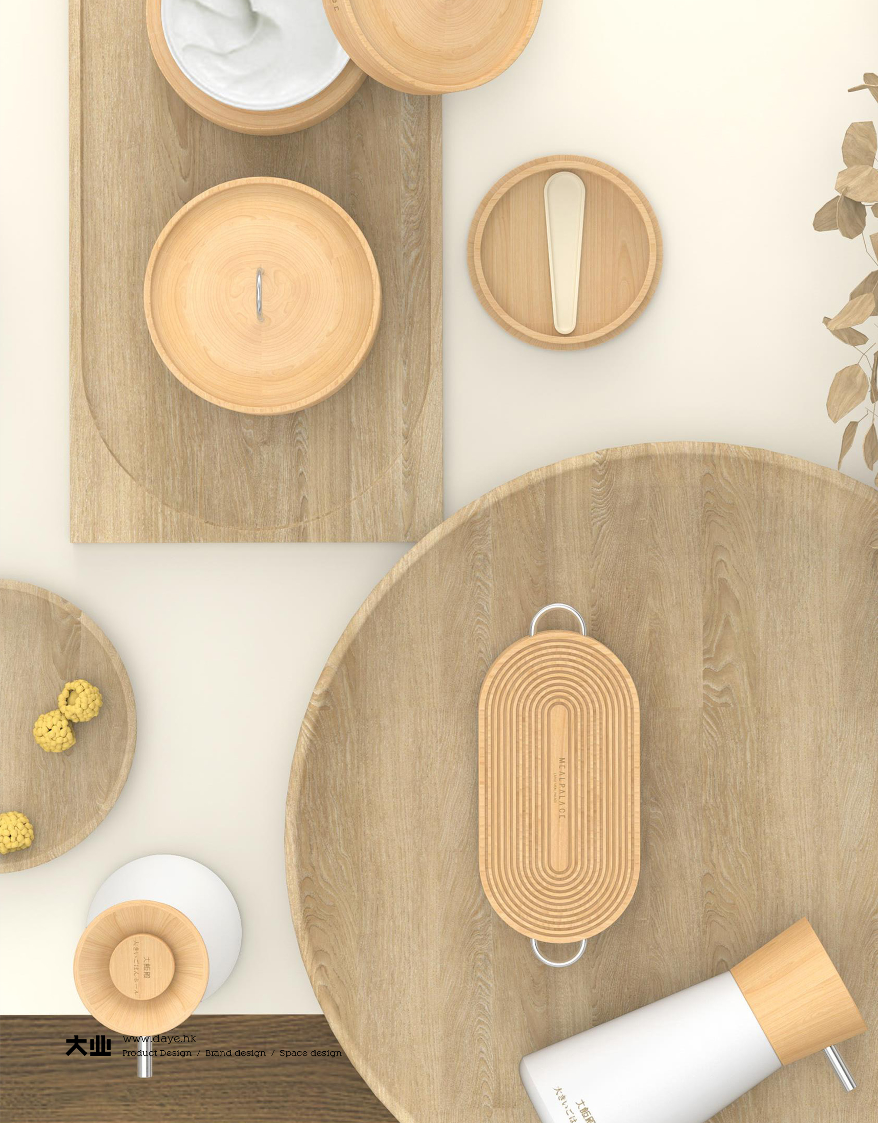
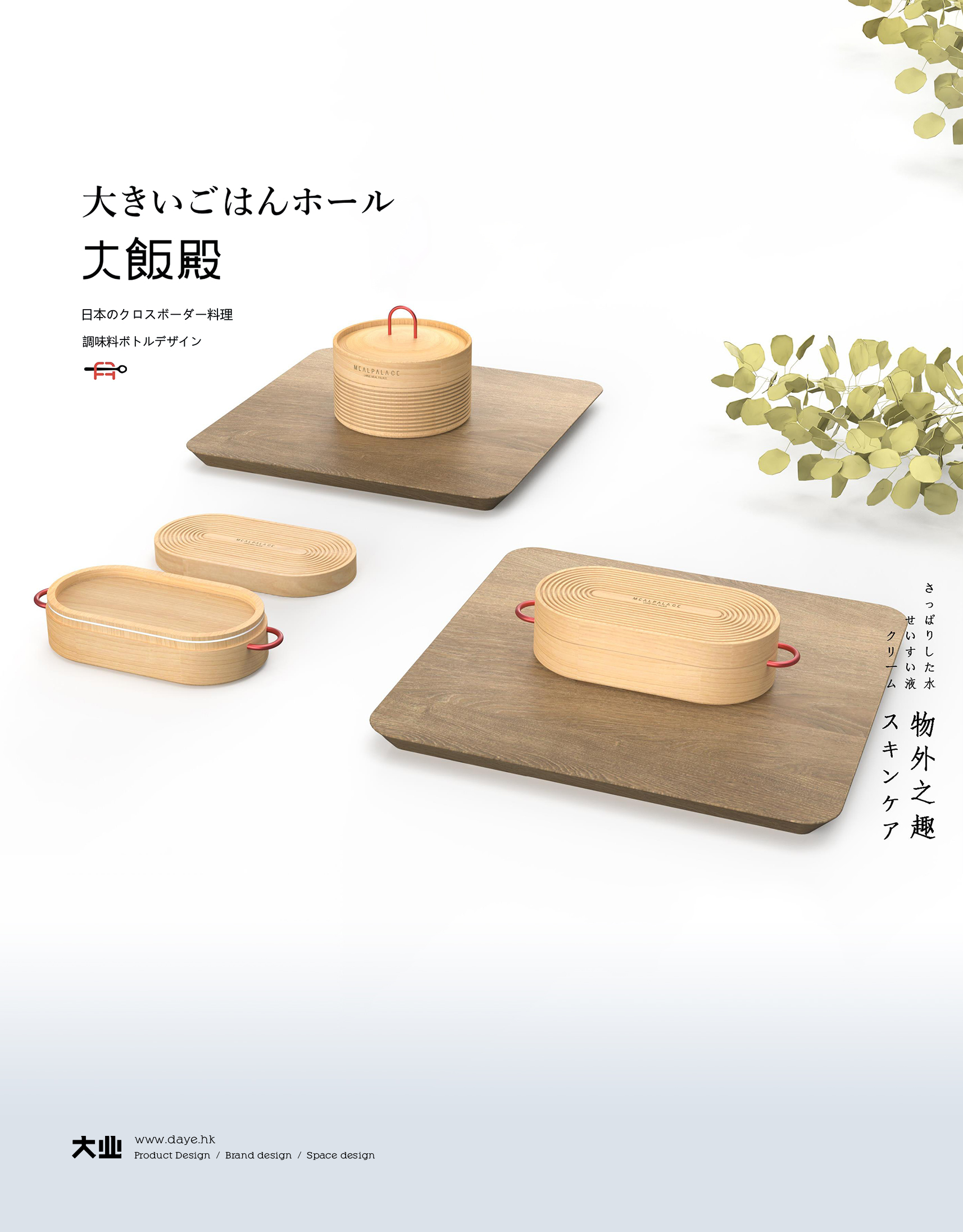
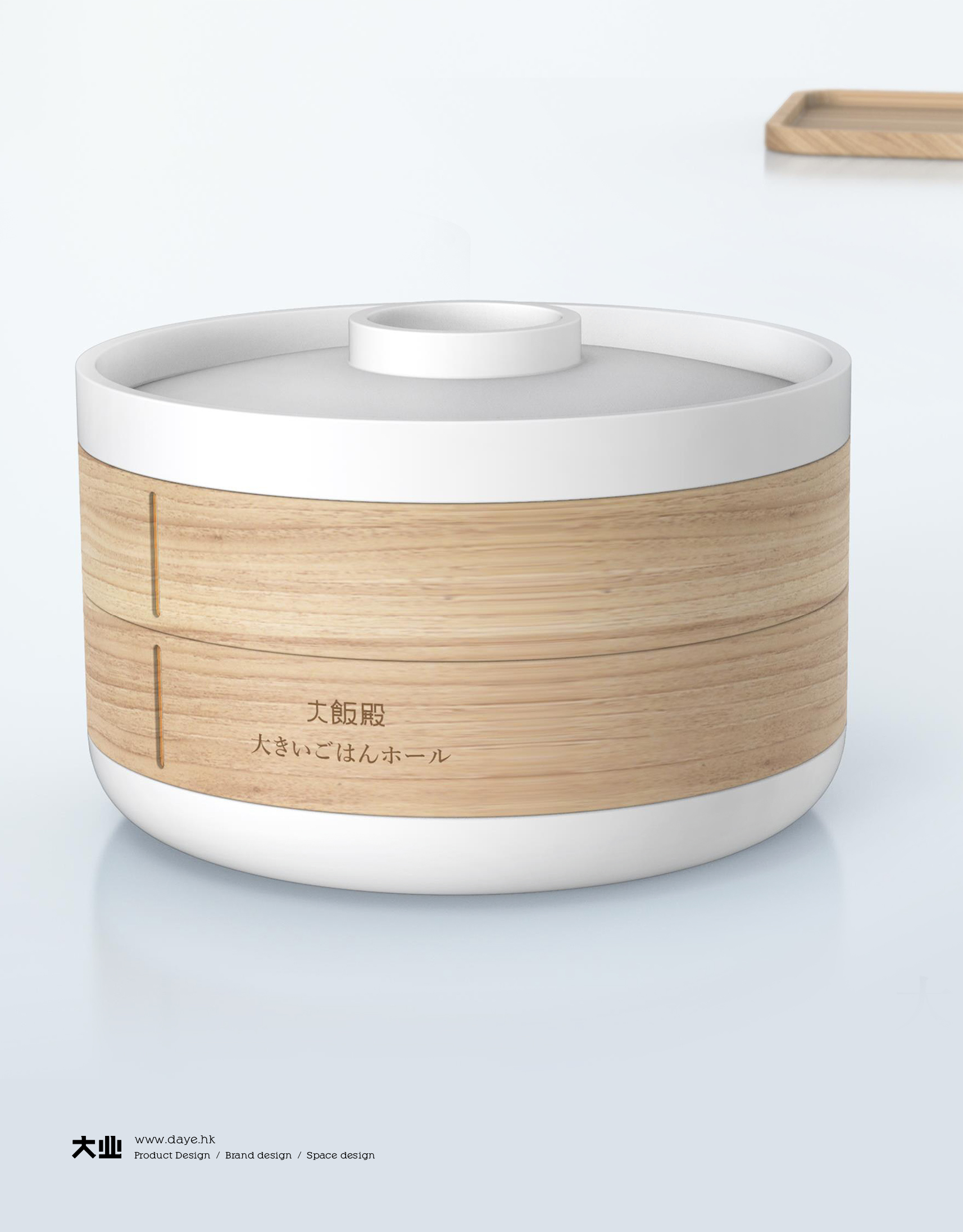
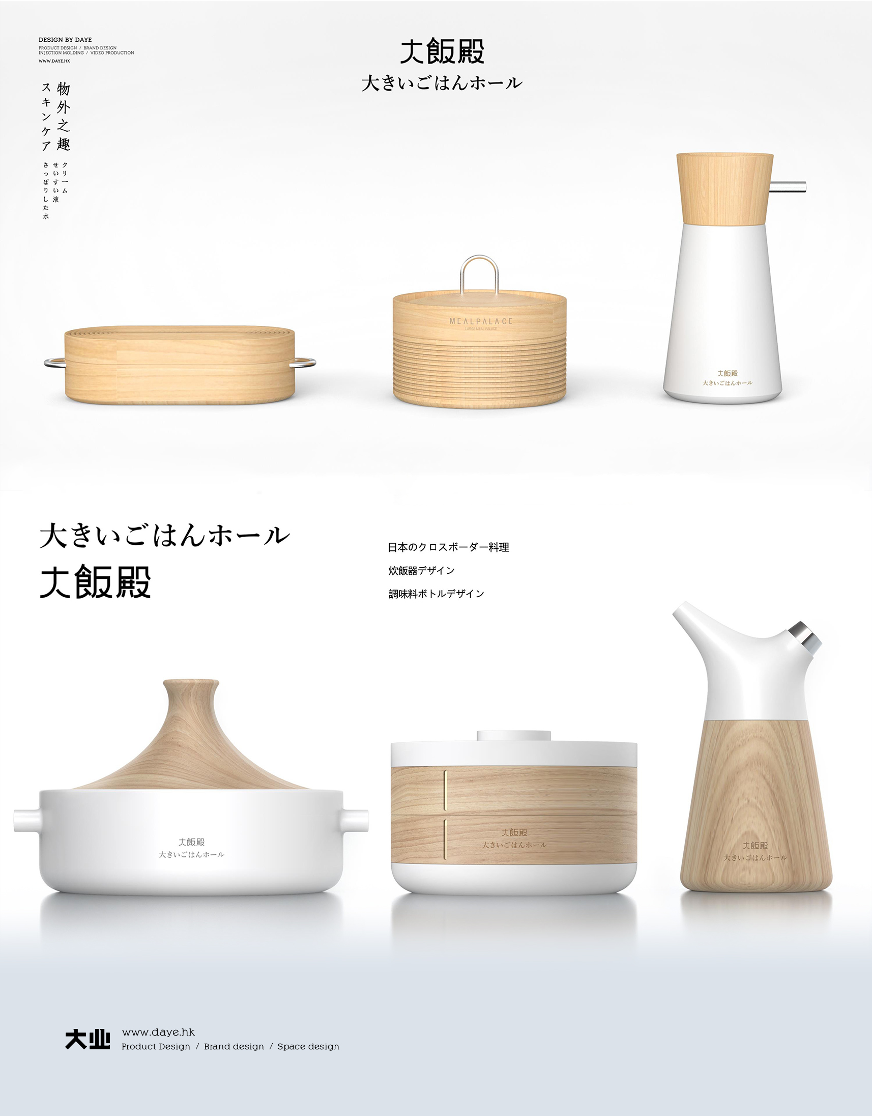
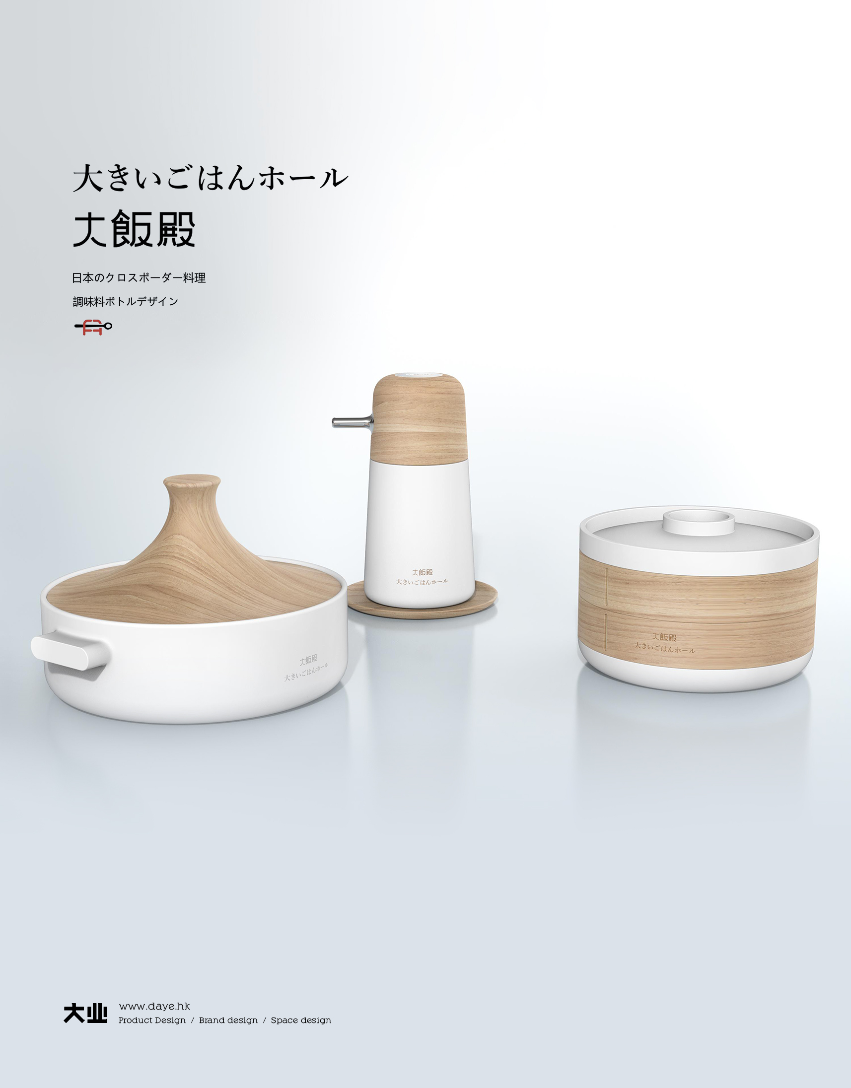
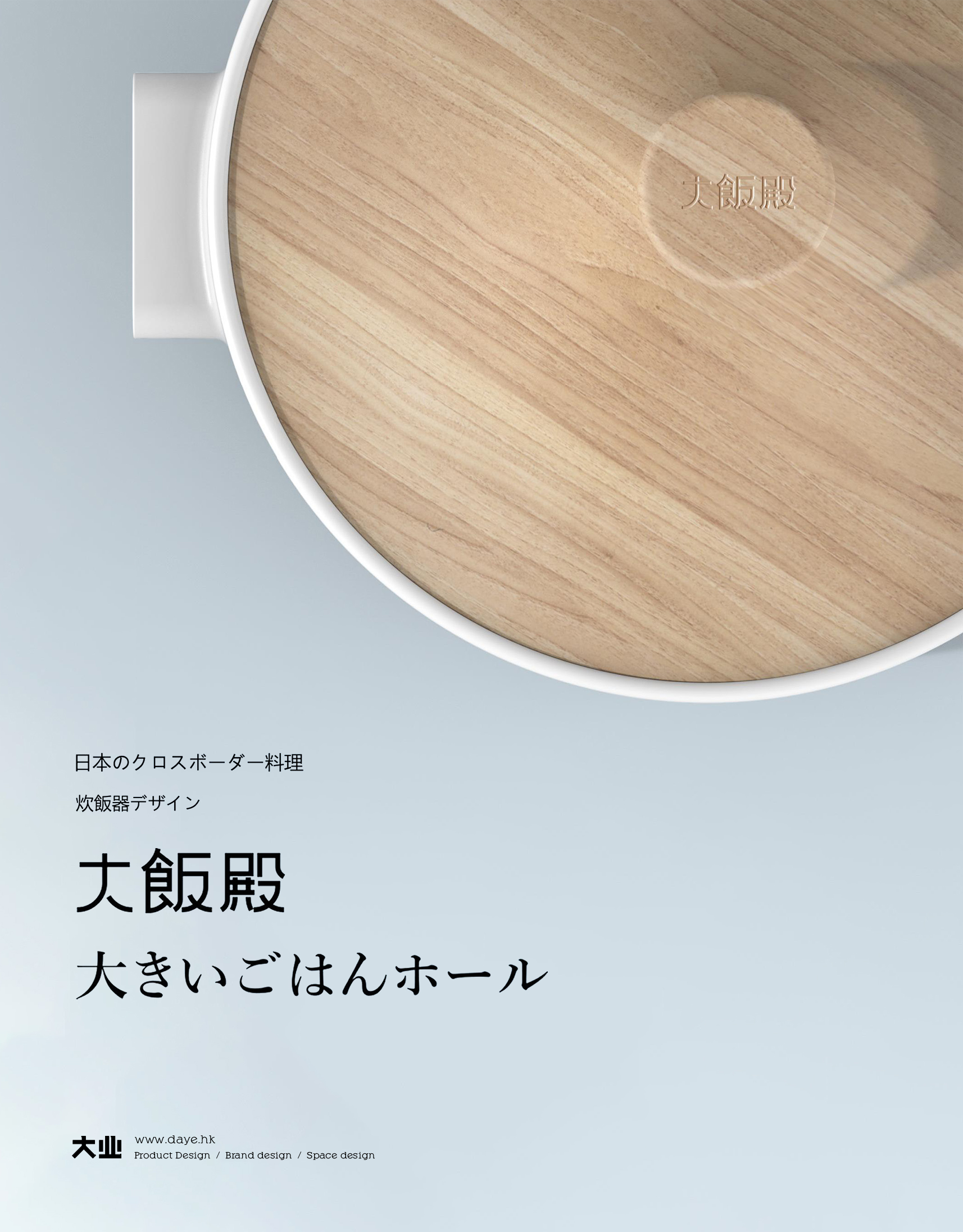
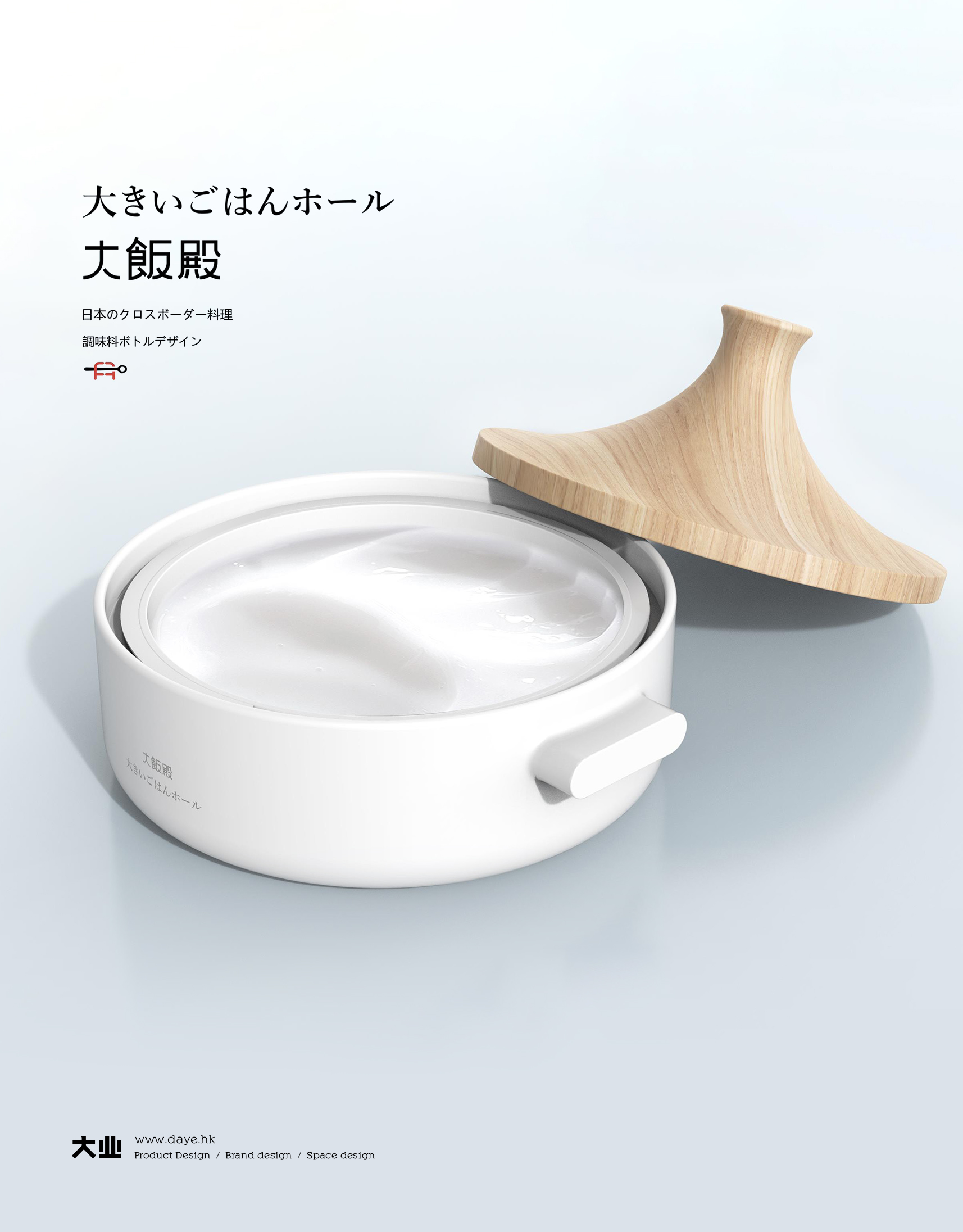
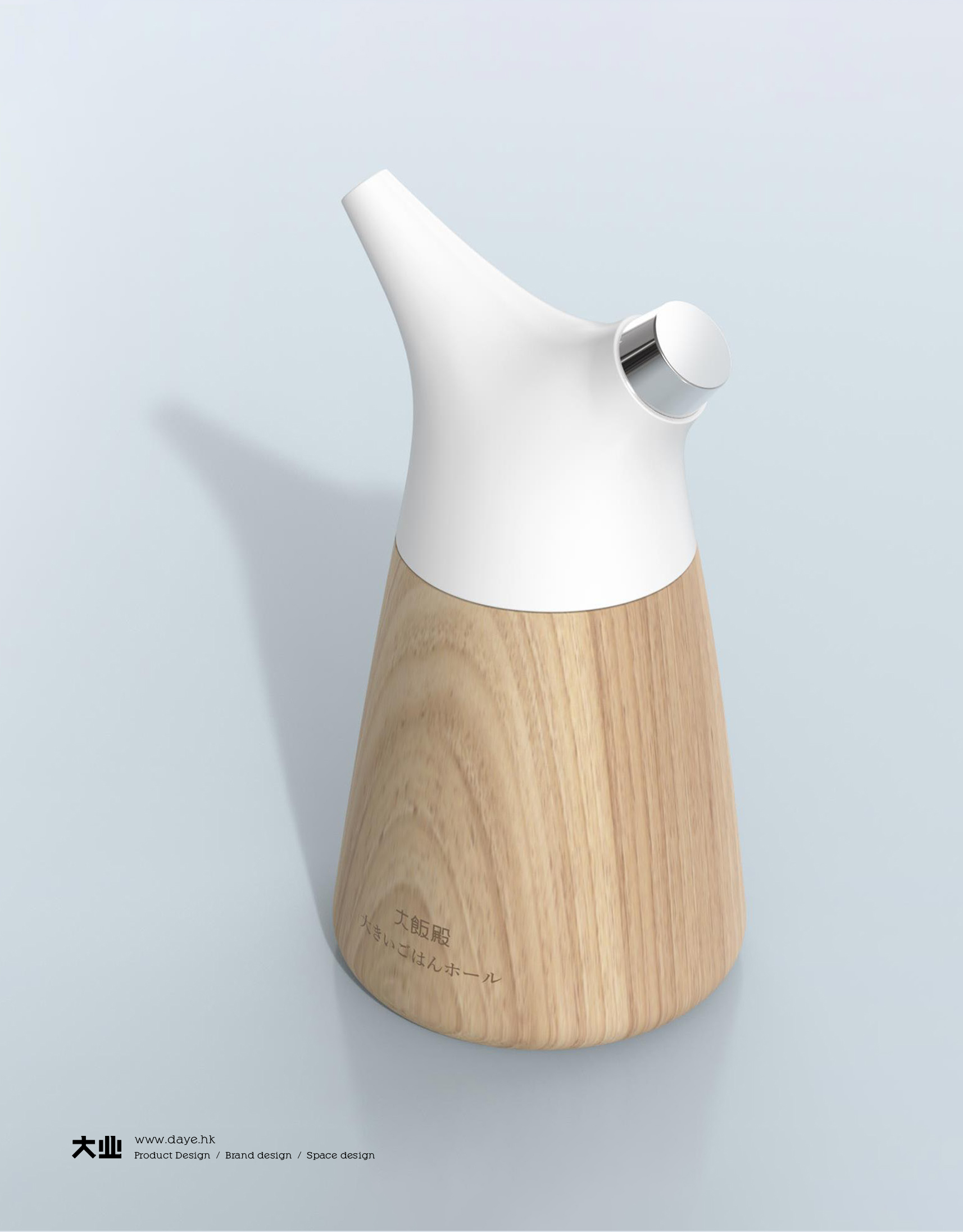
When Japanese food culture meets Chinese skin care brand, rice essence skin care set
2021-04-28
Other Industries
5054
7
37
关注
私信

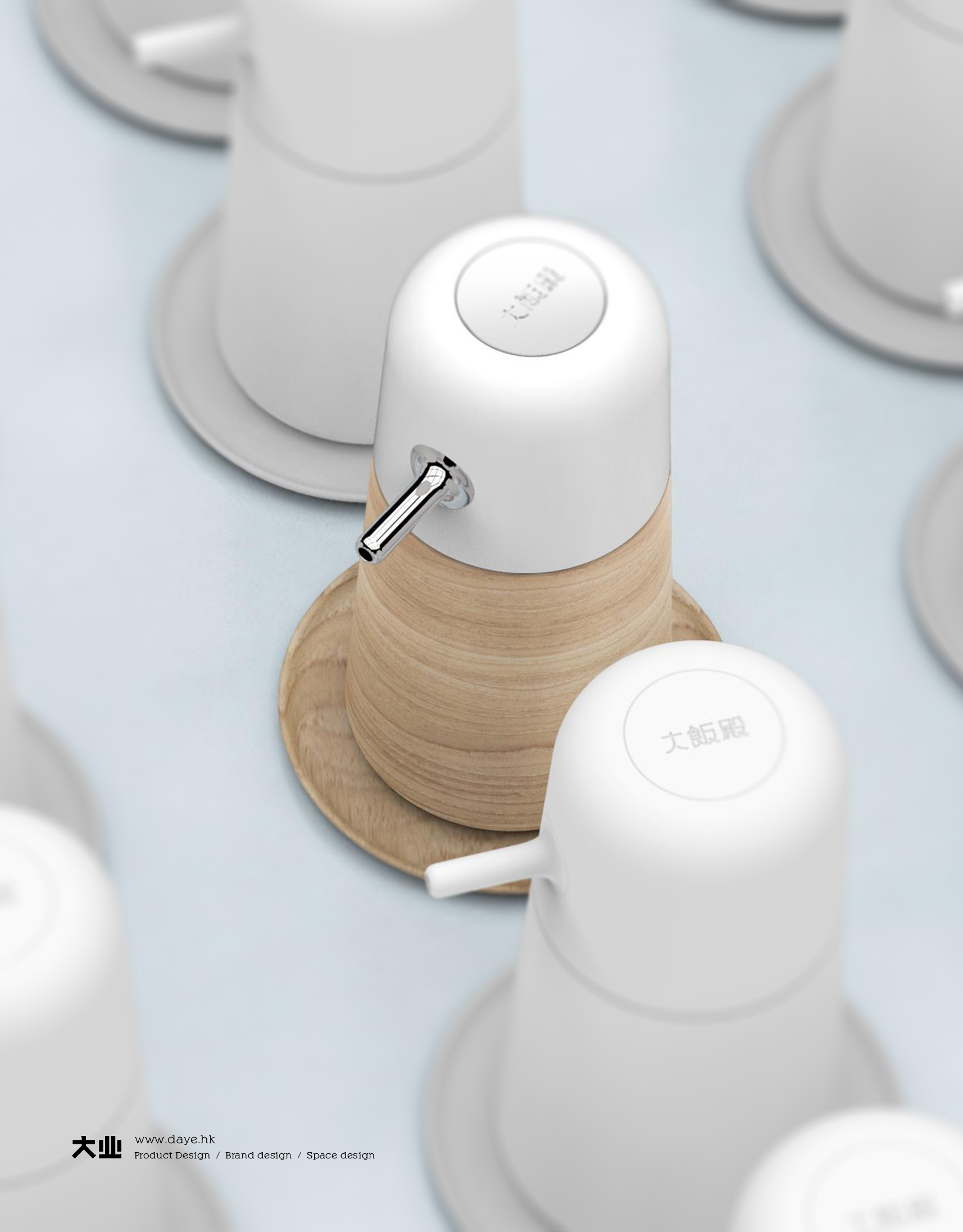

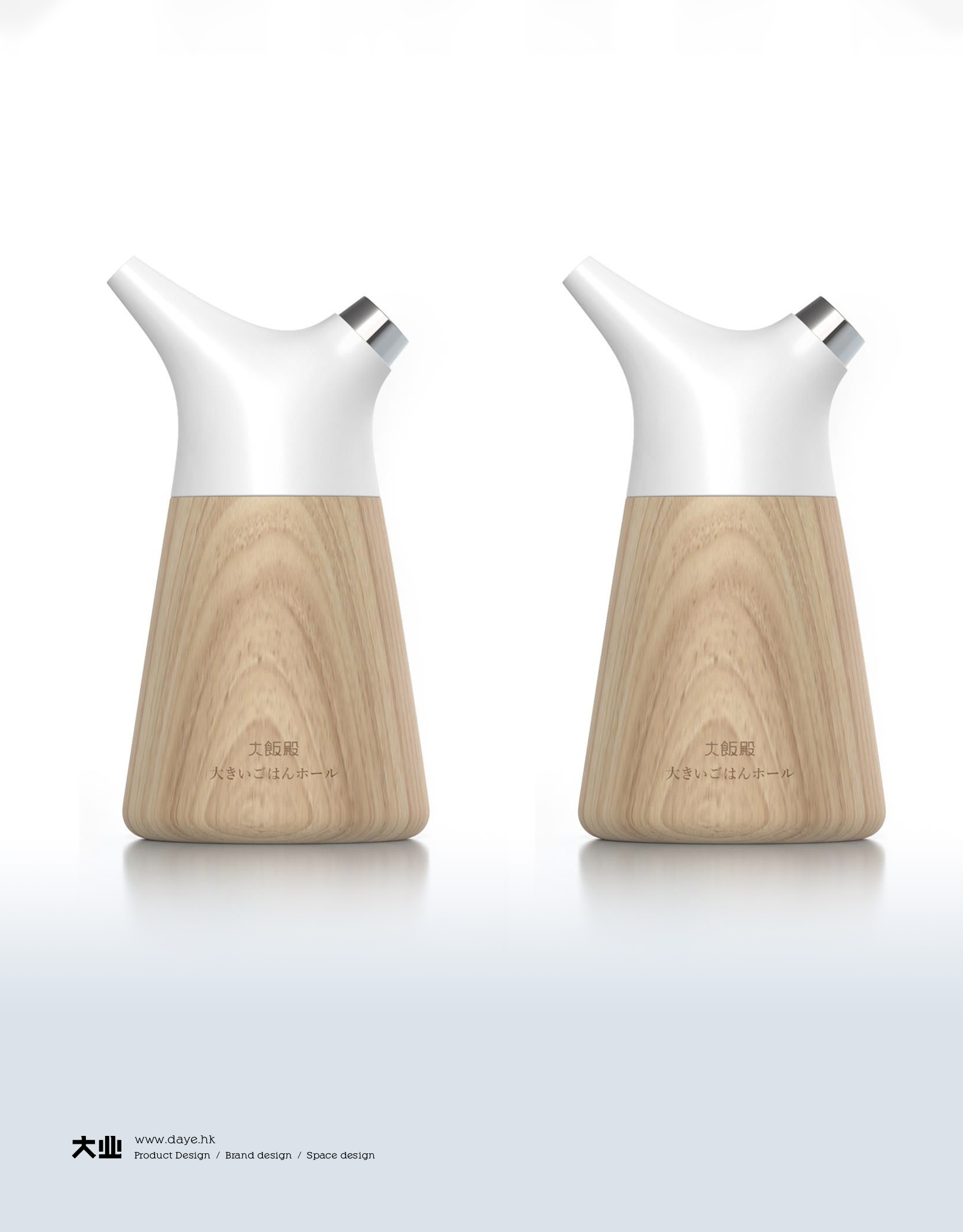


I privately think that the most feared thing about design is to let users misunderstand the wrong way of using it. Although I have always appreciated Daye design, I have to say that it will definitely make people eat directly when they open it. It is not marked with words to eliminate such misunderstandings. Good design does not need words to speak, and the product itself can speak.
Take my family as an example. It has happened that when the detergent is put in a beverage bottle, other people drink a big gulp when they go home and get thirsty, and finally go to the hospital to wash their stomachs. Therefore, it is best not to mix it up and make people misunderstand. Designers are also responsible for unnecessary accidents.
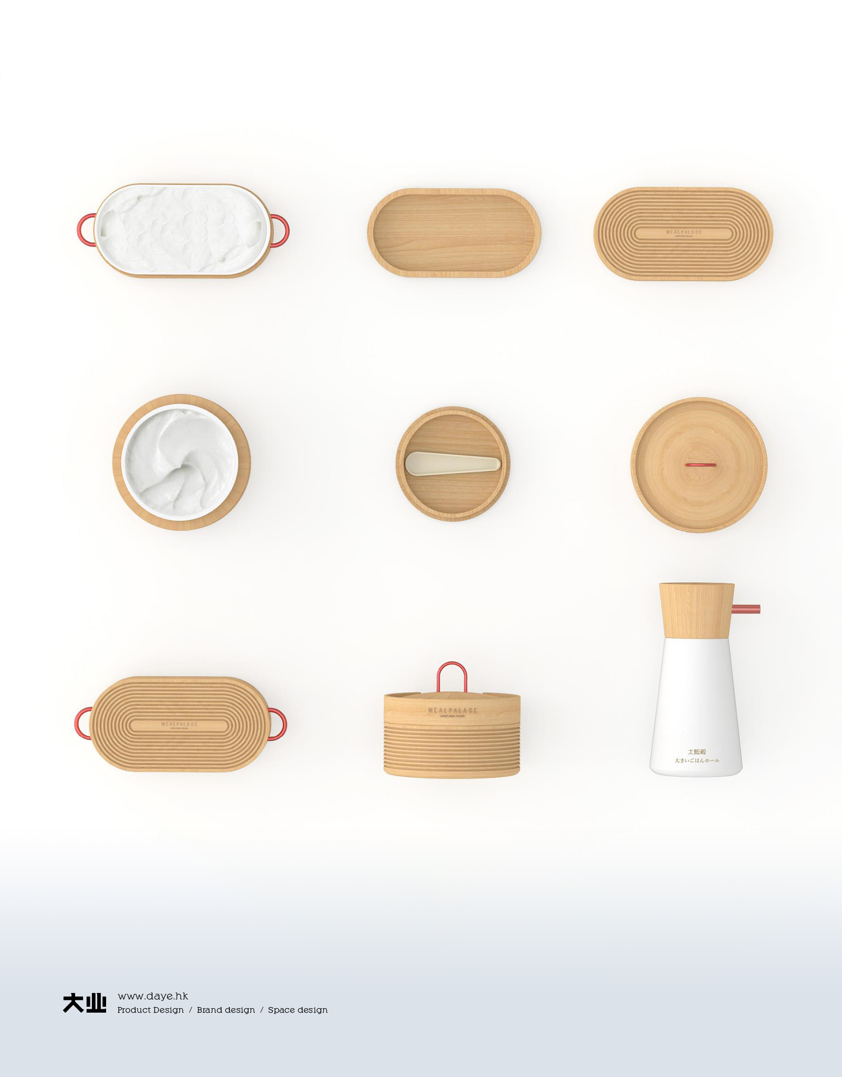
By the way, the meaning of the above Japanese is really unknown. It is better not to write the correct Japanese.
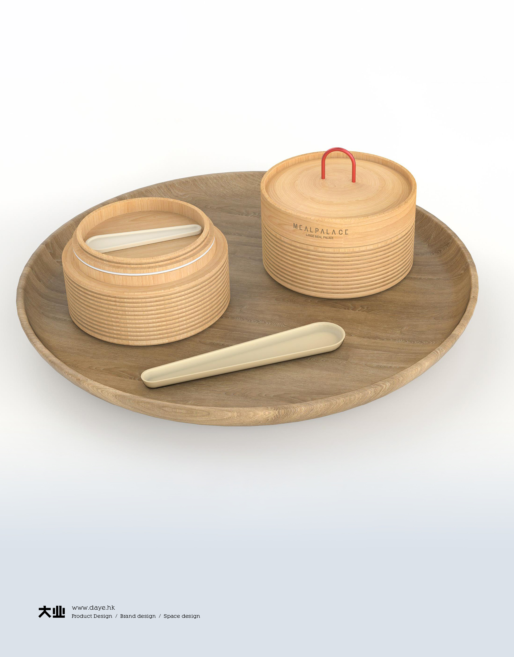
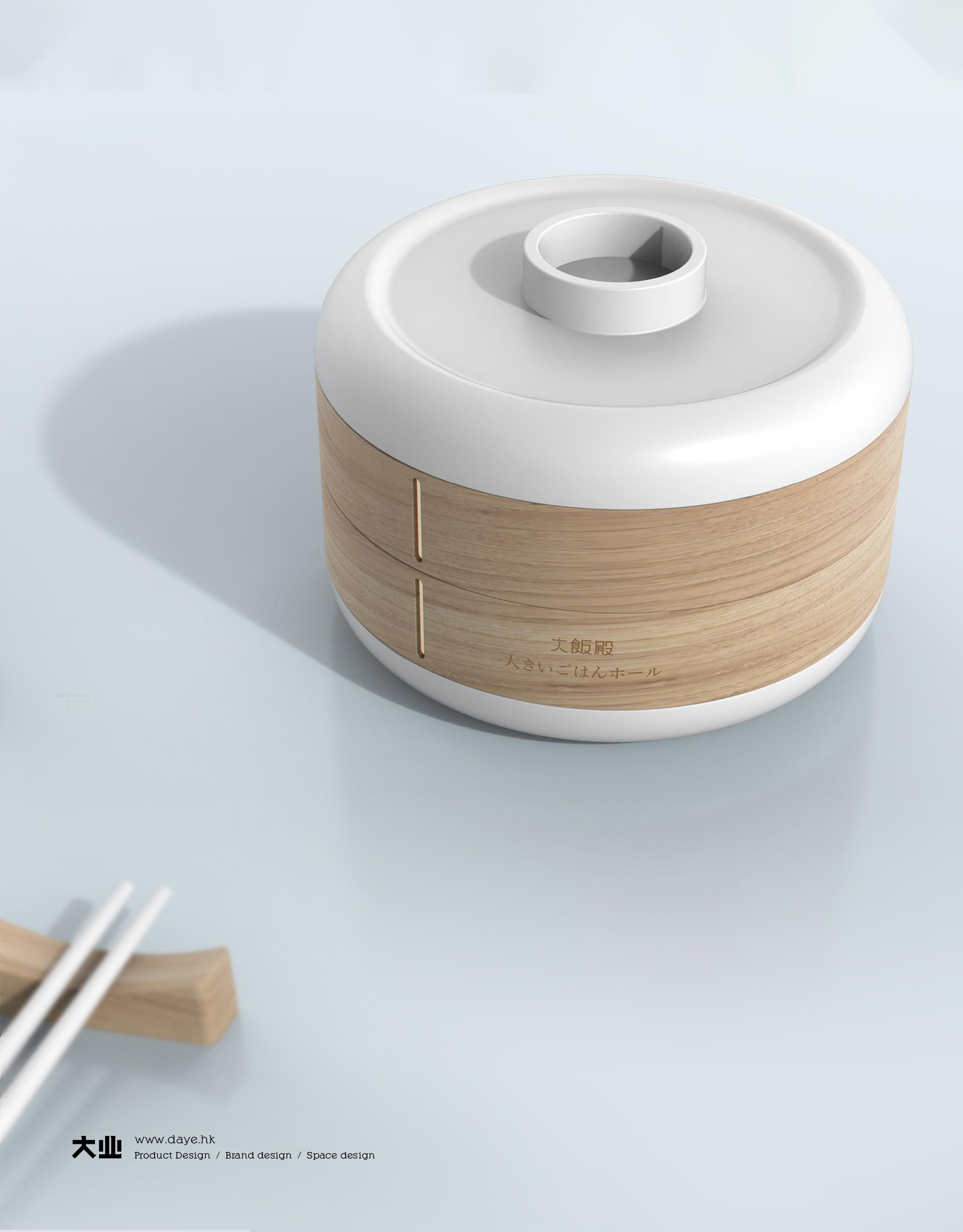
It looks very comfortable.
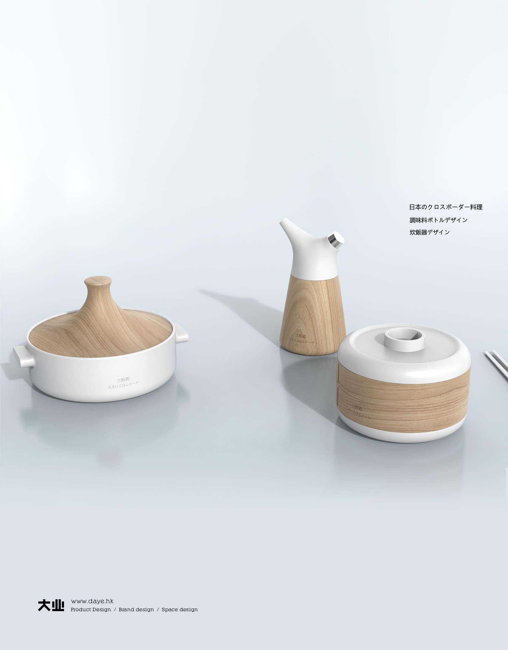
Will this make children think it is delicious?
Skin care products are so packaged that they have their own characteristics.
It can also be used as a seasoning box in the kitchen. Ha, ha, ha