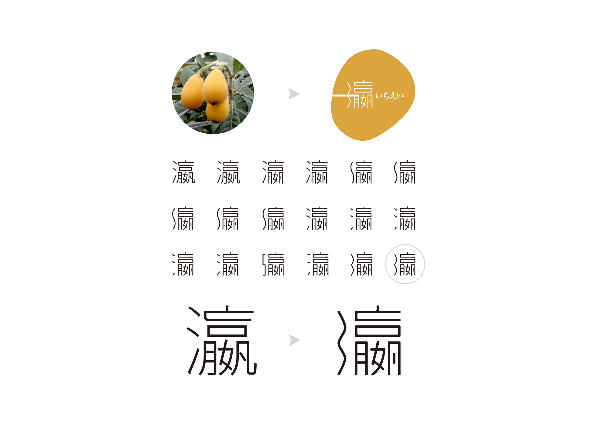
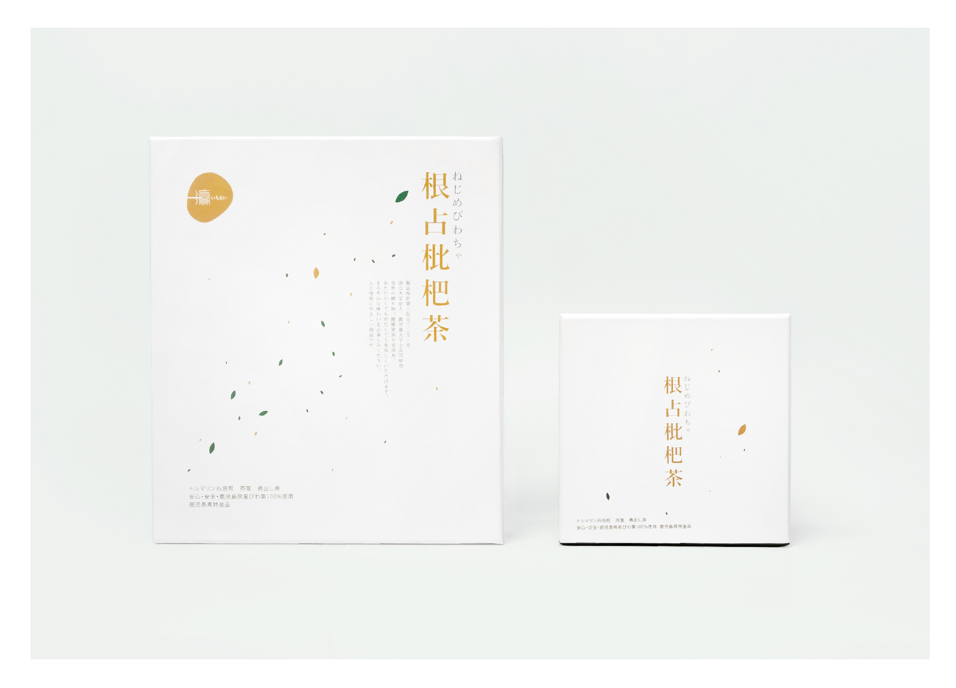
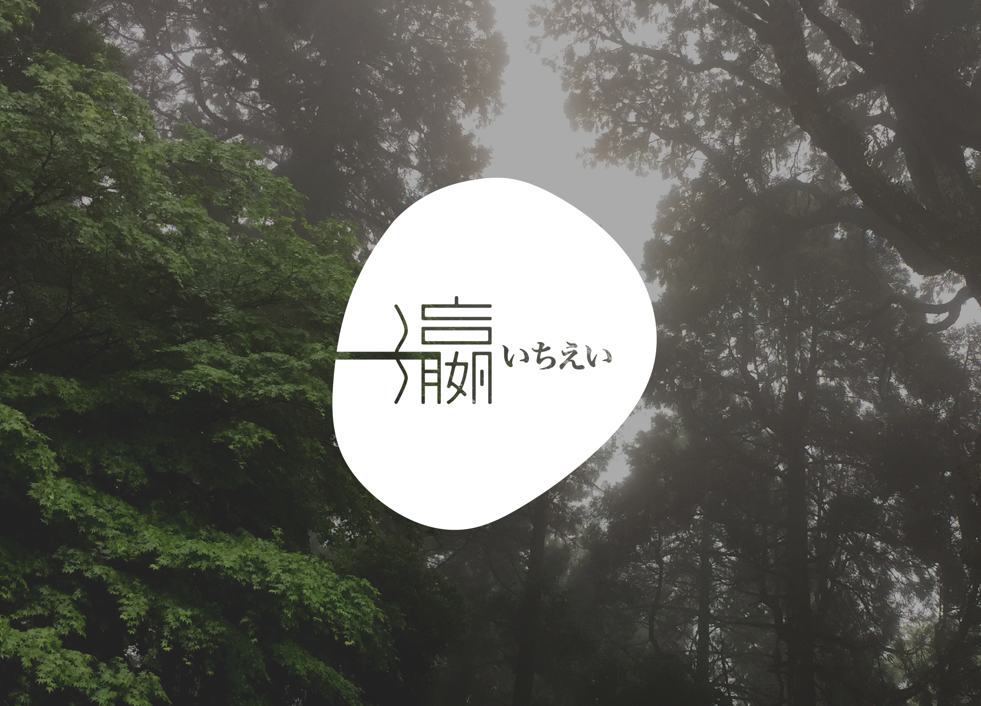
Yiying is engaged in health food agency. The company's philosophy is "beauty and health starts from eating habits", and its main sales markets are high-end customers in Mainland China, Hong Kong and Macau. Loquat is a highly effective plant. It has been used by traditional Chinese medicine and folk therapy since ancient times. The product adopts Japanese Kagoshima loquat leaves and is a healthy and common tea made by patented method. Set up a plan to turn the state of tea tasting into a poetic state. Tea is scattered to present the landform of Japan. Use the most concise and fashionable methods to deduce a healthy and tasteful attitude towards life, adding new forms to the art of tea tasting. In the design of the logo, the form of the word "one" extends from "one" to the Japanese name "one", forming a huge "one" that can be seen from a distance, with a unified metaphor. "Ying" means ocean in Japan, so its three-point water radicals are turned into a flowing curve. The shape of the entire logo is painted with reference to the shape of loquat fruit.
City
Hong Kong
Year
2018
Client
ichiei Limited
Affiliation
Chatter Design Limited
Designer
Nova Hung
本作品版权归 K-DESIGN AWARD 所有,禁止匿名转载及个人使用,任何商业用途均需联系原作者。

新用户?创建账号
登录 重置密码
请输入电子邮件以重置密码。


留言板 (0)
评论为空