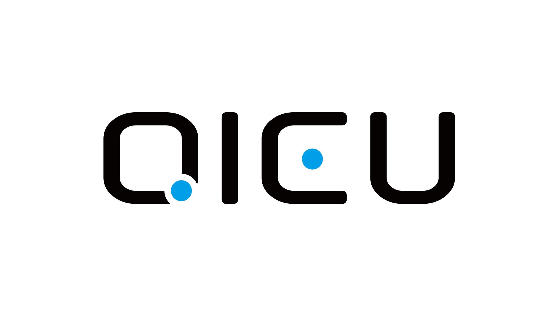
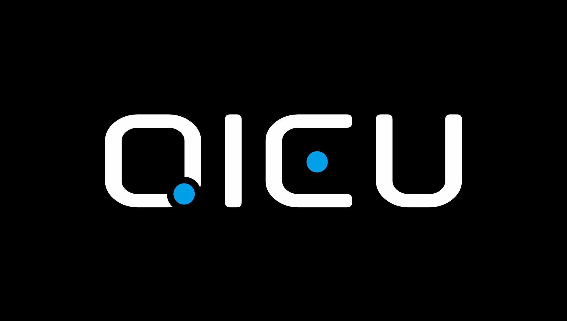
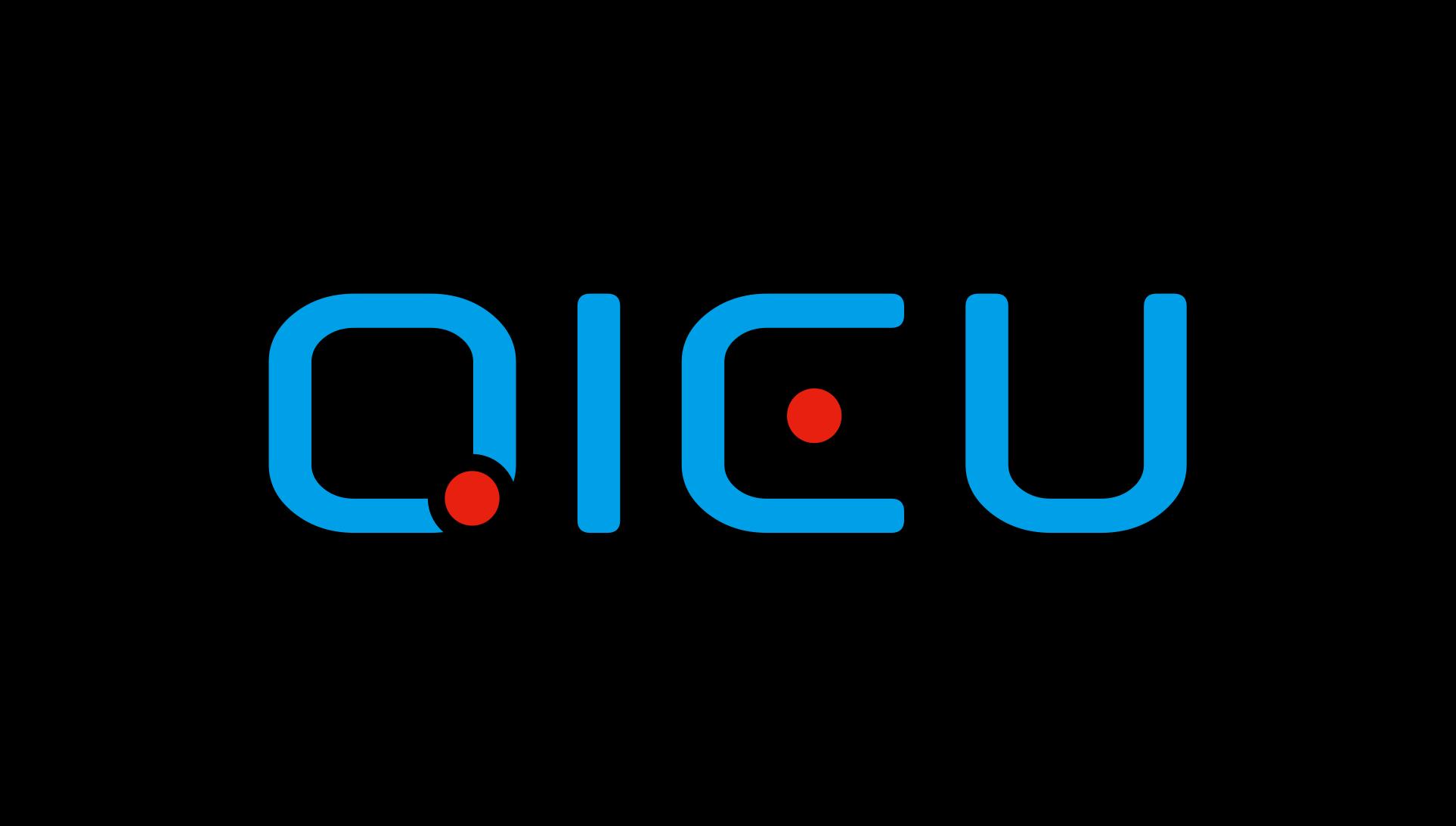
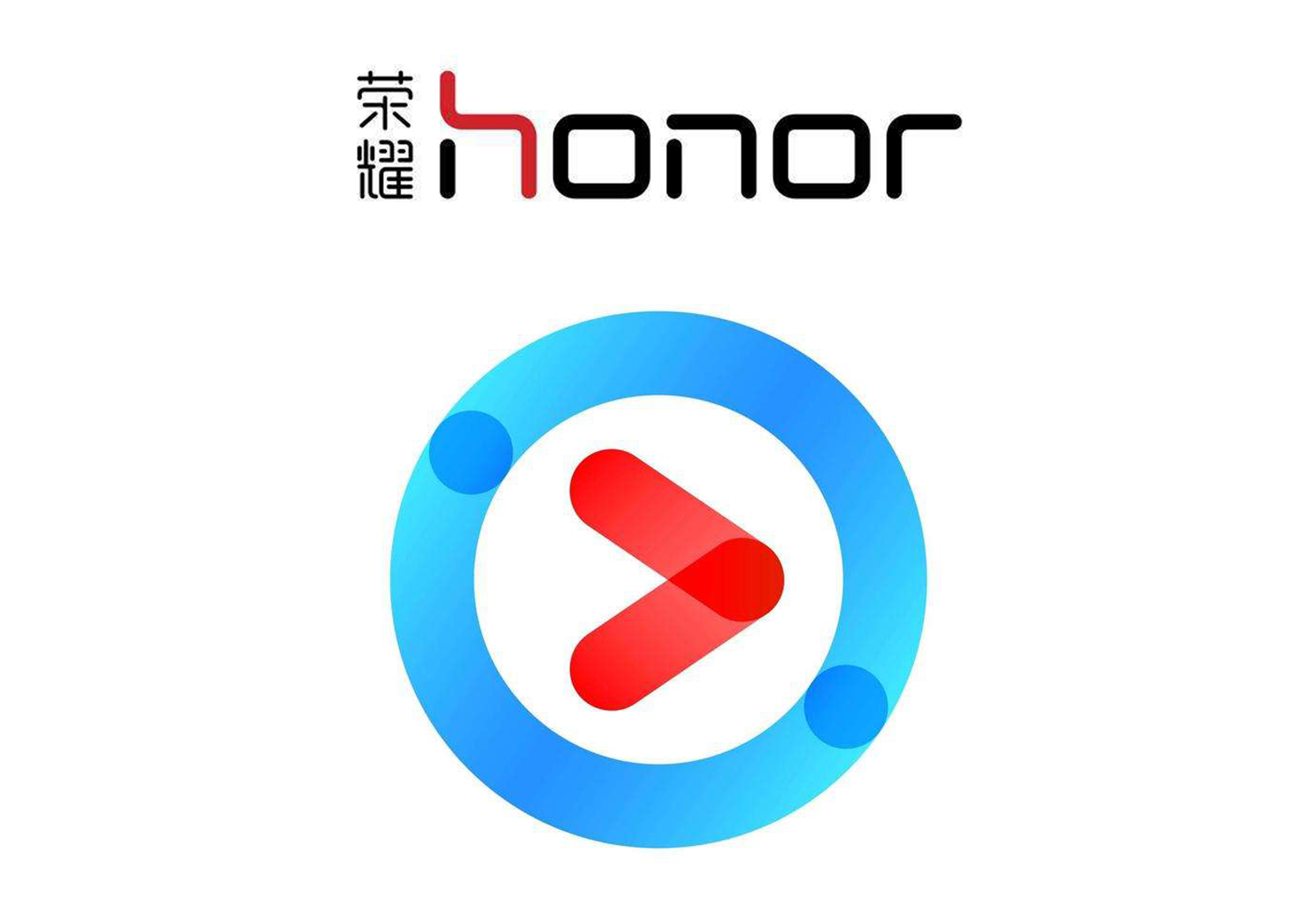
Before, I did logo design for the company's new product category sports brand "ABSOKE". After that, my colleagues in the sales department were very satisfied. Then let me redesign the logo of the company's original electronic product brand "QI-EU" (originally existing logo). It took me an afternoon to make a lot of comparisons, and finally I made a comparison of founder and sharp style. I wanted to submit it, but my intuition told me to go to work the next day every other night or have a new view. The next morning, I was not satisfied with the logo I made yesterday, so it took me 10 minutes to make the logo again. Round fonts are popular elements of logo for many technology Internet companies. Jumping dots make logo more lively, flexible and technological. Similar elements are embodied in glorious fonts, Youku dots, etc.
本作品版权归 点石·Desig 所有,禁止匿名转载及个人使用,任何商业用途均需联系原作者。

新用户?创建账号
登录 重置密码
请输入电子邮件以重置密码。


Why is the black upload dark green?