7MAGPIE
Brand Positioning/Brand Slogan/Logo Design/VI Design/CMF Design/Product Design/System Packaging Design
Award
IDEA International Design Excellence Award
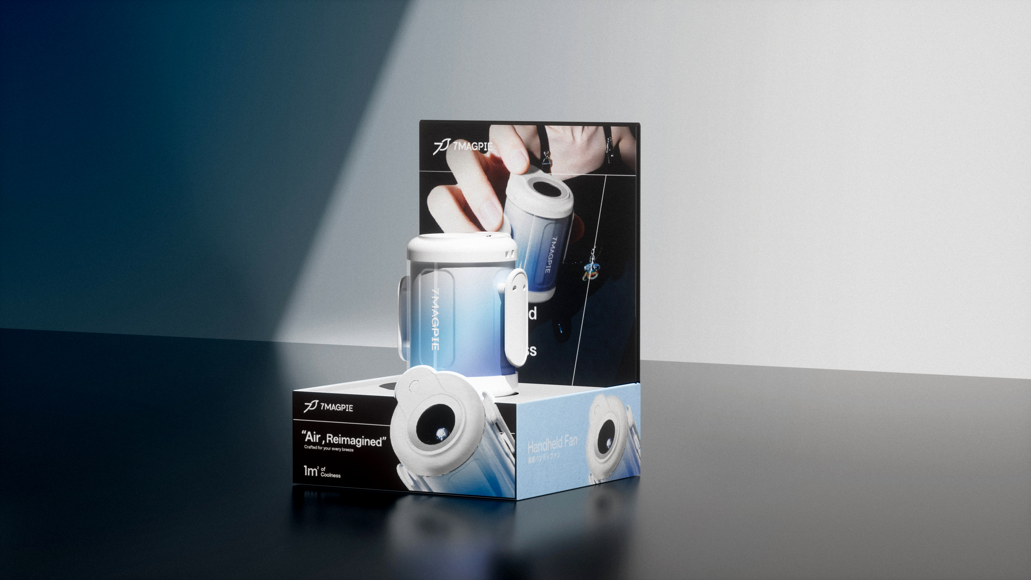
7MAGPIE is a small fan brand hatched by the Japanese innovation team. The team has always focused on its product strength and terminal layout capabilities, and has accumulated many fans in the Asia-Pacific region. We work together to develop its brand new image, established a perfect brand positioning strategy, visual identity system, packaging application system, product design, for the brand in the world market to open a new chapter.
Focusing on the brand strategy and geographical location, aiming at the positioning type of the brand's small fan and lifestyle, we put forward the brand concept of "Fashion Seiko, Cool One Square Meter Fashion Crafted Meets in 1 ㎡ of Coolness", and put forward an innovative solution for 7MAGPIE that closely fits the market trend and user needs. Create a clear and coherent brand display form for 7MAGPIE from the brand design, and clarify the style direction of the brand.
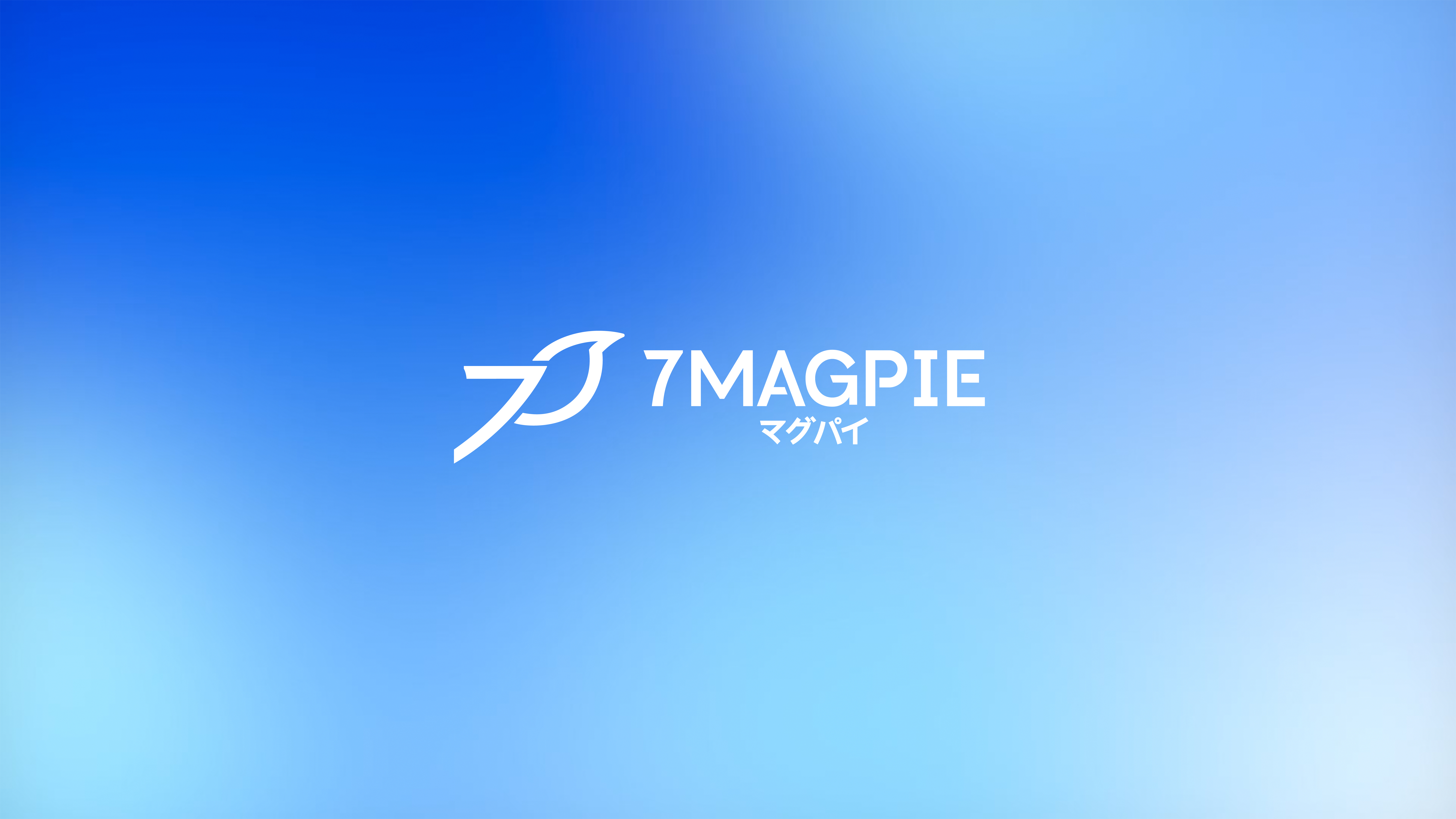
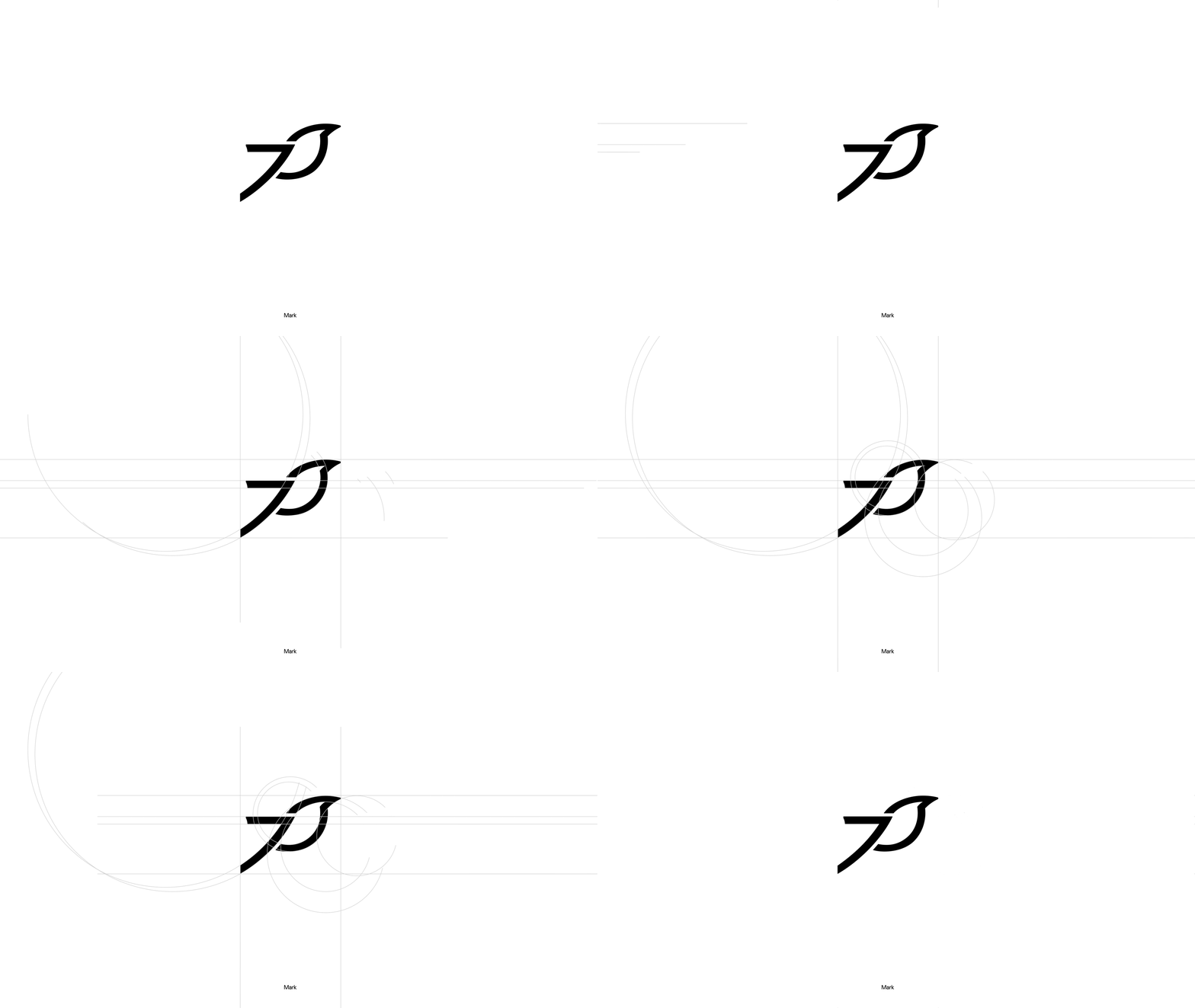
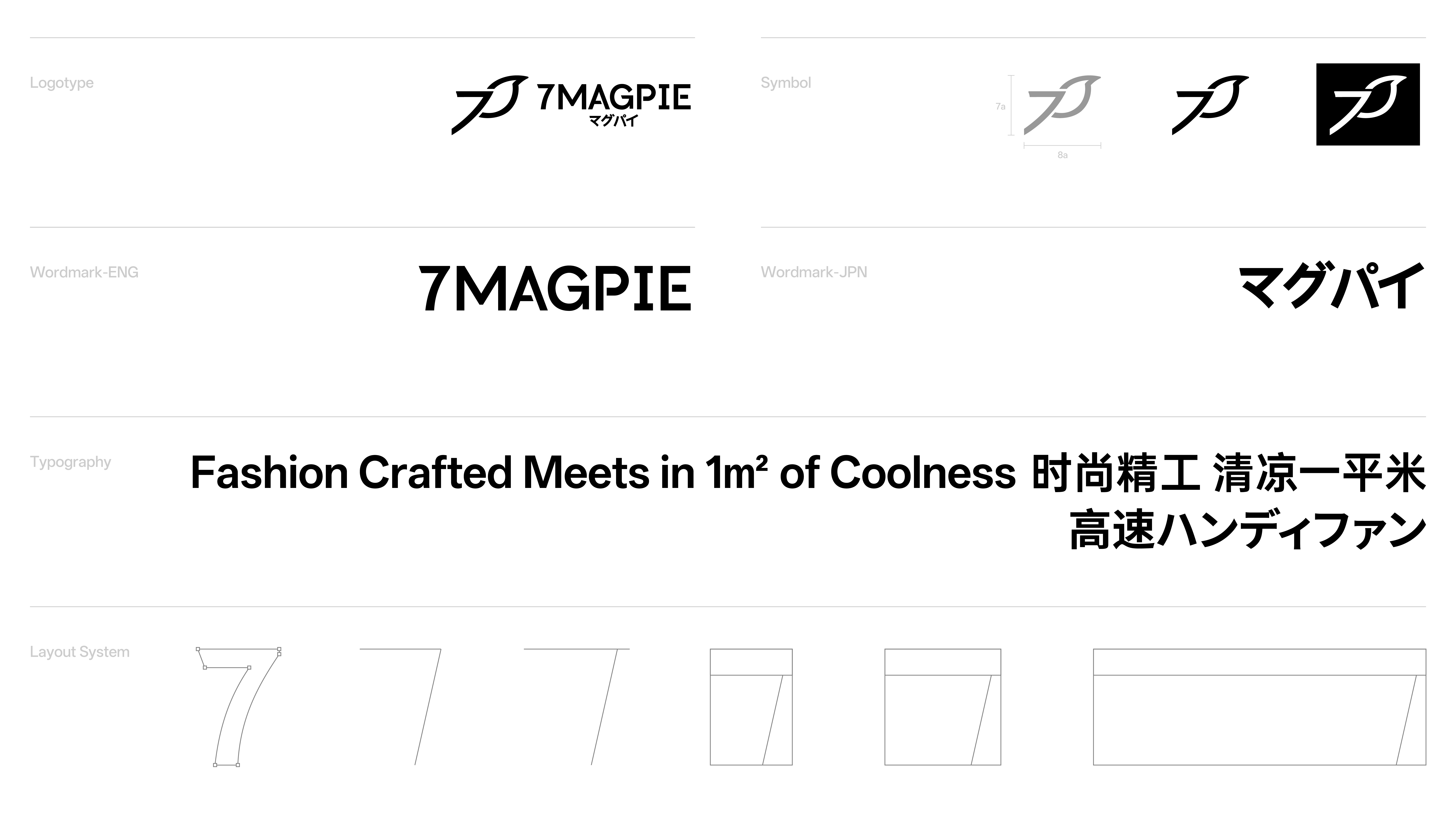
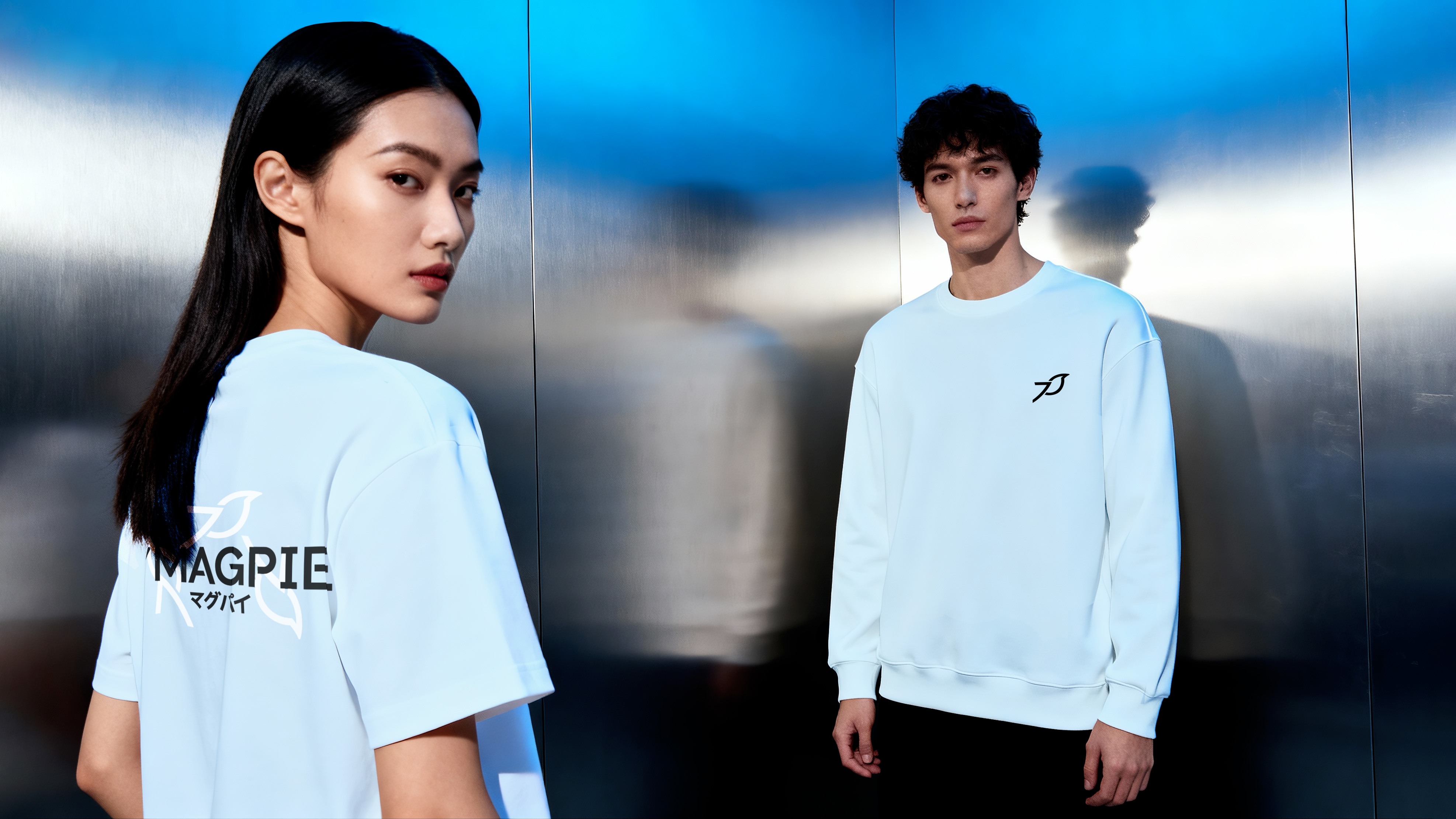
The design of the logo is based on the conciseness of the brand's visual hammer. Starting from the brand name, we extract its naming features-integrating the modeling of "number 7" and "magpie". Based on the global general cognition of "number 7" and "magpie", we create an exclusive brand form, reduce the brand's communication loss under different cultural backgrounds, and ensure the visual clarity and recognition of the global market.
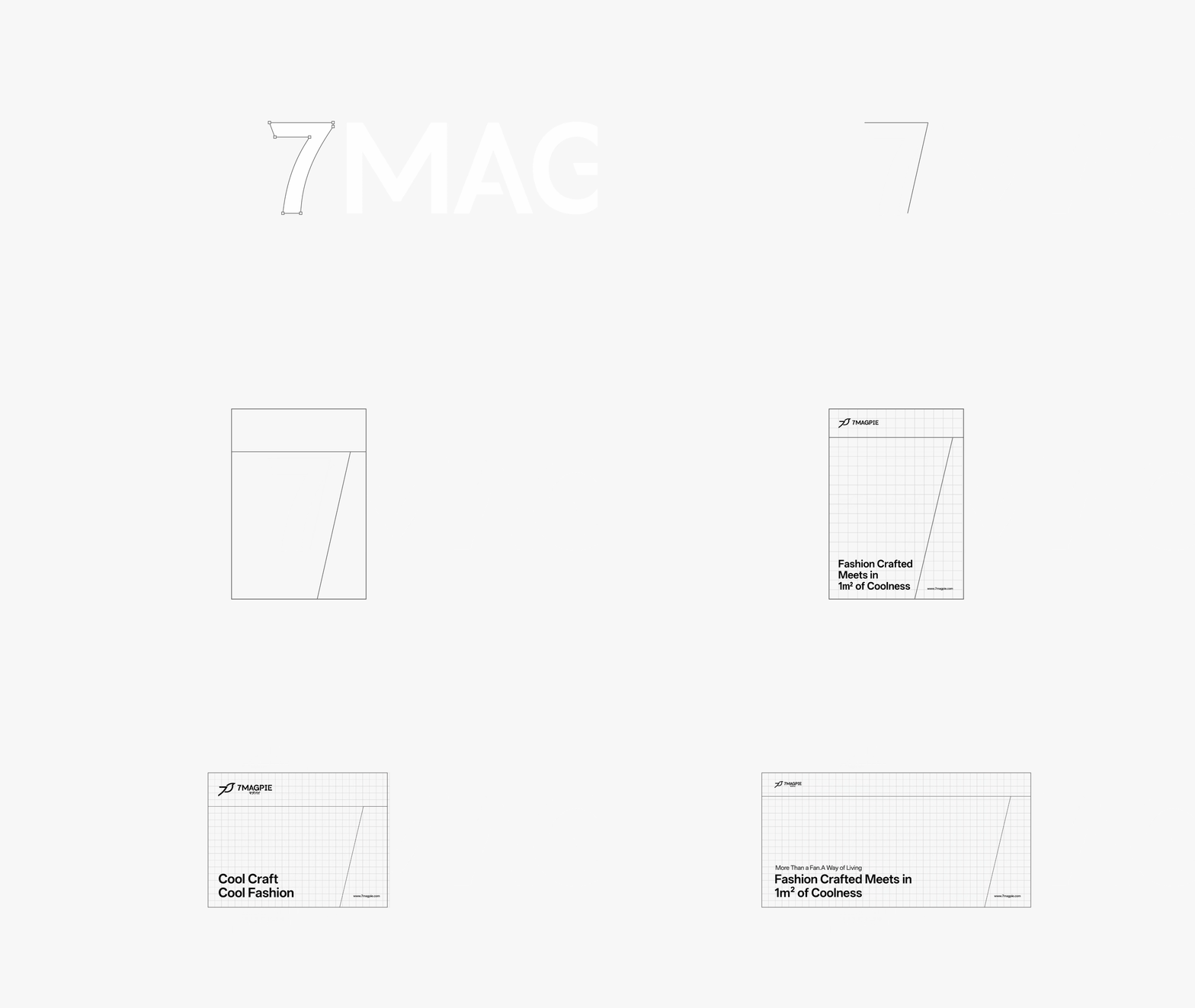
Starting from systematization, identification and ease of use, the brand application specification takes "7" as the core element, completes the spatial division on the picture level, rigorous grid and structural division through simple geometric figures and lines, respectively strengthens the concepts of brand strategy "fashion seiko" and "one square meter", and unifies the visual gene, marketing contact and packaging system, it has formed a set of visual language with consistency and flexibility, which explains the brand spirit of 7MAGPIE.

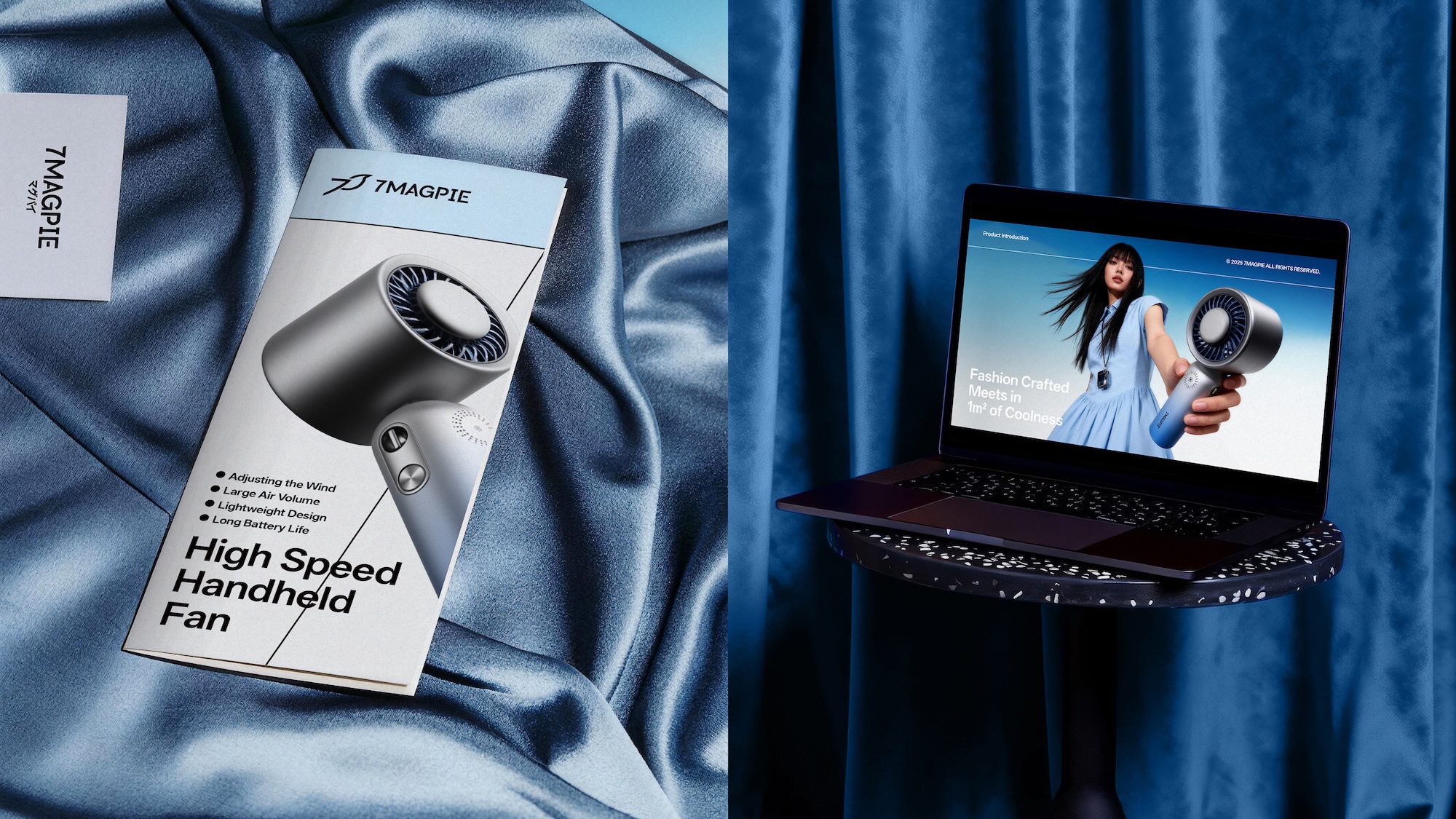
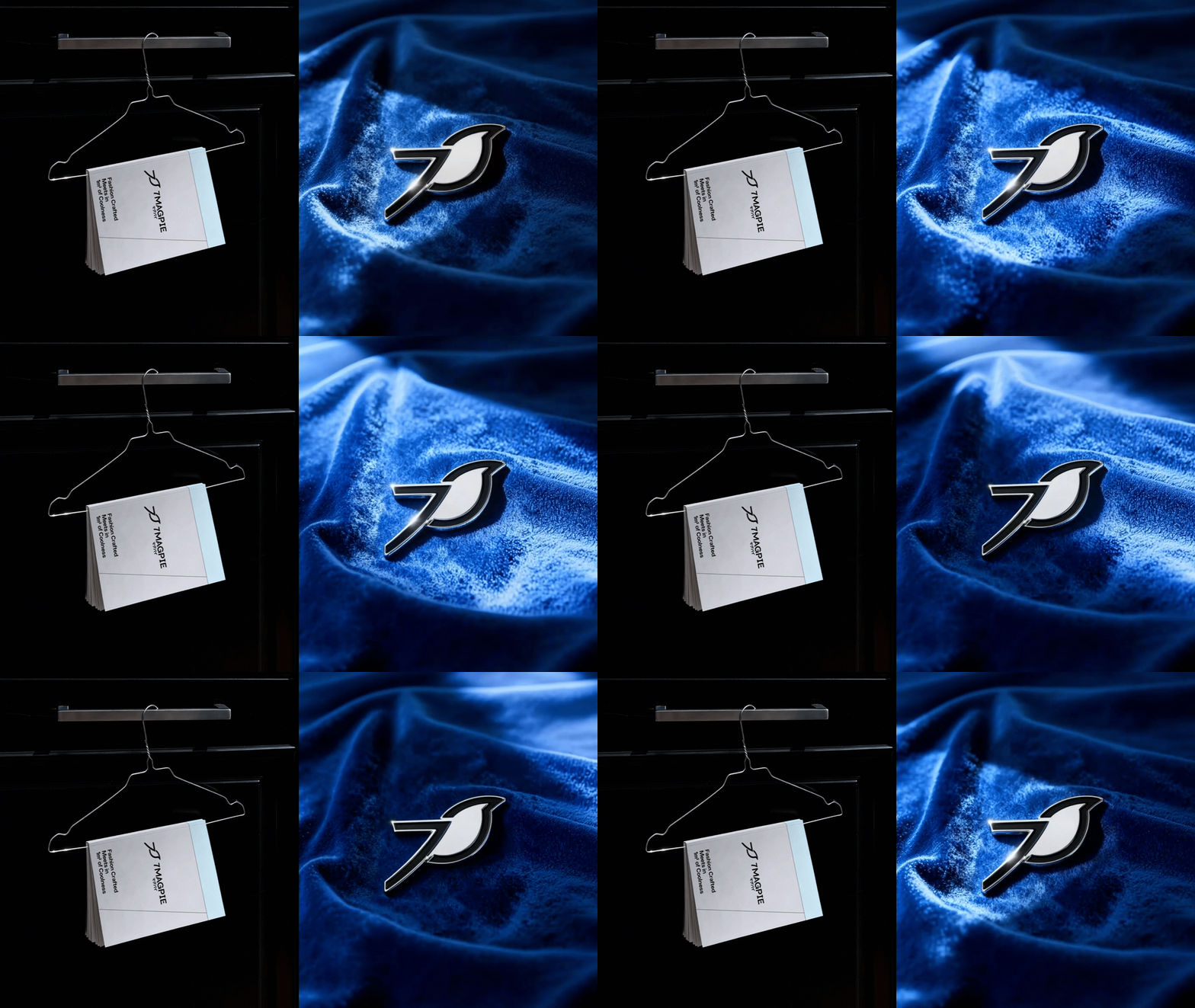
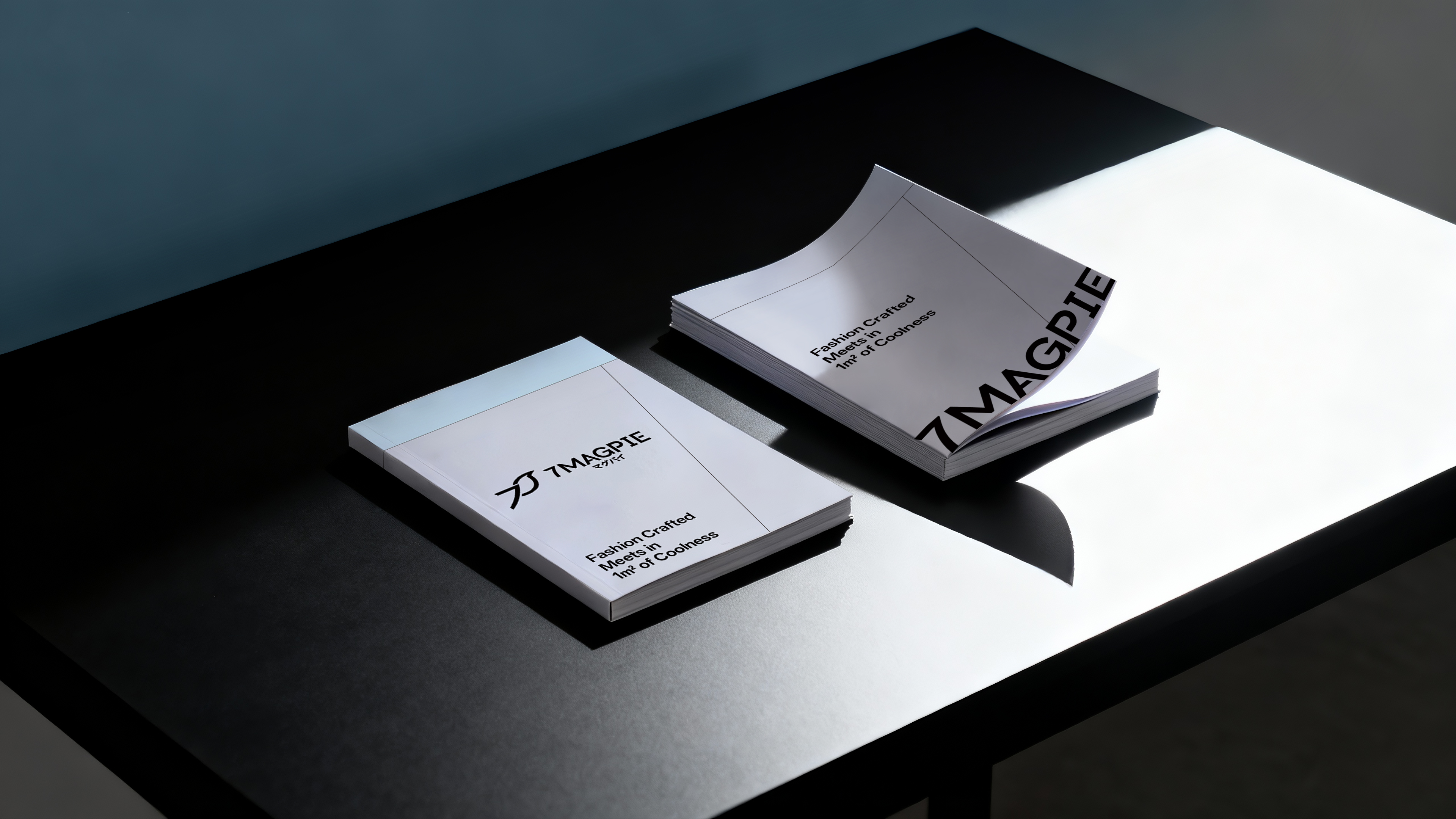
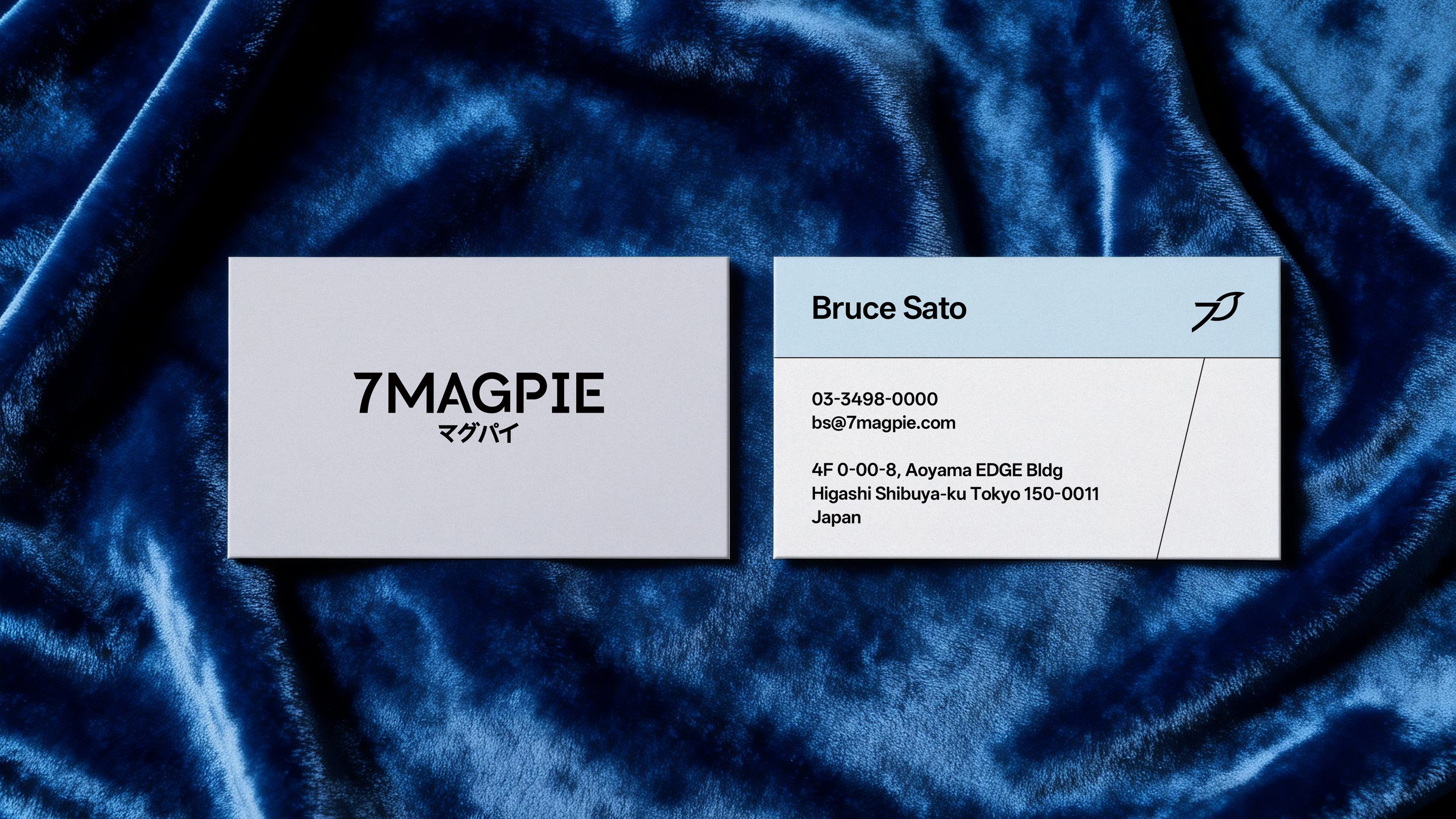
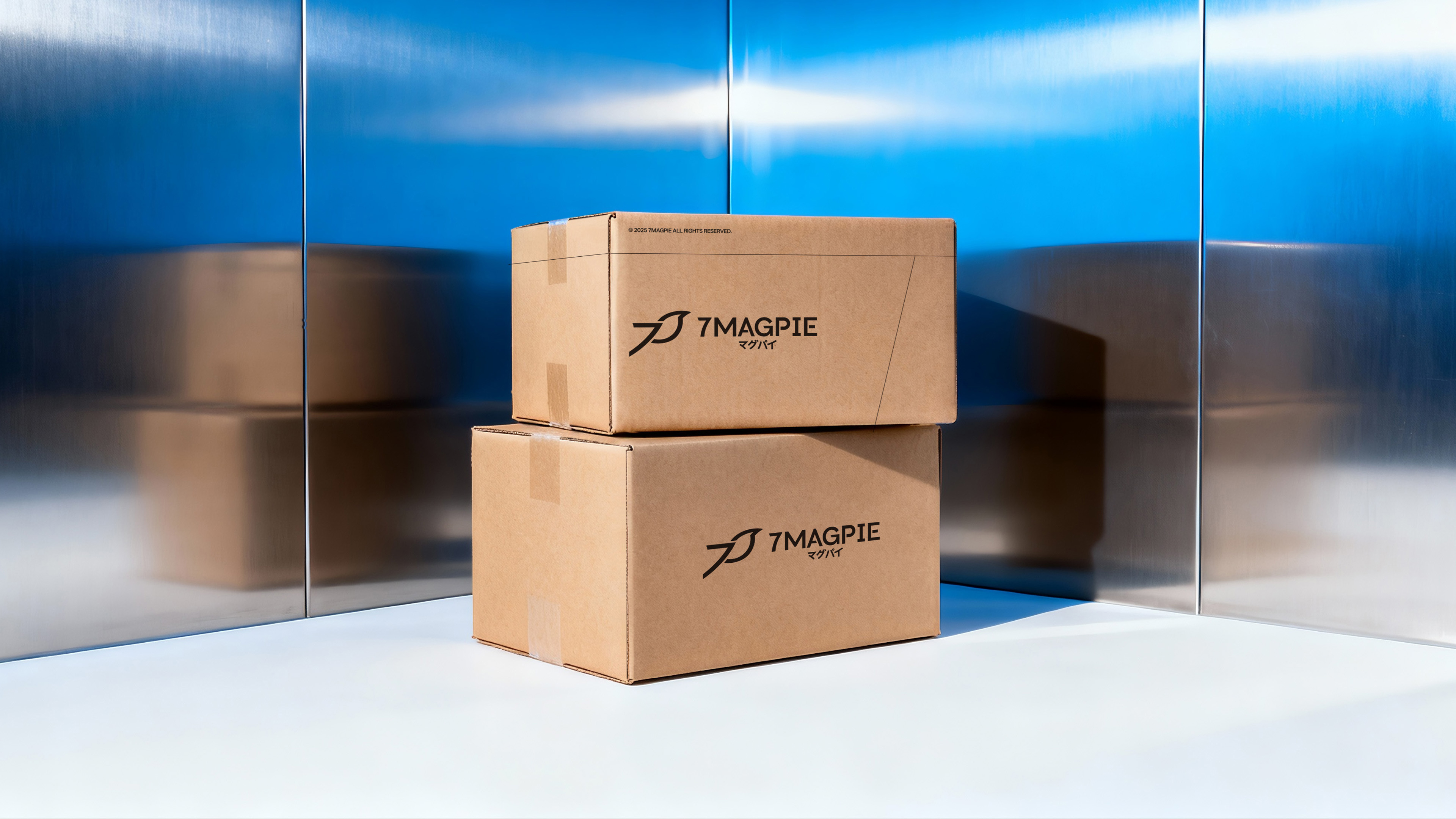
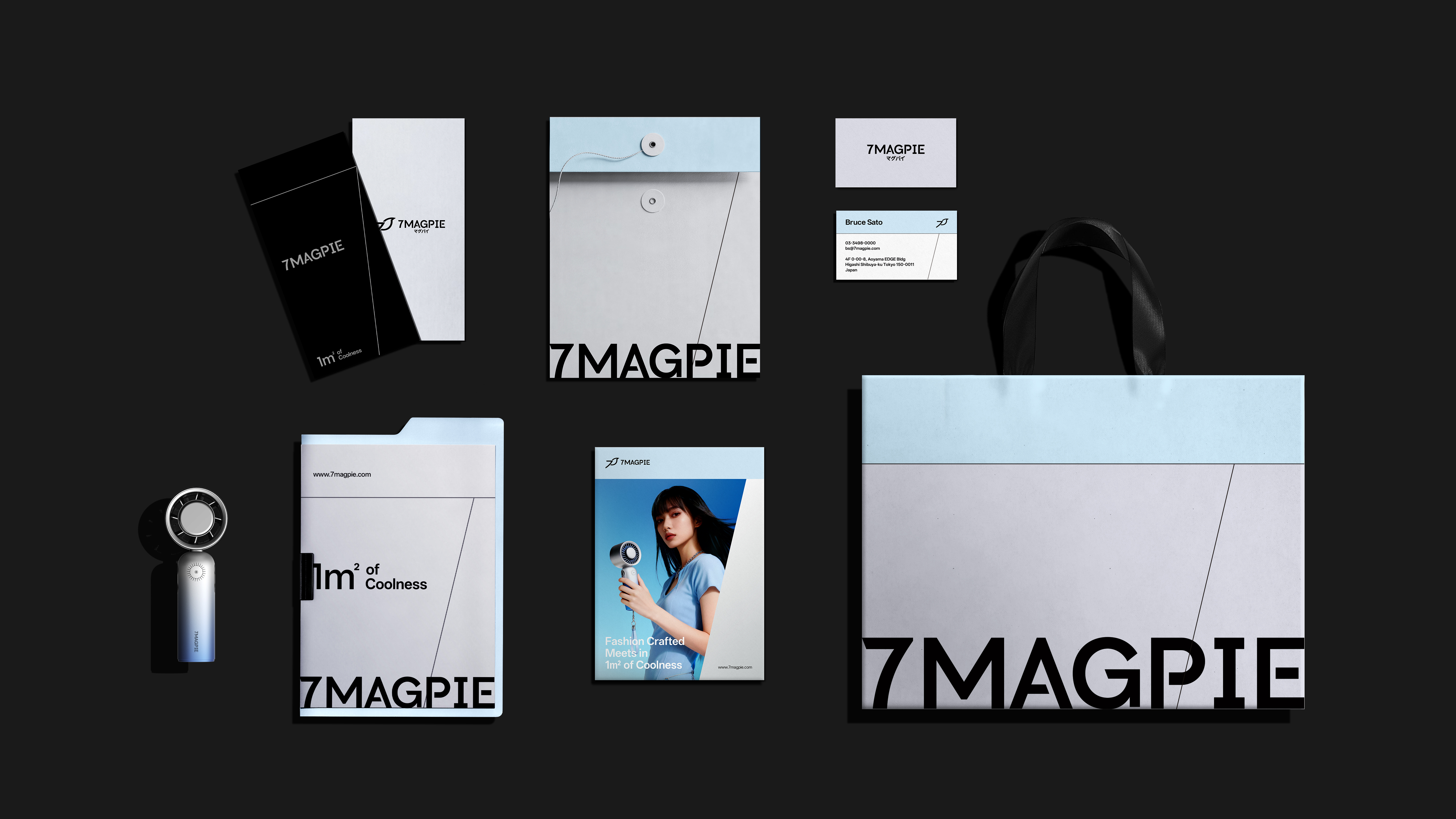
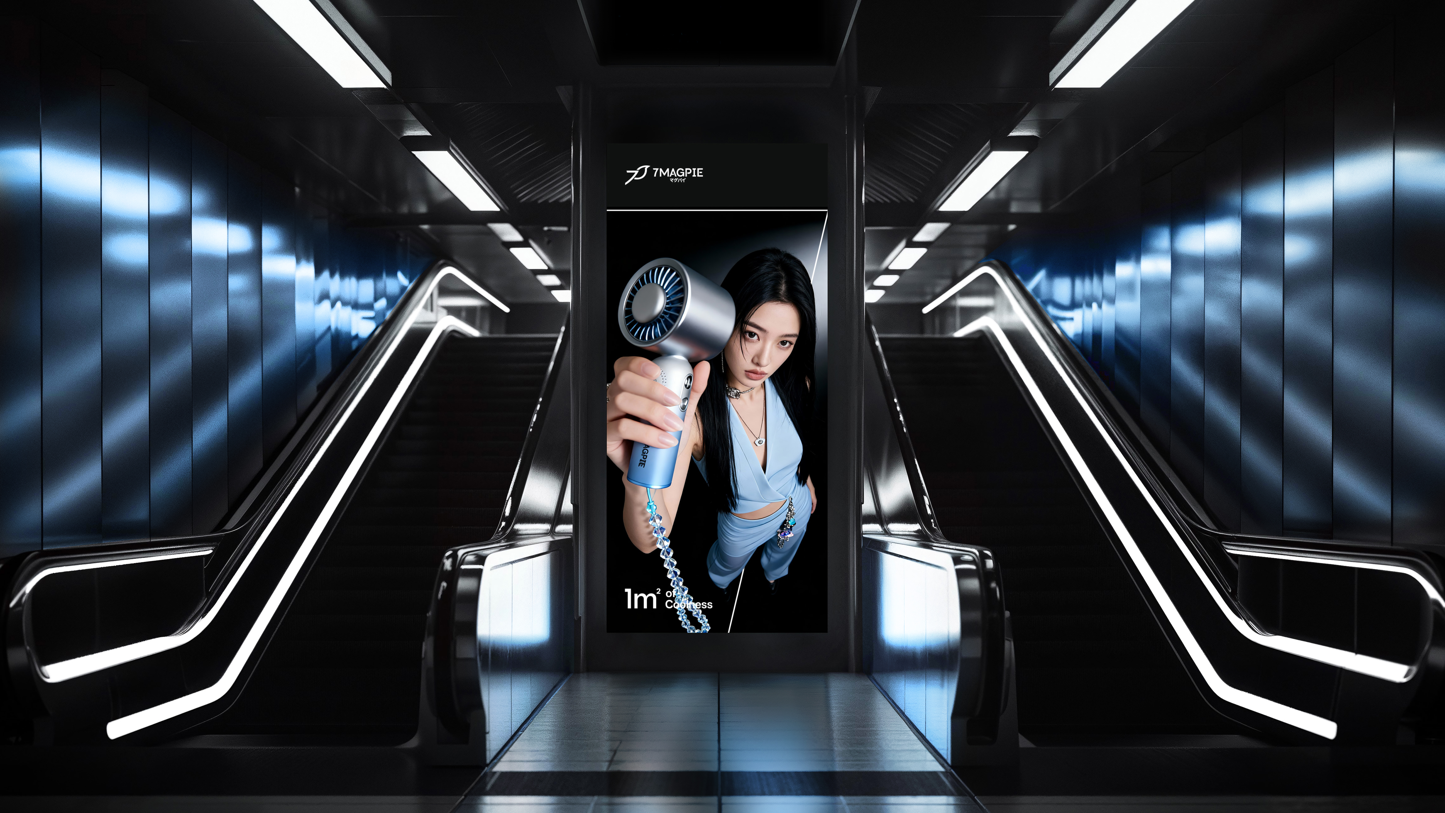
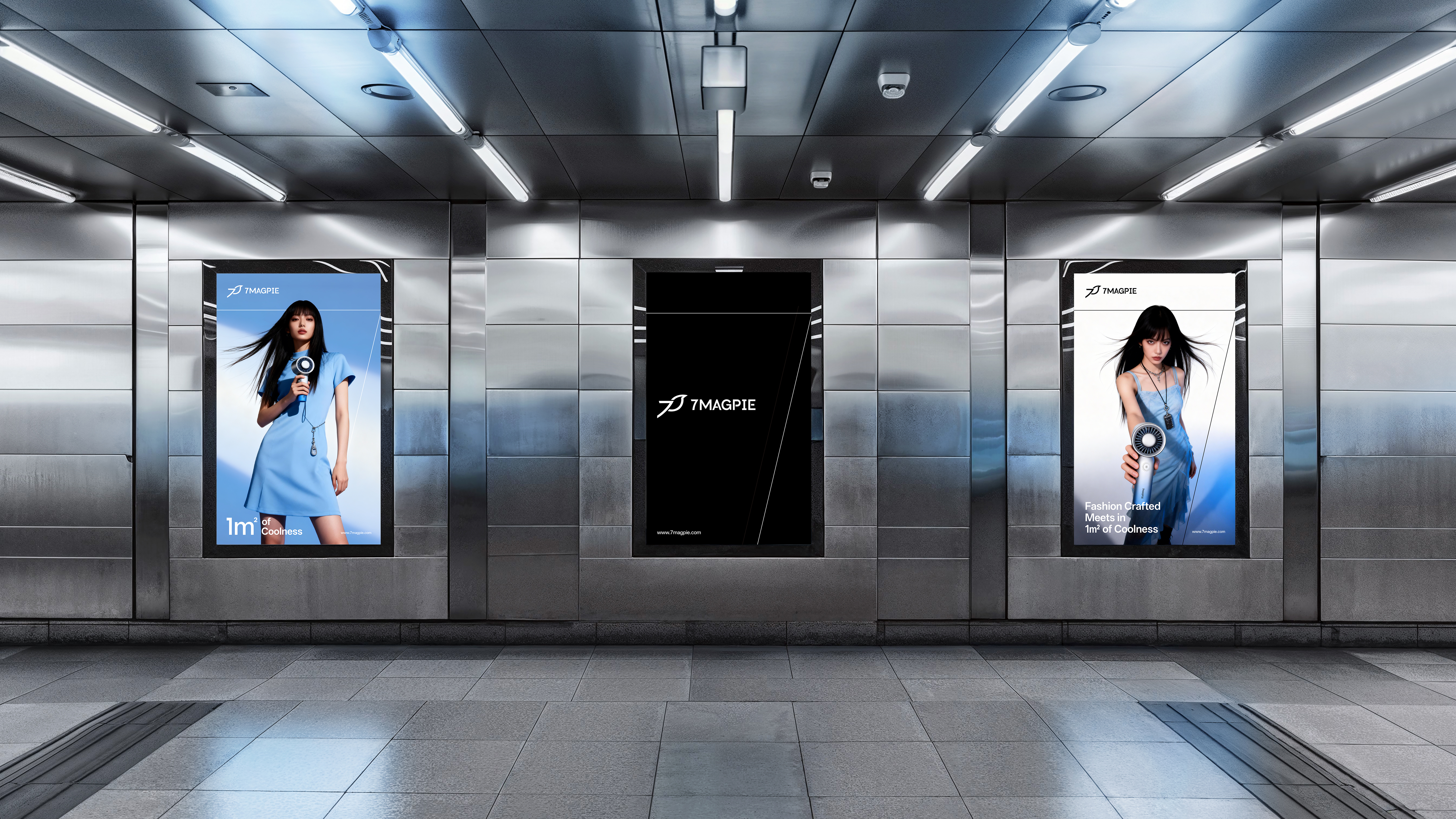
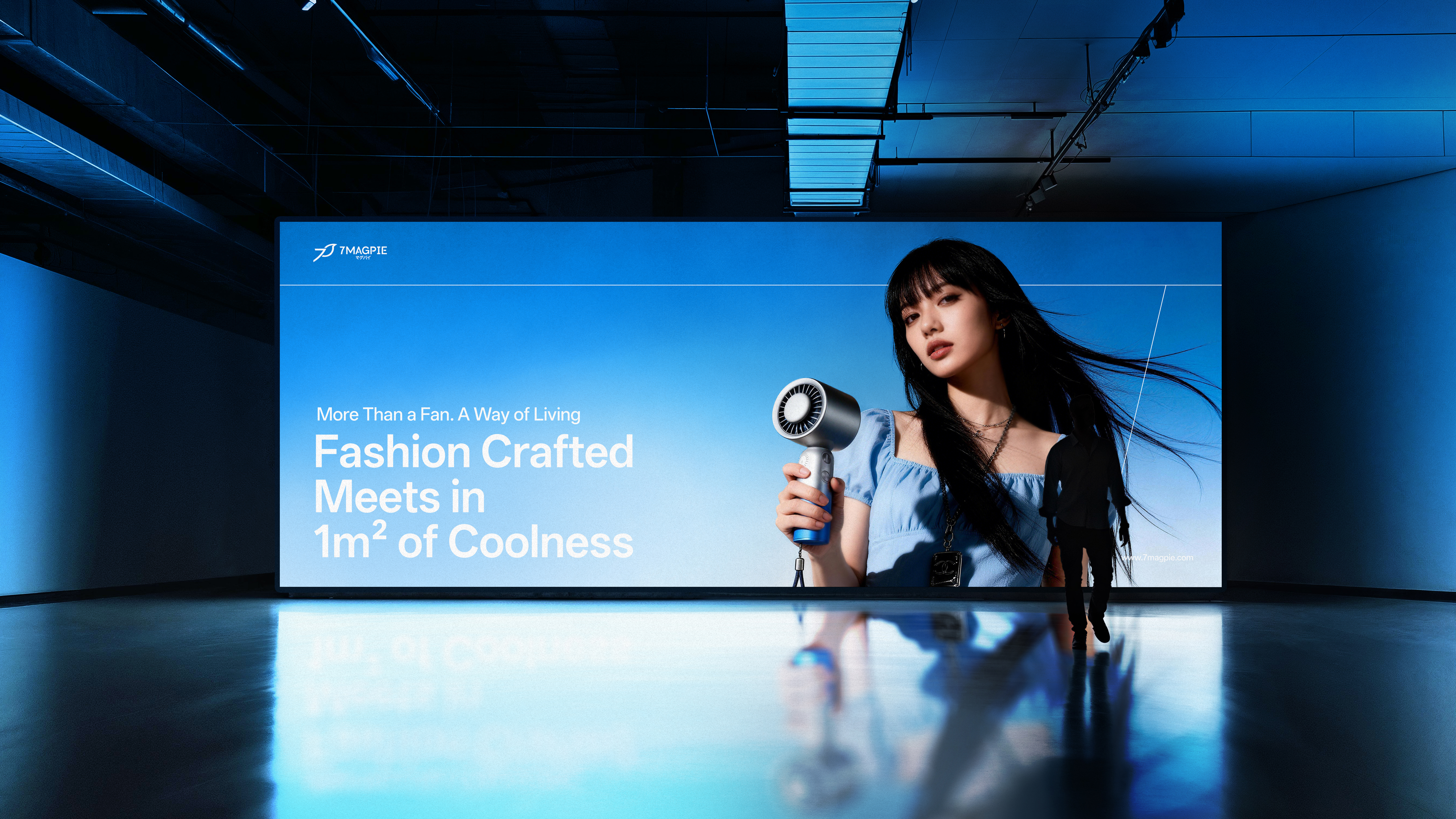
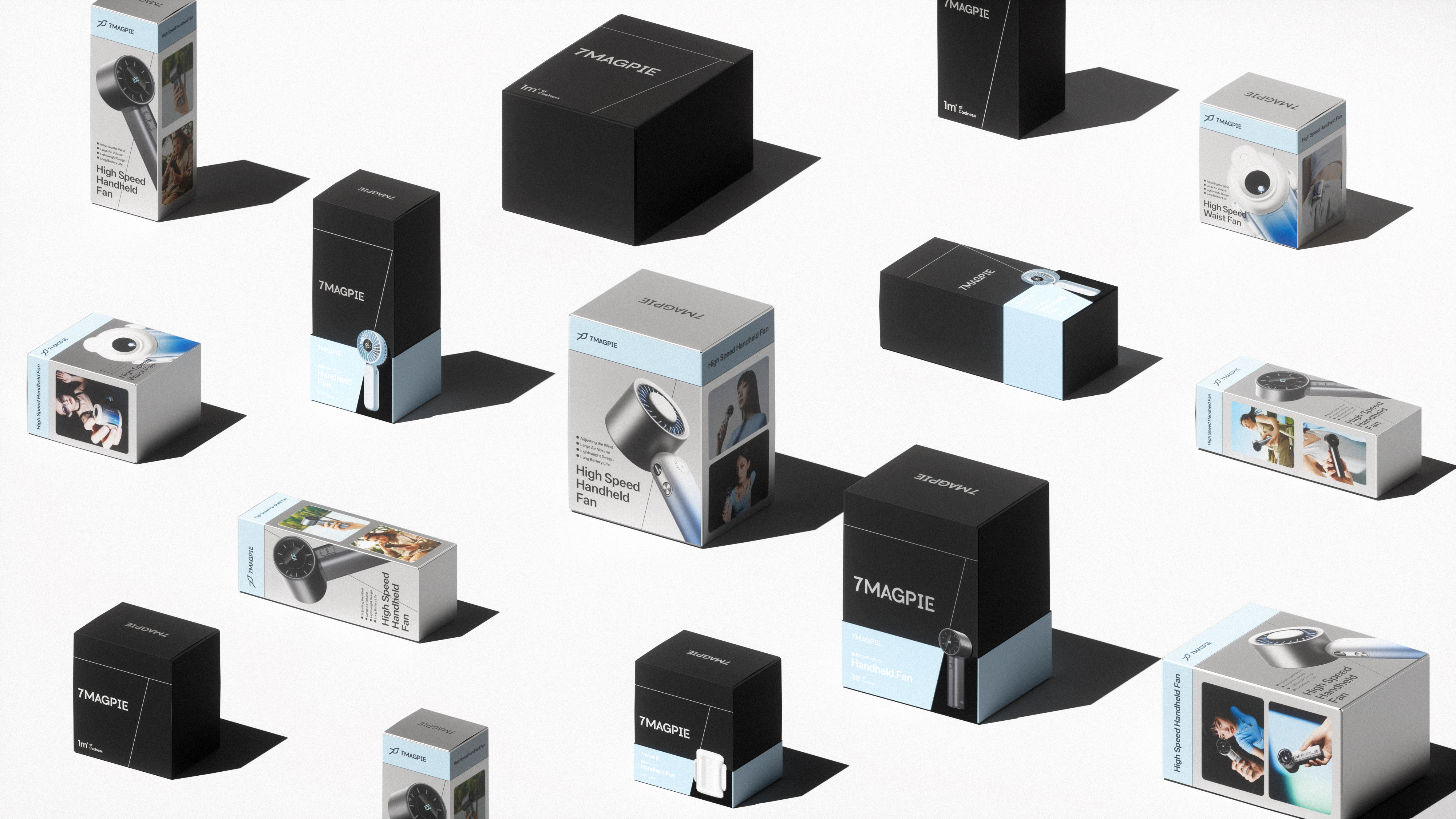
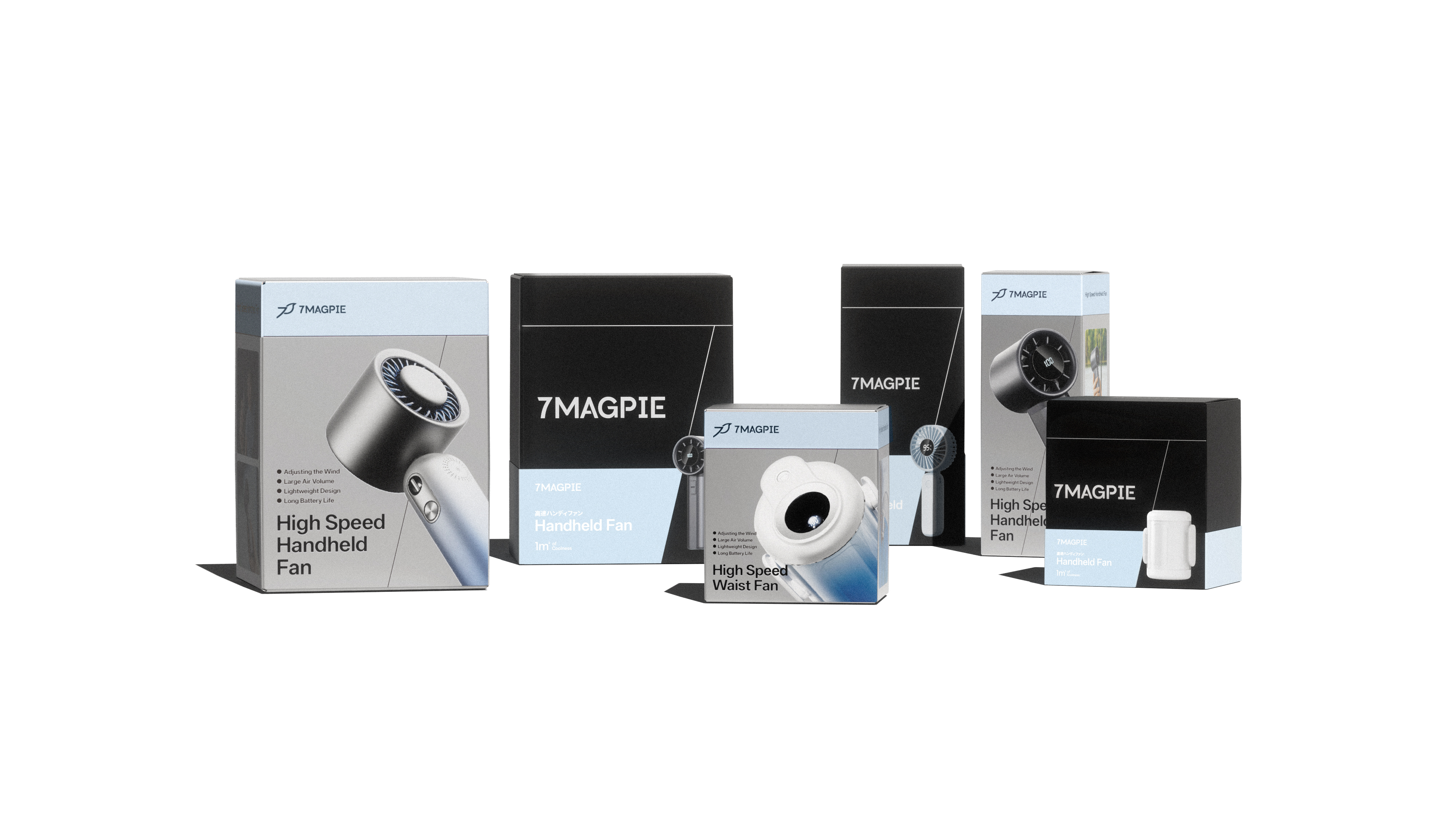
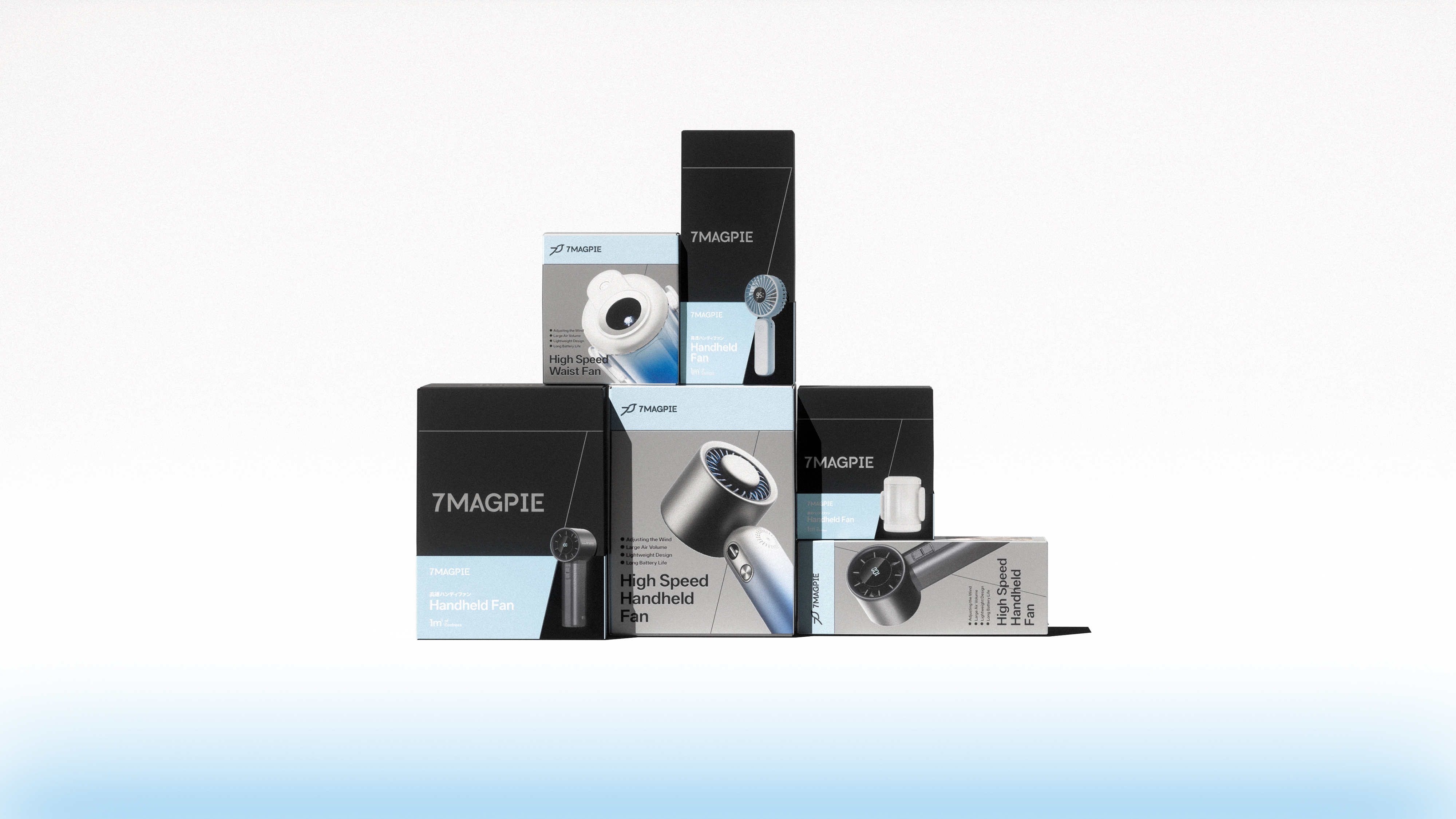
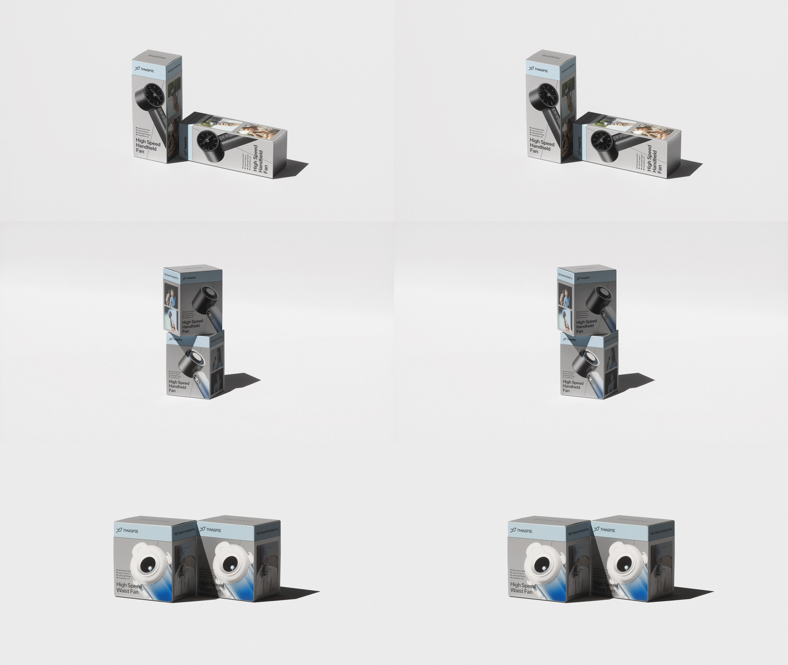
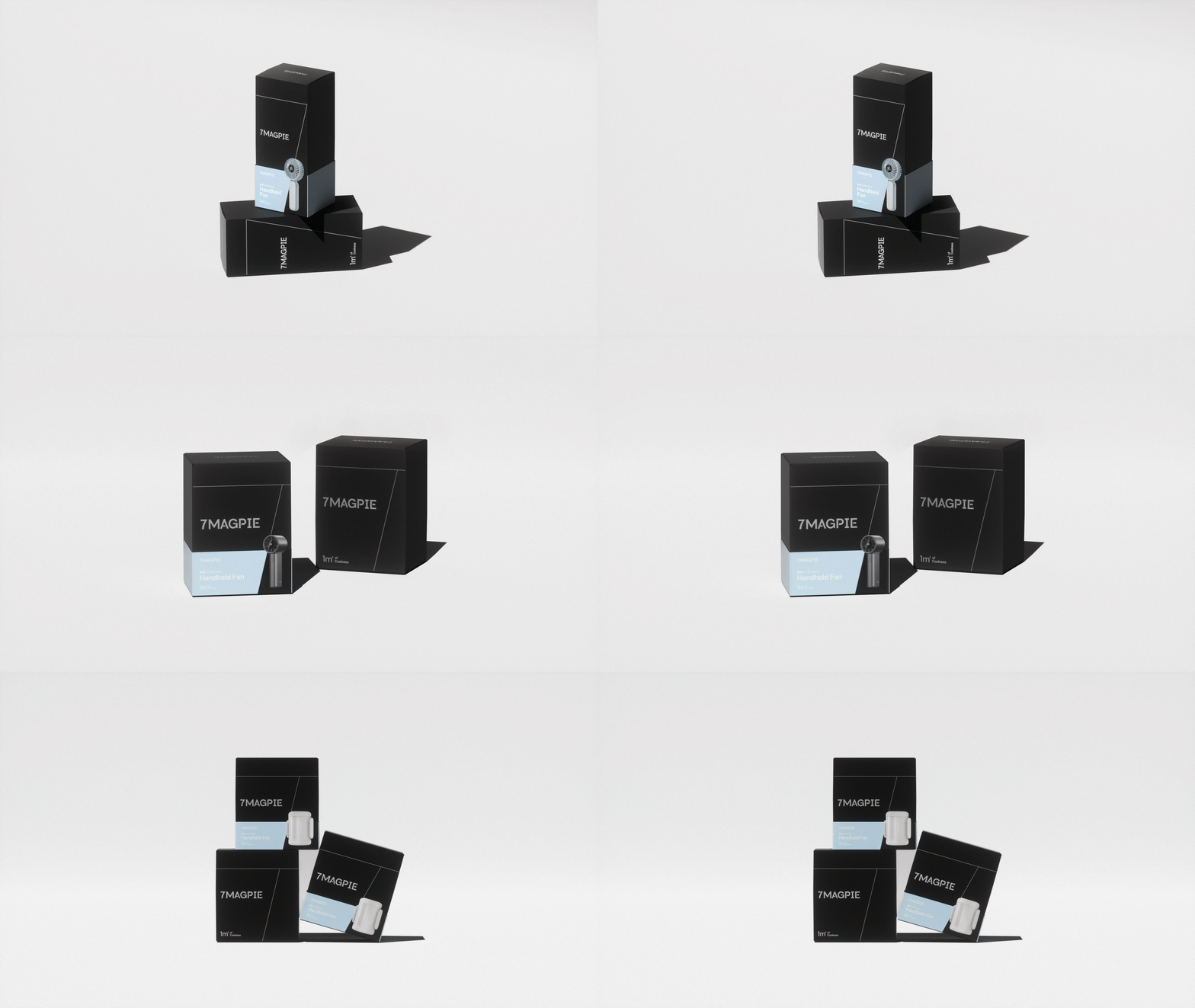
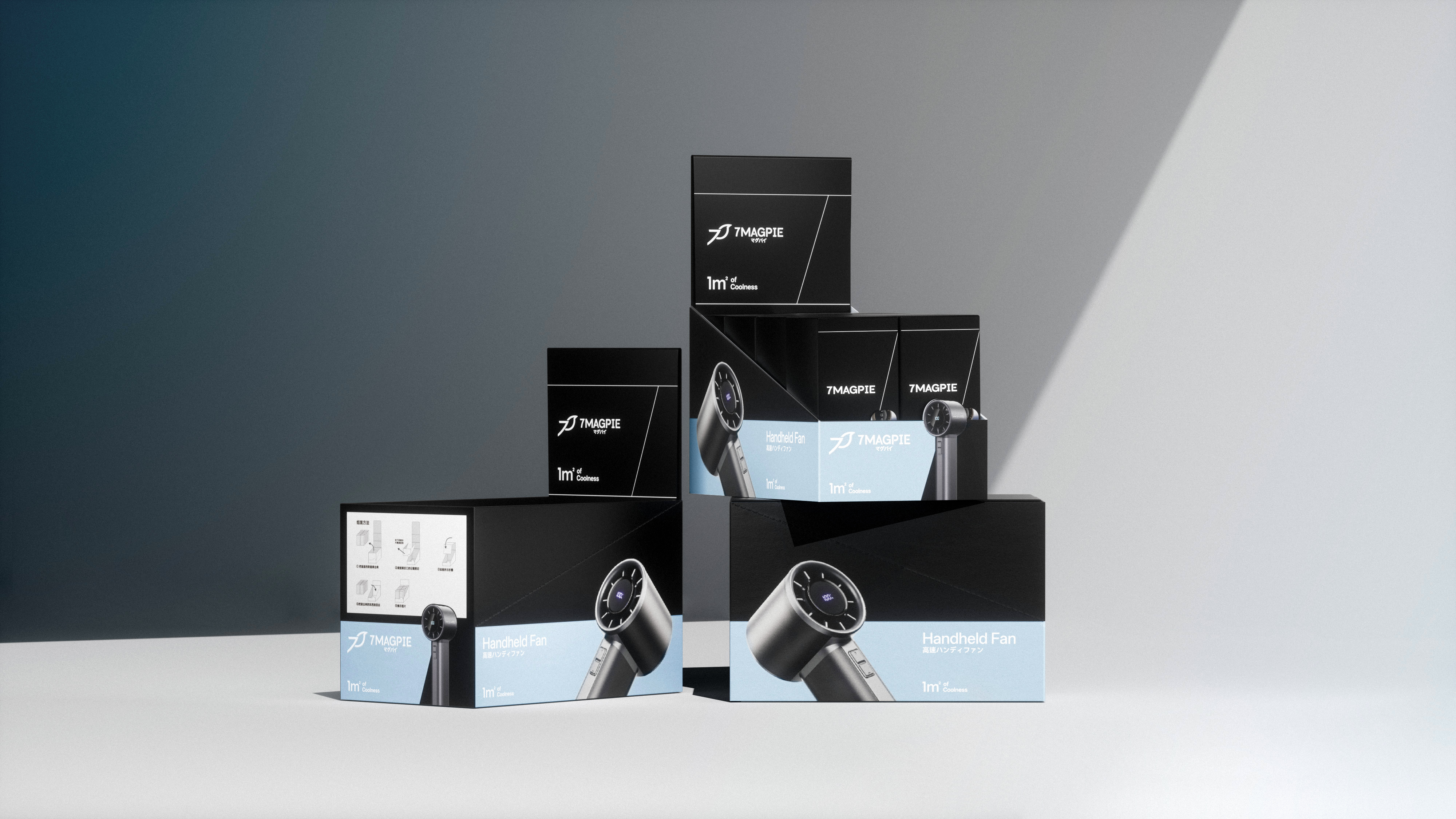
In terms of packaging, on the basis of systematic vision, we have planned two systems of "conventional packaging" and "gift box packaging" by color division. The information hierarchy has been combed, the information acquisition efficiency has been strengthened, the typesetting and display forms of various products have been constructed for 7MAGPIE, the online and offline sales environment has been clearly taken into account, and the brand genes of simplicity and technology have been strengthened.

本作品版权归 后浪设计 所有,禁止匿名转载及个人使用,任何商业用途均需联系原作者。
新用户?创建账号
登录 重置密码
请输入电子邮件以重置密码。


Learning from the LOGO you designed, I also made a
Awesome!
It’s pretty good.
Invincible!
That’s interesting.
Is it interesting?