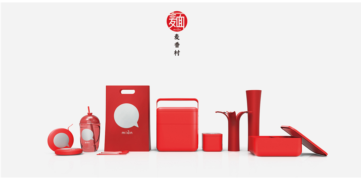
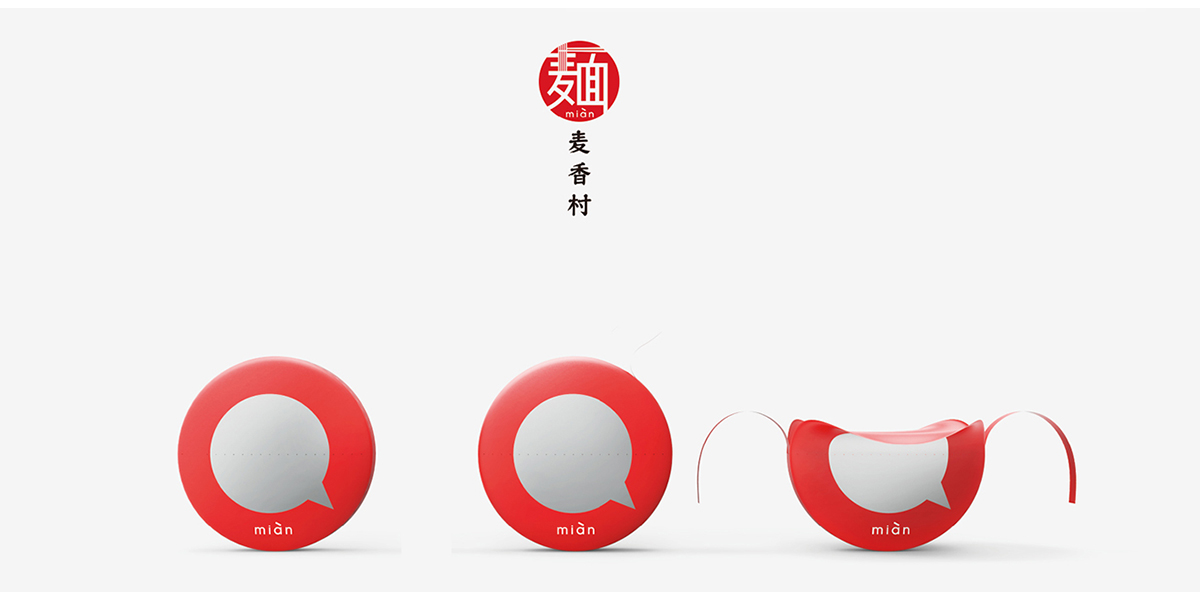
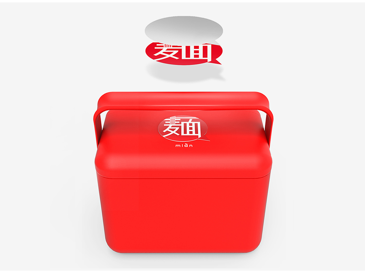
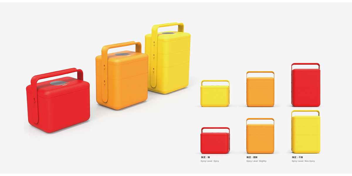
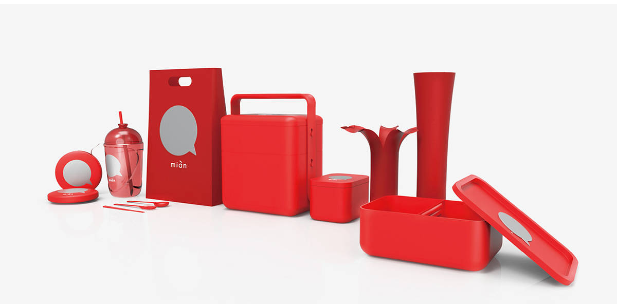
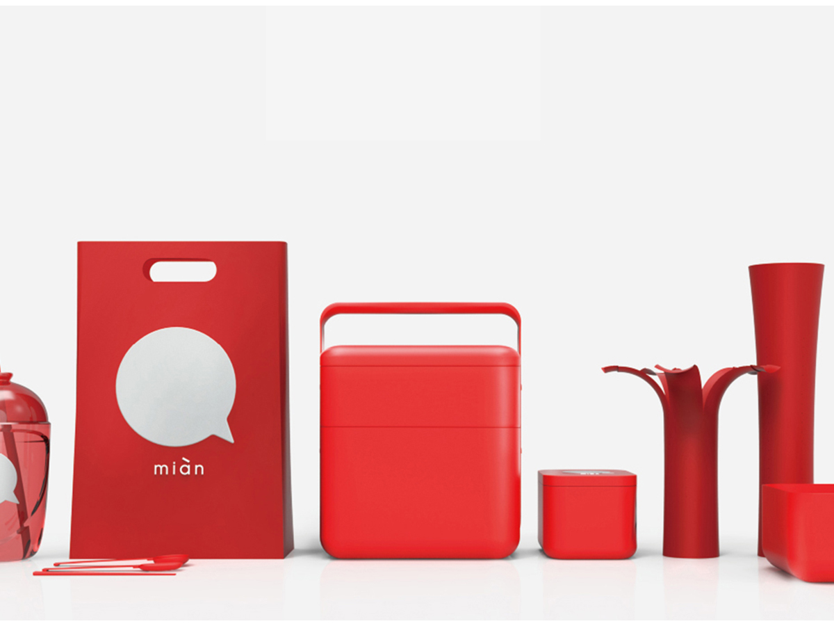
The design appearance of Maixiang Village's take-out series is derived from the modern elements of ancient food boxes. The red packaging design is consistent with the brand's main visual color. In terms of structural design, the designer adopts the design concept of separation of noodles in soup to minimize the cooking time and the waiting time of users, thus providing consumers with a convenient and comfortable eating process.
本作品版权归 合木设计 所有,禁止匿名转载及个人使用,任何商业用途均需联系原作者。

新用户?创建账号
登录 重置密码
请输入电子邮件以重置密码。


It's very festive
Advanced packaging
GOOD JOB
This package is very festive.
Red looks really good.