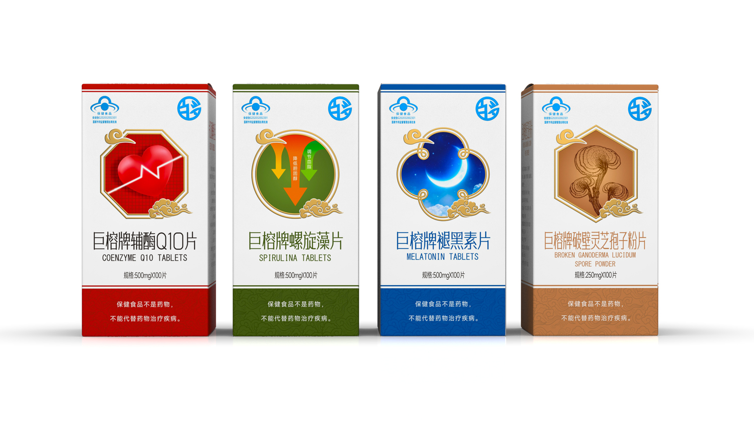
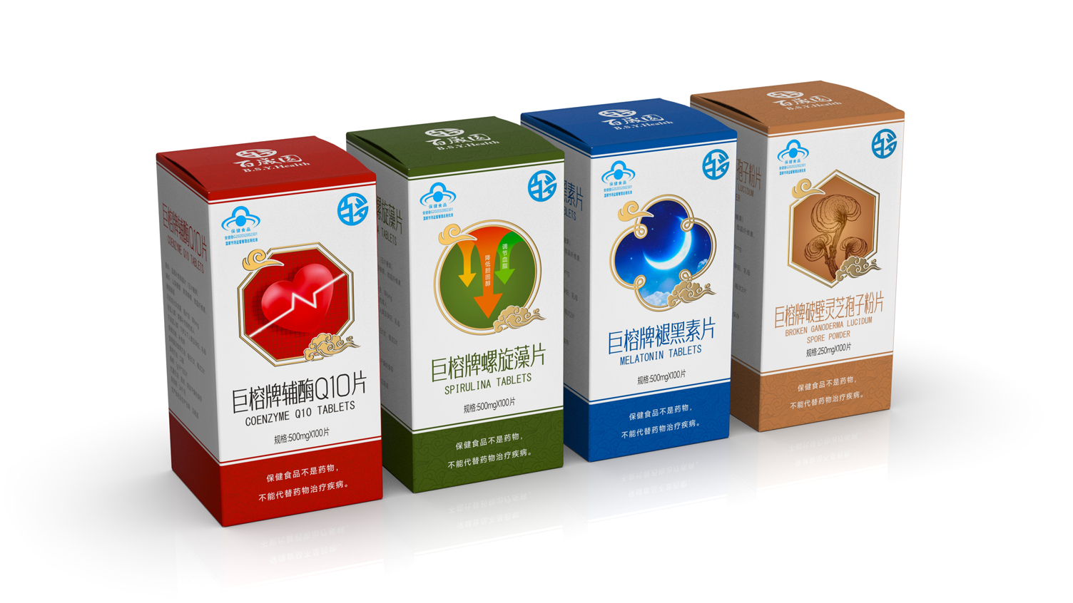
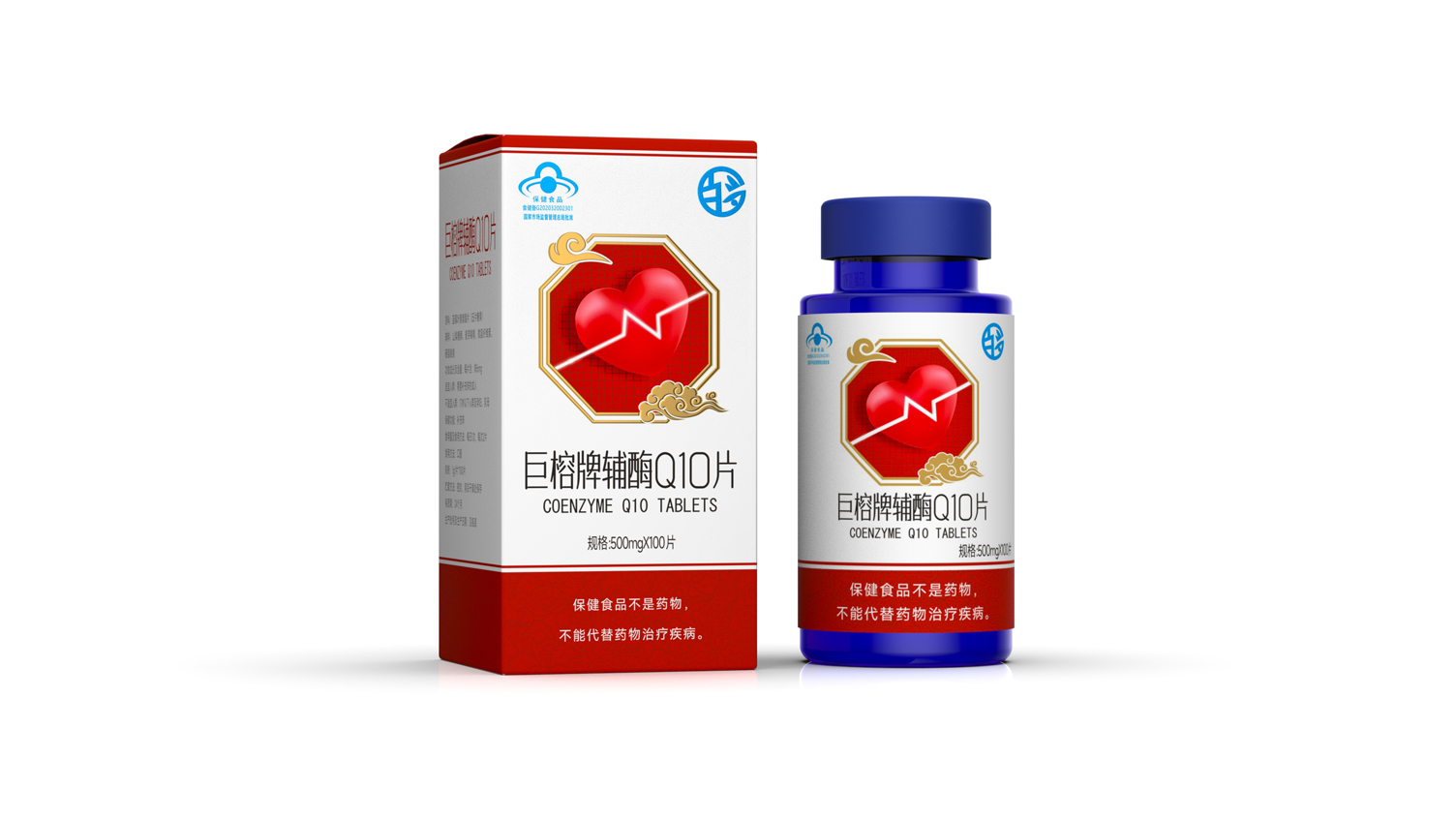
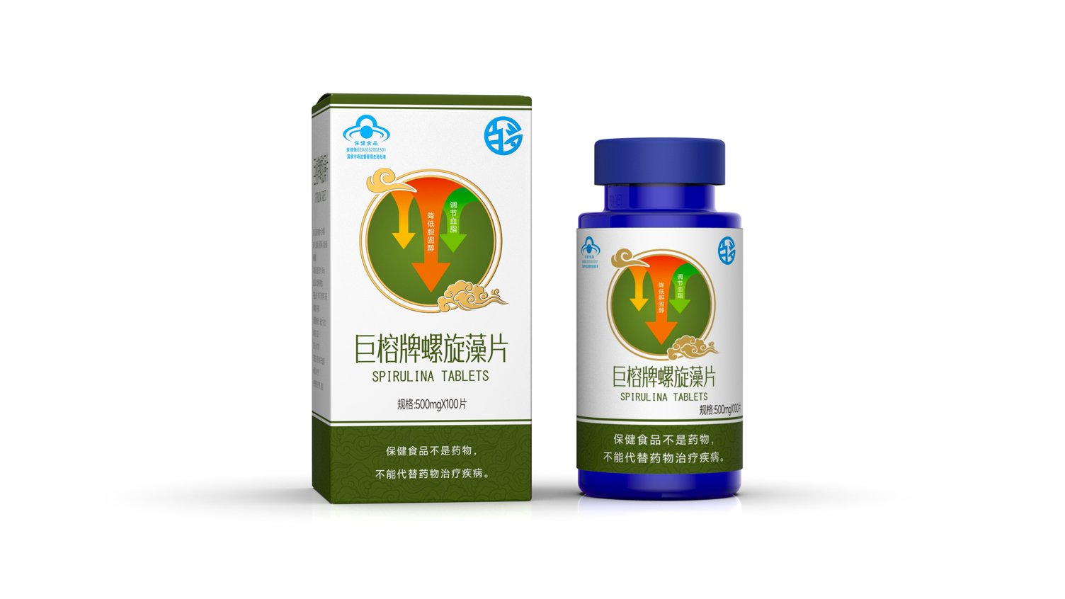
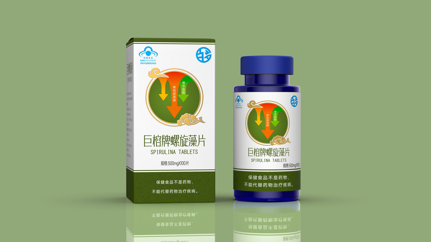
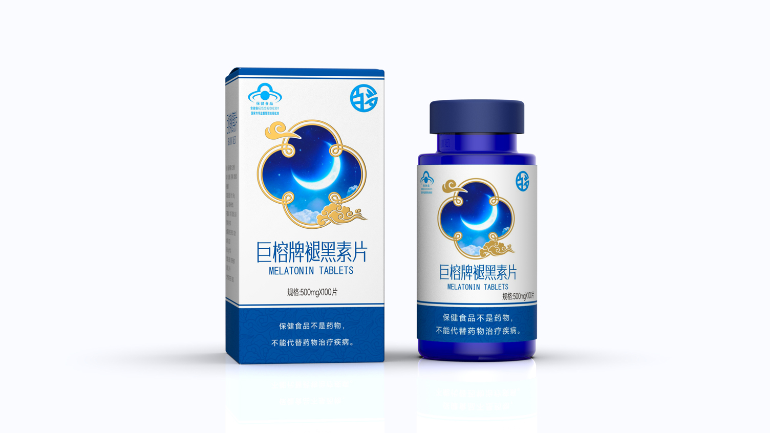
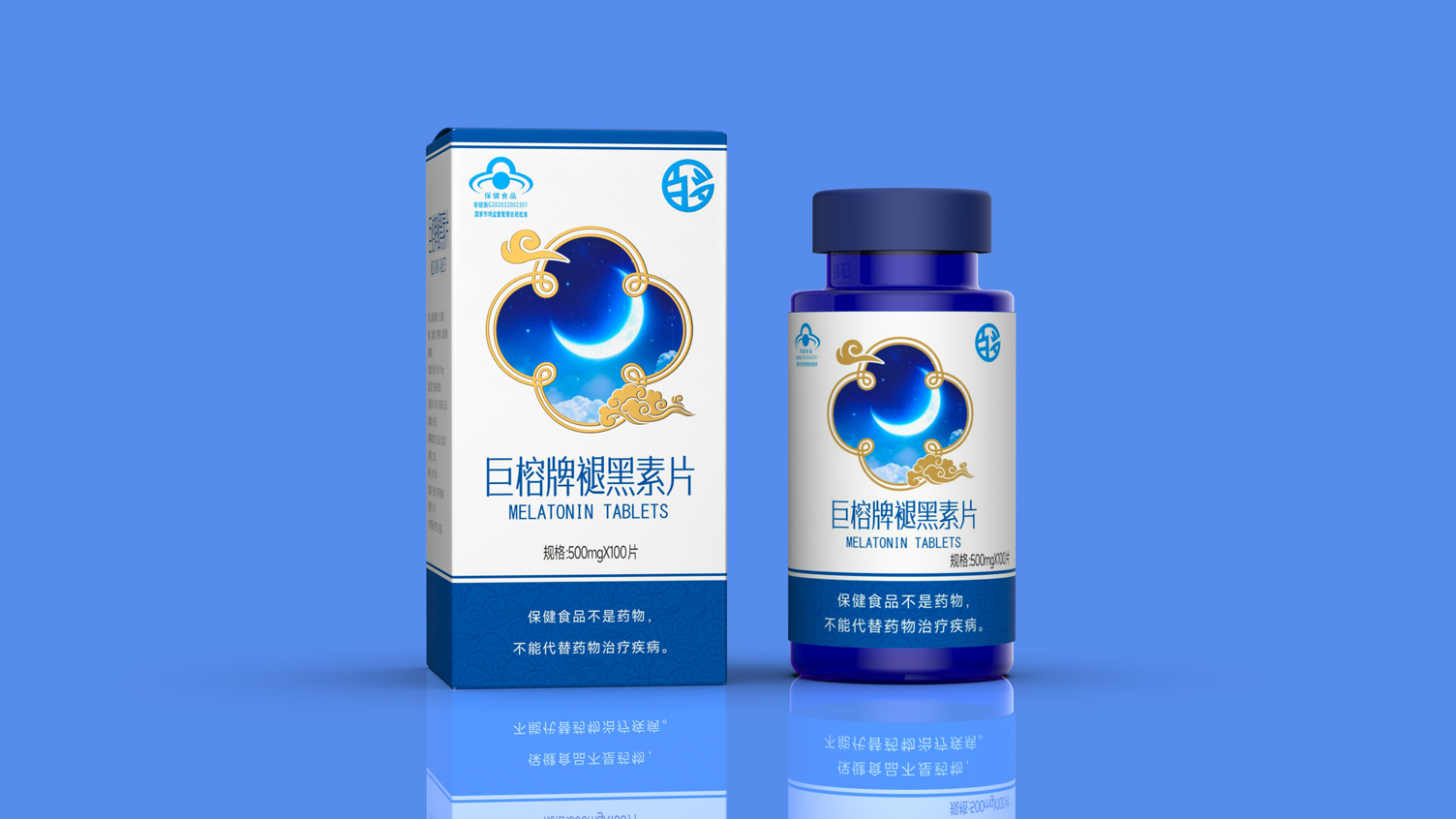
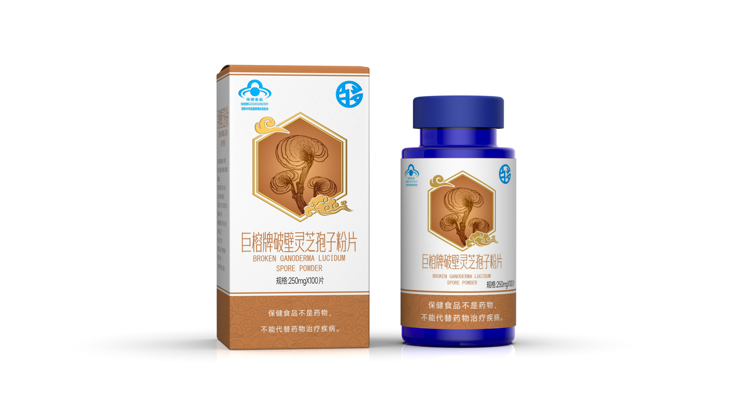
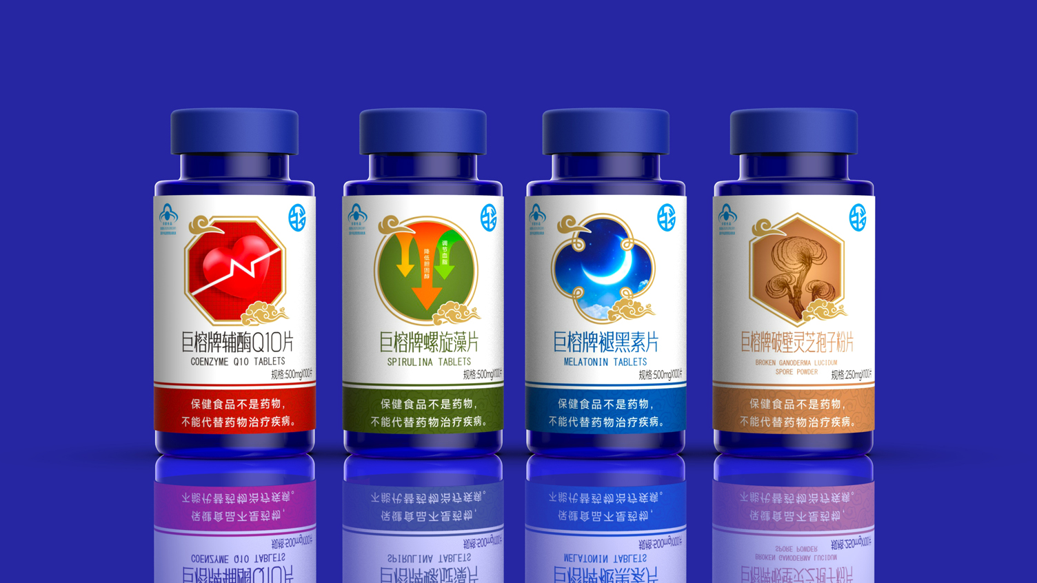
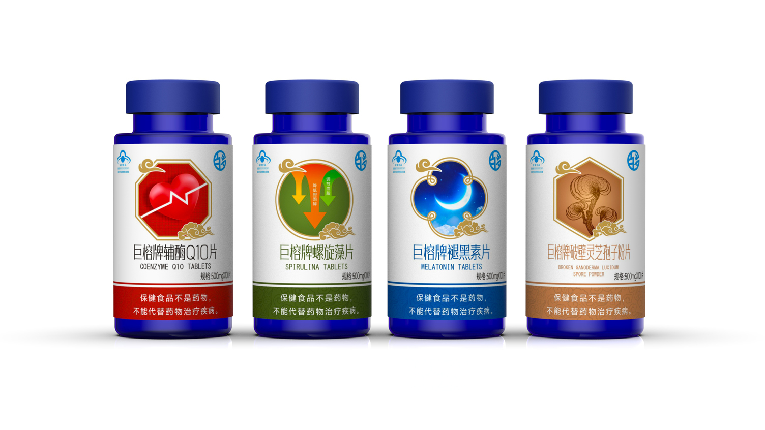
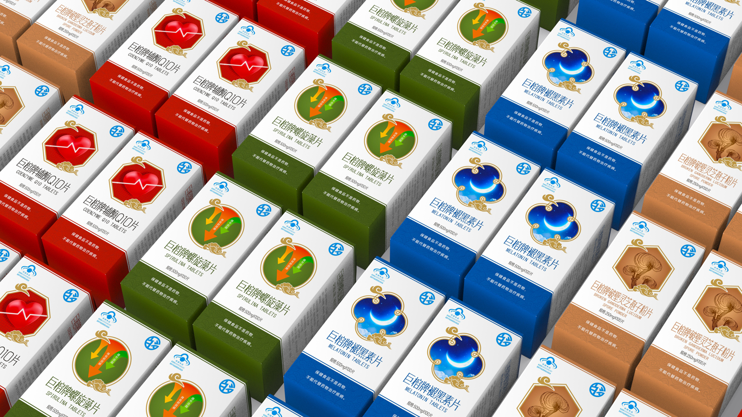
Zhiyuan Square Packaging Design Case | Functional Visualization of Visual Symbols Aesthetic Health Care Products Series Packaging
functional visualization
Series of health care products packaging
Unified Implantation of Xiangyun
National tide elements such as traditional patterns
Strengthen the brand national style tonality
Each product is associated with a strong
Visual symbols directly convey core functions
Let users "see the packaging to understand the role"
With red/green/blue/brown four main colors
Psychological Association Corresponding to Different Functions
Let the series pack in the network
The matrix can be identified uniformly.
Can quickly distinguish
本作品版权归 深圳智圆行方包装设计 所有,禁止匿名转载及个人使用,任何商业用途均需联系原作者。
新用户?创建账号
登录 重置密码
请输入电子邮件以重置密码。
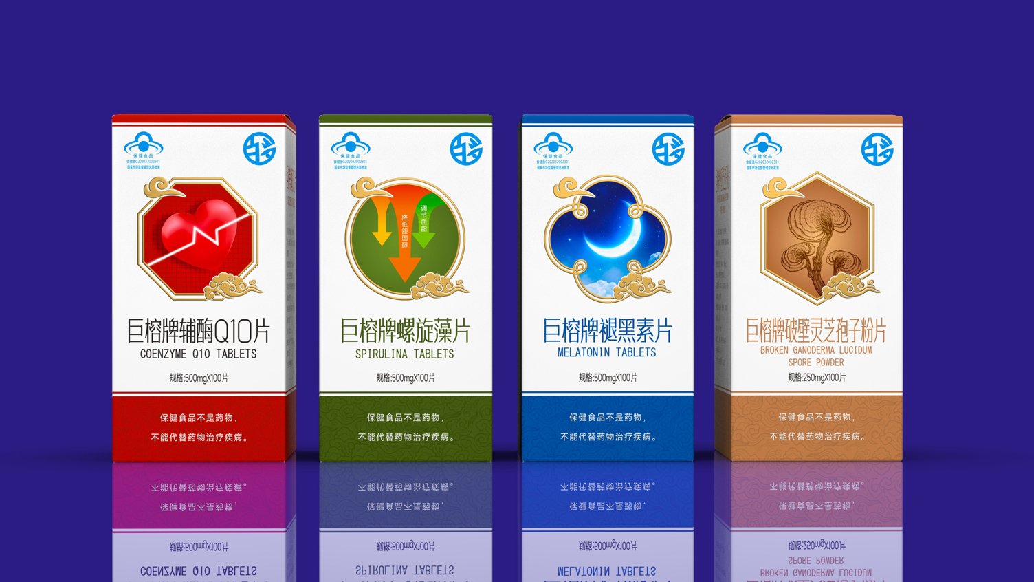
Personally, I think the color is a bit too bright.
It's really good
Yeah, that's it.
colorful