There are drops who have a crush on me and work.


本作品版权归 lydia 所有,禁止匿名转载及个人使用,任何商业用途均需联系原作者。

新用户?创建账号
登录 重置密码
请输入电子邮件以重置密码。

I actually saw the alumni cow
Haha, the overall tone is dark purple. It is suggested to change to a brighter color, which will be more suitable for the content you show.
Come on💪🐑🐑Sauce
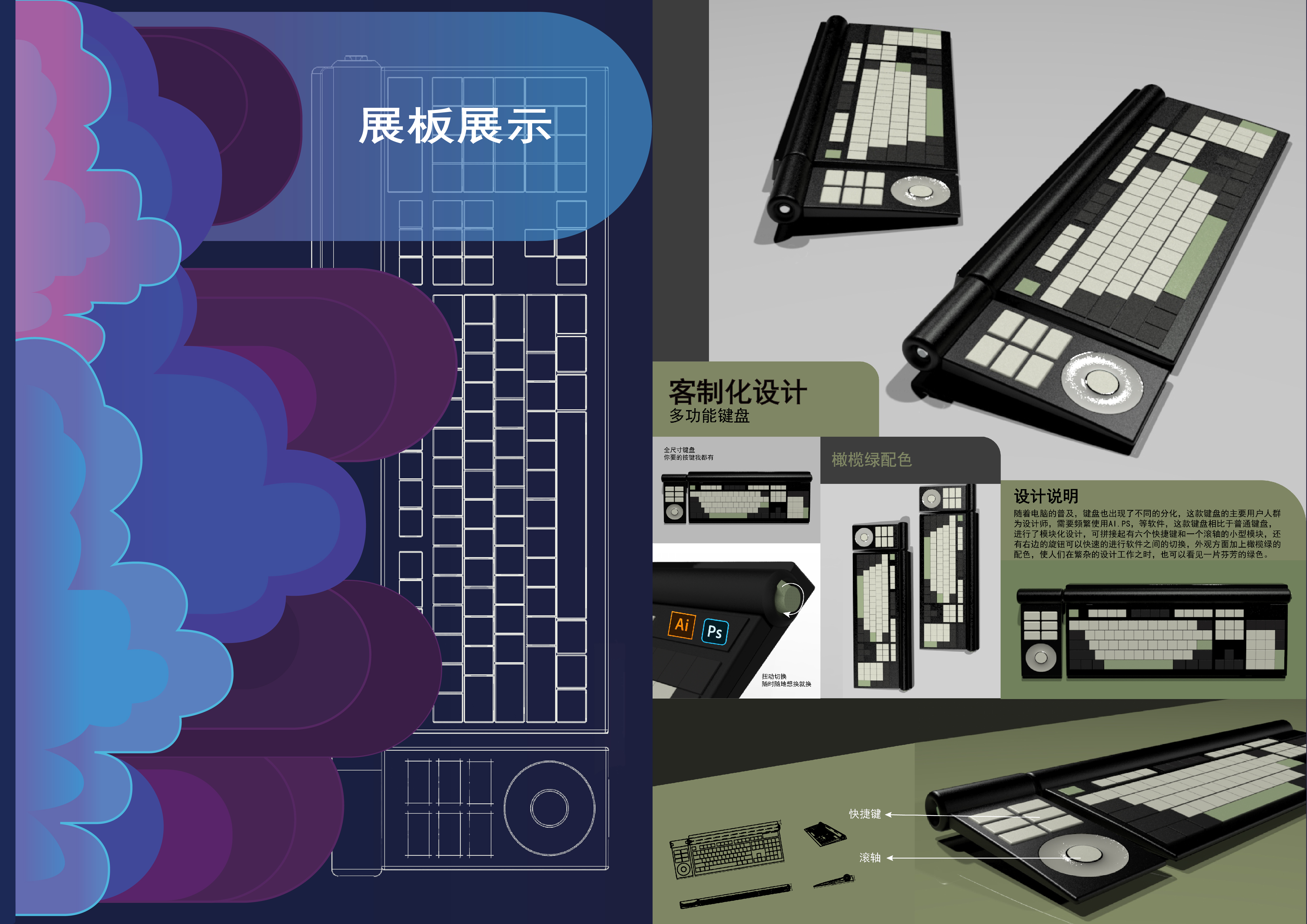
The cover is FASHION and suitable for visual communication of professional works
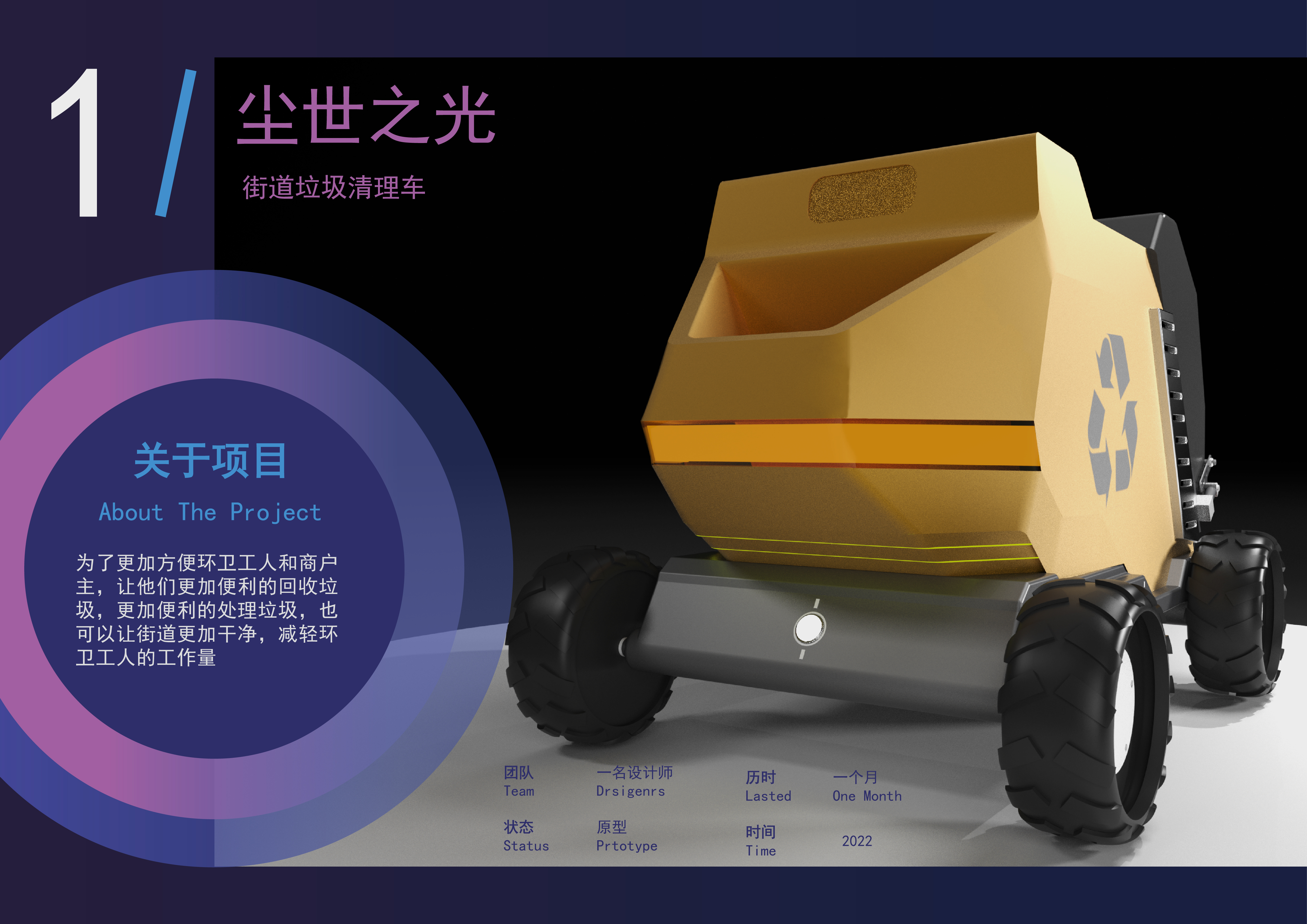
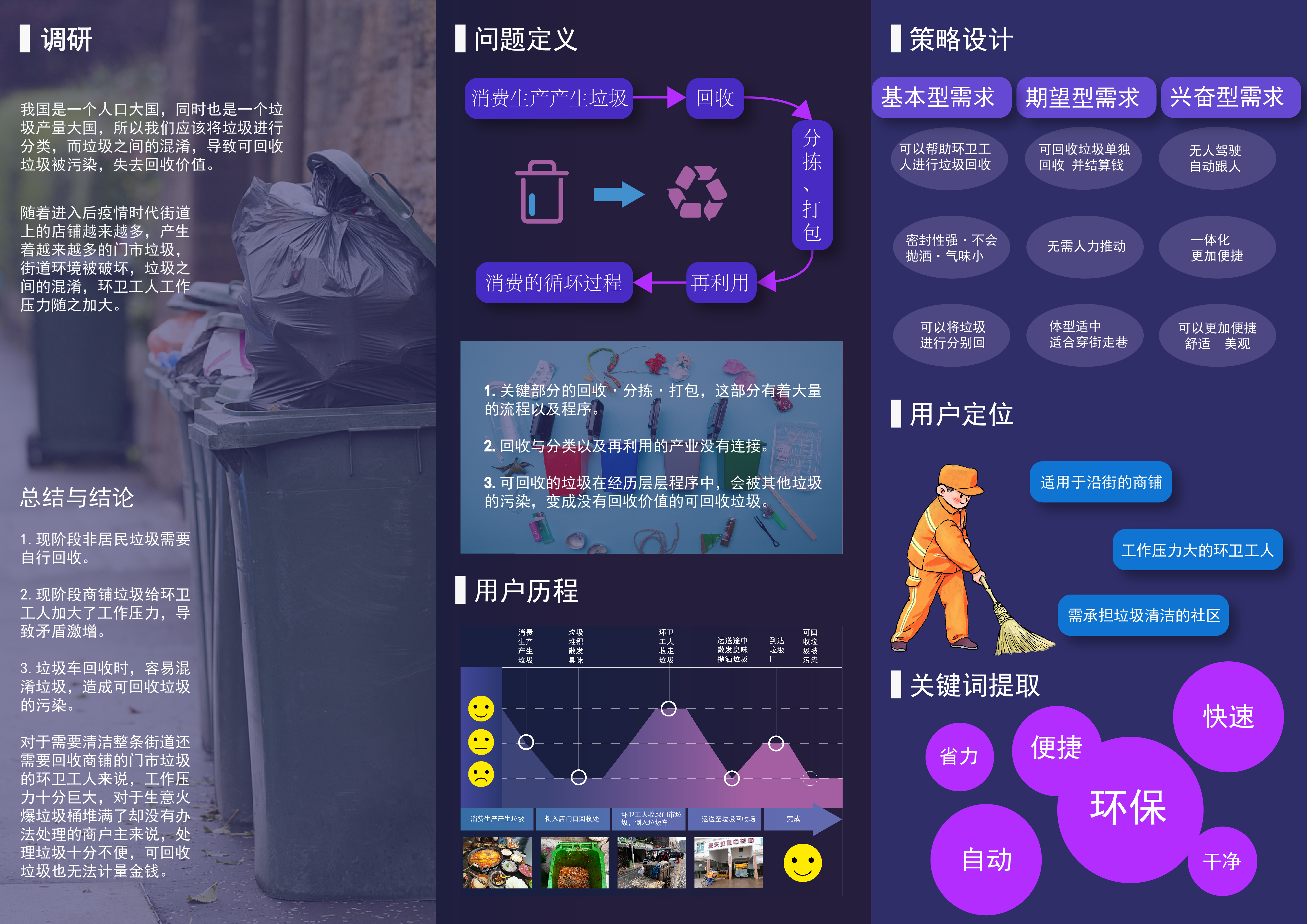
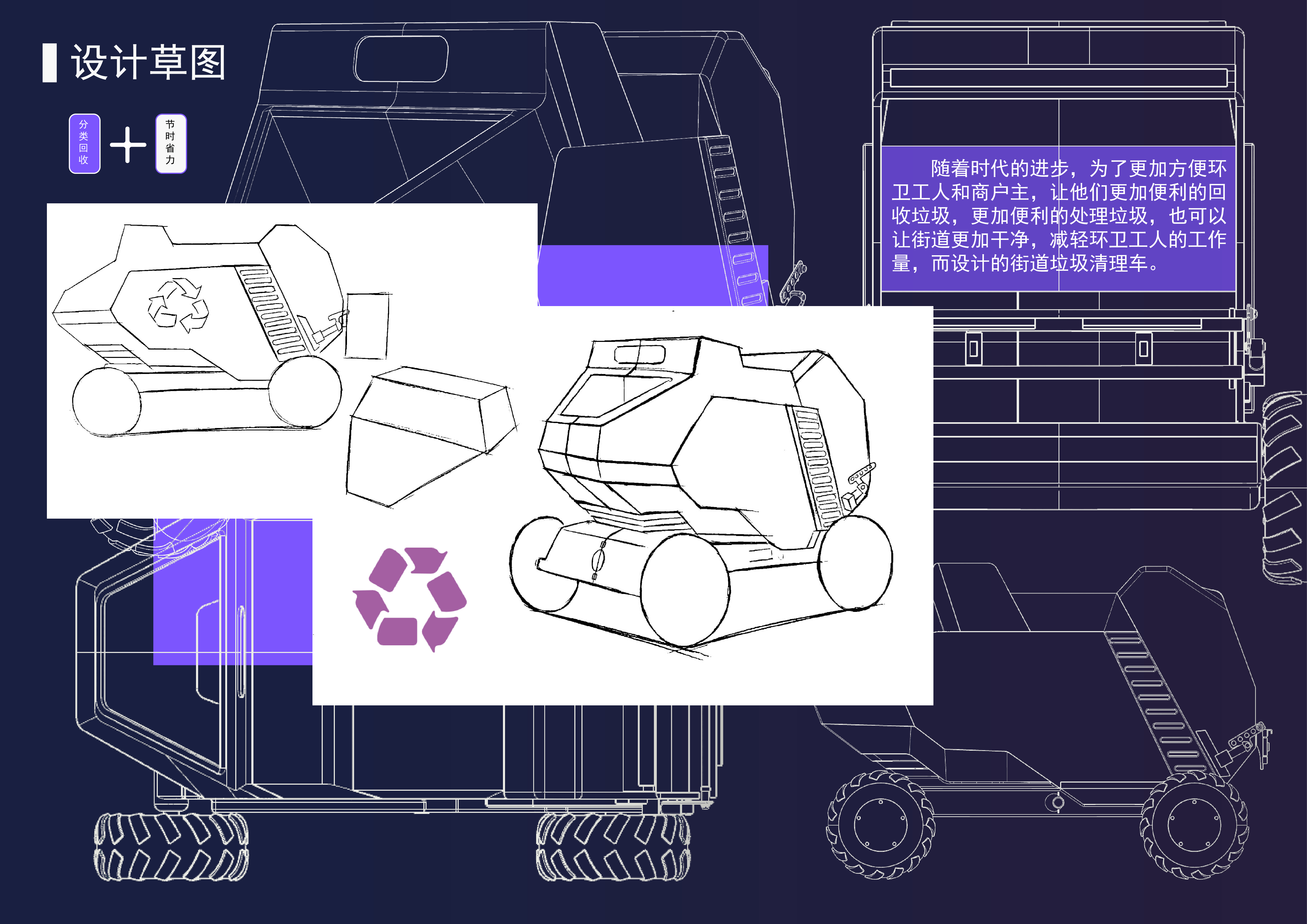
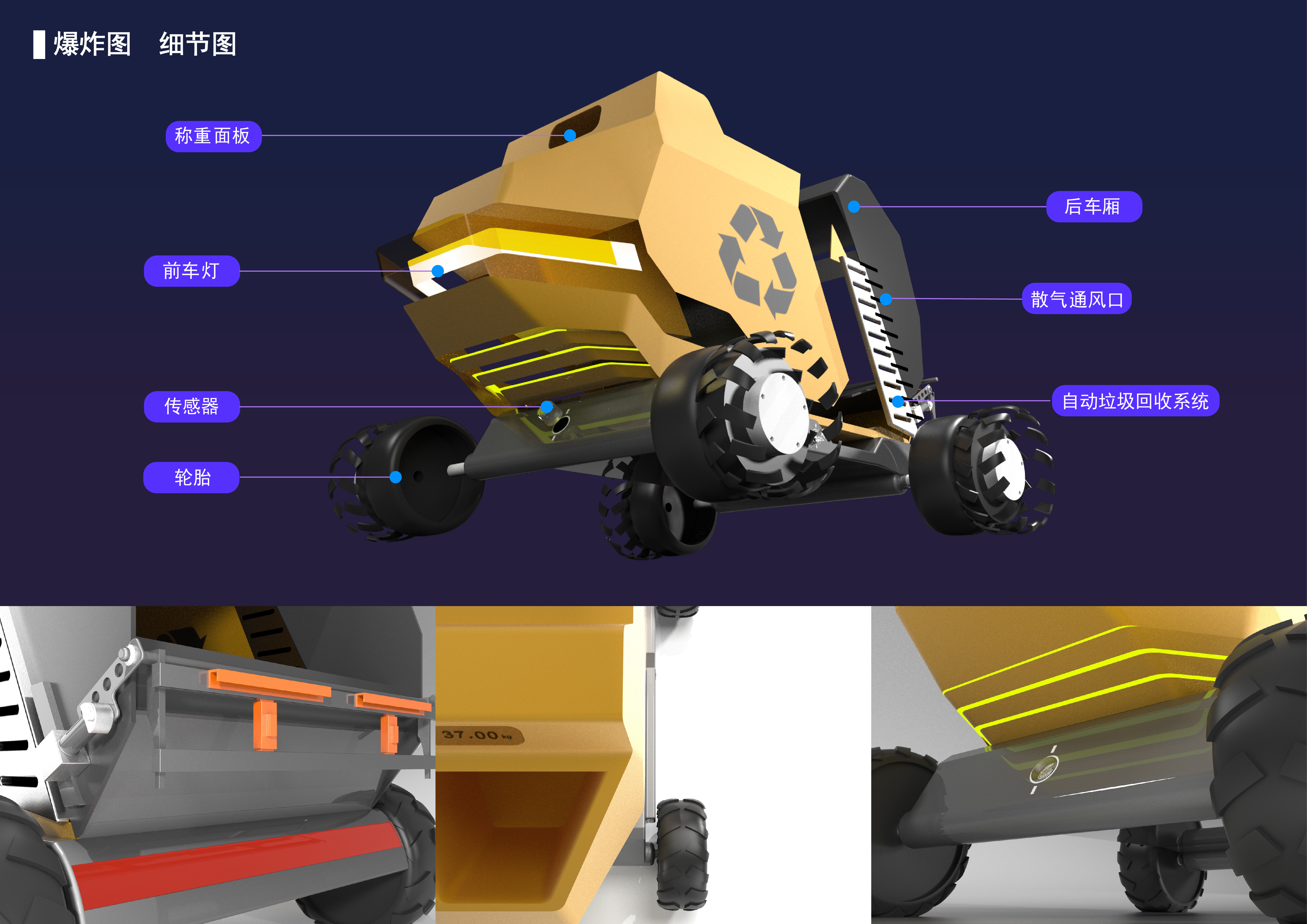
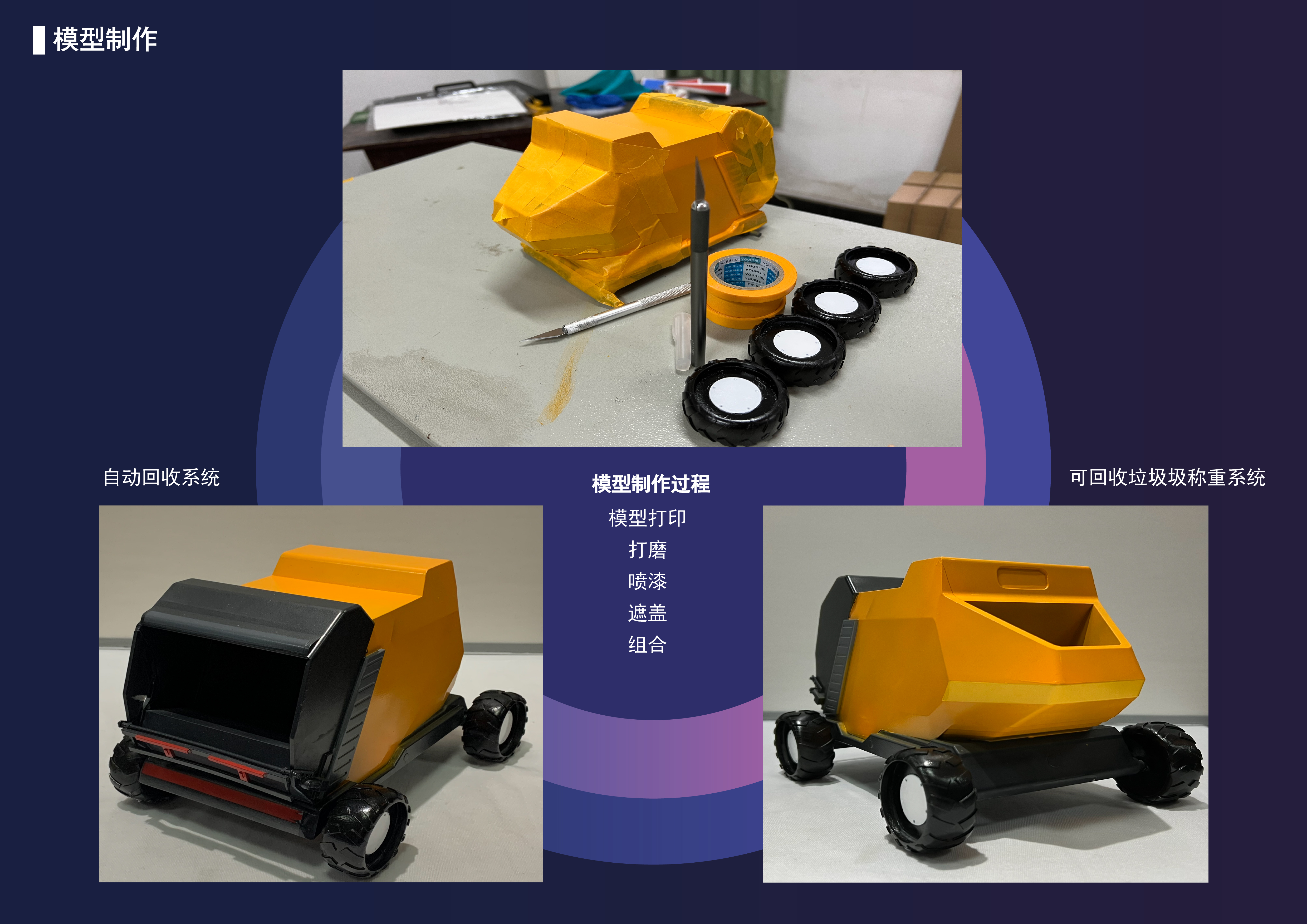
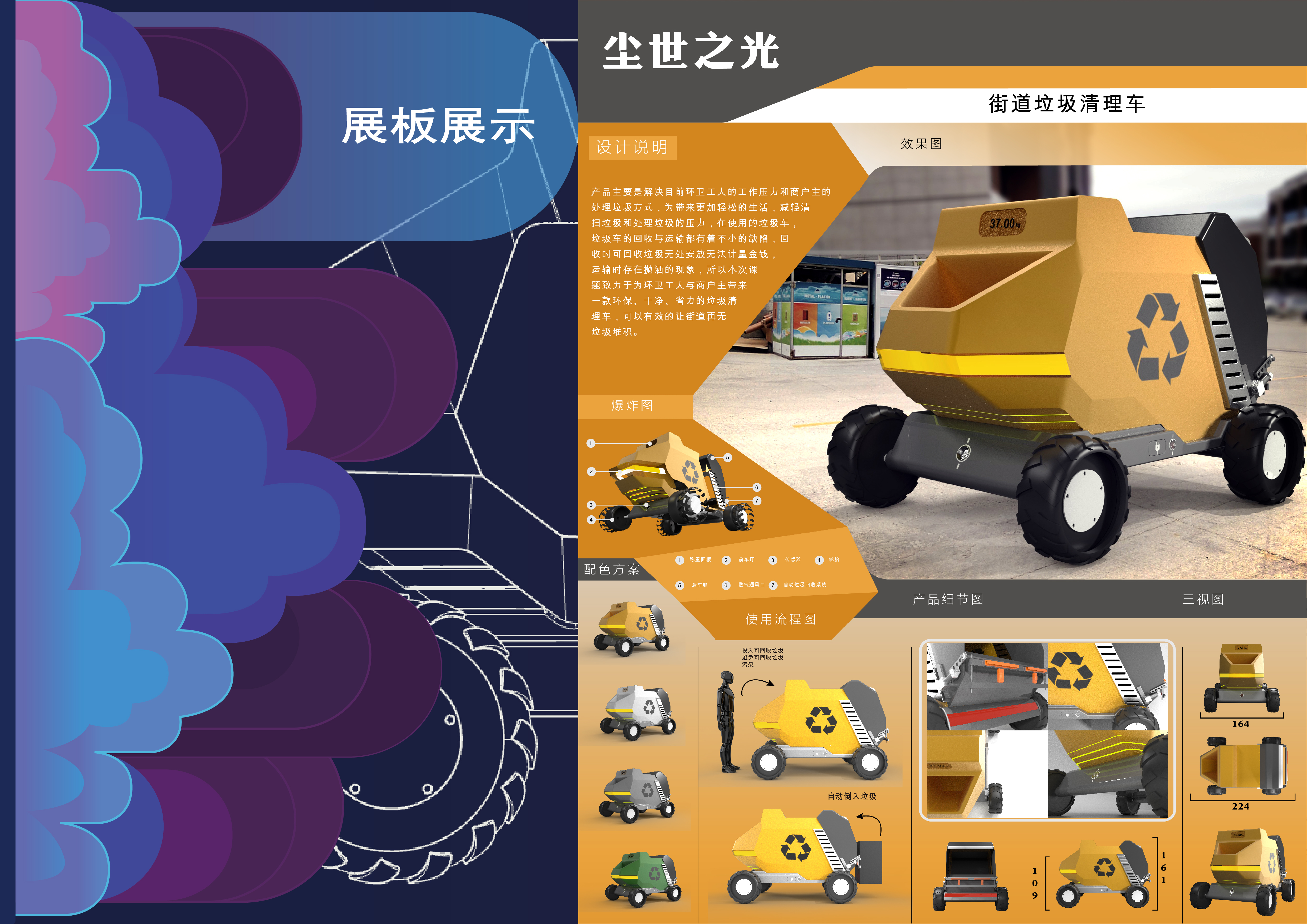
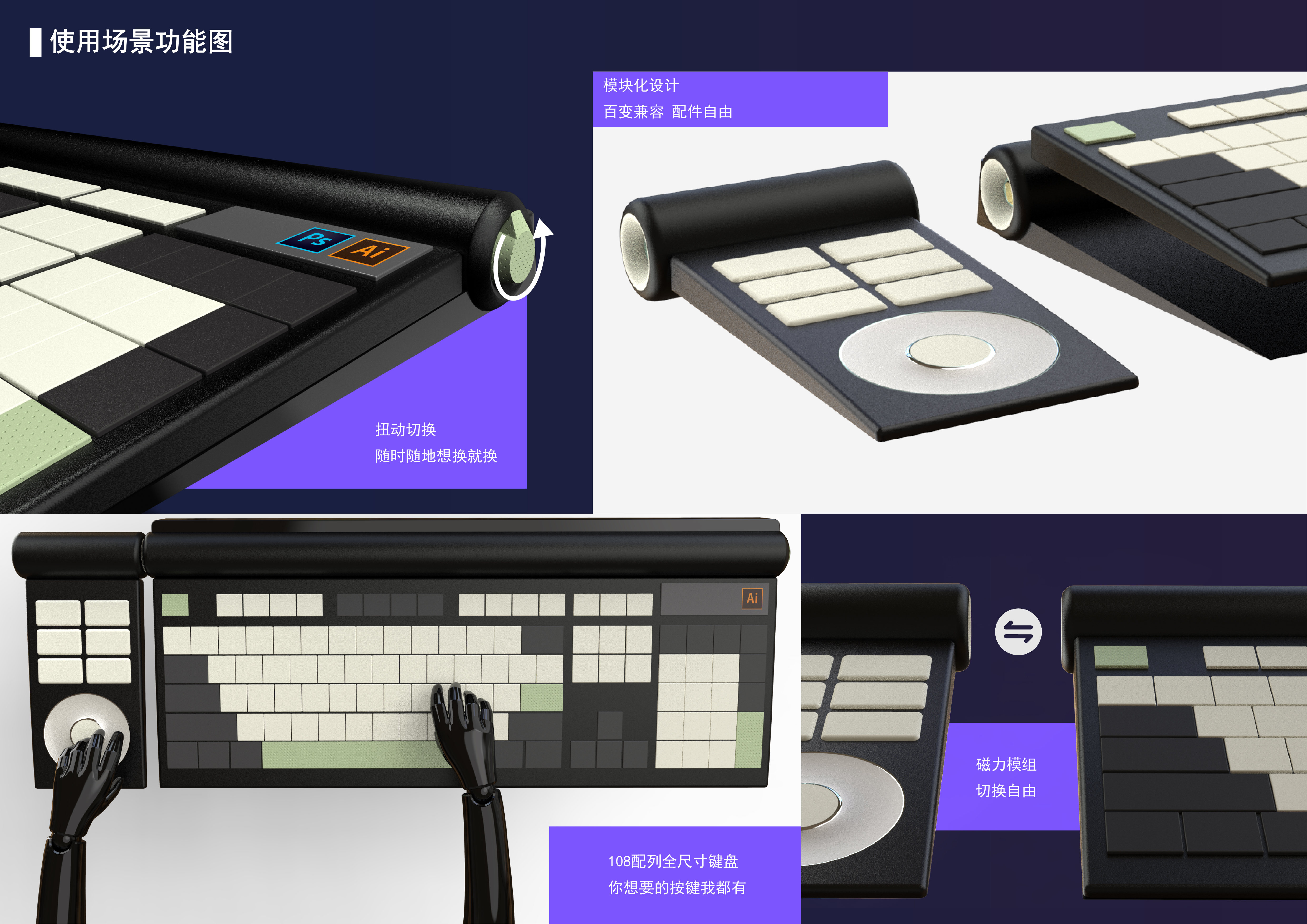
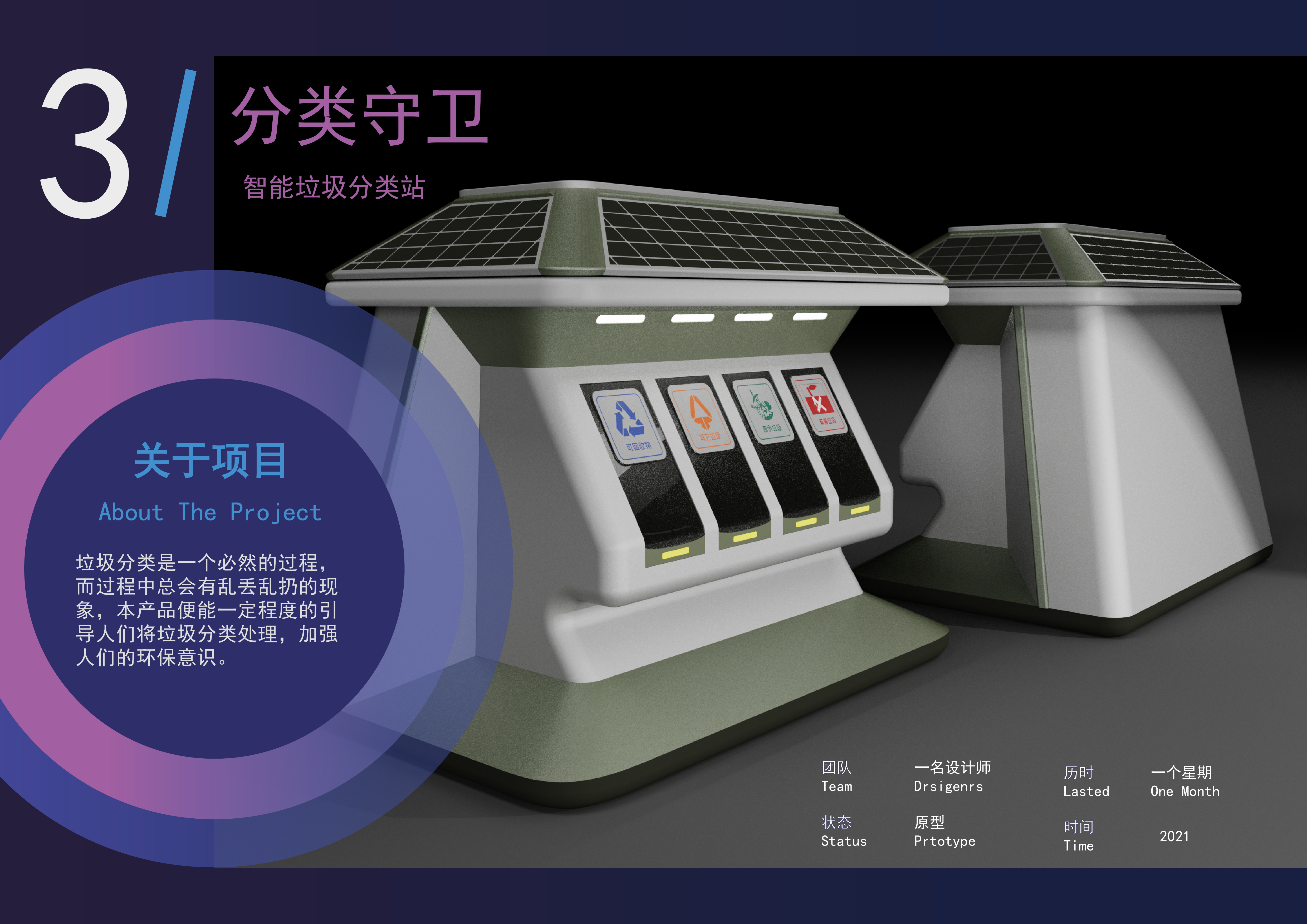
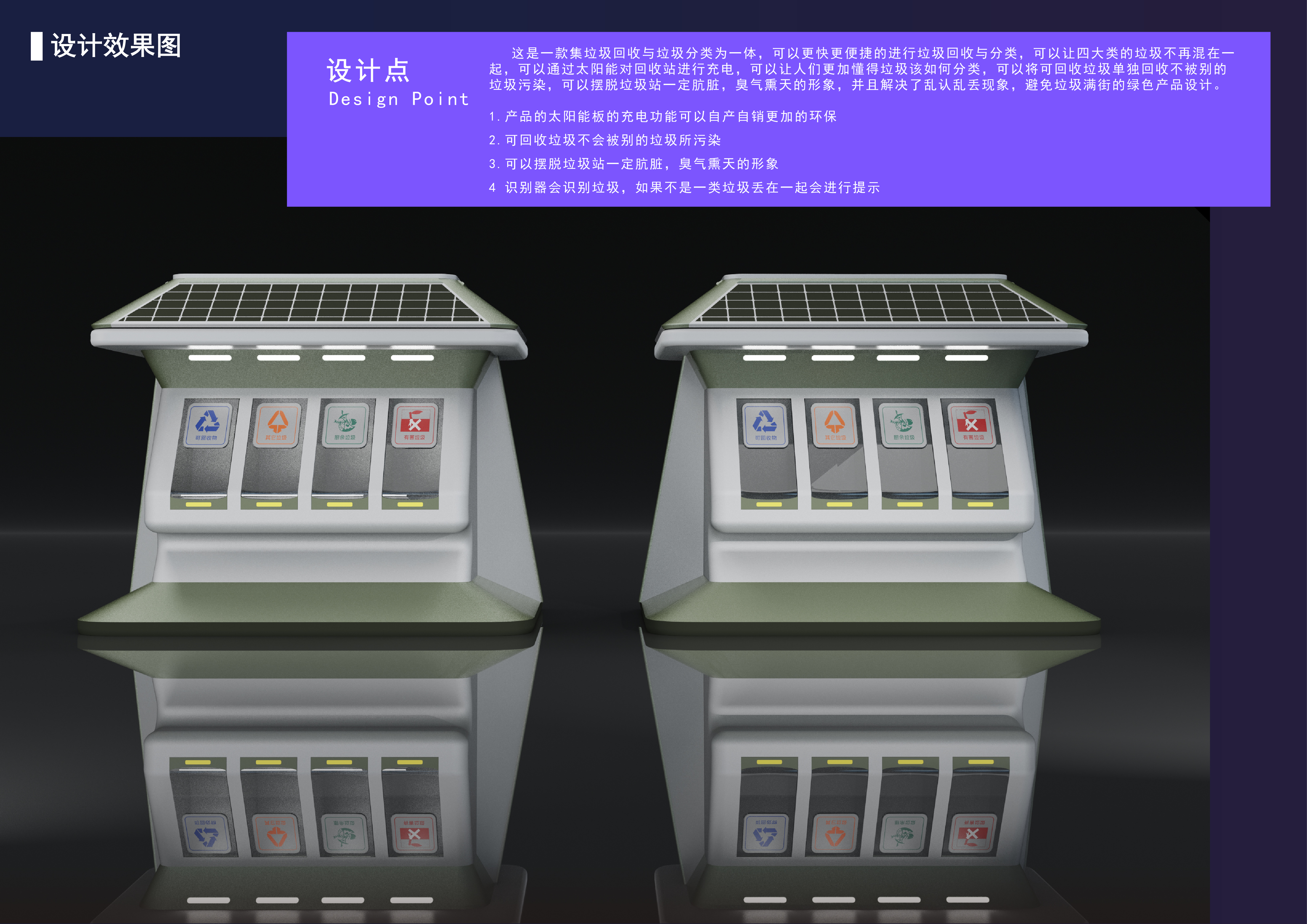
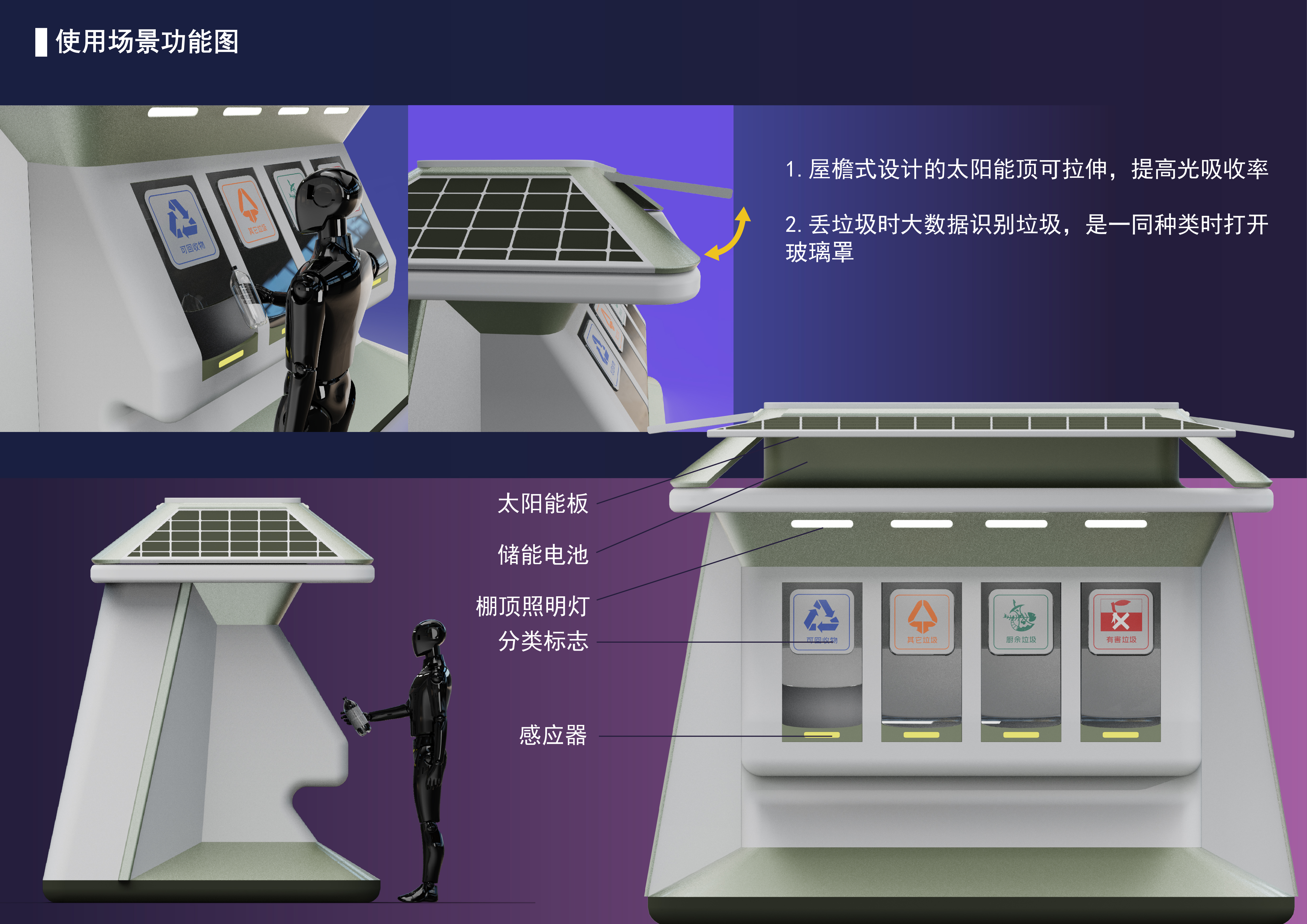
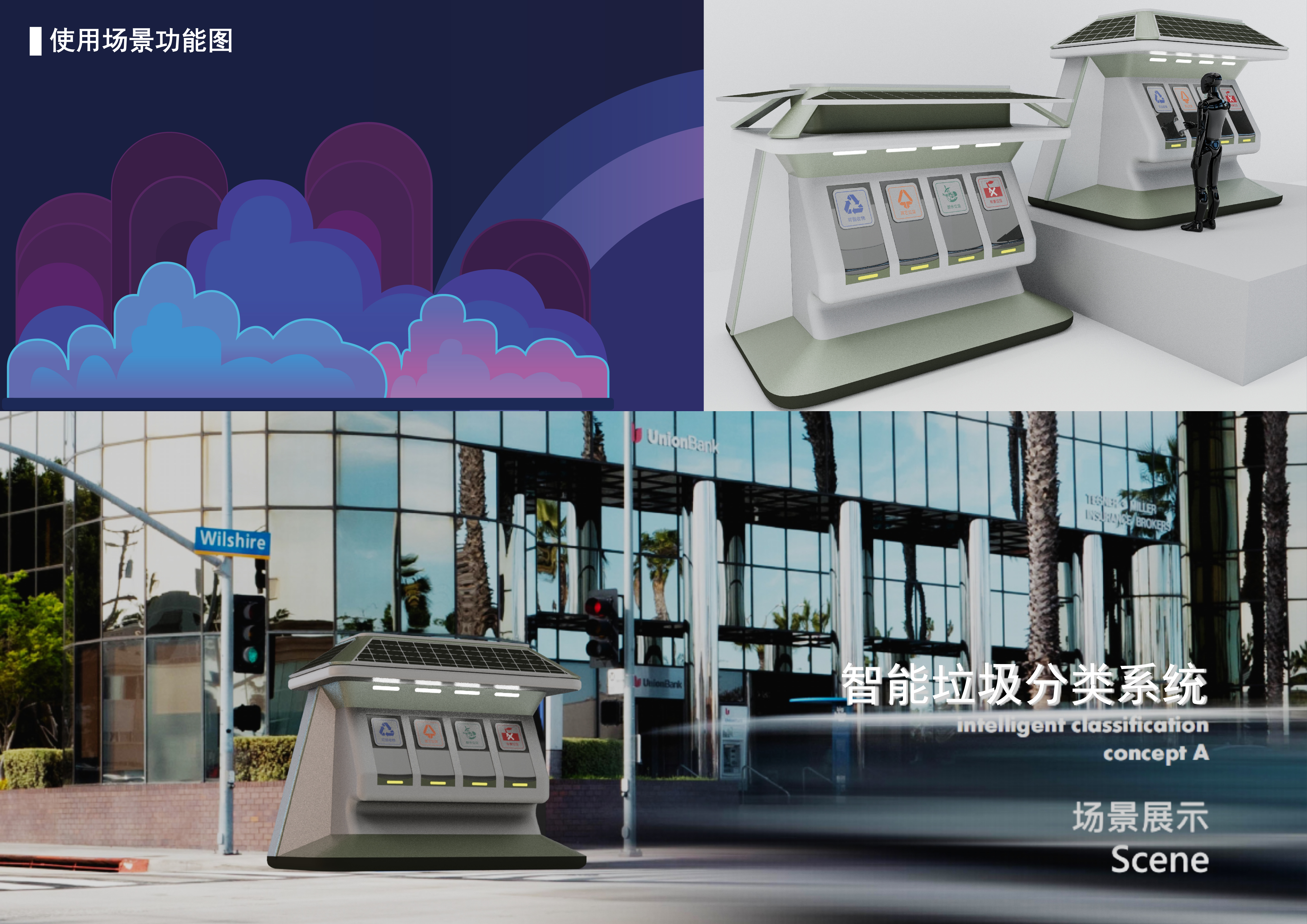
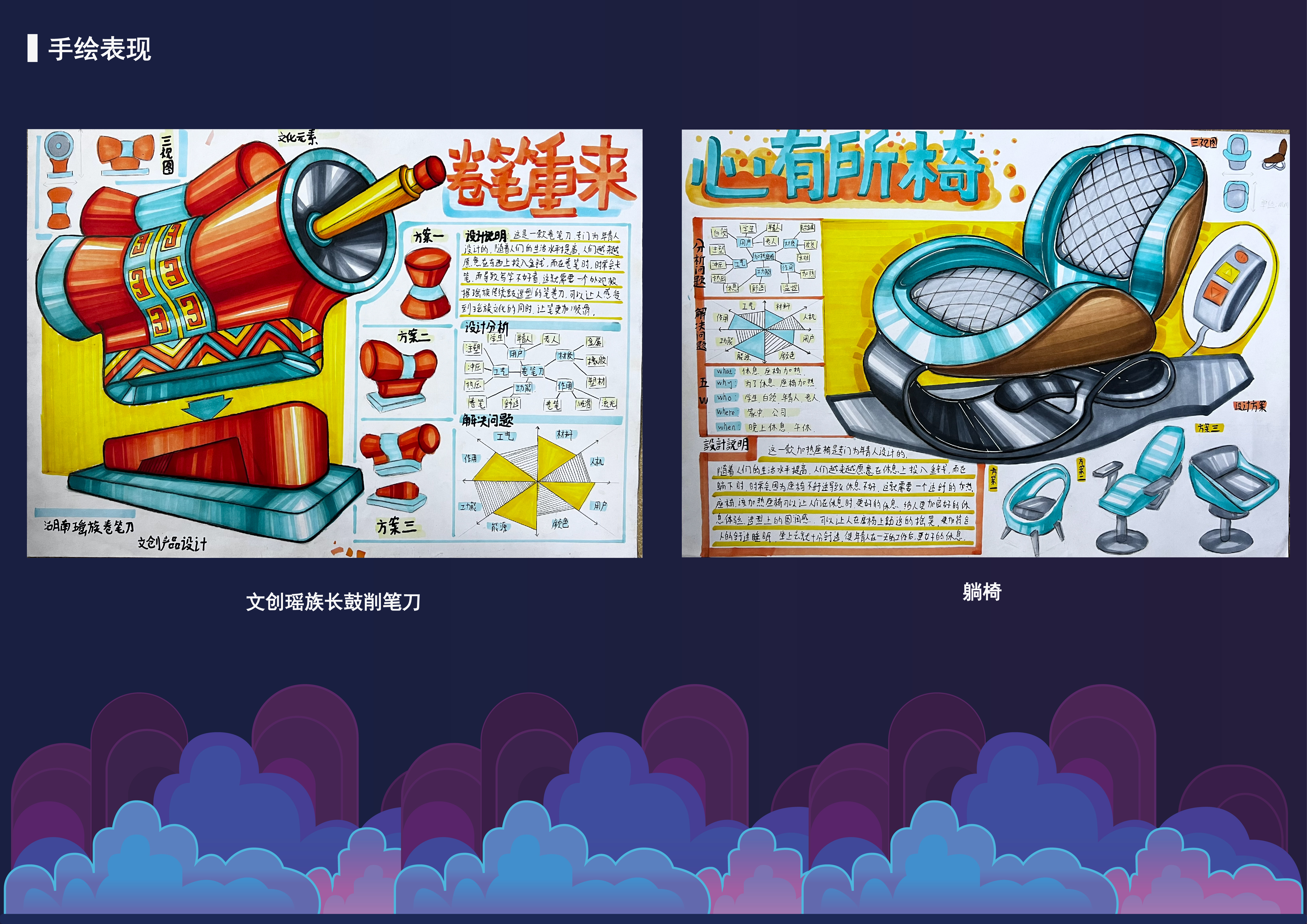
From the third point of view, I think it is OK. I suggest putting the best in front. 1. The first one thinks that the shape is a bit stiff and the garbage taking out the mouth is too small for the sake of the shape. This logic is reversed. In life, we often see a garbage bin full, so we should first consider that it is more convenient to have a larger garbage taking out mouth. Therefore, we should think about the shape with a large opening instead of thinking about the good shape and then putting the products in. In addition, tires can be purchased, so there is no need to explode the lines.2. The keyboard is still recommended to paste the key and stick the picture, so that it can be perfect and show the best side to others, so that it can be less complained.
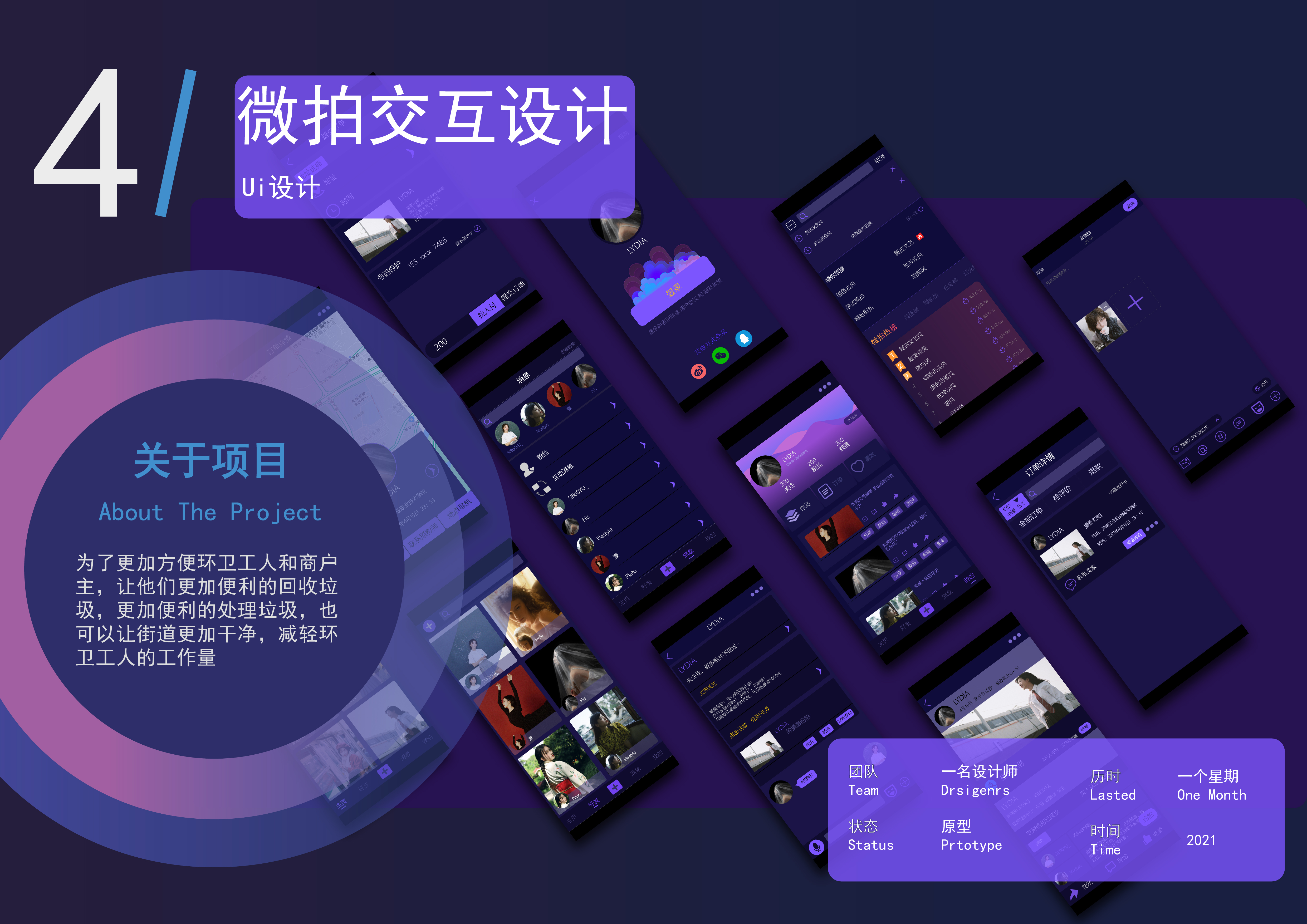
Everything is quite good, but the time spent below your work, why did you translate it into month (one month )
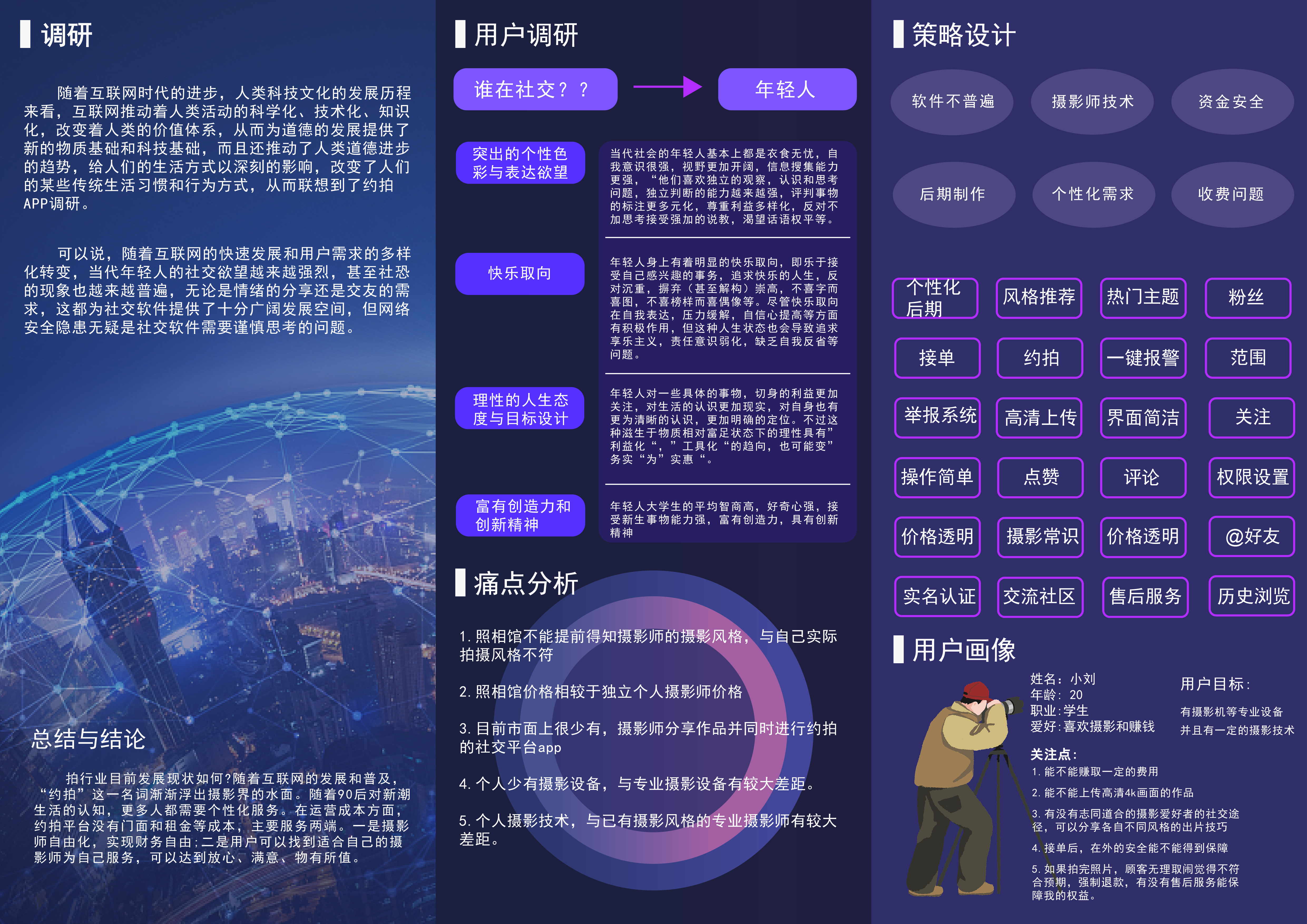
The creative hand-painted ones are really amazing. First of all, it is recommended not to use this PPT template. Some formats will look messy.
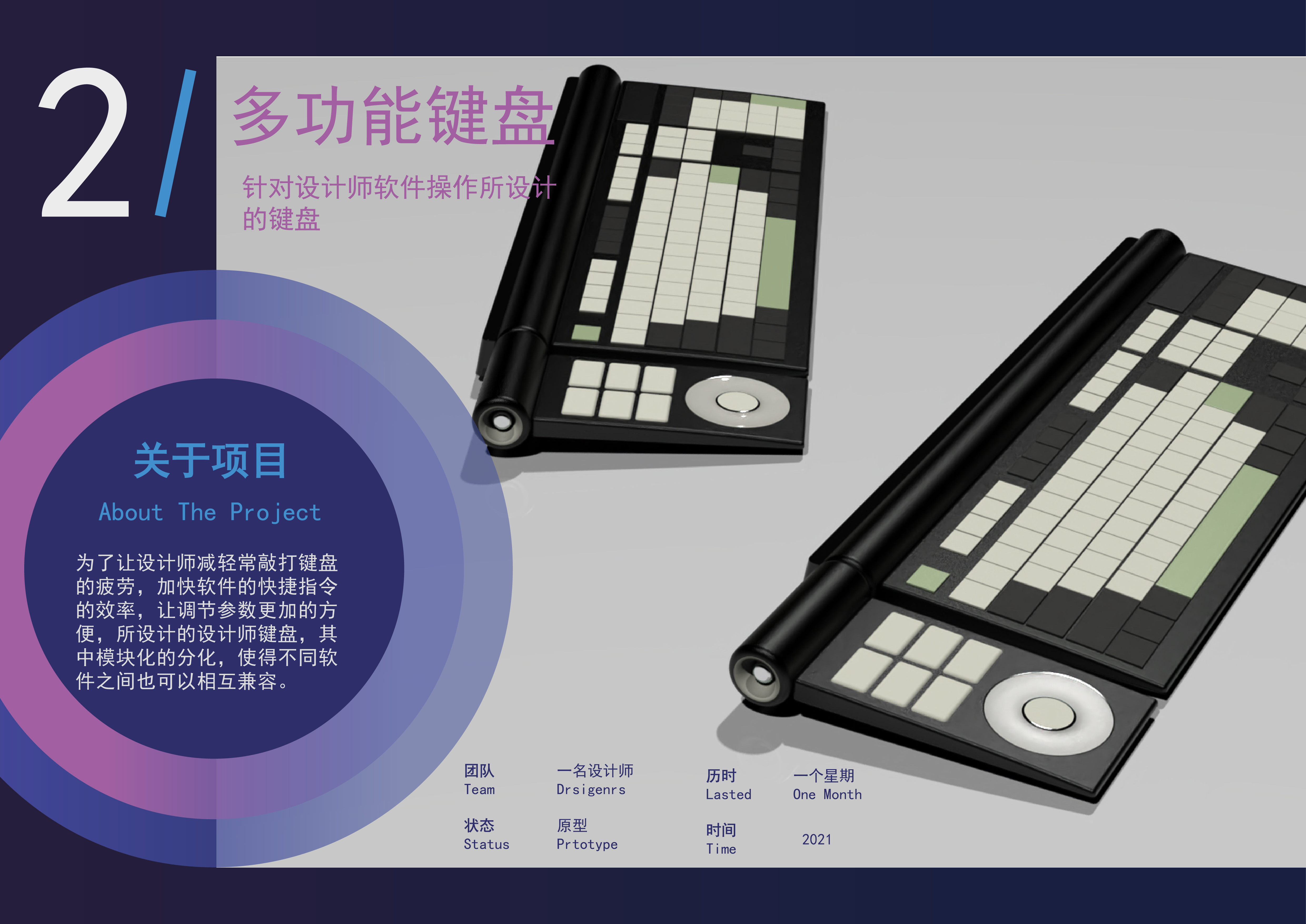
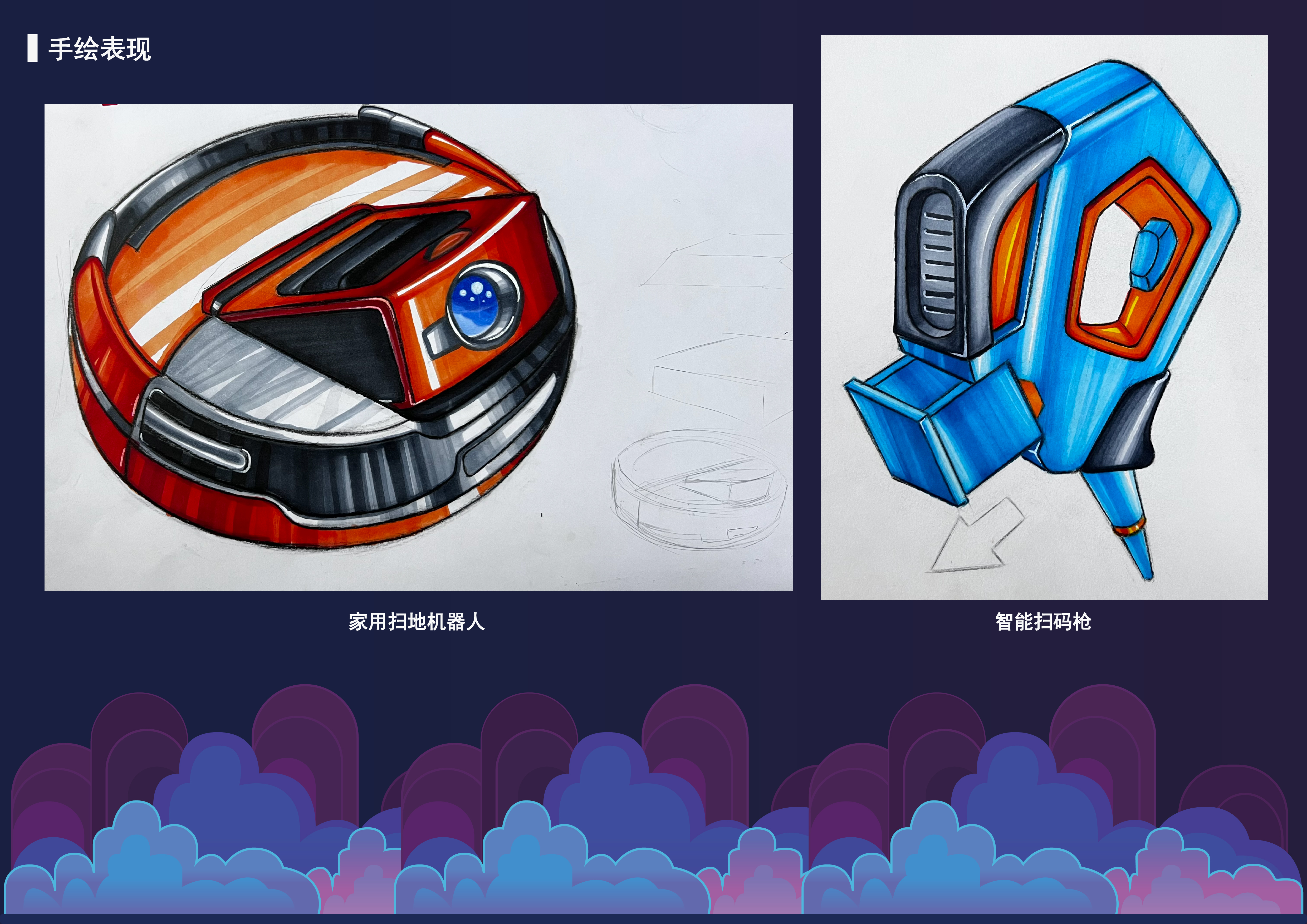
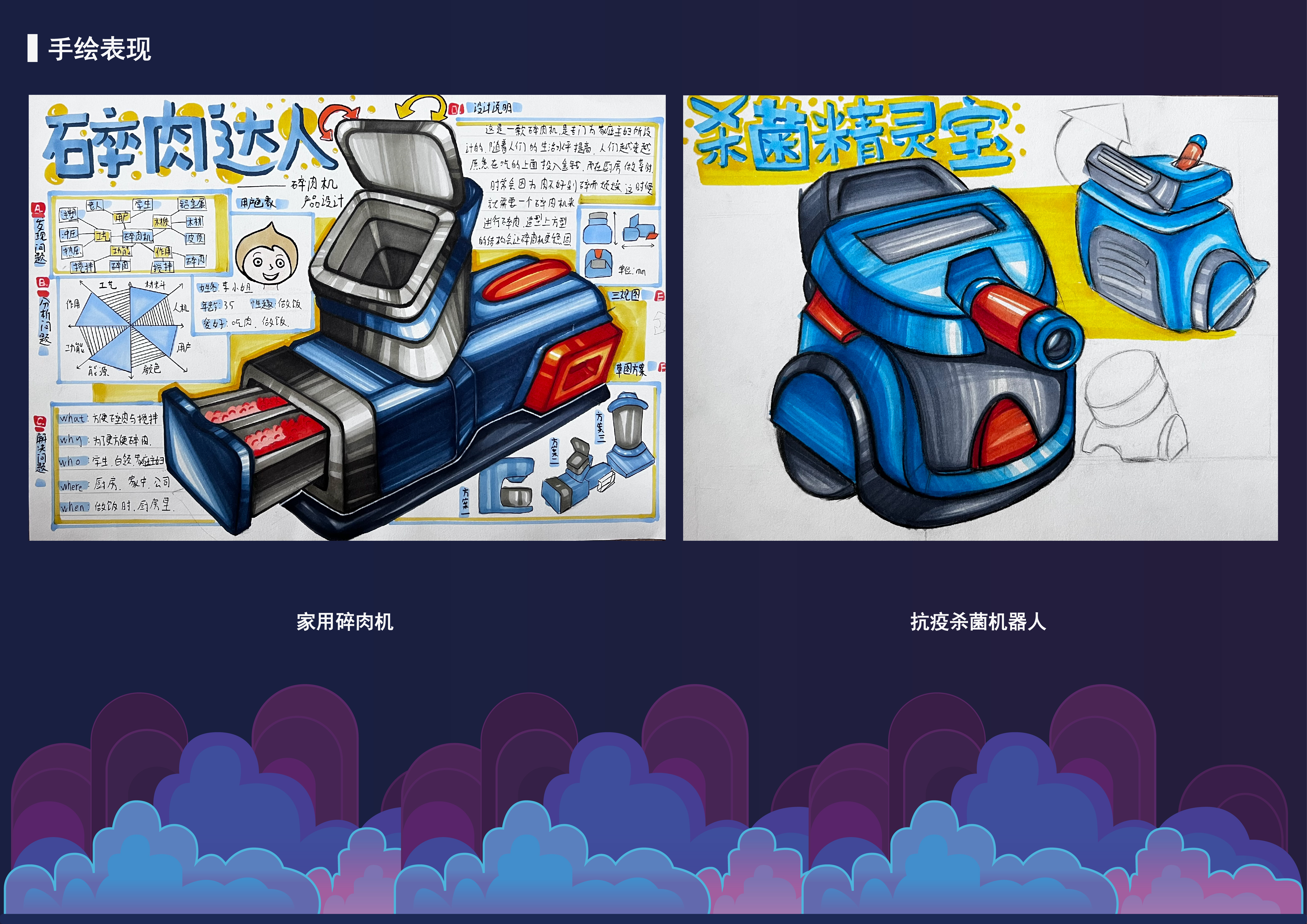
The keyboard plus characters will be much finer.
I feel that I can do at least better than my homework in those days.
Hand painting is OK, there are no other bright spots.
Why do I think it's okay
To tell the truth, what is not good, do design
Did you enroll in the postgraduate entrance examination class?
Learned
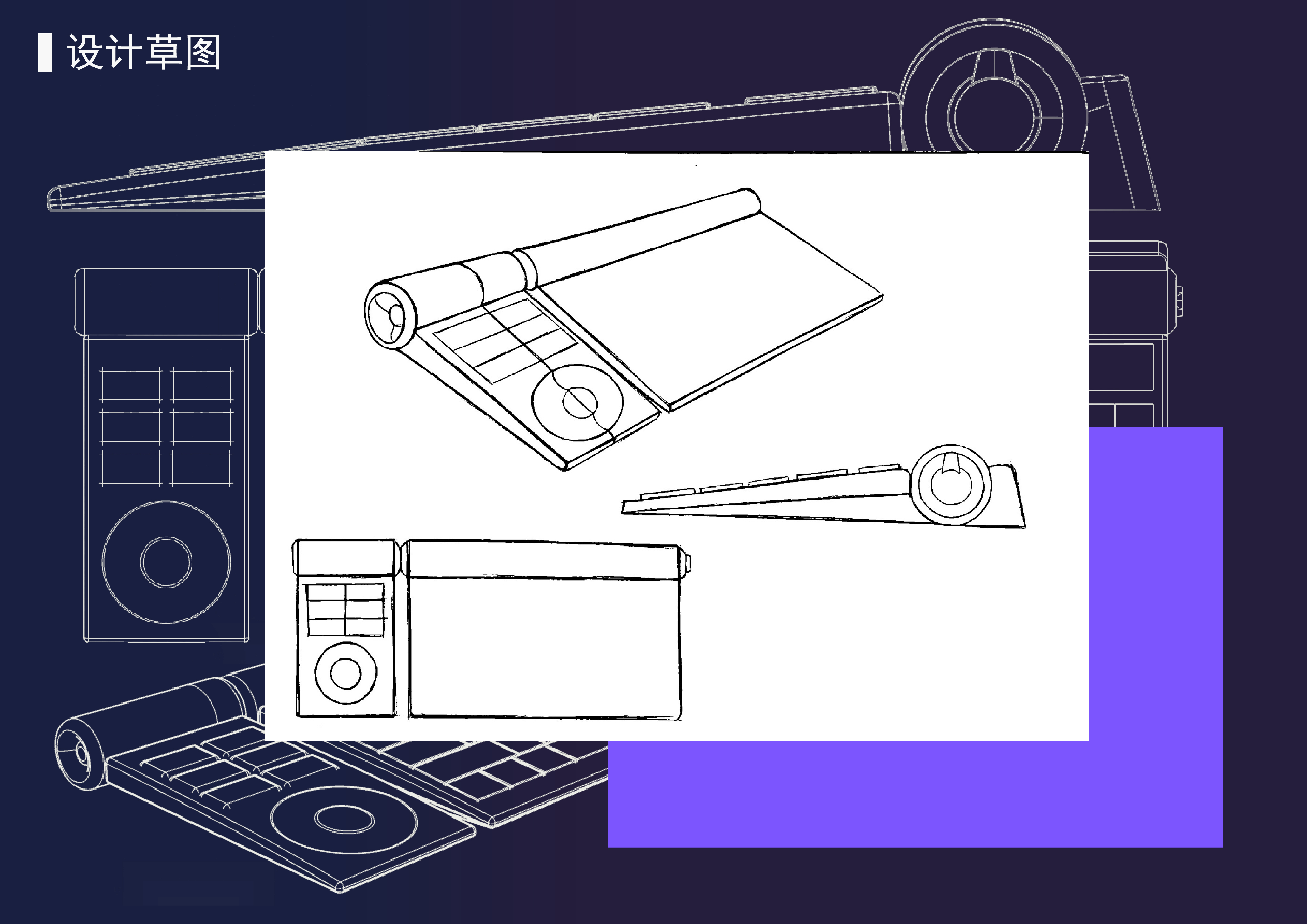
Basic skills... The perspective is basically all crooked... The teacher can't