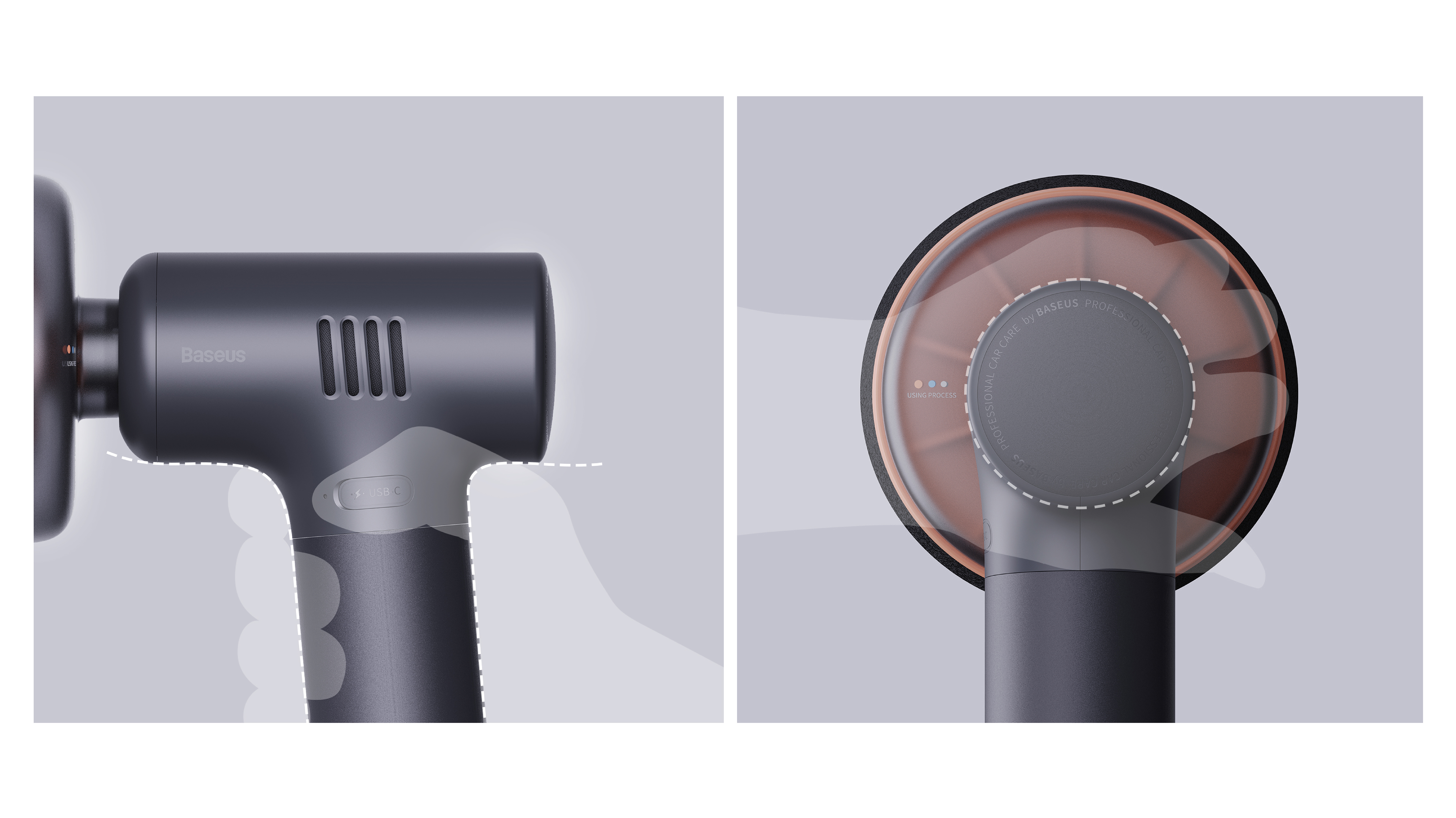
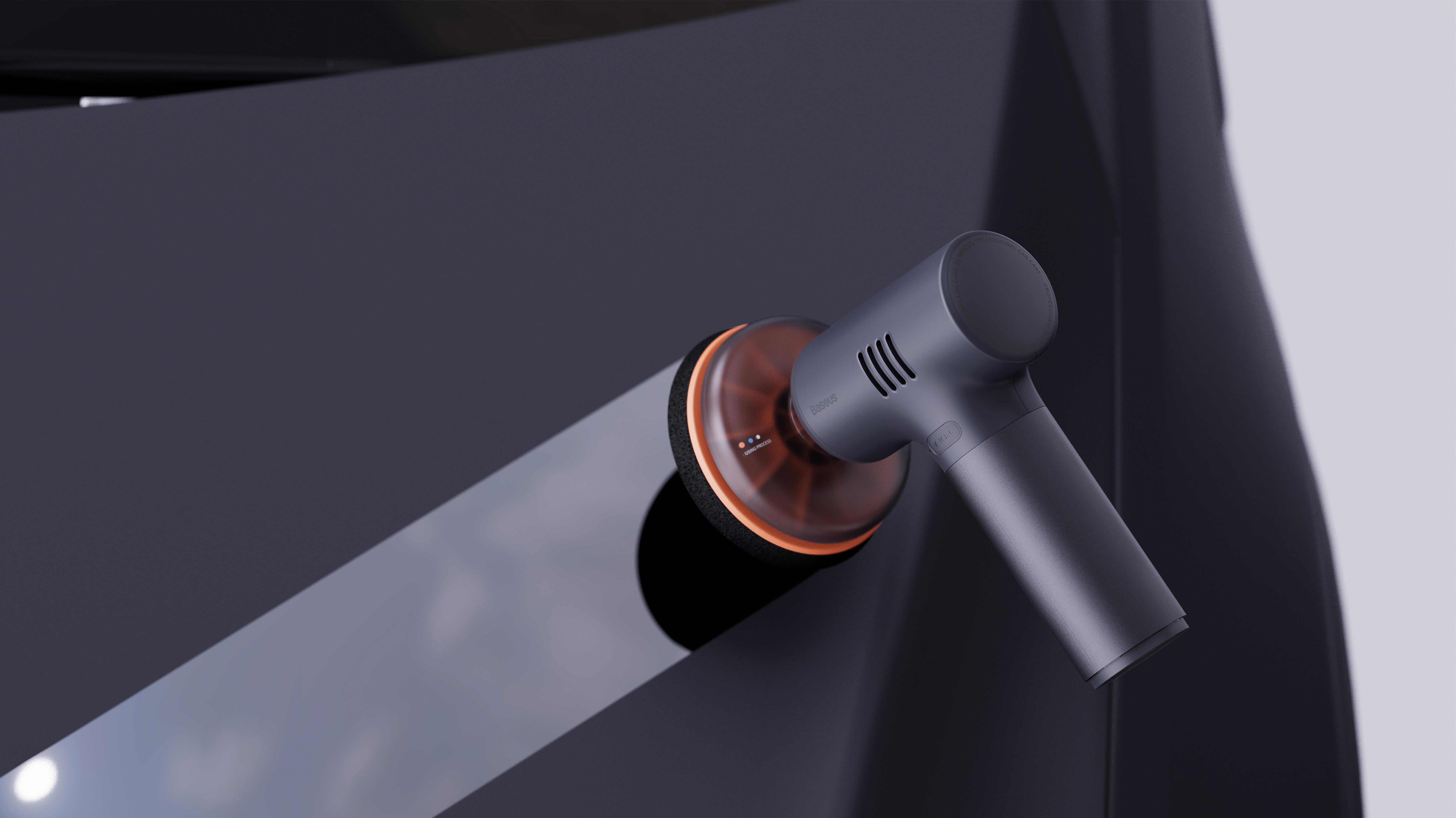
This car waxer was one of the first design projects I led when I joined Beisi in 2022.
Insights and Definitions:
At that time, the products on the market were generally "silly, big and black", and the blunt design language brought users a higher psychological and use threshold.
My design strategy-from "estrangement" to "affinity" of the triple design decoding:
🟠Dispelling barriers with curves: We have completely abandoned the sharp design language and adopted the friendly and soft streamlined language. This is not only for visual elegance, but also a psychological hint. Every curve of the product is to convey the signal of "friendly" and "easy to use" to the user, reducing the psychological burden of the user before starting from the first sight.
🔵Guide behavior with color: Facing potential operation confusion, I designed clear color icons at key contacts to intuitively guide users to complete waxing steps and transform complex processes into simple visual dynamics.
⚪️ Establish control with transparency: transparent protective cover design, so that the internal operation state is clear at a glance. This not only enhances the credibility of the product, its transparent texture itself has become the highlight of the product.
本作品版权归 Sean Zhang 所有,禁止匿名转载及个人使用,任何商业用途均需联系原作者。
新用户?创建账号
登录 重置密码
请输入电子邮件以重置密码。
留言板 (0)
评论为空