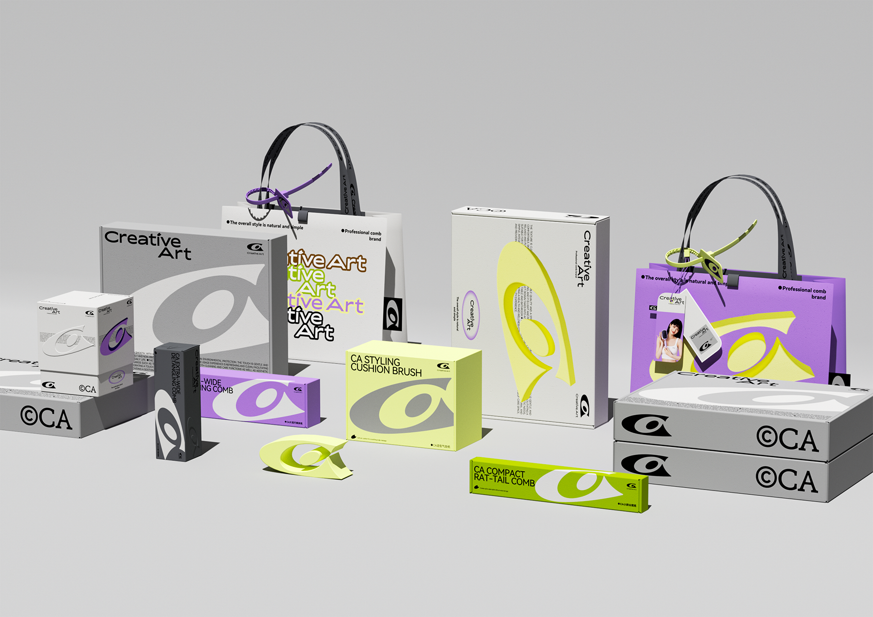
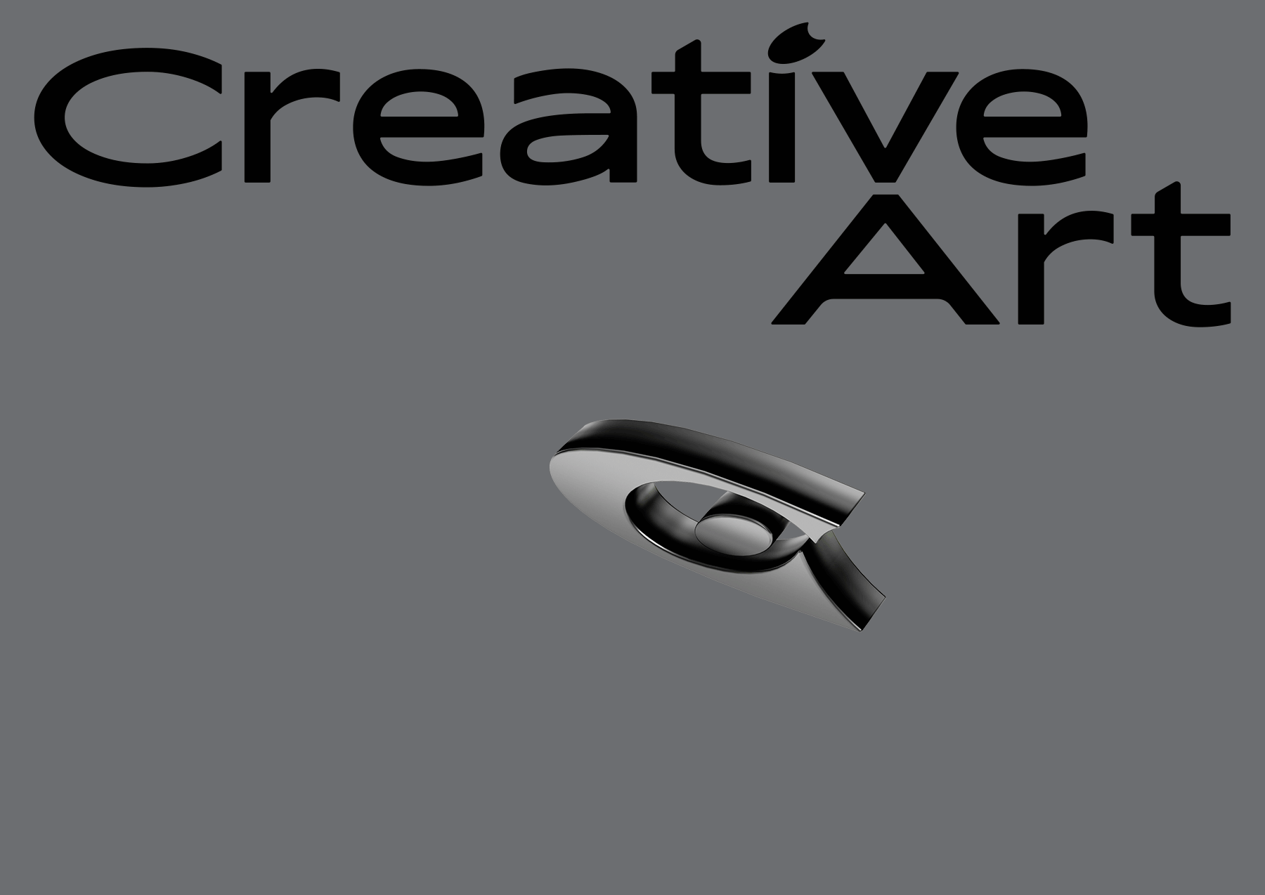
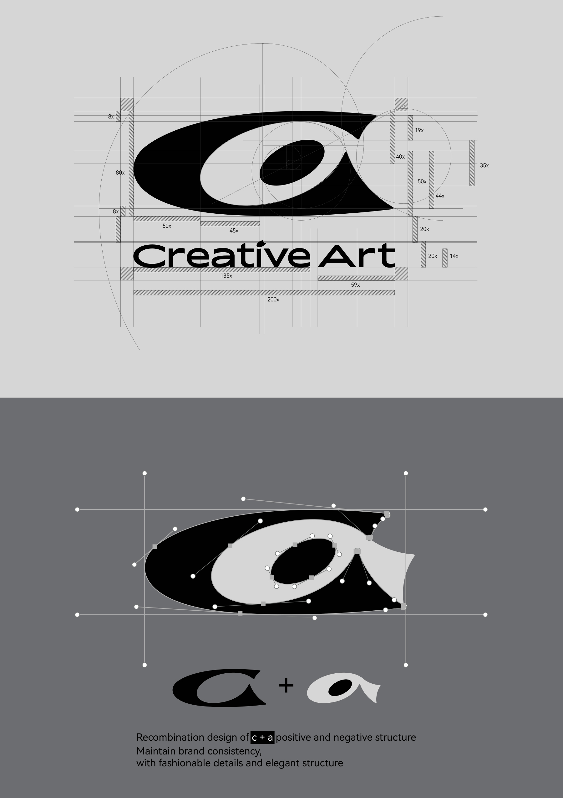
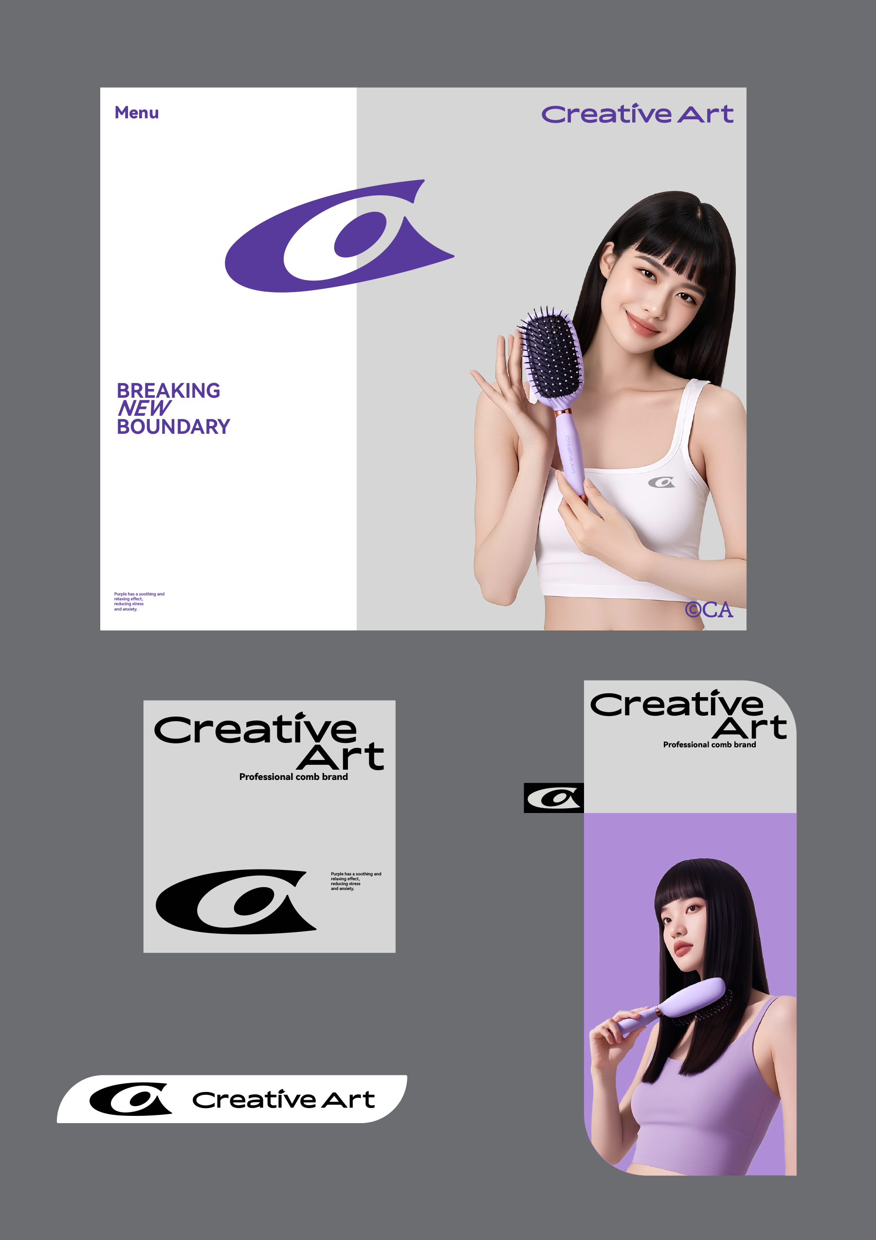
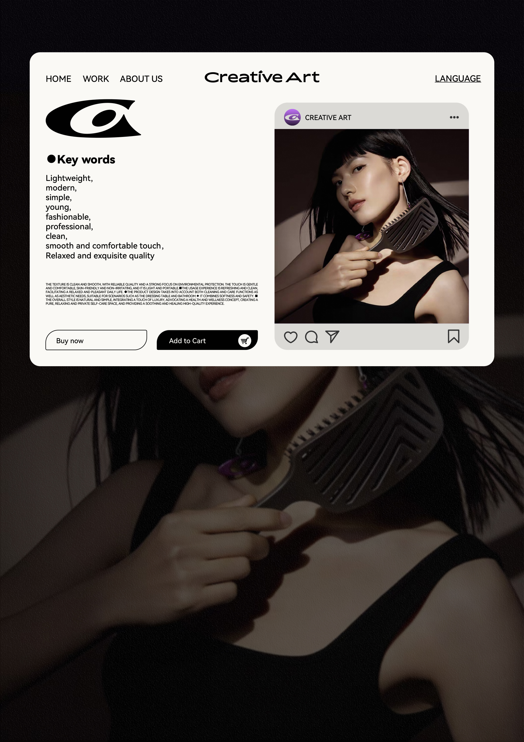
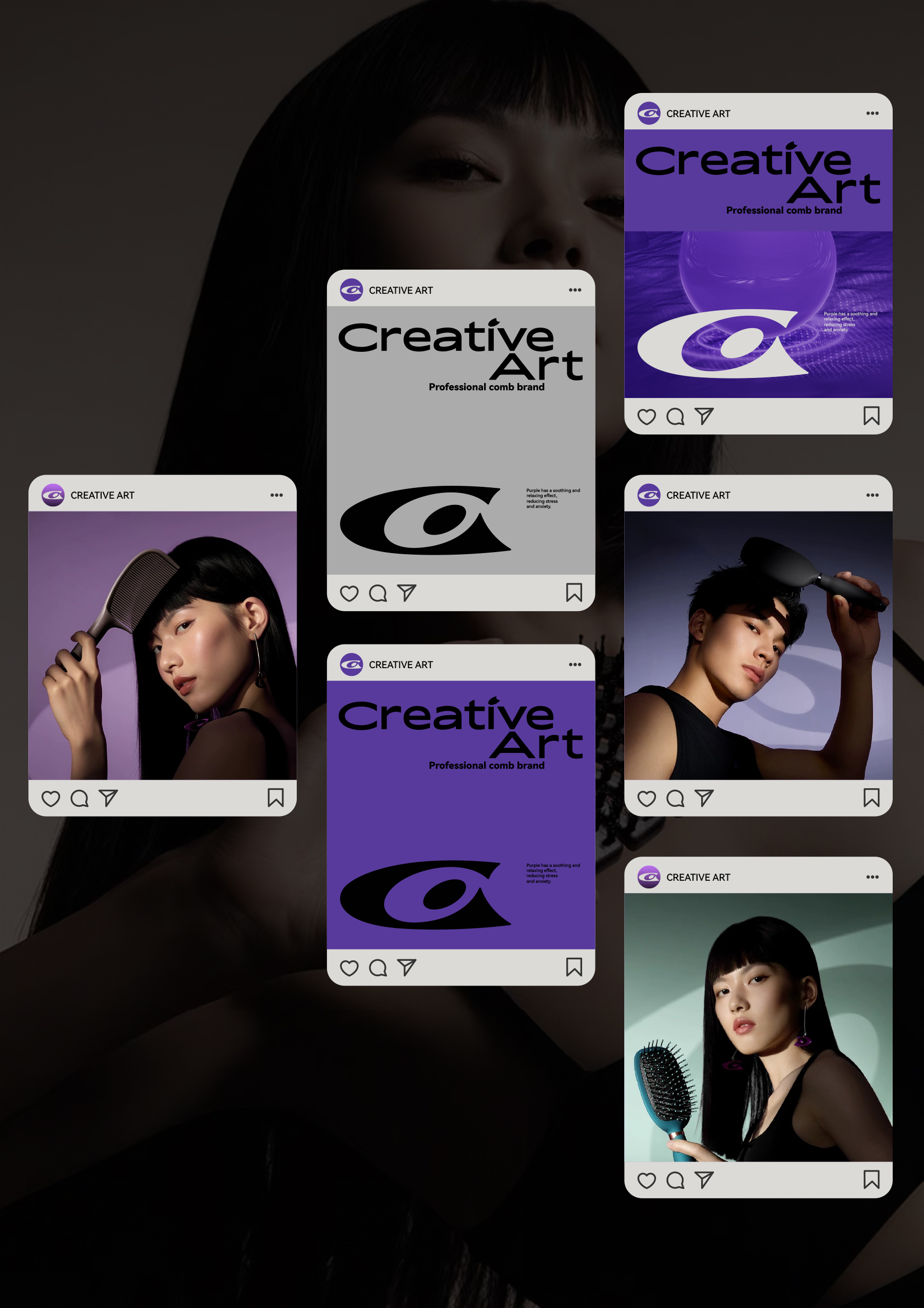
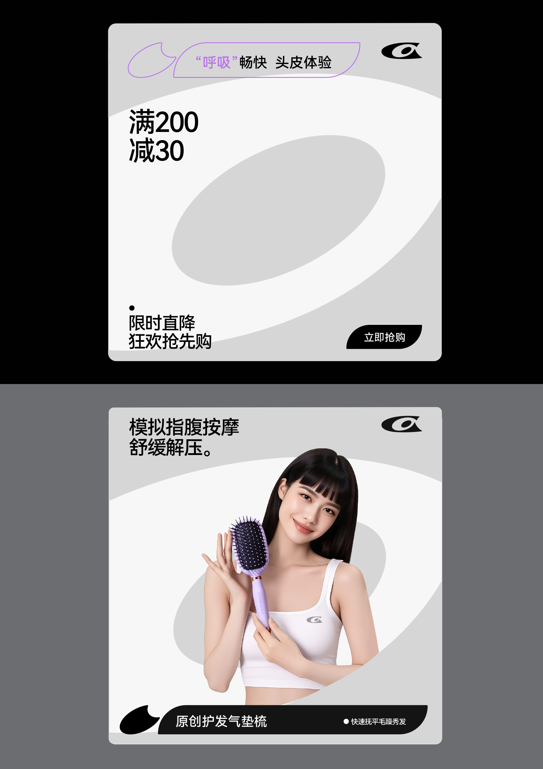
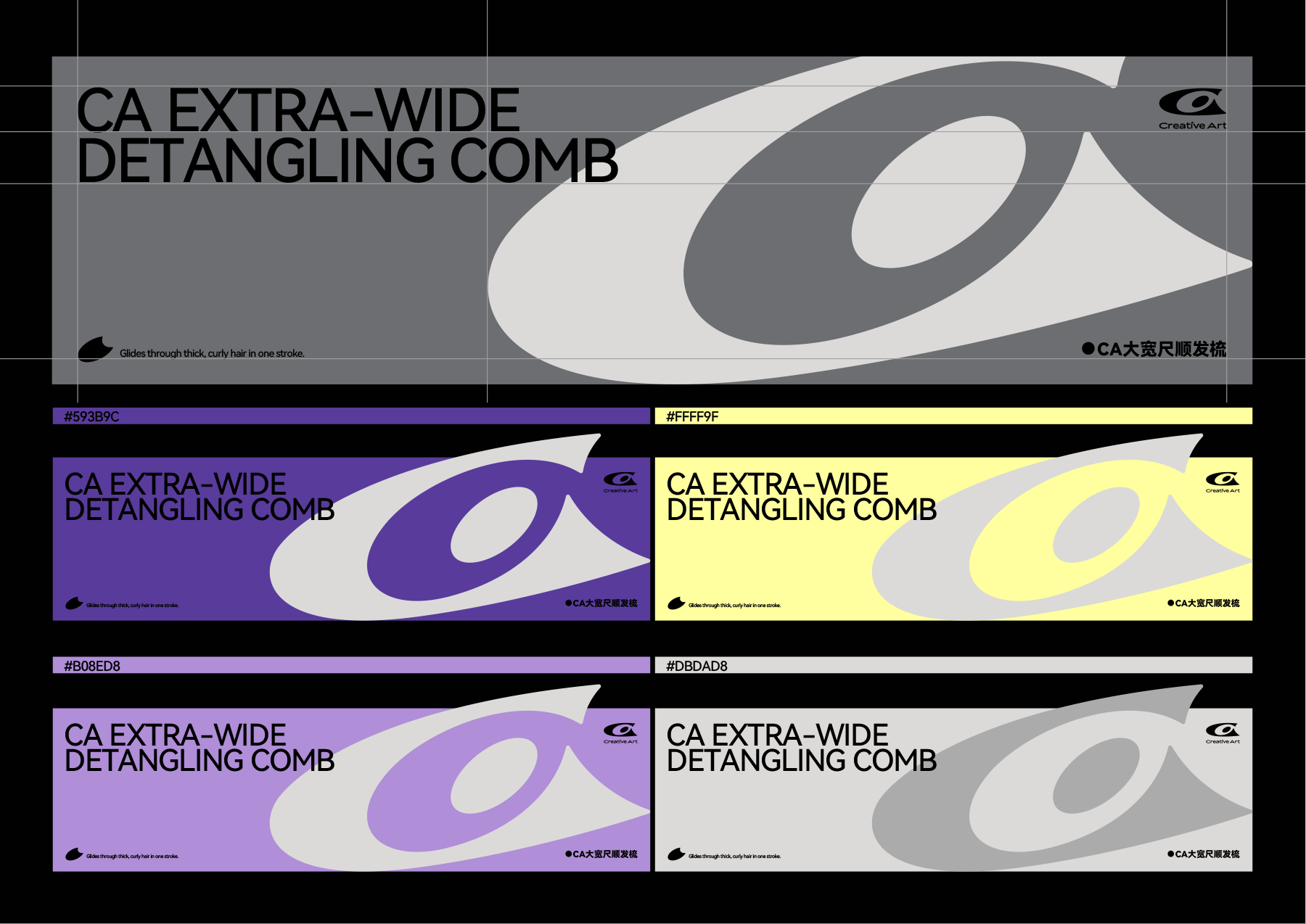
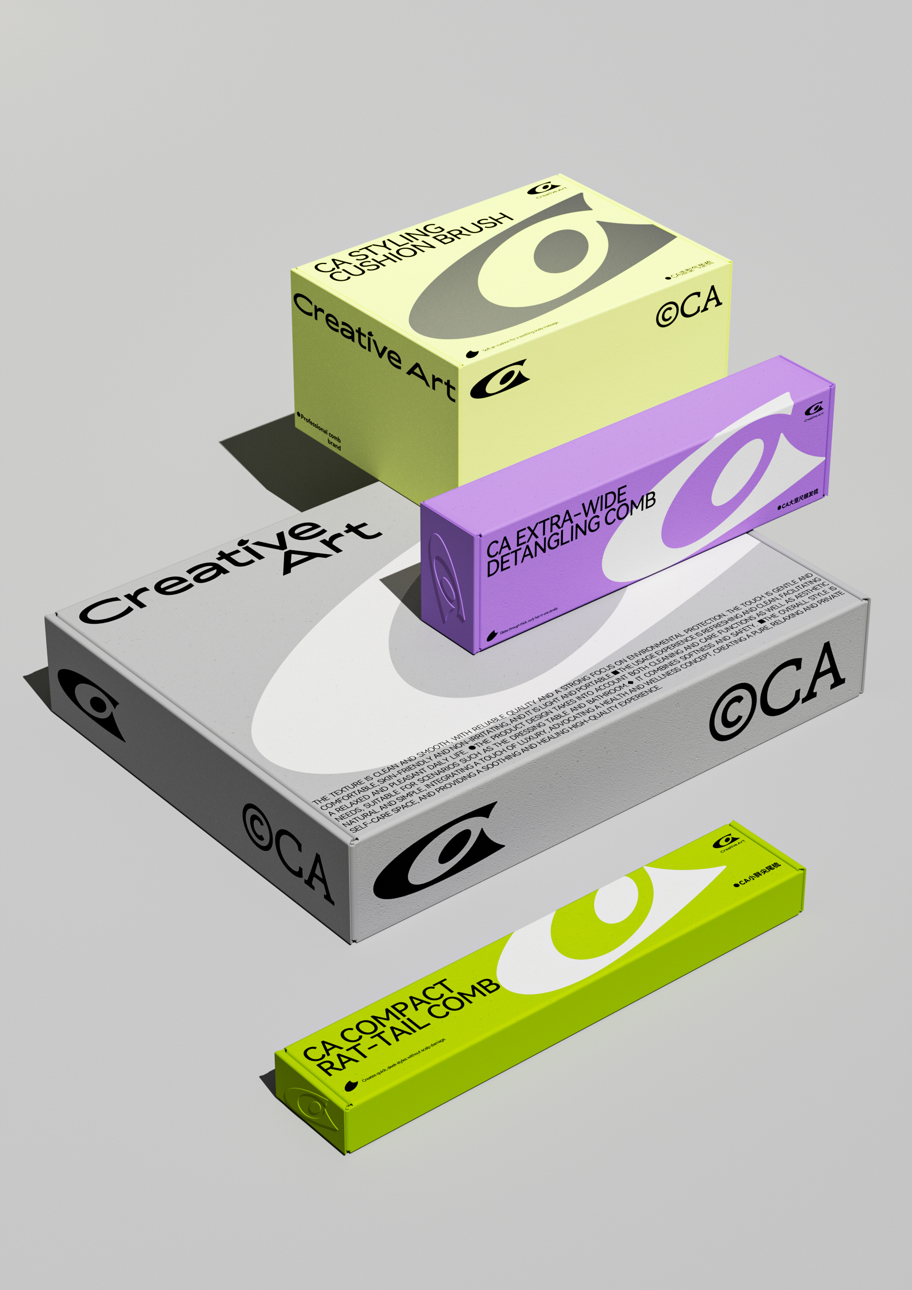
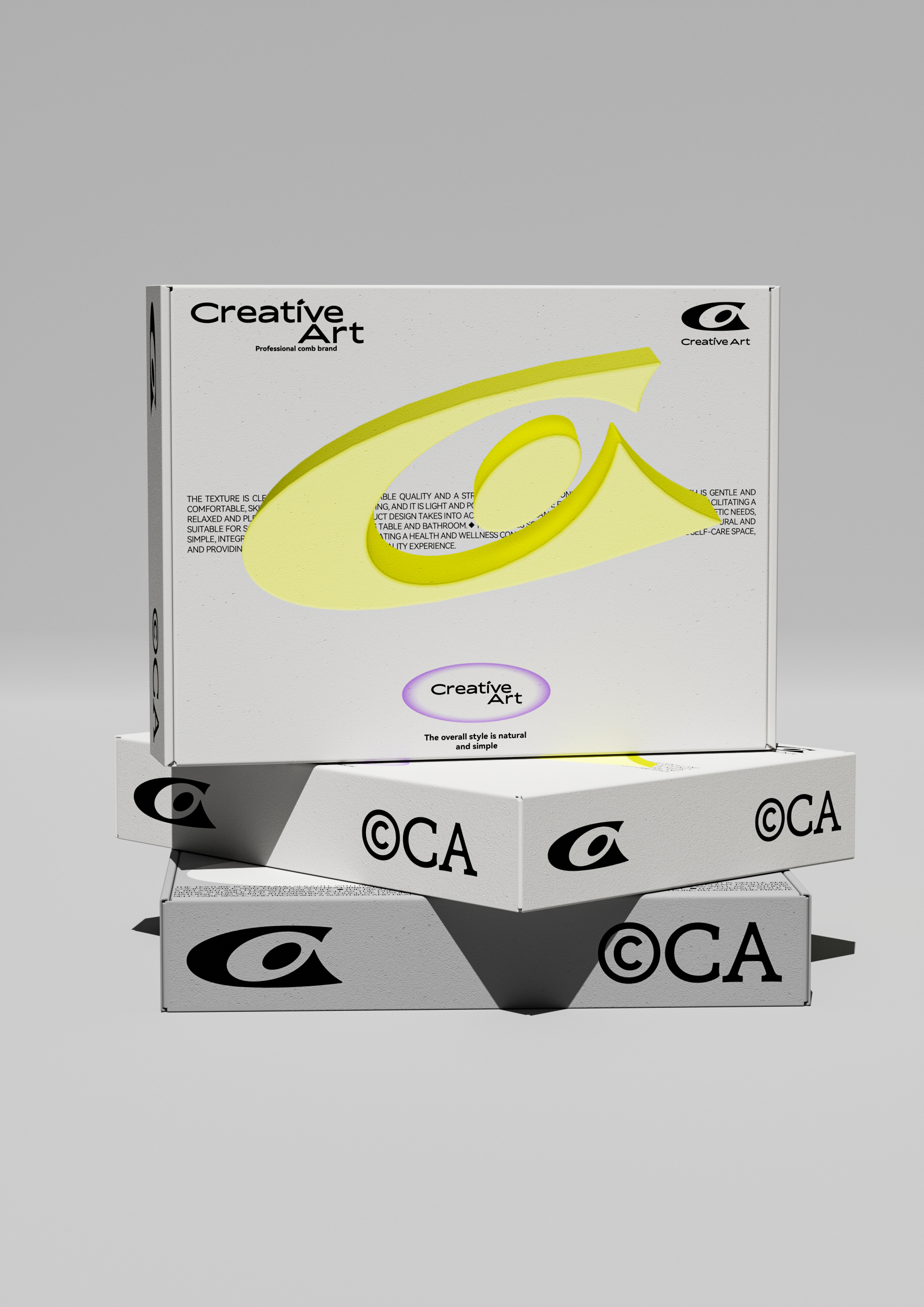
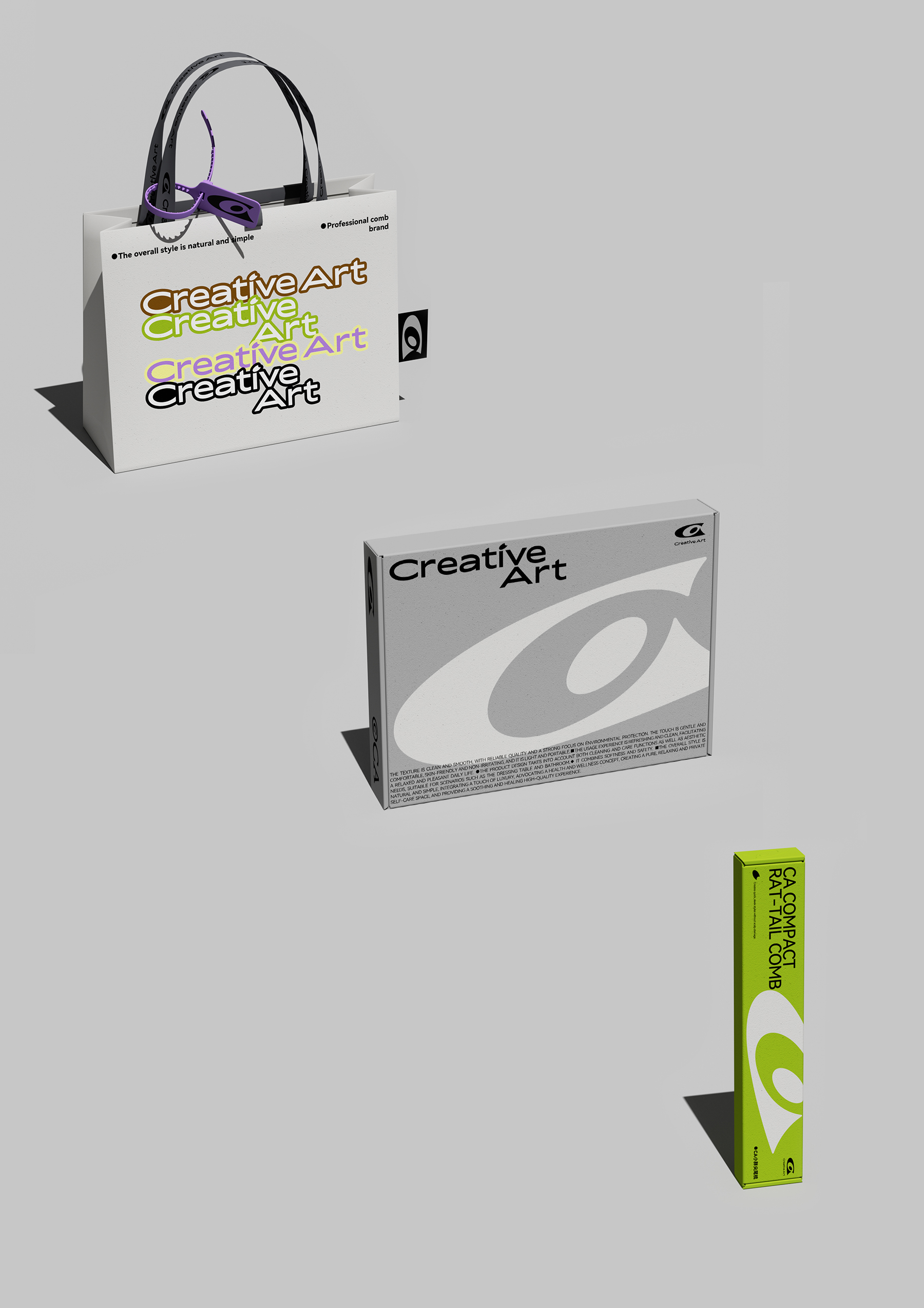
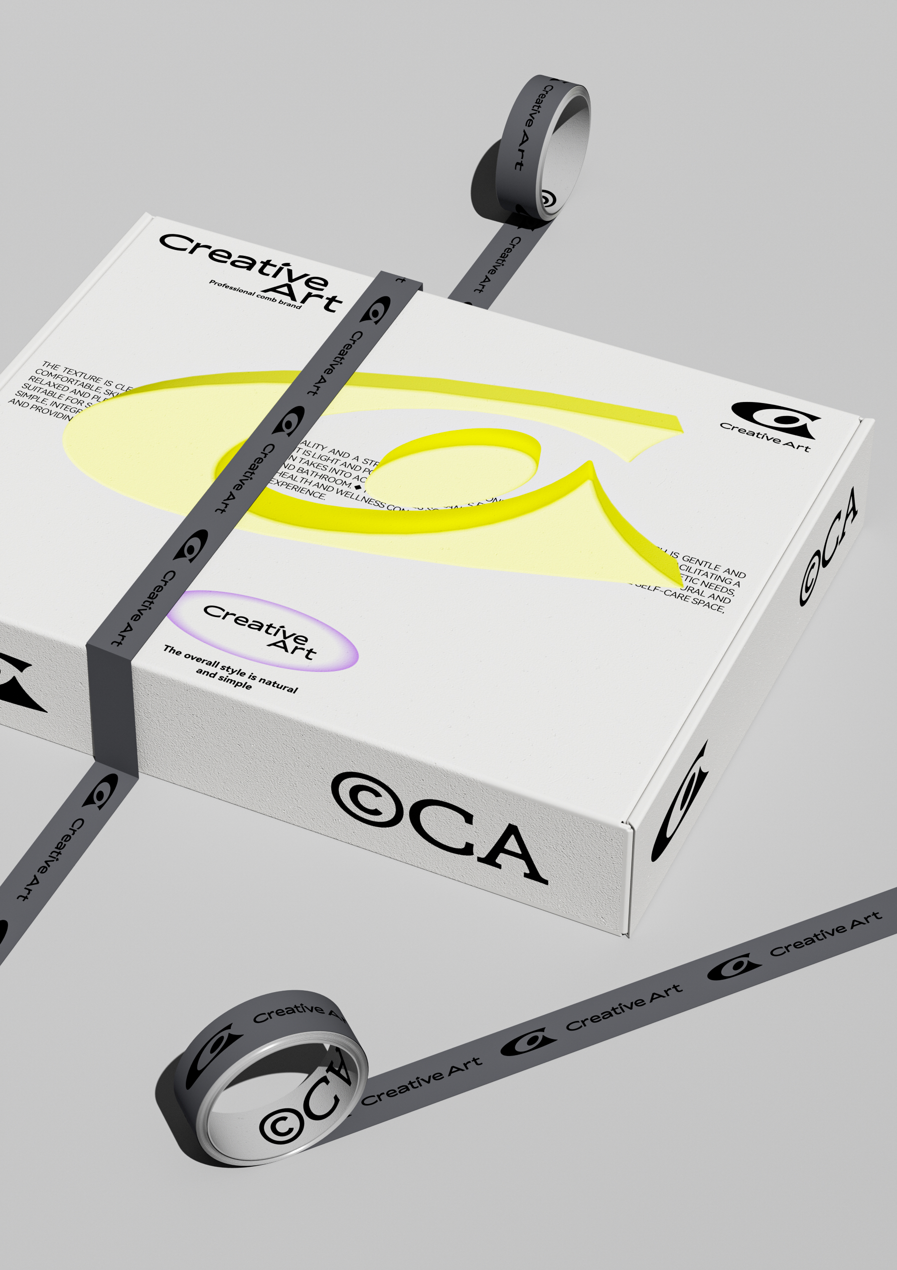
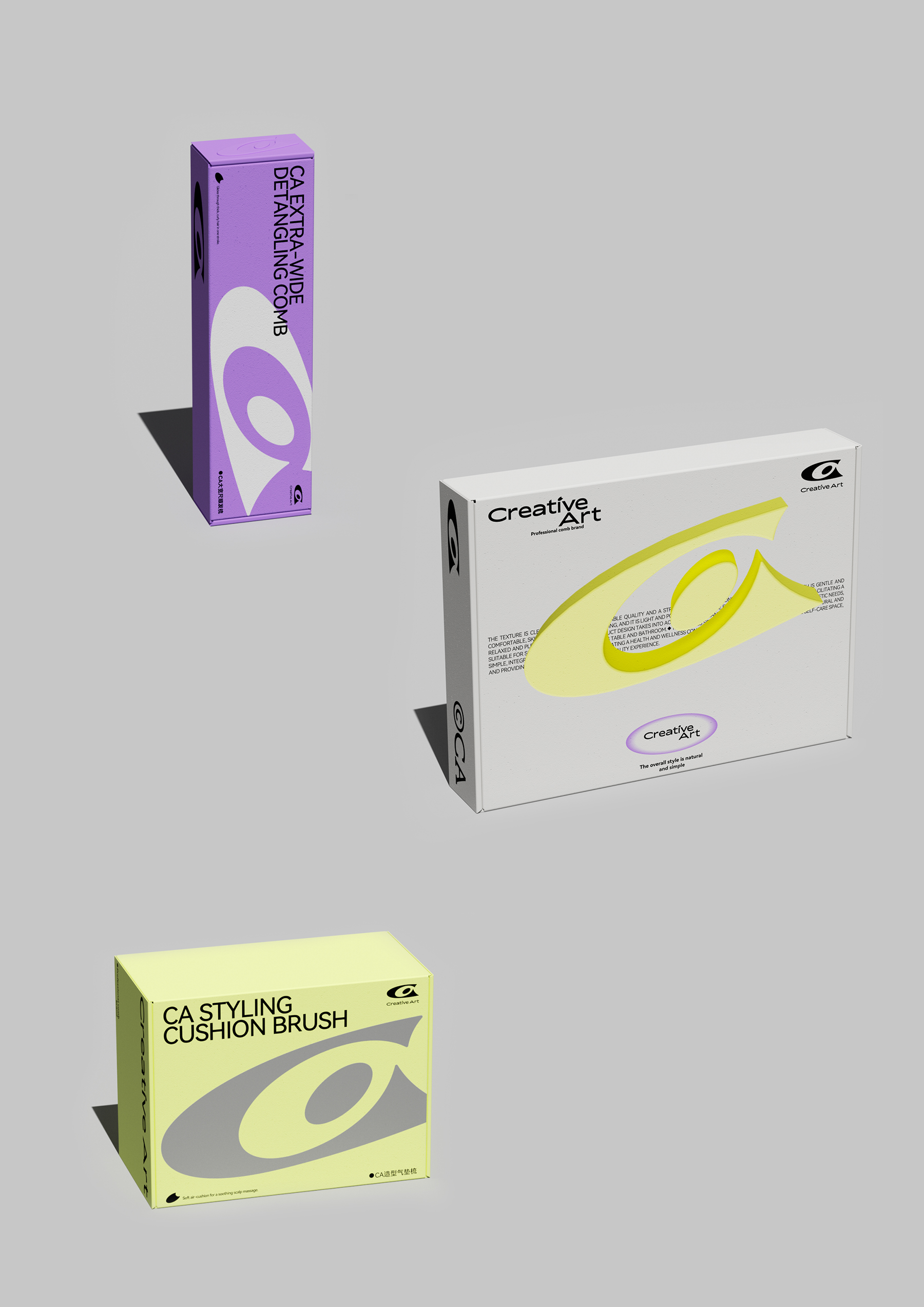
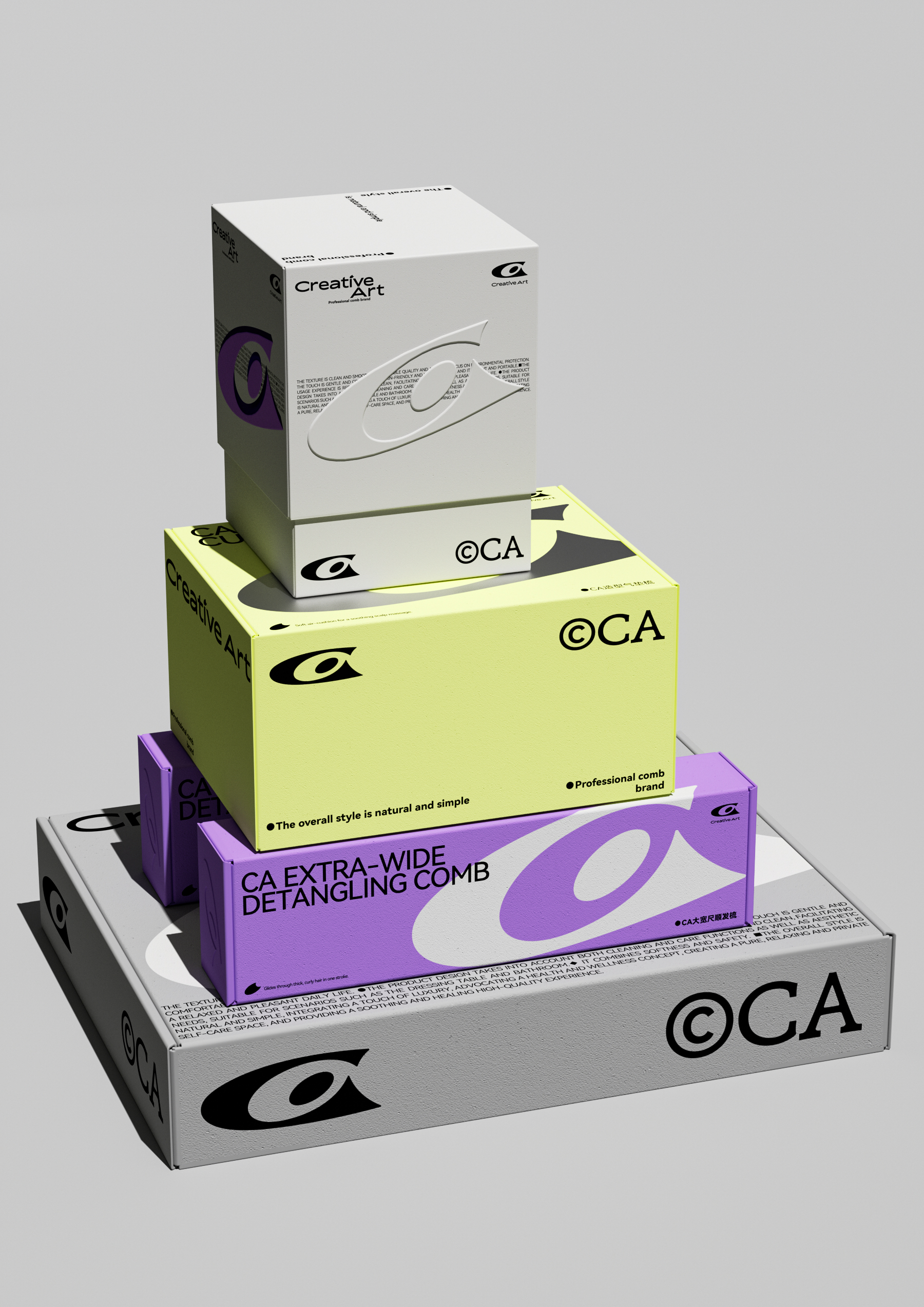
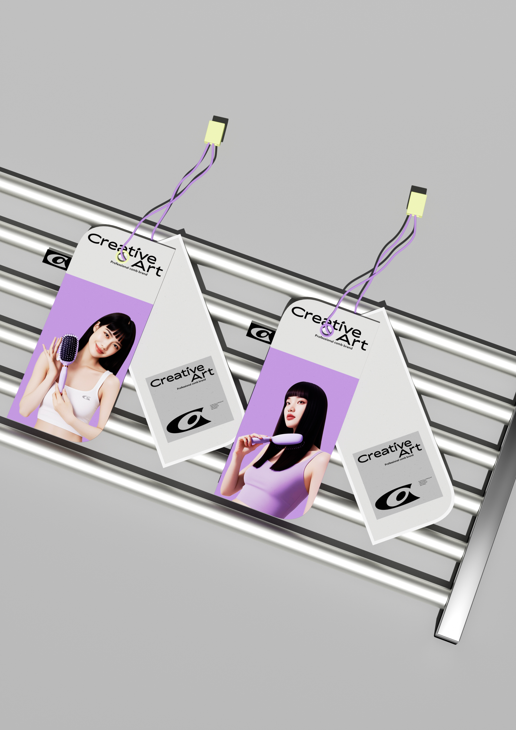
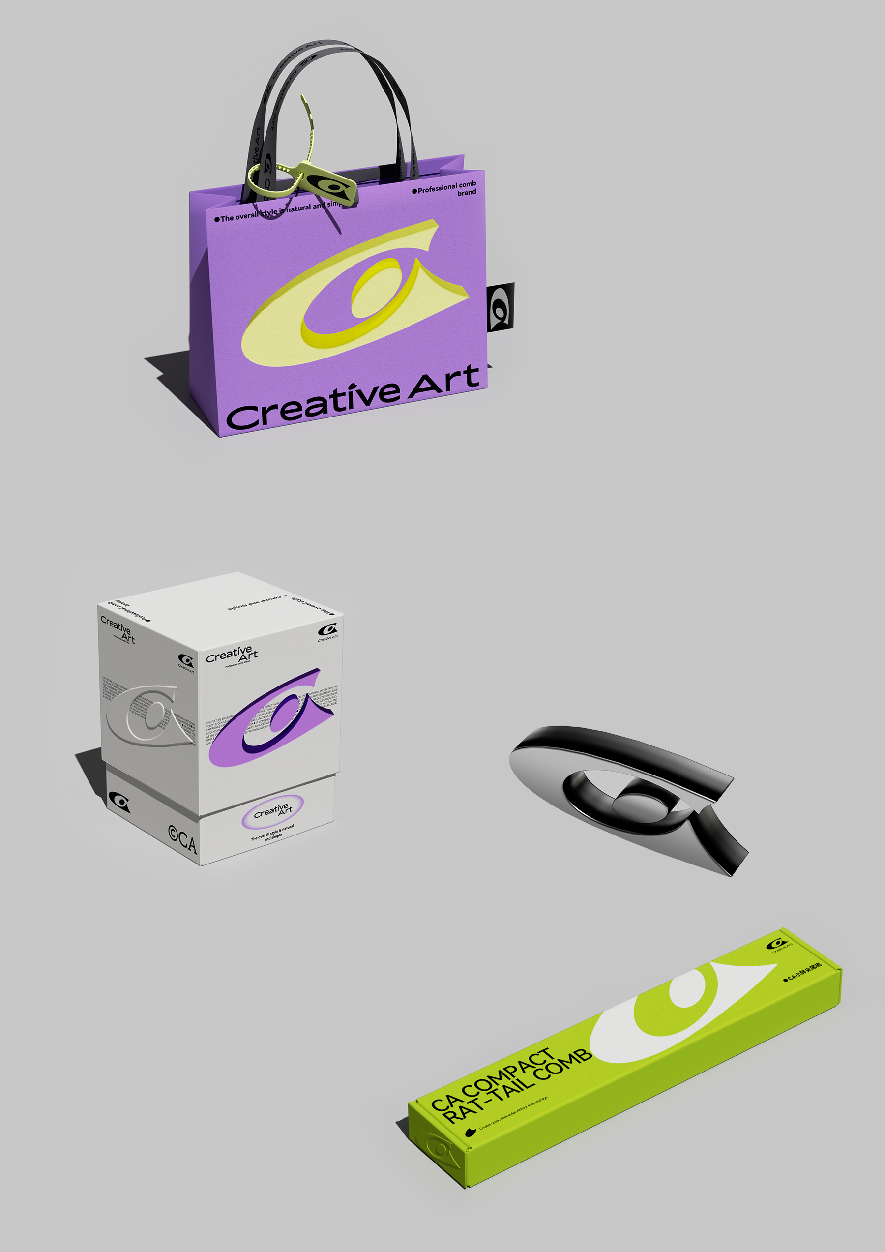
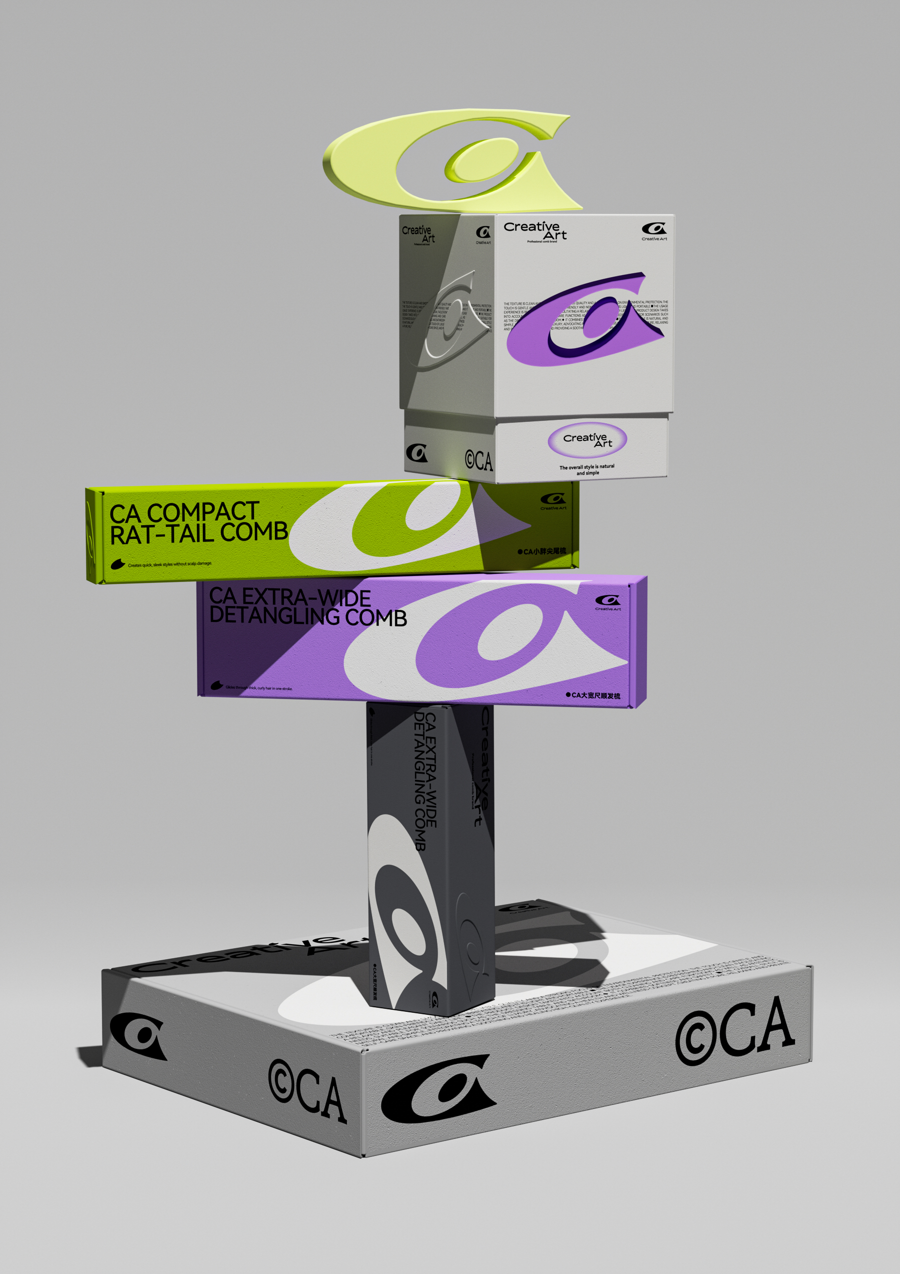
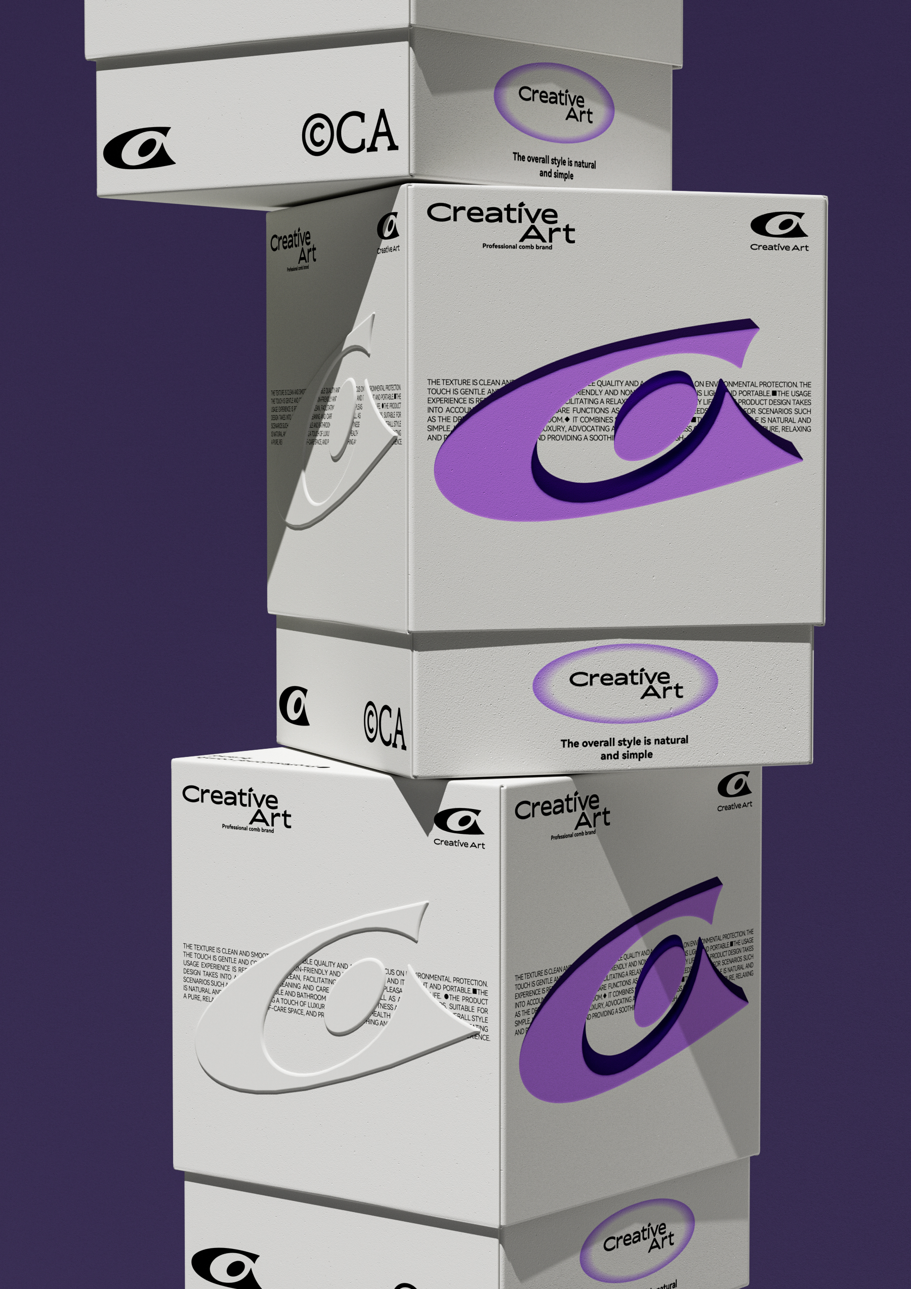
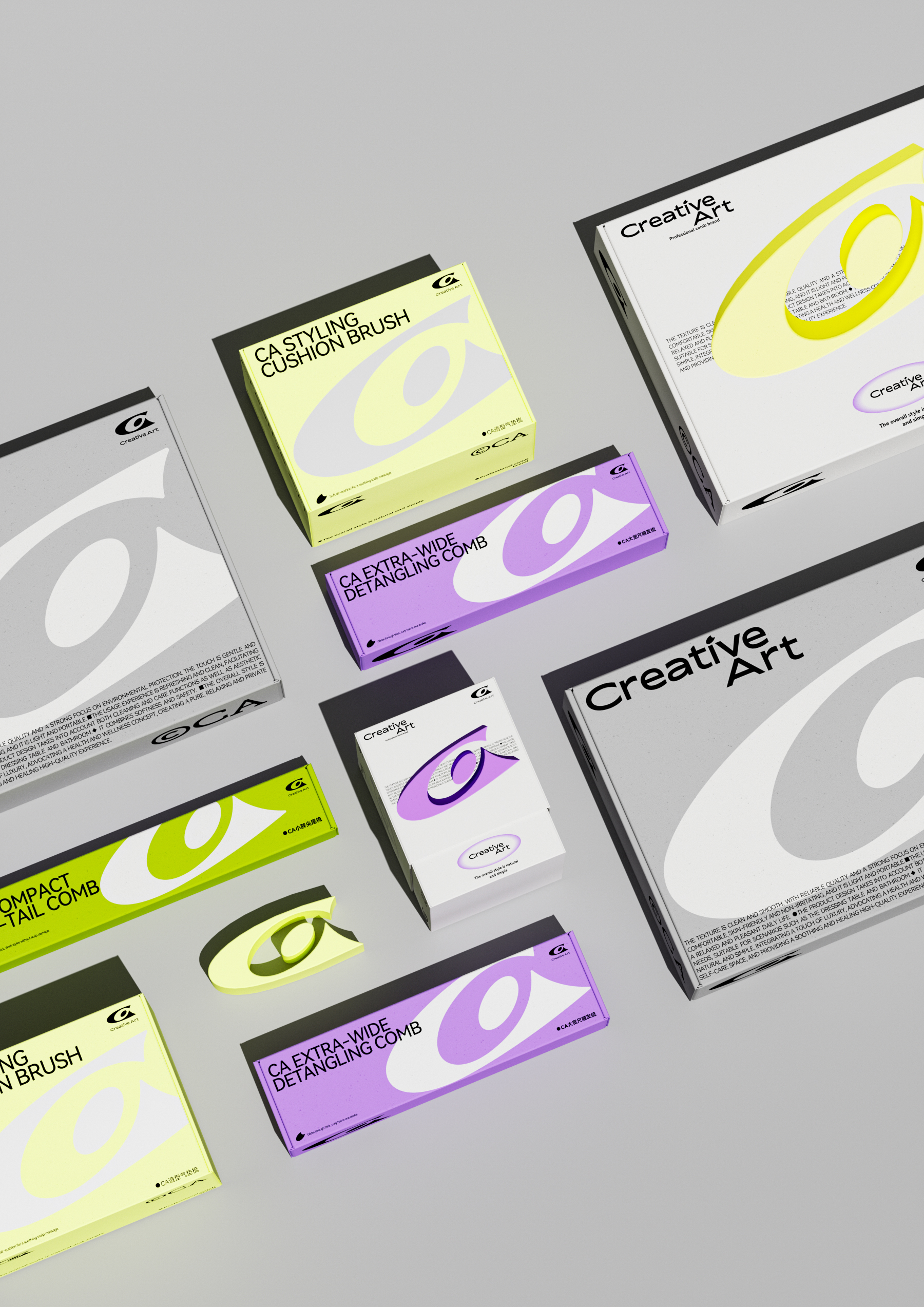
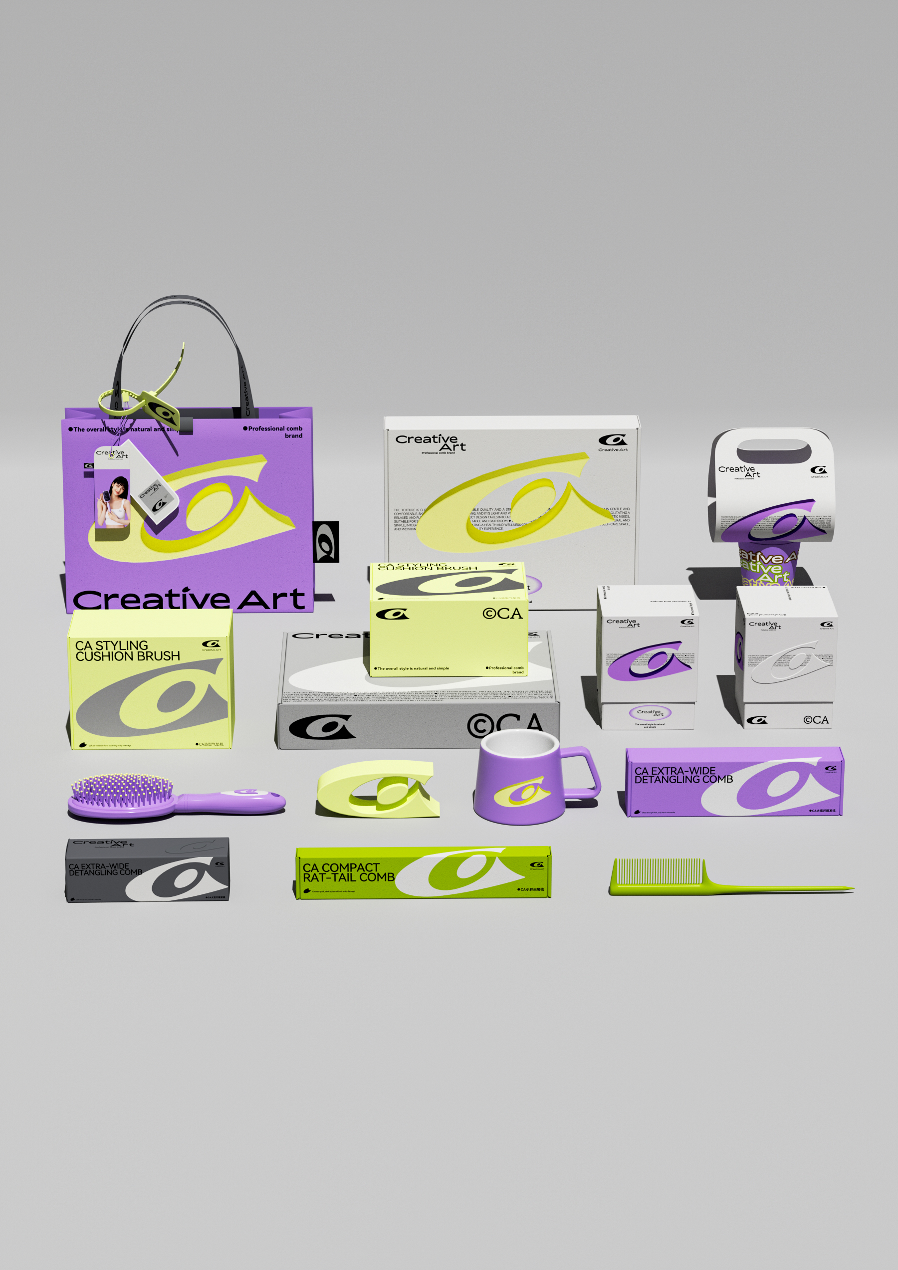
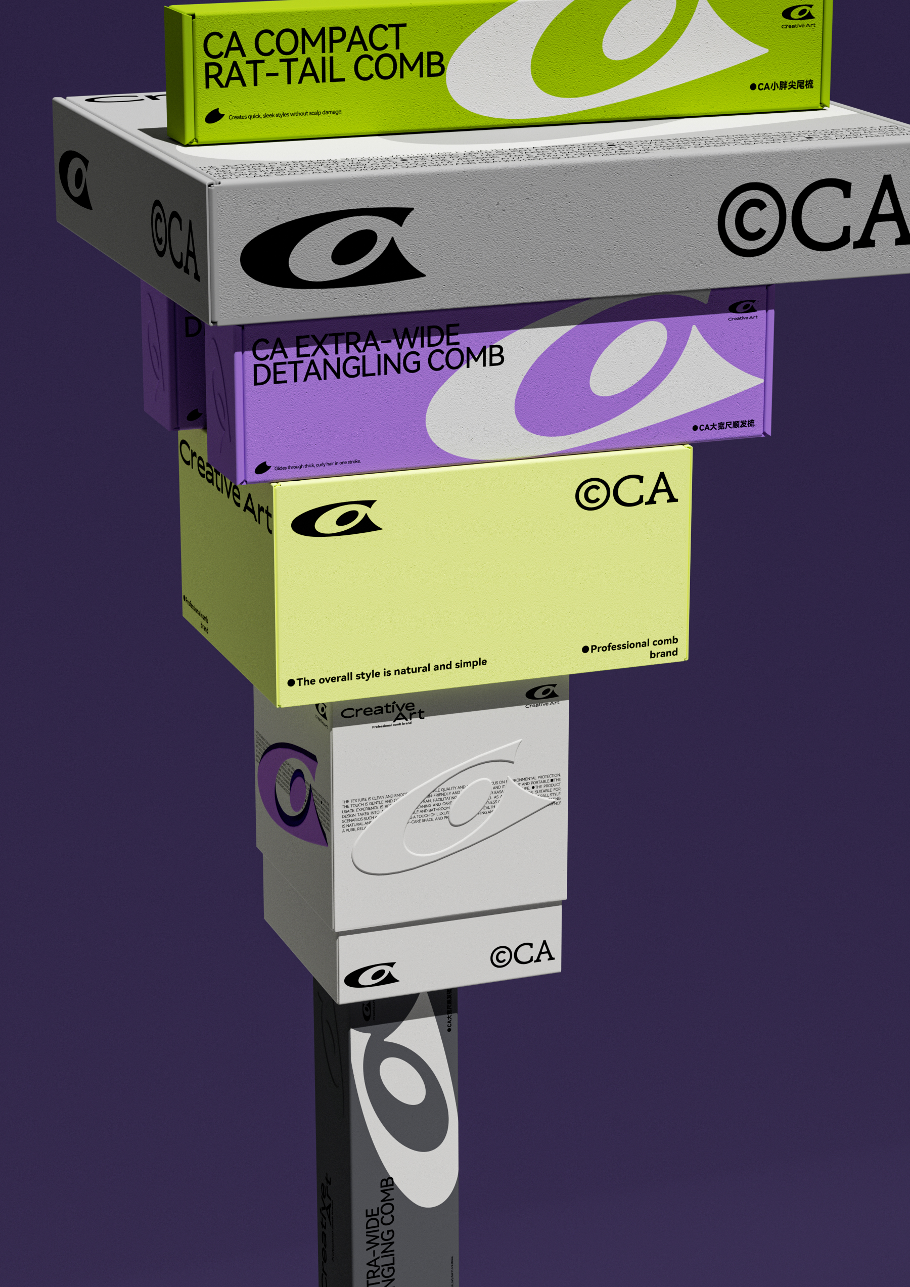
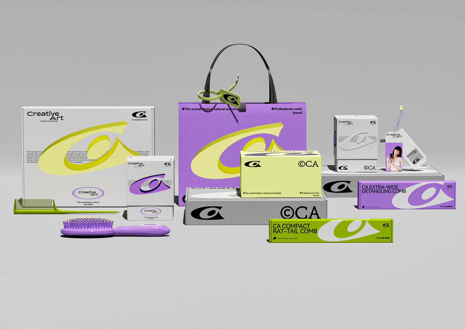
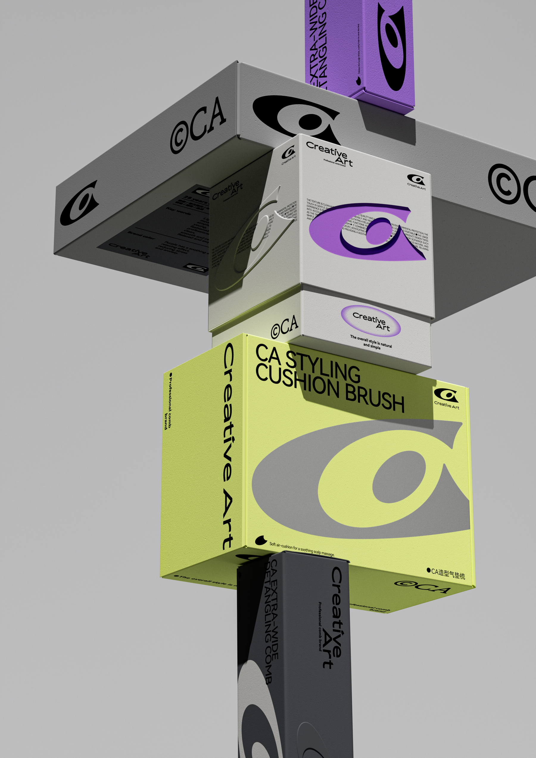
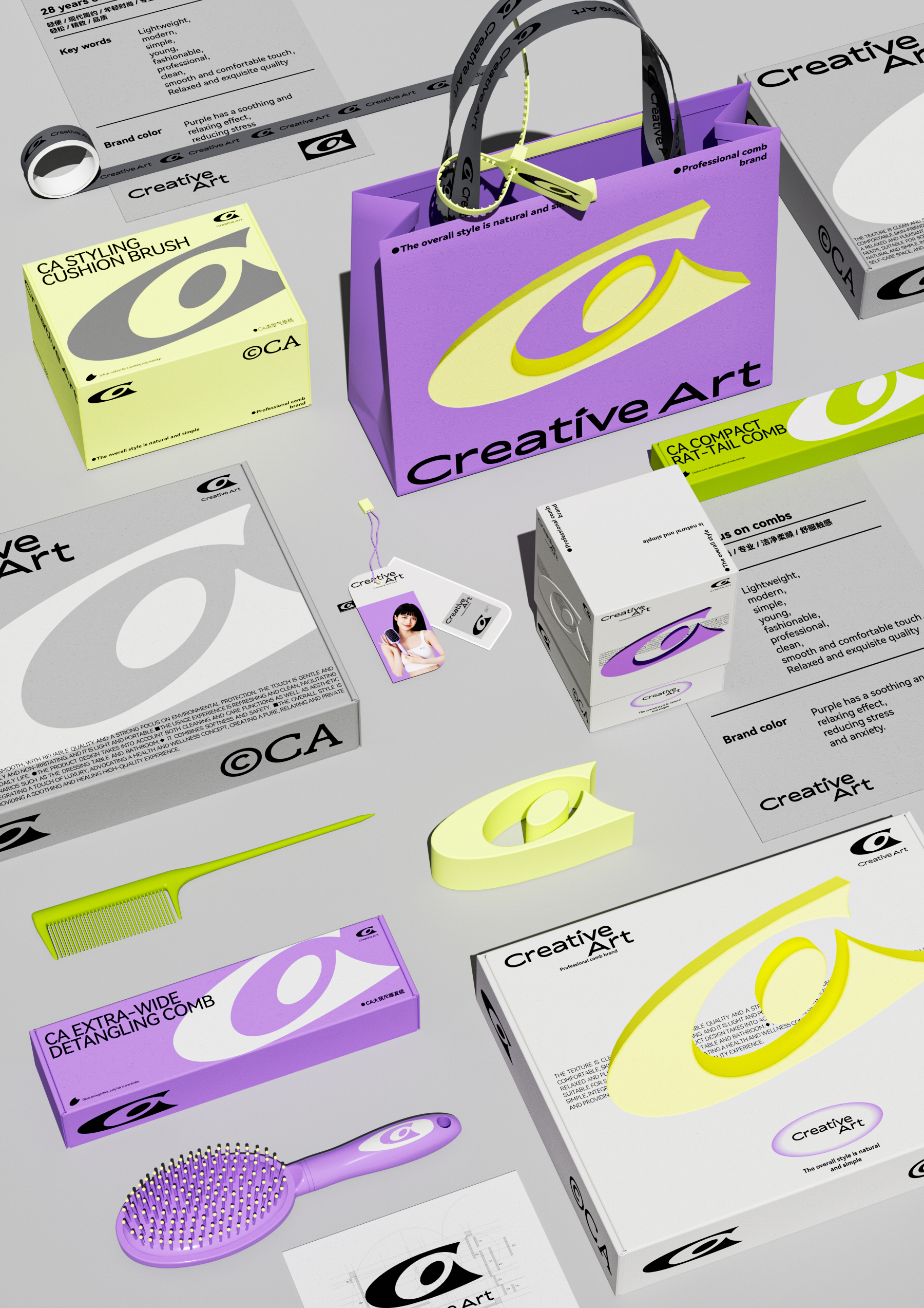
As a comb brand focusing on young fashion for 28 years, Creative Art has always been committed to integrating modern minimalist aesthetics and ergonomics to provide users with a relaxed and comfortable hair care experience. 2025 work together to upgrade the brand with different products. The problem to be solved in this cooperation is to realize the unified tonality from brand symbol-brand vi-product packaging-e-commerce page through brand upgrading. We take the construction of high recognition super symbol as the core, and extract the brand first letter "C" and "A" for positive and negative symbol isomorphism. The neat lines break through the conventional framework to form an open and inclusive visual carrier. The central circular element symbolizes the concept of "people-oriented", through the sense of fashion and comfort. We will this CA super symbol system throughout the entire product system, focusing on the eight core single product packaging integration, with a unified visual language to reshape the professional, young brand image. This not only effectively combs the vision of the scattered product line in the past, but also establishes a sustainable extension gene for the development of new products in the future, ensuring that the brand transmits consistent and professional perception at all contacts.
Original design/creation
○ Art Director/Xiao Qiong
○ Creator/LIDIN
○ Design Assistant/Xin Li, A Wei
本作品版权归 造物起异 所有,禁止匿名转载及个人使用,任何商业用途均需联系原作者。
新用户?创建账号
登录 重置密码
请输入电子邮件以重置密码。
100 points
Professional
It's so talented, huh