china time-honored:
Nanjing Tongrentang Pharmaceutical Co., Ltd. is a traditional Chinese medicine enterprise in Nanjing that produces traditional varieties of ancient prescriptions and comprehensive new dosage forms with modern technology, integrating science, industry and trade. In 2006, it was recognized as the first batch of "Chinese time-honored brands" by the Ministry of Commerce of the people's Republic of China ".
Industrial layout:
Nanjing Tongrentang continues to reform and innovate. Based on the development strategy of "one body and two wings" and the overall plan of comprehensively laying out the large health industry, Nanjing Tongrentang Health Industry Co., Ltd., a wholly-owned subsidiary, has been established. On the basis of the steady development of Nanjing Tongrentang proprietary Chinese medicine, expand the product line, enrich the product content, re-layout, innovate the marketing mode, and open up the second battlefield of Nanjing Tongrentang non-pharmaceutical services.
User pain points: in 2021, Nanjing tongrentang health industry co., ltd. found rococo design to create a brand-new brand logo and visual system based on the positioning of the big health industry and the brand culture of the parent company.
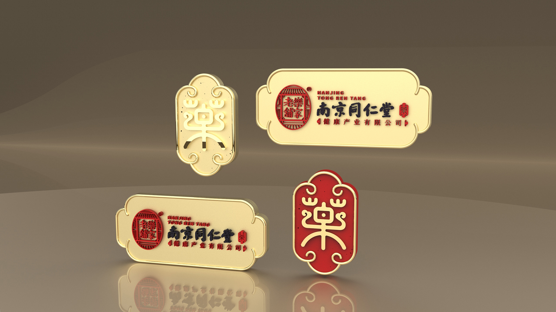
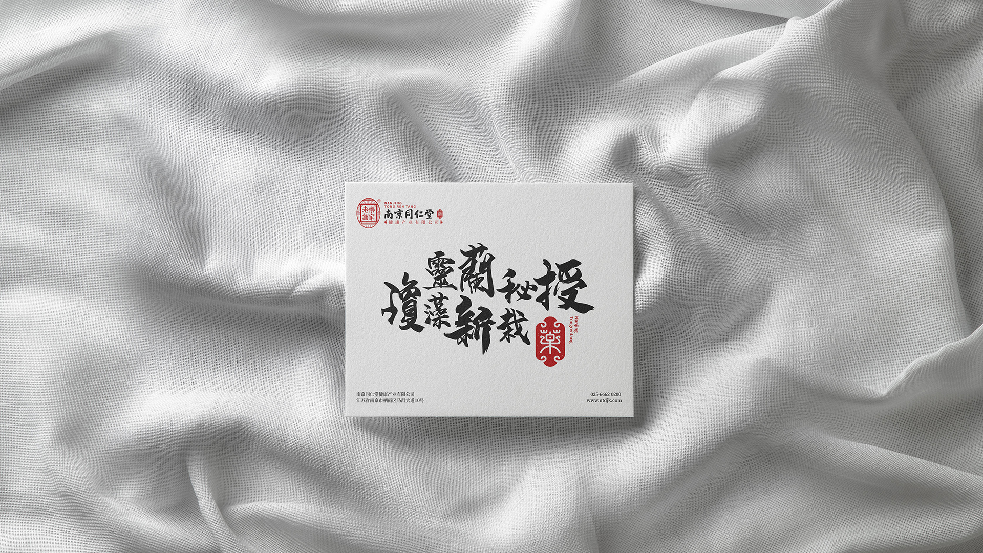
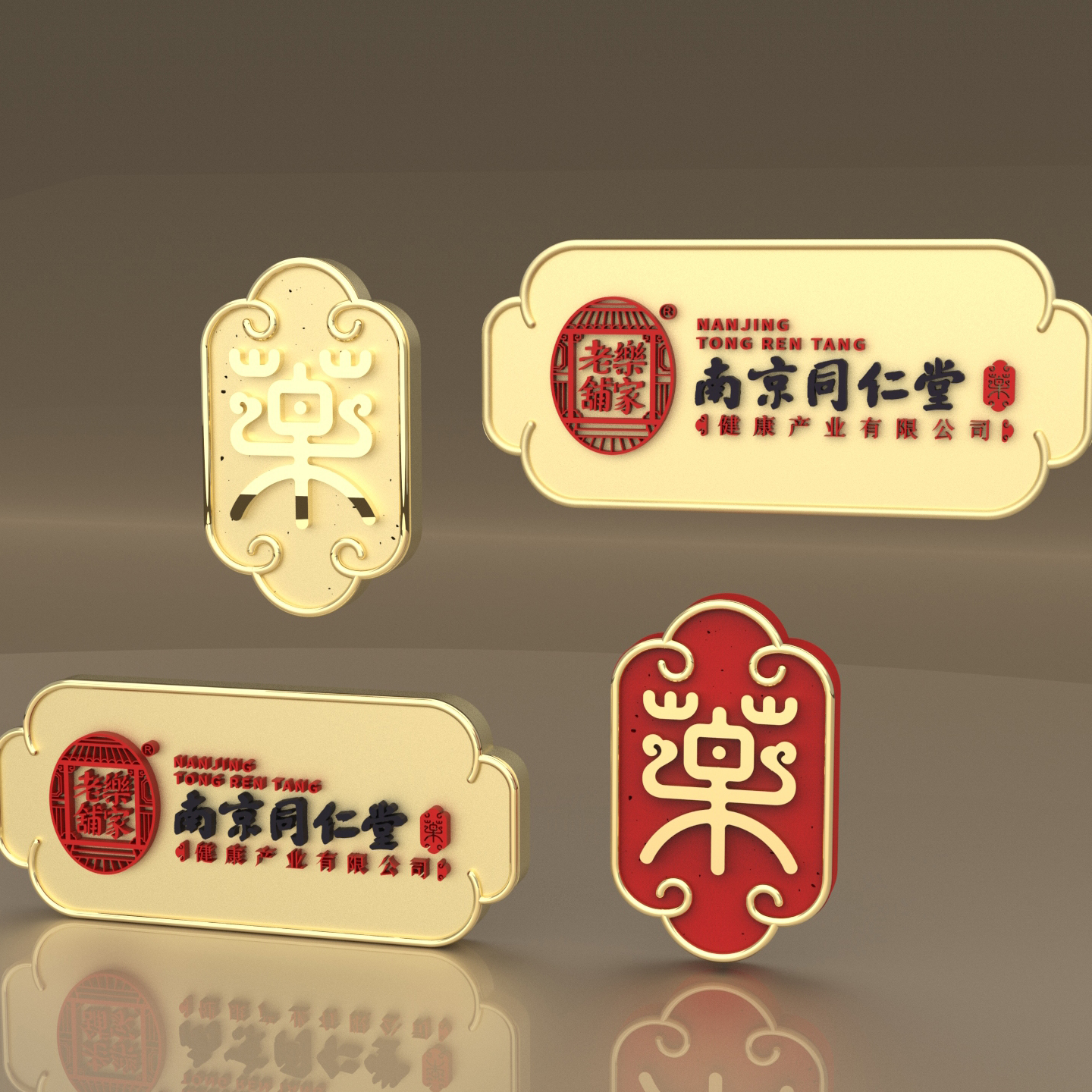
Product strategy: At the beginning of the design, the corporate culture and industry characteristics were fully investigated. In the process of upgrading the logo, various elements such as "medicine", "nothing brand", "fighting arch", "antler" and so on were integrated into the brand culture of "Nanjing Tongrentang", highlighting the brand's "traditional Chinese medicine", "health" attributes and historical and cultural characteristics of "time-honored brands.
Design concept: the new logo retains the structure of the shoulder armor of the Chinese character while weakening the shape of the Chinese character, which is reflected in the innovative concept of great health in the inheritance.
Image upgrade: "nothing card" means peace and security, nothing and worry-free, symbolizing that the old music shop is like a nothing card guarding the health of the people. The origin of the word "medicine" refers to the herbal medicine that can make people healthy and happy, skillfully combined with the old music shop. The design combines the simple shape of deer antler with the cursive head, and the royal appearance with the structure. Combination of medicine box and white, the whole forms an image of the nothing card wrapped in ".


新用户?创建账号
登录 重置密码
请输入电子邮件以重置密码。


It's too fan, isn't it
Large enterprises