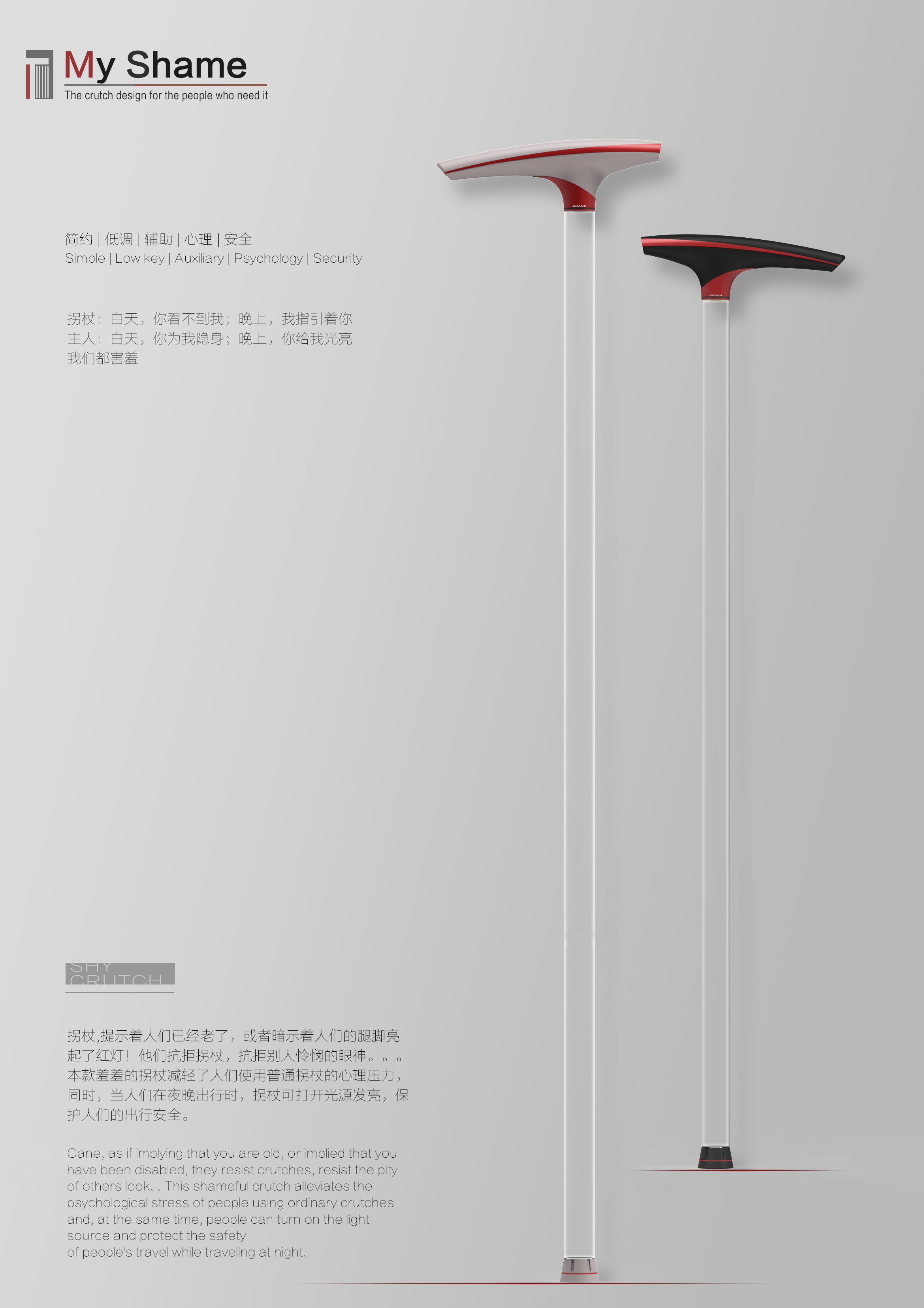
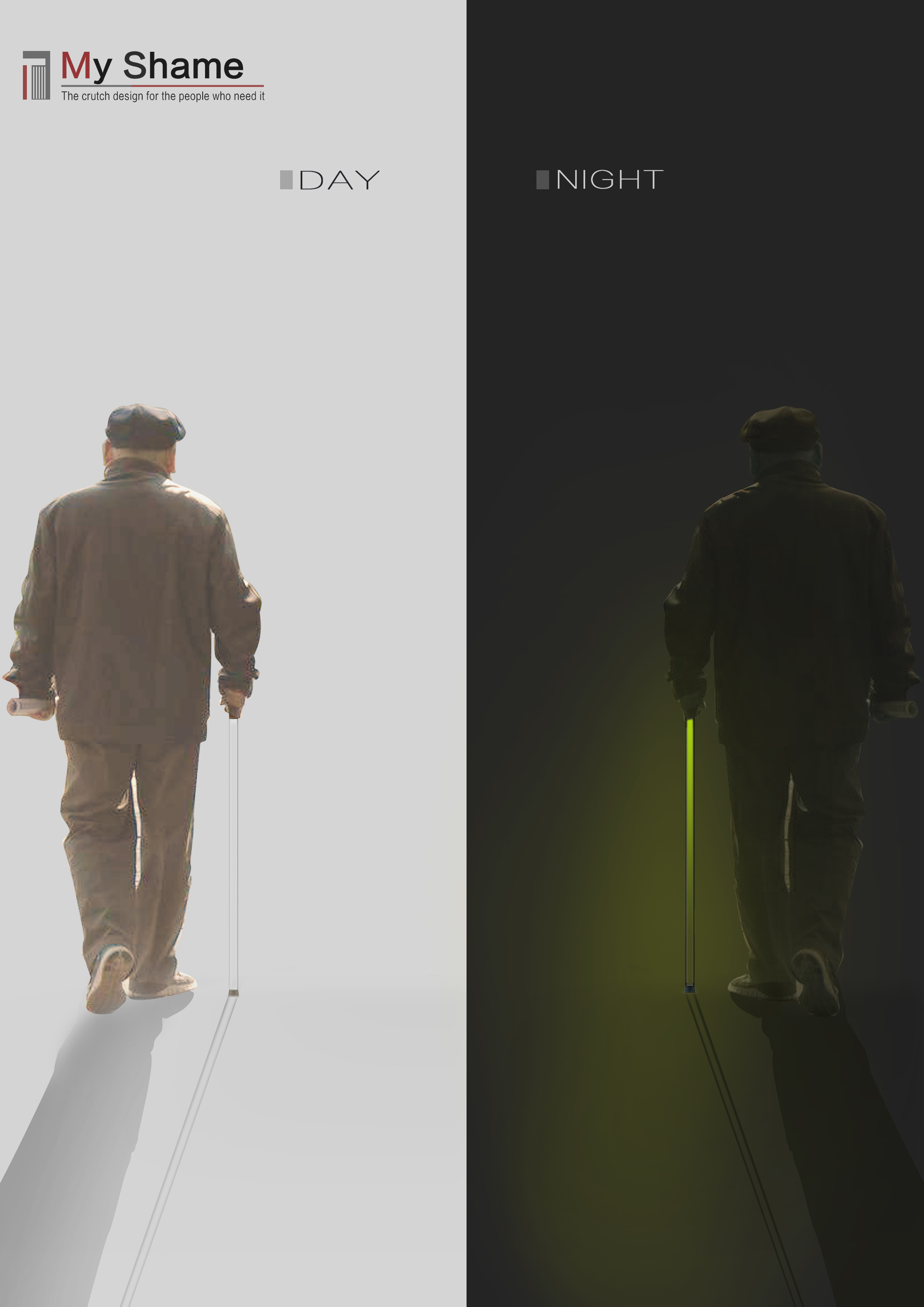
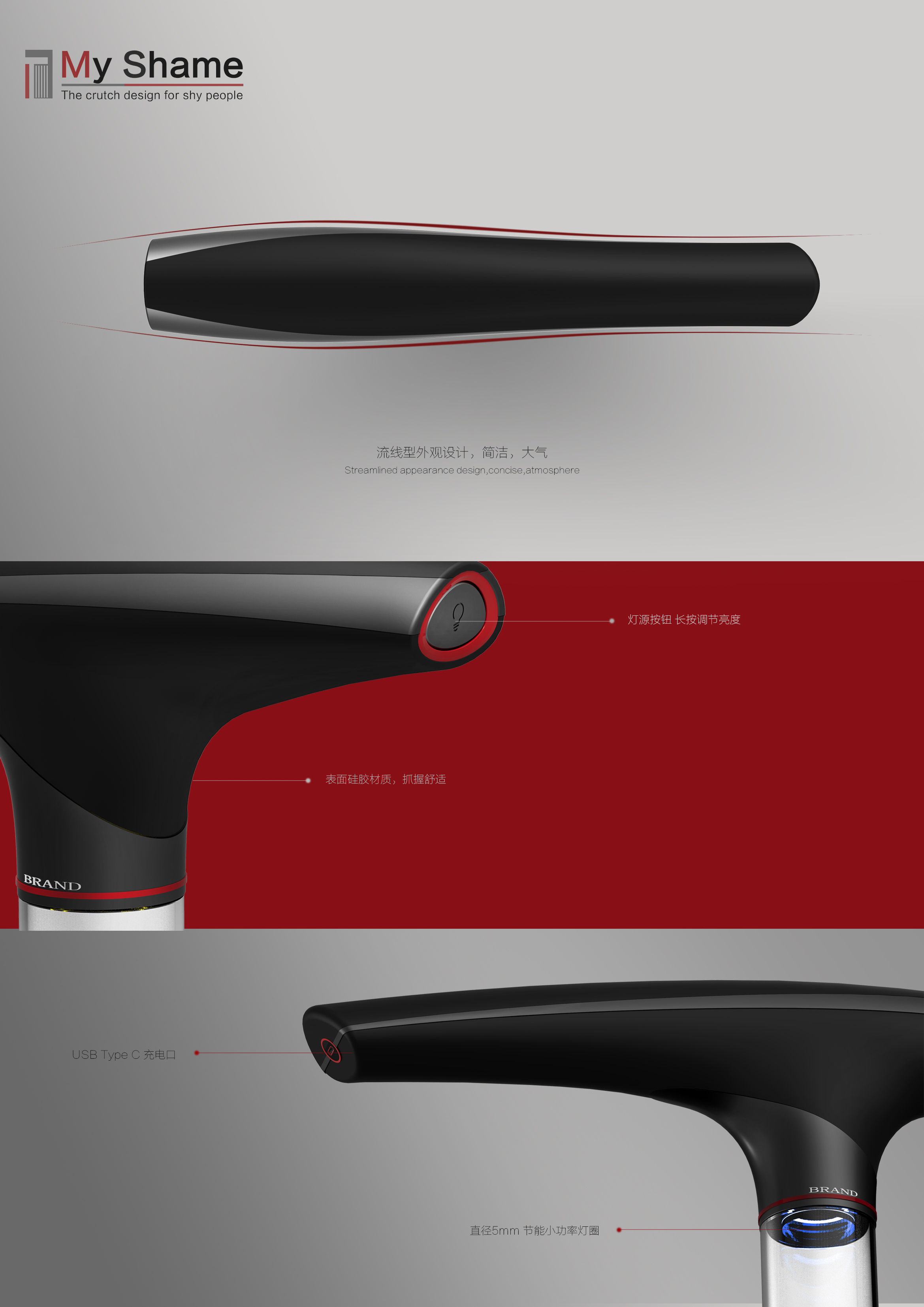
Sophomore work. A design that focuses on emotion. Many users who need to use crutches are resistant and helpless to crutches. They are more or less concerned about the eyes of others. Disobedient to the old, or unwilling to accept the pity of others.. This design makes the crutch member transparent, trying to reduce its sense of existence, even far away can't see its existence. Let the user's psychology be more relaxed.

新用户?创建账号
登录 重置密码
请输入电子邮件以重置密码。


Very meaningful emotional design!! If only we could make real objects for the elderly to experience.
Great!
Great duck, great duck, great duck ~!!!
This design starting point is very bad. Canes are tools. No matter who uses it, it is not a symbol of shame. Design should be inclusive and well-intentioned, and should not be done from a design perspective. It's like designing a face-blocking mask for people with facial disabilities, which essentially encourages such bad prejudices as "disability is ugly, hateful, and should be covered up!
Sophomore year can make such products, awesome! The idea is also super nice
Love
Great angle
Excellent
Ha, ha, ha, ha, ha, guess who I am
Very wandering
Only details
I have always thought that this kind of products are very good, but there is no effect diagram to show.
The overall product renderings do not seem to exist ~ unfortunately