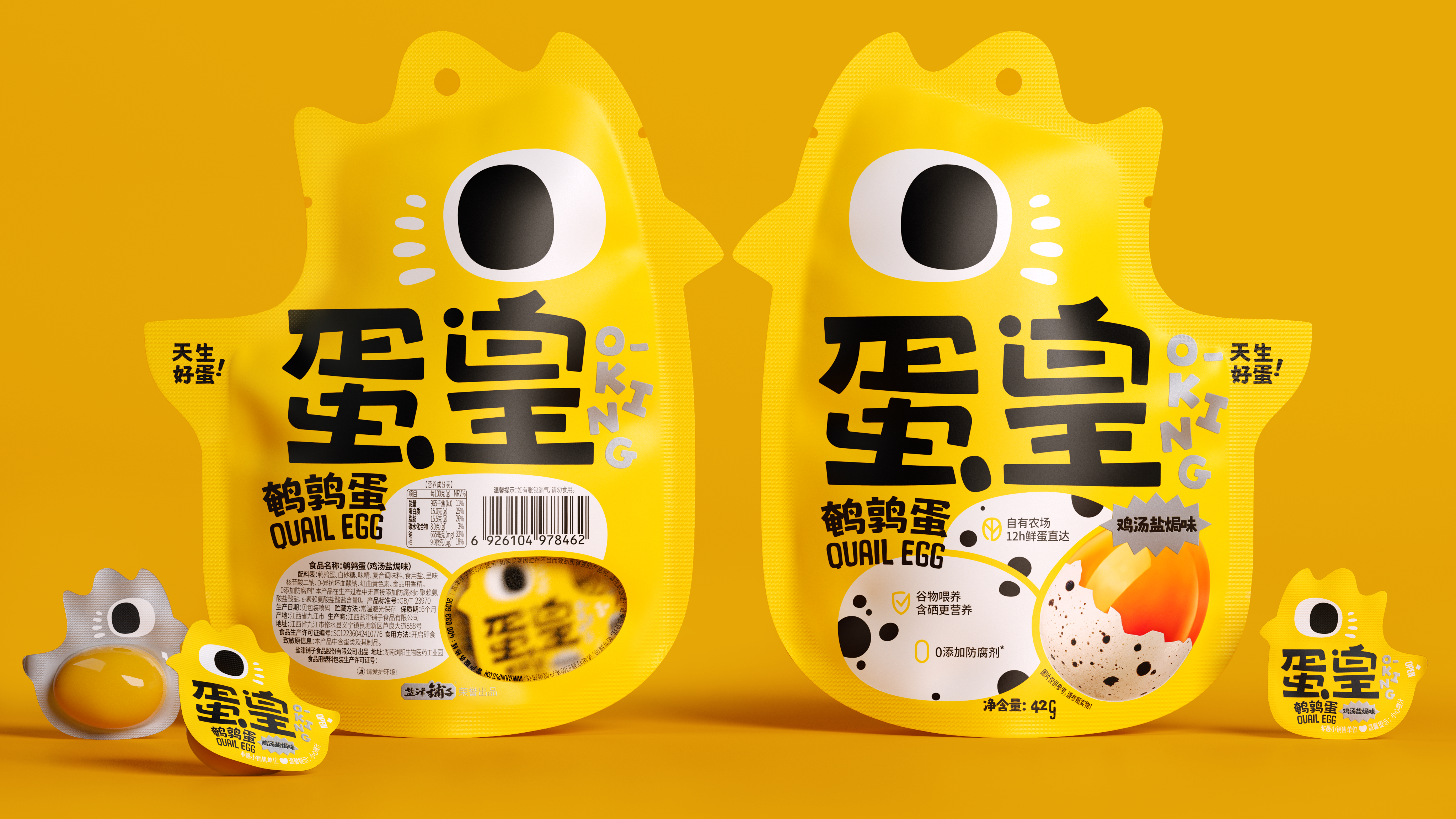
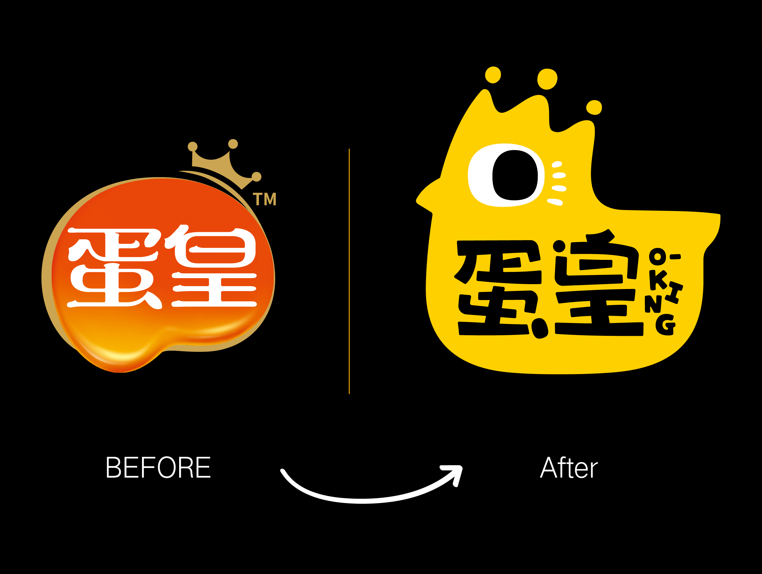
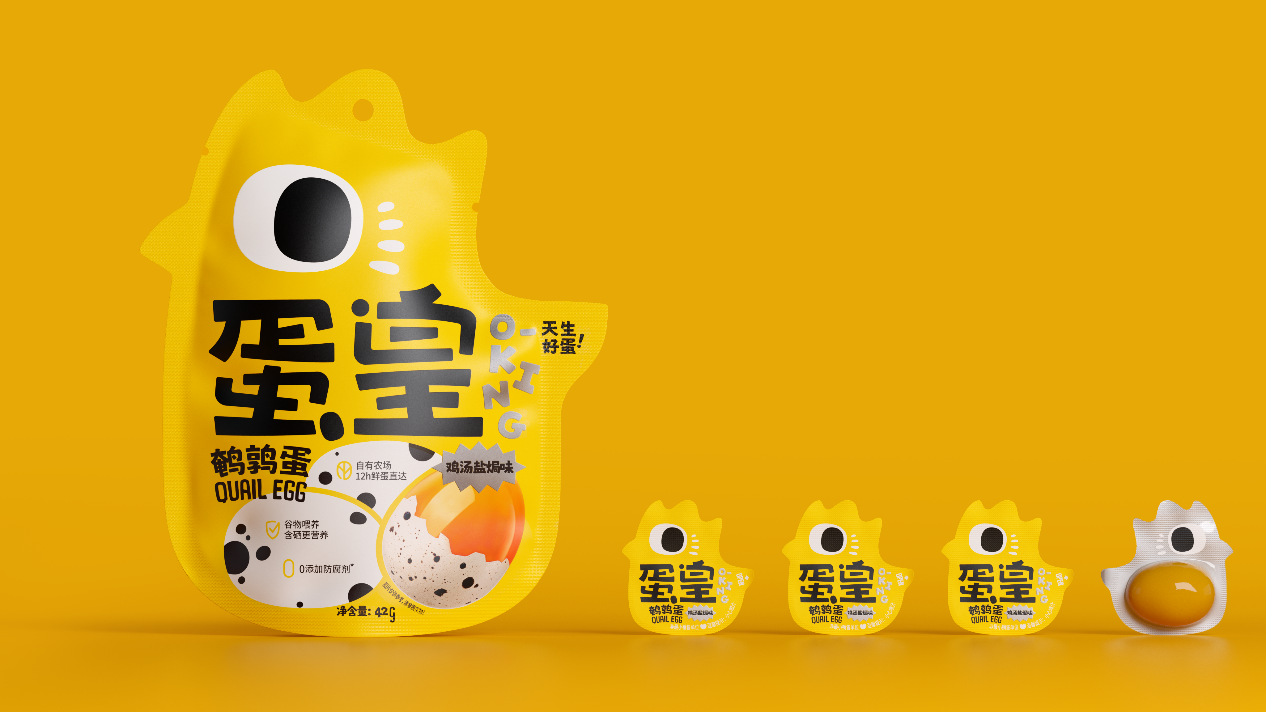
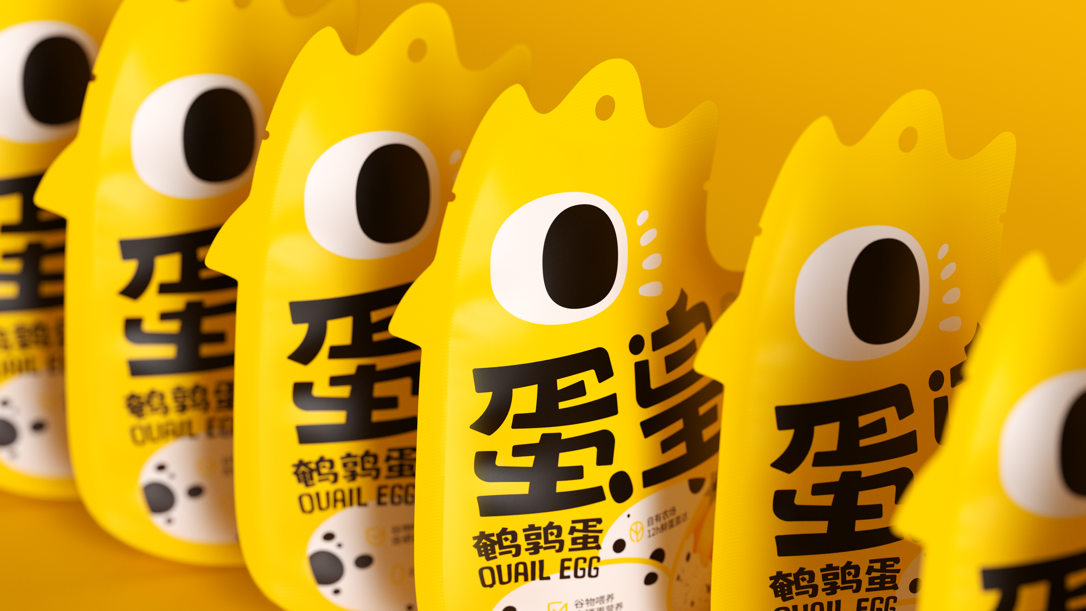
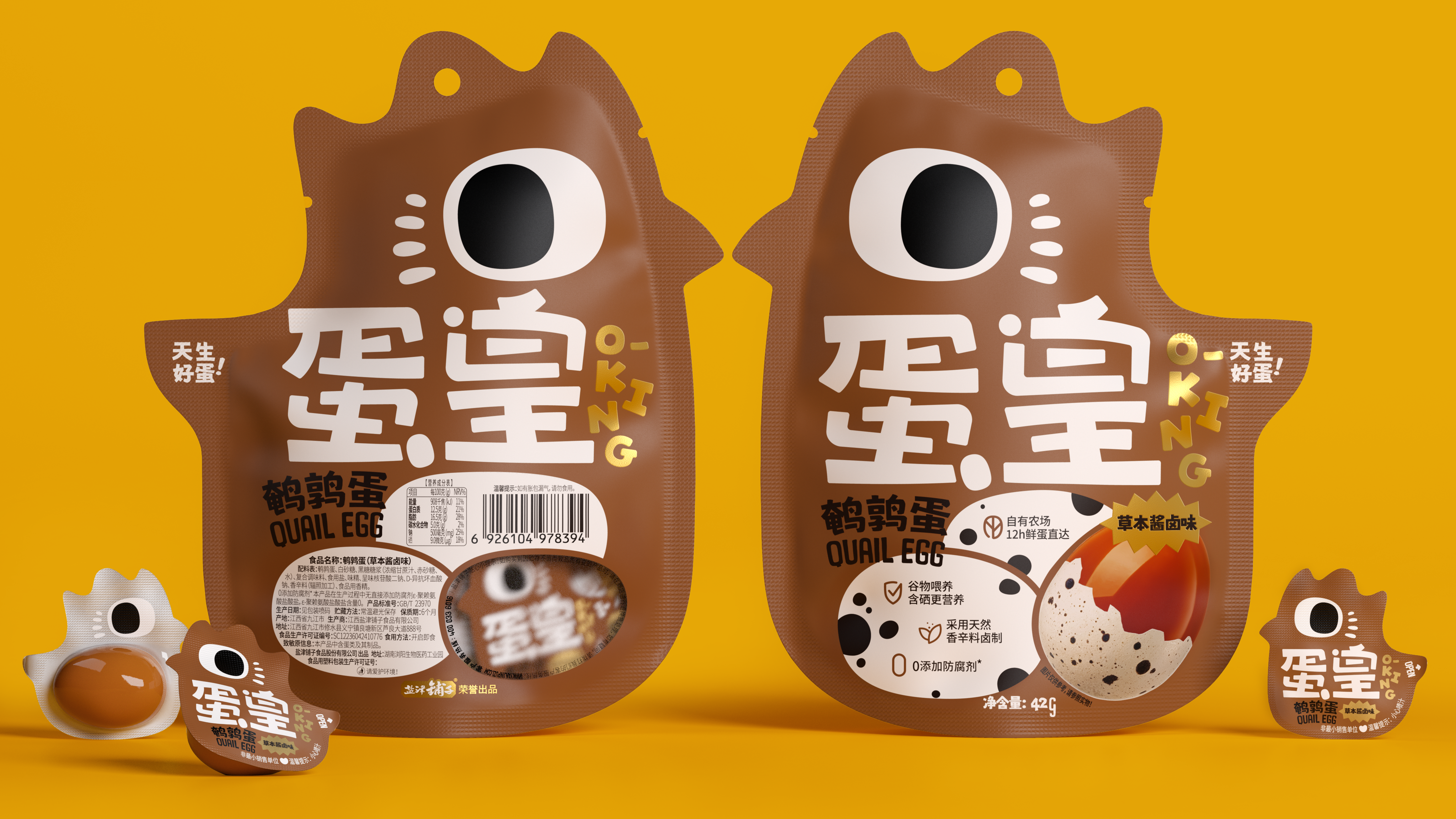
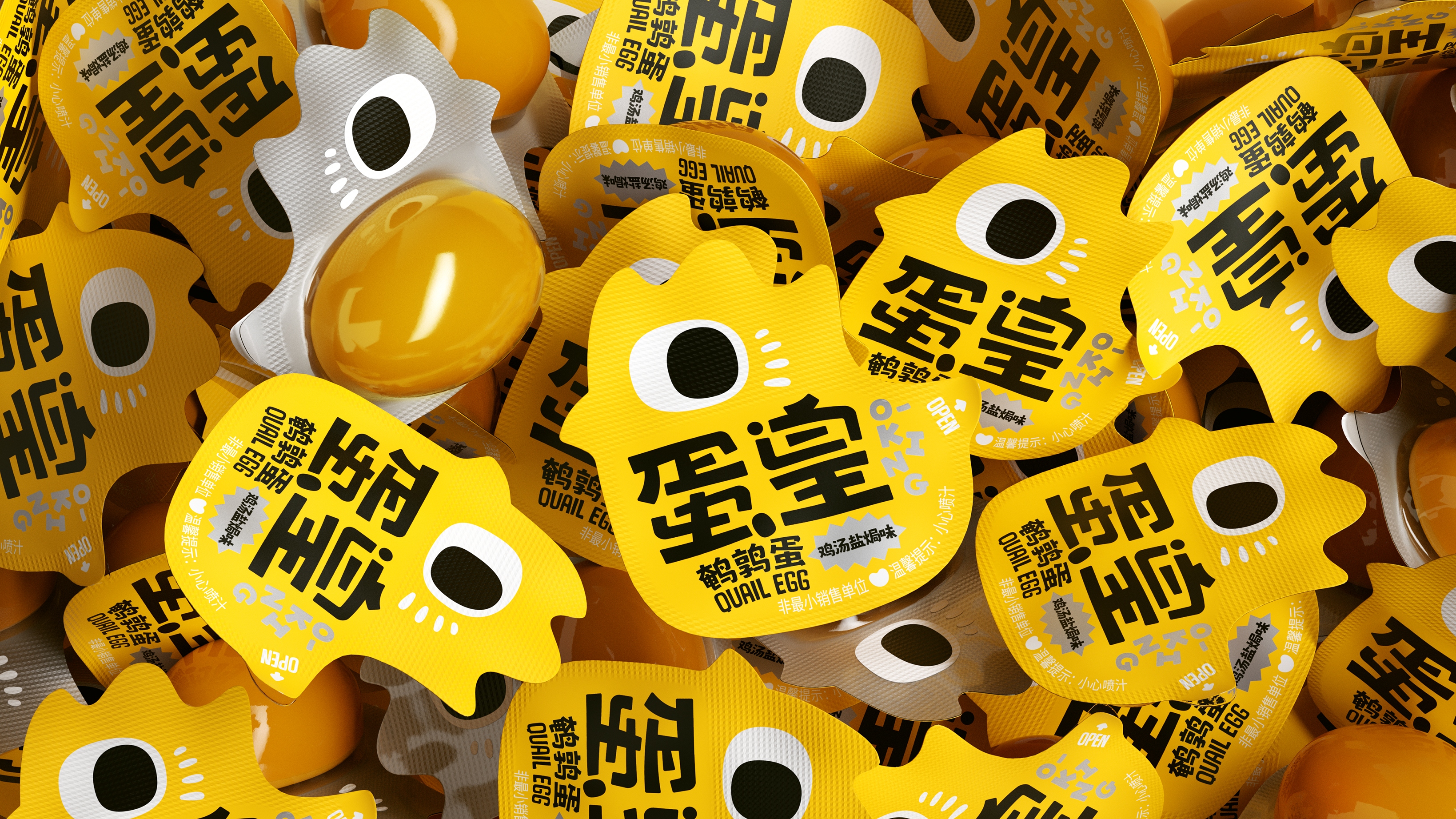
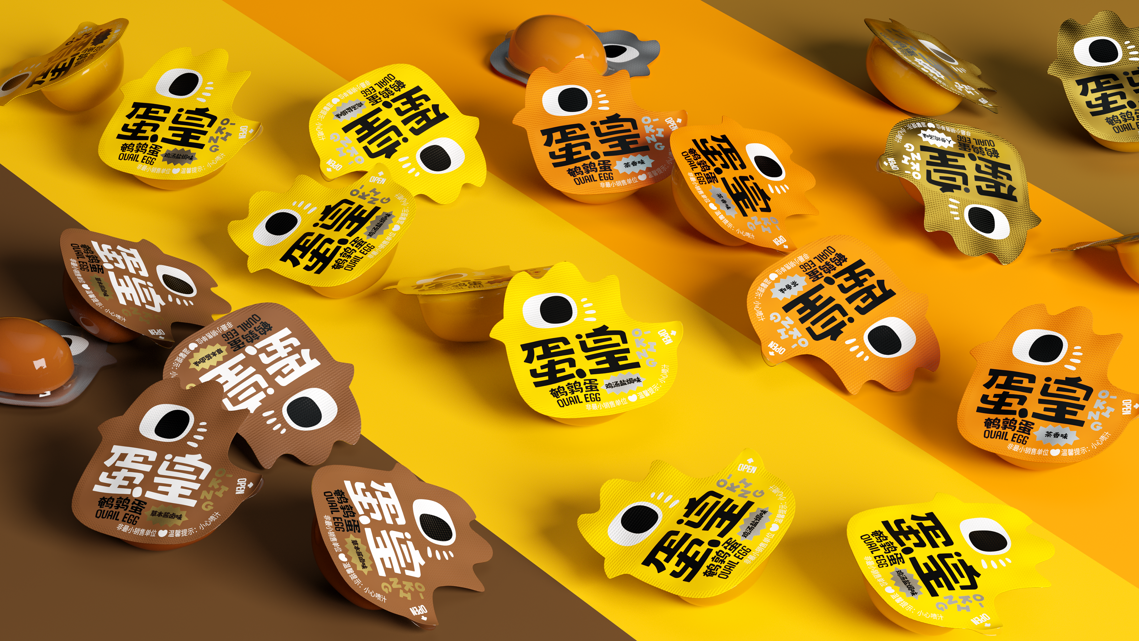
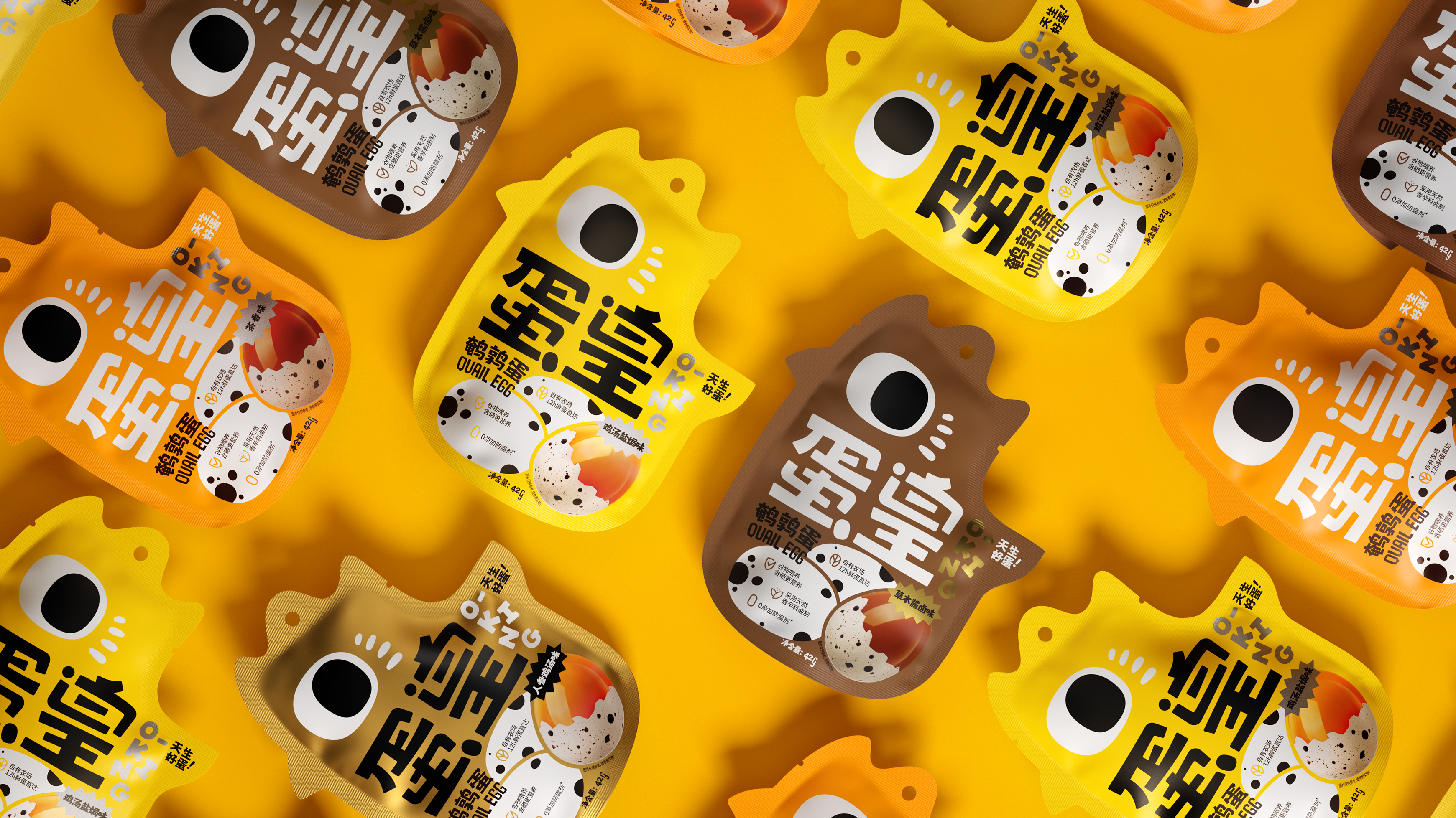
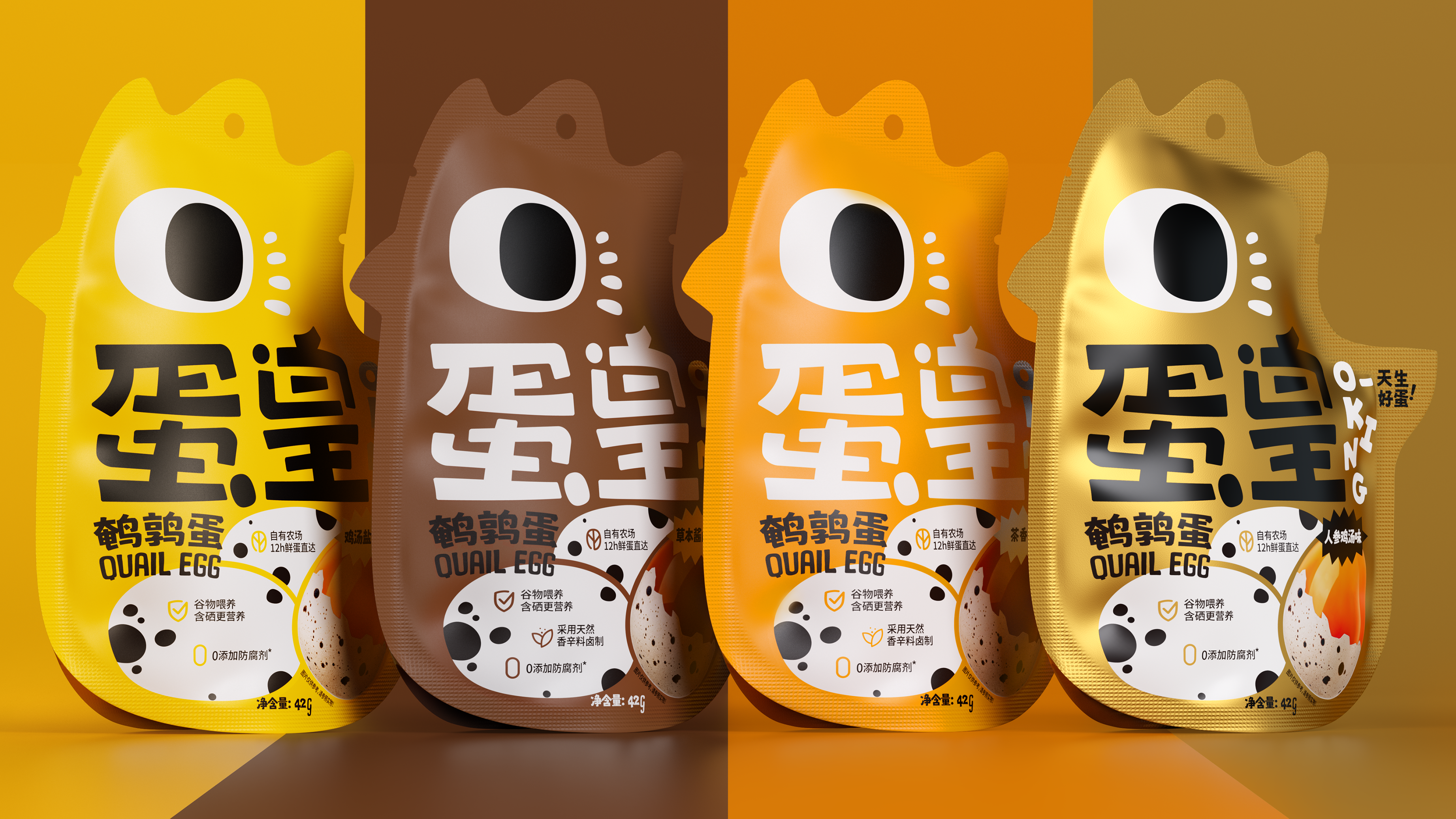
Fast out of the circle and leave a deep memory to consumers is an important goal of this packaging design upgrade.
At first glance, the egg emperor summarizes the appearance of quail, and IP image seizes the mind.
Like a chicken? Or a bird? It doesn't matter! Interesting and easy to remember is more important!
Quail does not form a very familiar cognitive image in the minds of consumers. By designing interesting images to visualize the original inflexible shape, it leaves a deep impression on consumers, so as to realize the long-distance identification of packaging on the shelf and the efficient dissemination of brands. To a certain extent, it challenges the traditional packaging form, which will promote the brand's attention to consumers' experience emotions.
Name of Work | Yanjin Shop Egg Brand and Packaging Upgrade
Brand Holding | Yanjin Shop Food Co., Ltd.
Original Design | Tiger Pan
Executive Design | Xia Xuedan Liu Shicong
Visual Presentation | Wu Juanjuan Kong Chen Liu Zhenyu
Process Design | Xie Zhangkun
Project Management | Peng Lei
Media Relations | Xiang Lingli

新用户?创建账号
登录 重置密码
请输入电子邮件以重置密码。


Childlike innocence is full
it looks delicious
Fun