In the collection of primary school chickens, everyone passed by and said when they looked at what was wrong, I actively corrected it.
In the collection of primary school chickens, everyone passed by and said when they looked at what was wrong, I actively corrected it.

本作品版权归 San Junipero 所有,禁止匿名转载及个人使用,任何商业用途均需联系原作者。

新用户?创建账号
登录 重置密码

请输入电子邮件以重置密码。
It is suggested to enlarge the photo a little.
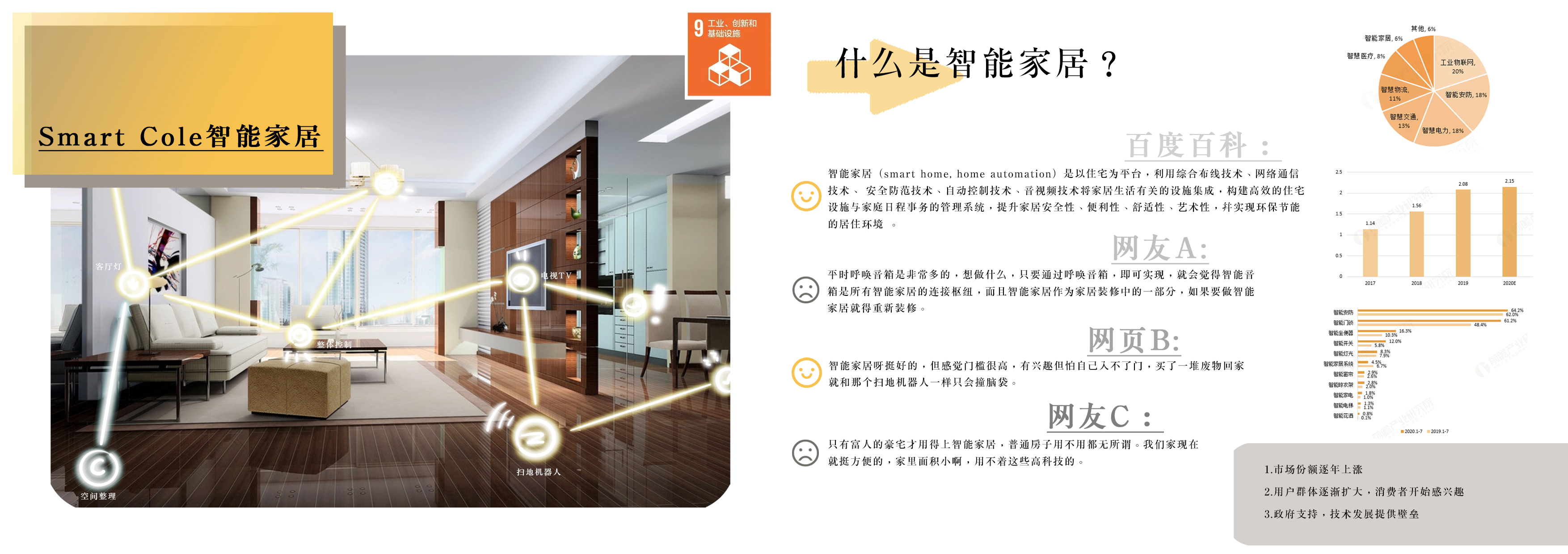
There is too much research, and there is basically no such thing when I come out to work.
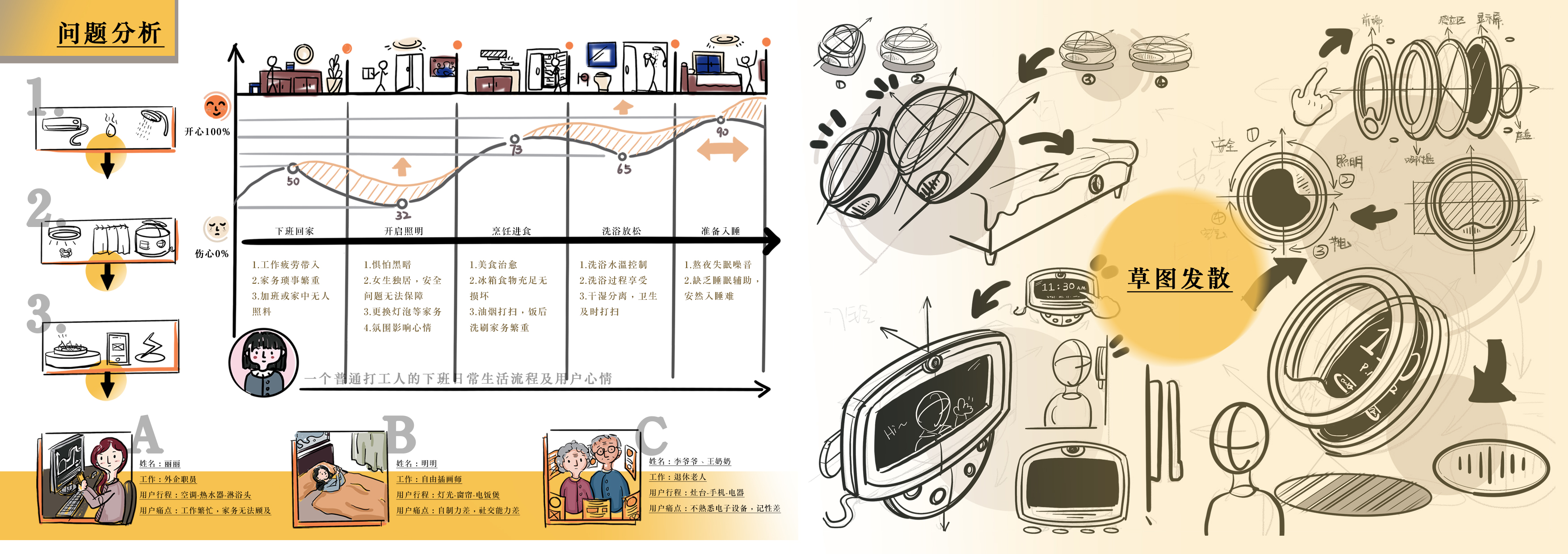
Strengthen the focus and weaken the non-focus.
It is rare to see students from Shandong schools. The whole is worth encouraging, the layout is not concise enough, and the focus of expression is not prominent enough.
Personal opinions are for reference only: 1. few designers use song style directly. 2. the layout color is a bit vulgar. 3. it is not that the design integrity is not good, but that too many words and too few pictures are easy to see. can appropriately enlarge the layout space of the picture.
This work is too informative. I just look at people..
What feels good is that things are too dense .... I don't want to see it
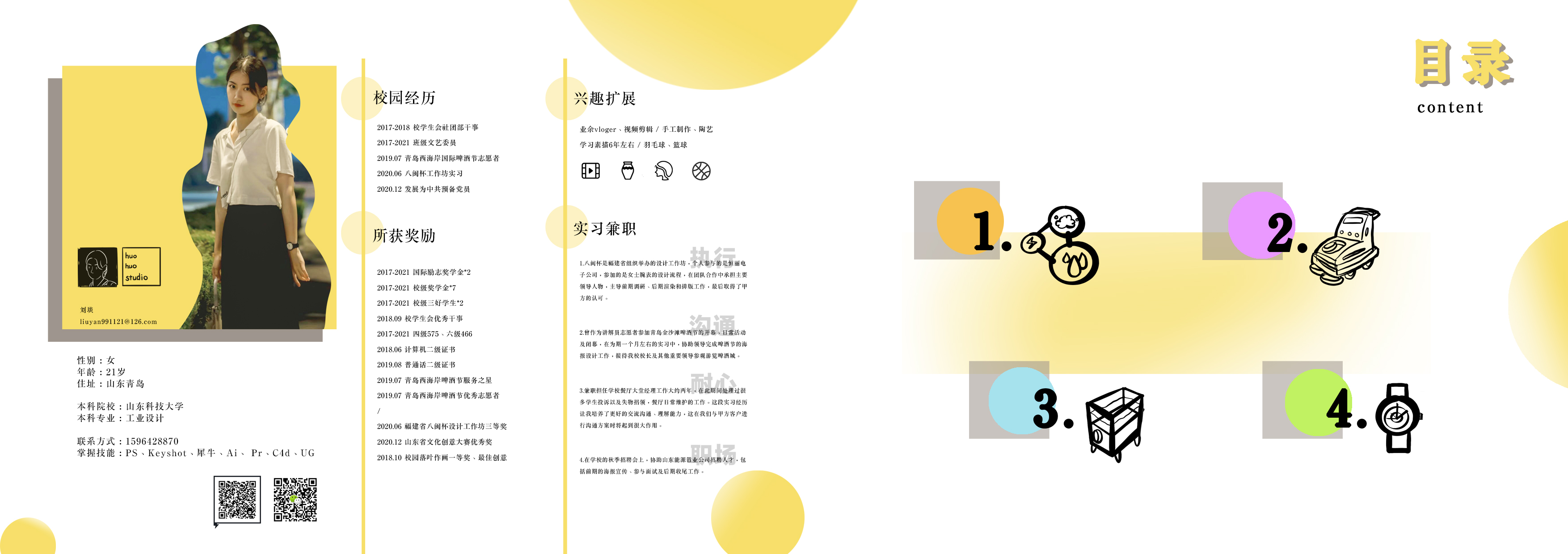
The text can be simplified, and keywords or phrases are enough for English advice. After all, few people in China can read the job search. I personally suggest that the designer's introduction page can be written less or not about the experience that has nothing to do with the design. If you want to explain other aspects of the ability, please show it in the interview
People look good, the layout looks a little messy, fresh and natural
More big pictures, product details, usage scenes, can be put, words can be less
On the one hand, what you have done well is that there are fewer product displays and the expression of the effect needs to be strengthened come on!
Wang Yehua, come on
For this complete portfolio, I will decide to let him come for an interview when I see the catalog page.
That's great. Jimei
Like