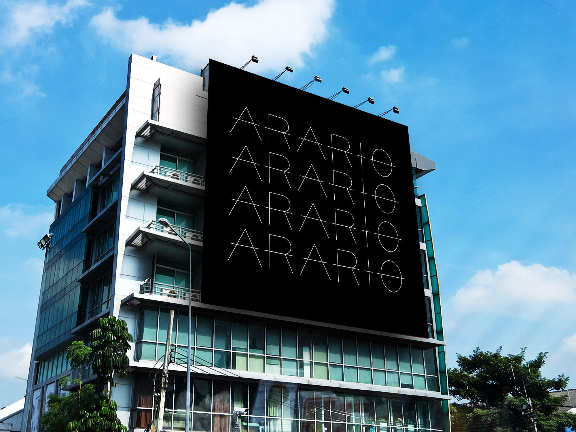
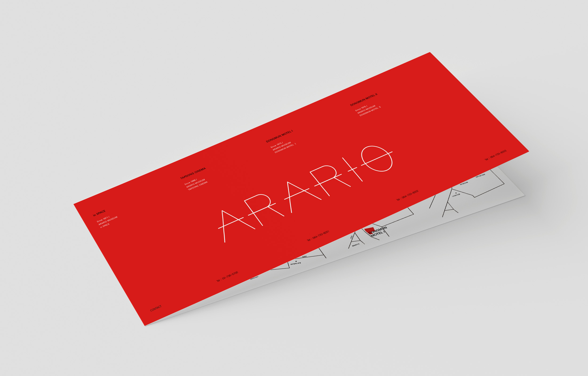
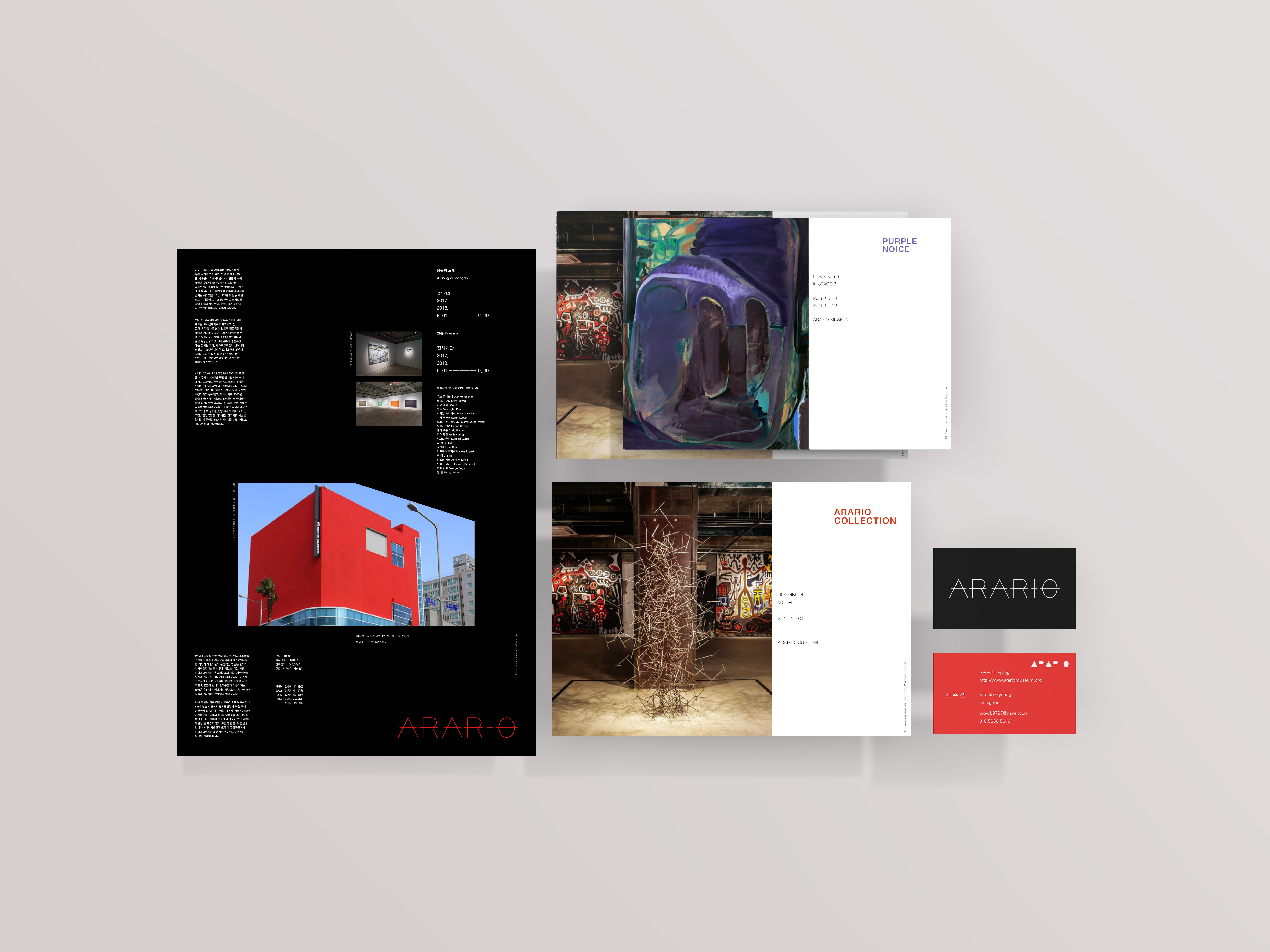
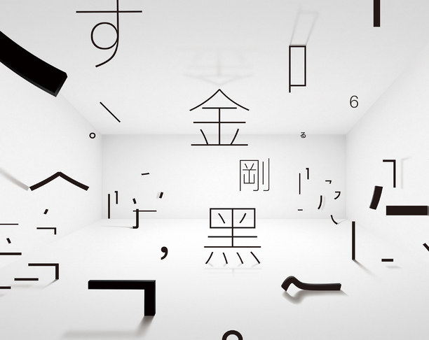
It is a concept that focuses on the simpleness of holding the soul, the ARARIO Museum philosophy, and visualizes the work and audience in a space called the Museum. The ARARIO Museum returns to its initial focus every moment to manage the exhibition space and shows the philosophy of the work ba-sed on simplicity. Therefore, ba-sed on the three simple, harmonious and co-existing brand systems, the main color was chosen as Pantone Black and Red, and it became visually noticeable. The posters contain desc-riptions of buildings and exhibition information for each building. Different pictures in the center wanted to show the building's shape.
Country
Korea
Year
2019
Designer
KIM JU GYEONG
本作品版权归 K-DESIGN AWARD 所有,禁止匿名转载及个人使用,任何商业用途均需联系原作者。

新用户?创建账号
登录 重置密码
请输入电子邮件以重置密码。


留言板 (0)
评论为空