7000KM
Brand Naming/Logo Design/VI Design
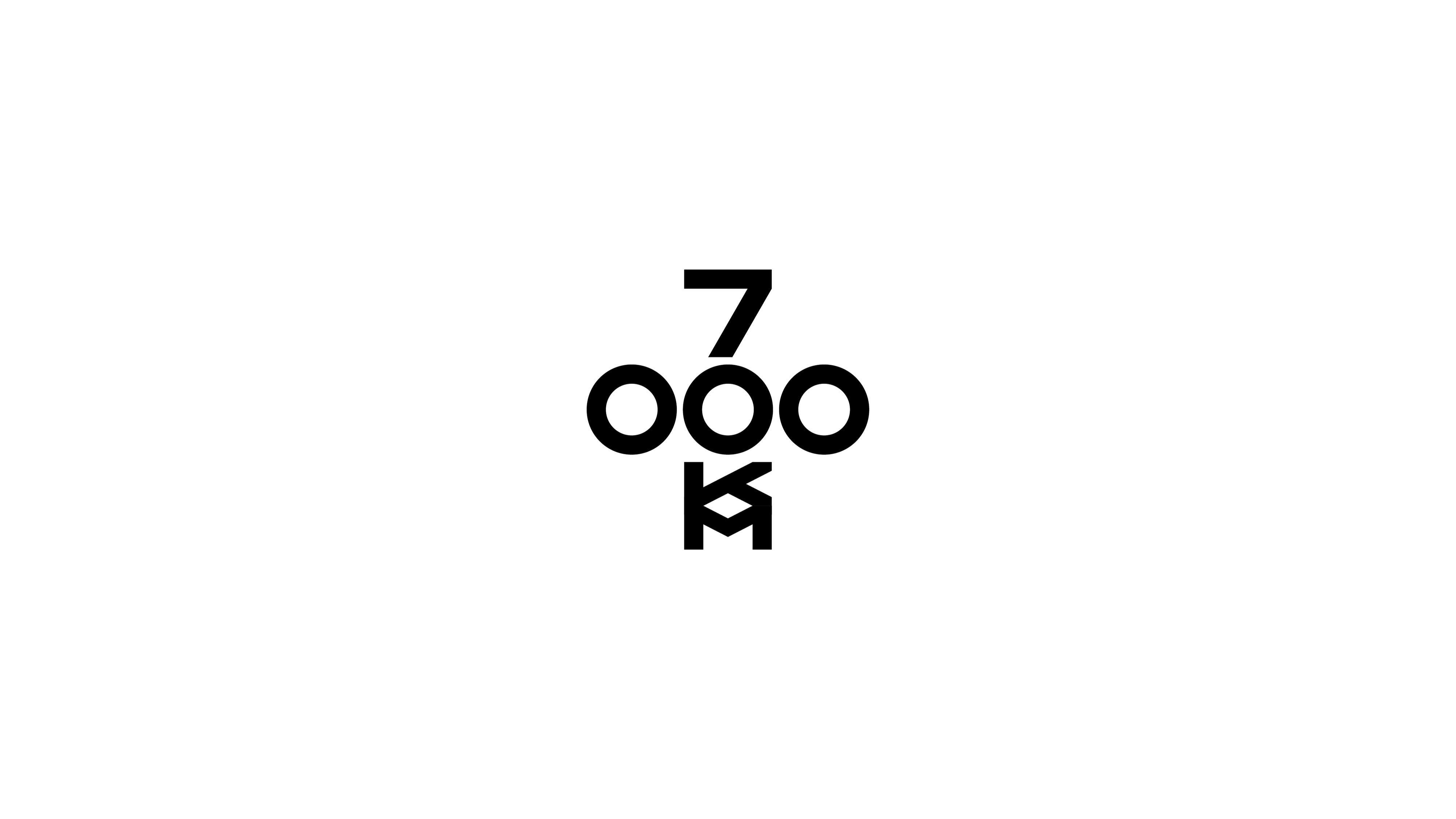
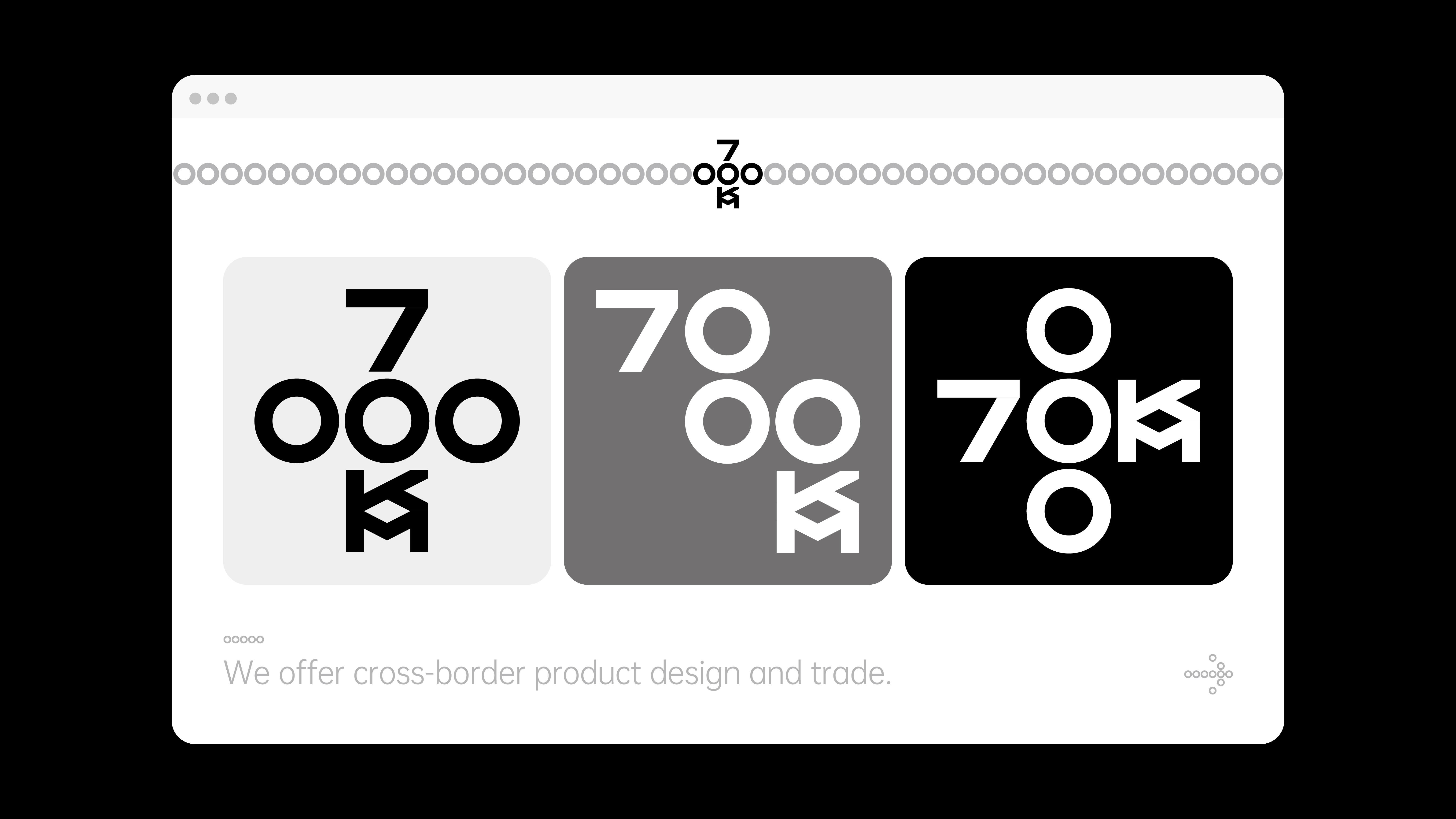
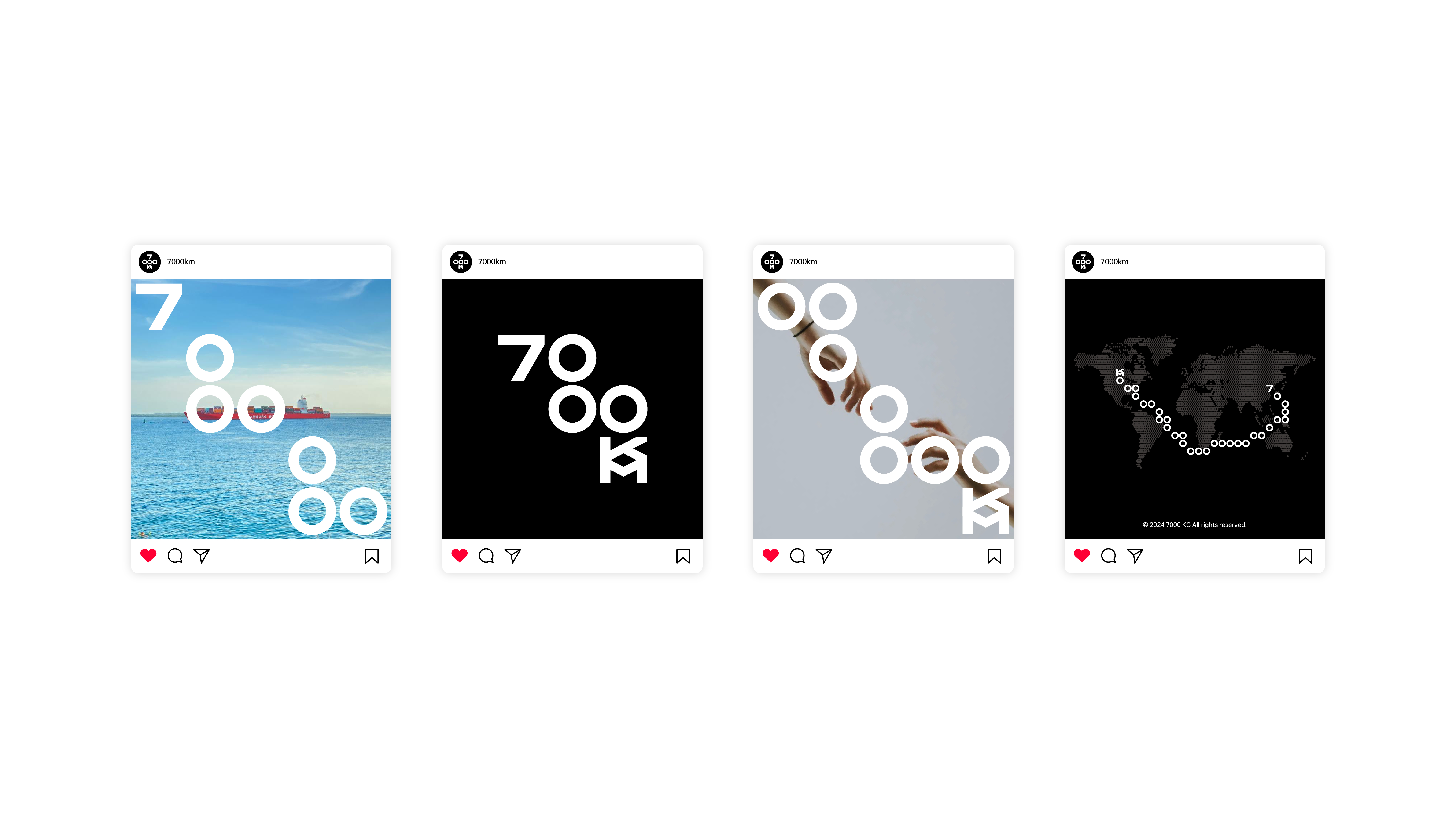
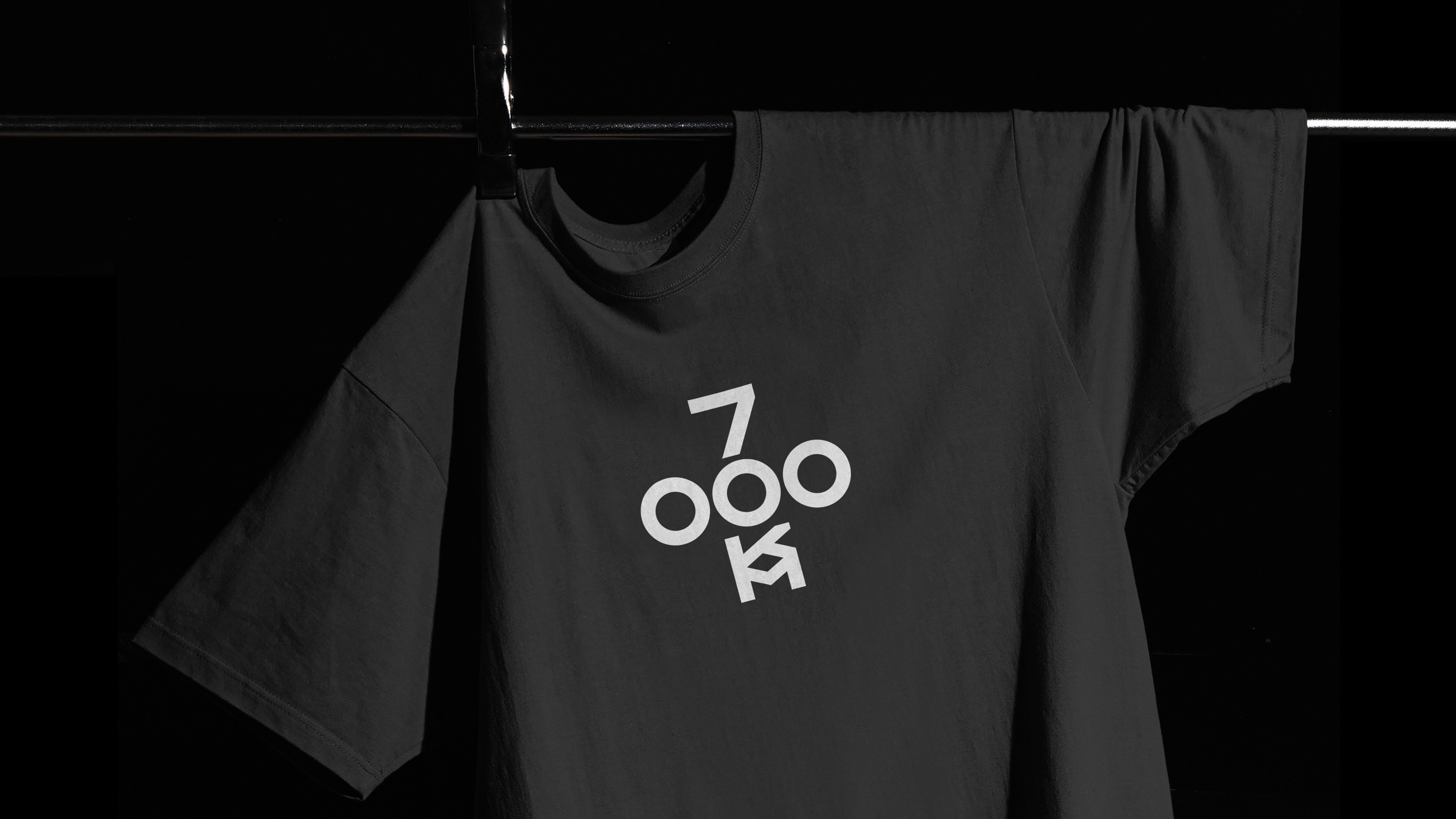
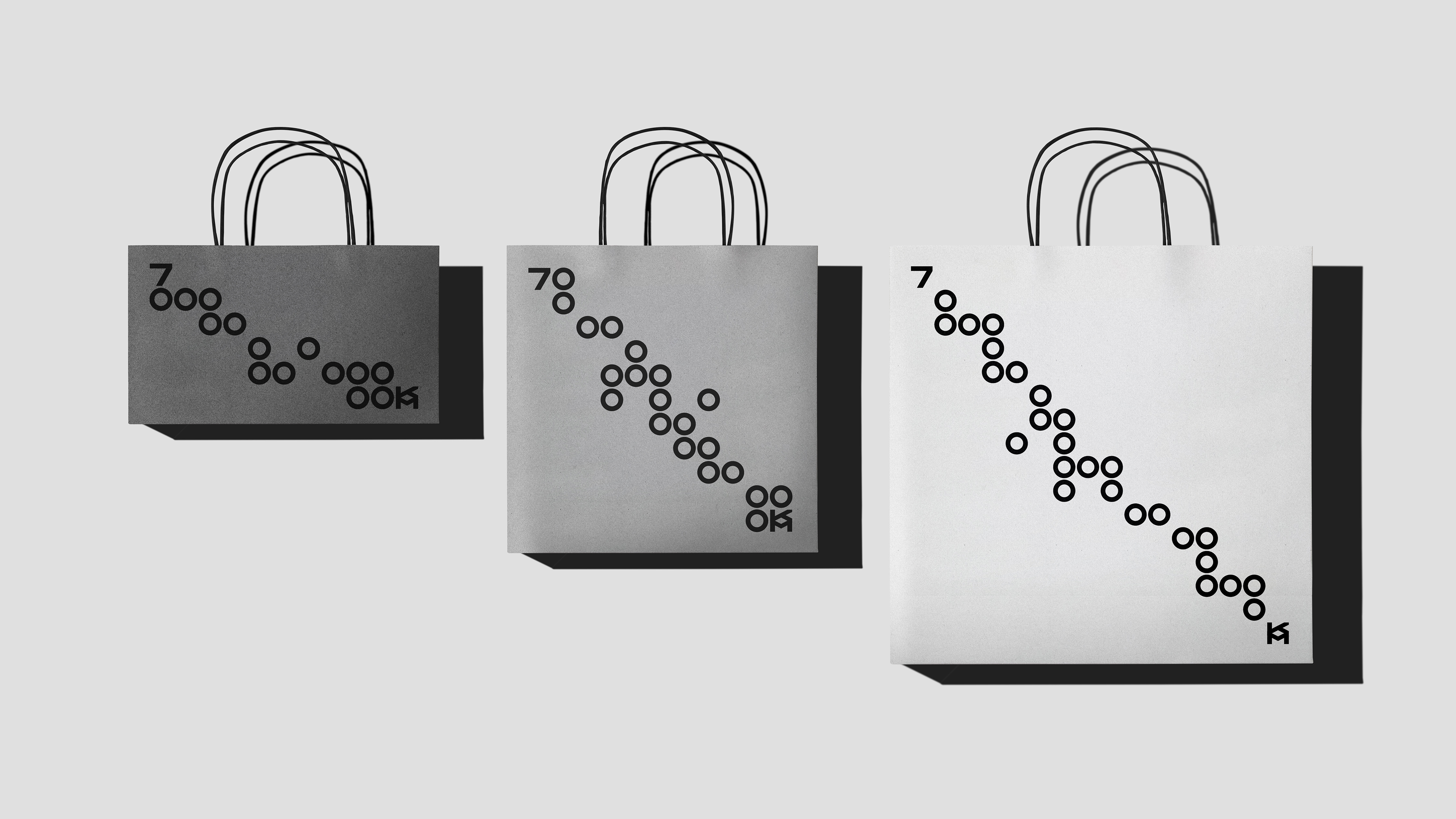
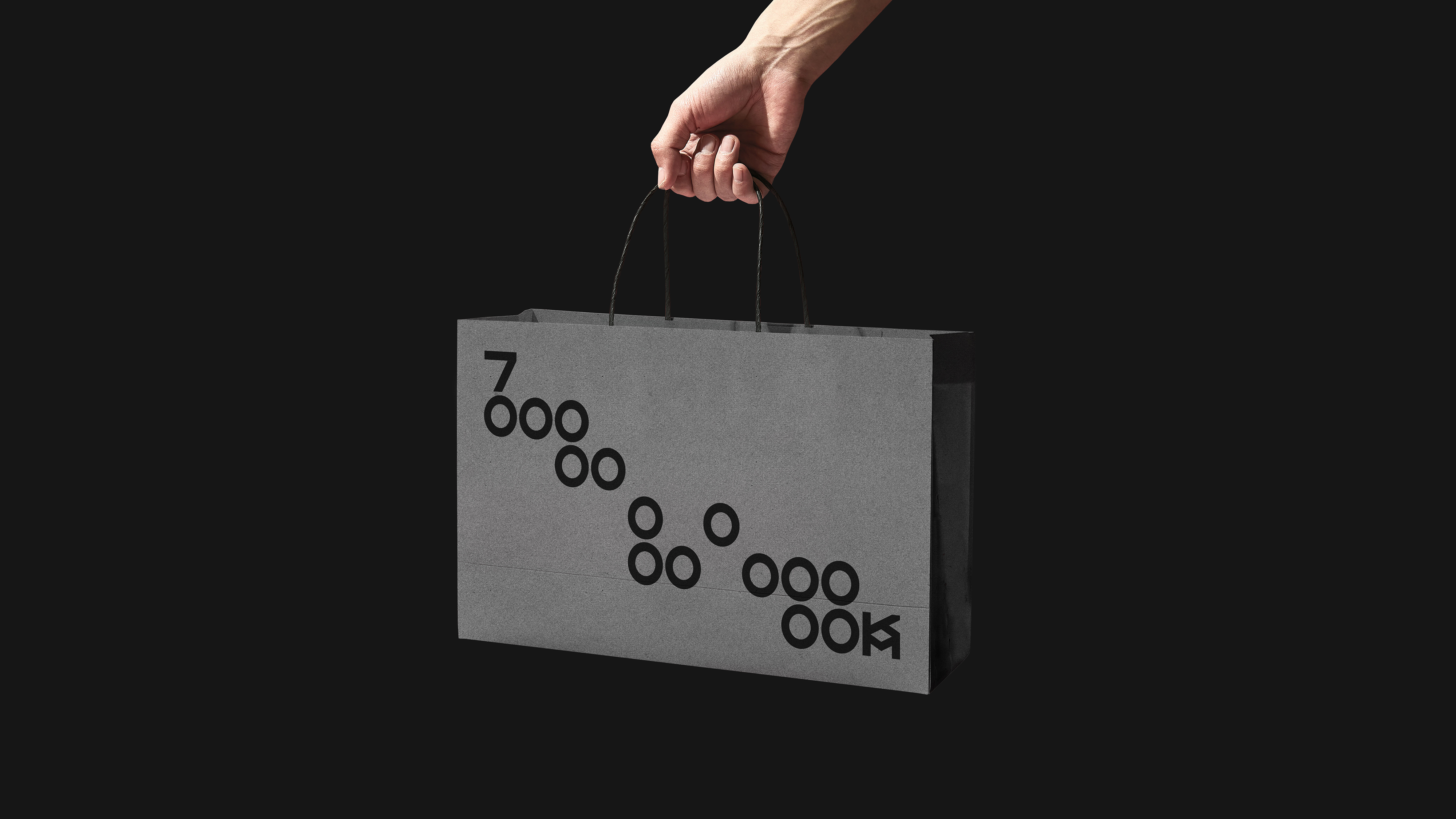
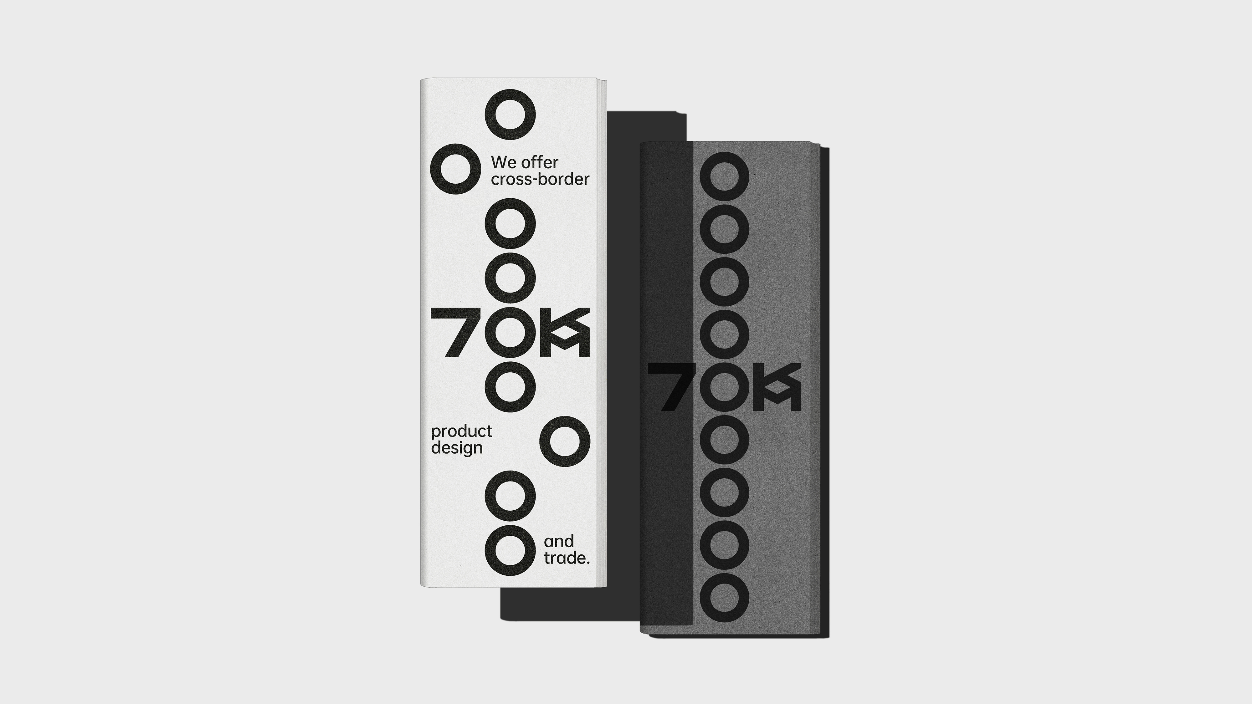
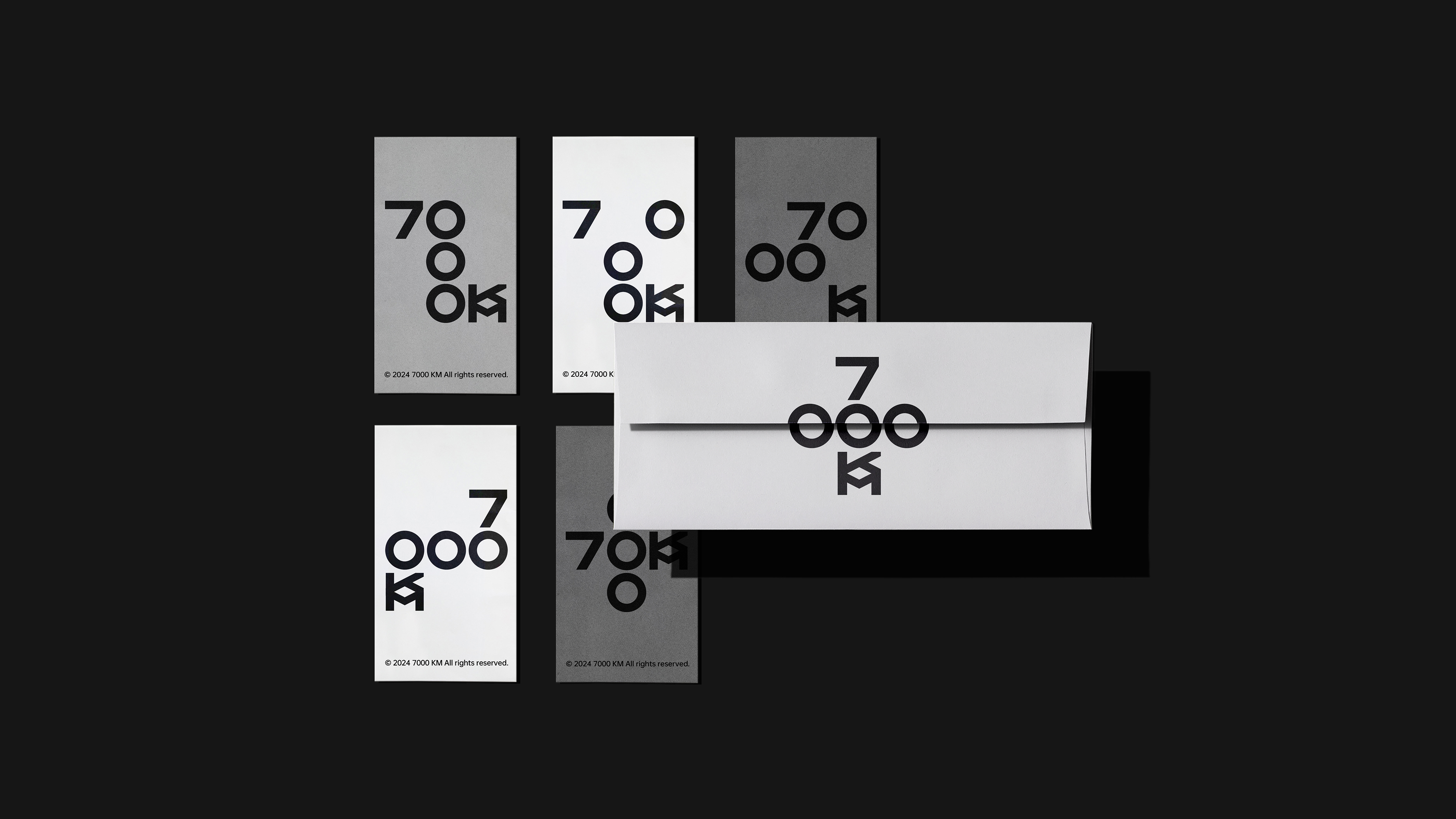
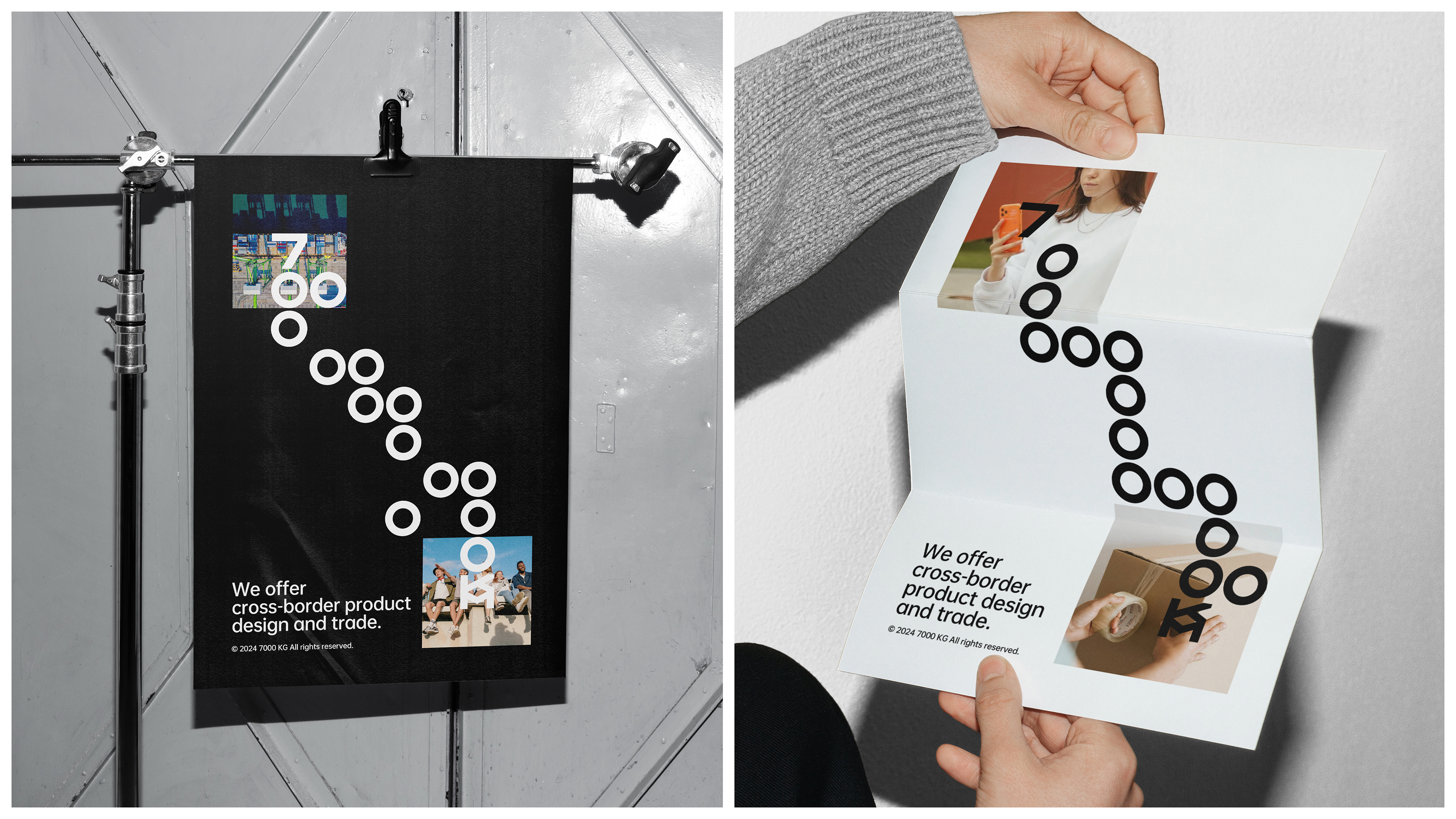
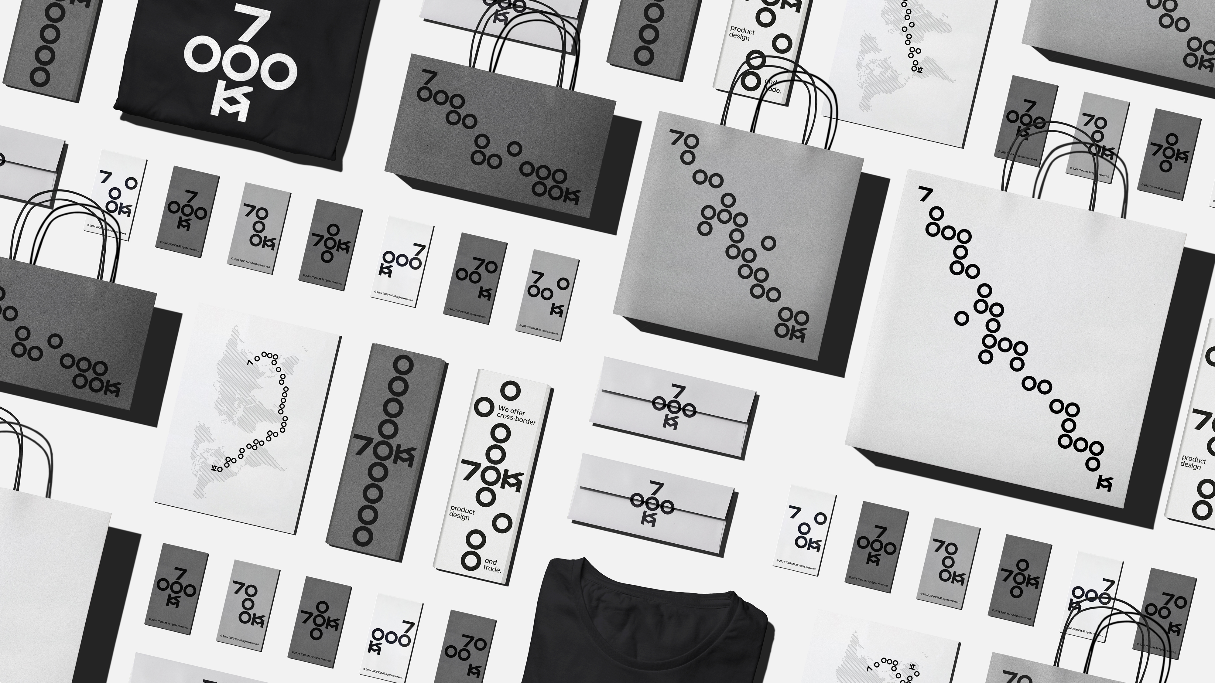
7000KM is a professional international trading company with operations in major economies such as America, Europe, and Australia. Its name comes from the total length of the world's earliest international trade route-the Silk Road, which also makes the brand temperament full of romance. Our understanding of international trade and the Silk Road is free, flexible, and friendly exchanges such as network spreading, so we have created a set of Logo and visual recognition system based on grid system for 7000KM. The letters of 7000KM are condensed into a 5 × 5 grid, which is arranged and shuttled under rules, so Logo becomes dynamic and interesting, echoing the freedom and flexibility of the trade network. At the same time, the number 0 can also be extended into a "map route" representing trade and the Silk Road, connecting from a starting point (number 7) to an end point (letter KM), strengthening the brand impression, enriching the brand's emotional attributes and helping the brand to develop more rapidly.


本作品版权归 后浪设计 所有,禁止匿名转载及个人使用,任何商业用途均需联系原作者。

新用户?创建账号
登录 重置密码
请输入电子邮件以重置密码。


Strong
Cool
Very personal feeling
Strong
good workmanship