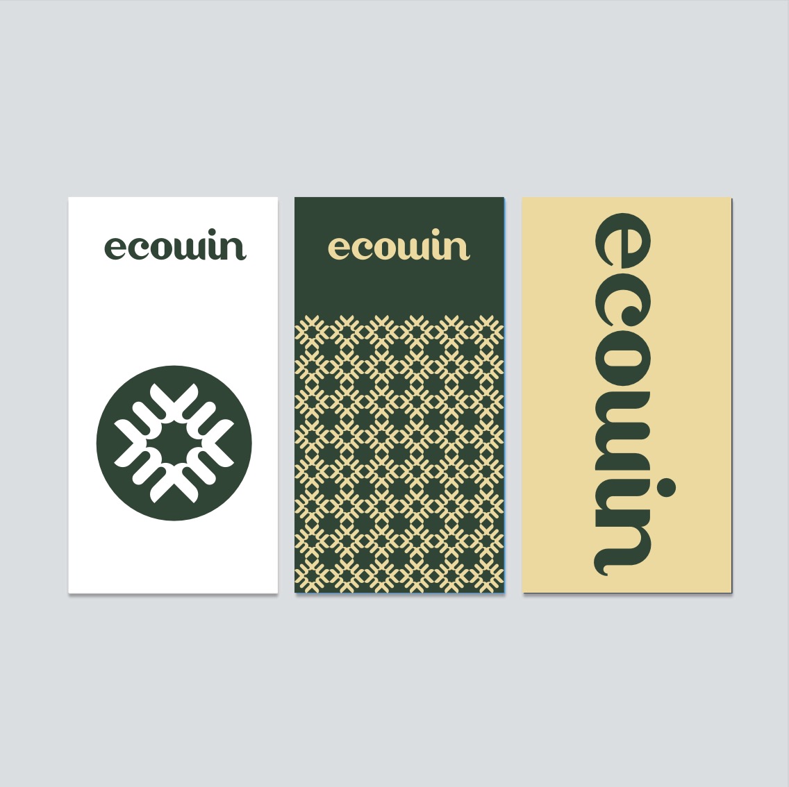
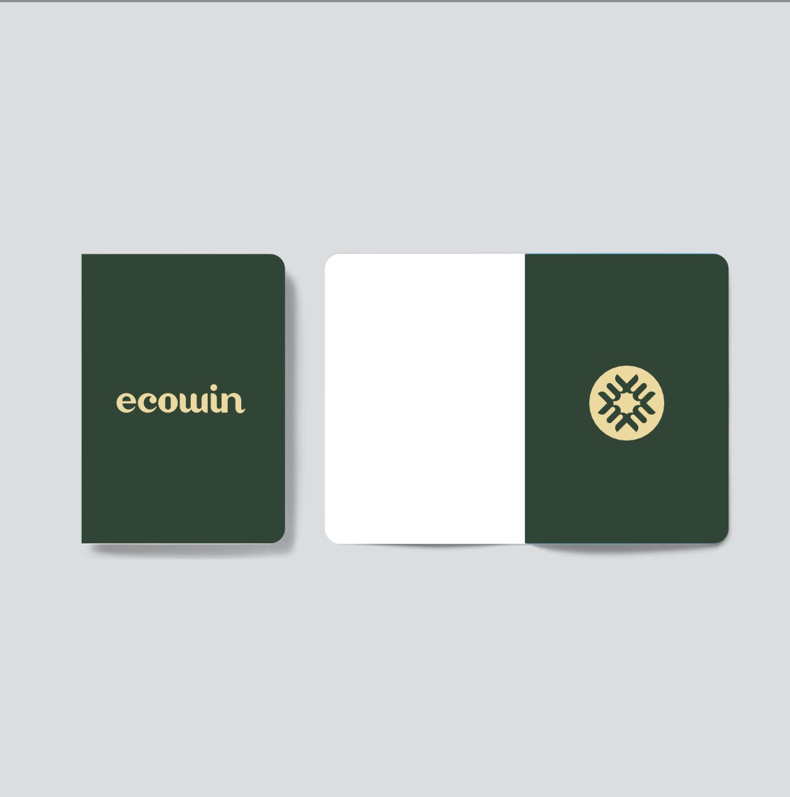
Aolab VI Design-Manual of Visual Identification Specifications for Italian Brands.
The VI designed for this purpose includes: Chinese and English logo design; Color matching; Plate size; Special fonts; Auxiliary graphics; Image style and basic application.
The English logo is the primary brand symbol that can be flavored. It helps to establish brand identification and convey the reputation and stability of the brand. The Chinese logo is used as a combined logo of the English logo. The graphic logo is divided into wireframe version and background color version, and it is also used as the main brand symbol of Yimowei.
In order to ensure that the brand logo of Yike can be clearly identified in all applications, the safe area and minimum size of the logo are specially marked in the manual. At the same time, in order to ensure the integrity and unity of the brand logo, the non-standard use style example is the use and restriction of the brand logo.
Brand color plays a central role in the visual communication of the brand. The manual contains references to the standard color and color matching ratio of the brand. As an important part of visual recognition, brand standard Chinese and English fonts are specially selected.
Combined with the above, give the brand basic application reference.
本作品版权归 上海物集设计咨询有限公司 所有,禁止匿名转载及个人使用,任何商业用途均需联系原作者。
新用户?创建账号
登录 重置密码
请输入电子邮件以重置密码。
留言板 (1)