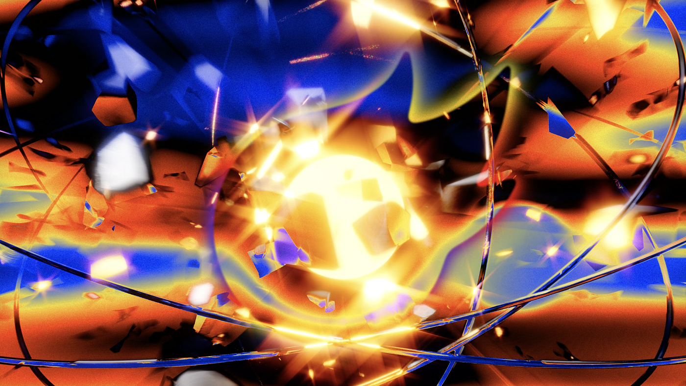
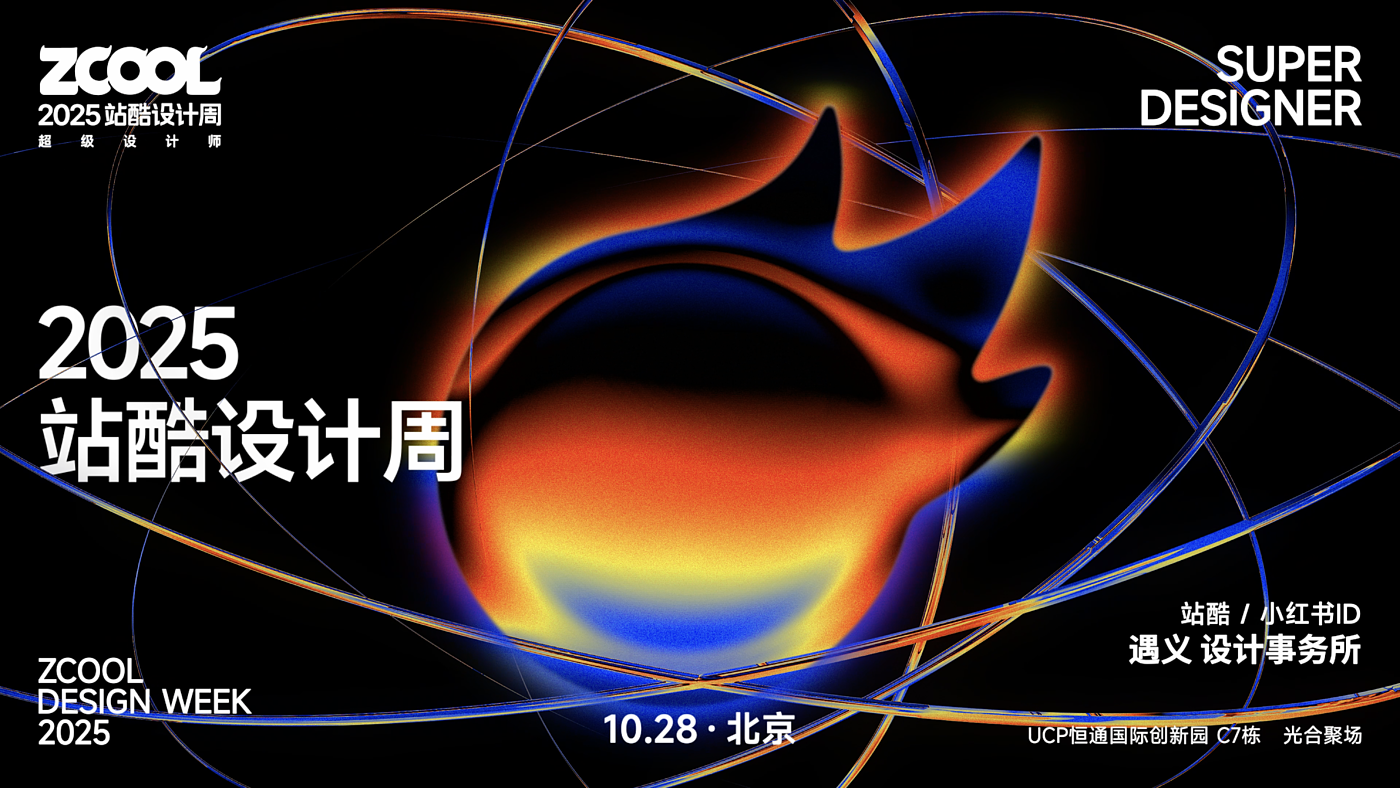
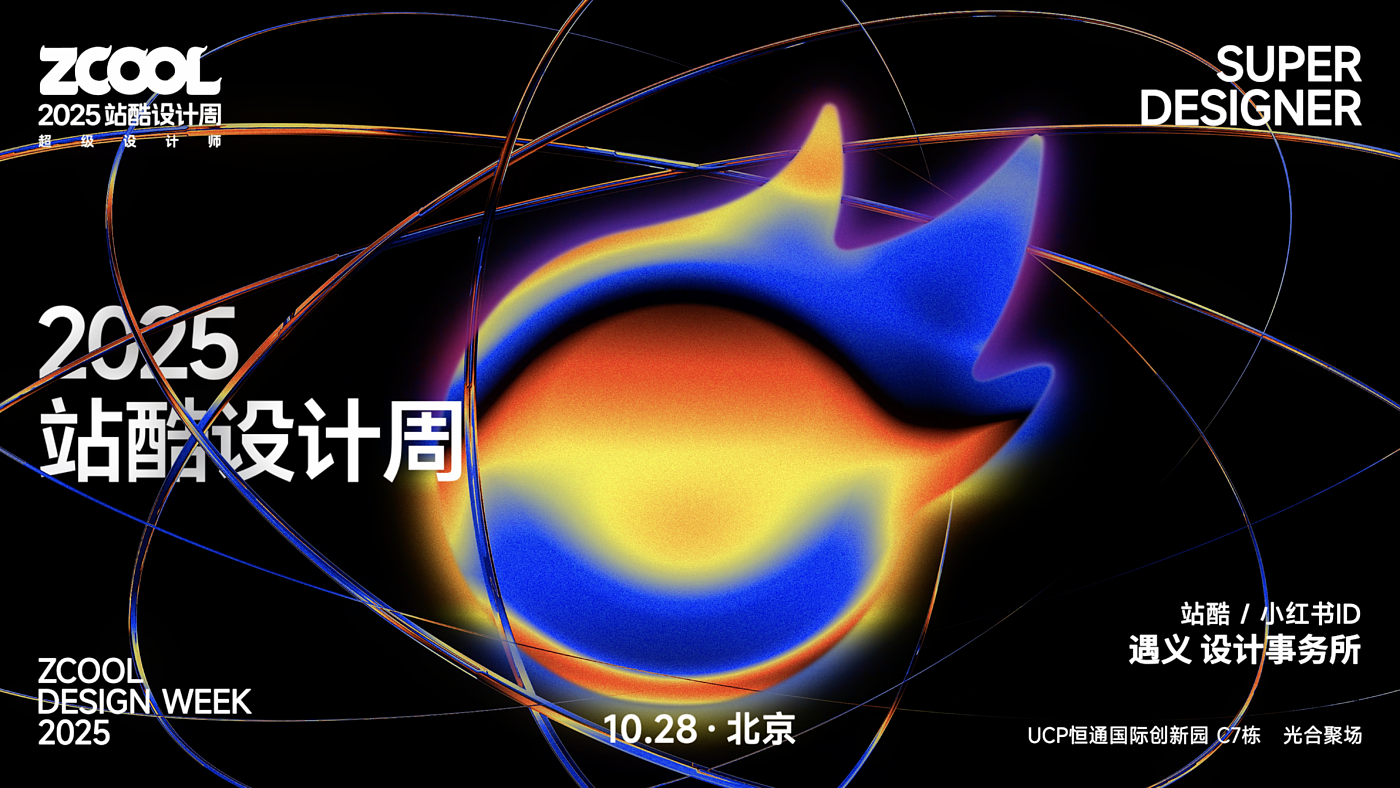
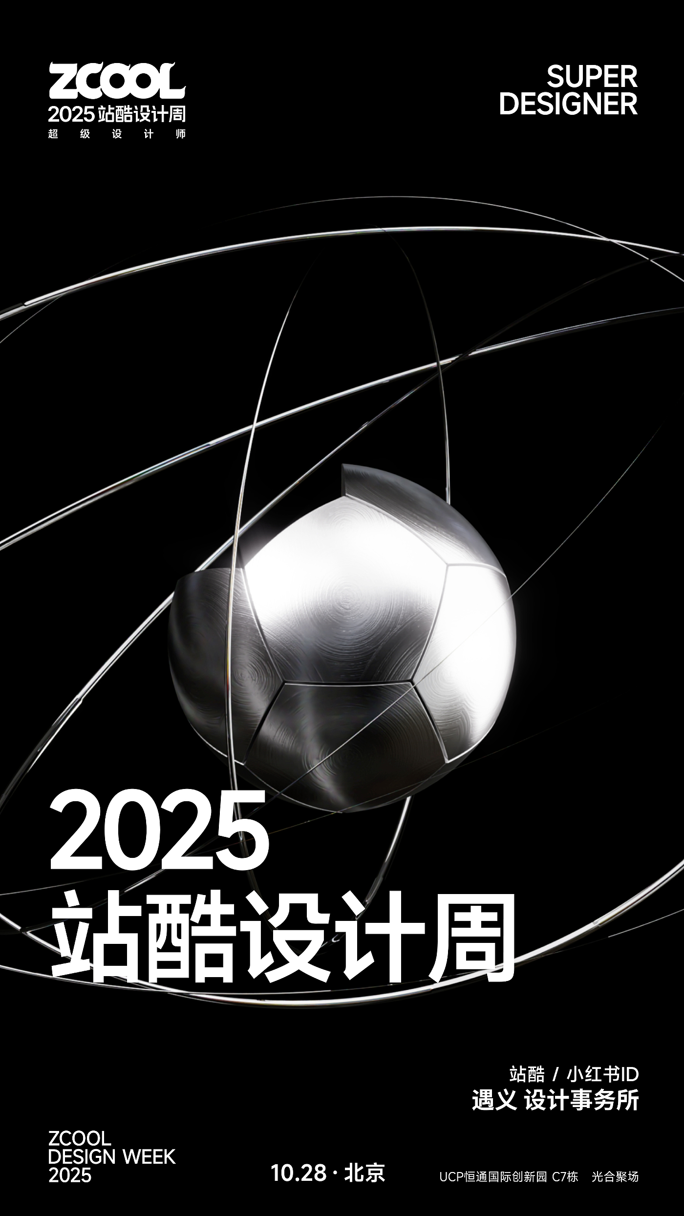
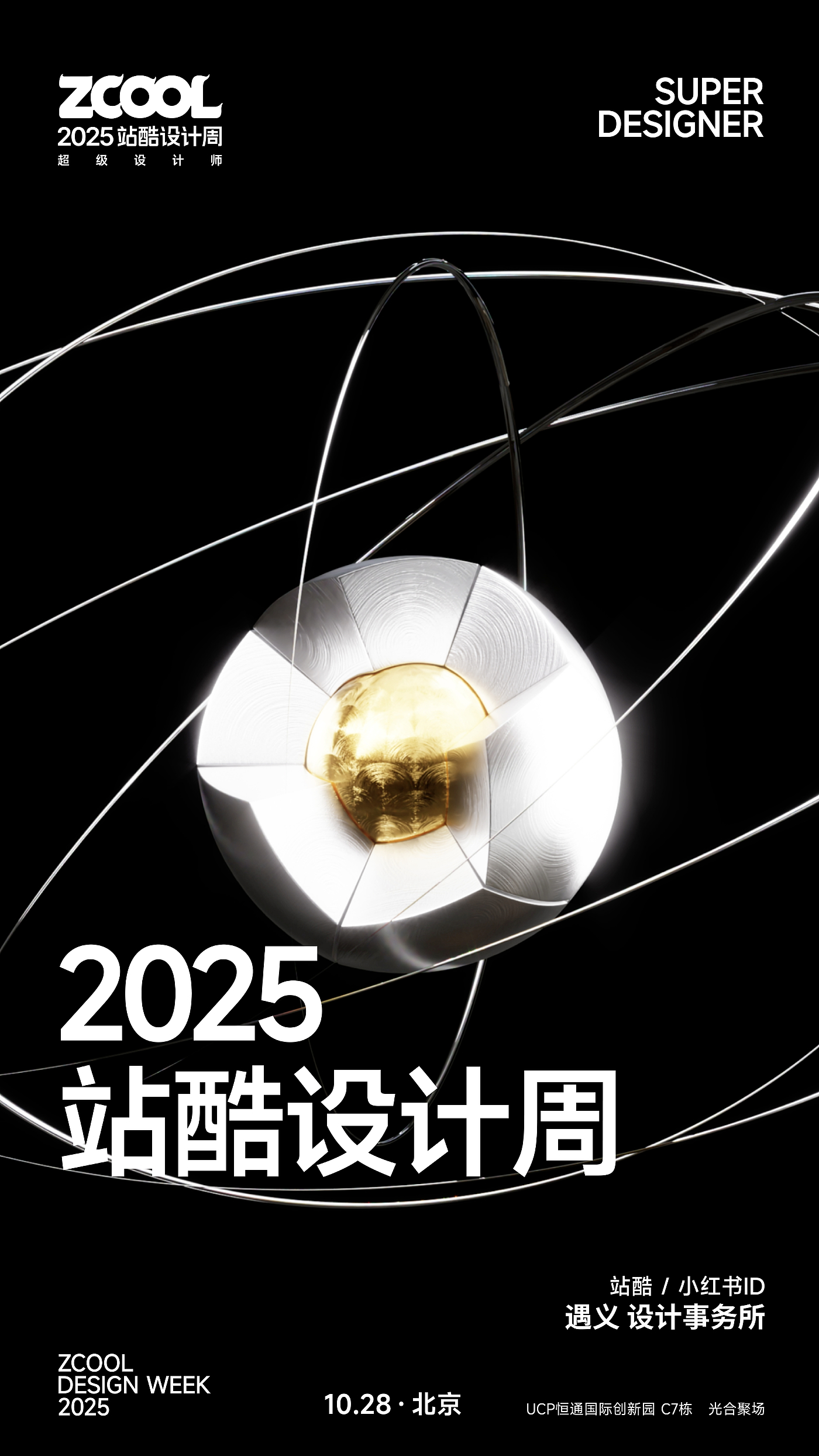
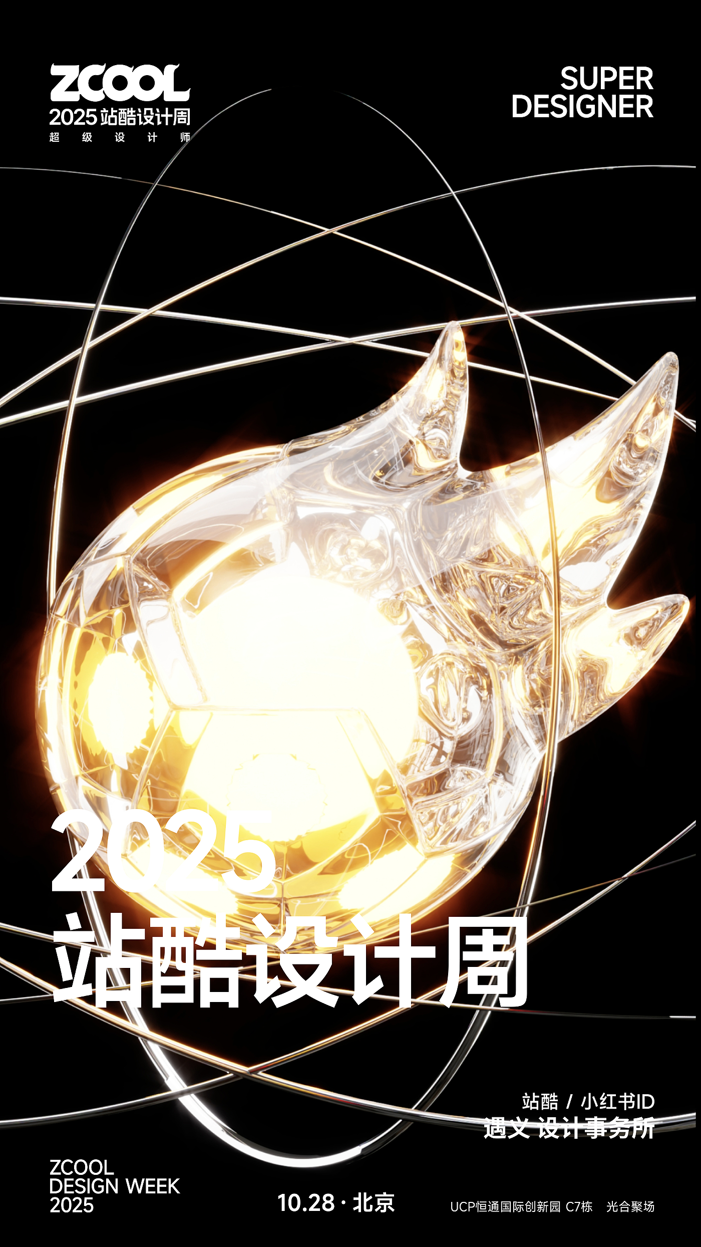
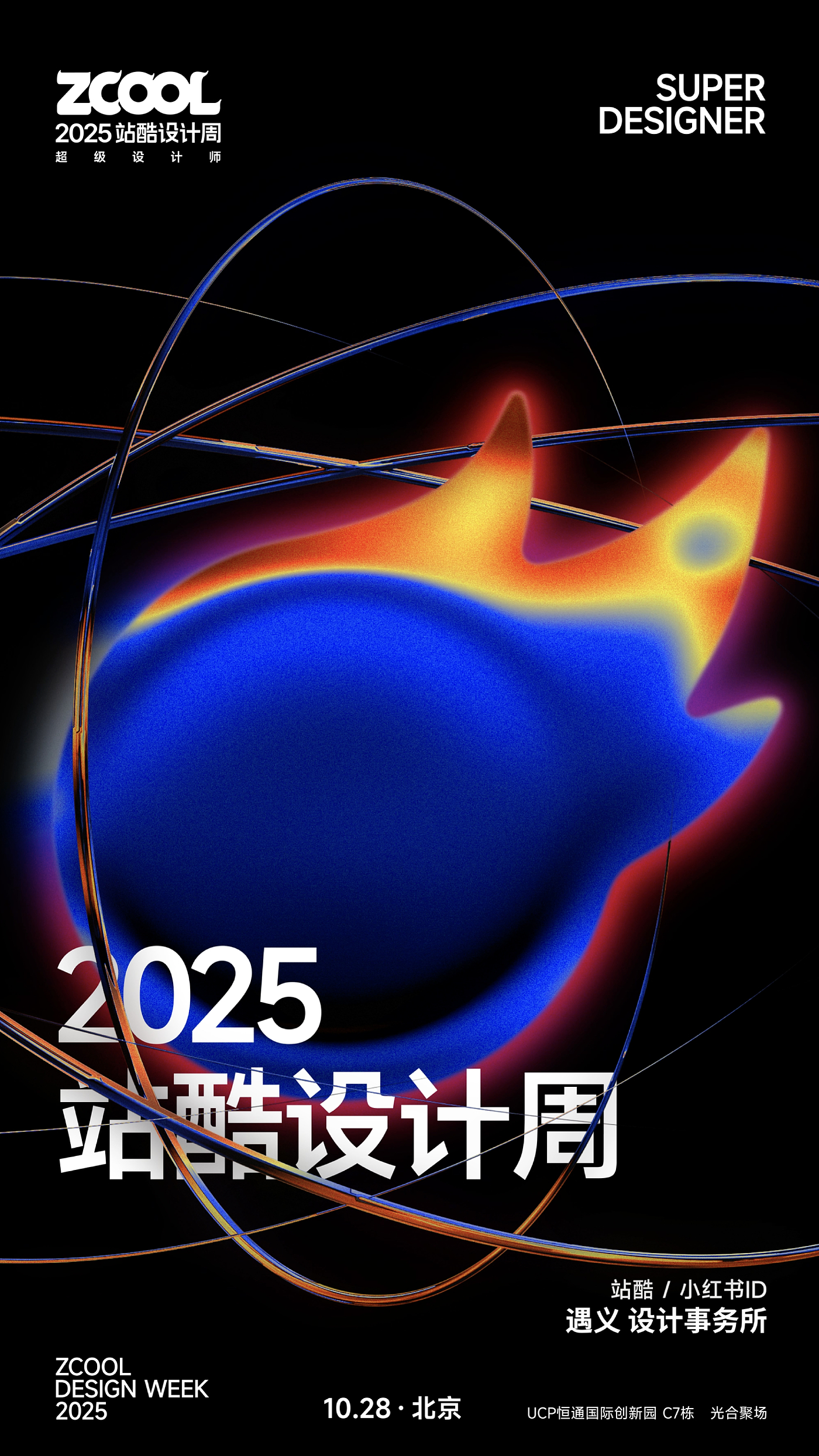
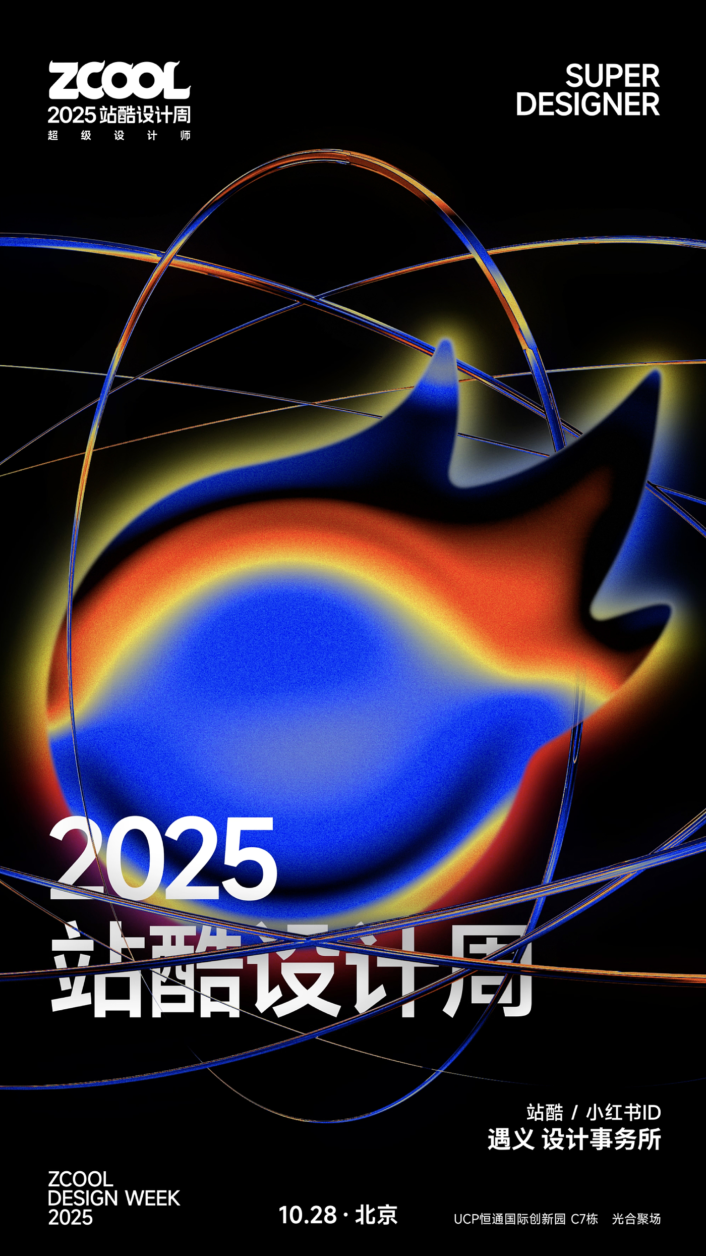
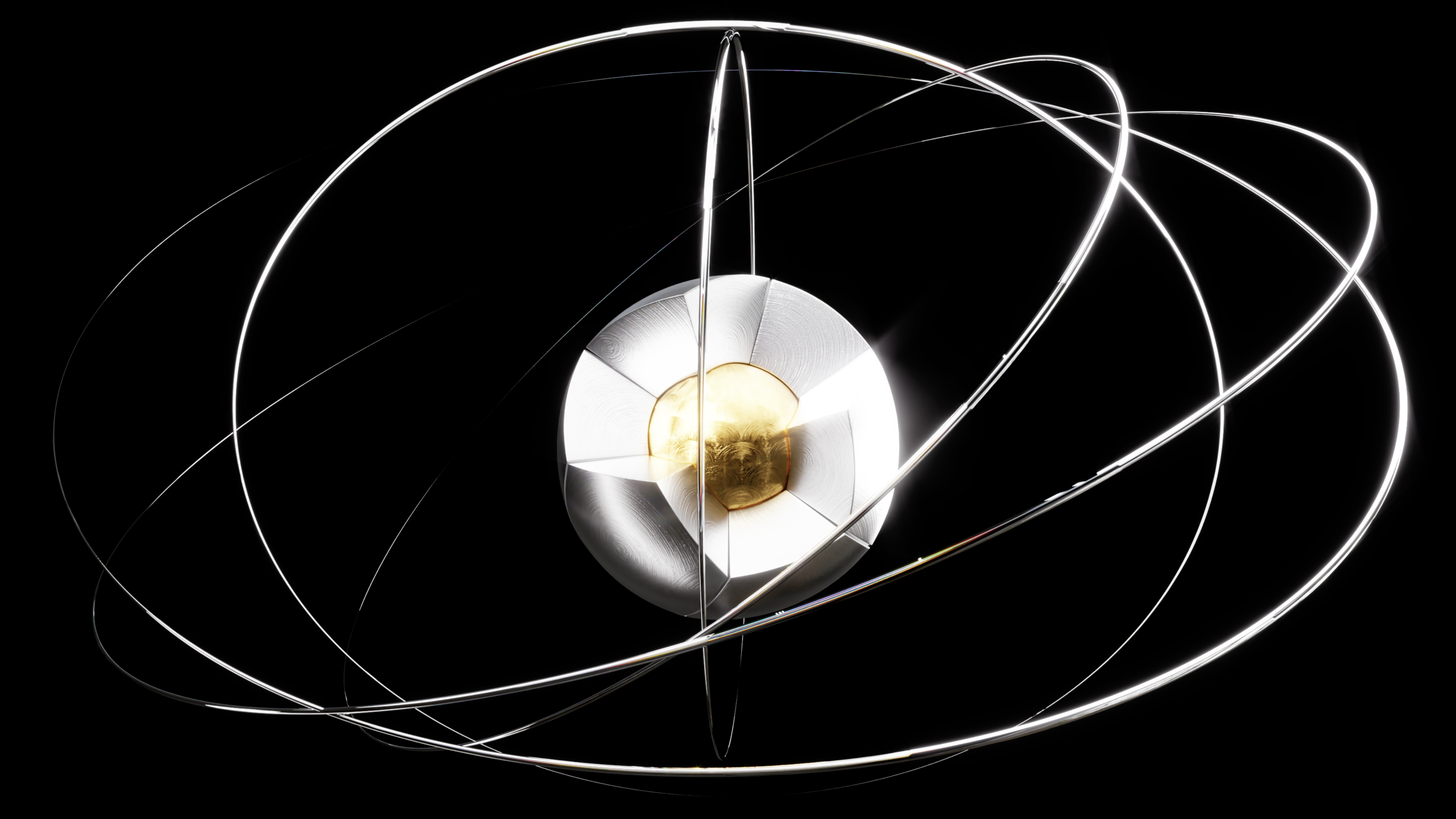
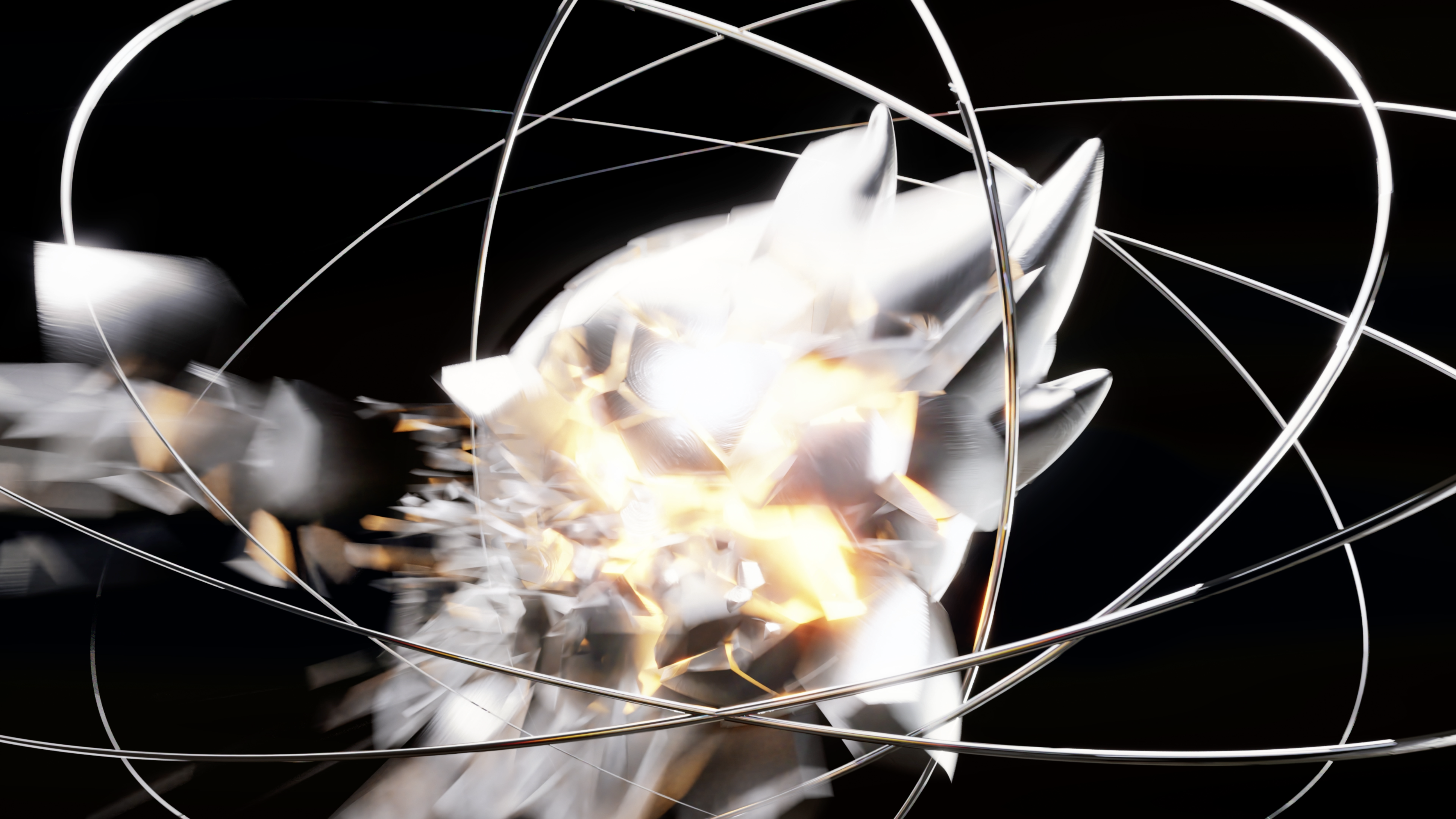
If the explosion symbolizes destructive energy, then the design week conveys creative energy. Borrowing the symbol of extreme energy, but giving it a new connotation of creation-driven-creative explosion, not destruction explosion.
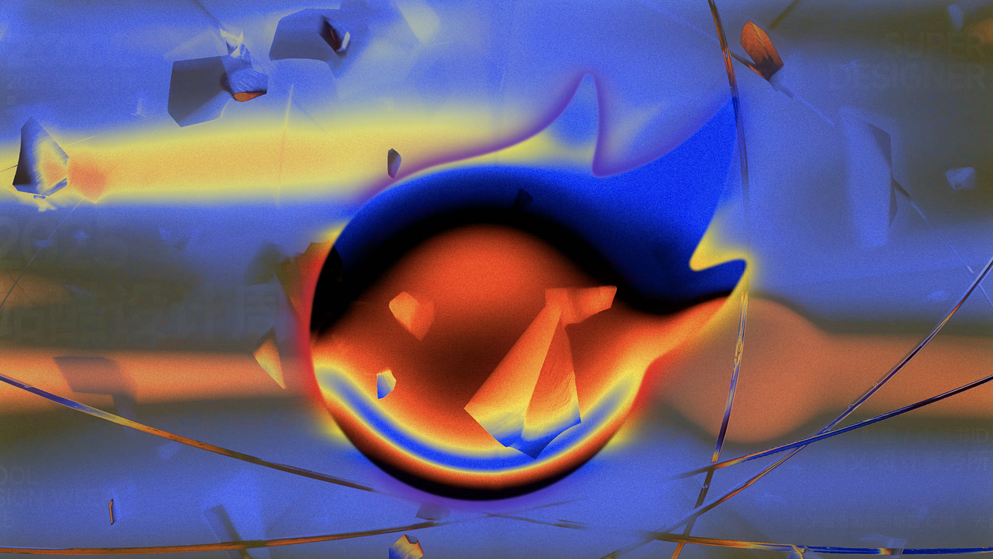
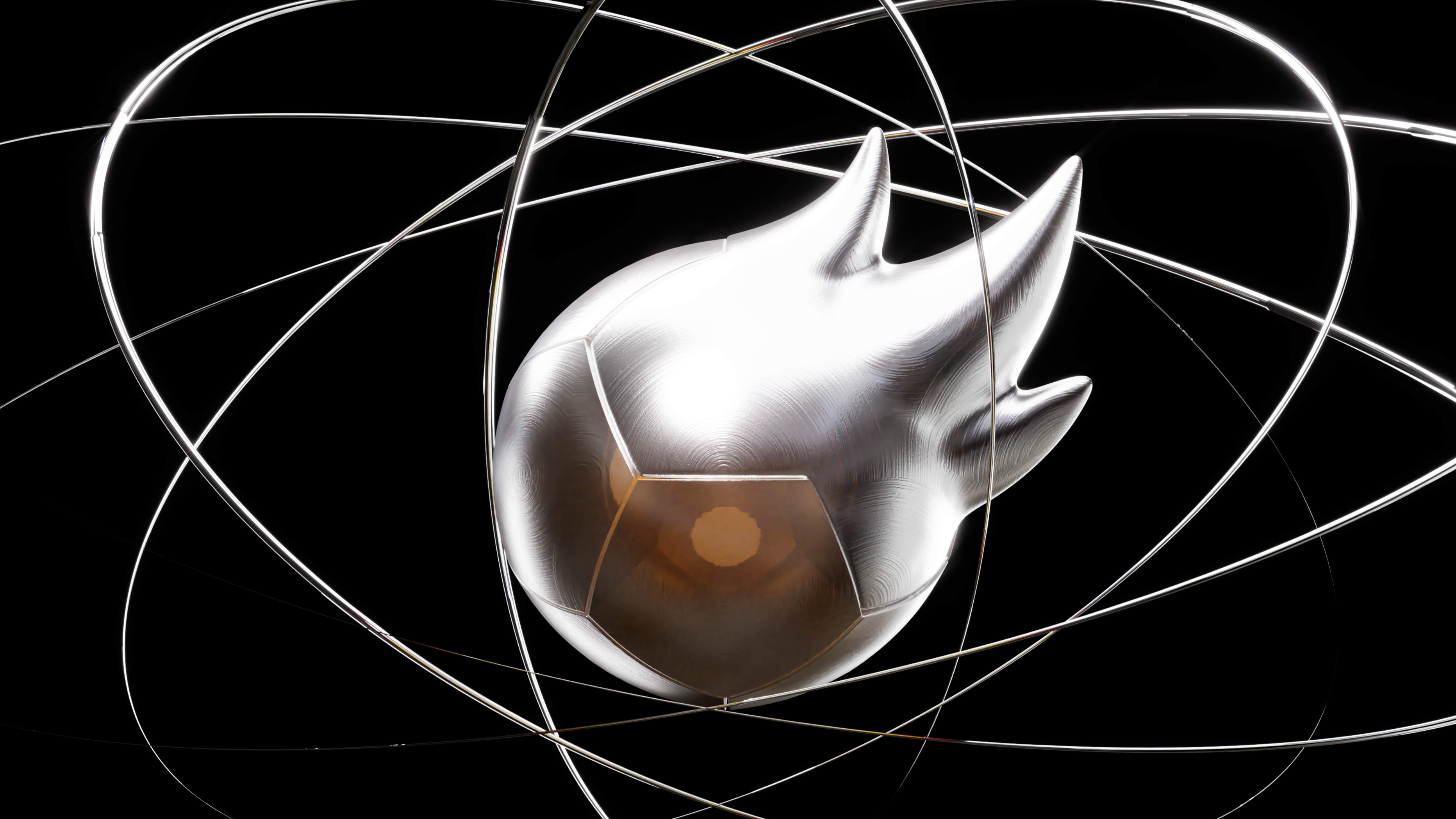
At present, it is easy for the audience to connect "explosion, energy and core" with historical narrative, which is the natural projection in the social and cultural context. But here, this kind of visual image is retranslated: the core structure that determines everything no longer symbolizes the end, but the beginning of new things; the energy explosion from the inside out is not a destructive release, but a creative aggregation; the geometric rationality of metaphor complexity and order is also transformed from cold feeling to the generation of inspiration and possibility. Through this translation, the imagination of an extreme power is transformed into a narrative of inspiration fusion and creation release, allowing the audience to see new meaning spaces in familiar symbols.
Wish station cool, more and more hot.
Authoring information
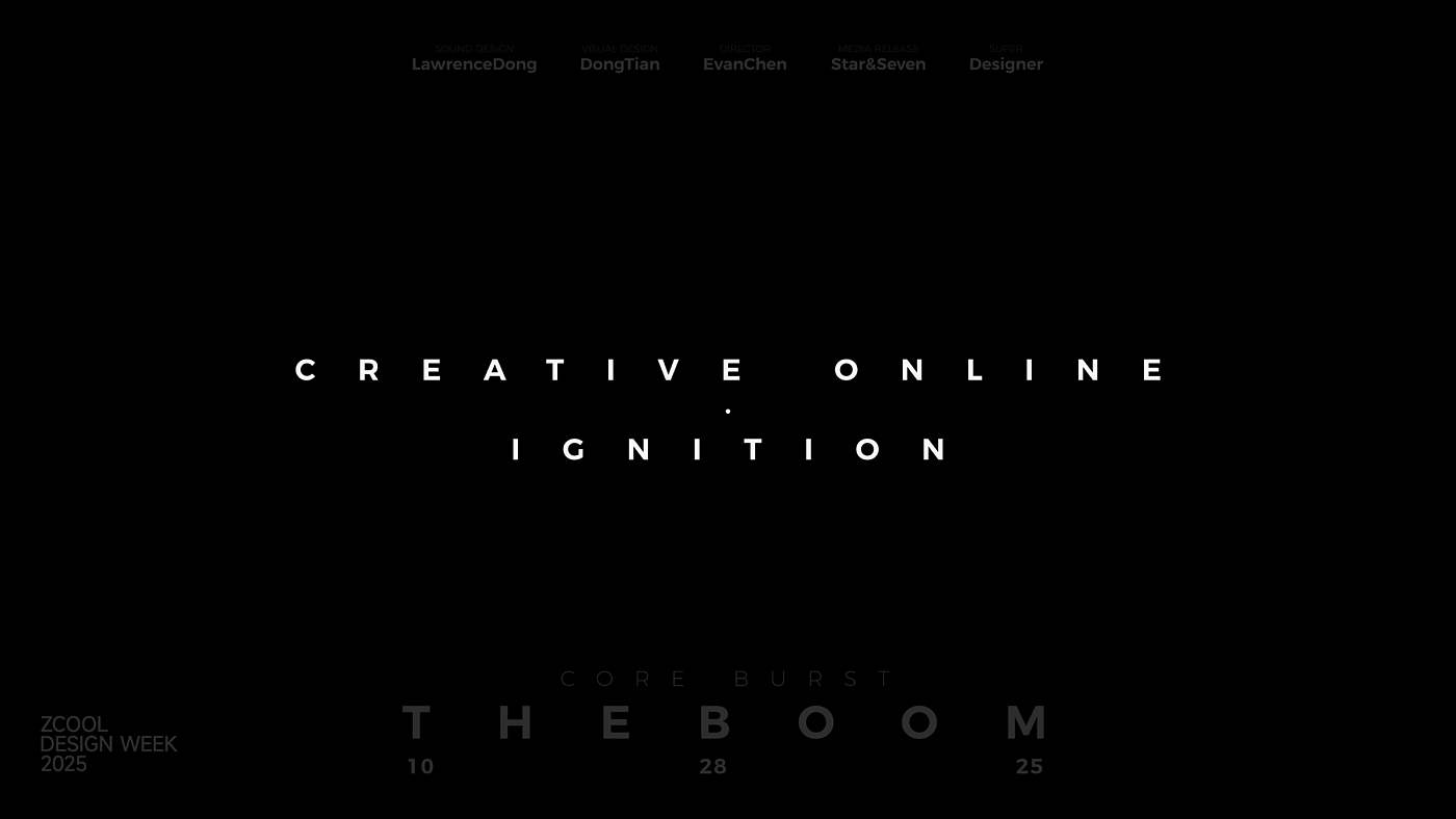
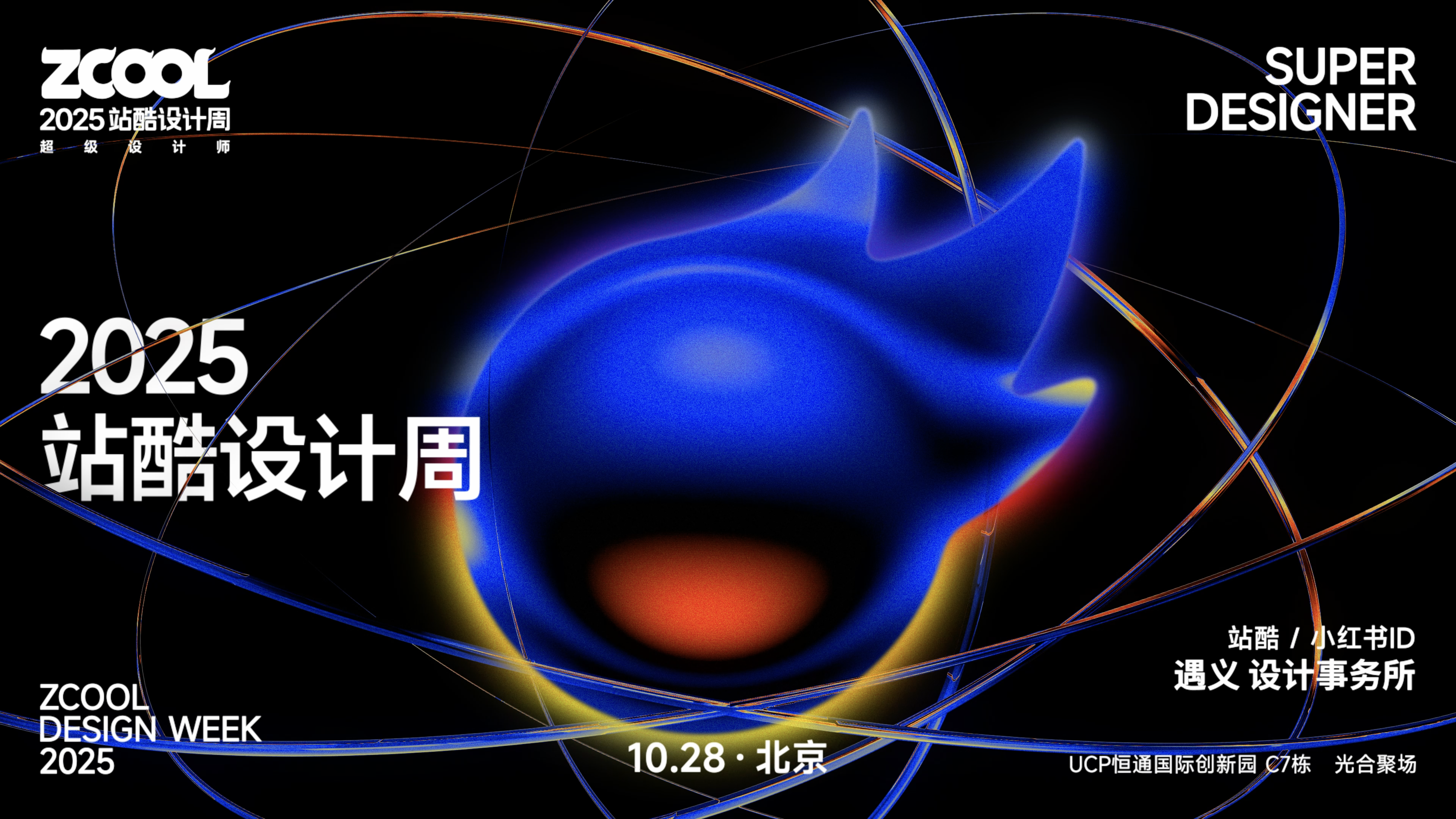
Name of Work: Station Cool Design Week to Create "Super Symbol" Poster
Invitation: station cool ZCOOL
Yuyi Design Office
Original design: Chen Yiwen
Visual performance: Dong Tian
Project Promotion: Lv Yuxing and Wang Yu
Tip: With the sound to watch, let the energy really "burst".


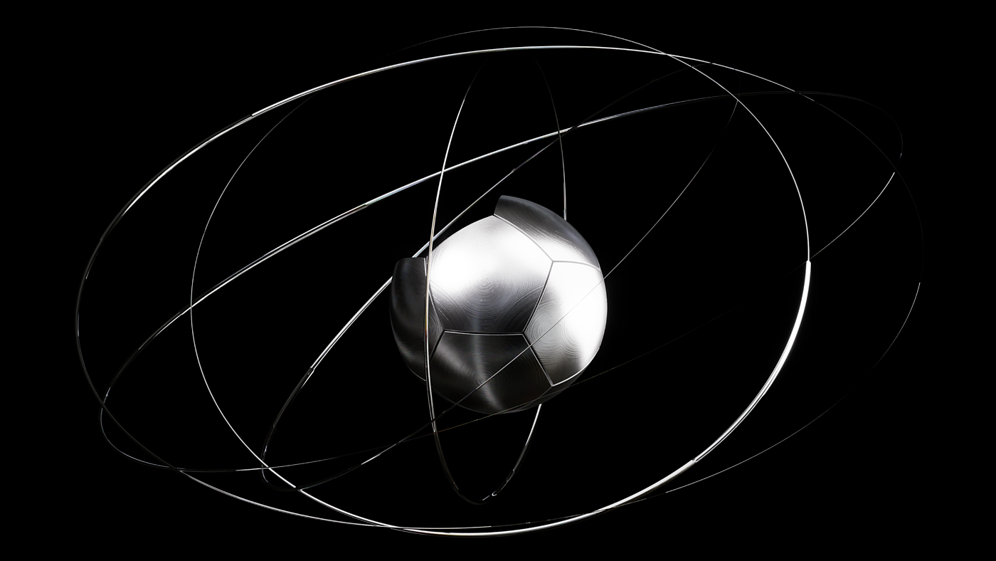


Think of the apple conference icon
Yes, yes, yes
This is too atmosphere