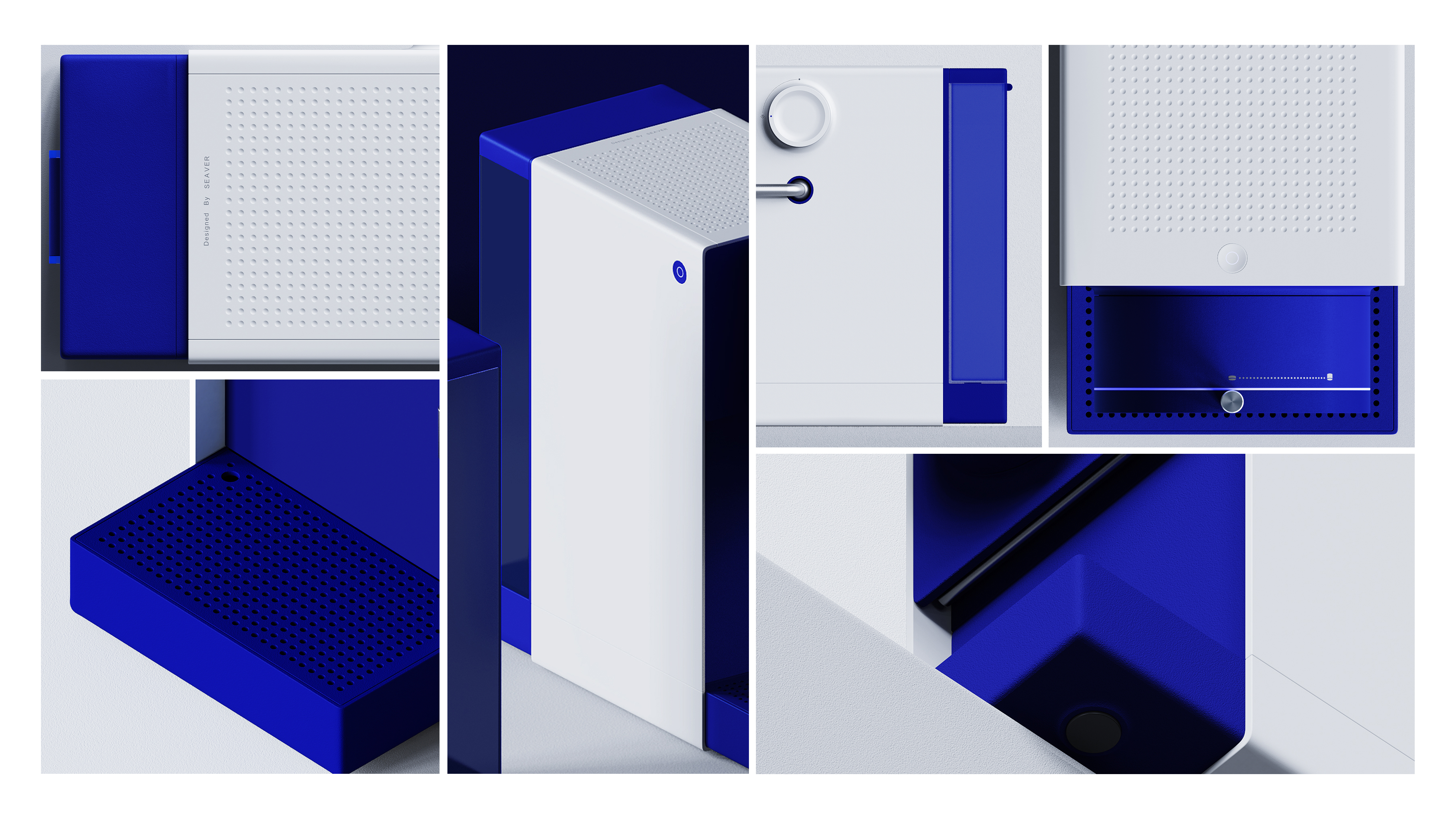
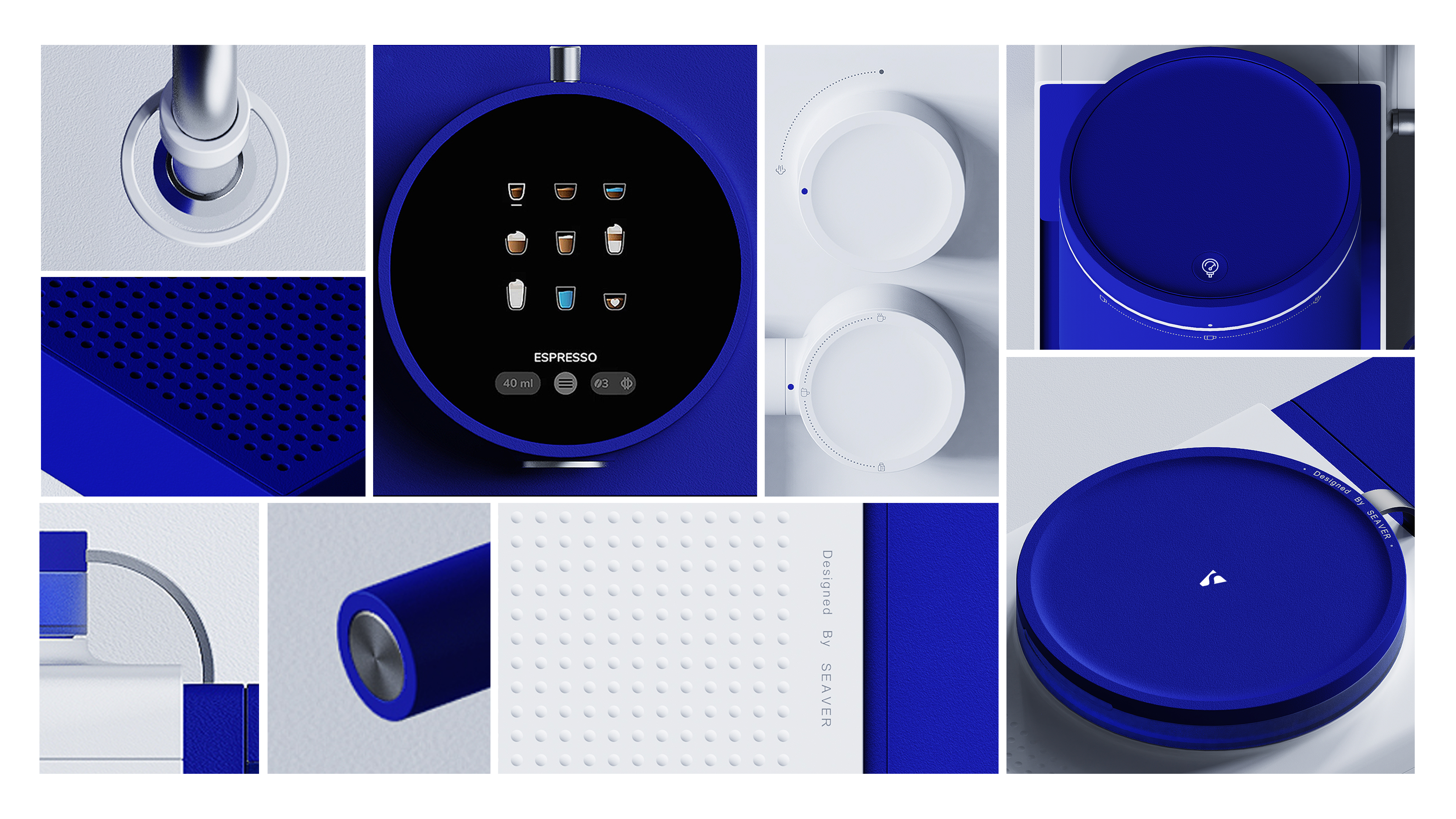
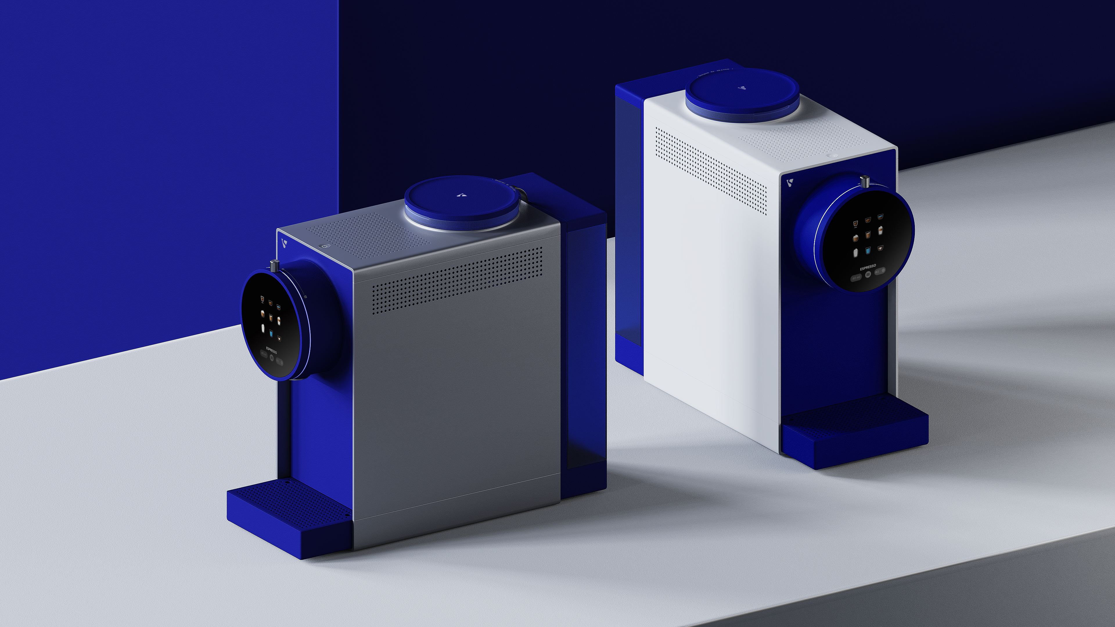
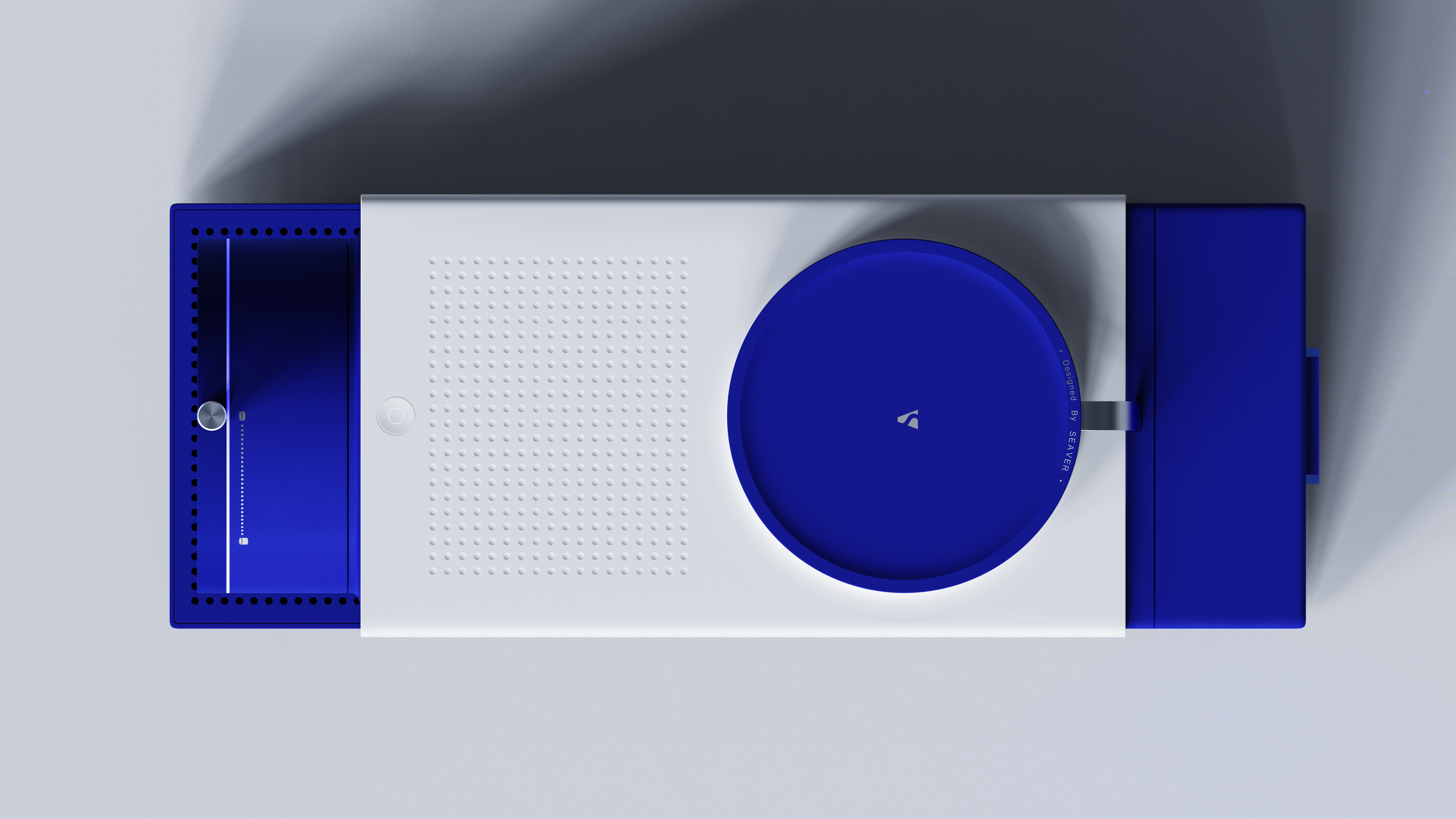
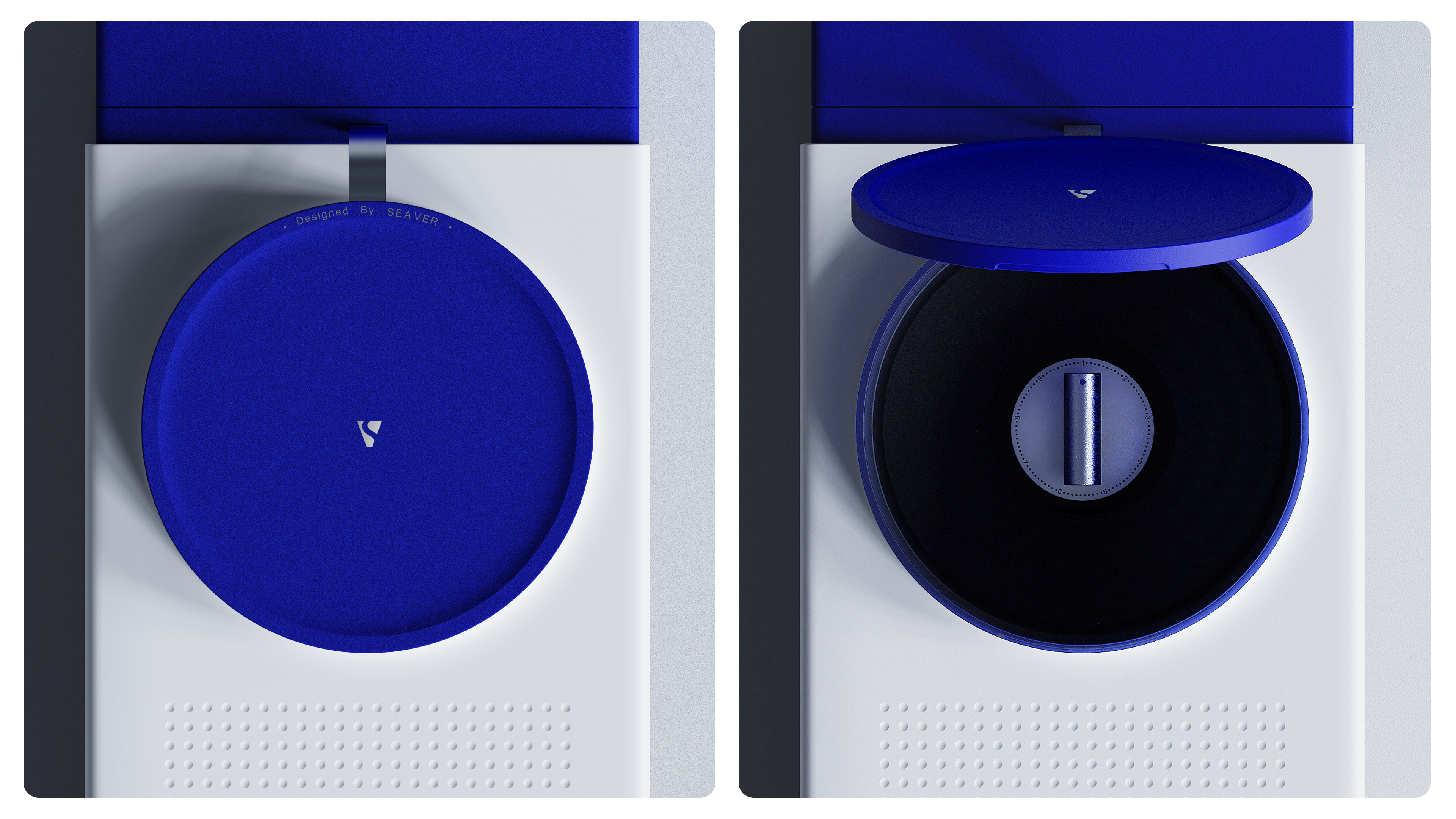
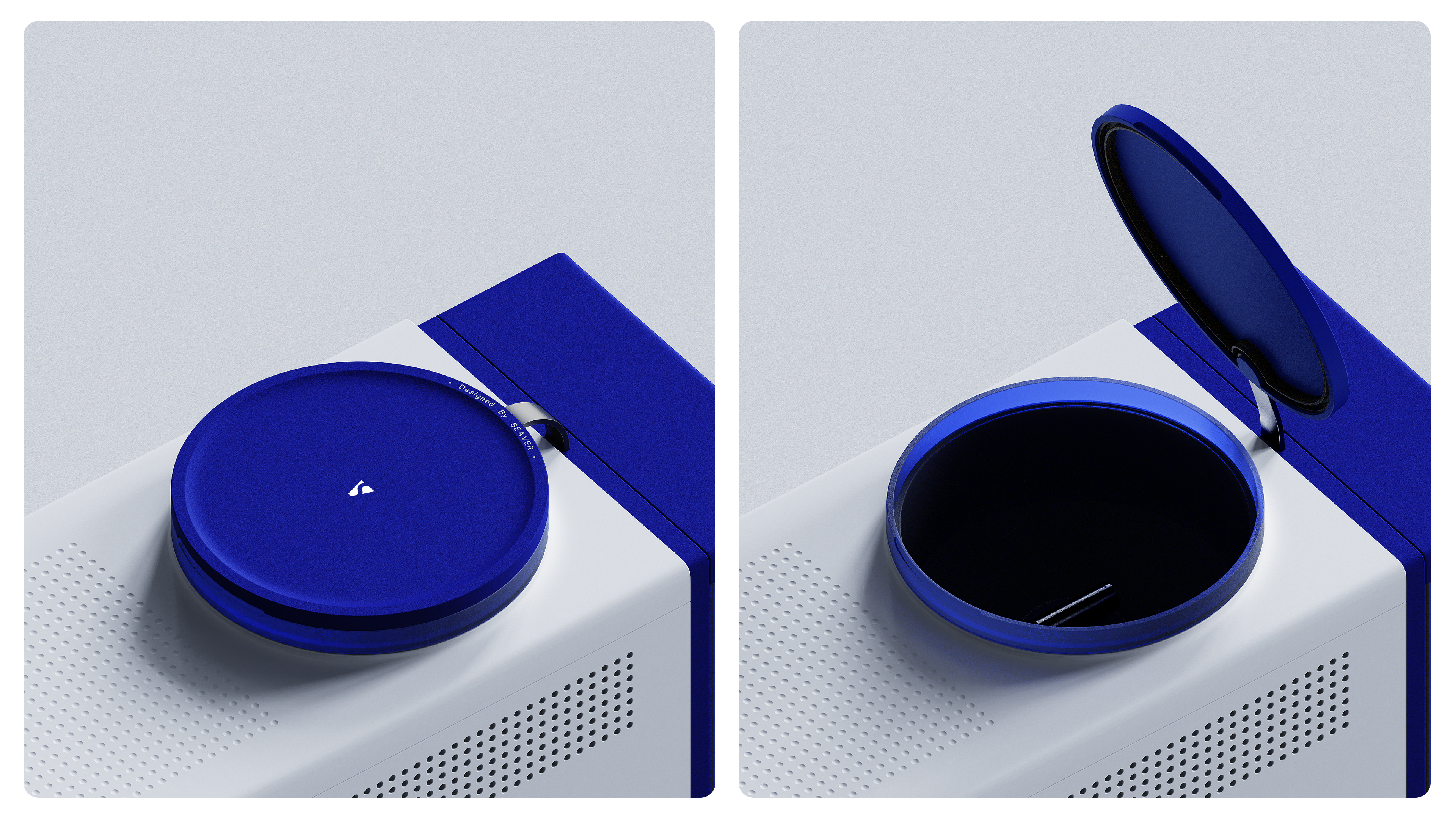
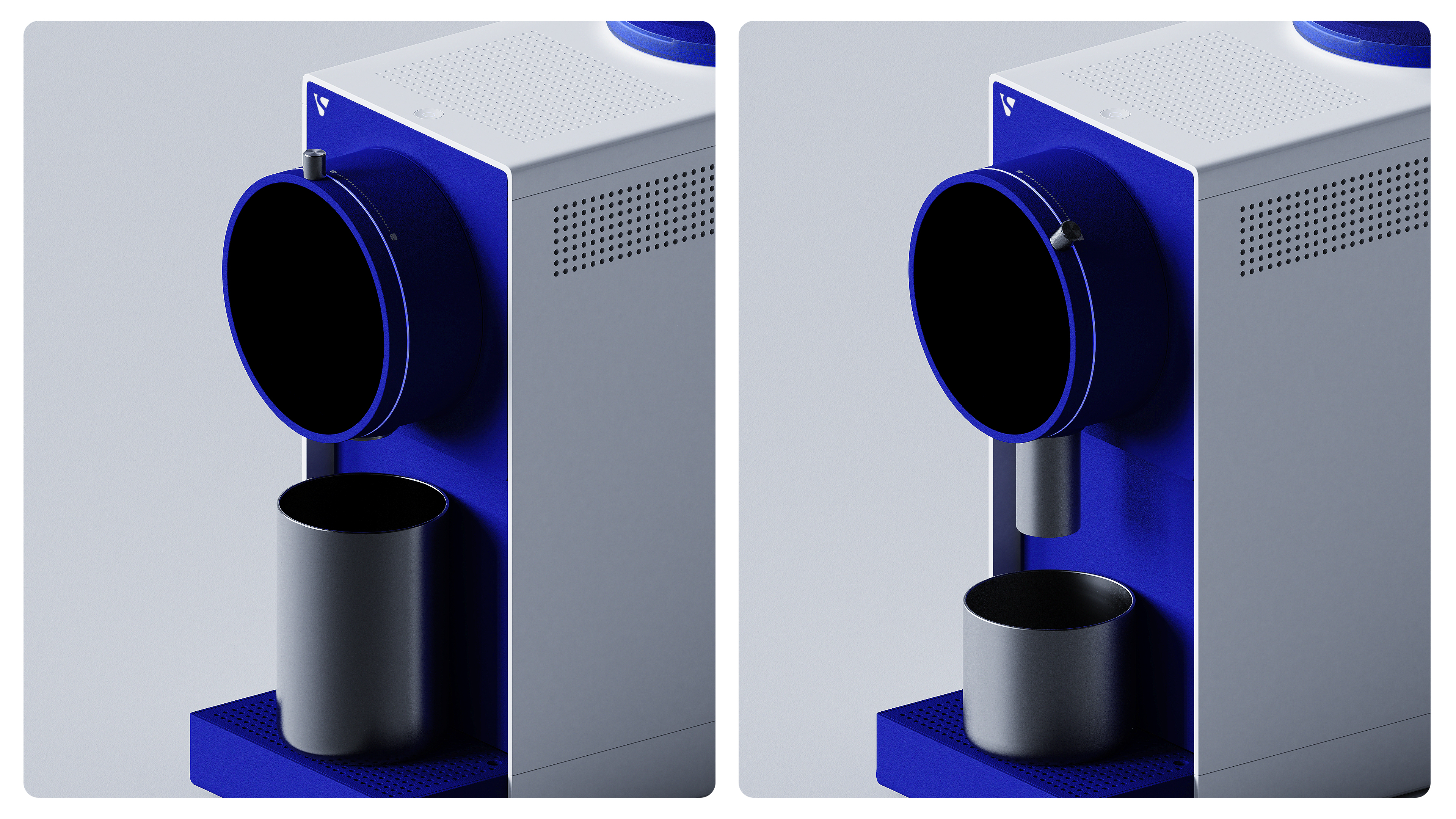
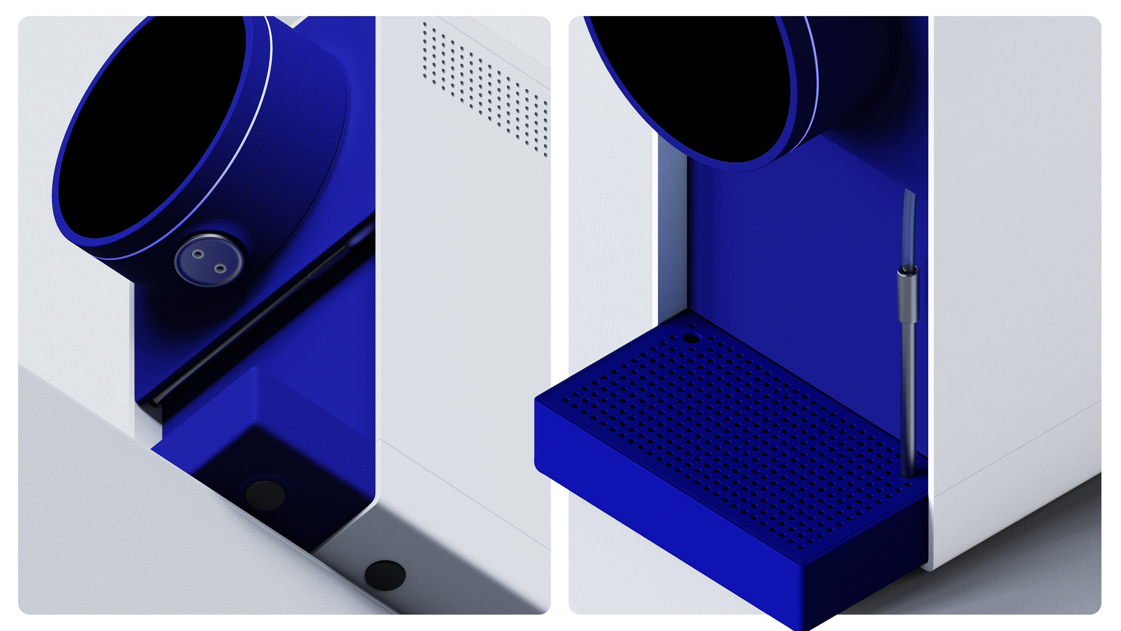
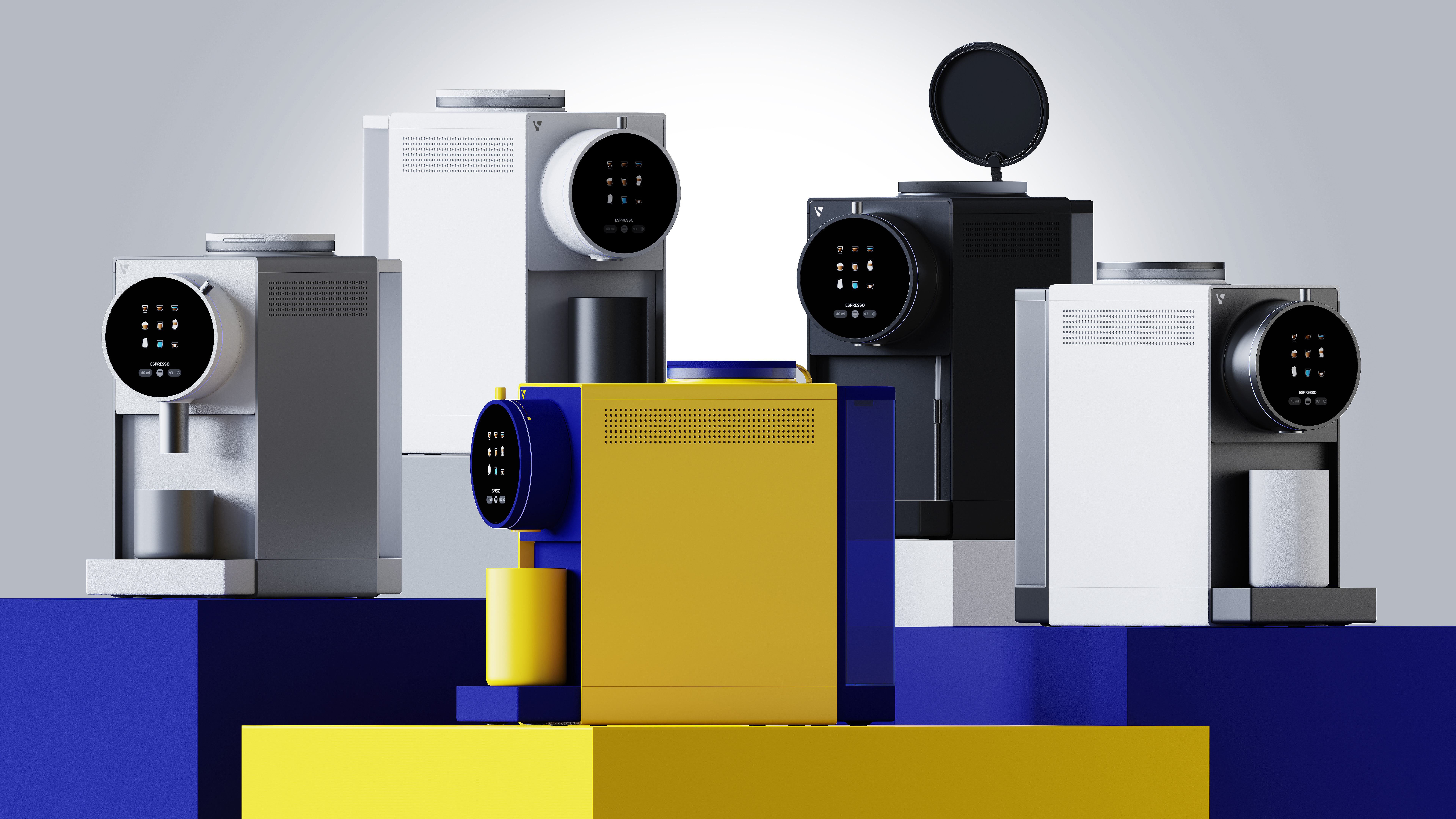
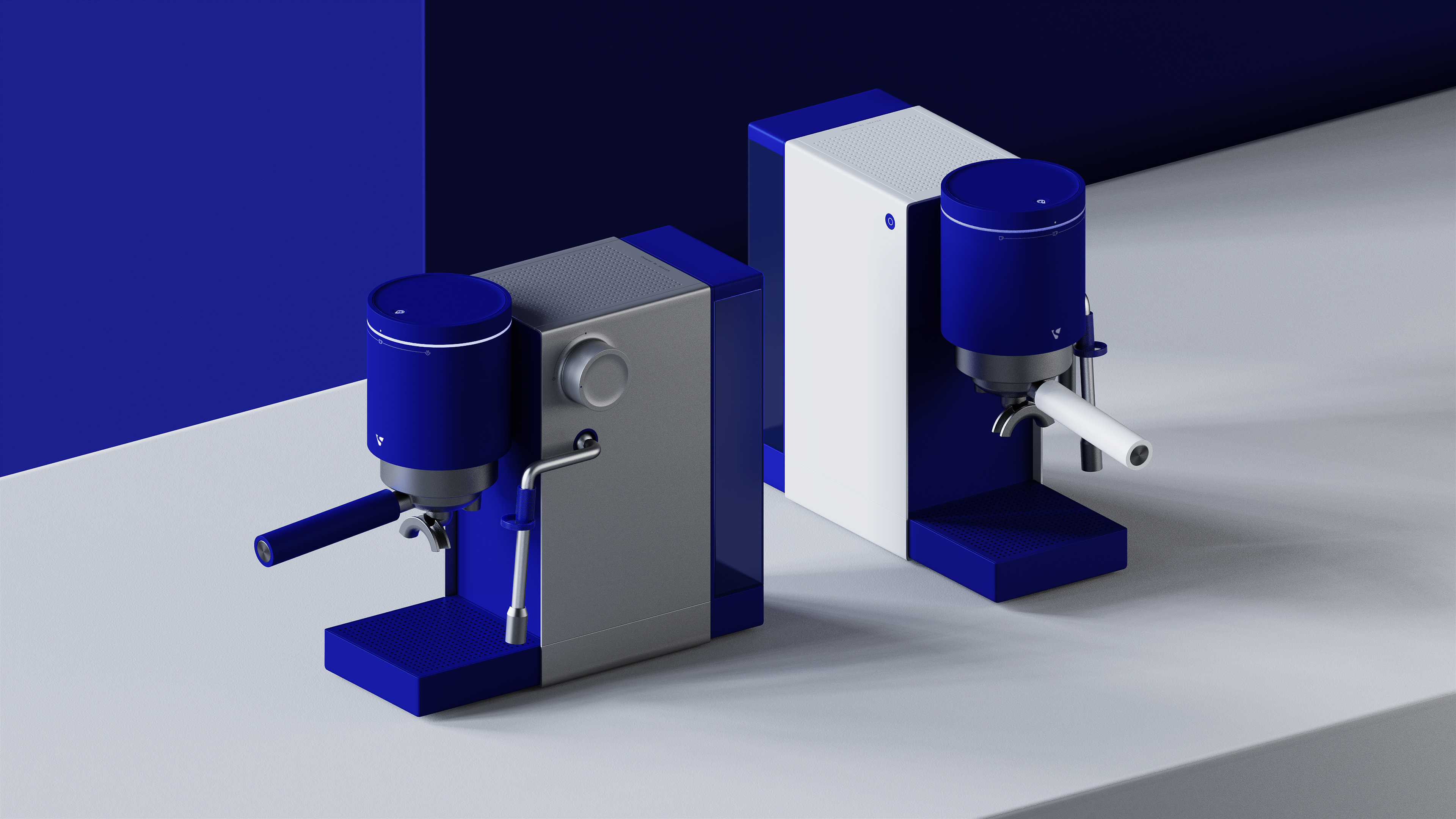
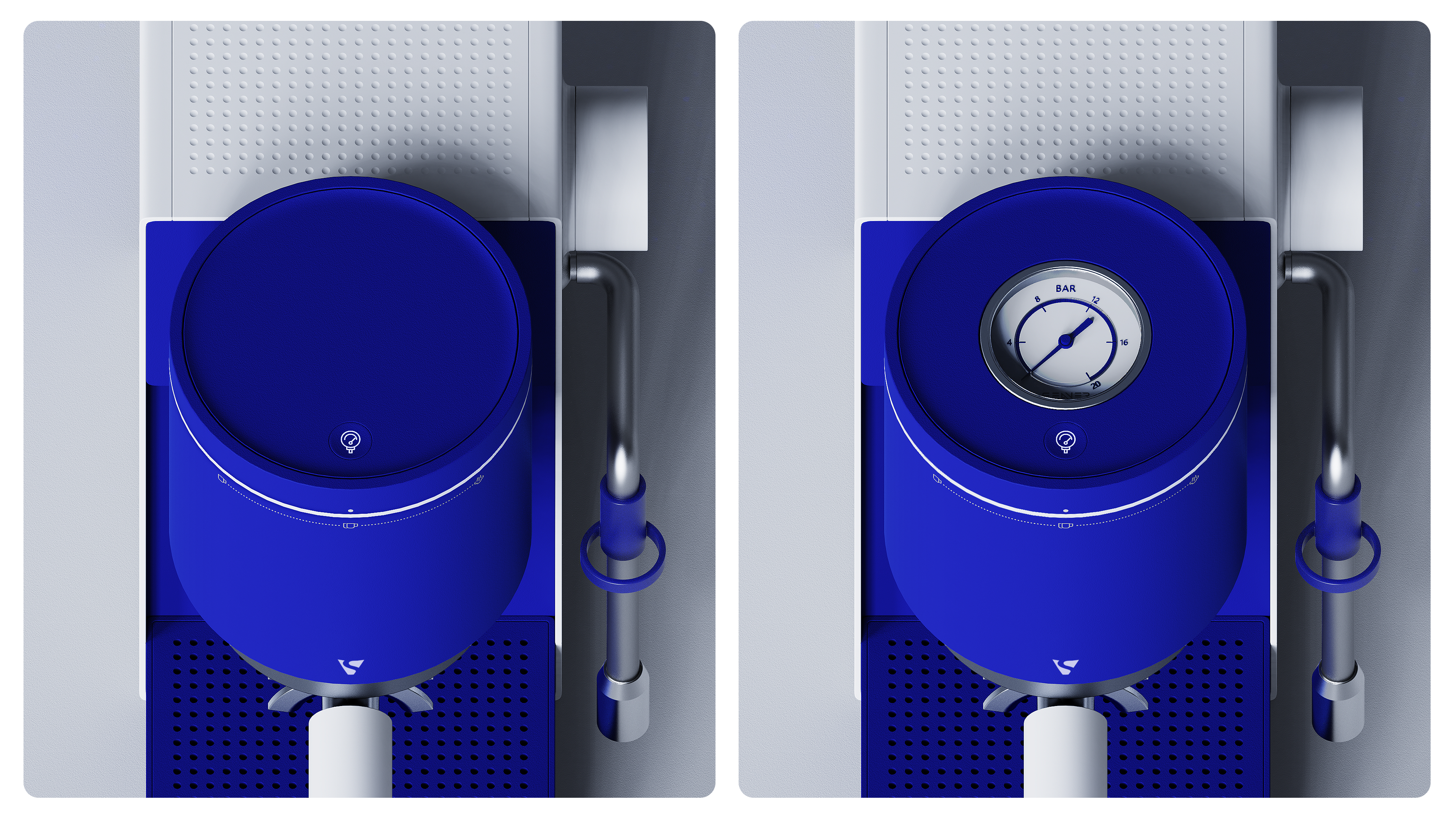
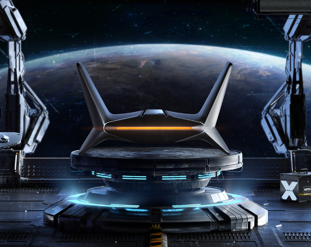
Blue saturation is too high, a little too much, look at two eyes tired. It is more beautiful to do that kind of embellishment color style. On white products, the proportion of blue should be less. The UI of the circular screen will fit the circular screen better, and the user side is short of meat.
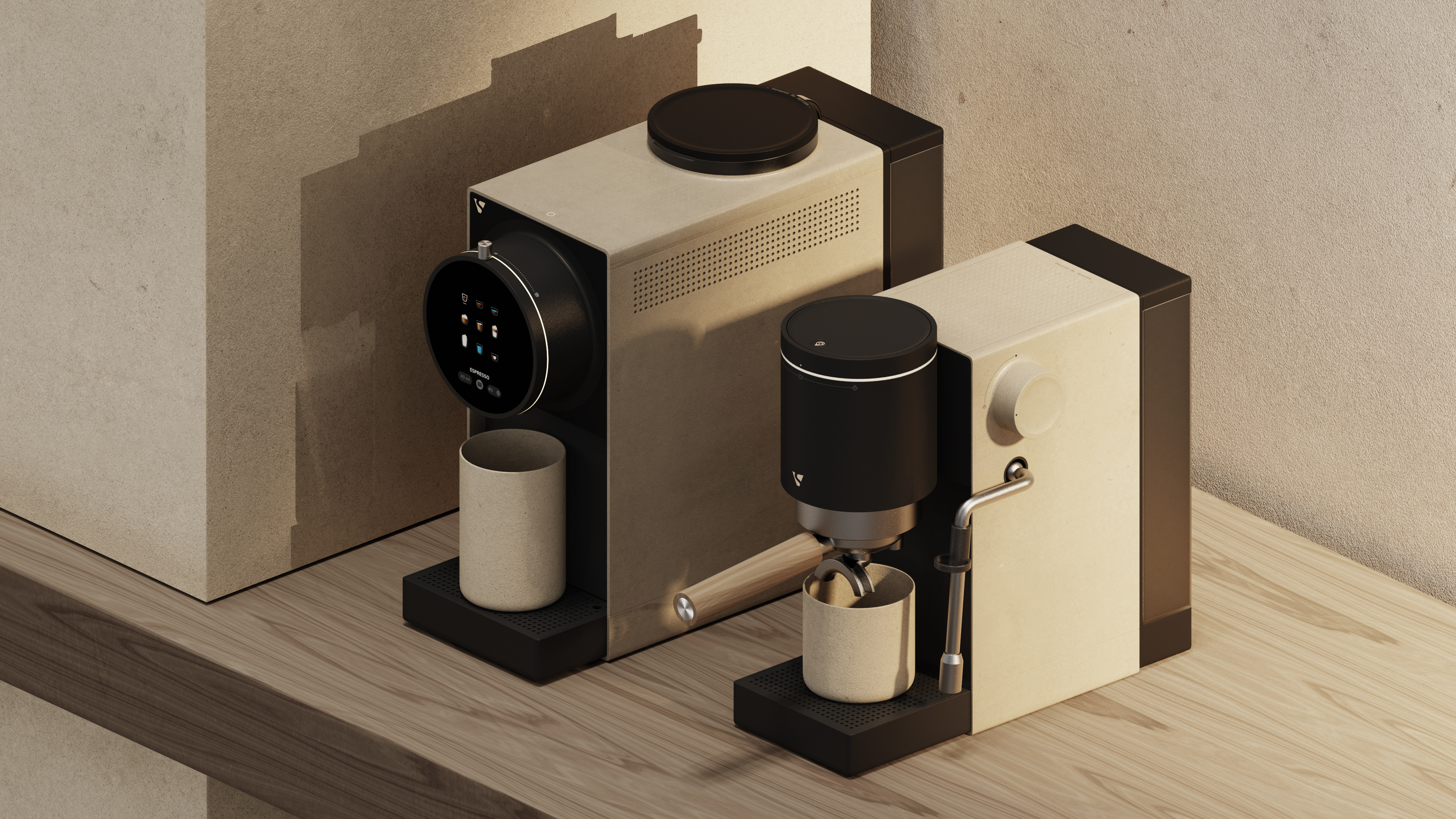
Many people don't open perspective rendering. It is estimated that it is a science design. Art students rendering absolutely does not allow reverse perspective. It looks really uncomfortable.


NO - GO
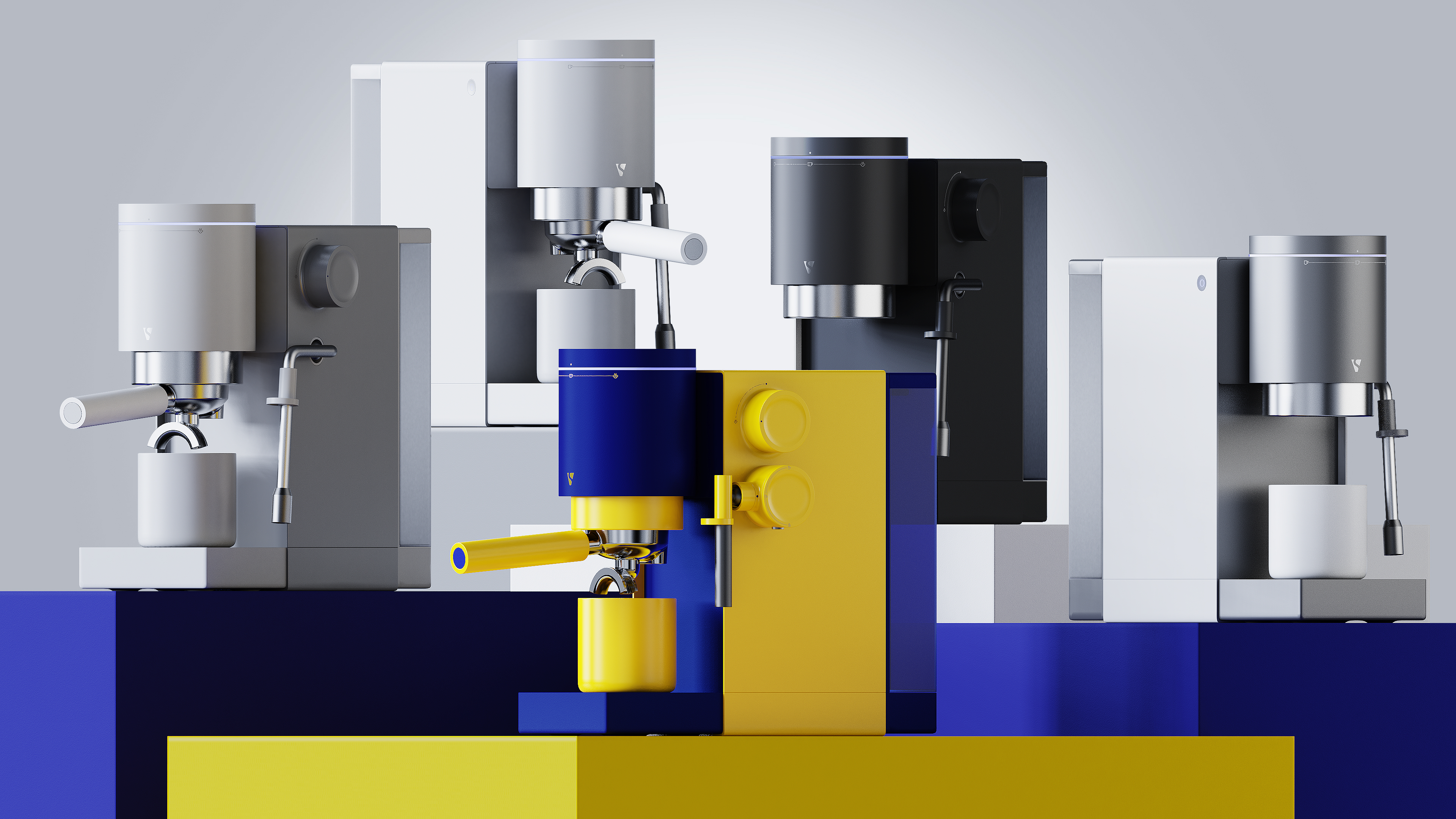
6666666666666666666 is full of high-class feeling, blue looks good
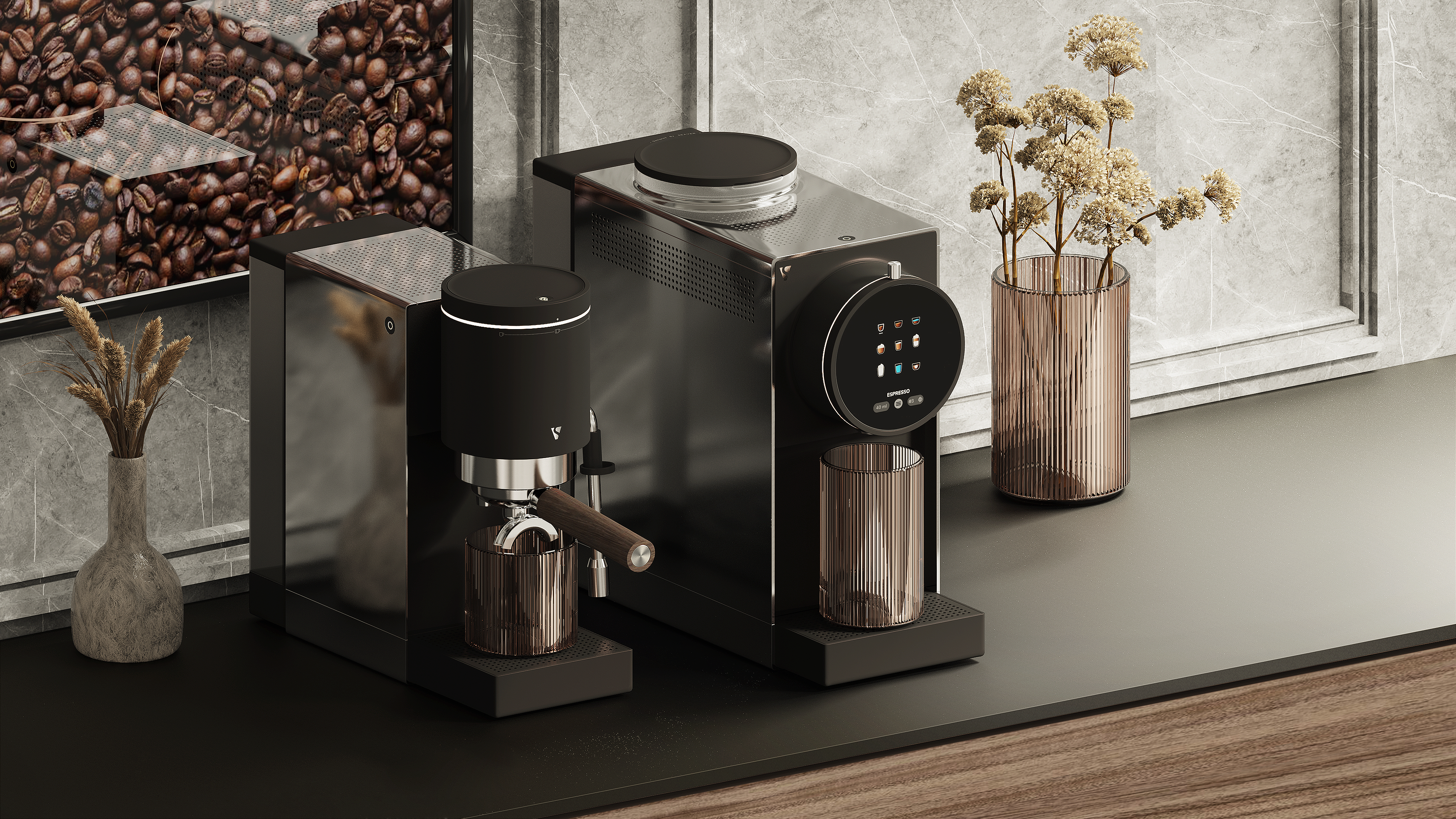
nice
beautiful
very advanced
Klan blue
Blue saturation is too high, a little too much, look at two eyes tired. It is more beautiful to do that kind of embellishment color style. On white products, the proportion of blue should be less. The UI of the circular screen will fit the circular screen better, and the user side is short of meat.