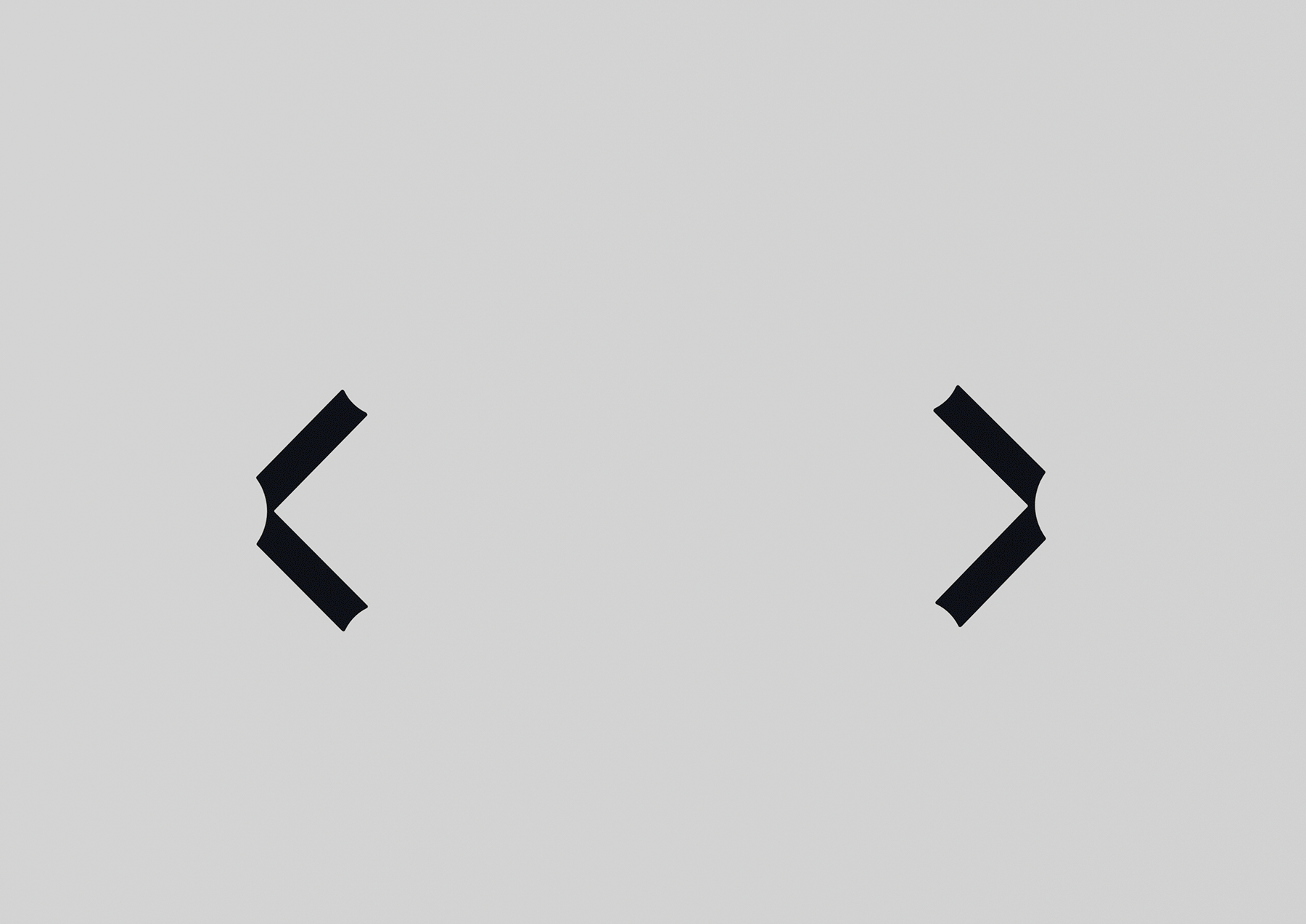
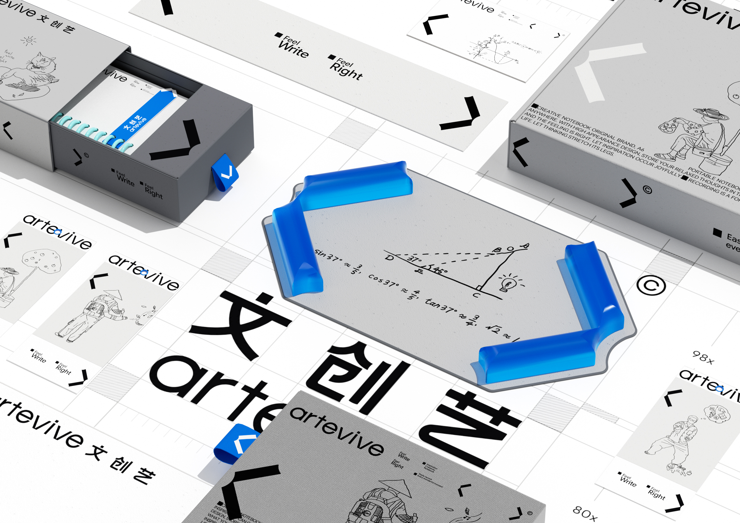
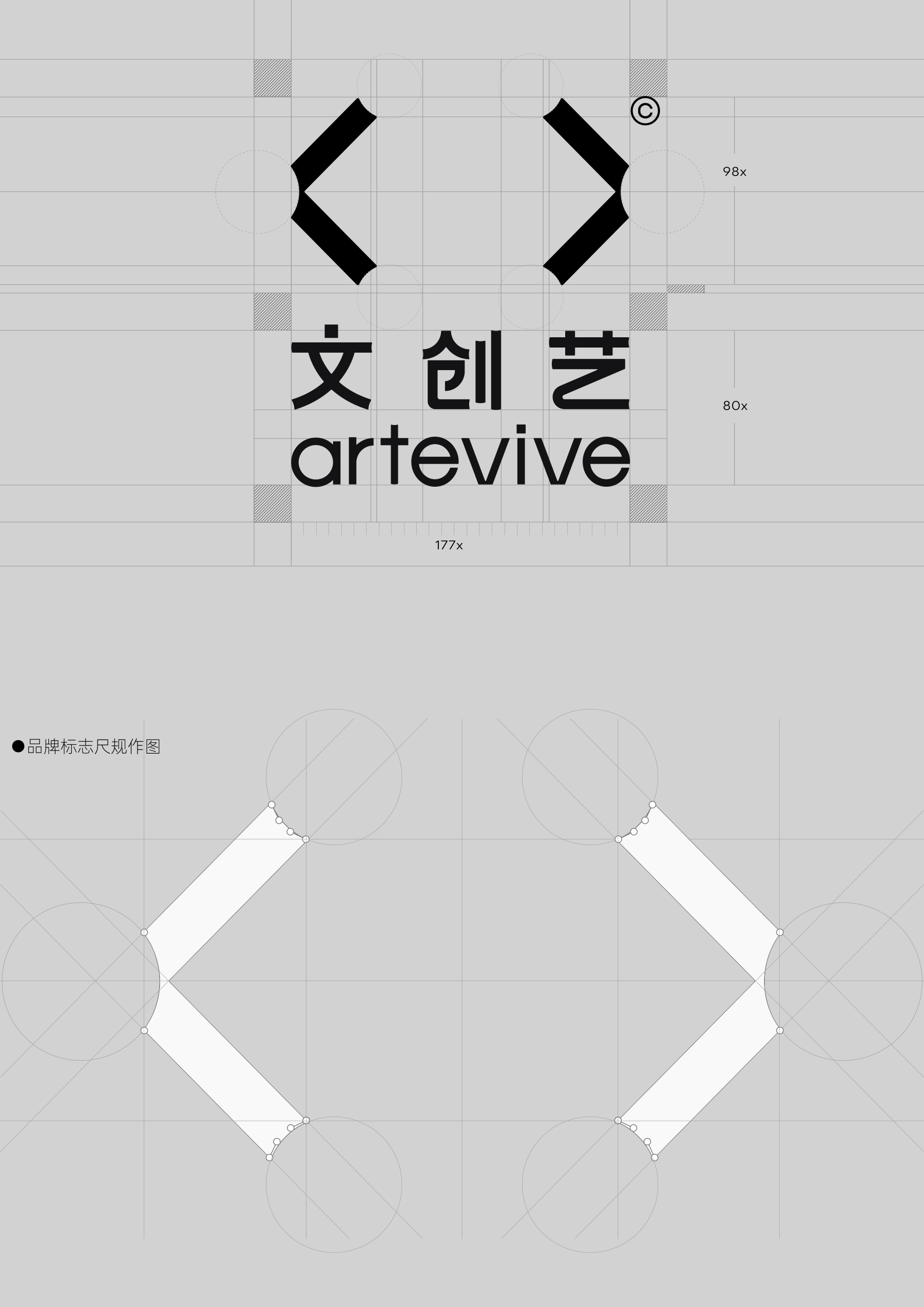
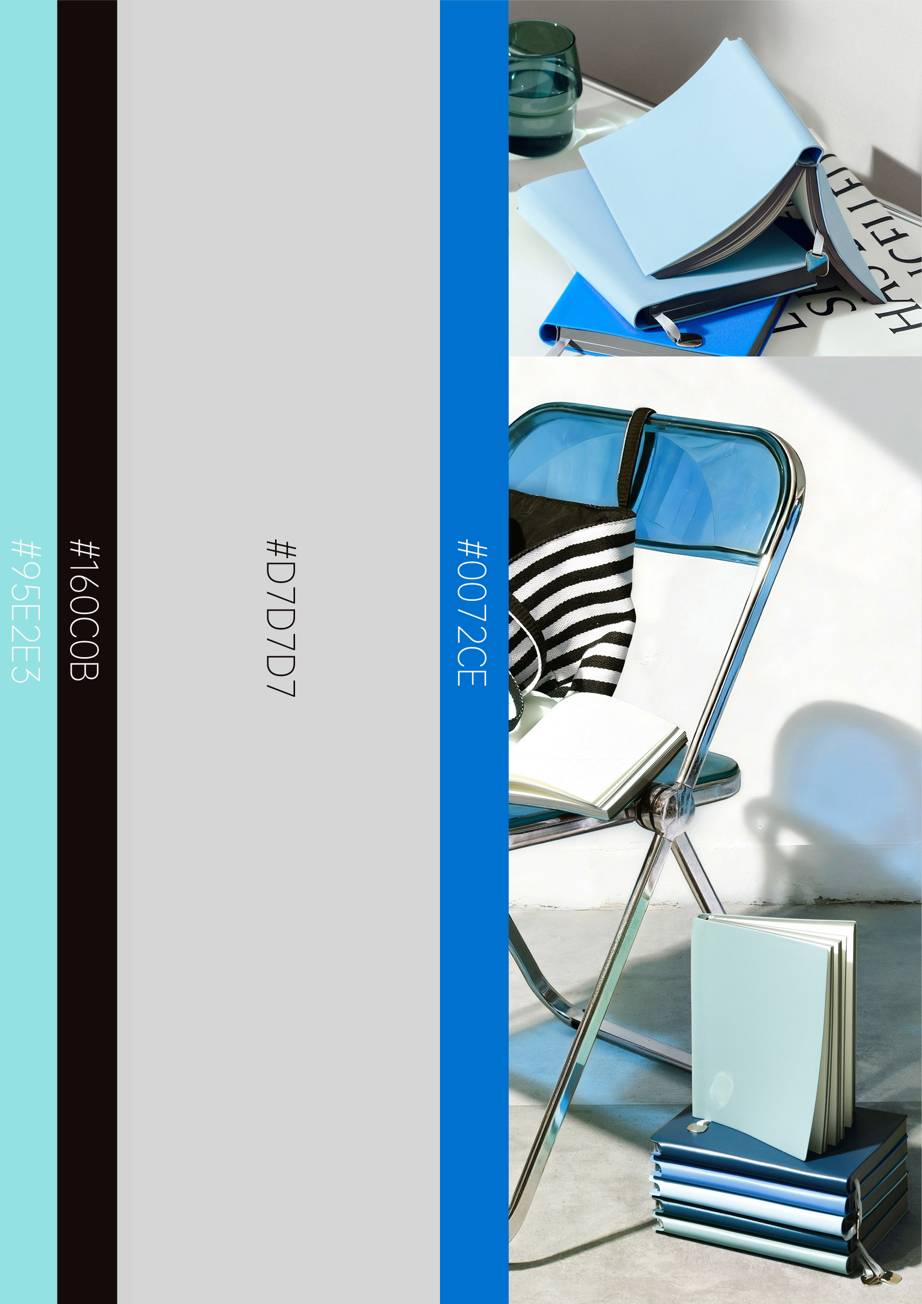
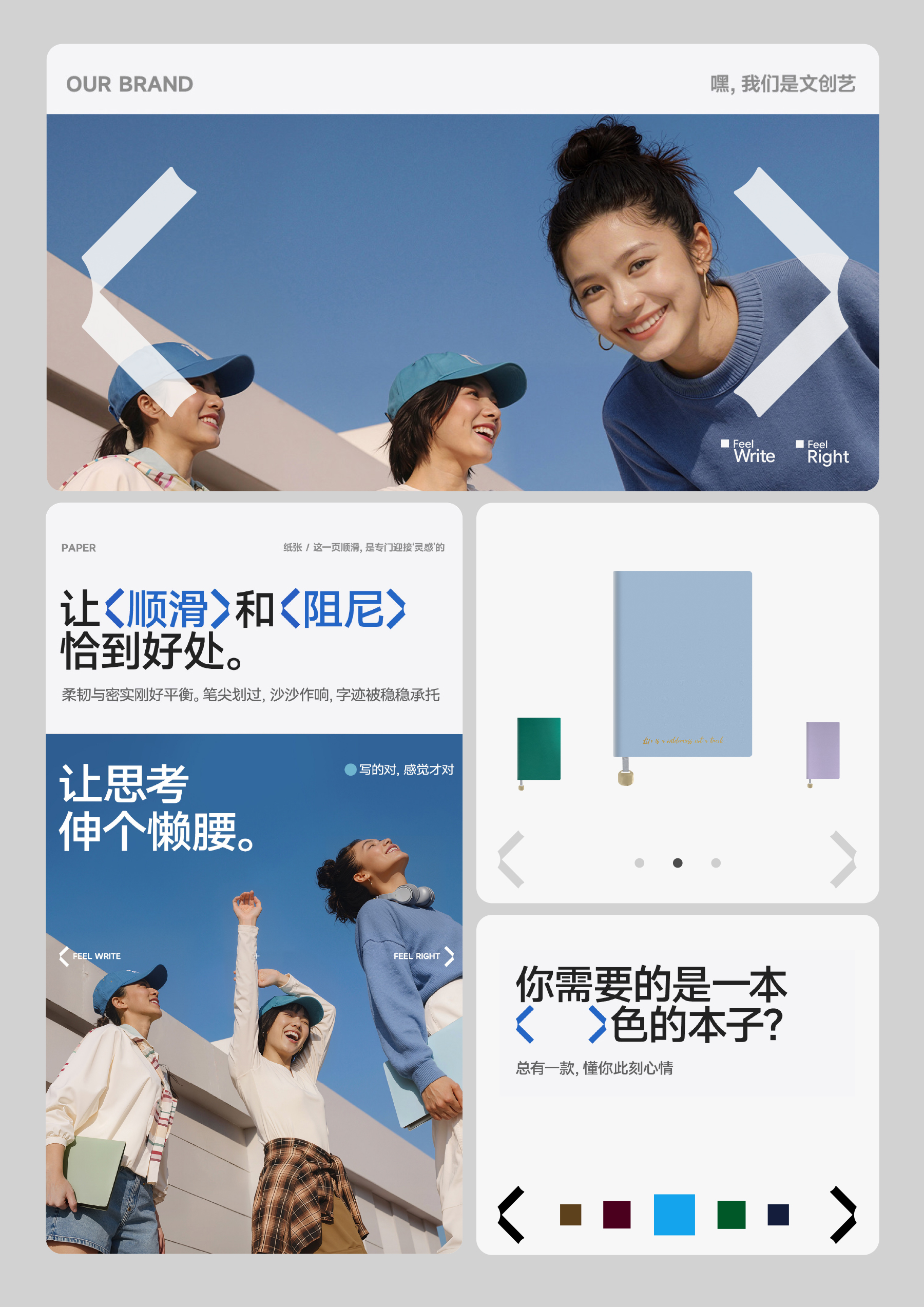
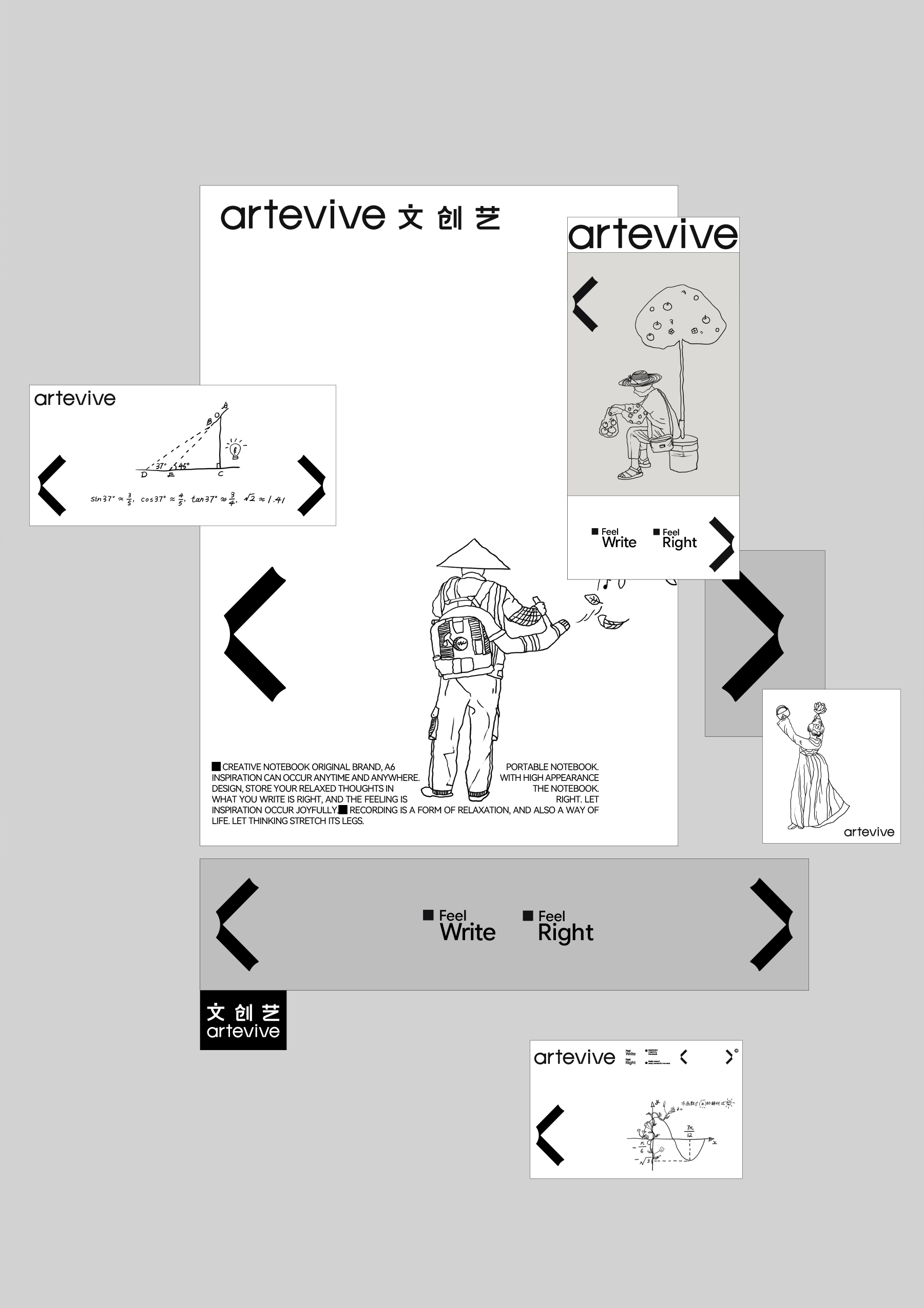
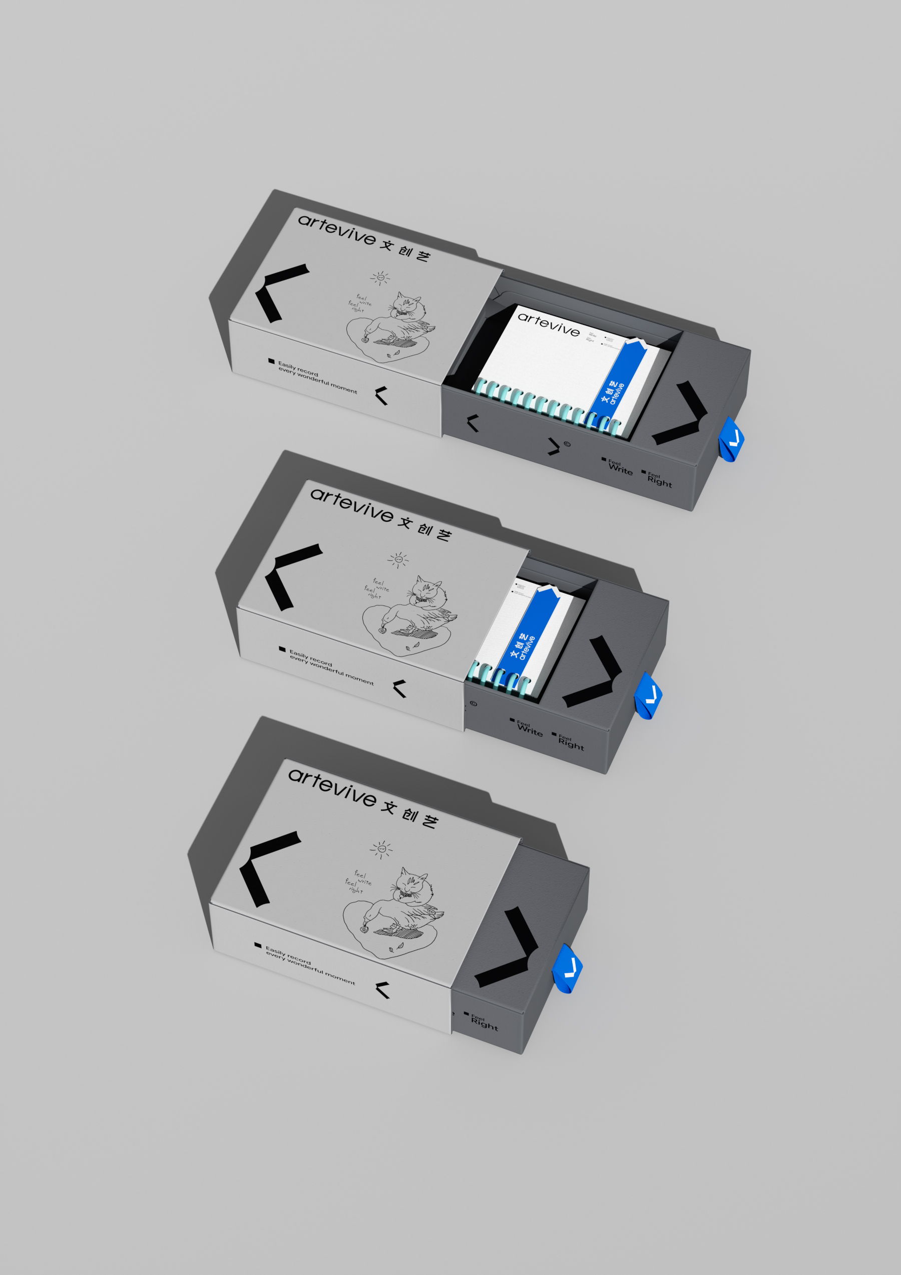
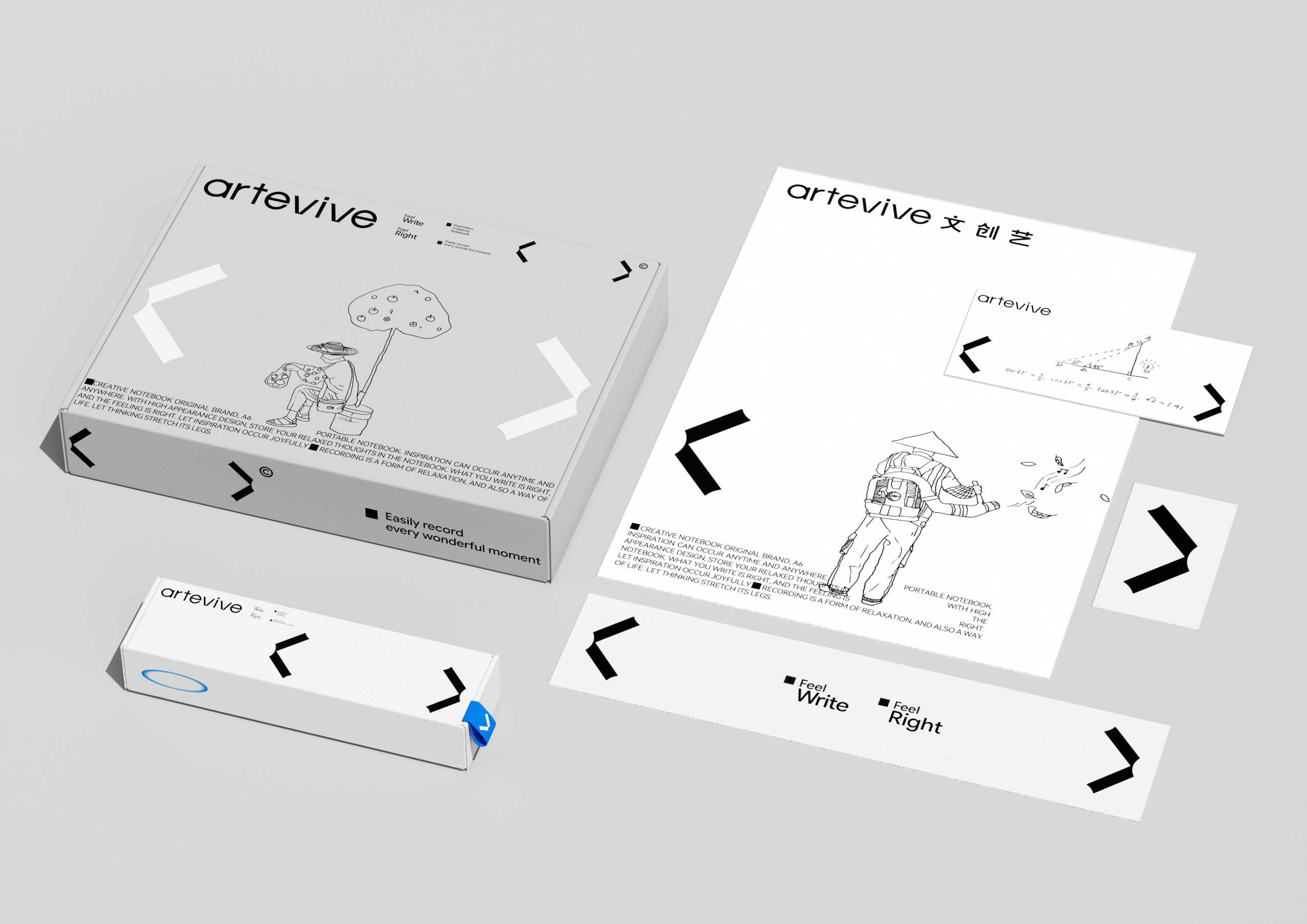
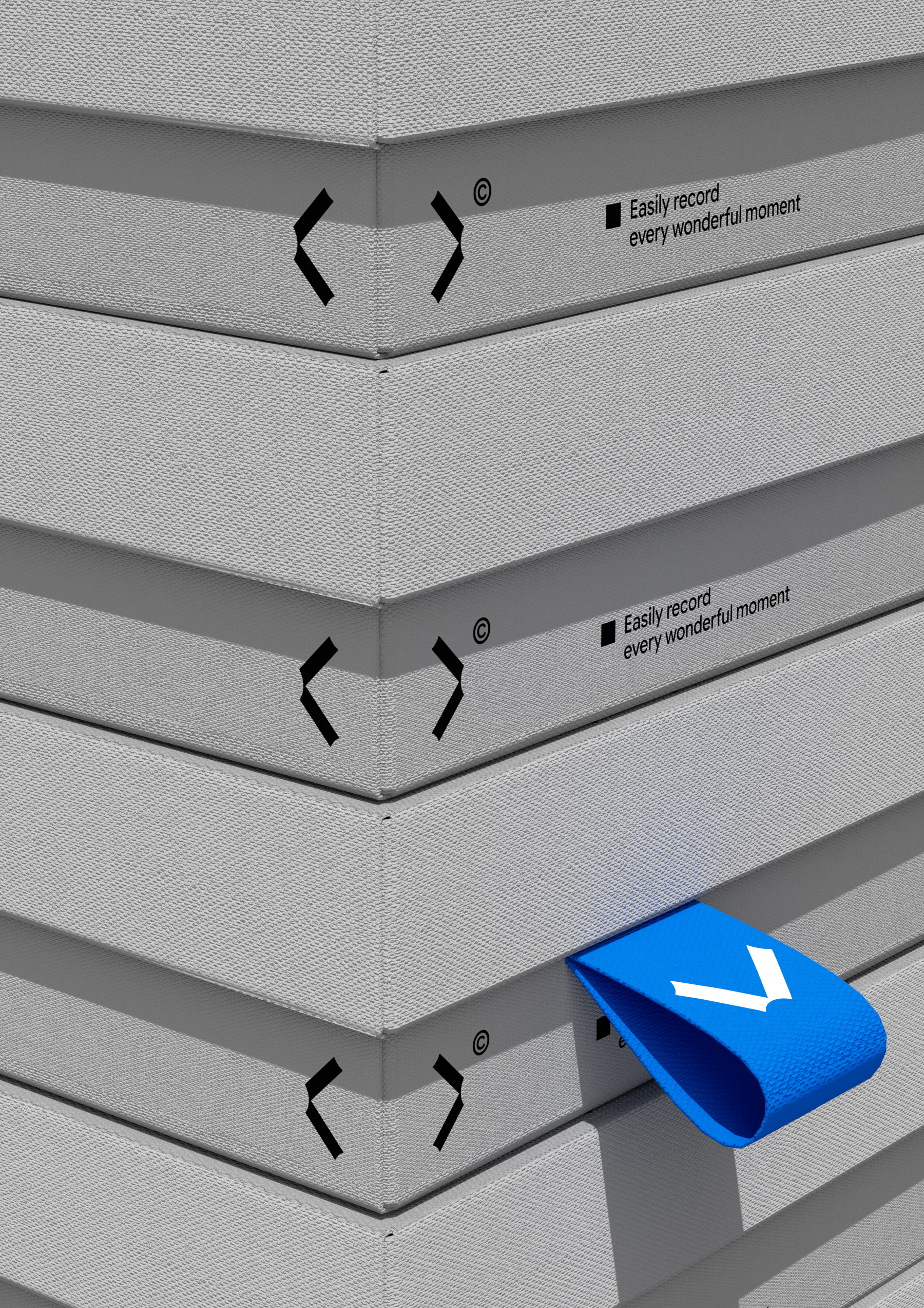
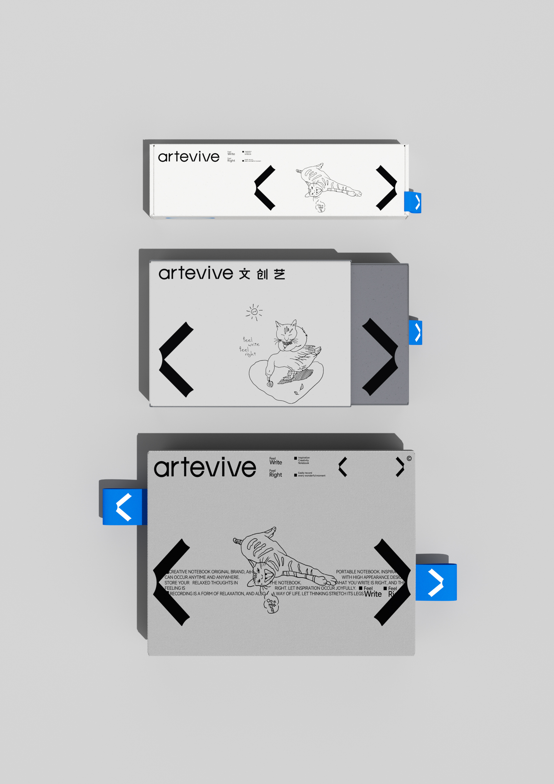
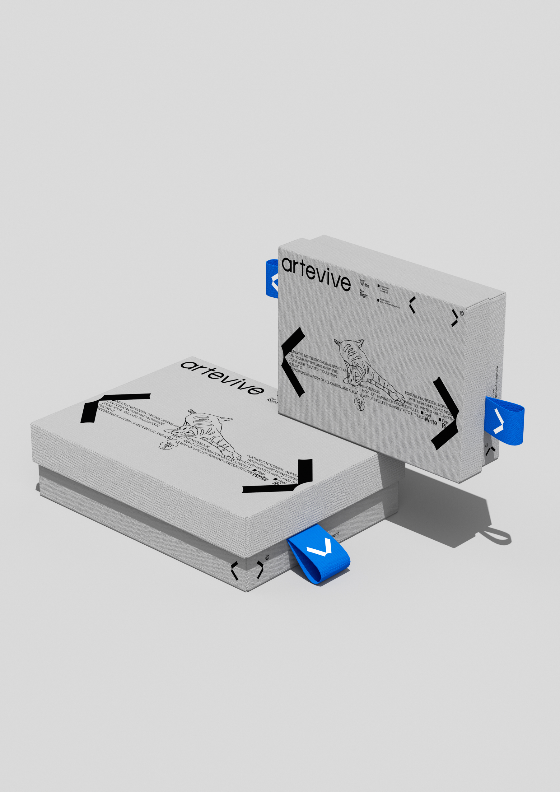
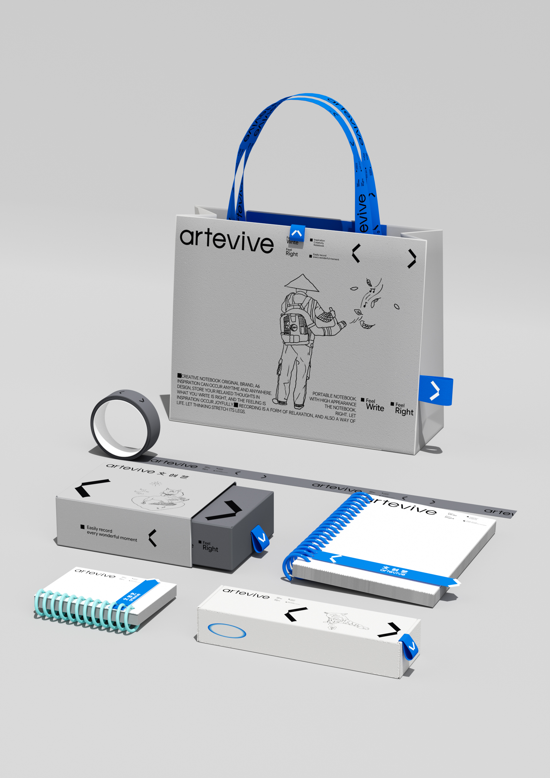
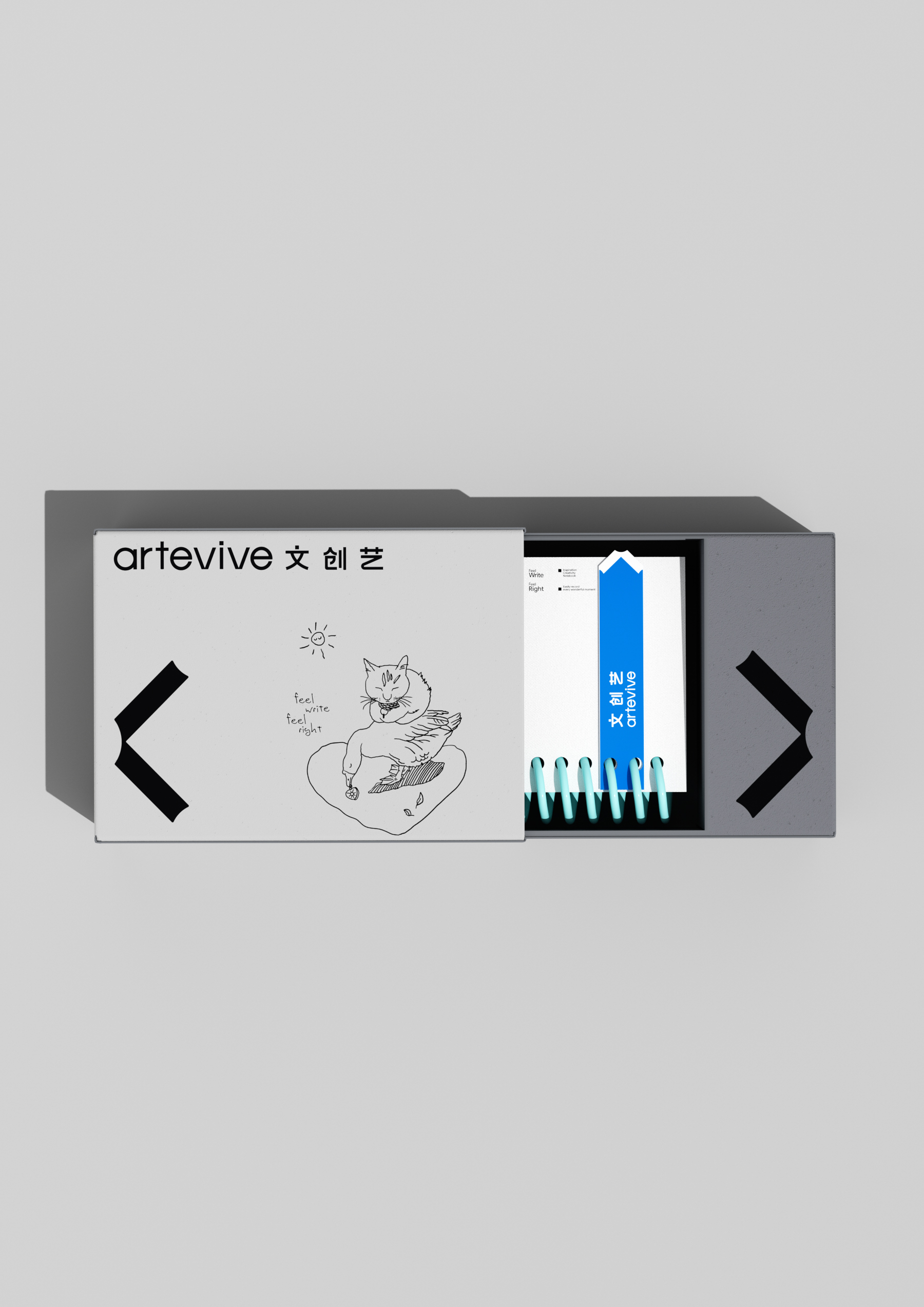
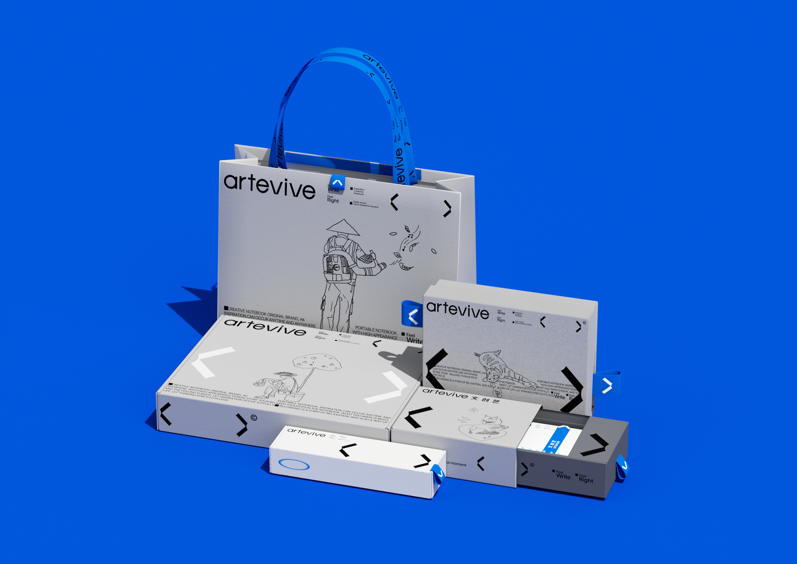
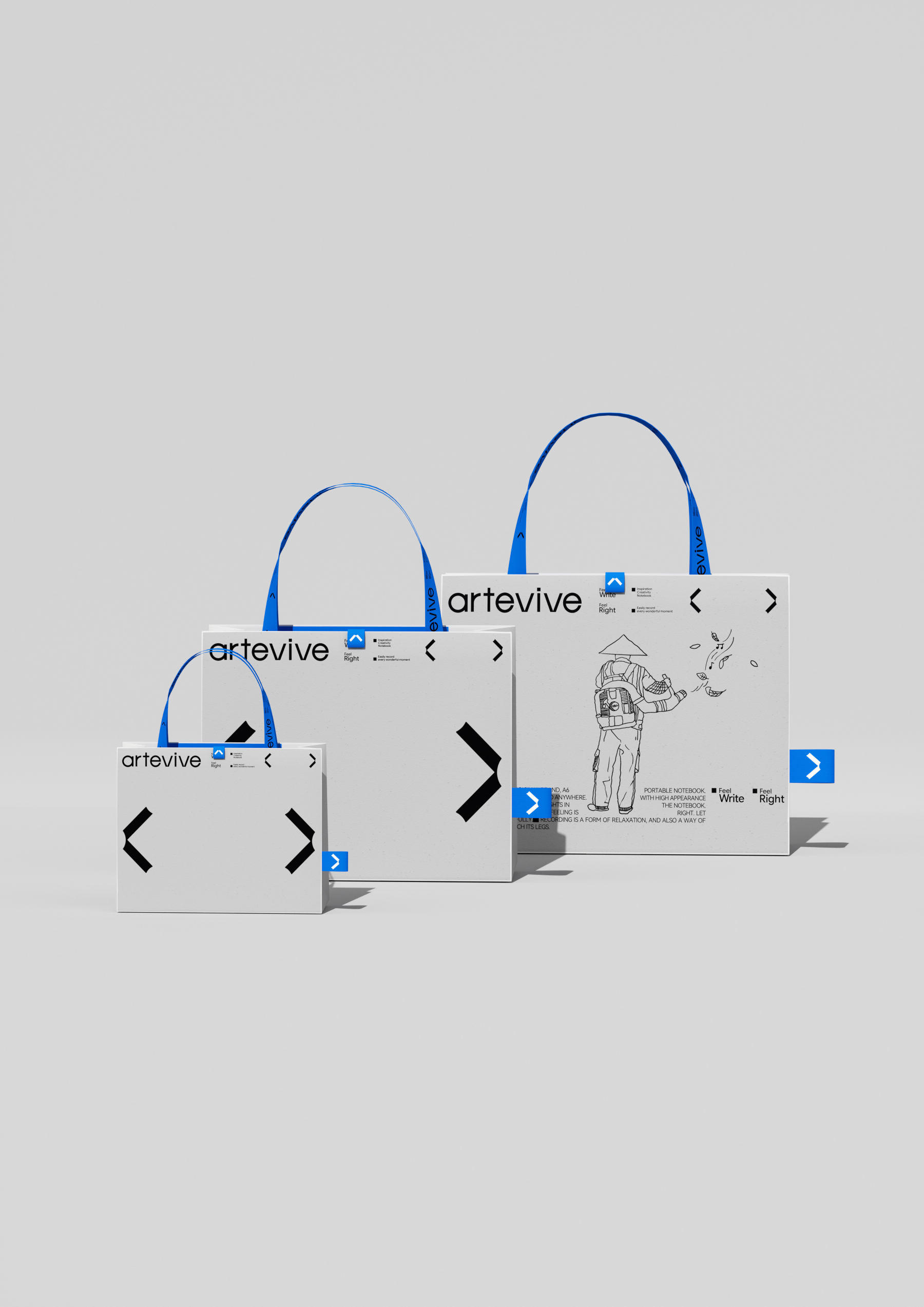
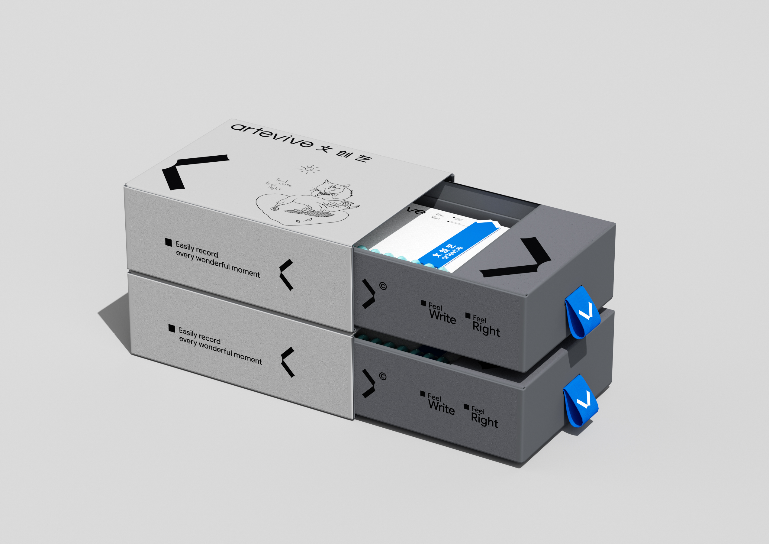
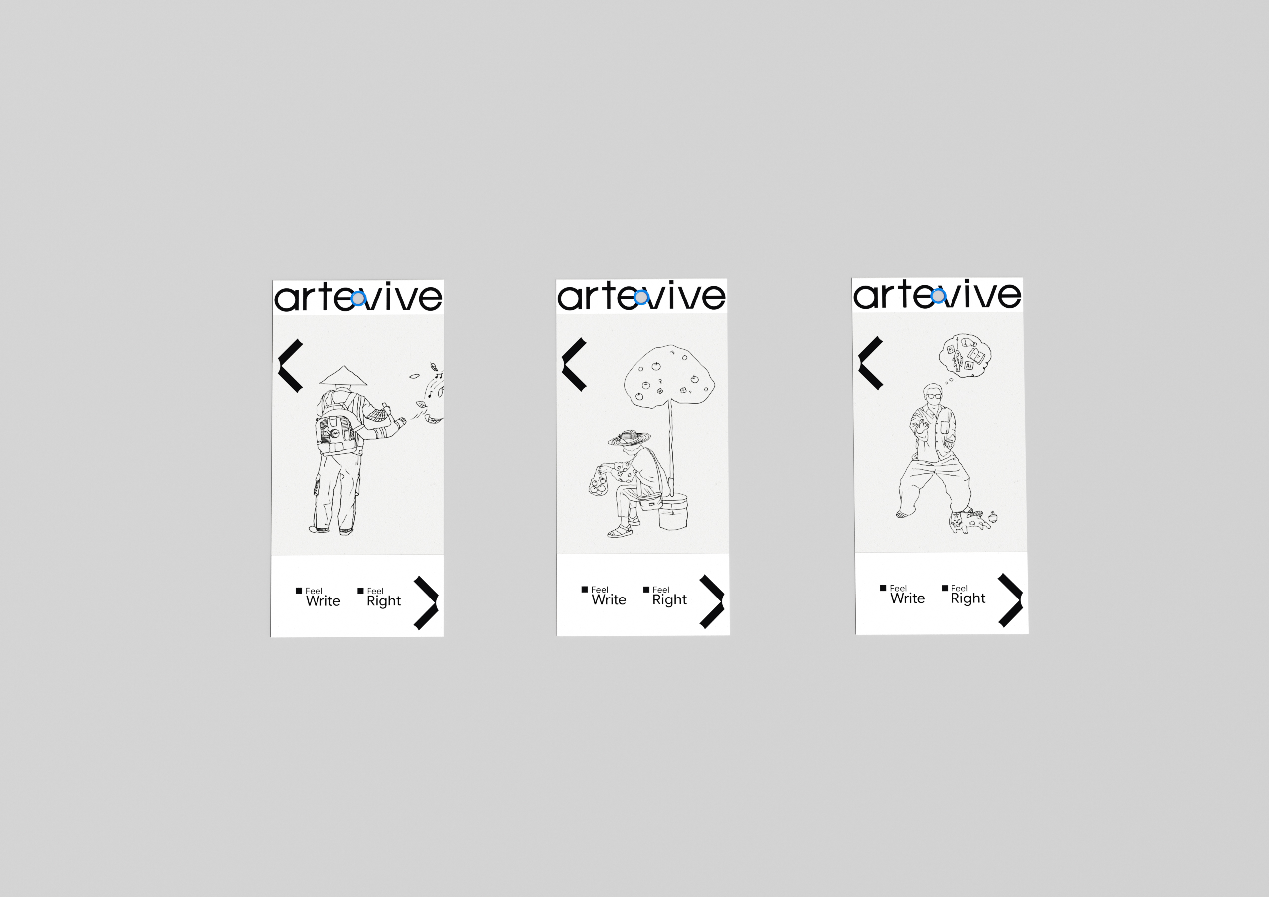
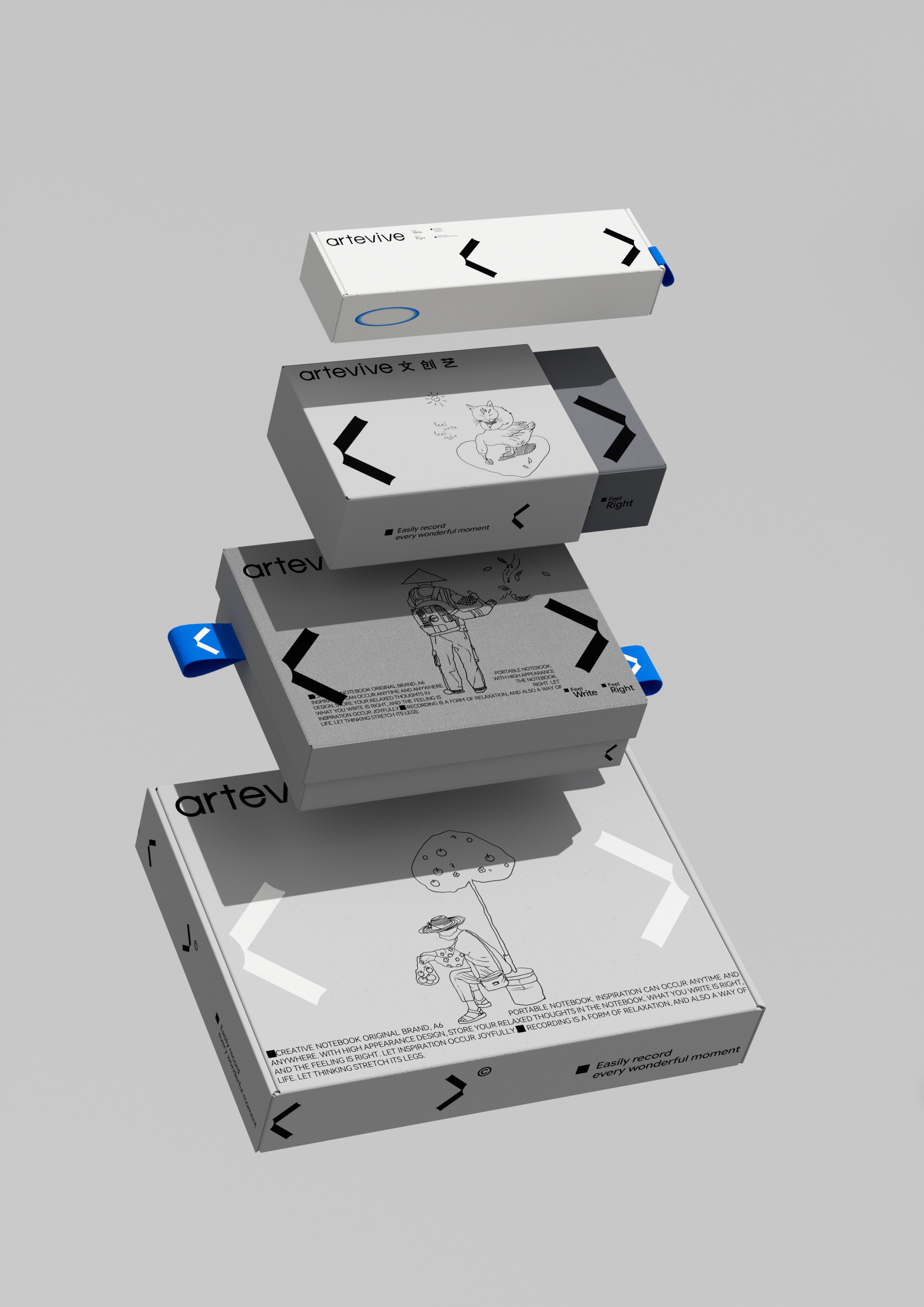
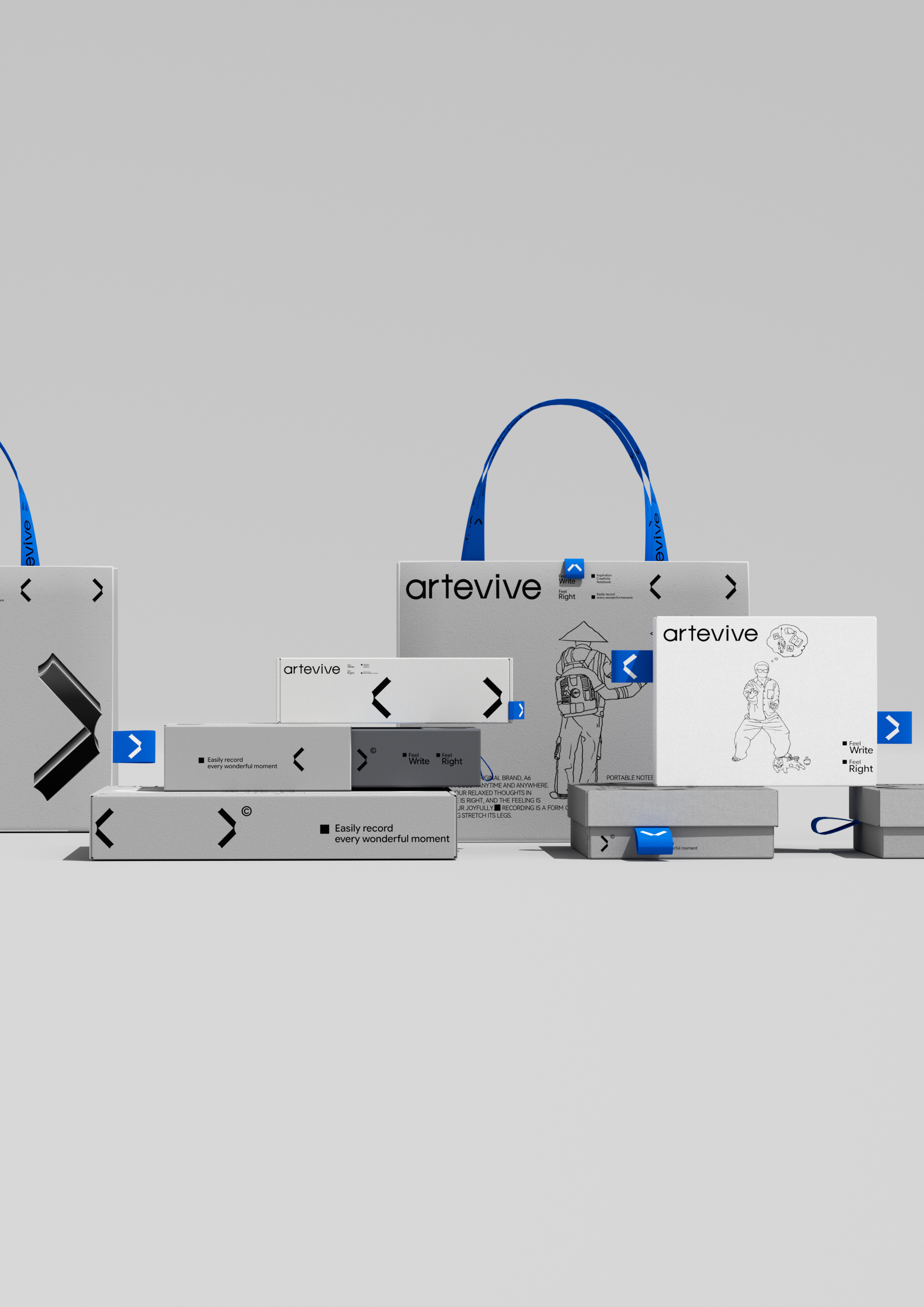
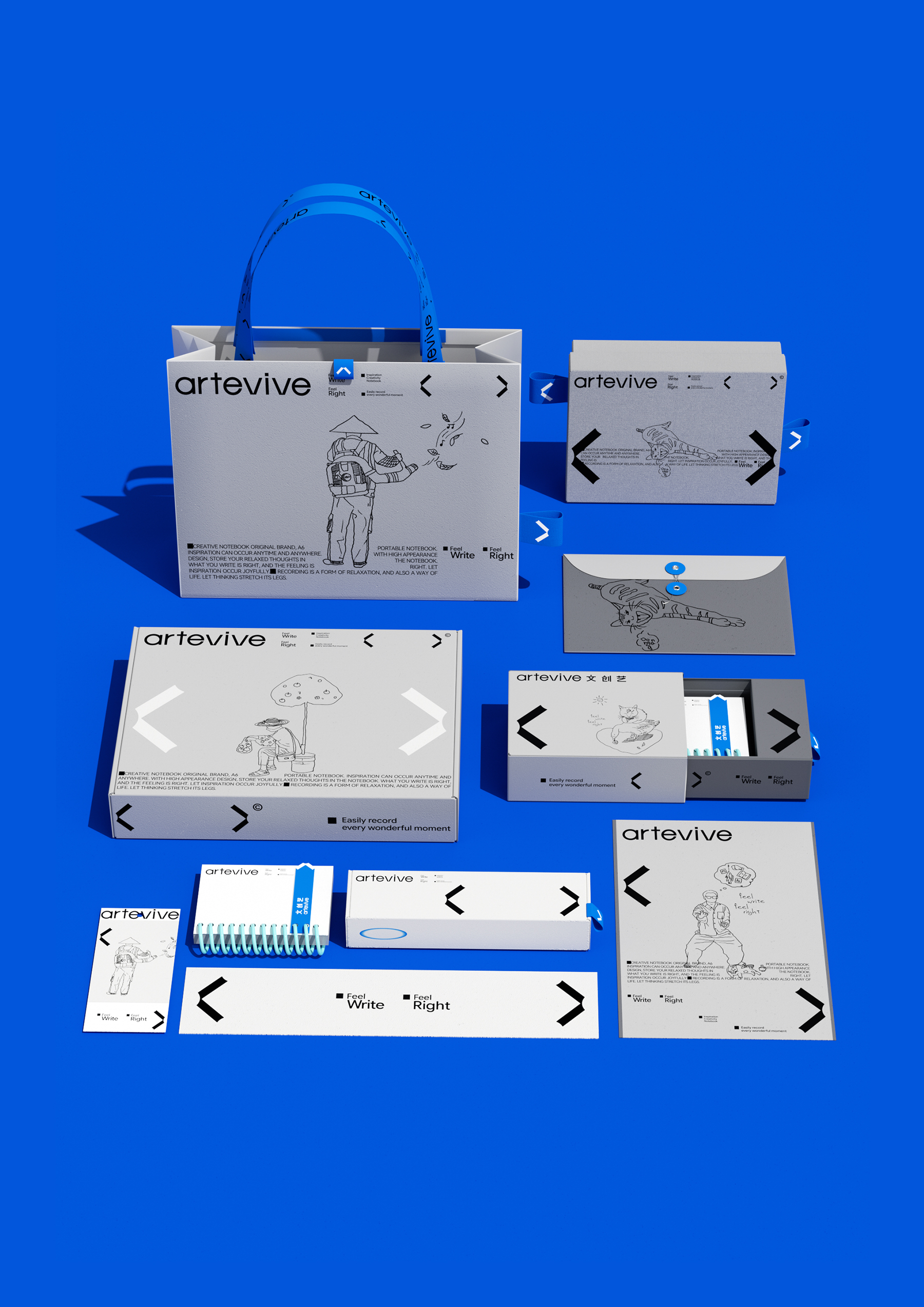
Wen Chuangyi®Artevive®Brand upgrade, with the title "" as the origin. The subtraction form of taking the title of a single book captures the dynamic of opening the notebook-the arc echoes with the spine of the book, and the subtle round back at the opening of the book gives the symbol a restrained rolling texture. It is both an open page and an open door to knowledge. Minimalist geometric sans-serif fonts are designed for new consumption scenarios. The design of strokes simulates the outline of books and is highly consistent with brand symbols. Mobile recognition is efficient, offline packaging is regular and regular, forming a set of restrained visual order. Symbols are not one-time stunning, but reusable visual assets. From brand logo vision, product packaging to e-commerce UI, we have put the single book name number through the outer packaging box type, functional icon and main drawing framework of different products to realize a unified and extensible symbol language. Users can intuitively feel the brand's intentions in every link of browsing, placing orders and receiving goods. Remove the hybridity and keep the core -1 book title and 1 creative beginning. Wen Chuangyi®Artevive®Put cultural creativity into writing life.
Original design/creation®Studio
Art Director/Xiao Qiong
Design Director/LIDIN
Design Assistant/Xin Li, Xiao He


Hello, how can I get in touch?
Not bad, not bad
Maverick