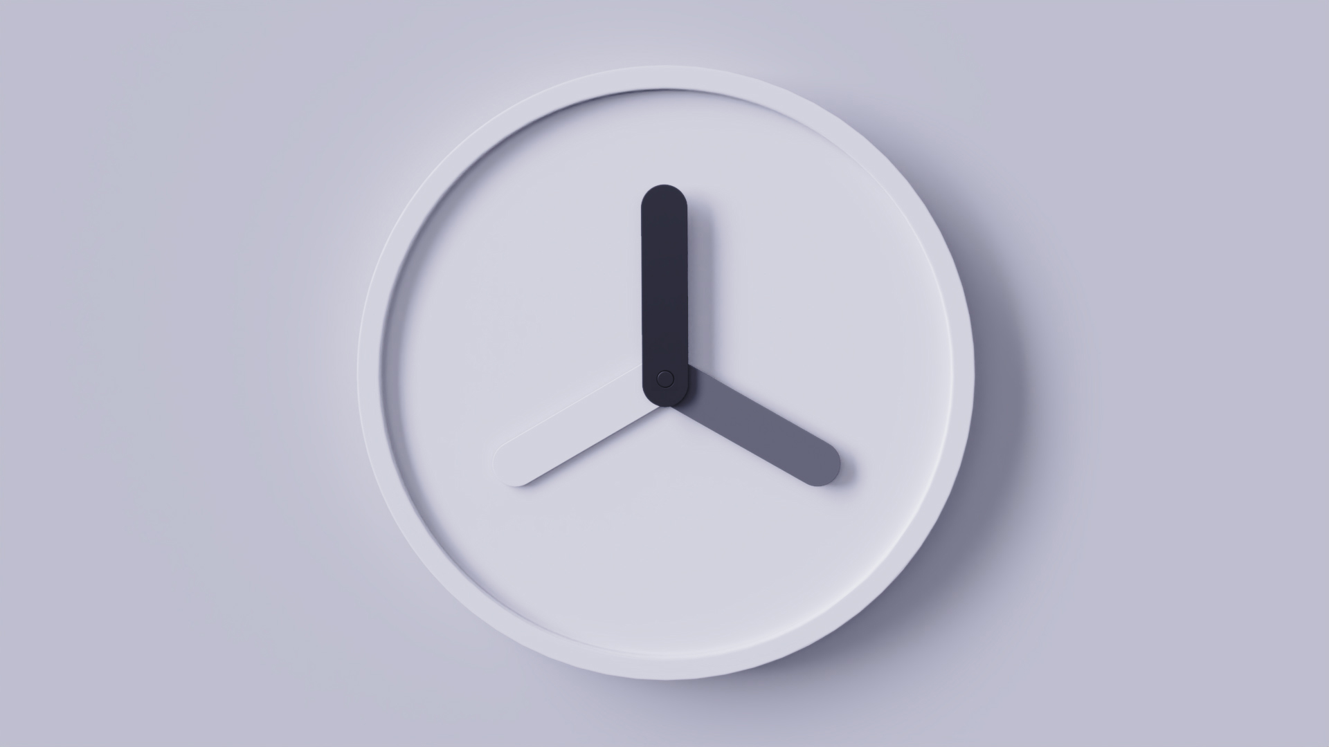
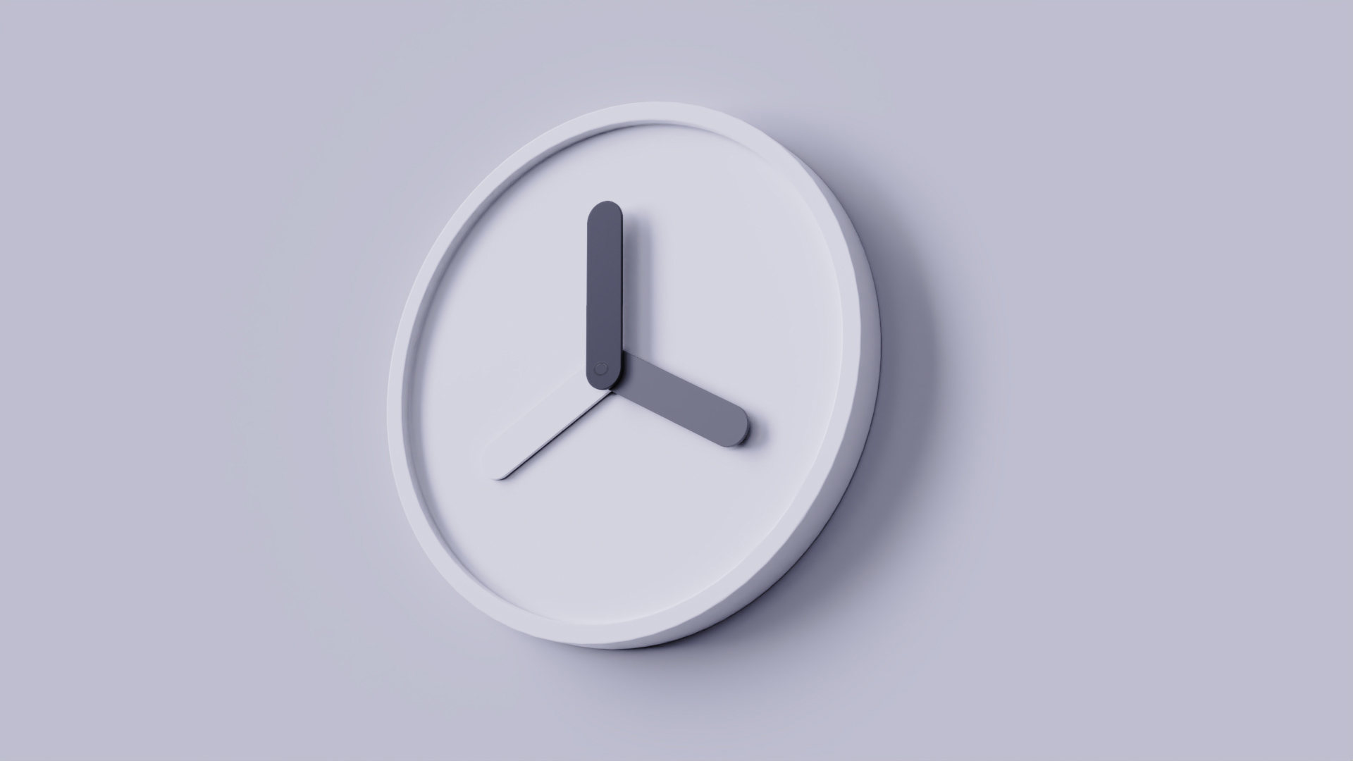
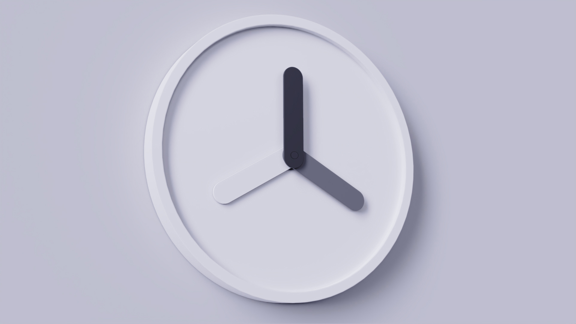
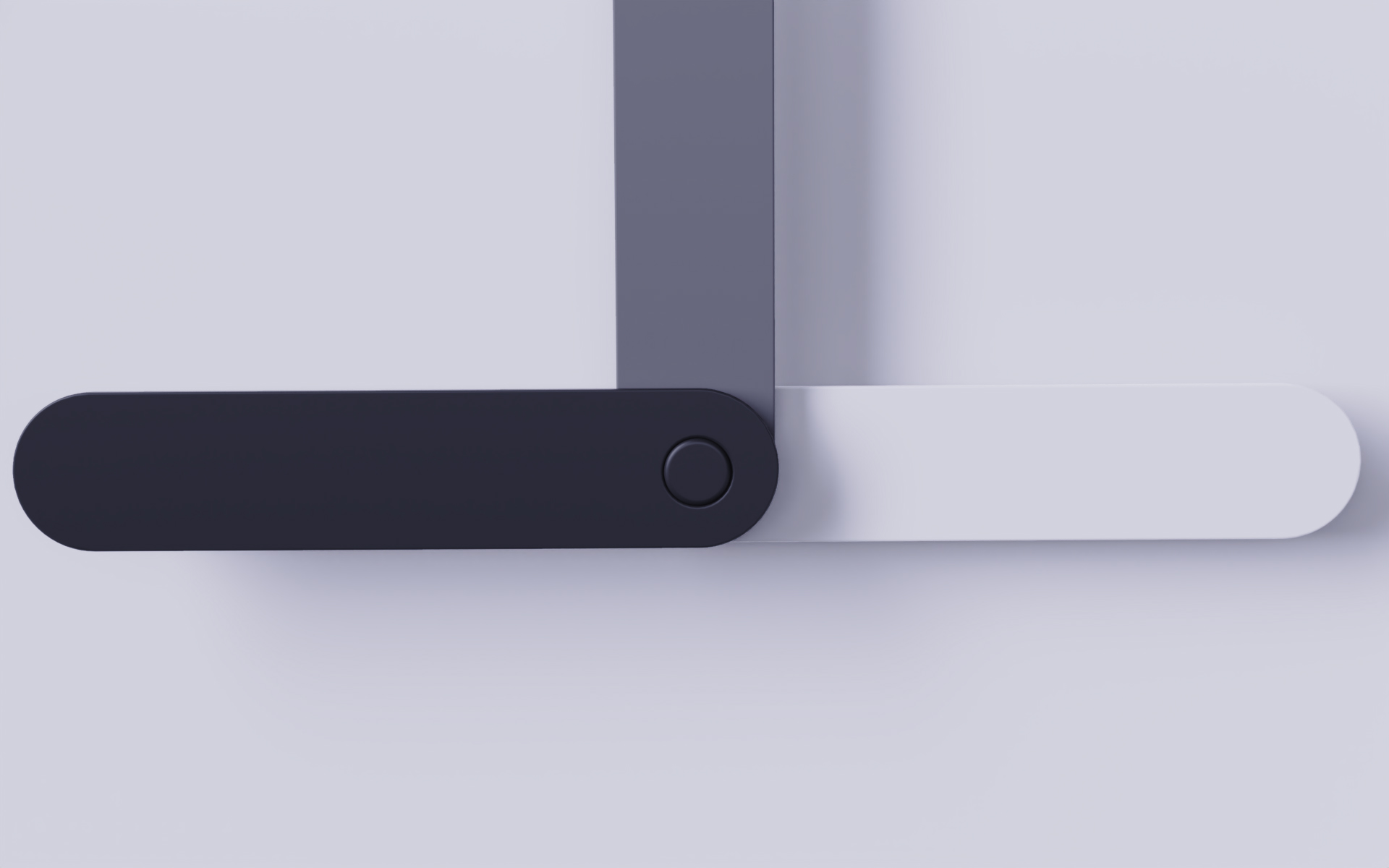
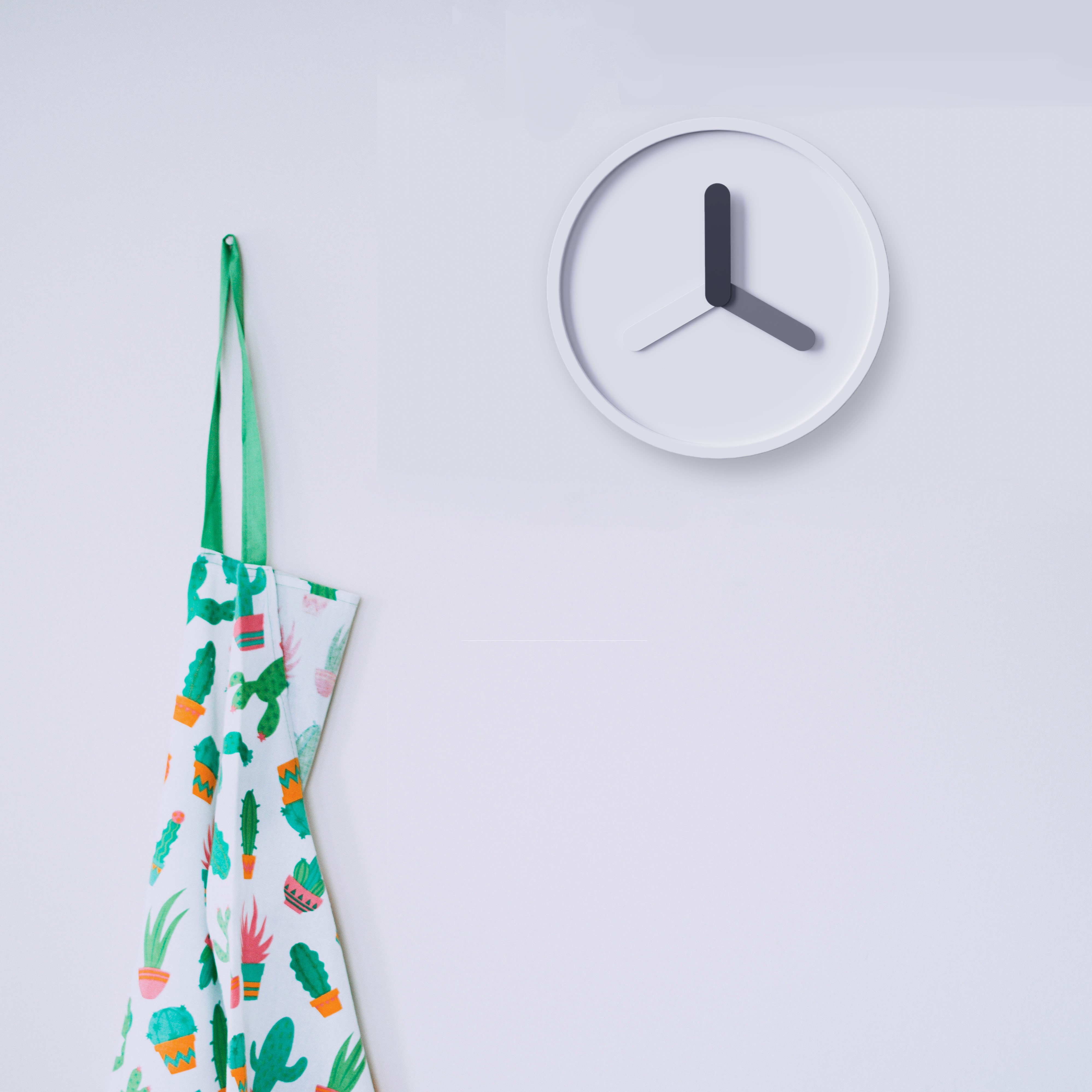
Is today's hour hand too complicated to design? Traditional clocks have three hands: hour hand-minute hand-second hand. These three pointers are independent of each other and each will have a different design, which is too complicated and ignores the connection between them. Therefore, we integrate the appearance elements of the pointer in a unified way, leaving only the color distinction: the depth of the color represents the importance of the three hour hands. The black hour hand is the most noticeable, the gray minute hand is the second, and the most interesting is the white second hand. White melts into the background, but it can still stand out from the background due to the rotation of the time. The "black and gray" clock expresses their relationship in an intuitive way.

本作品版权归 薯条炸 所有,禁止匿名转载及个人使用,任何商业用途均需联系原作者。

新用户?创建账号
登录 重置密码
请输入电子邮件以重置密码。


Did you design this?
This function is not strong, it is an interesting decoration.
Is this an award-winning
OK
For users, it needs corresponding colors to clearly know whether the time is inconvenient or not.
Is it better to distinguish the size of hour hand, minute hand and second hand?
Micro signal: zhous5226
(If you have ideas, you can communicate together ~)
It would be perfect if there was a video display.
The minimalism is beautiful
I like simple style.
Your works have been collected among my good ideas and good things.