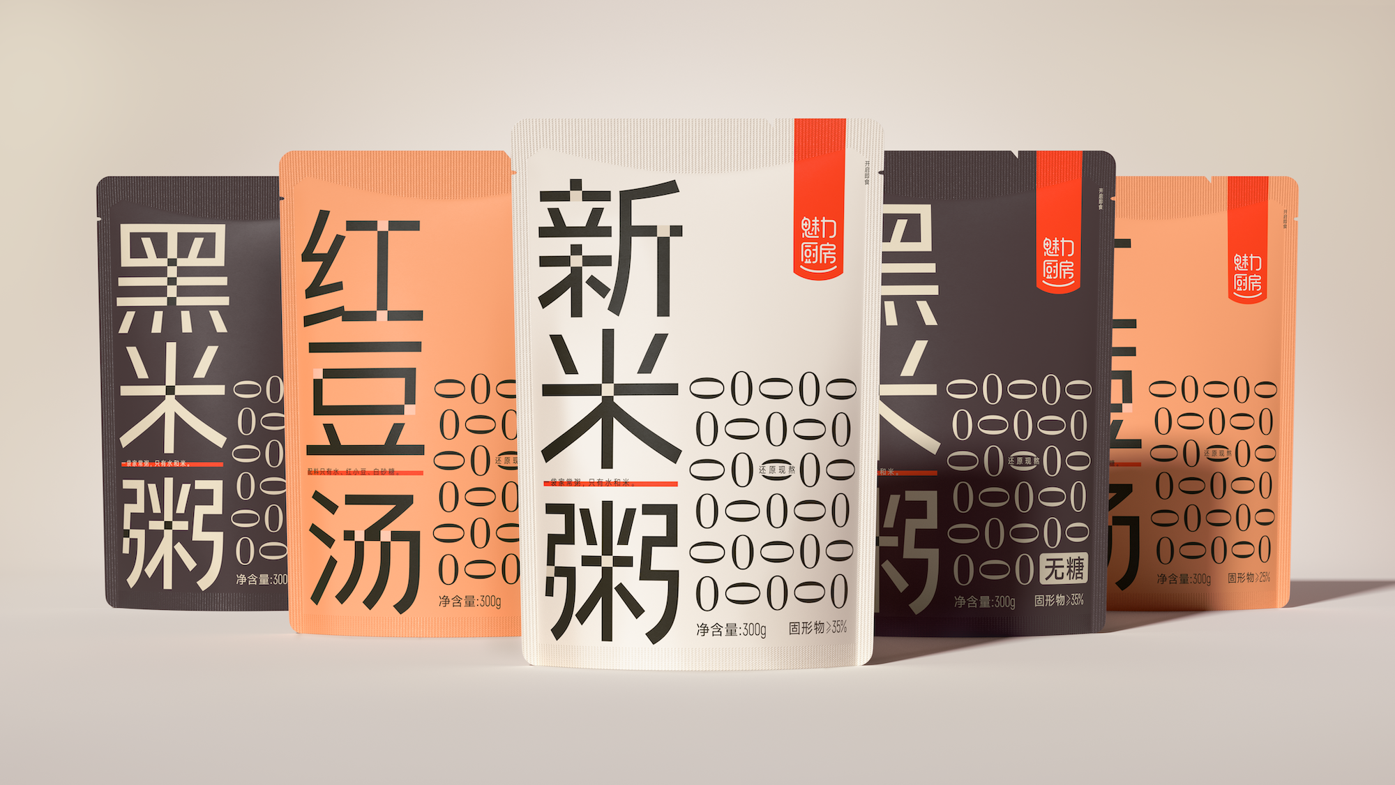
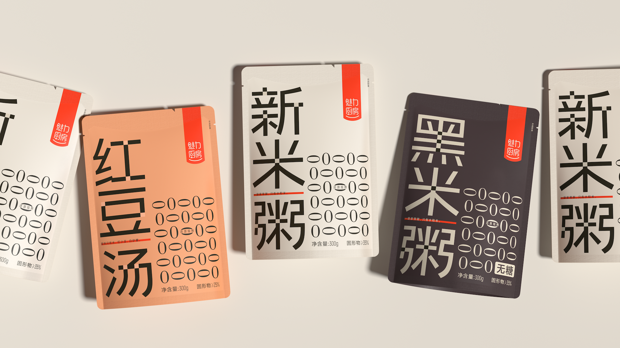
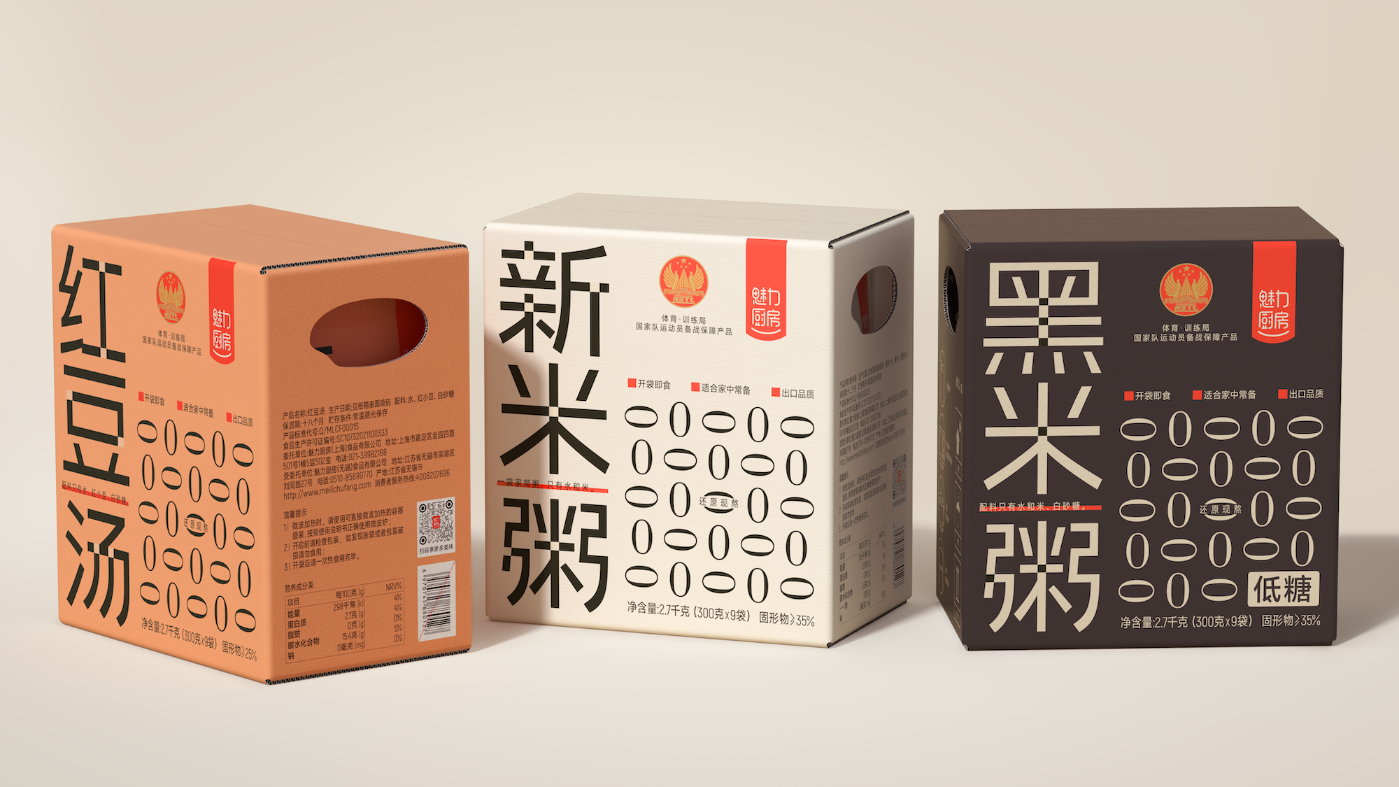
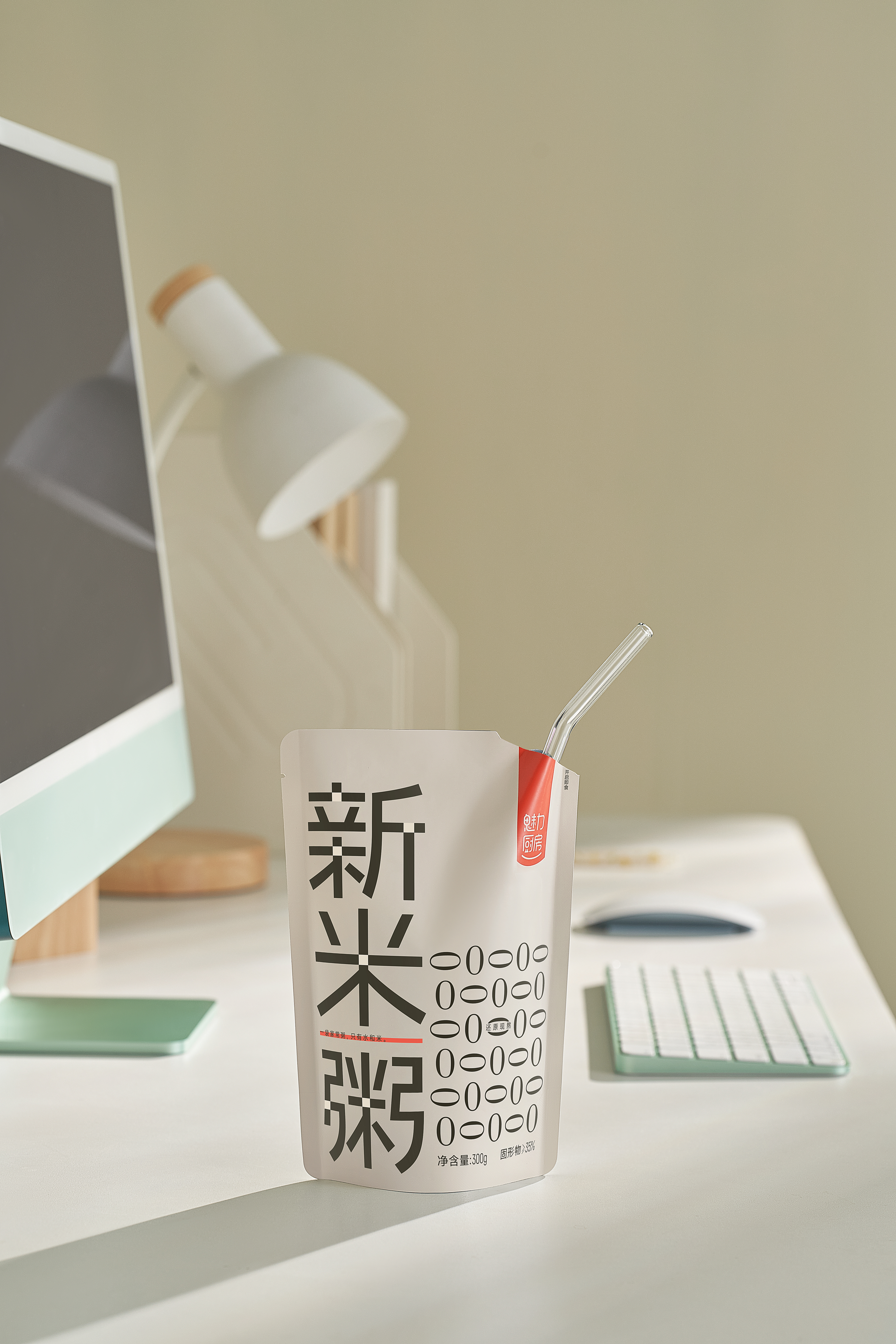
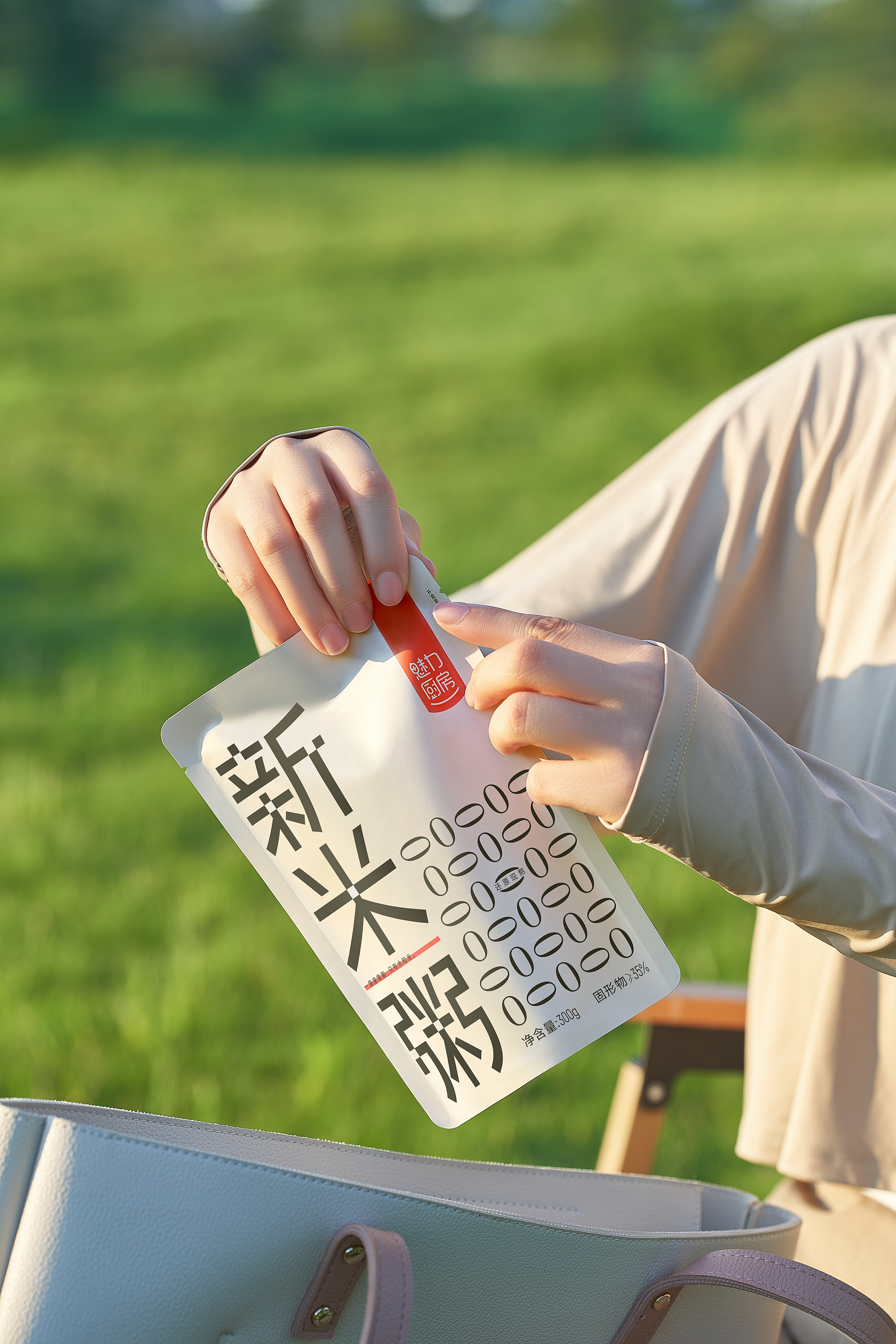
This design aims to convey the warmth and advanced sense of the charming kitchen brand through visual language. Starting from a bag of ready-to-eat "new rice porridge", every bite is a love of life.
We carefully magnify the category logo to make it stand out on the shelves, instantly capture the sight of consumers and strengthen the market penetration. In the choice of fonts, we skillfully integrate the neatness of modern blackbody and the warmth of handwriting style, which not only highlights the high-end style of the brand, but also does not lose the affinity, effectively accelerates the brand recognition process, makes the overall design exquisite and balances every detail, and reveals a pure, healthy, natural and fresh brand atmosphere.
In terms of layout, we pursue the precise communication of information and the harmony and unity of vision. Through the modular processing of information, the core selling points and auxiliary information are clearly defined and clear at a glance, which greatly optimizes the browsing experience of consumers and promotes the smooth progress of purchase decisions. In addition, the innovative use of graphical "0" symbols to intuitively interpret the product's "pure without adding" health promise, not only deepen the brand memory, but also touch consumers visually and deeply in their hearts, making them deeply feel this health gift and unique charm from nature.

本作品版权归 潘虎设计实验室 所有,禁止匿名转载及个人使用,任何商业用途均需联系原作者。

新用户?创建账号
登录 重置密码
请输入电子邮件以重置密码。


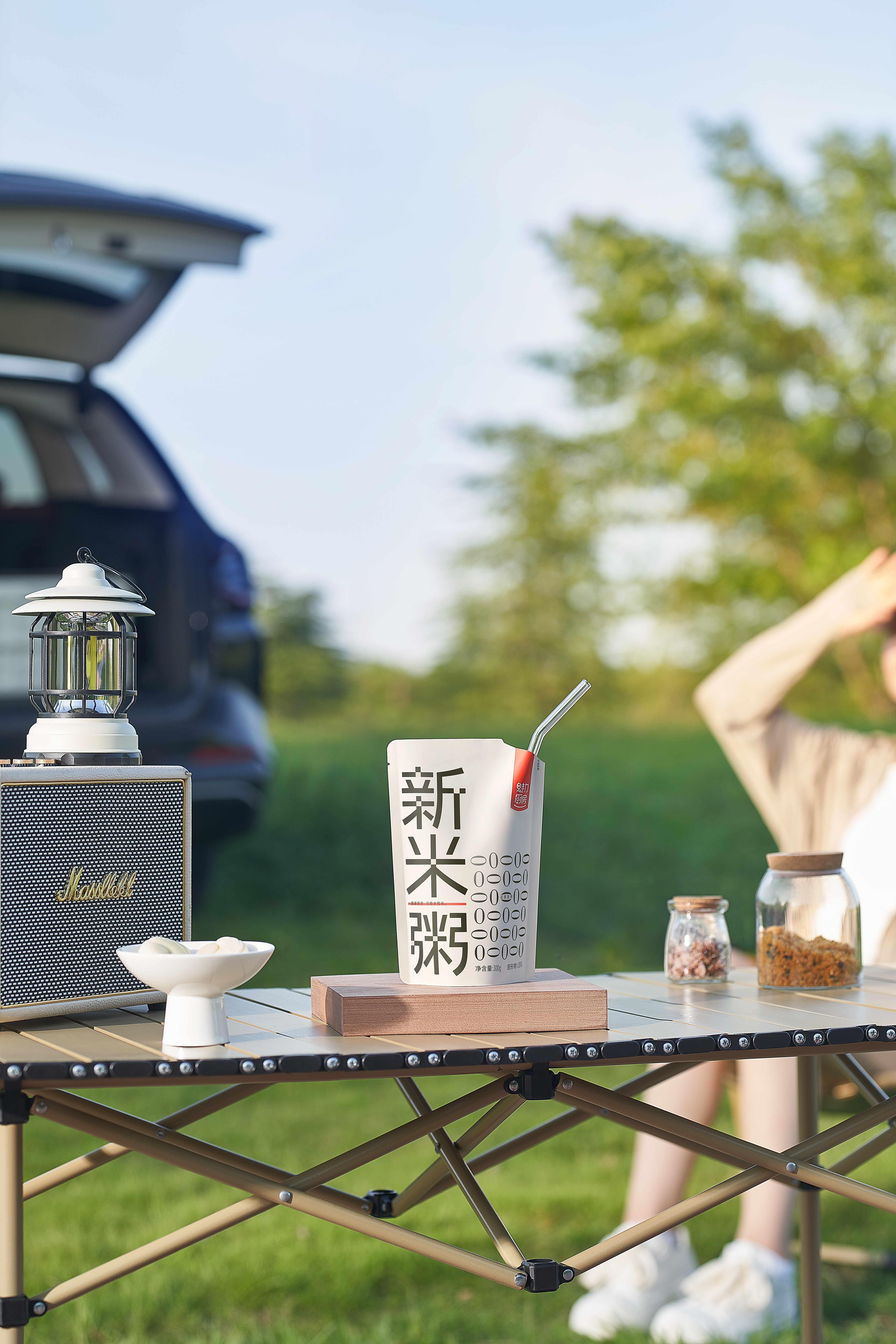
This package is very convenient
Really talented
The Big Brother's Works
not bad