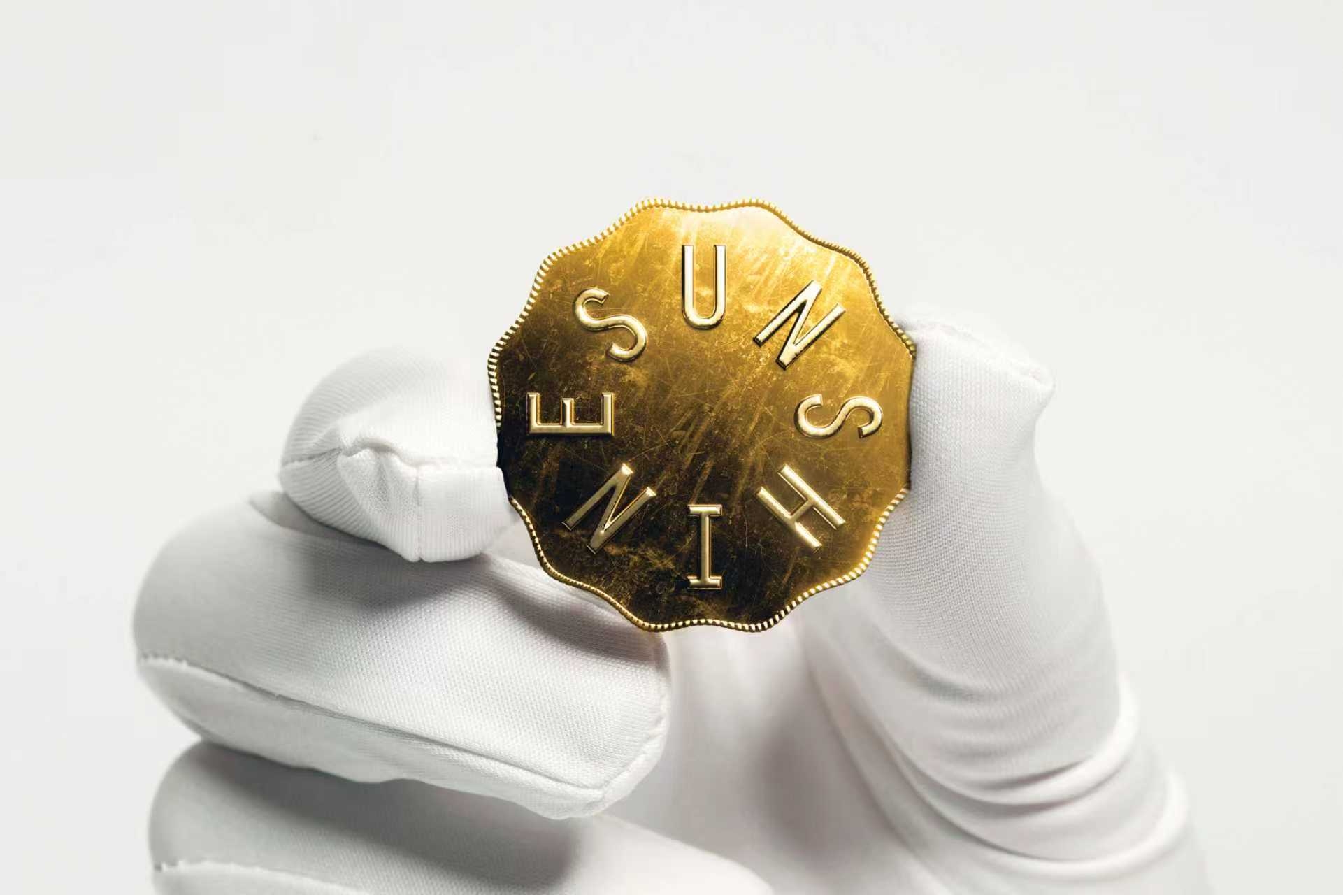
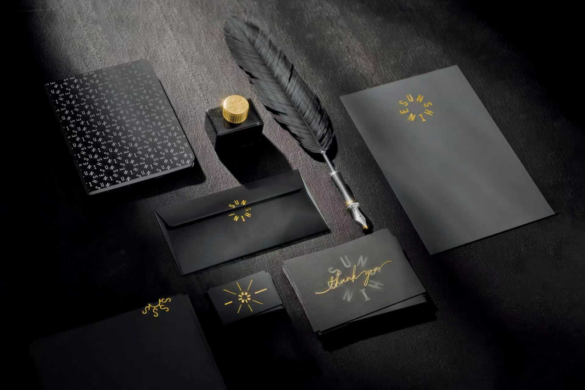
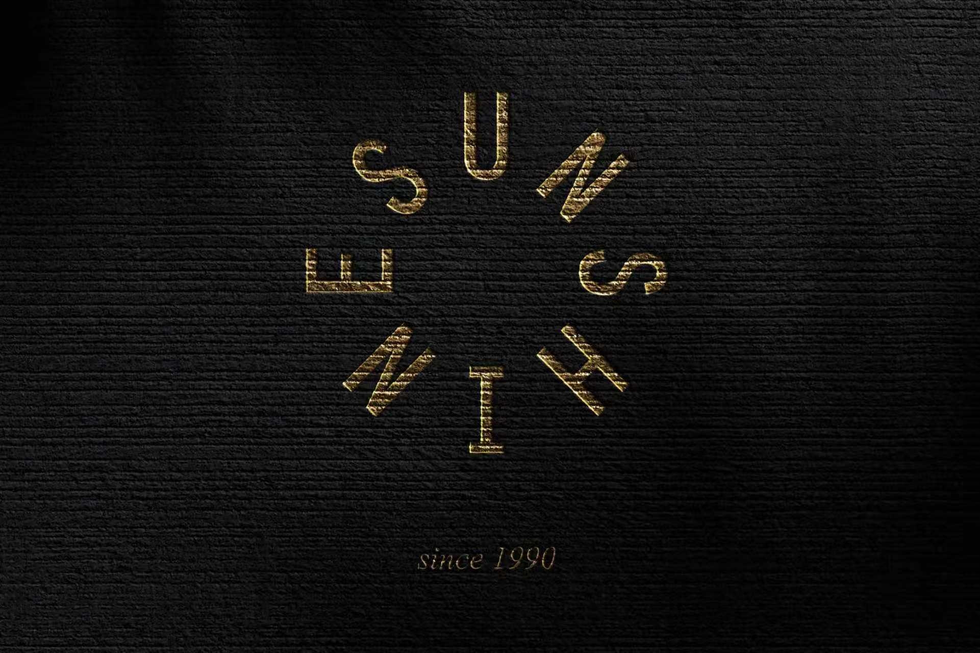
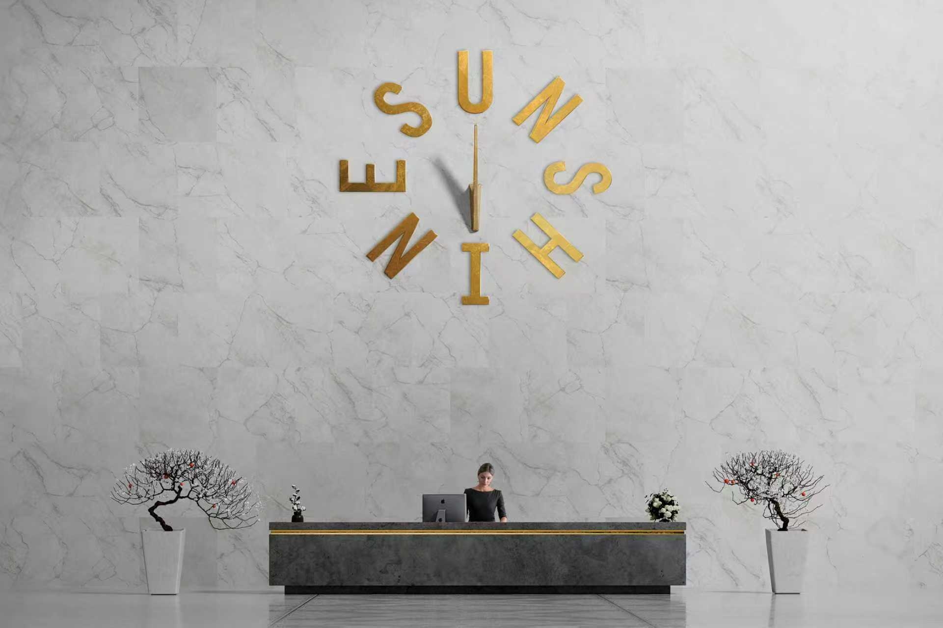
Sunshine Ltd. is a conglomerate engaged in international trade, covering a wide range of consumer goods. The logo is designed to create an all-encompassing feel through the circular layout of letters, which are arranged in lines of sunlight to symbolize sunlight, while the circular blank area in the middle remains unchanged. In a way, this makes it a symbol that doesn't have to be deliberately designed. Although the design language is English, the logo is designed to transcend language barriers and be easily interpreted and understood on an intuitive level, relying entirely on visual perception. The case comes from the official website of the Red Dot Award and is only shared as a winning case.


新用户?创建账号
登录 重置密码
请输入电子邮件以重置密码。


That's it.
It's really extraordinary