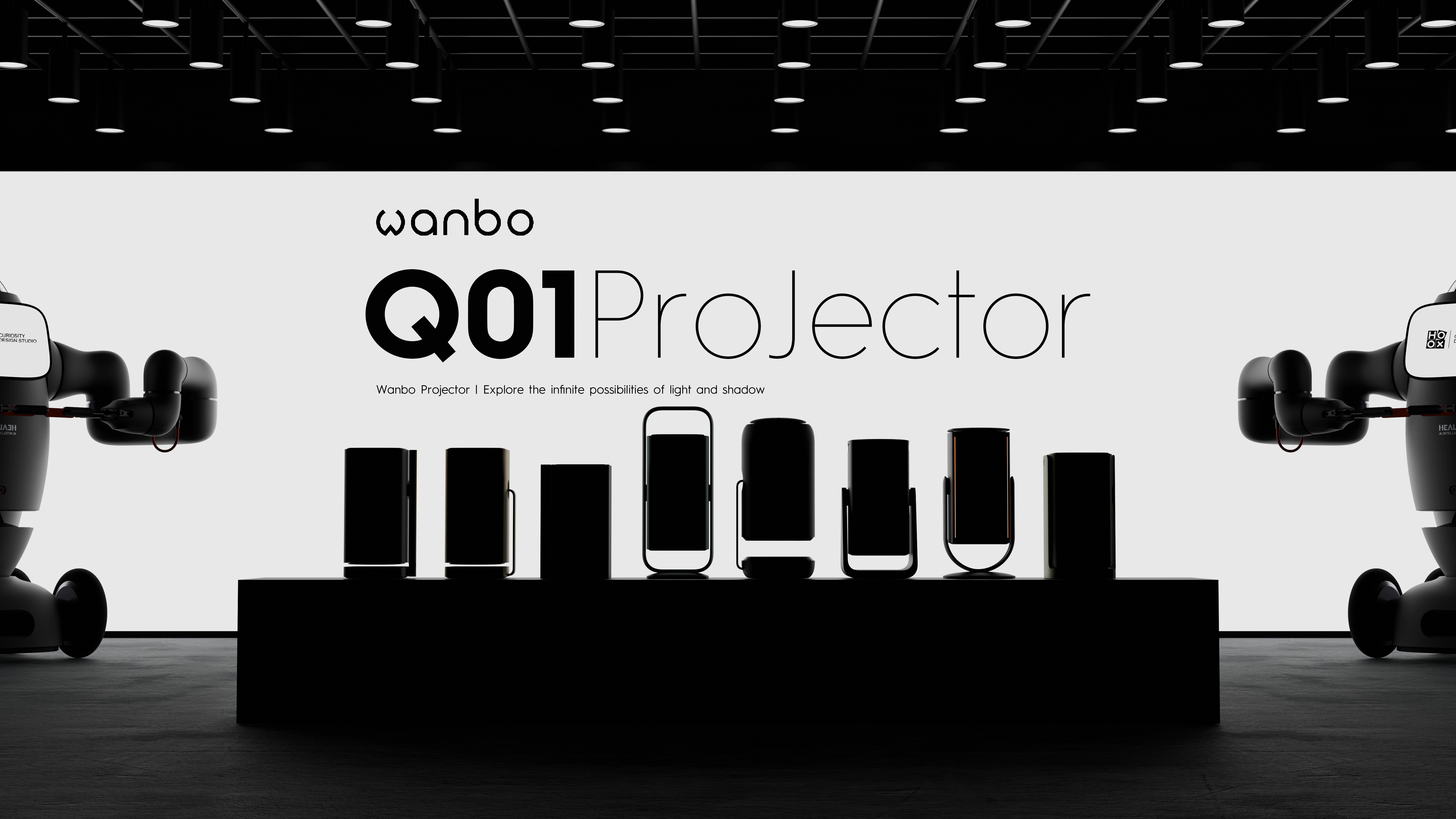
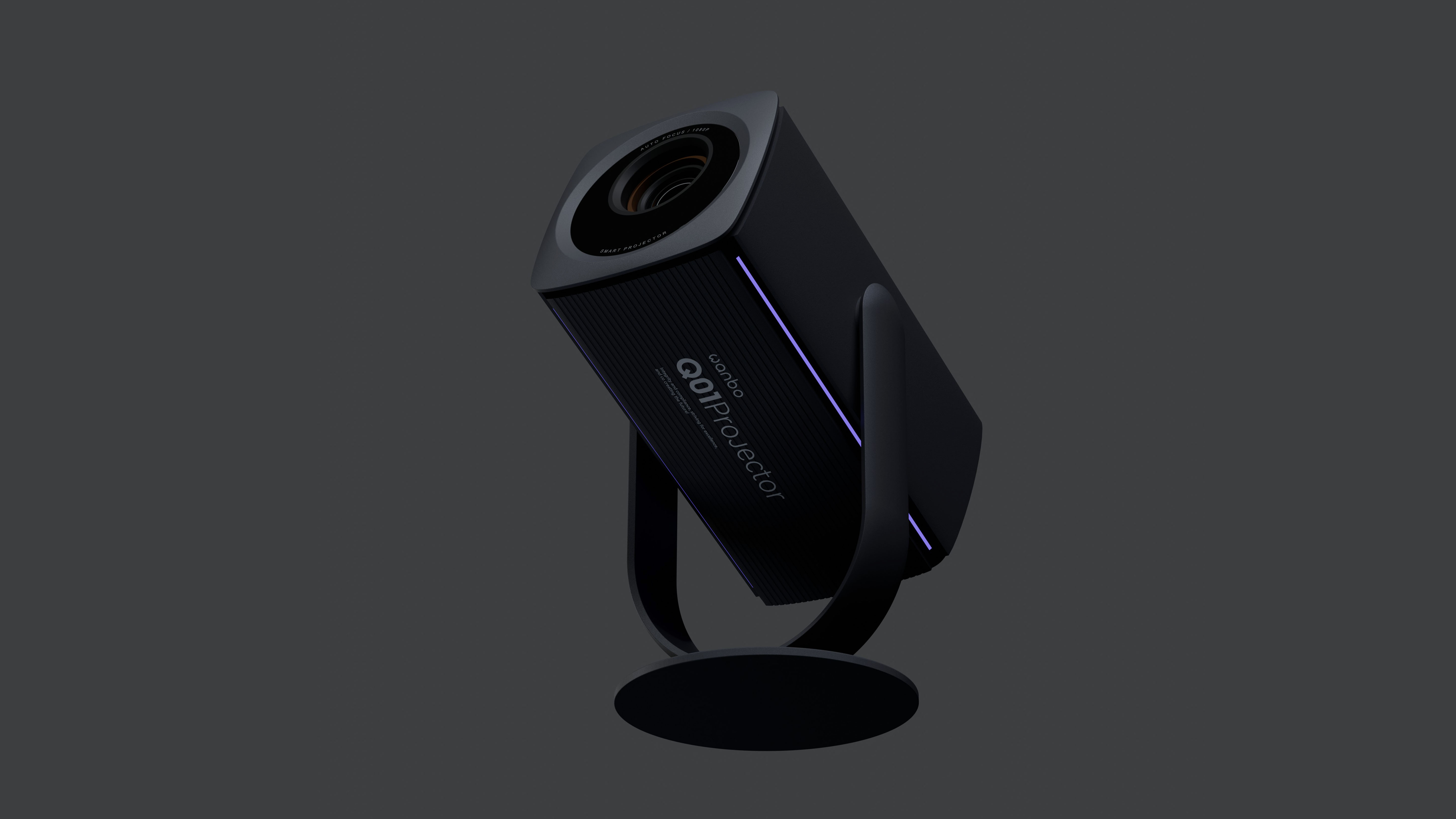
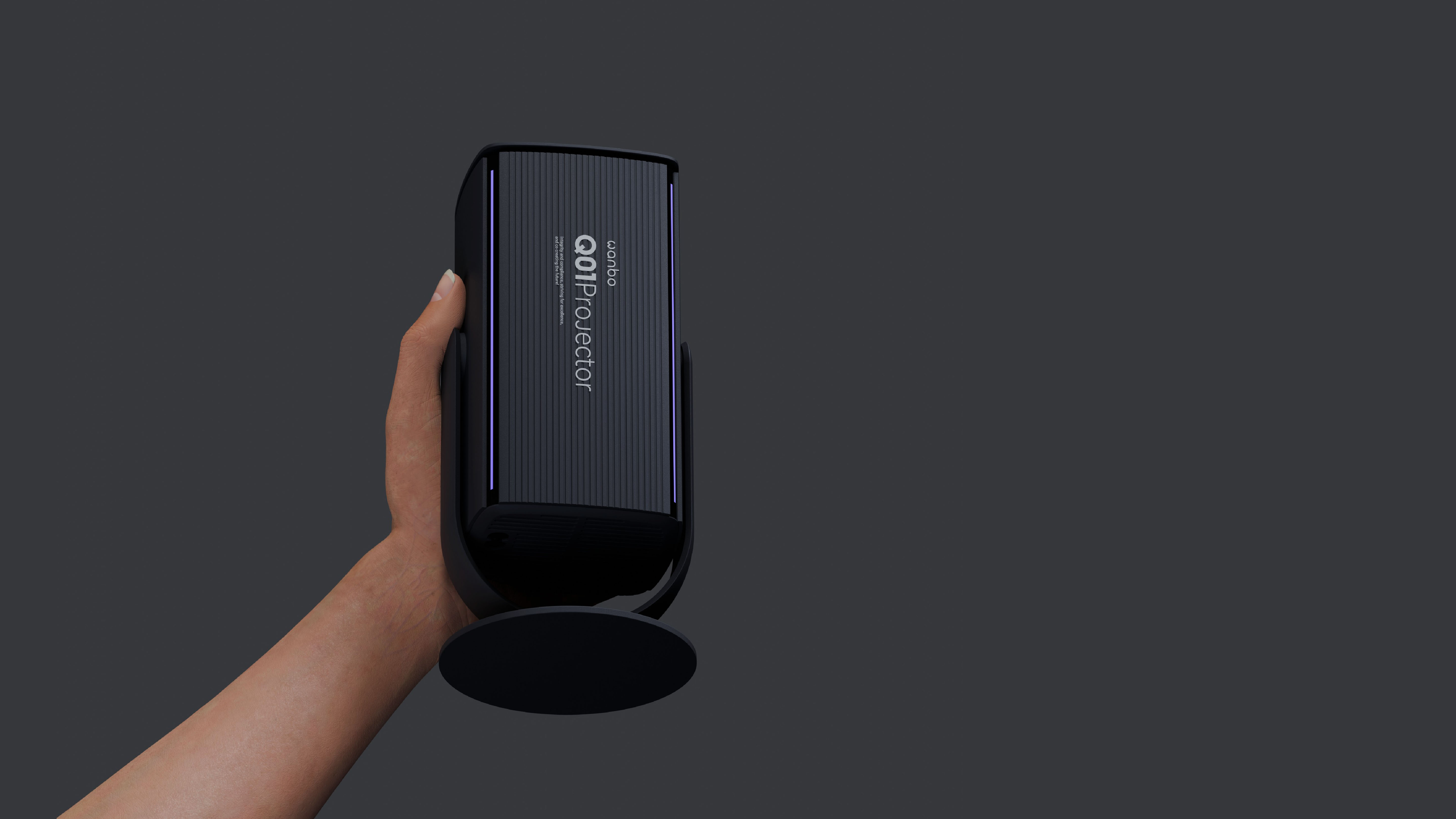
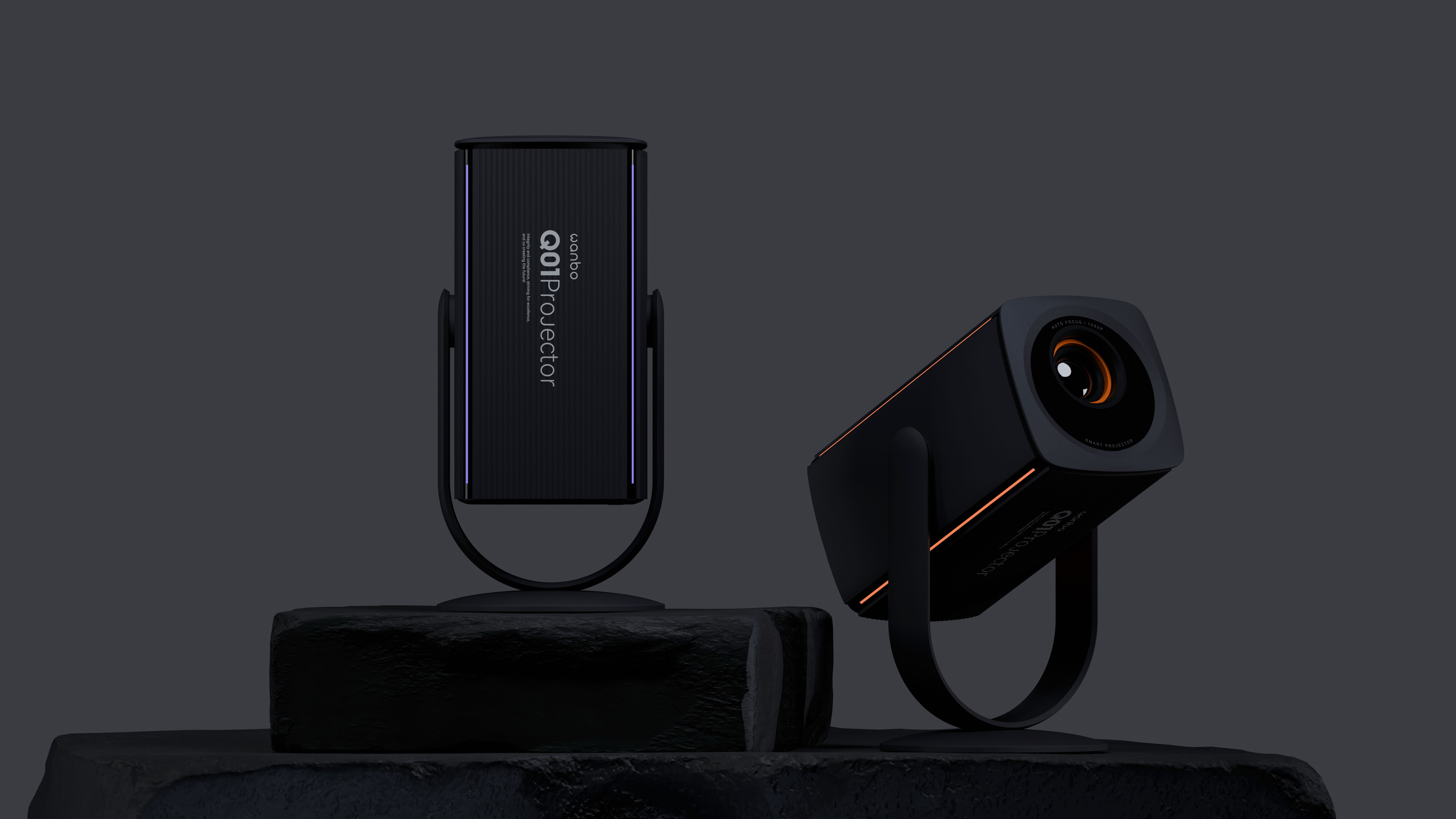
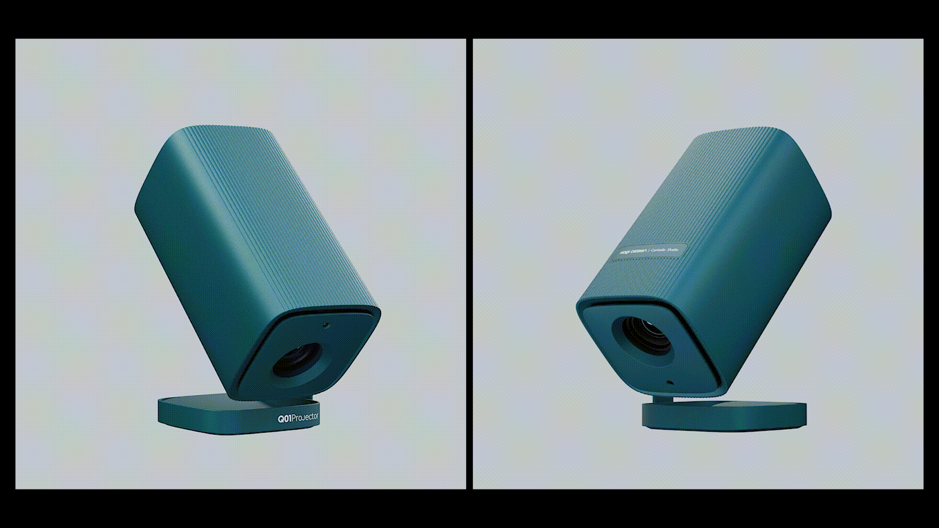
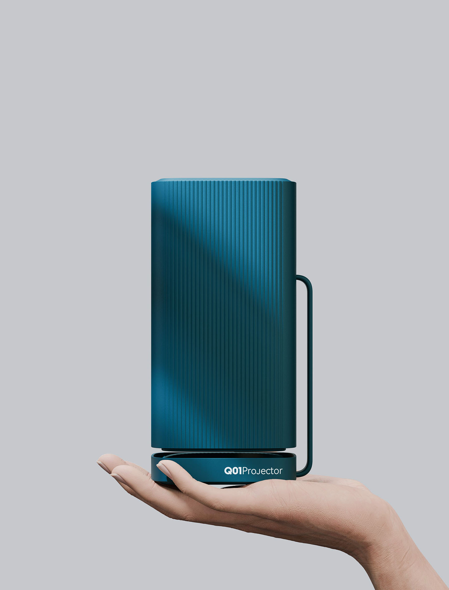
Share a complete case of a projector (an annual customer project).
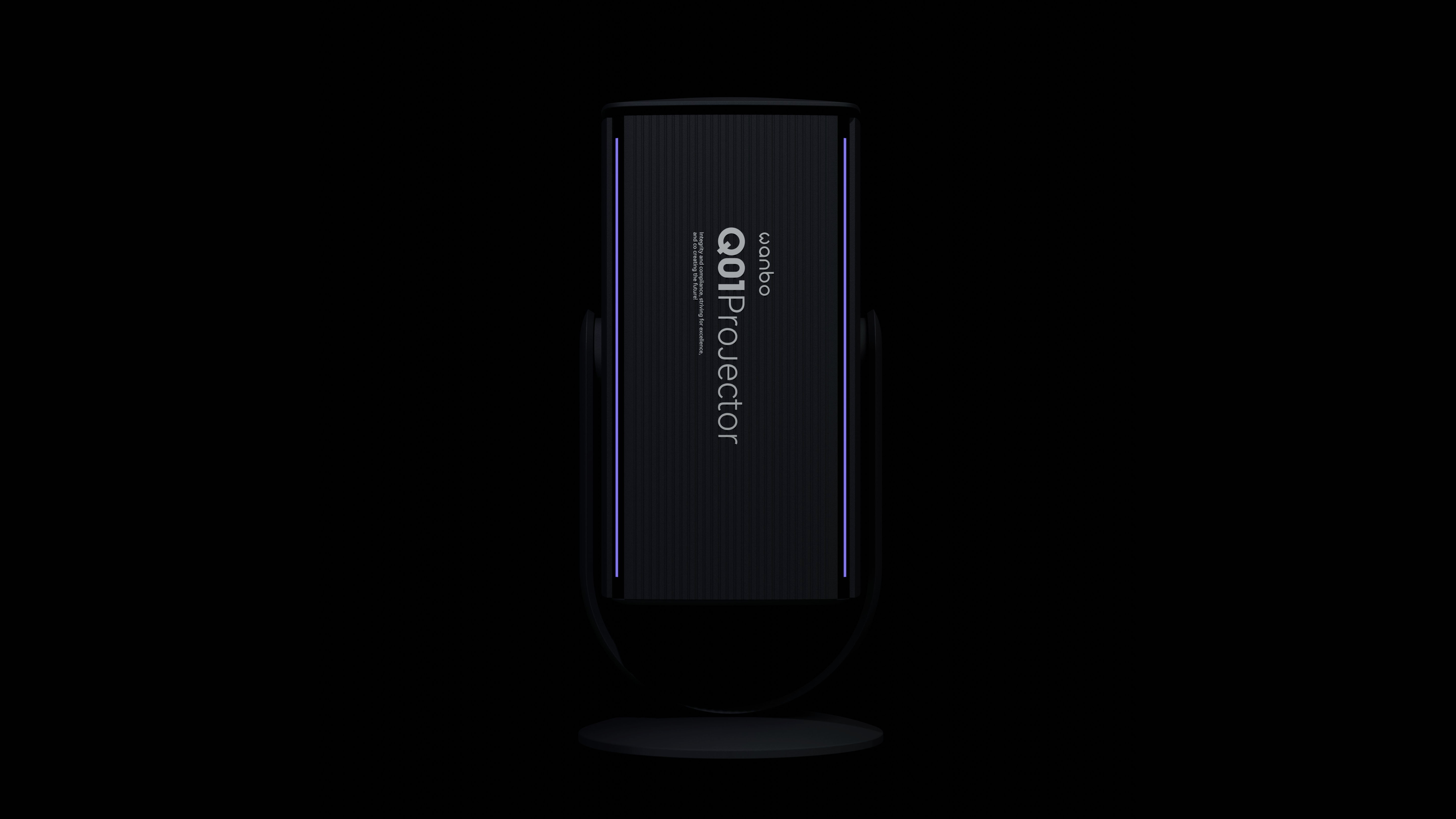
This is a bit like a microphone, a partial function-oriented scheme, four status lights is an interesting attempt.
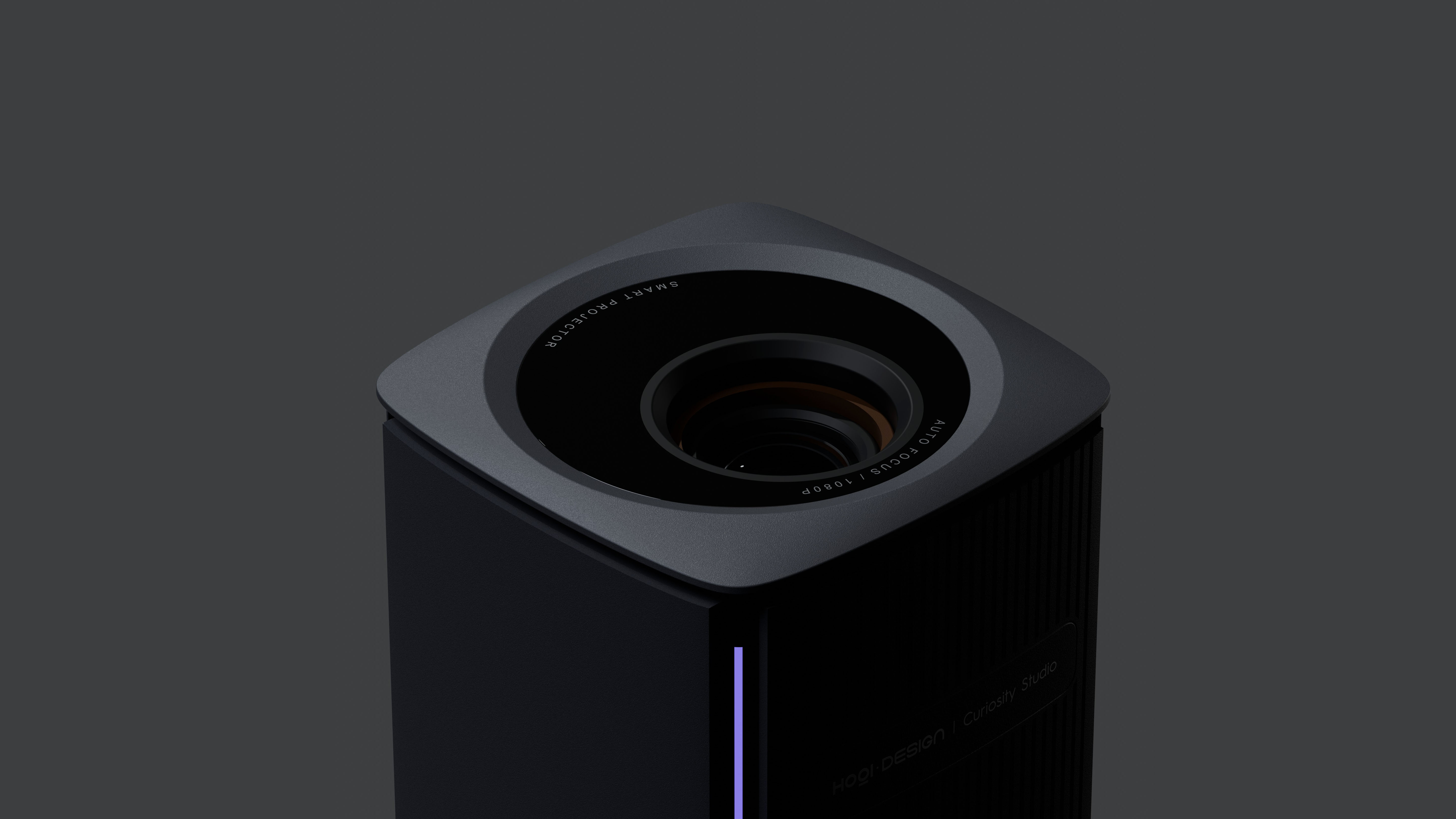
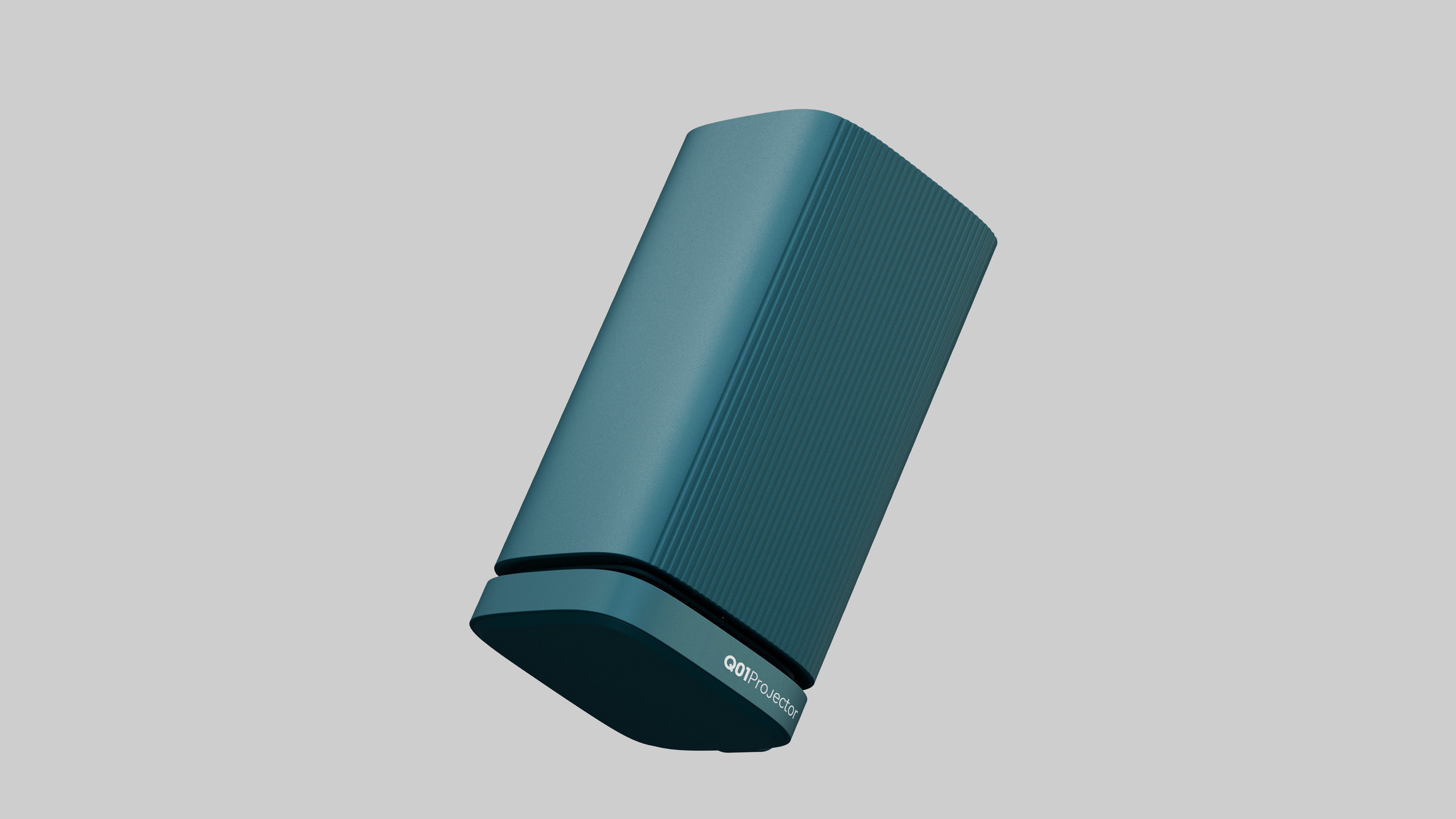
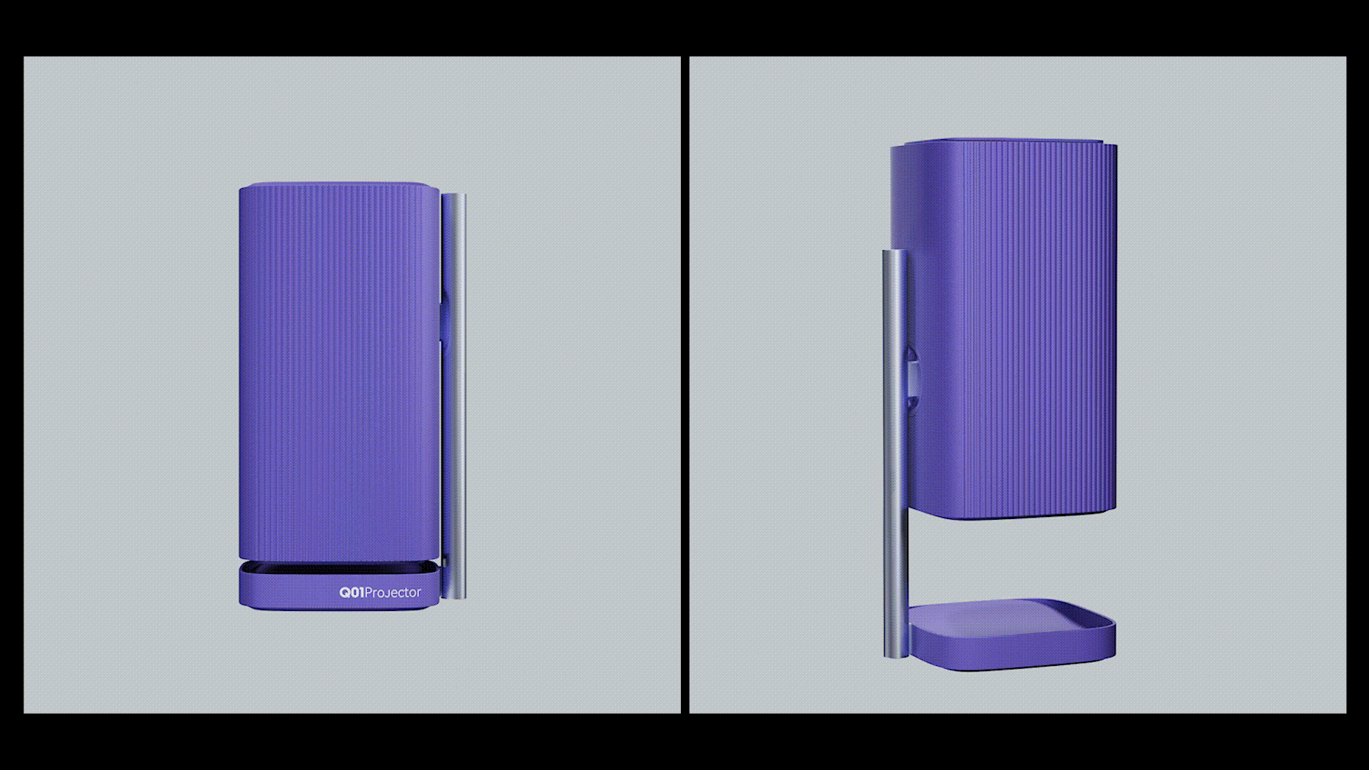
This is actually based on the extended design of the first scheme, which will be more compact and reduce the abdominal space, which can effectively control the cost.
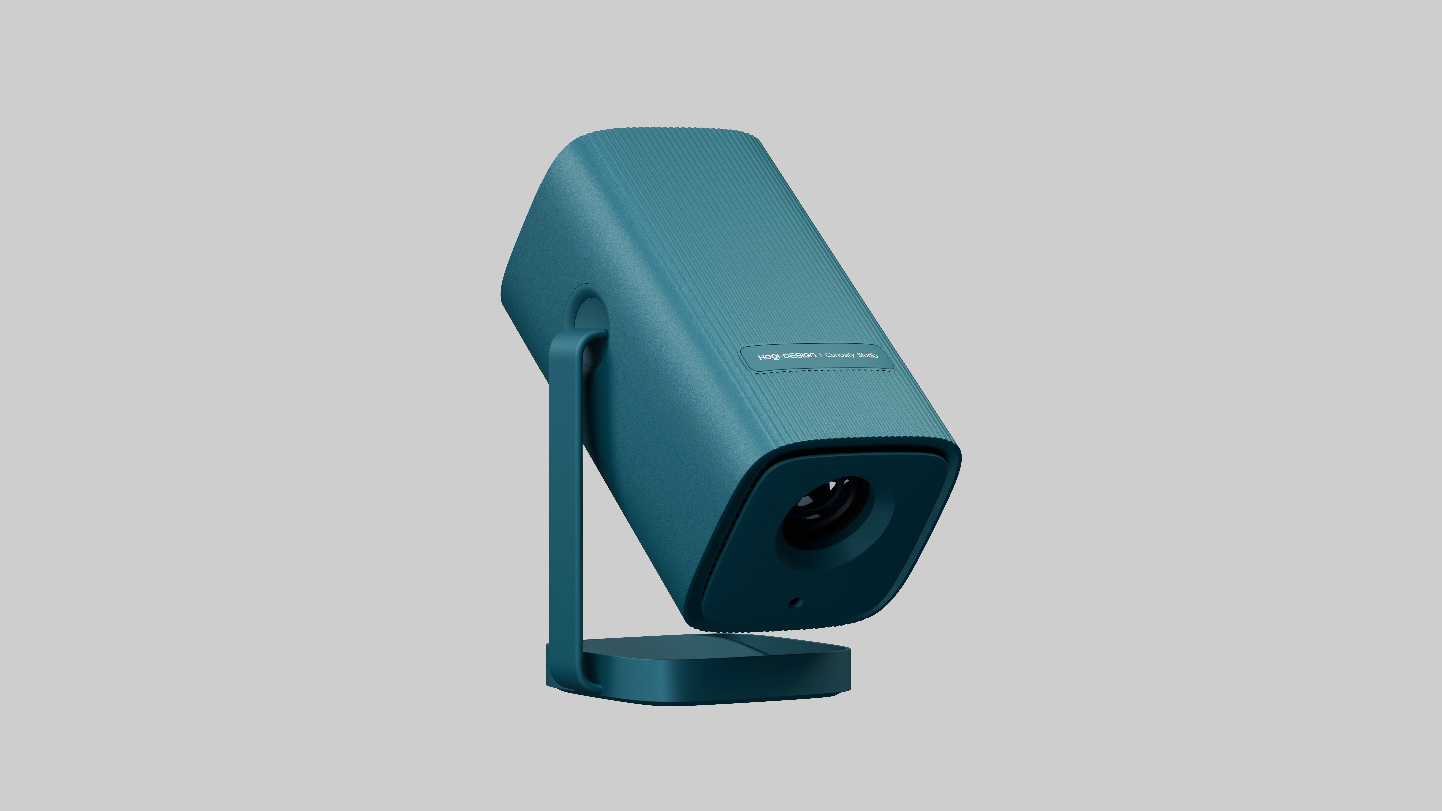
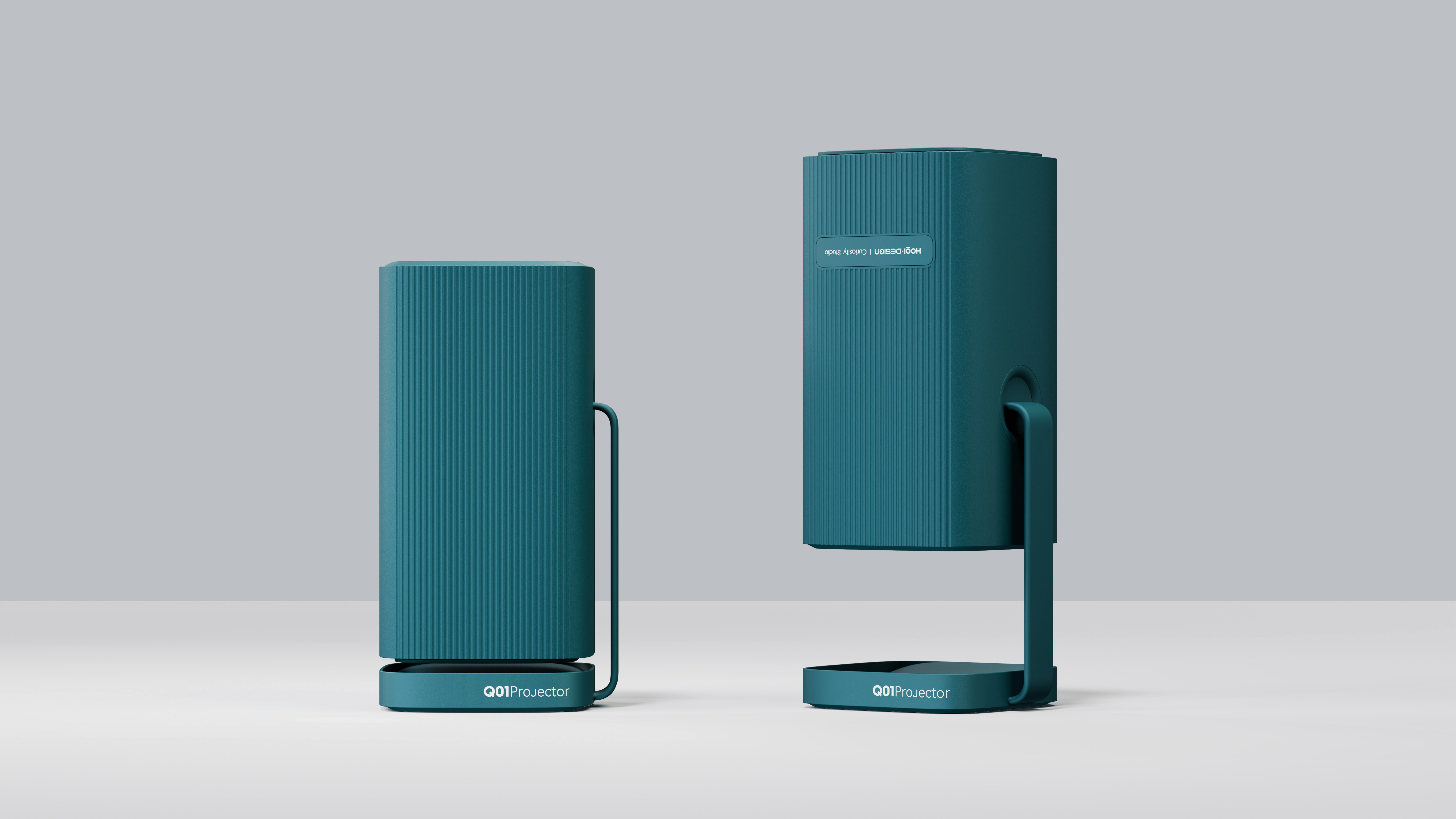
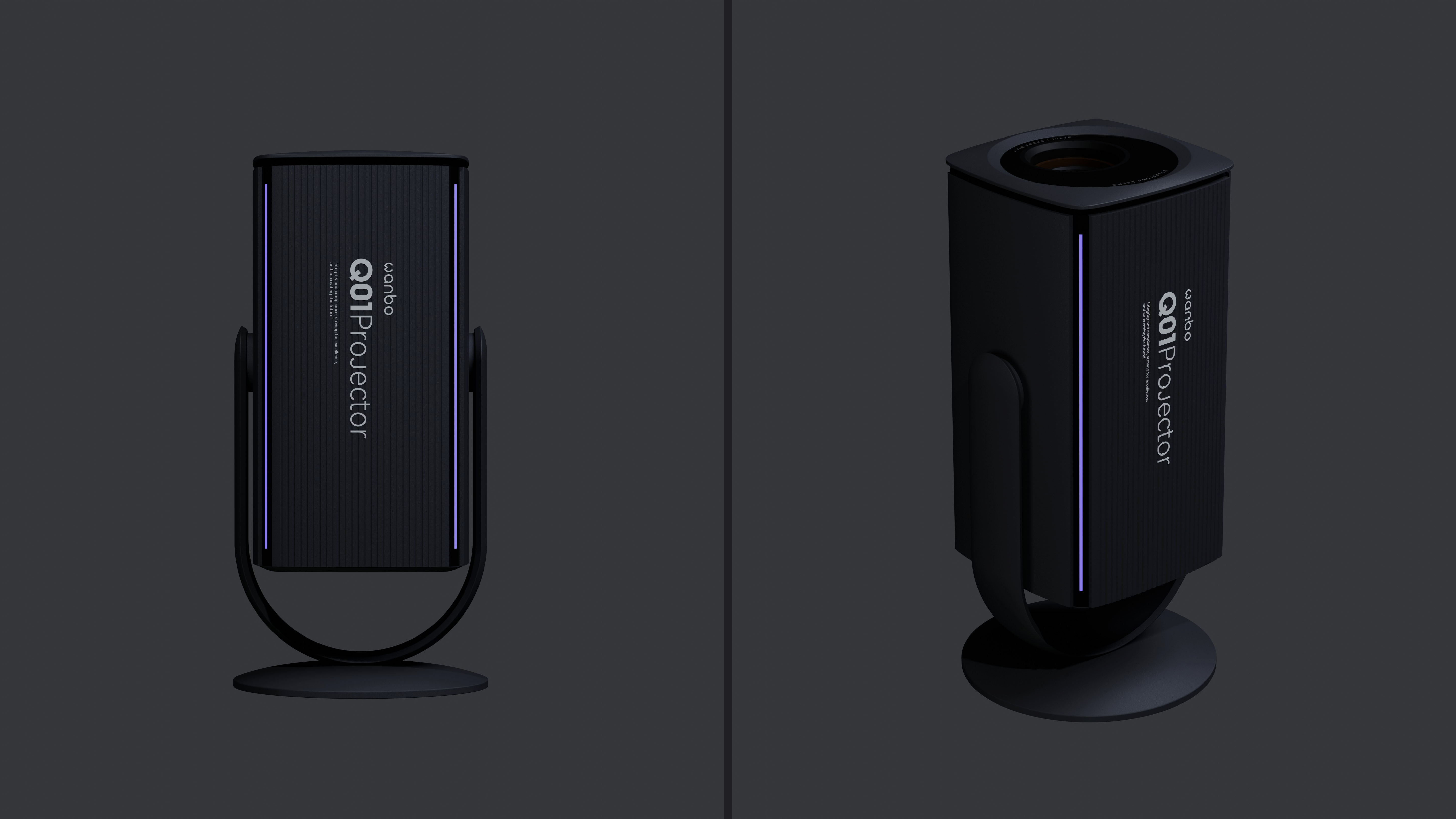
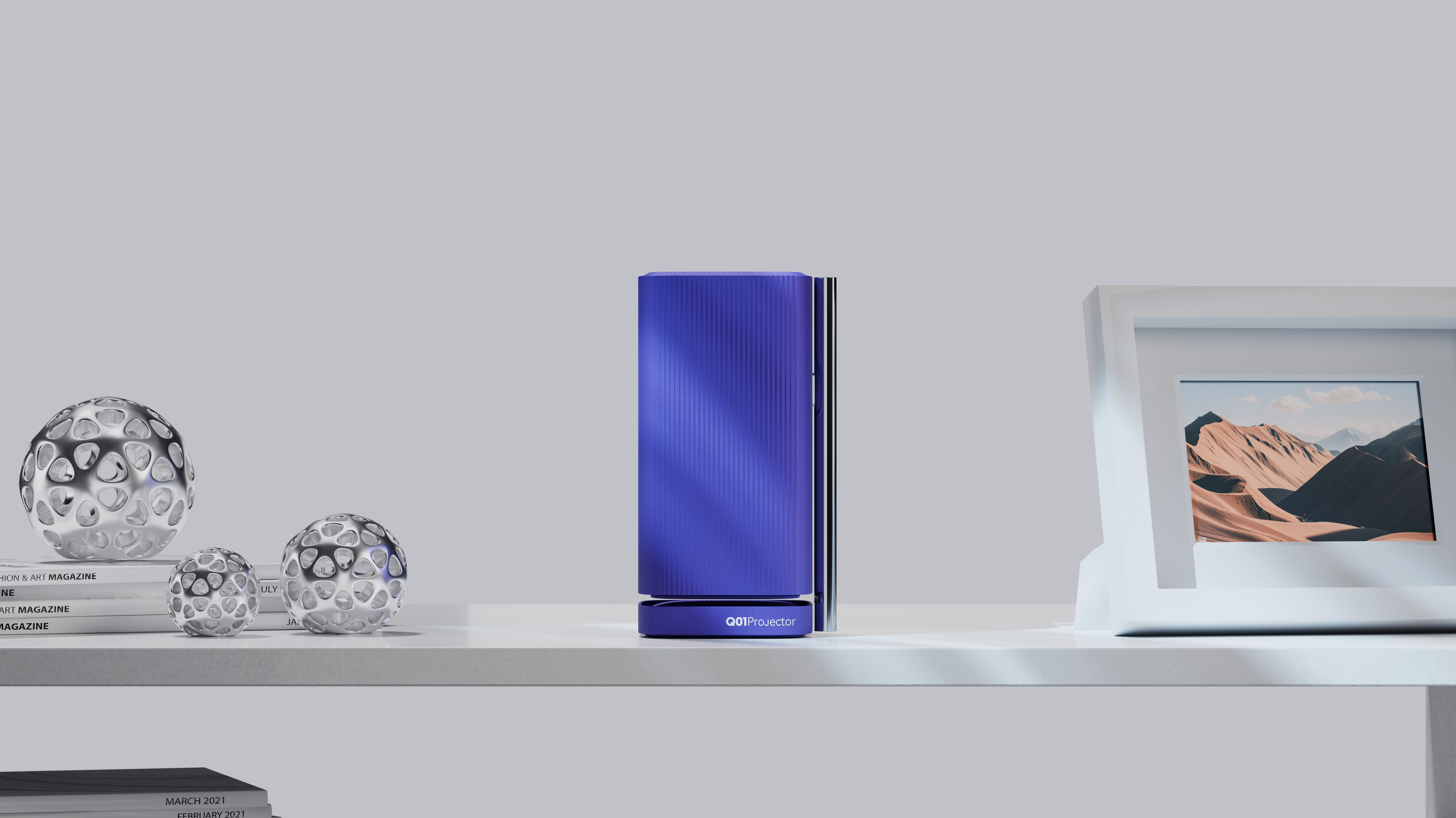
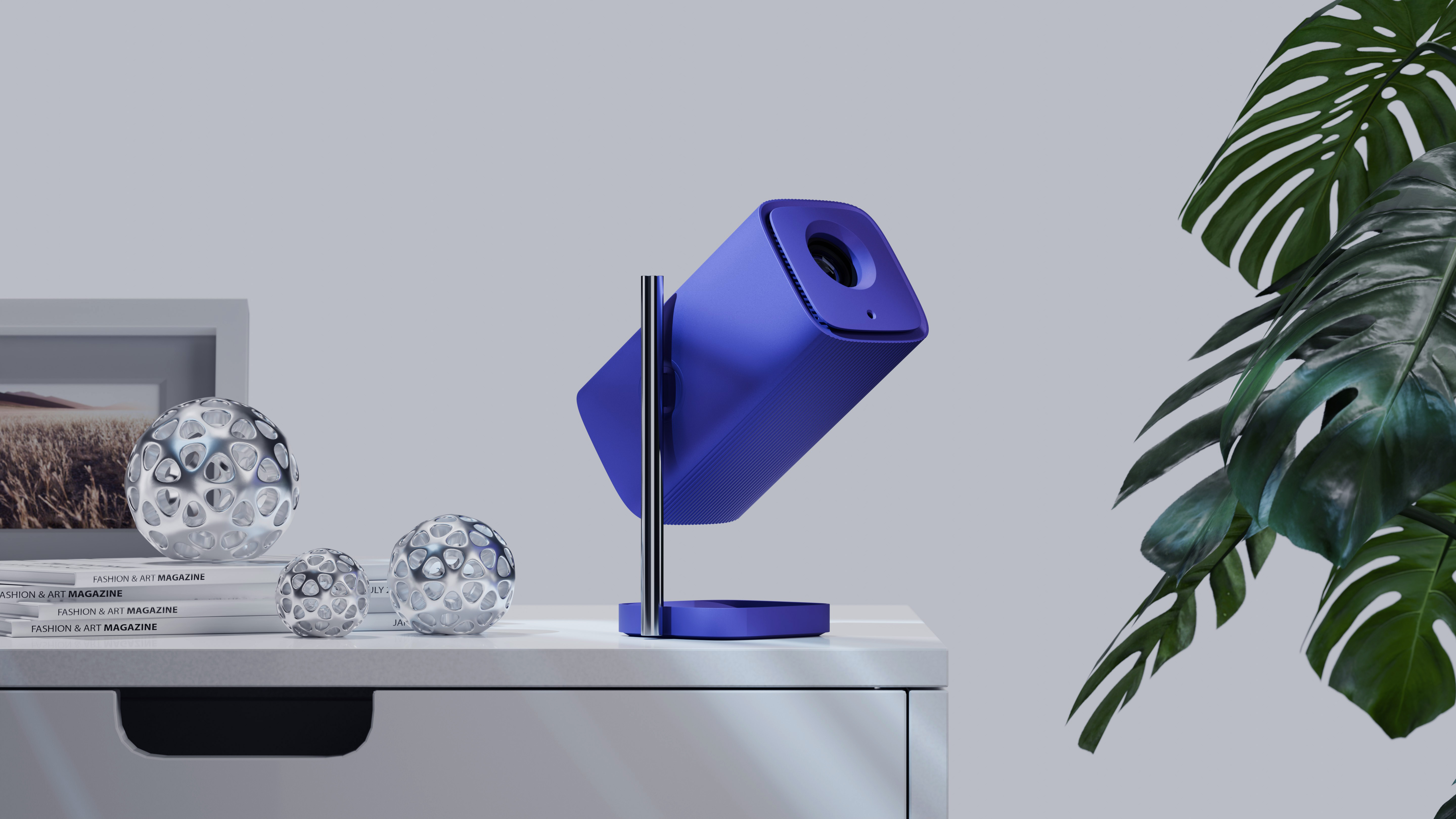
This is also an extended design based on the first scheme. Adding metal materials can effectively improve the texture.
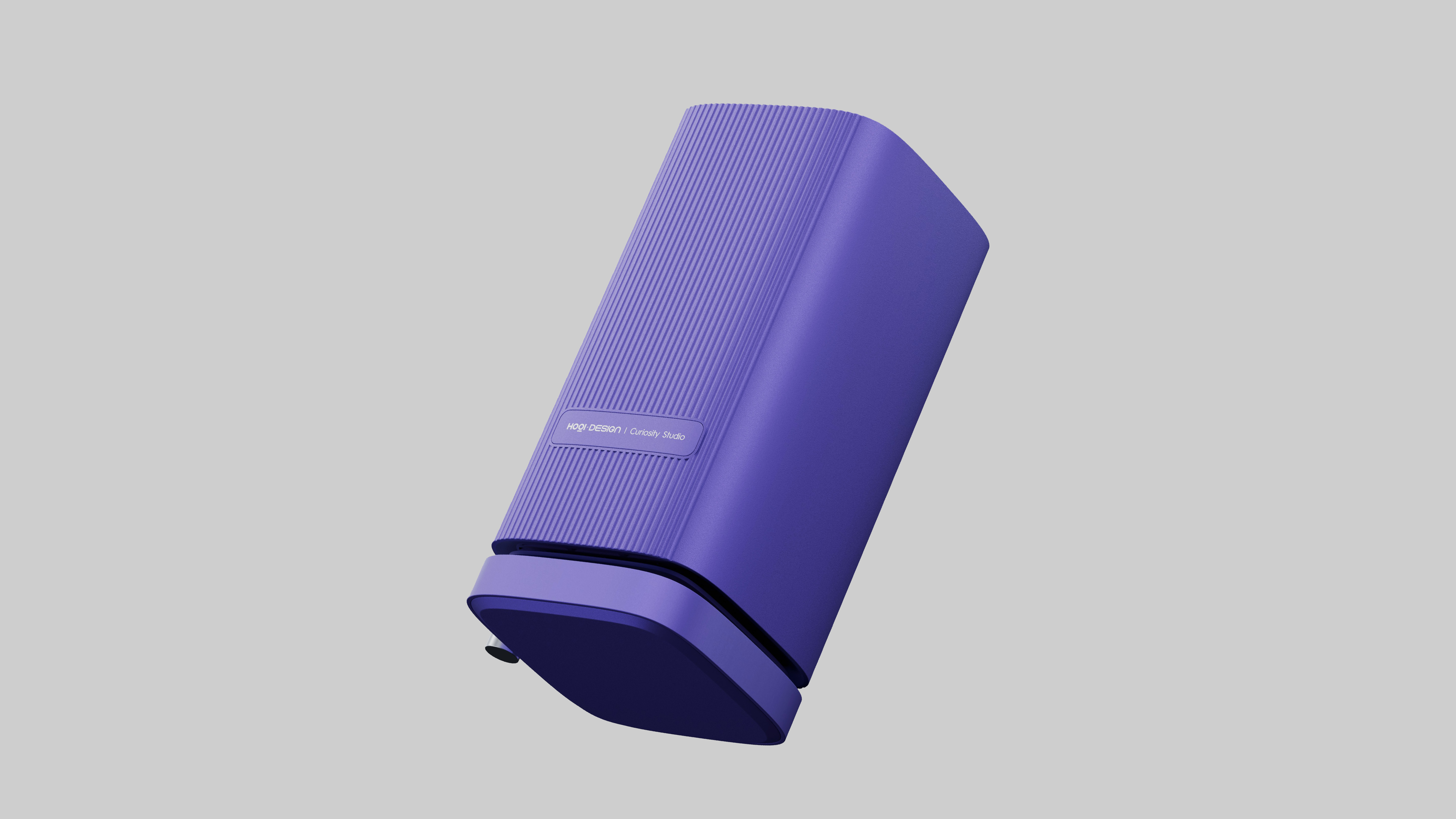
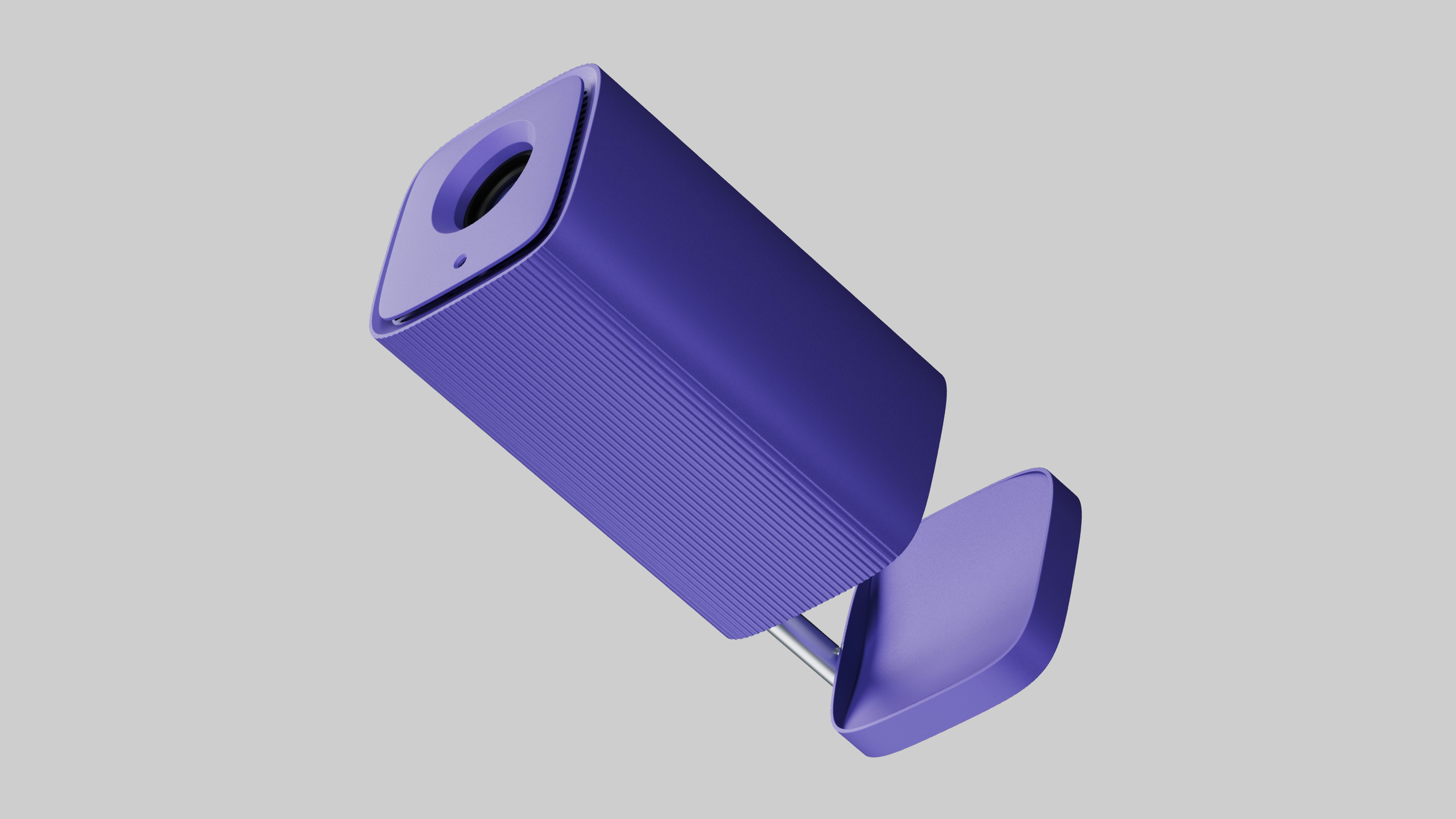
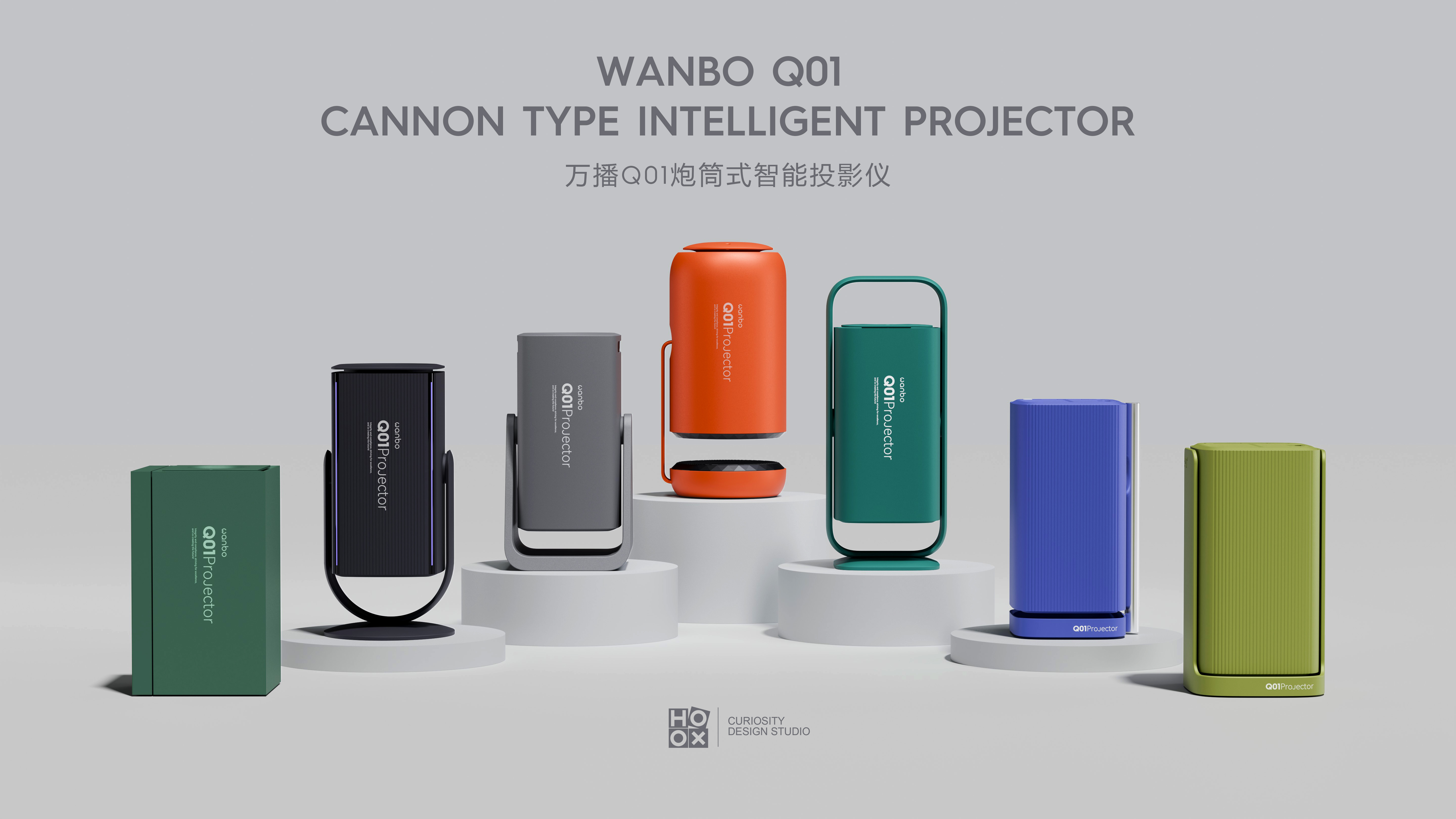
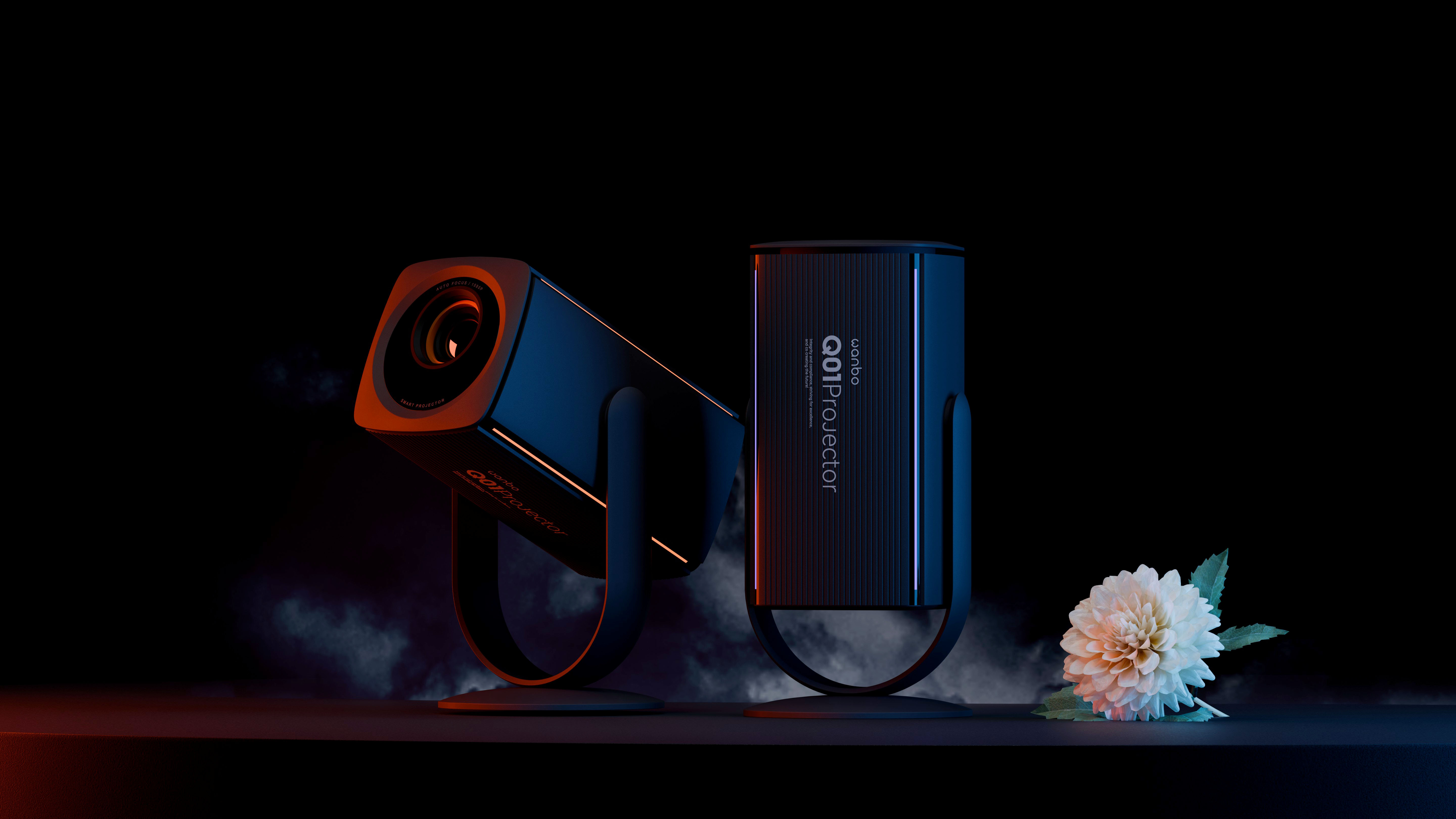
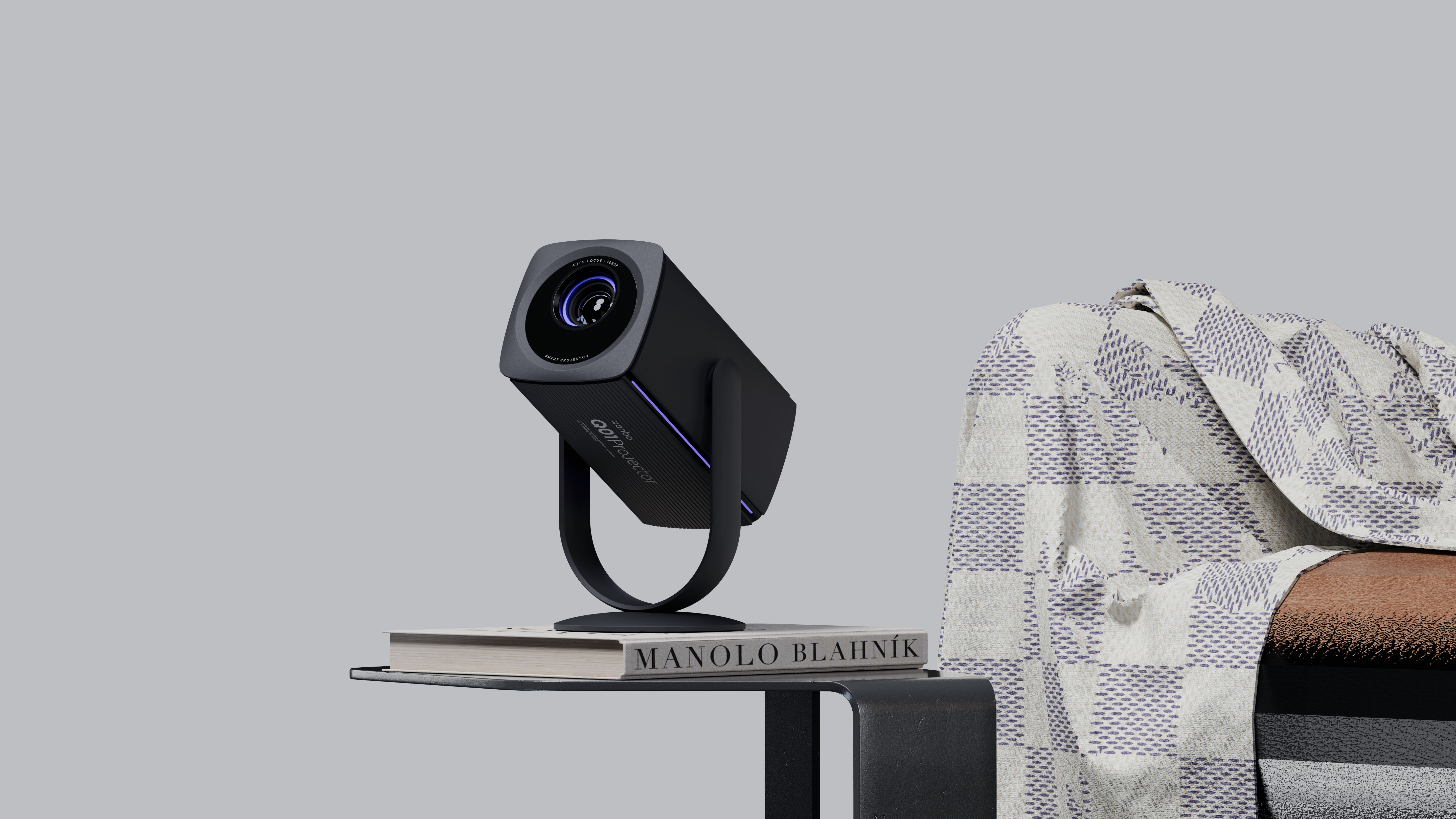
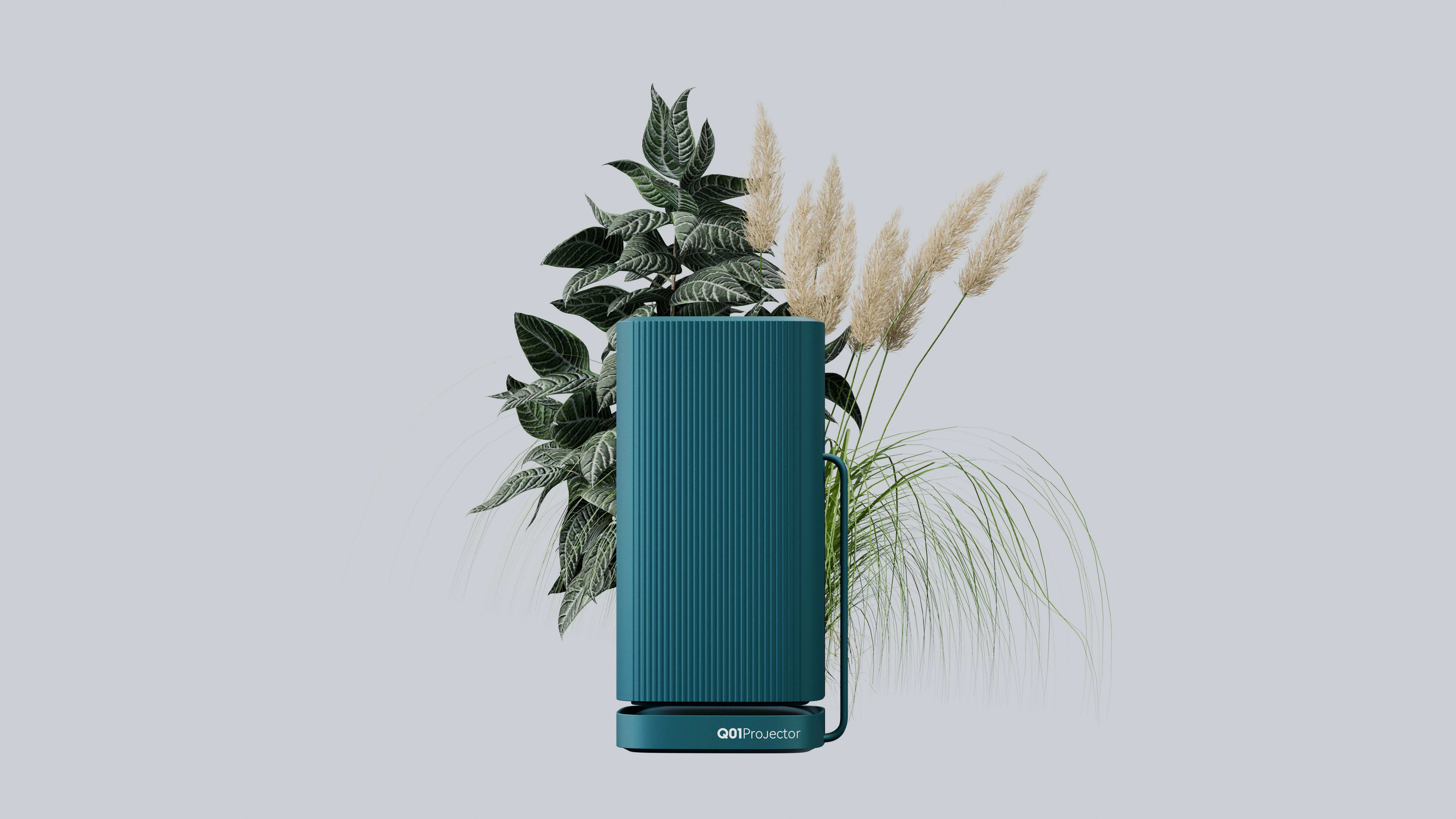
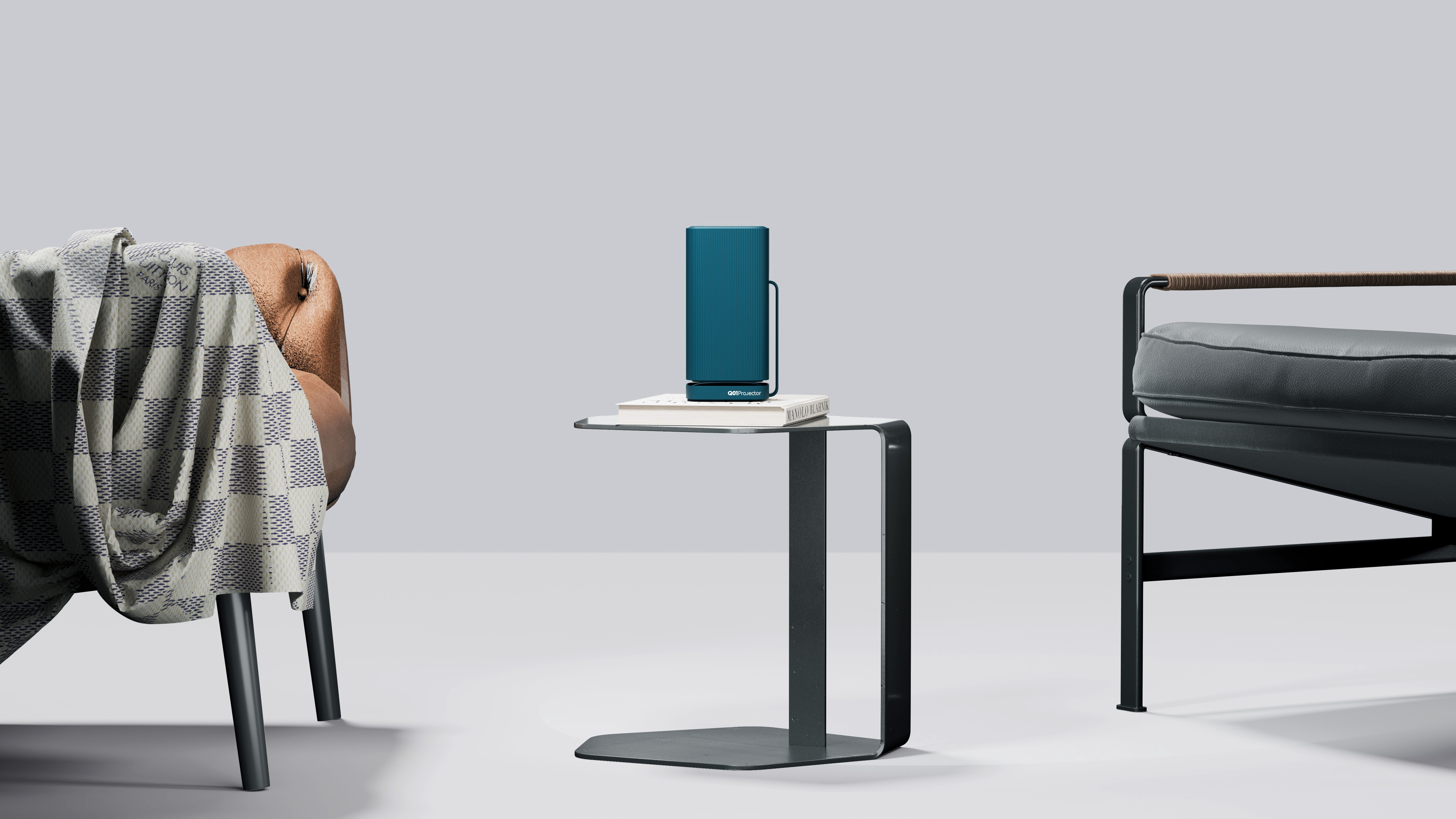
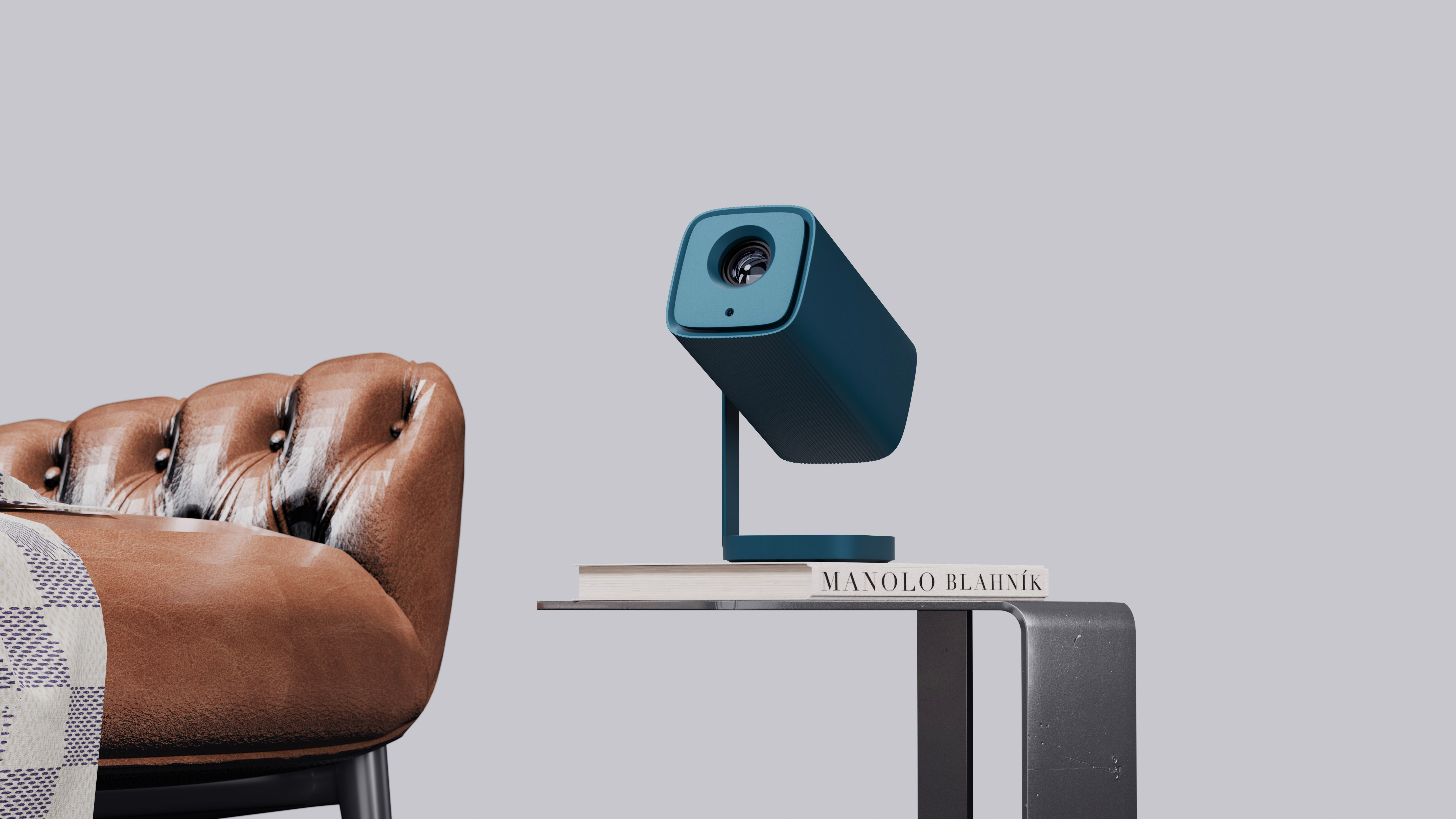
This is the whole effect diagram scheme. Of course, there are several times more schemes for two-dimensional graphic design, which are more bold and innovative. I hope there is still a chance to share them.
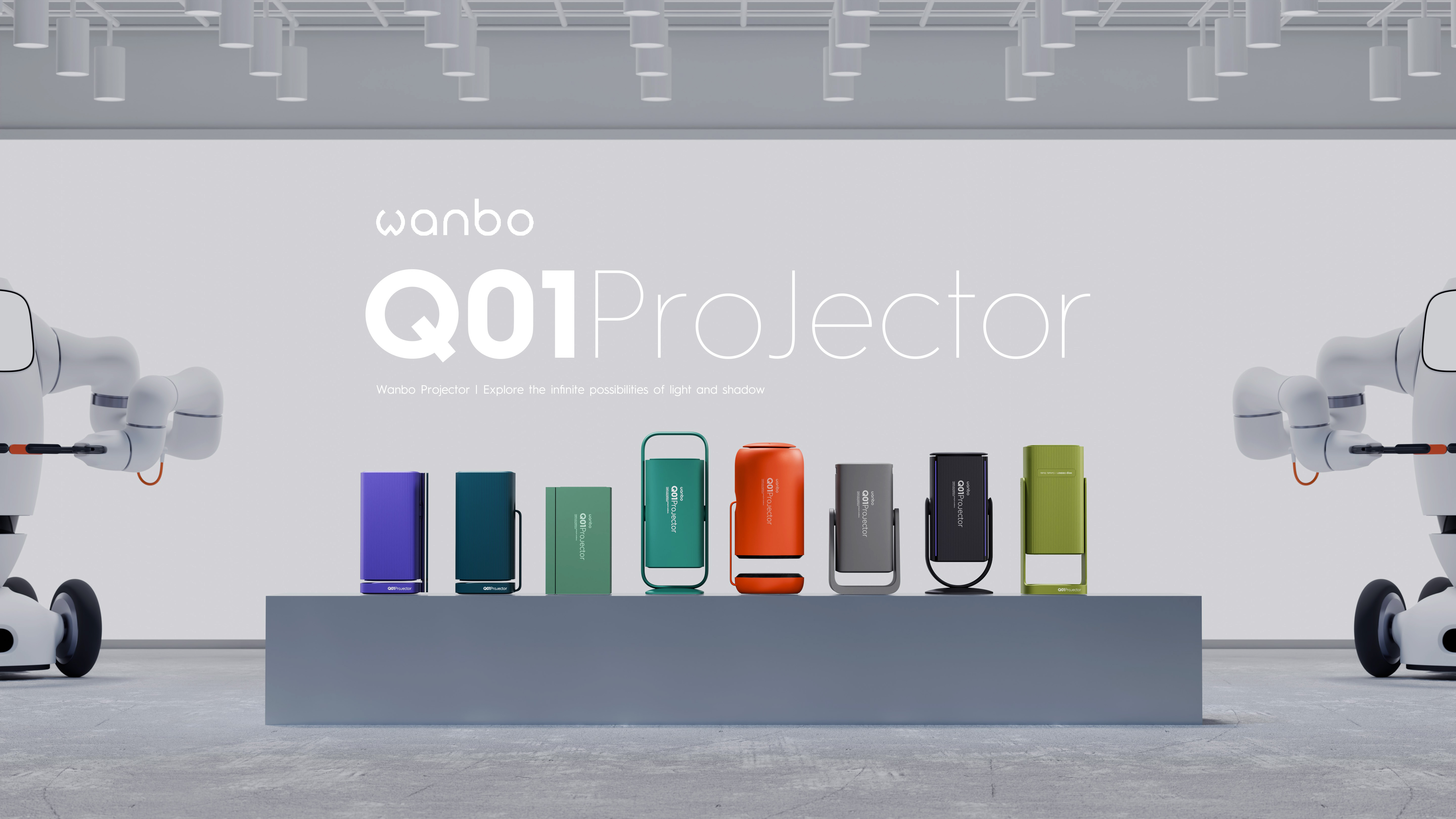
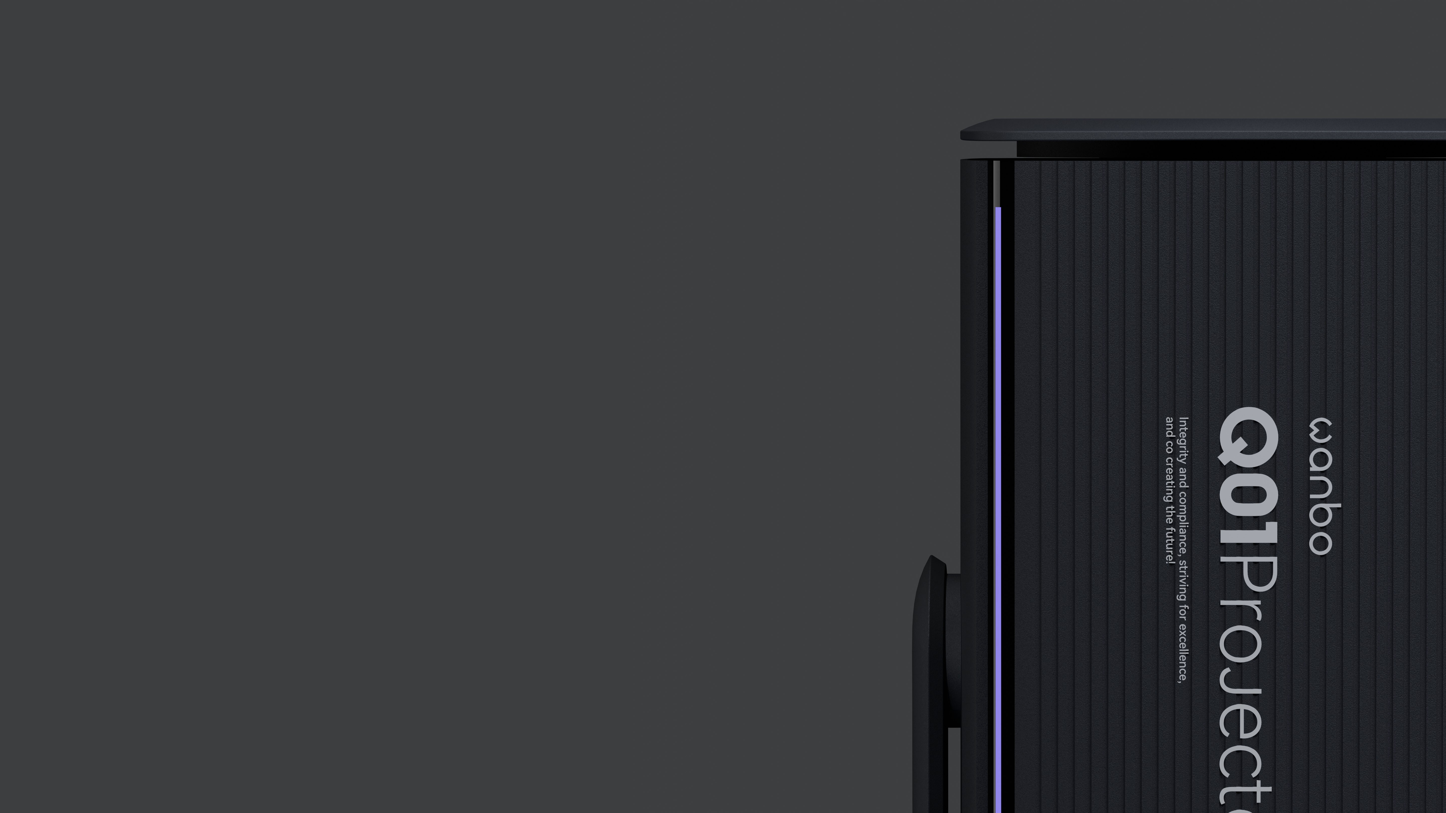
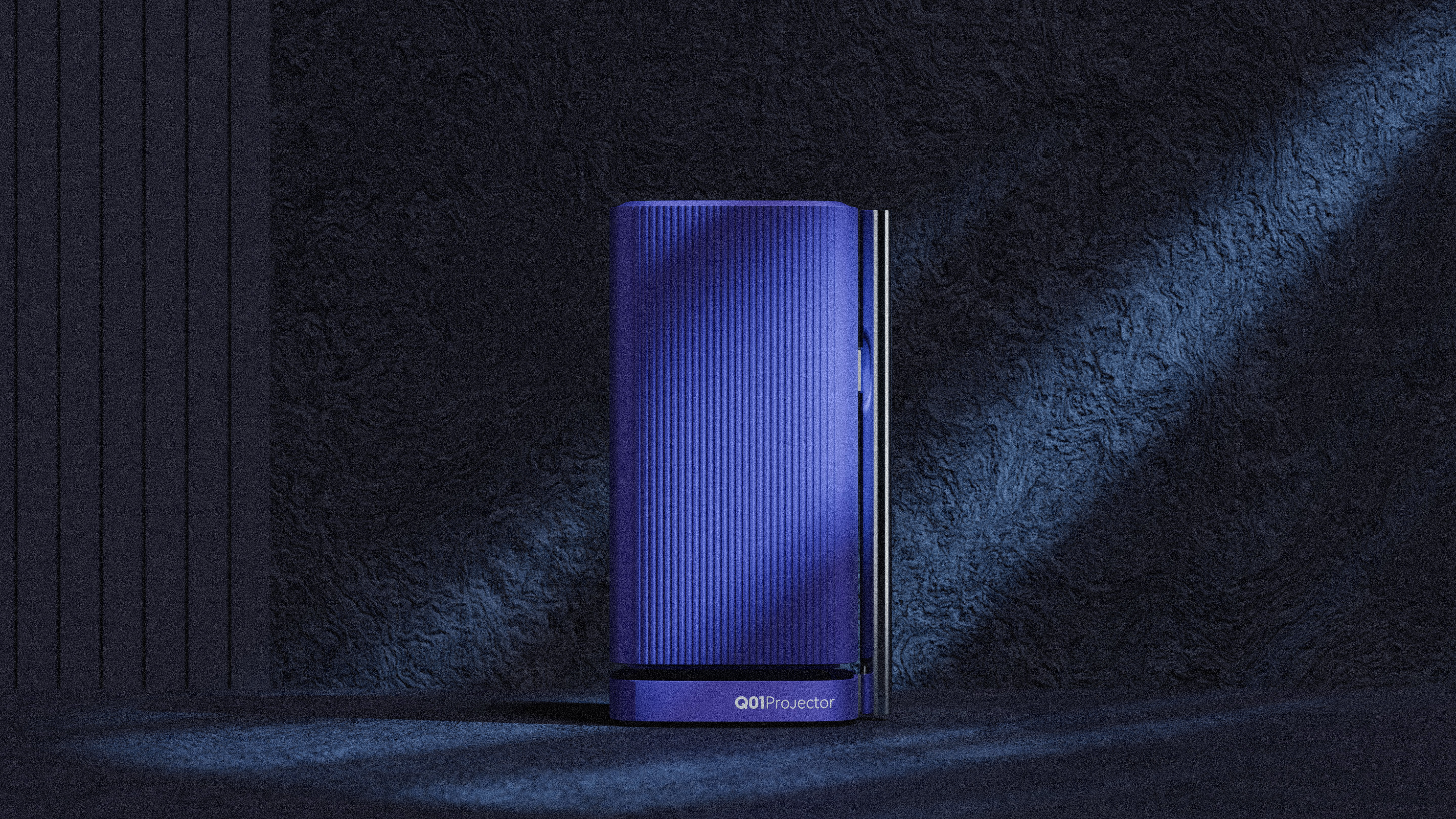
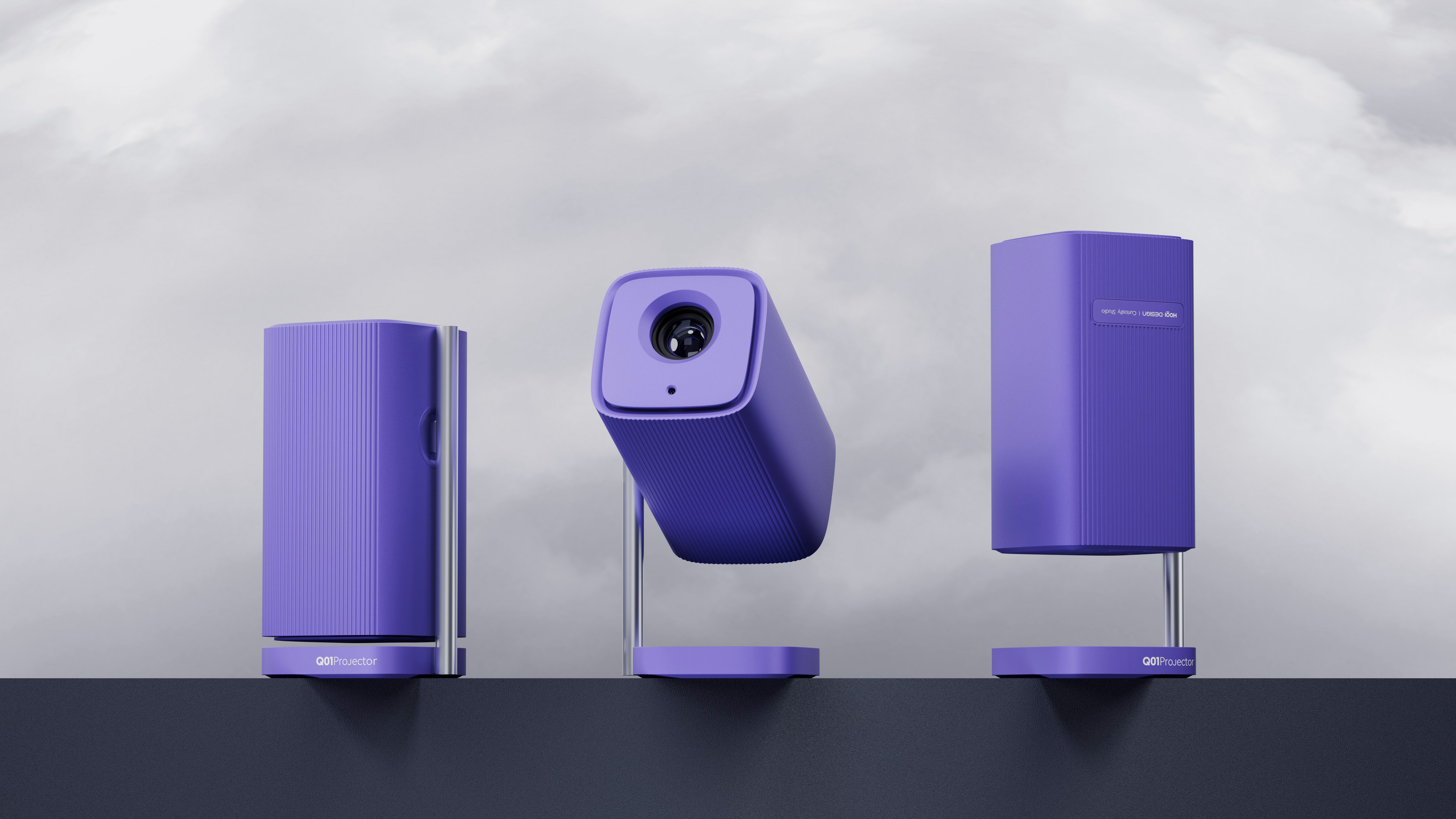
Finally, why are there so many colors? In fact, color does affect most people's judgment, but there is no way, I just like color matching, whenever the product to color matching link is not far from the landing, this link is also the most willing to run the factory when. Everyone's aesthetic experience is somewhat different, so I hope we can have friendly exchanges... Don't spray it if you don't like it...

新用户?创建账号
登录 重置密码
请输入电子邮件以重置密码。


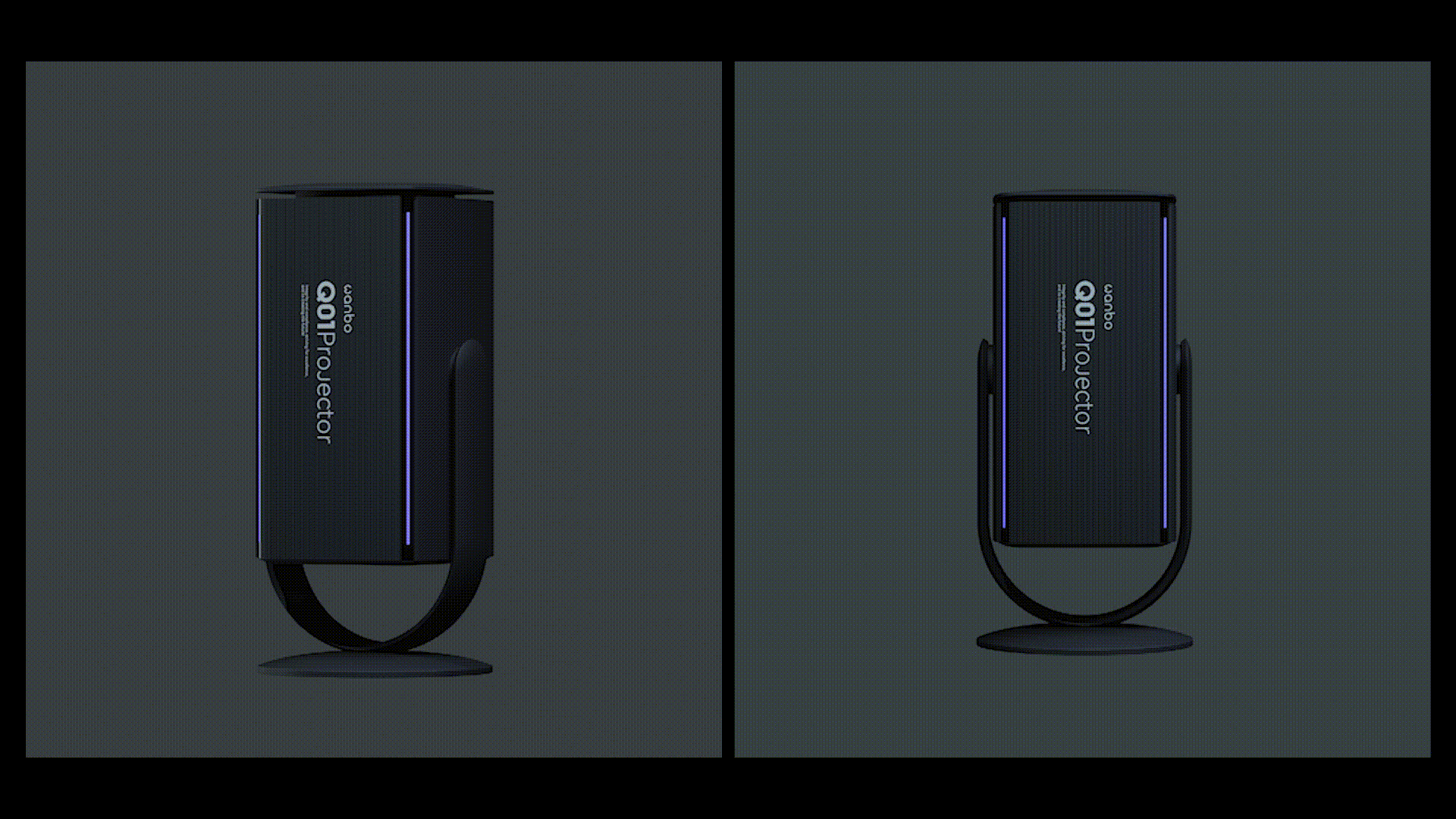
The direction point is still very interesting.
Invincible
I like the orange one in the middle, huh
beautiful
Fashion
The idea is too special.