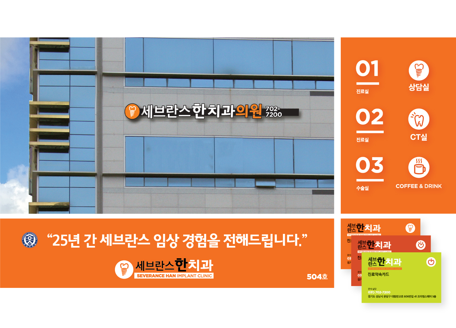
is a dental clinic that specializes in dental implants. The core of the brand identity is to convey reliability and assurance. The main logo, composed of the crown of a tooth and the screw part of a bulb, emphasizes the clinics specialty in dental implants. Apple and heart shapes were used to communicate healthy teeth and warmth. Since the majority of the clinic's patients are senior citizens, the wordmark was designed to be clearly visible and legible by using large fonts and a distinct orange color. The proposed brand identity has been applied to stationary, signs, and online communications of the clinic.
Country
Korea
Year
2017
Affiliation
gourmet graph
Designer
Jiyon Han
[K design award]
[www.kdesignaward.com/]


留言板 (0)
评论为空