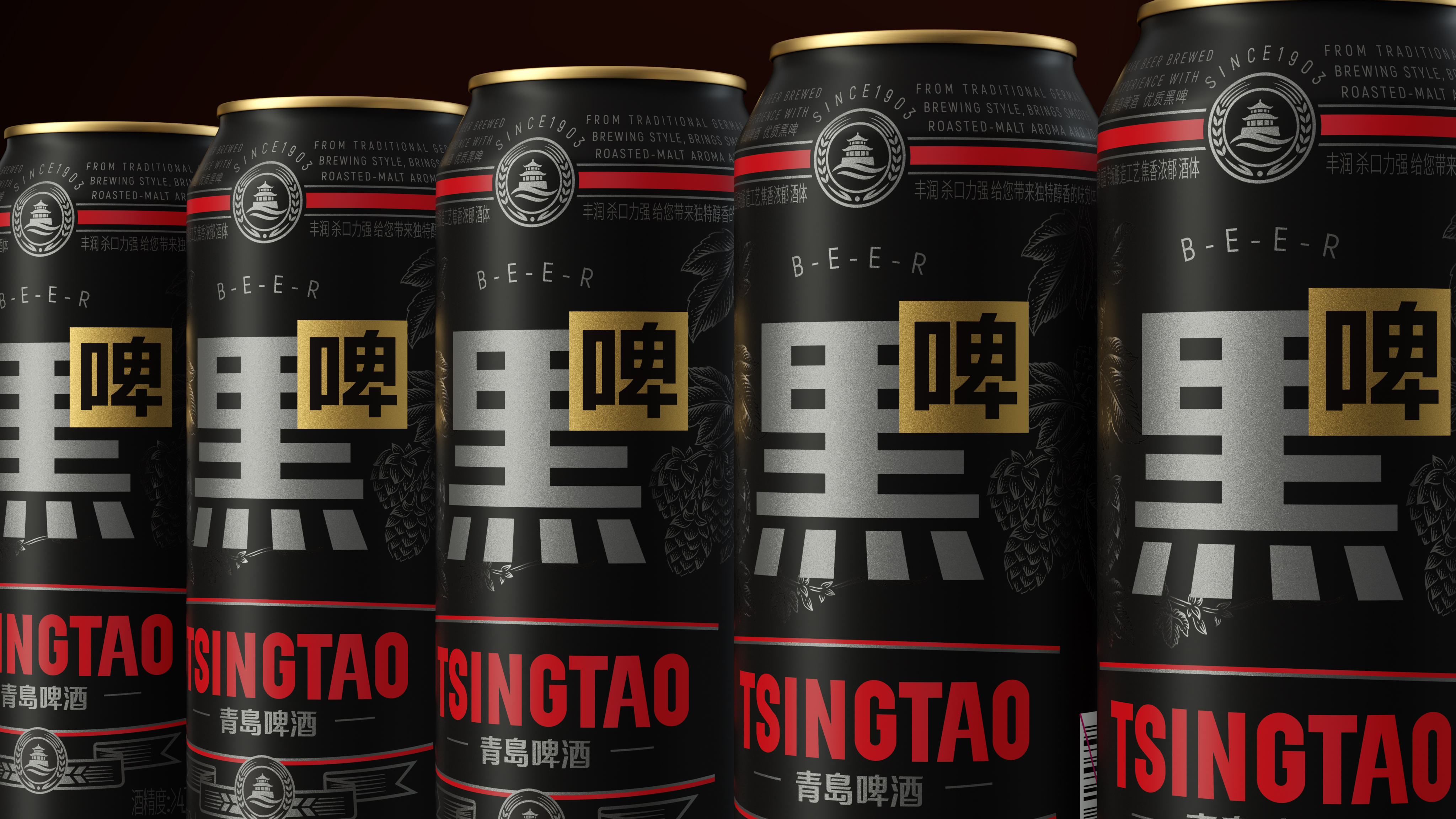
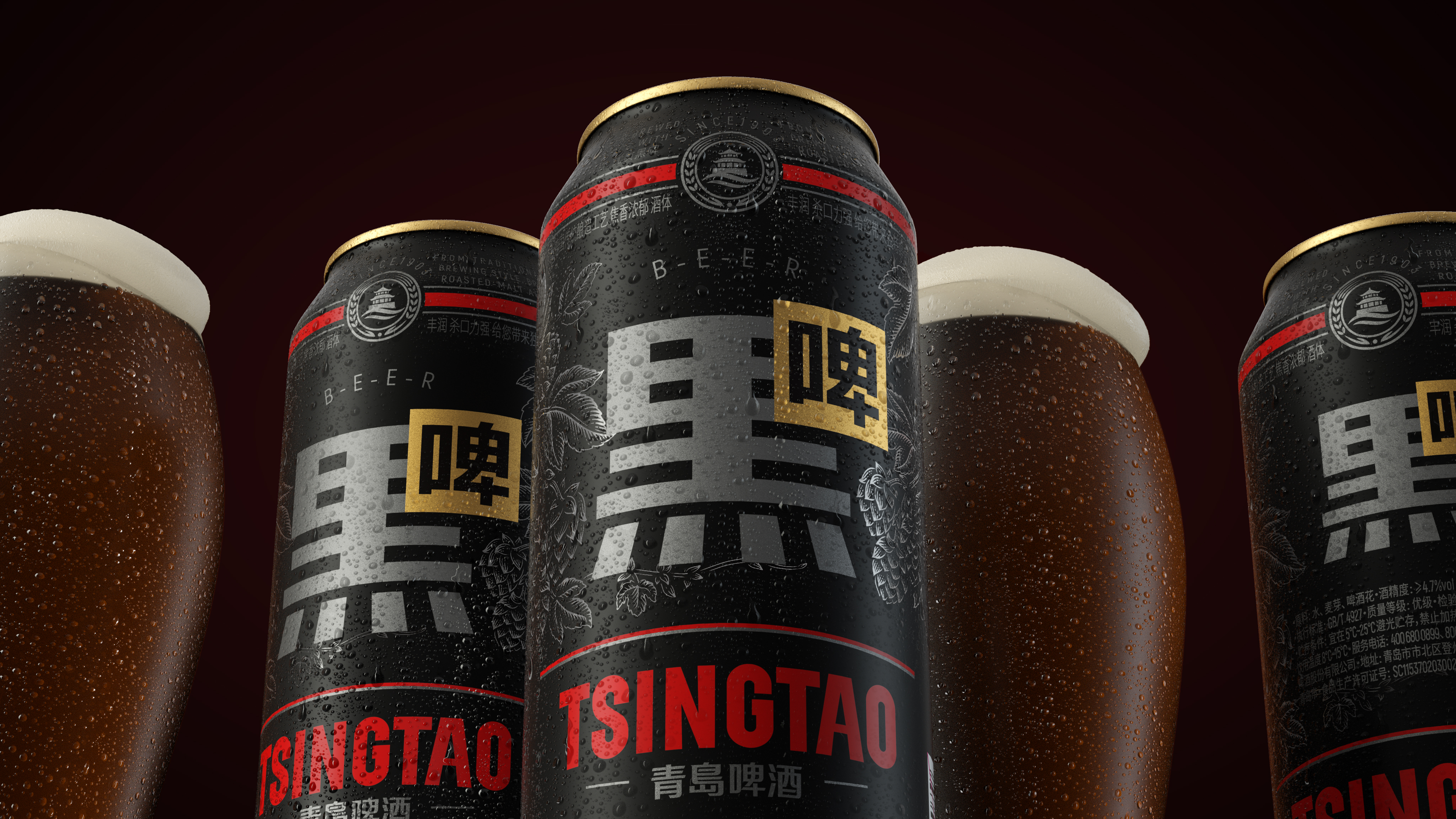
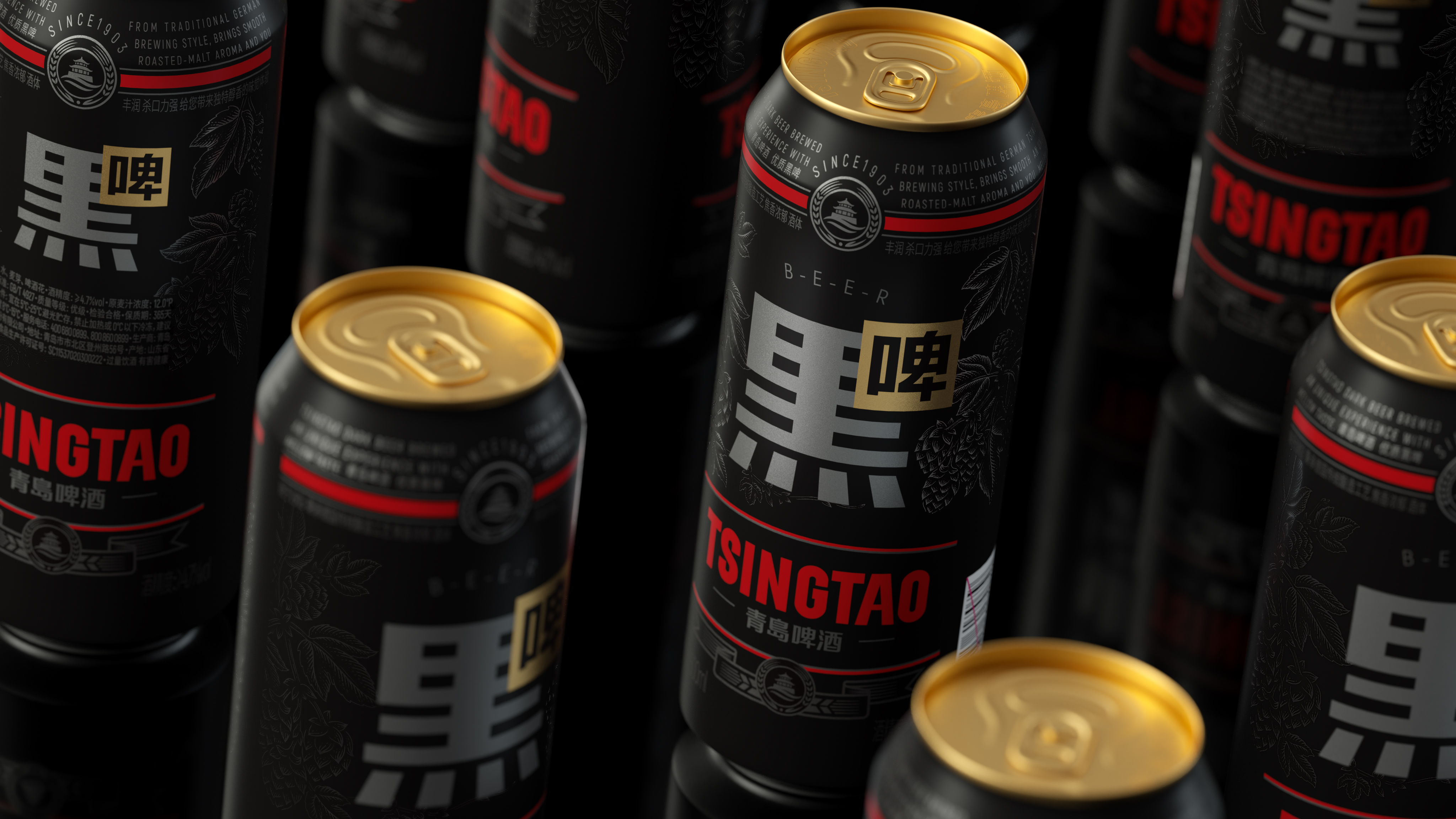
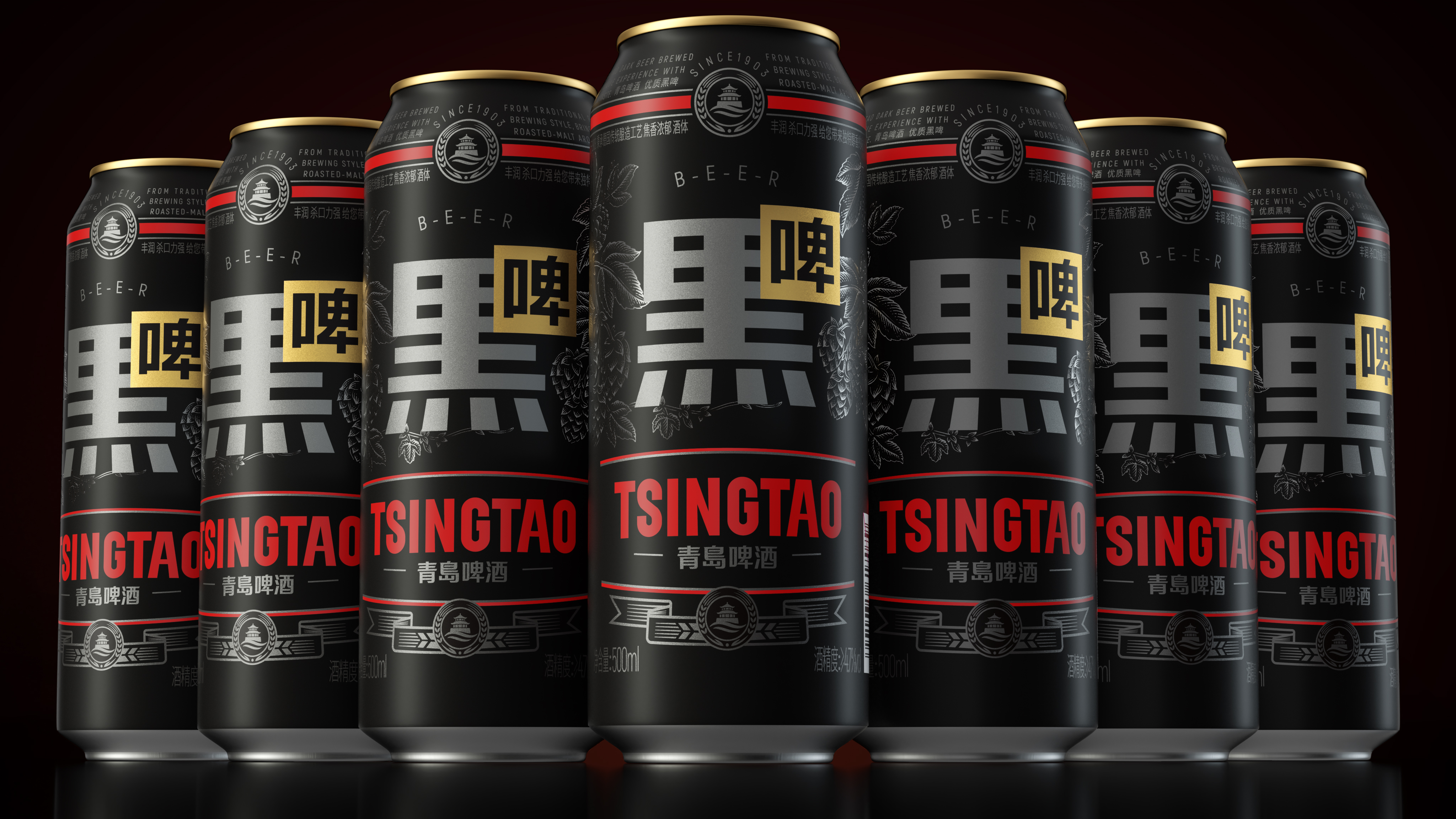
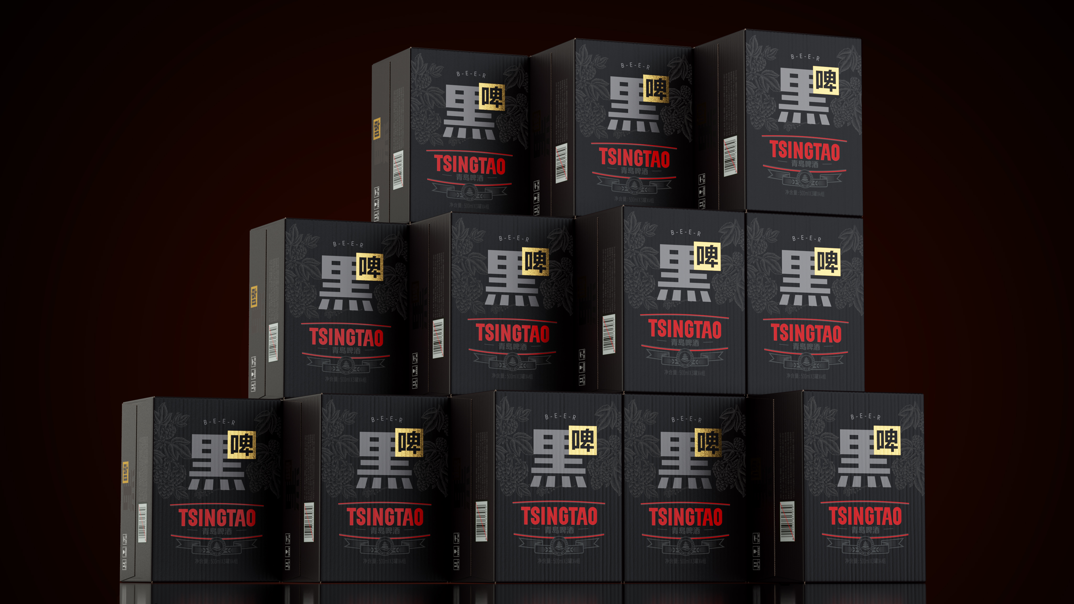
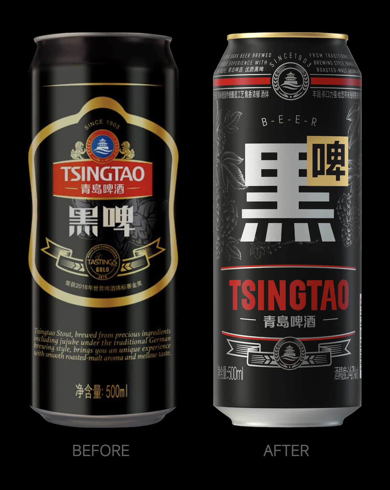
The stout market has always been a niche but huge potential field. China's stout market is still a blue ocean, but it is also facing serious homogenization challenges. Faced with 90% of the "foreign goods" black beer, which is mainly in English, Tsingtao Beer and Pan Hu Design Laboratory once again jointly decided to break the limitation and redefine this category with concise and modern design language, integrating the rich texture of black beer with classic style, enhancing brand recognition, and satisfying the pursuit of fashion and quality by a new generation of consumers.
"Chinese characters are the most concise and powerful symbols in Chinese culture." The core of this design upgrade is to return to Chinese characters, reshape cultural symbols, and strengthen the uniqueness and cultural value of products. Chinese is not only a communication tool, but also an important carrier of brand culture. The packaging of Chinese characters not only makes Qingdao stout unique on the shelves, but also shows the brand's respect and confidence in local culture. Chinese characters are intuitive and powerful, removing the "foreign characters" that go around, reducing the visual pressure, doubling the efficiency of communication and hitting people's hearts directly.
Name of Work-Tsingtao Beer Stout
Brand Holding | Tsingtao Brewery Co., Ltd.
Original Design, Tiger Pan
Executive Design, Yuan Wenhao
Illustration Drawing, Yi Ping
Visual Presentation, Zhu Yuling
Process Design, Xie Zhangkun, Lu Miaorong
Project Management
Media Relations | Xiang Lingli Xu Wenjing
本作品版权归 潘虎设计实验室 所有,禁止匿名转载及个人使用,任何商业用途均需联系原作者。

新用户?创建账号
登录 重置密码
请输入电子邮件以重置密码。


High level promotion ~
The packaging is cool.
black is good
Looks good to drink