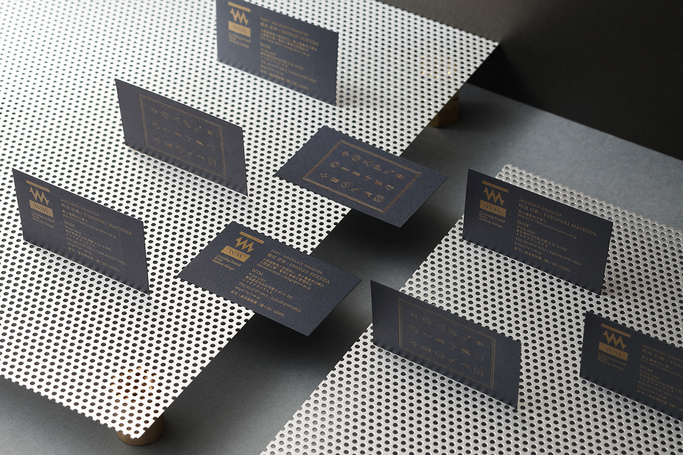
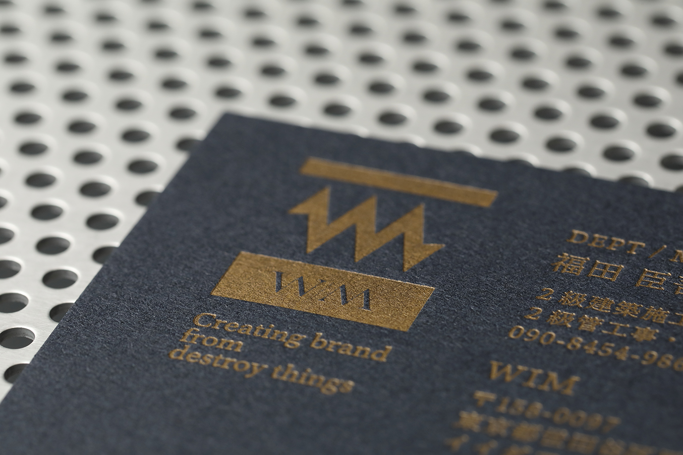
Because I think it's a good idea to strengthen the story of WIM's past 20 years of experience in demolition & facility design, I decided to brand the company using the word "Mechanic". I designed the W & M to look like an electrical schematic of a resistor. This represents two concepts: 1, we'll no longer be bound by the past rules of the construction industry: &, 2, that we'll step forward on a new path. This symbolizes where we've come from & where we're headed. Moreover, we used images and symbols from electrical schematics and construction tools on the card, etc. to show the brand's creativity & express the brand identity of Mechanic.

Country
Japan
Year
2019
Client
WIM
Affiliation
BEAR BRANDING INC.
Designer
YUKI
本作品版权归 K-DESIGN AWARD 所有,禁止匿名转载及个人使用,任何商业用途均需联系原作者。

新用户?创建账号
登录 重置密码
请输入电子邮件以重置密码。


留言板 (0)
评论为空