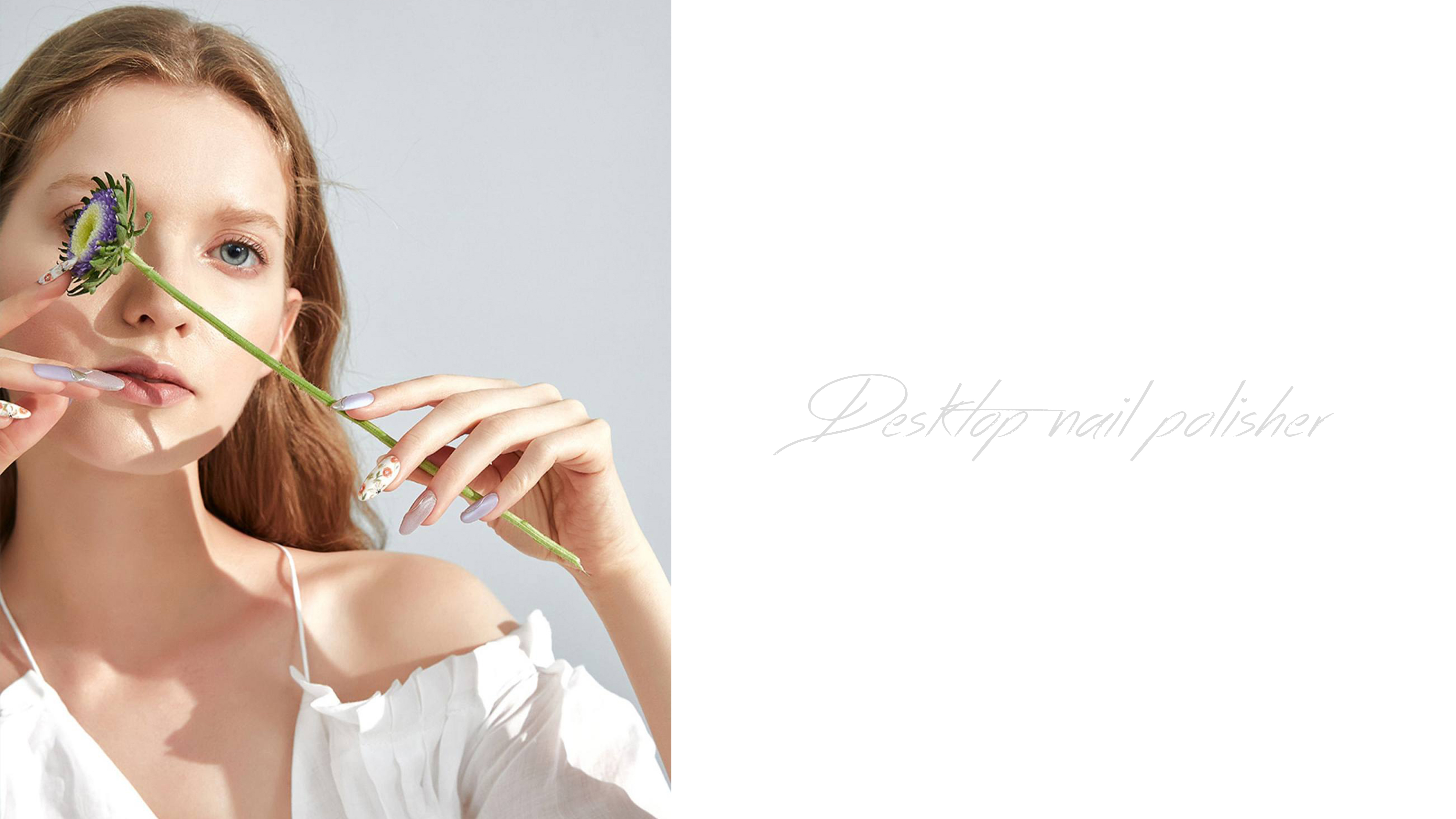
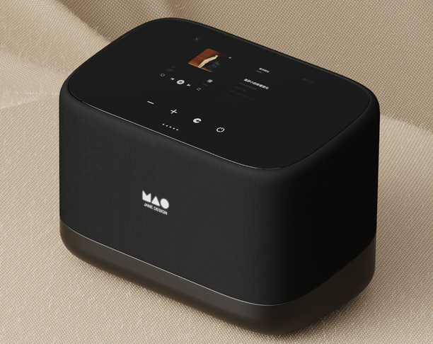
The desktop grinding machine to simple, exquisite as the core design concept, designed to provide users with a not only efficient grinding function, but also in the appearance and use experience to show a sense of advanced tools. Through simple lines, exquisite craftsmanship and classic
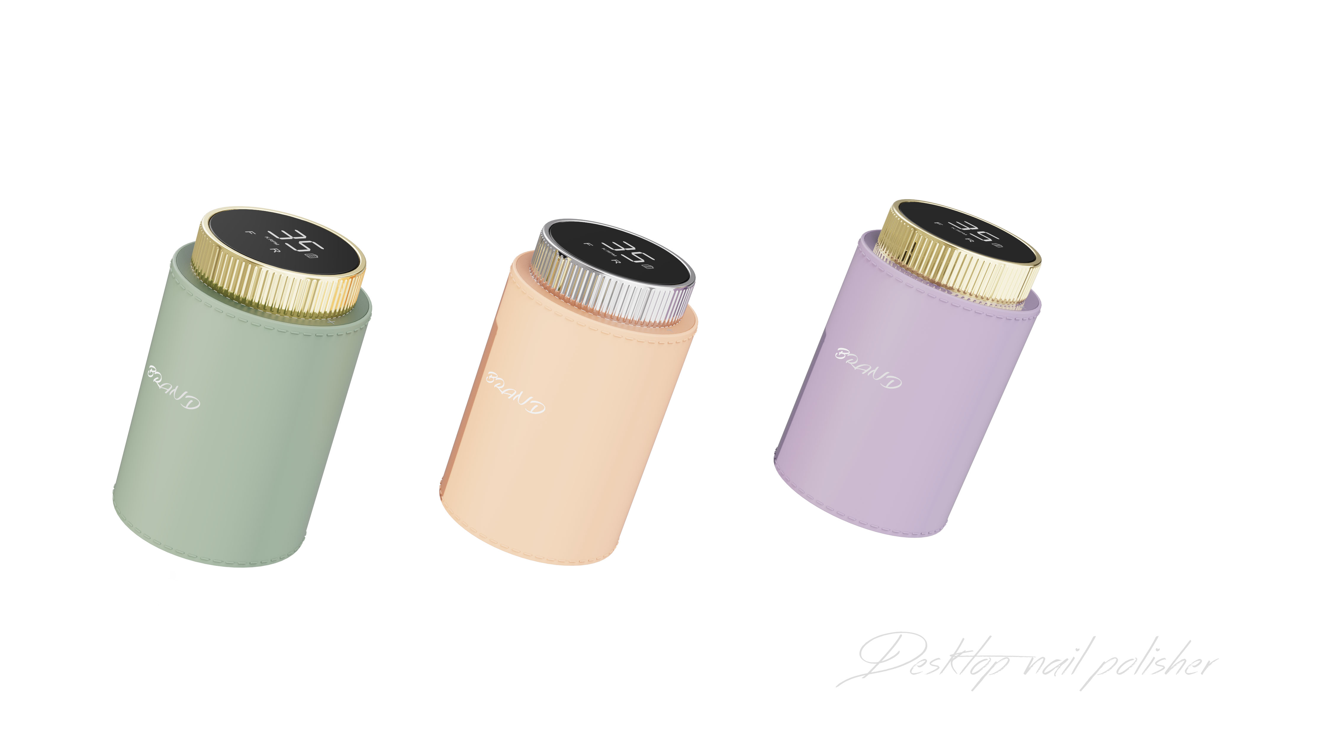
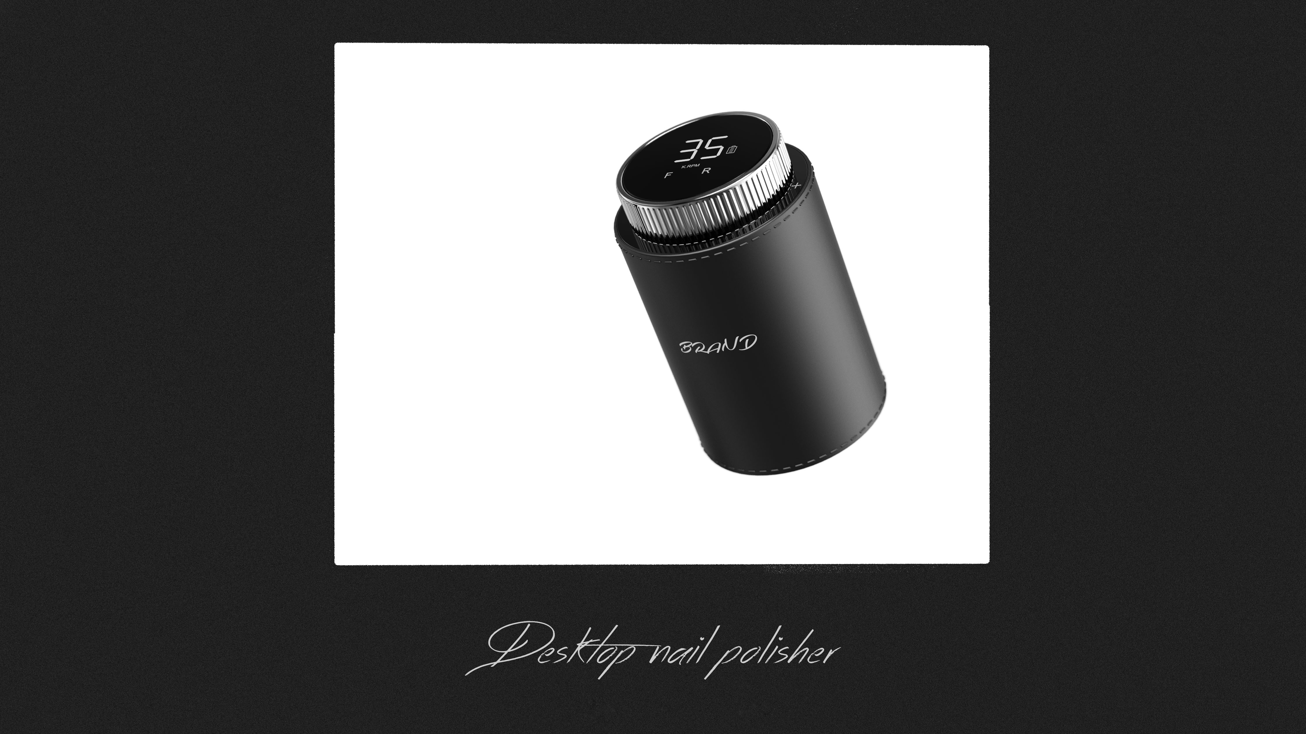
1. The main color of the classic black, black not only has a stable, noble visual experience, but also effectively highlight the high sense of the product. At the same time, black is not easy to show dirt during long-term use, and can maintain a clean and beautiful appearance.
2. In the part of the adjustment knob, silver is used for embellishment, which is in sharp contrast with the black body, which enhances the layering and visual impact of the product and makes the overall design more refined.
With simplicity and sophistication as the core design concept, this desktop grinder aims to provide users with a tool that not only has efficient grinding functions, but also shows a sense of luxury in appearance and use experience. Through clean lines, refined craftsmanship and timelessness
1. The main color is classic black, which not only has a stable and noble visual experience, but also effectively highlights the high-end sense of the product. At the same time, black is not easy to be dirty during long-term use, and can maintain a neat and beautiful appearance.
2.In the adjustment knob part, silver is used for embellishment, which contrasts sharply with the black body, enhances the layering and visual impact of the product, and makes the overall design more refined.

本作品版权归 简设计 所有,禁止匿名转载及个人使用,任何商业用途均需联系原作者。

新用户?创建账号
登录 重置密码
请输入电子邮件以重置密码。


The work is a typical case of design disaster, exposing fatal flaws everywhere:
1 of⃣The color system is completely broken-the suffocation of black, white and gray is like the funeral scene, and the lifeless monotonous tones completely obliterate the high-level sense of the product, and the so-called "modern simplicity" becomes a fig leaf for laziness.
2 of⃣The logic of composition is self-contradictory-the static composition in the middle should have highlighted the main body, but the visual balance was completely torn apart by the abrupt weed pattern at the bottom. It is neither minimalist aesthetics nor natural wild interest, and has become a nondescript four-image.
3.⃣Light and shadow treatment exposes amateurs-uniform and layerless flat lighting reduces the equipment to cheap props with full plastic feeling, and the metal texture and stereoscopic feeling are completely annihilated, just like unopened express cartons.
4.⃣The brand logo is useless-the "MAO JANE DESIGN" logo is as slender as a hairspring and almost invisible in a black background. This logo design that self-destructs the Great Wall can be called brand suicide.
5 of⃣Background processing is extremely absurd-the low contrast between the light gray cloth background and the black box equipment is like a monitoring screenshot taken in a smoggy day, and the outline of the equipment is blurred like a ghost, which completely violates the basic law of product display.
If these works are measured by professional design standards, even the passing line is out of reach, let alone carrying brand value. It is recommended that creators retake basic design courses, otherwise such works will only become the laughing stock of the industry.
Did you design the desktop sander in Ou Liyuan? The mainframe is 90% similar to yours. The bracket for the sander is exactly the same. The product has been out for a year.
1 of⃣The color system is completely broken-the suffocation of black, white and gray is like the funeral scene, and the lifeless monotonous tones completely obliterate the high-level sense of the product, and the so-called "modern simplicity" becomes a fig leaf for laziness.
2 of⃣The logic of composition is self-contradictory-the static composition in the middle should have highlighted the main body, but the visual balance was completely torn apart by the abrupt weed pattern at the bottom. It is neither minimalist aesthetics nor natural wild interest, and has become a nondescript four-image.
3.⃣Light and shadow treatment exposes amateurs-uniform and layerless flat lighting reduces the equipment to cheap props with full plastic feeling, and the metal texture and stereoscopic feeling are completely annihilated, just like unopened express cartons.
4.⃣The brand logo is useless-the "MAO JANE DESIGN" logo is as slender as a hairspring and almost invisible in a black background. This logo design that self-destructs the Great Wall can be called brand suicide.
5 of⃣Background processing is extremely absurd-the low contrast between the light gray cloth background and the black box equipment is like a monitoring screenshot taken in a smoggy day, and the outline of the equipment is blurred like a ghost, which completely violates the basic law of product display.
If these works are measured by professional design standards, even the passing line is out of reach, let alone carrying brand value. It is recommended that creators retake basic design courses, otherwise such works will only become the laughing stock of the industry.
good, huh
You can also stay at home.