Title: Packaging Design of Lake Romance Whisky
Brand Holding: Loch Lomond Group Roman Lake Group (UK)
Original Designer: Tiger Pan
Executive designers: He Yuxuan, Wang Yahui
Process Design: Xie Zhangkun, Zhou Jinyan
Video Production: Gong Xiaohan
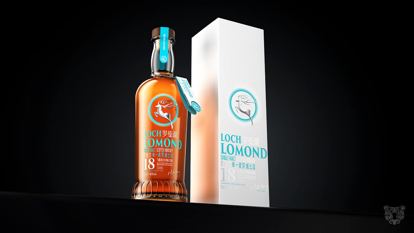
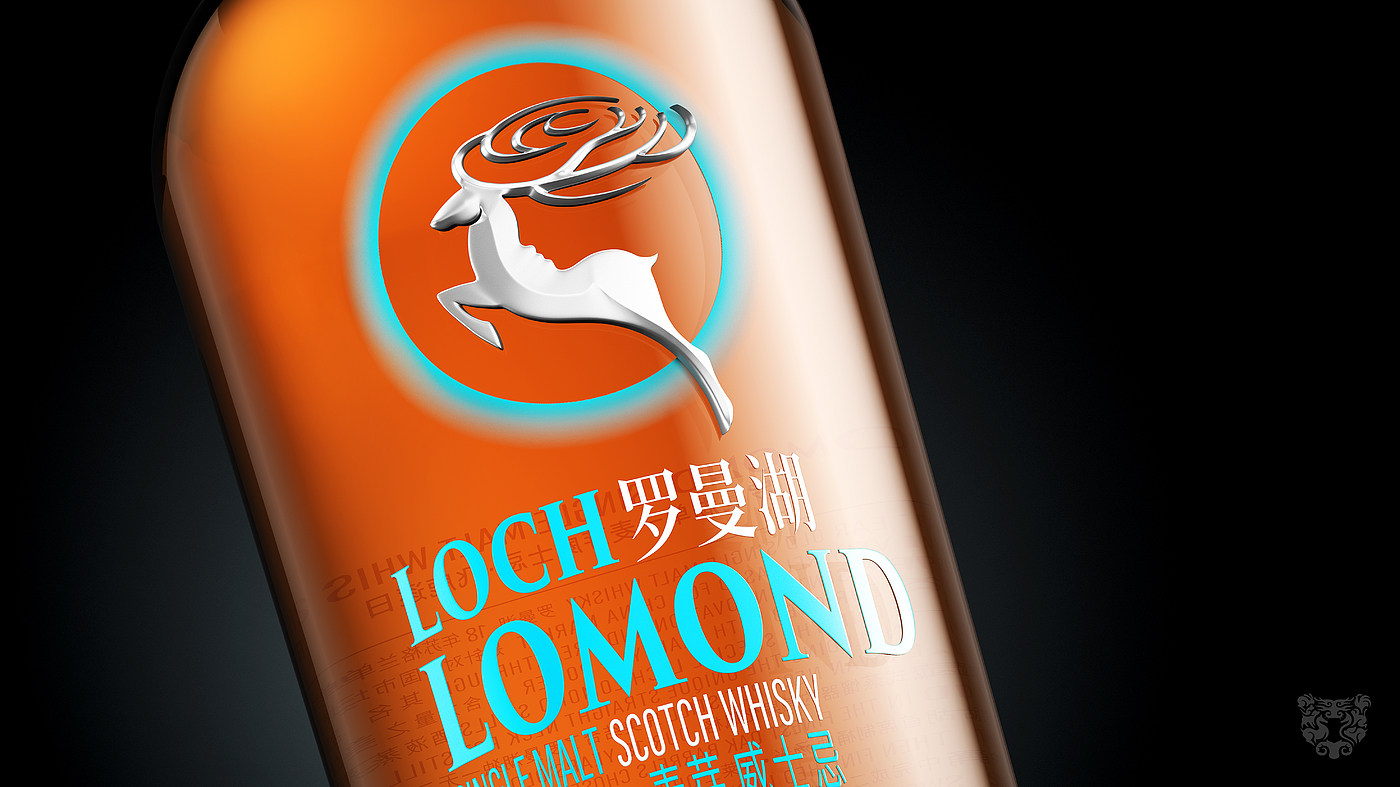
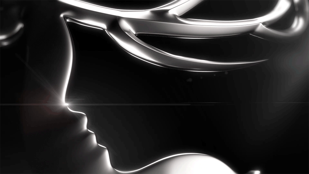
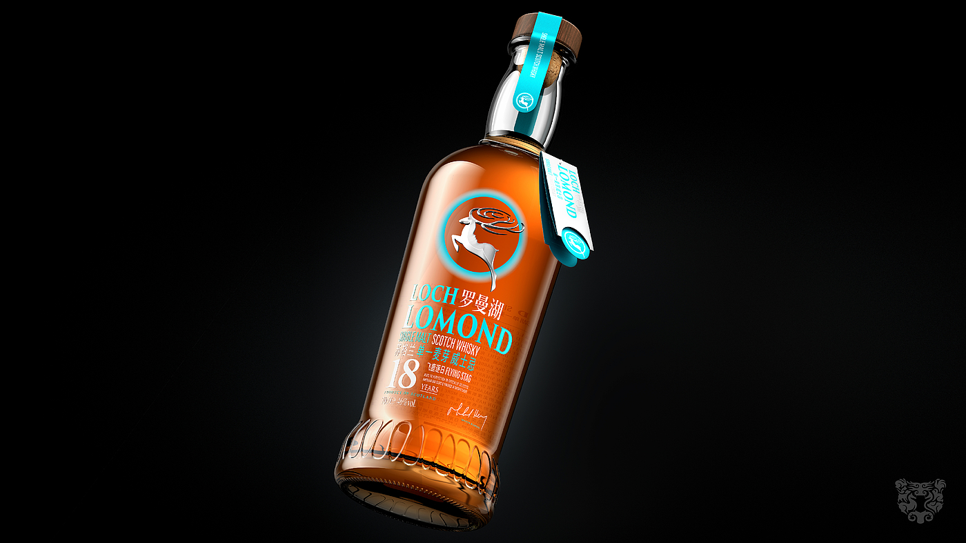
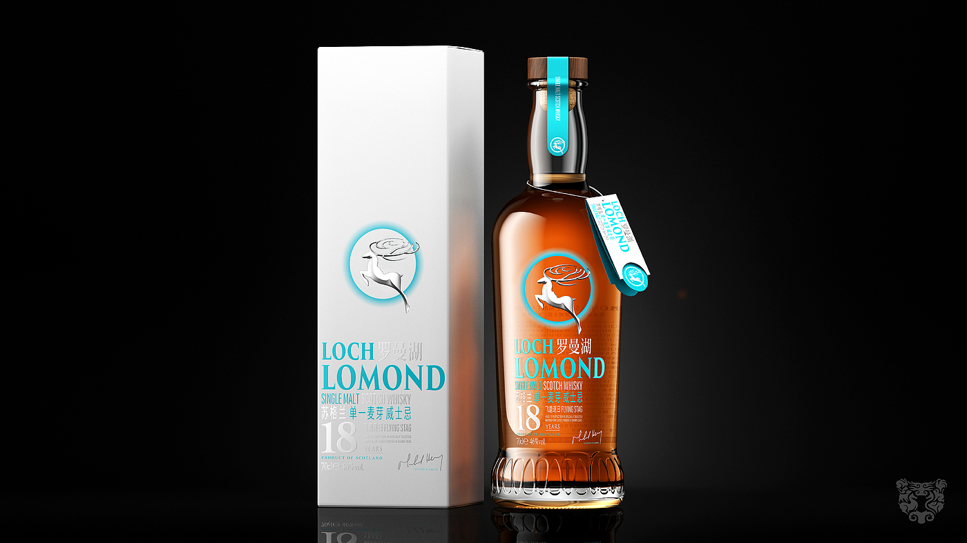
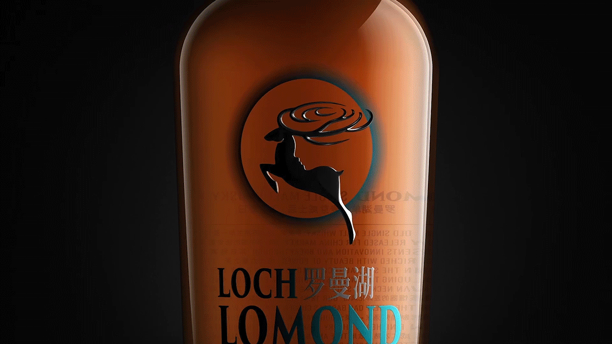
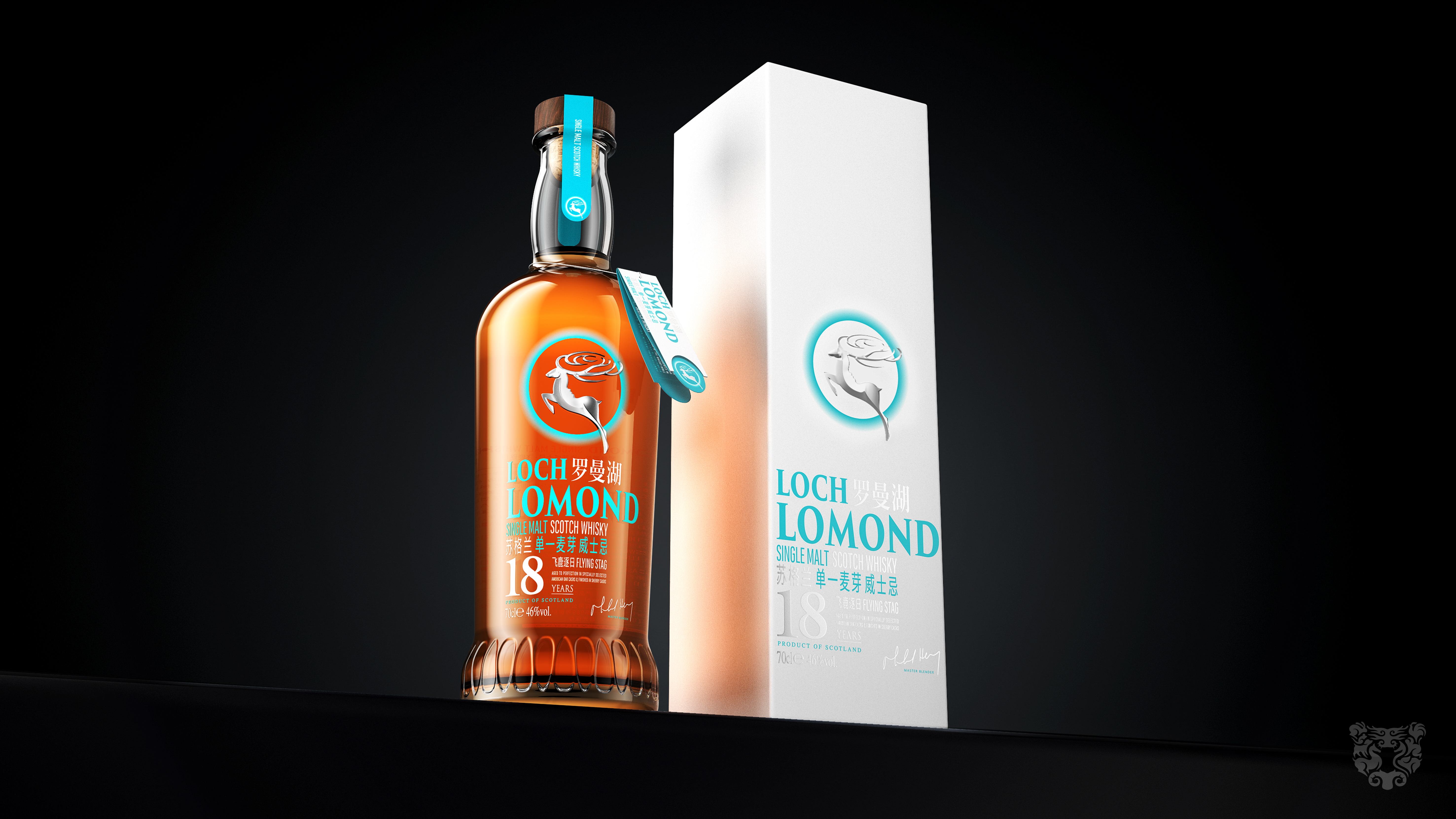
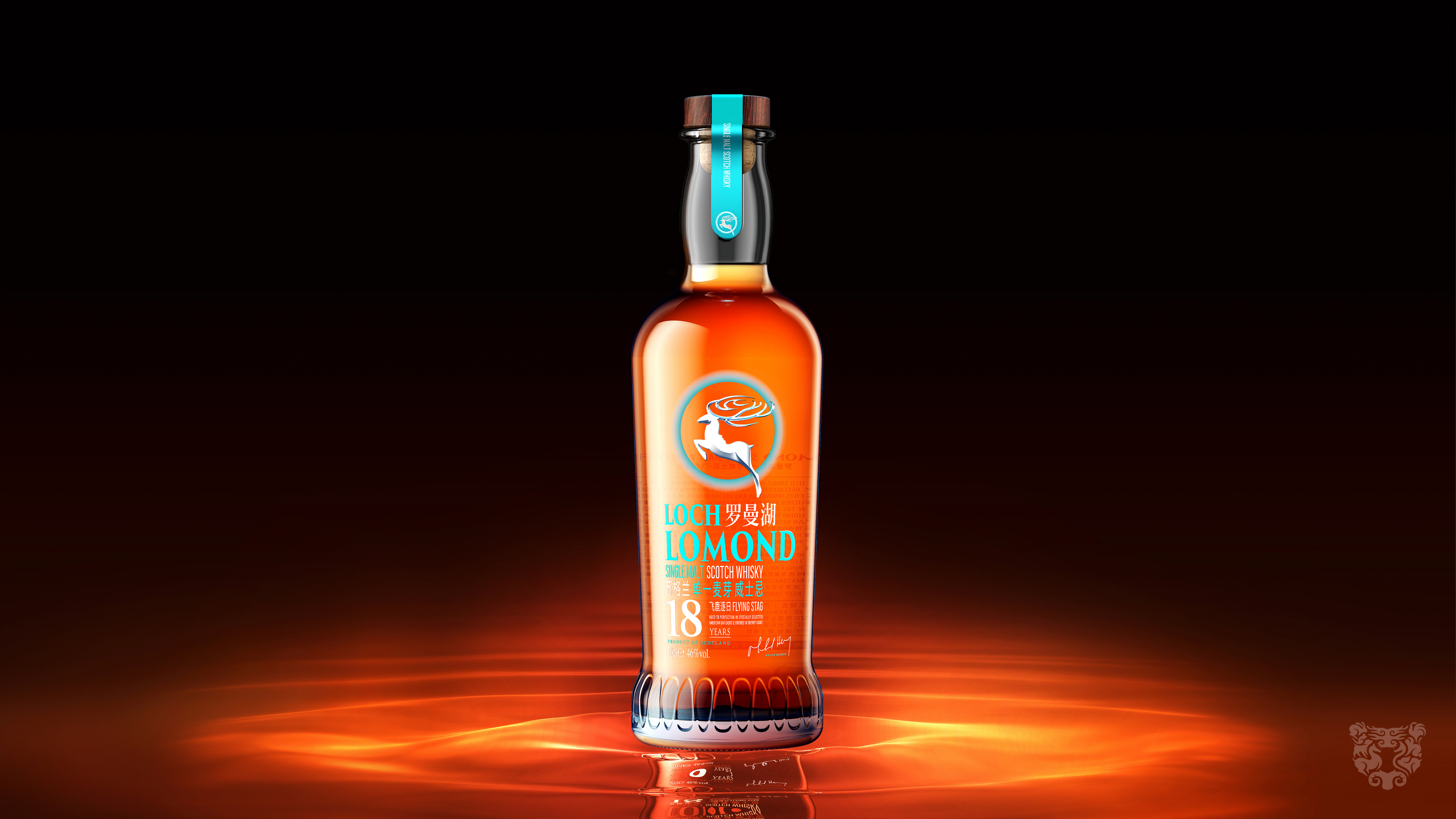
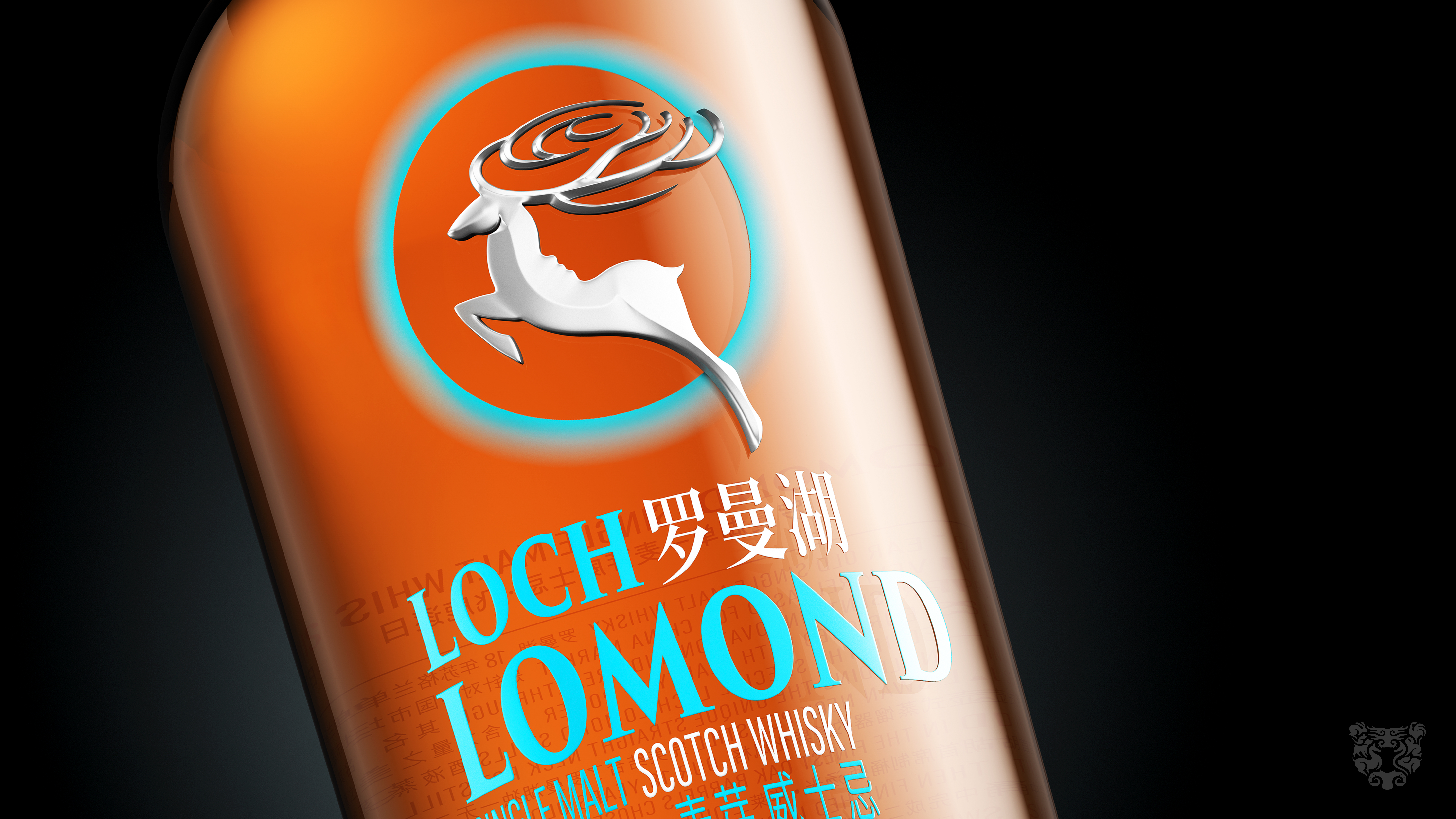
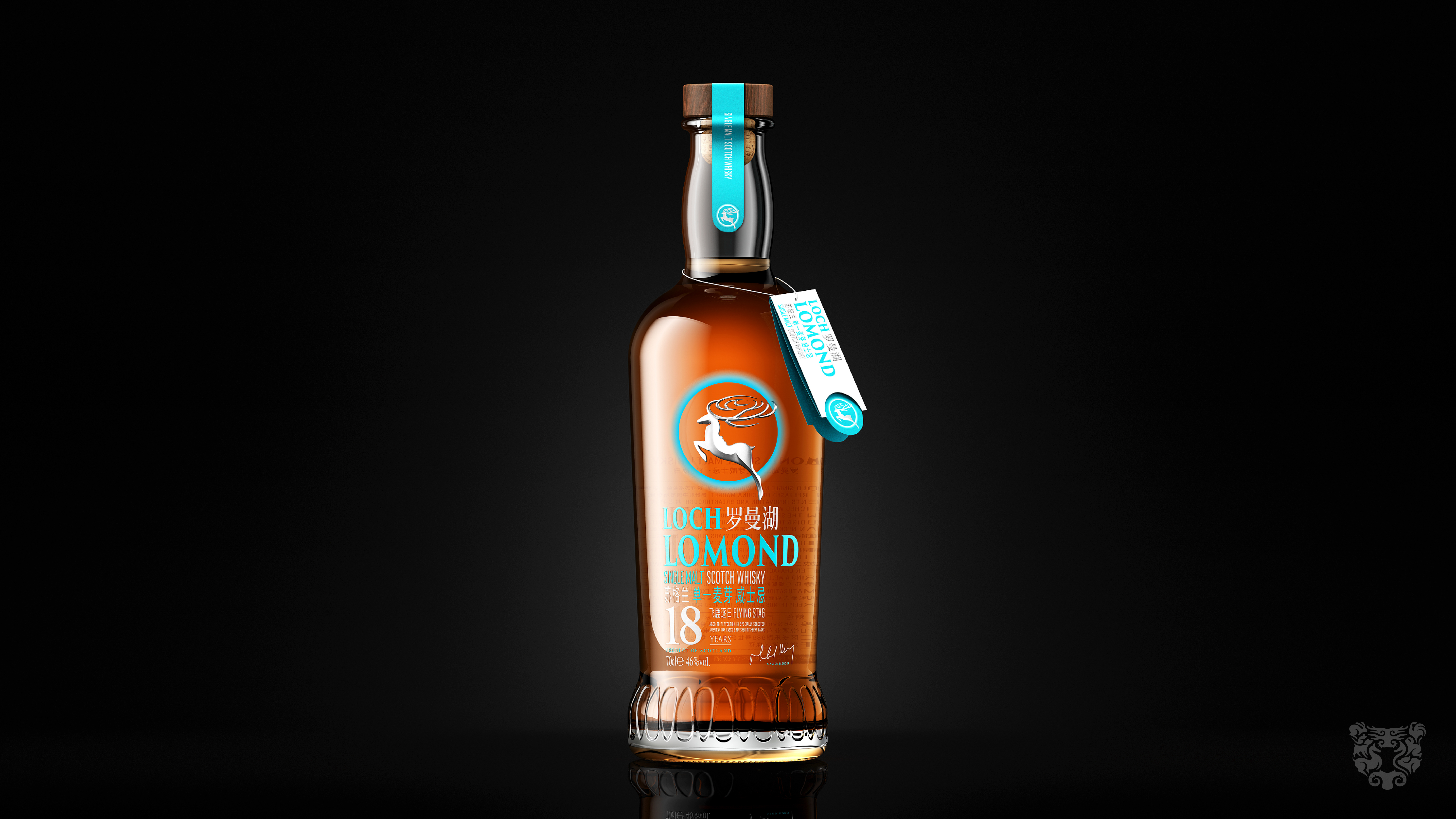
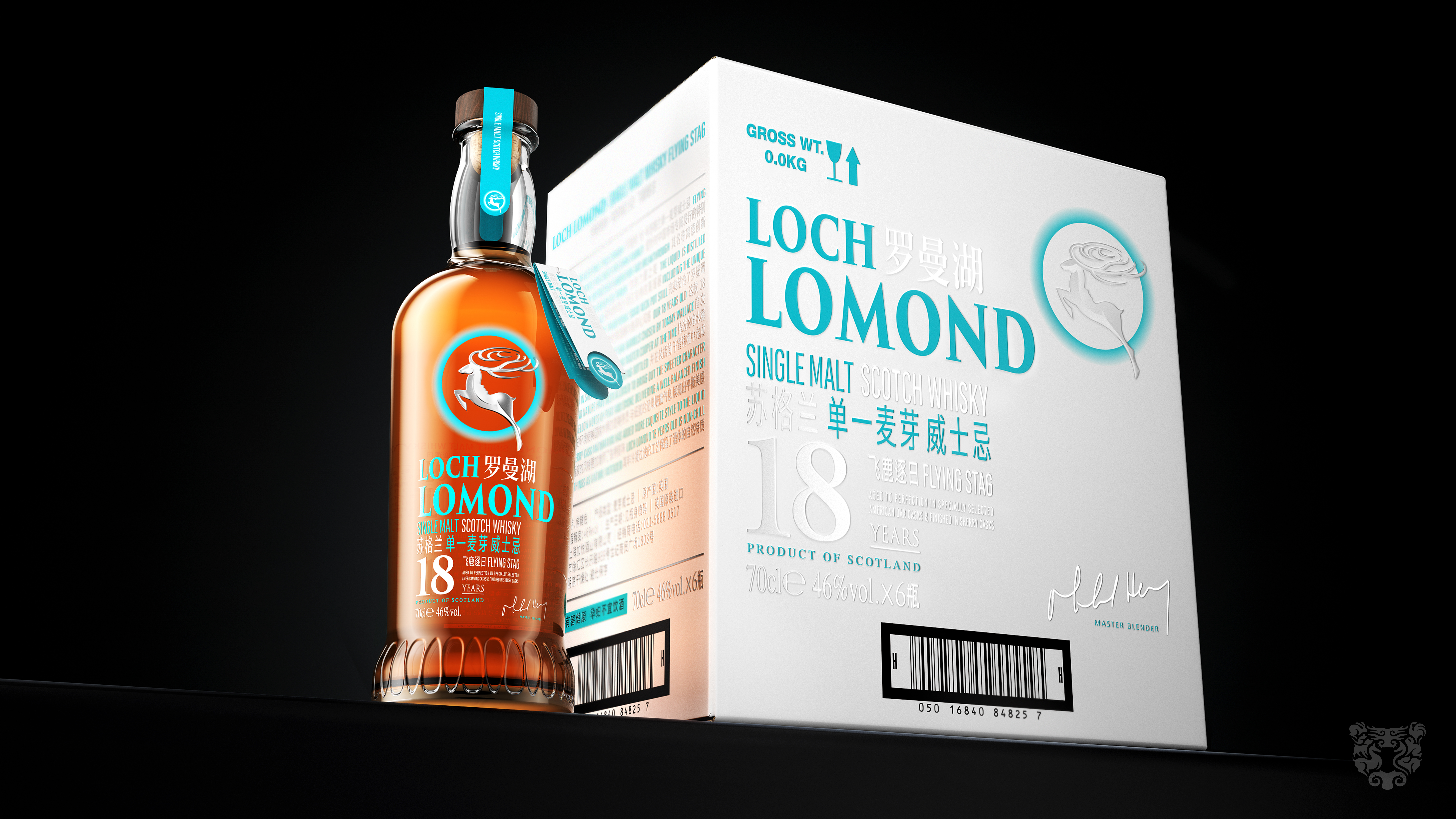
This time, the "Asian Limited Edition" is designed for Roman Lake. The LOGO design is presented in positive and negative shapes. A stag running day by day is not afraid to move forward and never follows the crowd, symbolizing freedom. The antlers are shaped like ripples, slightly rising, just like the waves on the surface of Roman Lake. The negative shape on the back of the deer hides the beautiful and tender profile of the Roman Lake goddess, full of romantic imagination. It has both static beauty and dynamic beauty, both recognizable and artistic.
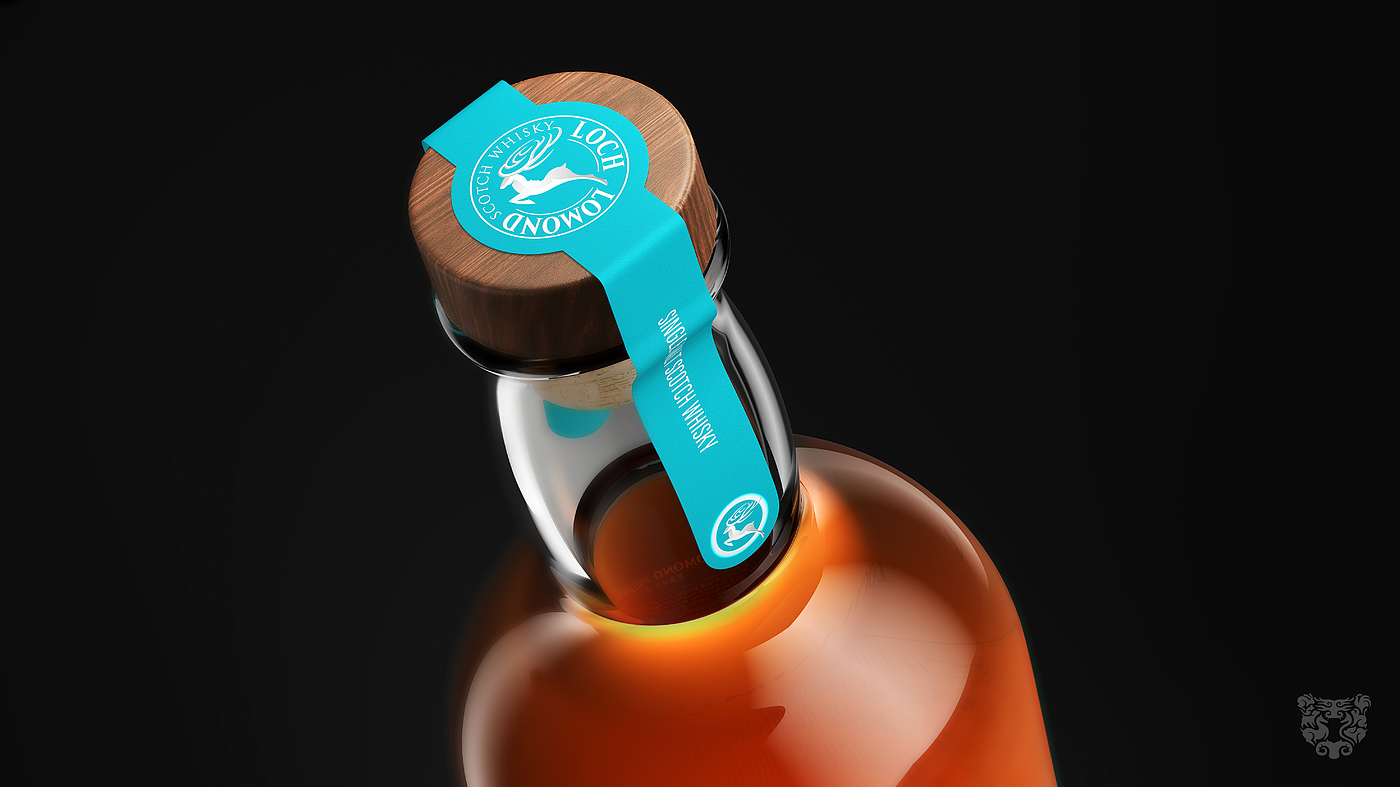
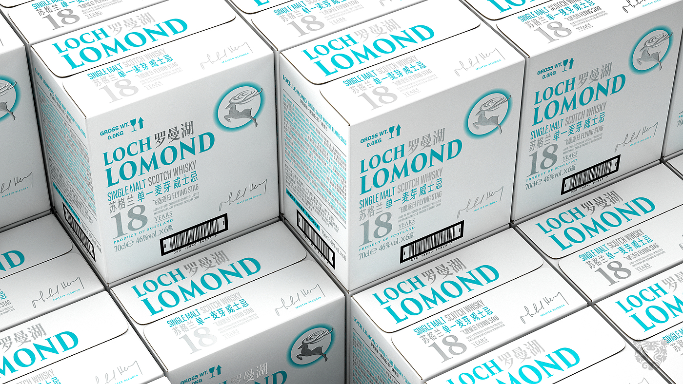
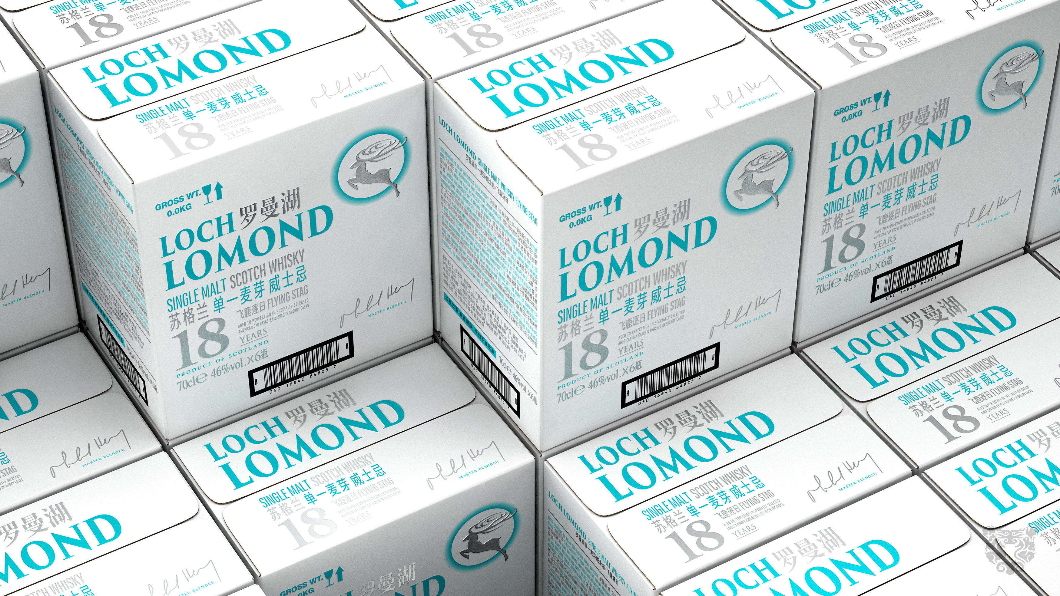
In order to create difference in color, we extract clear water blue from Roman Lake as the main color, reinterpreting the youthful and advanced feeling of Roman Lake whisky. This is not only the color of natural gift, but also the color of healing. Chinese is added to the typesetting for information arrangement. Chinese is no longer a footnote, allowing Chinese characters to add a bit of charm to brand communication.
The relief of the bottle body and the bottle body form a form of mutual inlay, and the depression gradually changes from lower left to upper right to none. Like works of art, it has created a rich visual and tactile world, directly bringing the bottle into the 21st century.
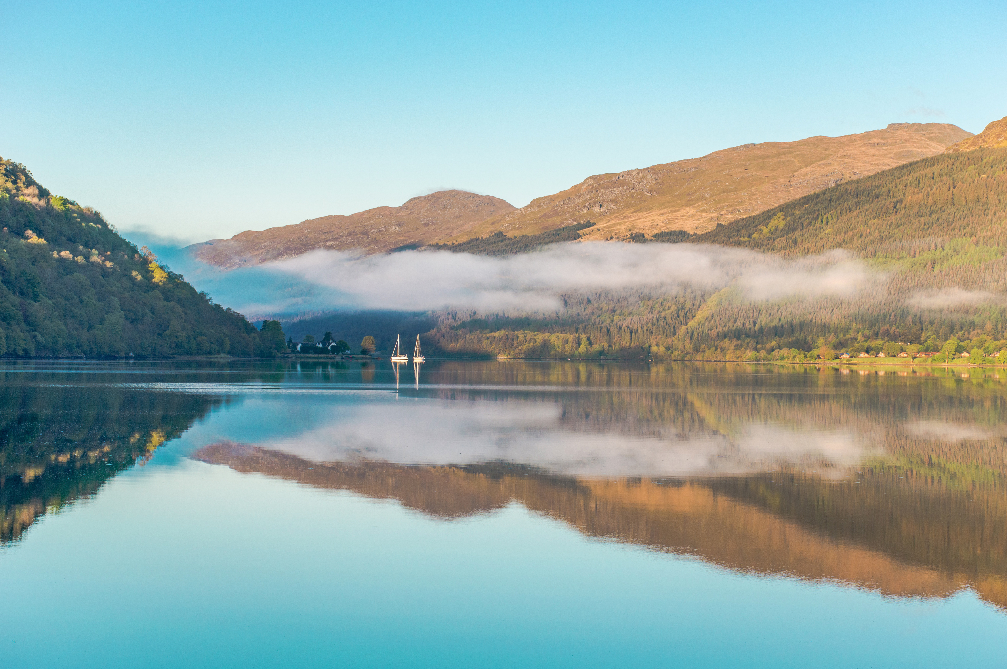
Roman Lake is fragrant and fragrant. The taste tour is like walking beside the lake in Scotland. It is so simple that it only needs barley to be made, because the ultimate thing it yearns for is purity and nature.


The cow force is over
Good-looking
Beautiful!