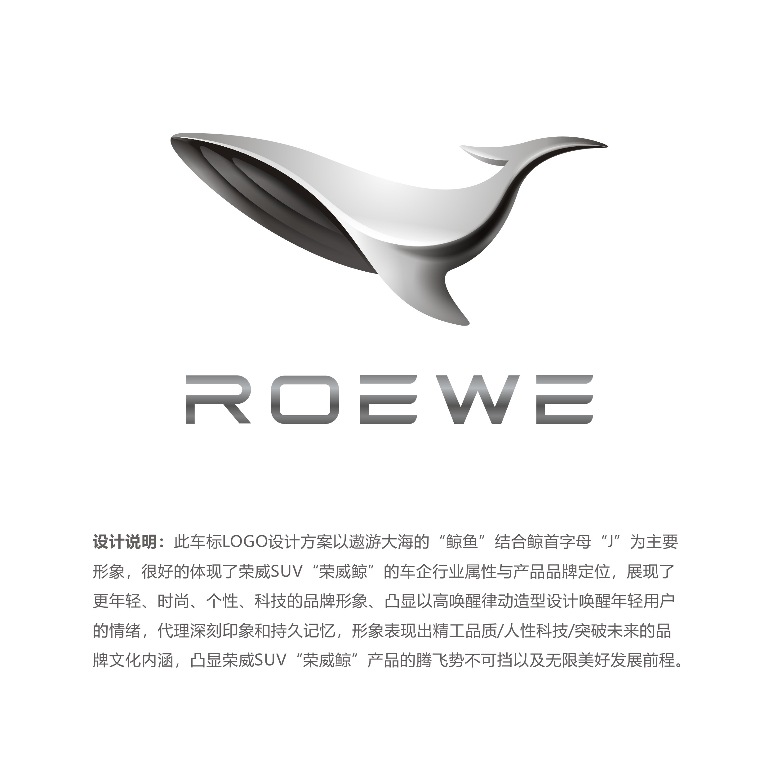
The LOGO design scheme of the car logo takes the "whale" traveling in the sea and the initial letter "J" of the whale as the main image, which well reflects the industry attribute and product brand positioning of the Rongwei SUV "Rongwei whale", shows the brand image of younger, fashionable, personalized and technological, highlights the emotion of young users awakened by high-arousal rhythm modeling design, and represents deep impression and lasting memory, the image shows Seiko quality/human nature technology/brand cultural connotation of breaking through the future, highlighting the unstoppable take-off of Rongwei SUV "Rongwei Whale" products and unlimited bright development prospects.


本作品版权归 lijianluan 所有,禁止匿名转载及个人使用,任何商业用途均需联系原作者。

新用户?创建账号
登录 重置密码
请输入电子邮件以重置密码。
With all due respect, the renderings are well done, but the design of this logo is too similar and not concise enough. It seems that the car is not classy enough when placed on the car. You can look at Mercedes-Benz.
Looking at all the works, the gold medal for this work is well deserved.
But why is it so strange to put it in the car?
The second is to reduce the dimension of the blow, the original Roewe designer, in addition to this and the ninth in the award, what are the other things,
The realization of technology is not considered. Young people's design is easier to release their ideas. Of course, the works should also be liked by leaders, right?
Why must LOGO be symmetrical and the mindset is too terrible
Asymmetric LOGO has no long-term advantage.
I also drew a fish to go up and put it on the car. It doesn't look good at all.
I also participated in the competition. Although I didn't win the prize, I still gained a lot of knowledge. The gold medal is really powerful. It is also my favorite one, except mine.
Still very durable, really good.
The gold medal was voted out by the public, right? It may be the position when voting. It is definitely not enough to put it on the bus.
Be durable
Sorry, I saw it as a bird
The works of the competition are quite good-looking. There is no first and no second. Just let nature take its course.
Good-looking