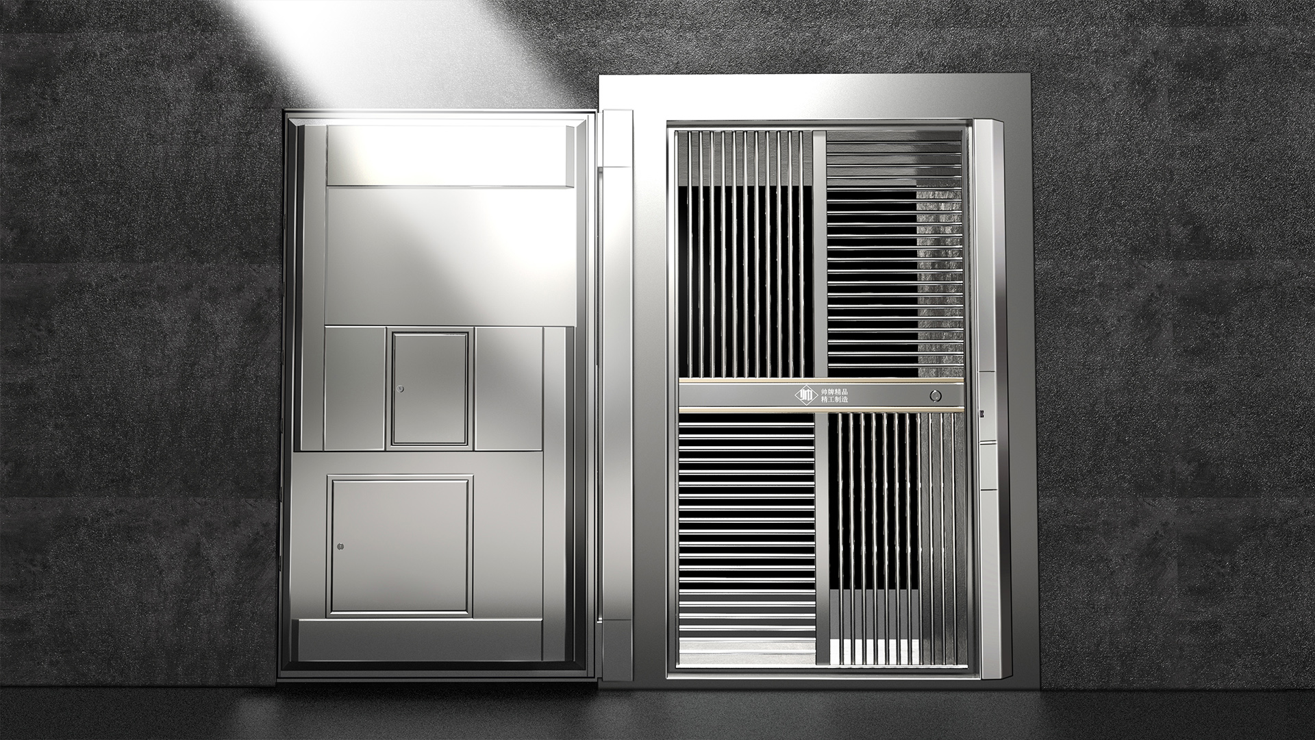
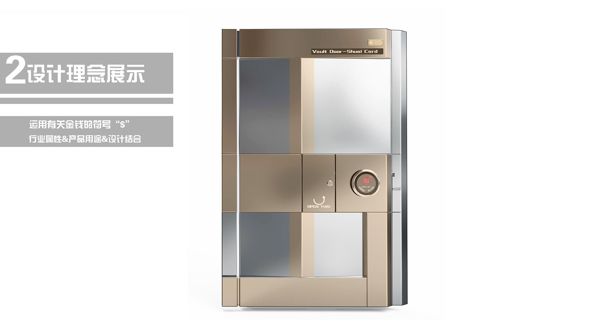
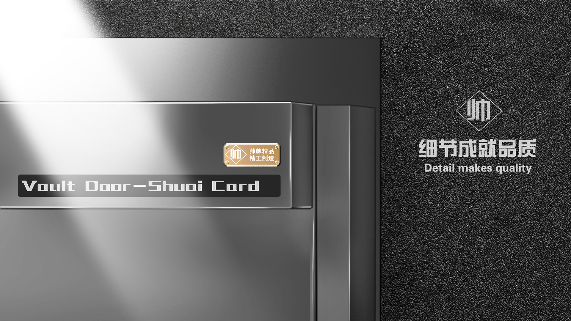
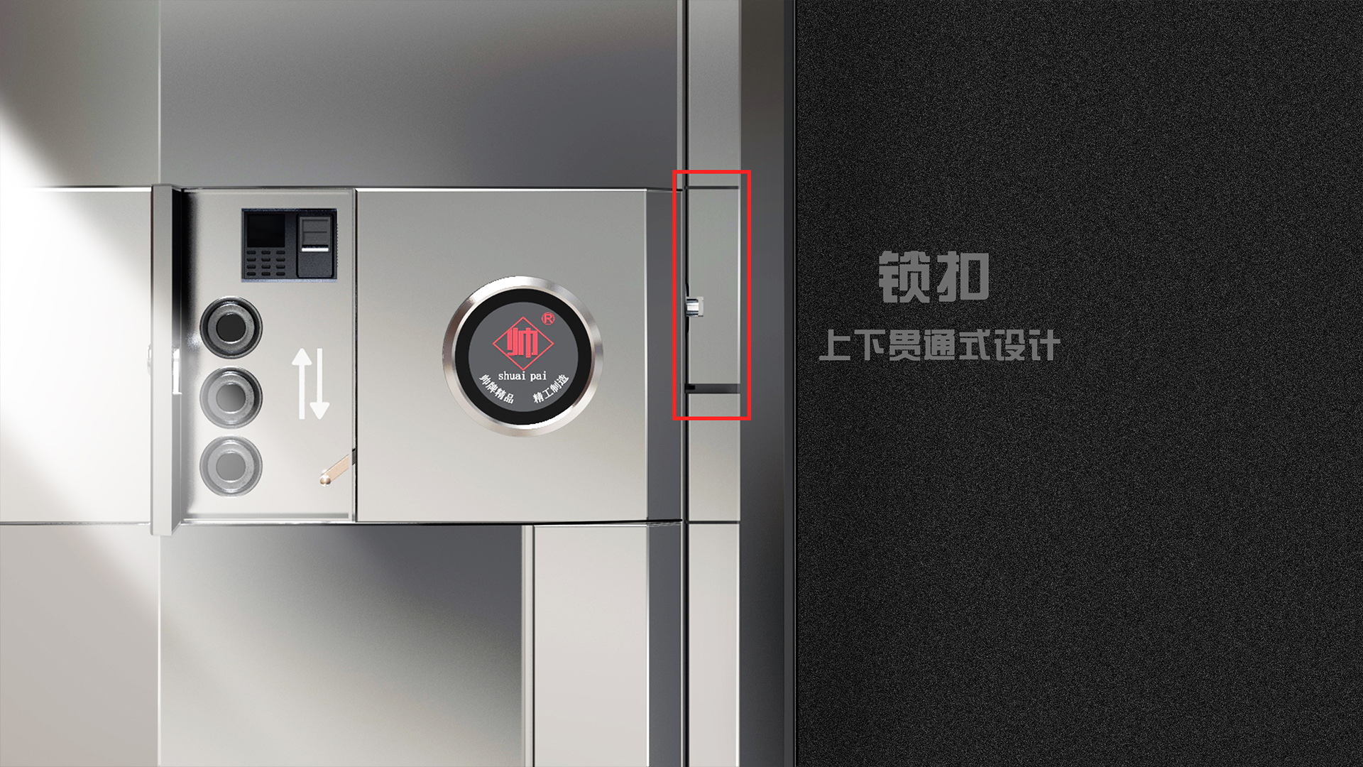
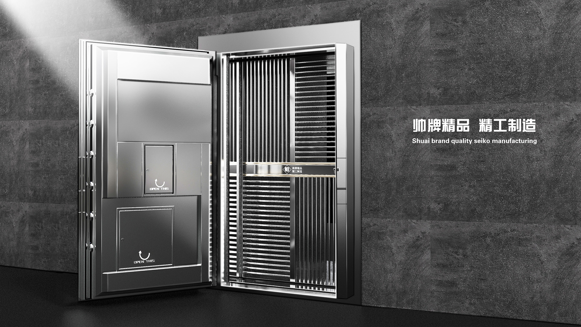
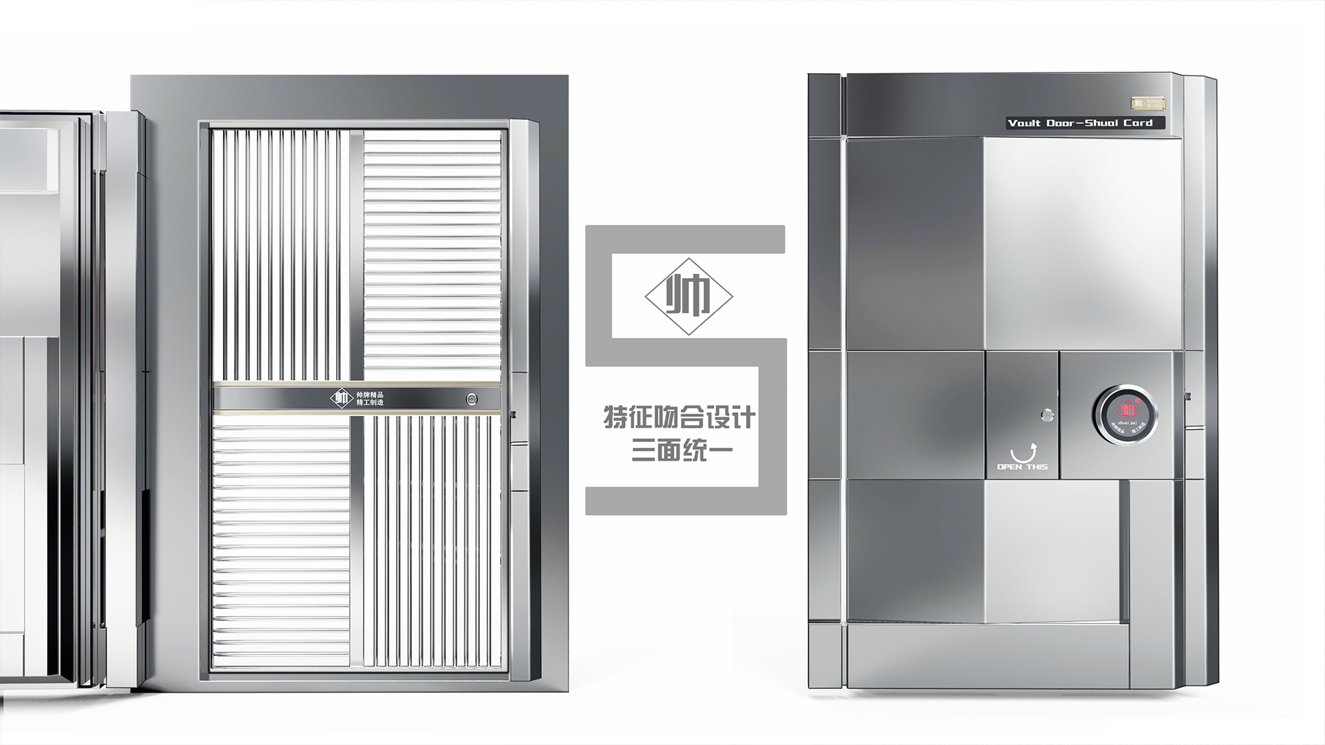
Inspired by the shape of the brand's first letter "S", the brand design is integrated, the shape conforms to the characteristics of the bank, the cost is low and the atmosphere. The door lock hinges on both sides form a unified design, visually regular, the open state of the door presents brand characteristics, and the closed state presents the letter "B", which means "bank" and bank. The small door is cleverly integrated into the overall shape to become a money symbol "$", the overall design language is unified, and the door body is simple and atmospheric.
本作品版权归 韵博设计 所有,禁止匿名转载及个人使用,任何商业用途均需联系原作者。
新用户?创建账号
登录 重置密码请输入电子邮件以重置密码。
Not bad
Good job!
Great!