Energy is not only a function, it is an experience. Although the energy drink market is crowded, most products are caught in a strange circle of homogenization of functional stacking. In a complex market, maintaining brand recognition and uniqueness through simple design is the deep interpretation of the core demands of the brand in this design.
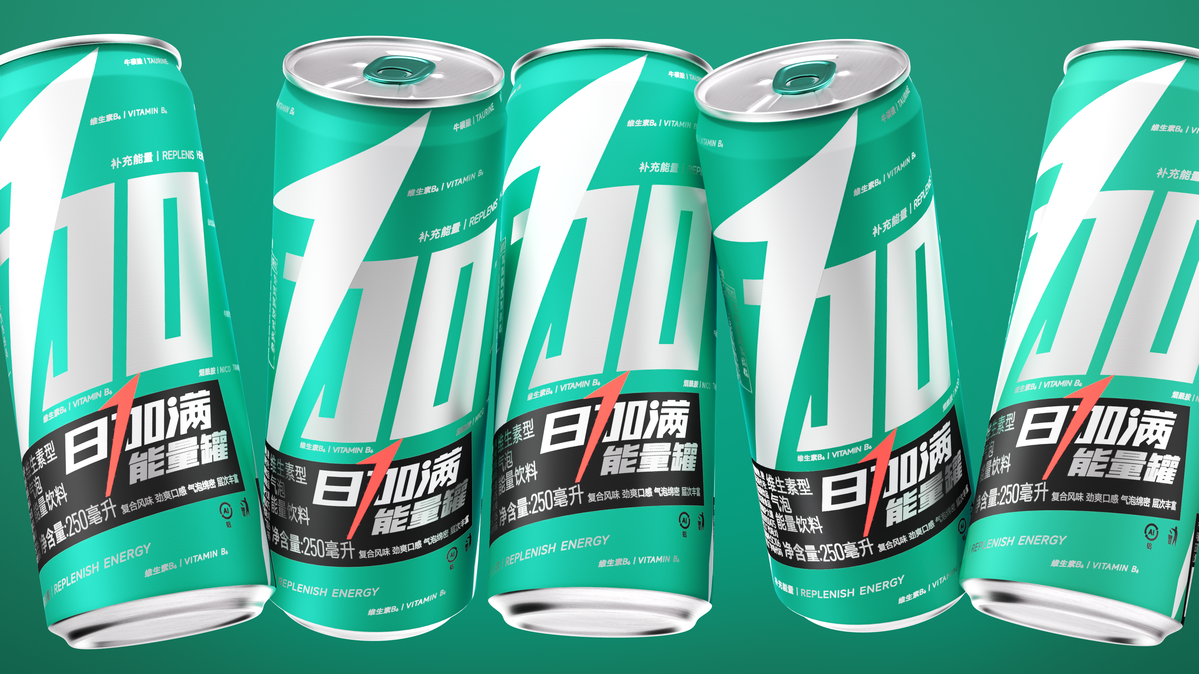
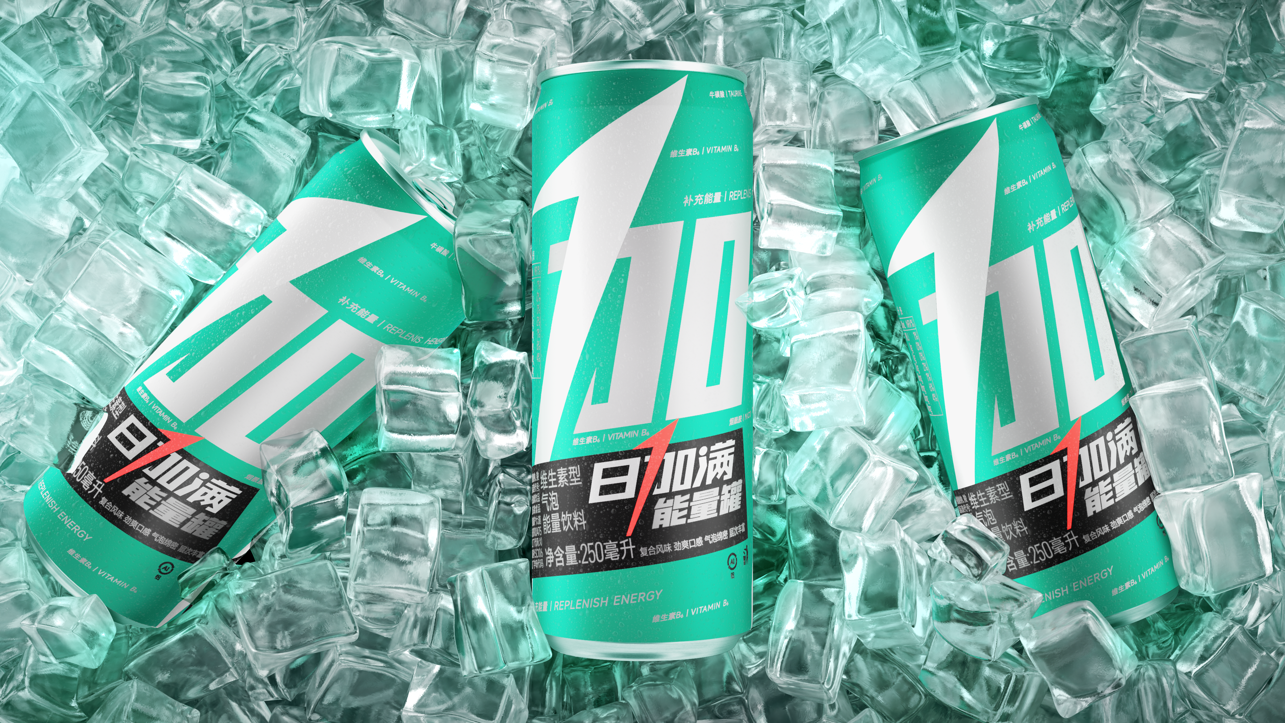
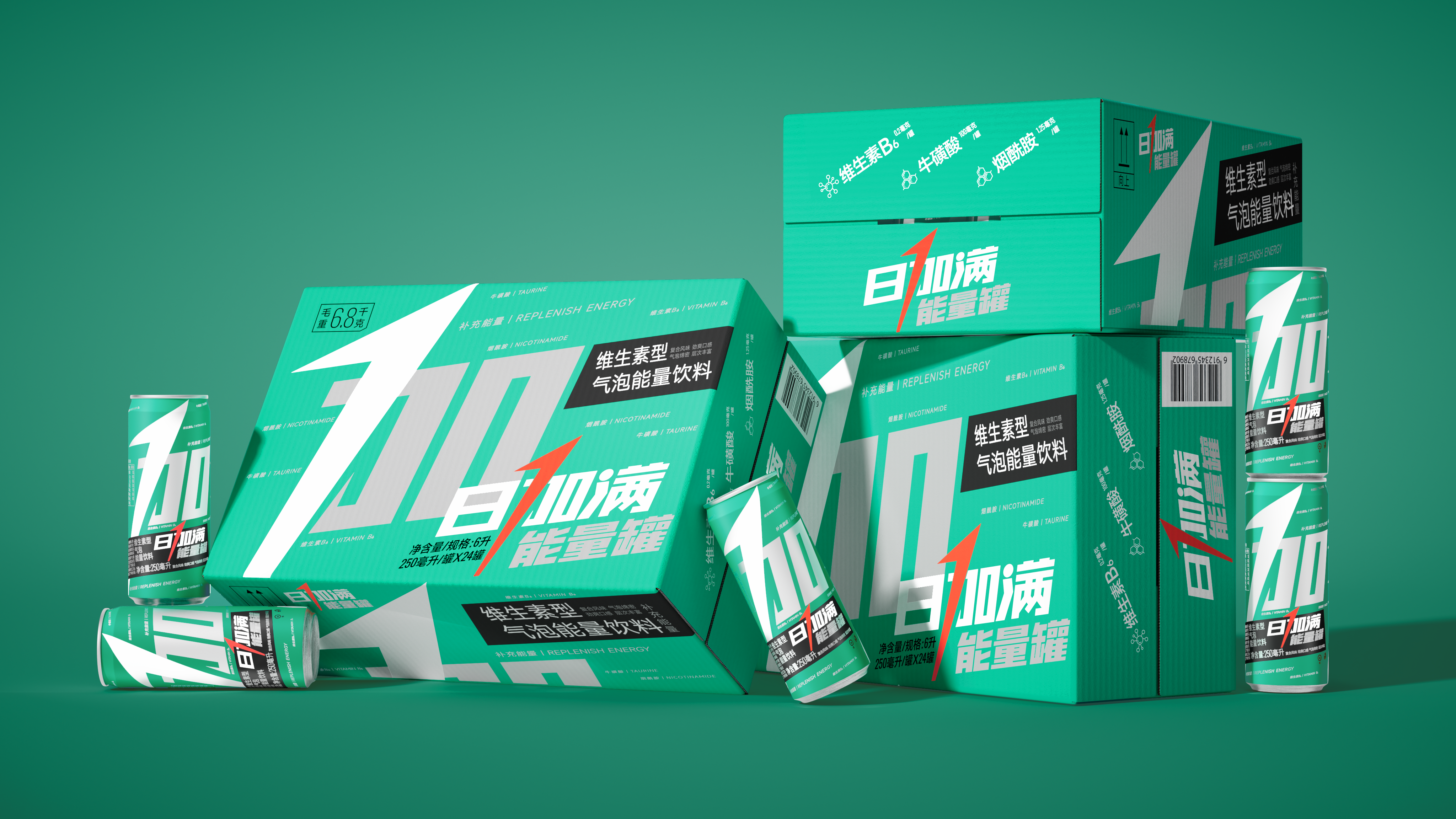
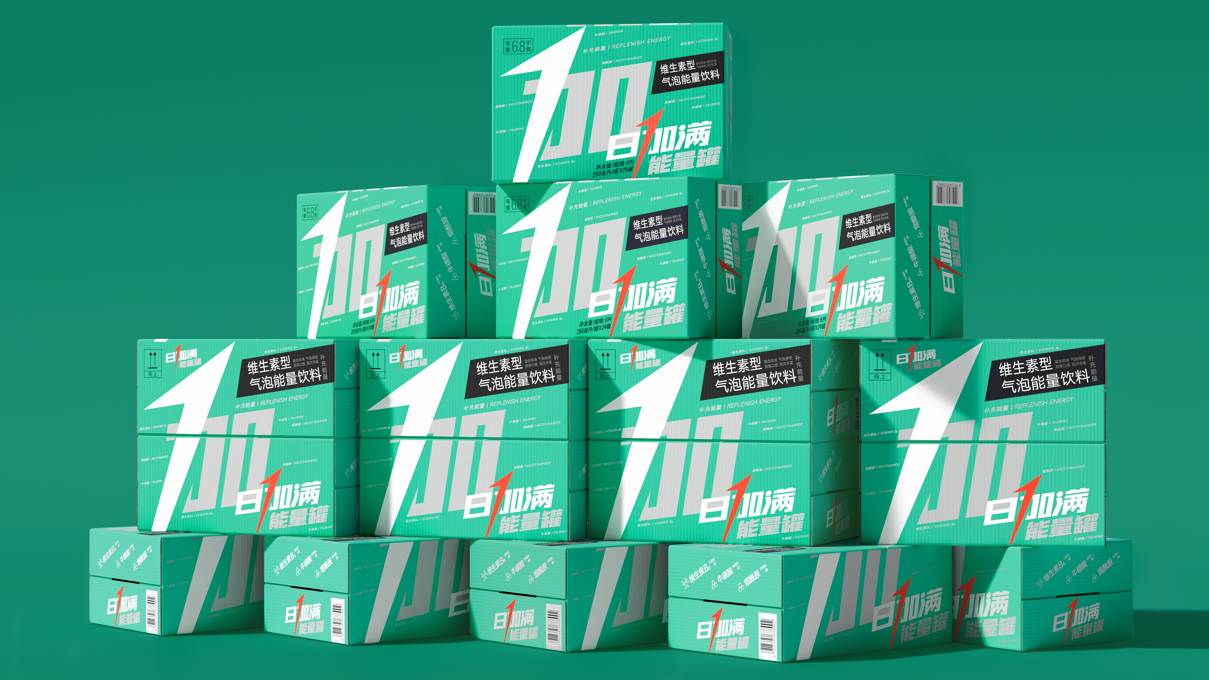
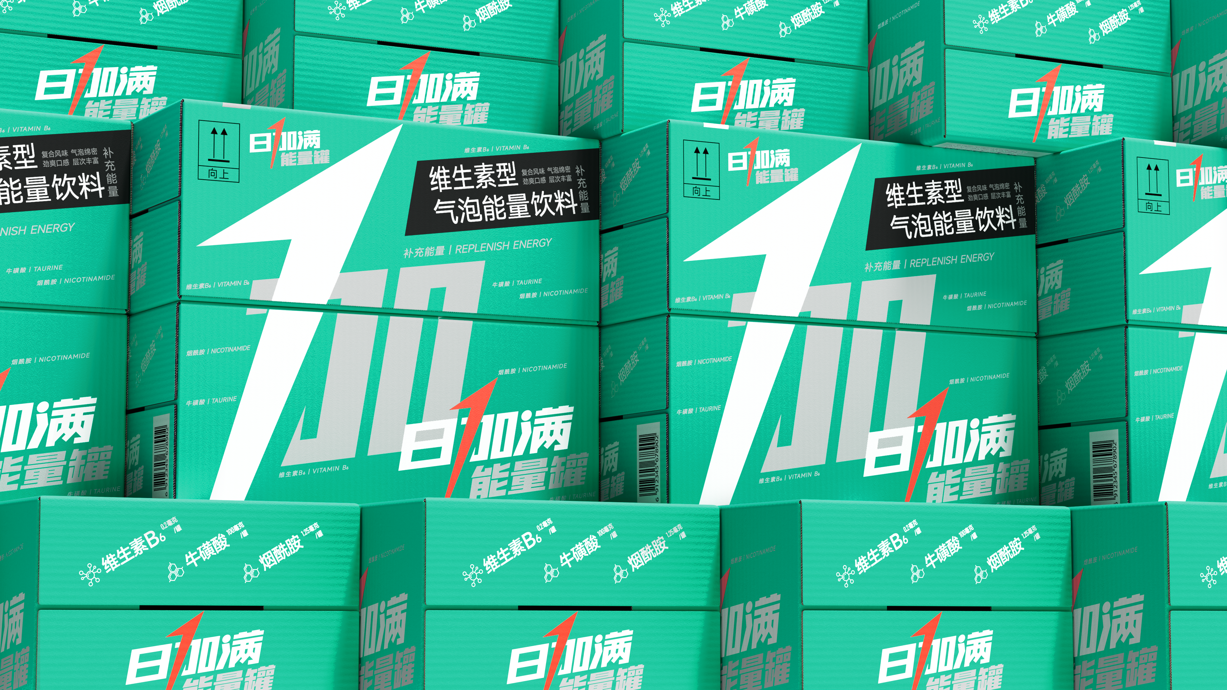
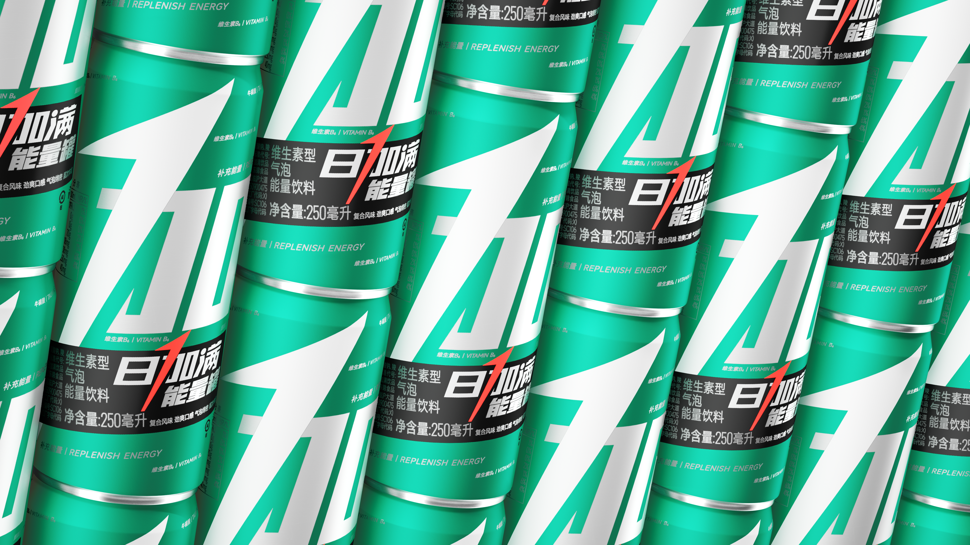
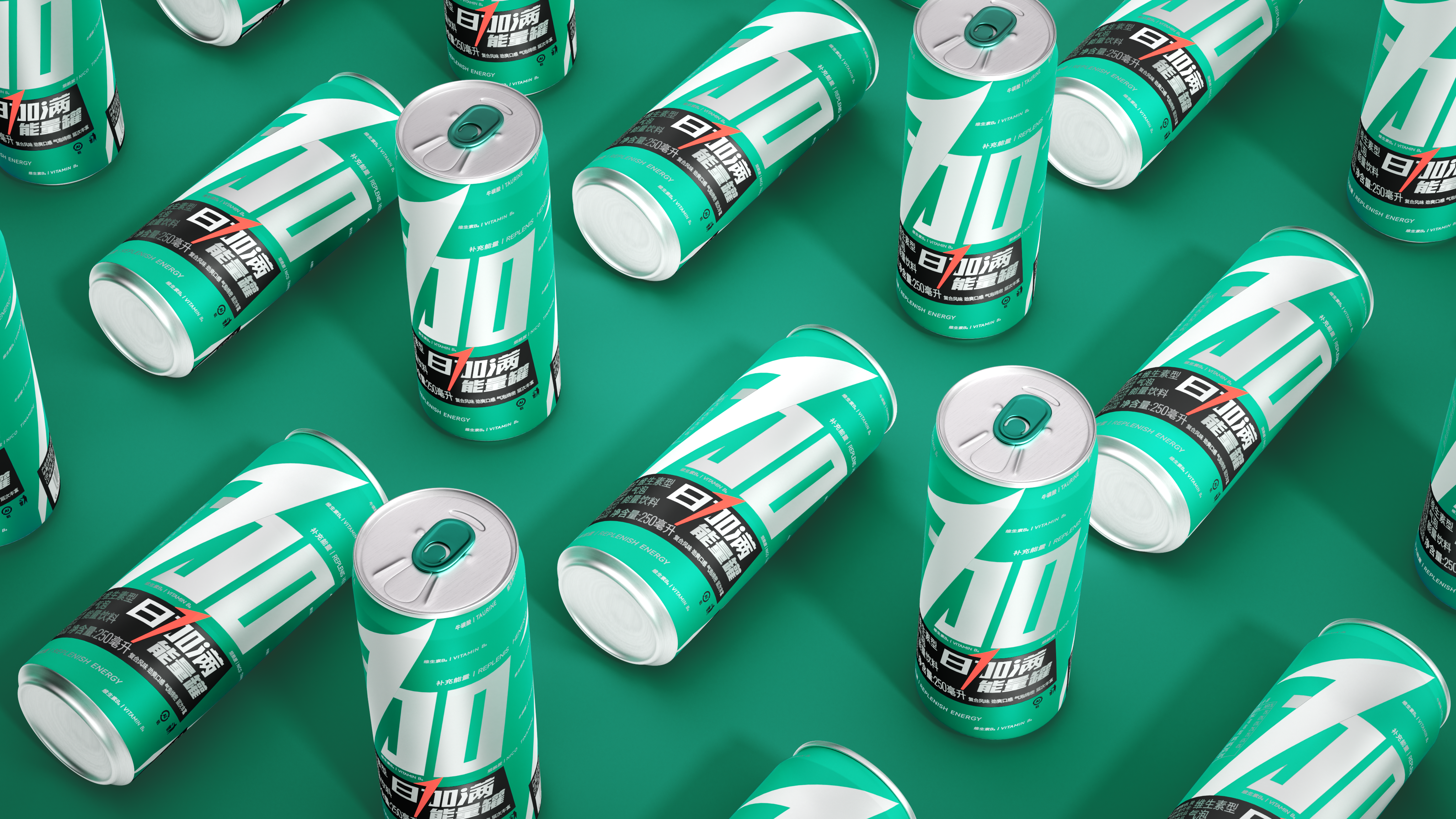
Symbolization, the first step out of the circle. We do subtraction on the basis of the original packaging, first focus on refining the most recognizable arrow "plus" in a stroke to play a new height-directly into the number "1". This stroke not only accurately conveys the core function of "replenishing energy", but also reminds people of the full score concept of "100", which makes the brand's sense of speed and energy instantly full. This design has full potential to become a super symbol of the brand, just as Nike's simple, powerful and memorable check gives the brand stronger recognition and long-term market extensibility.
本作品版权归 潘虎设计实验室 所有,禁止匿名转载及个人使用,任何商业用途均需联系原作者。

新用户?创建账号
登录 重置密码
请输入电子邮件以重置密码。


The Big Brother's Works
The copywriting is unique.