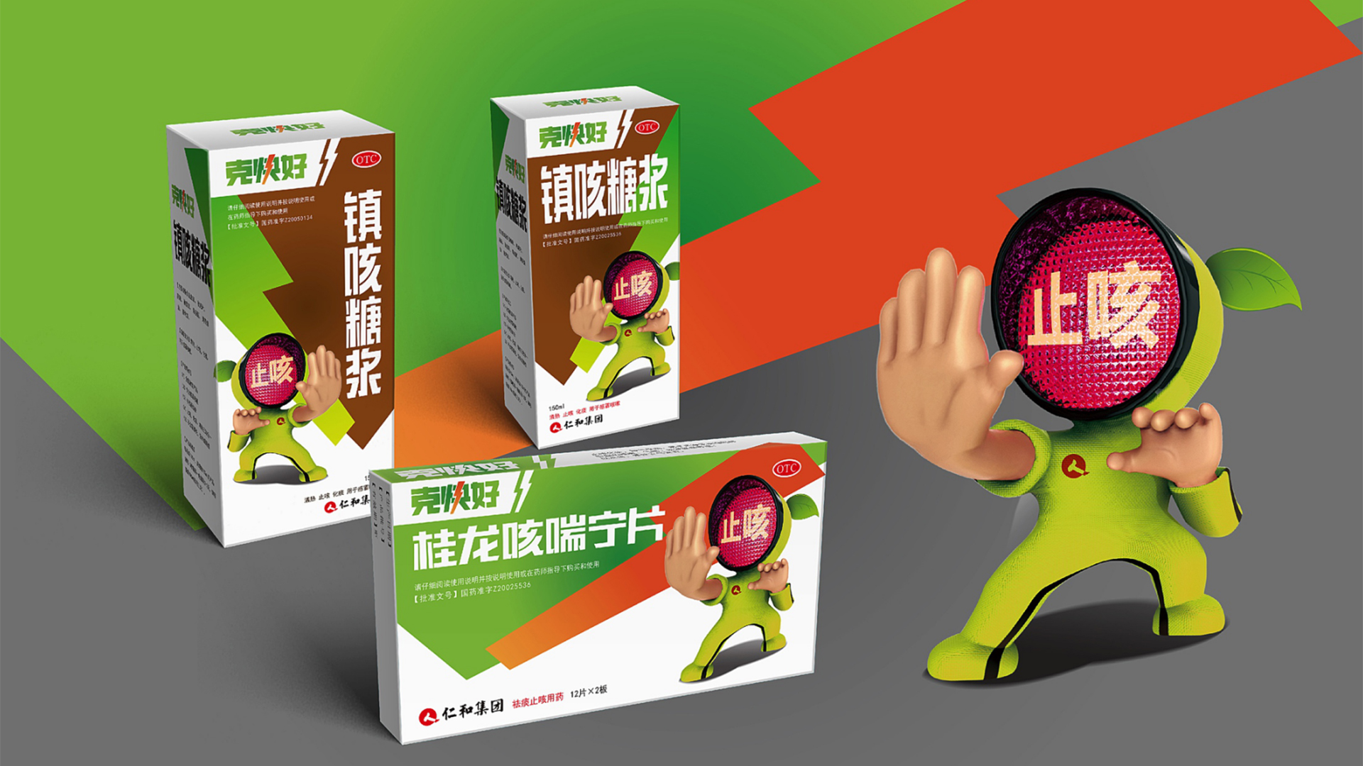
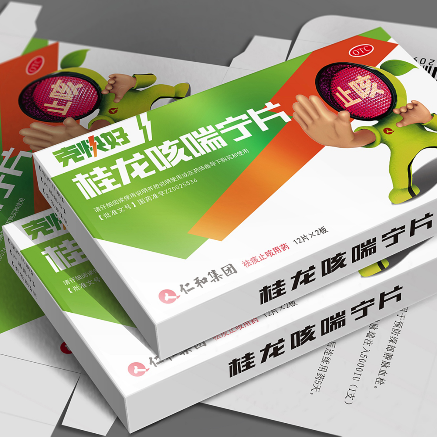
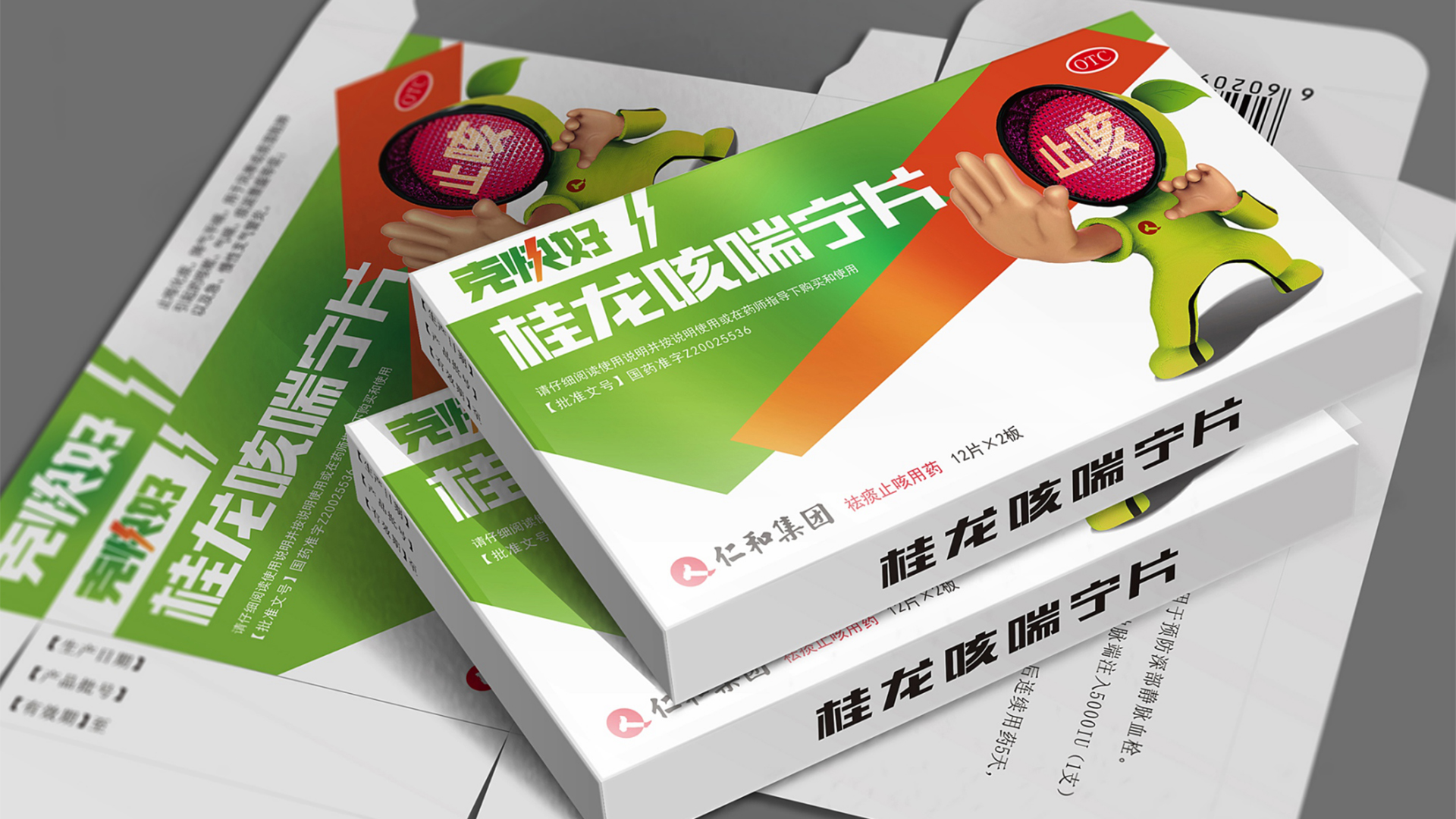
Project background: Renhe Pharmaceutical's cough syrup product needs packaging design. How to stand out among many products and how to make people remember their products is the biggest demand of customers.
User pain points: Before the design, we did some research and found that most people hope to stop coughing quickly, get better quickly and stop coughing when facing cough diseases.
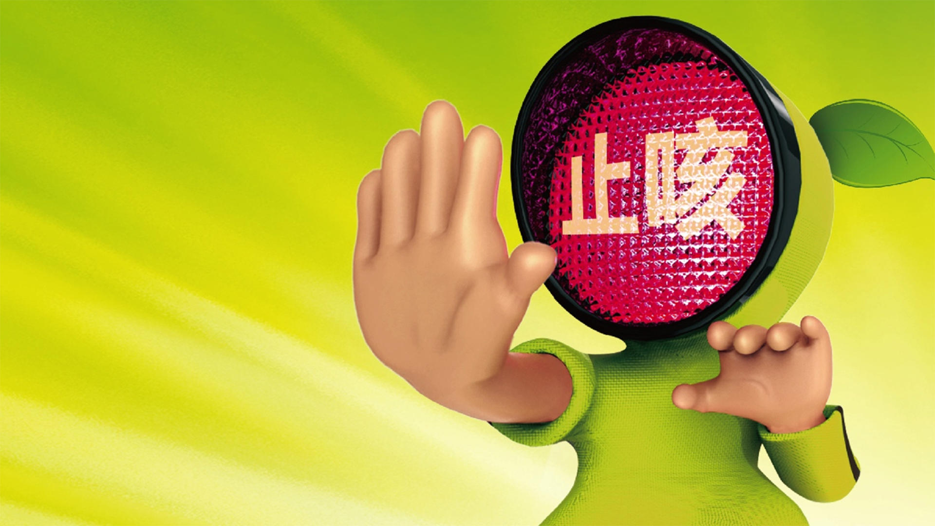
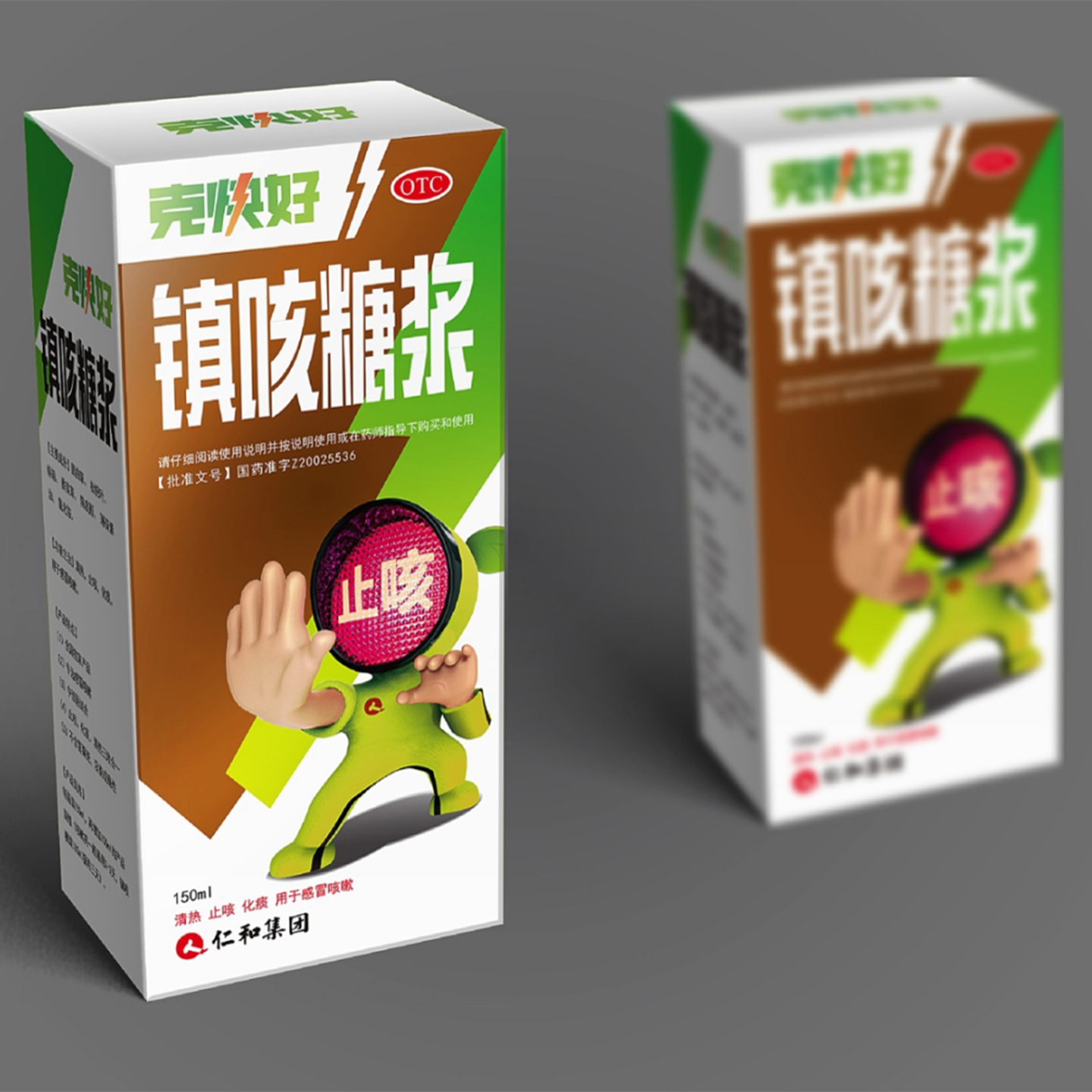
Design concept: Because coughs usually improve more slowly. Therefore, a cartoon image similar to Bruce Lee was adopted in the creativity of the packaging picture. The metaphor of fast and powerful effect and the zigzag orange-like lightning are also outstanding concepts.
Color matching: the head of the little person is a red light figure, which says cough relieving directly shows the main diseases of drugs. the auxiliary color uses green to represent health, and red and green are in sharp contrast, which is relatively bright.
1, easy to identify on the shelf, but also to impress the user. This form is used in the packaging of cough syrup and cough and asthma tablets.
2. Form a small series on the packaging, so that people can know at a glance that they are all cough suppressants. Give users a better visual experience, easy to deepen the impression of the brand.
本作品版权归 洛可可咨询设计 所有,禁止匿名转载及个人使用,任何商业用途均需联系原作者。

新用户?创建账号
登录 重置密码
请输入电子邮件以重置密码。


Good, good
It belongs to a big brand
Children eat
Not bad
I saw this medicine.