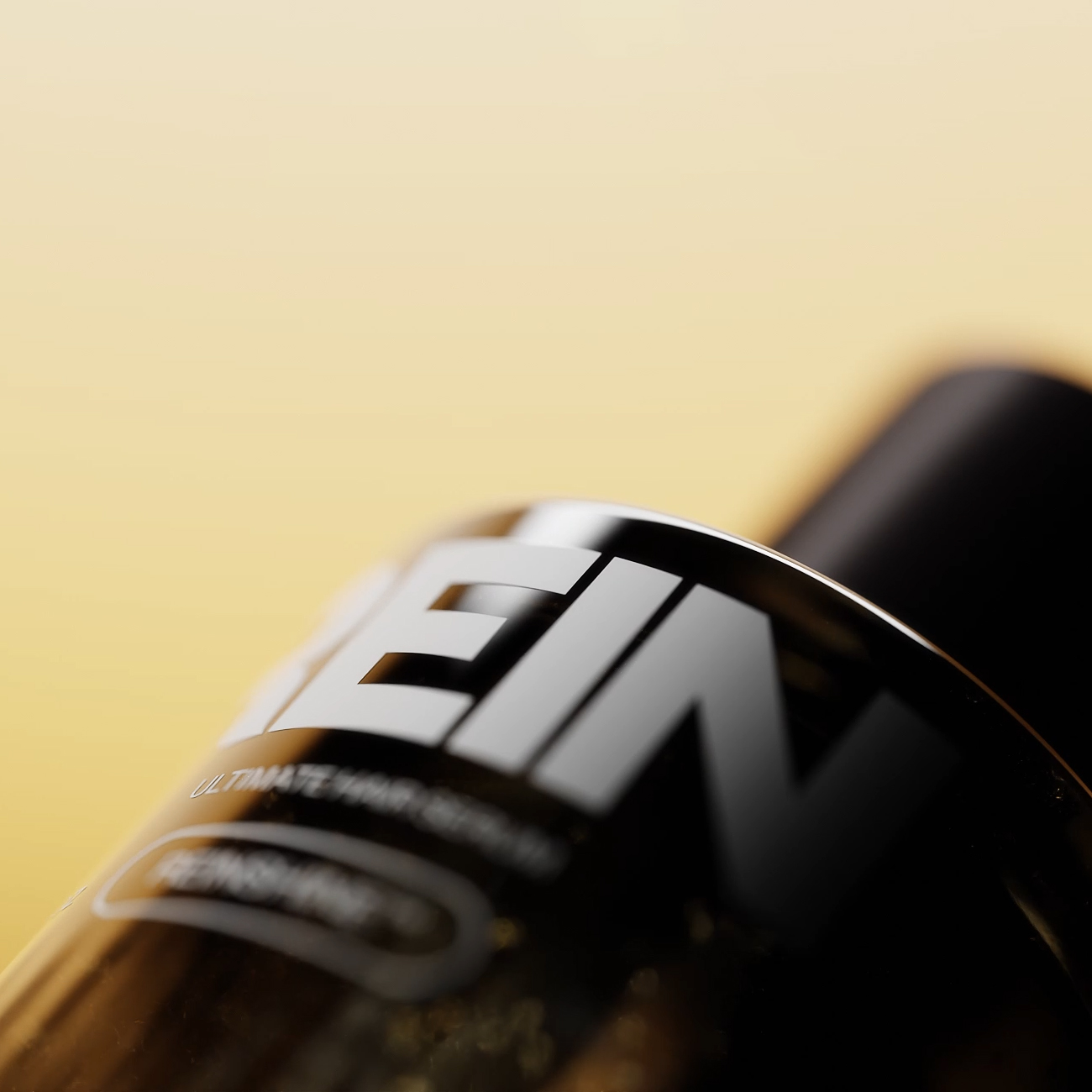
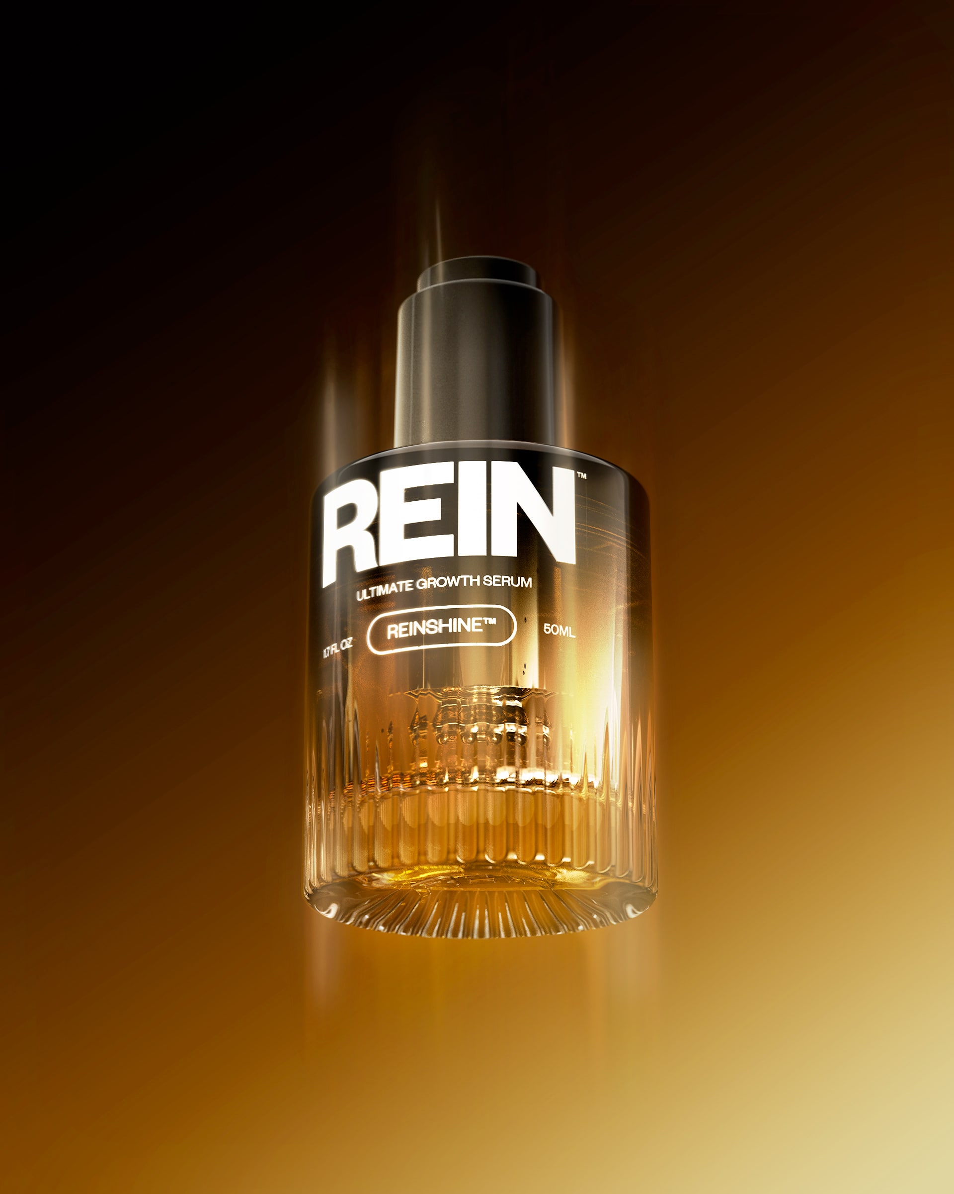
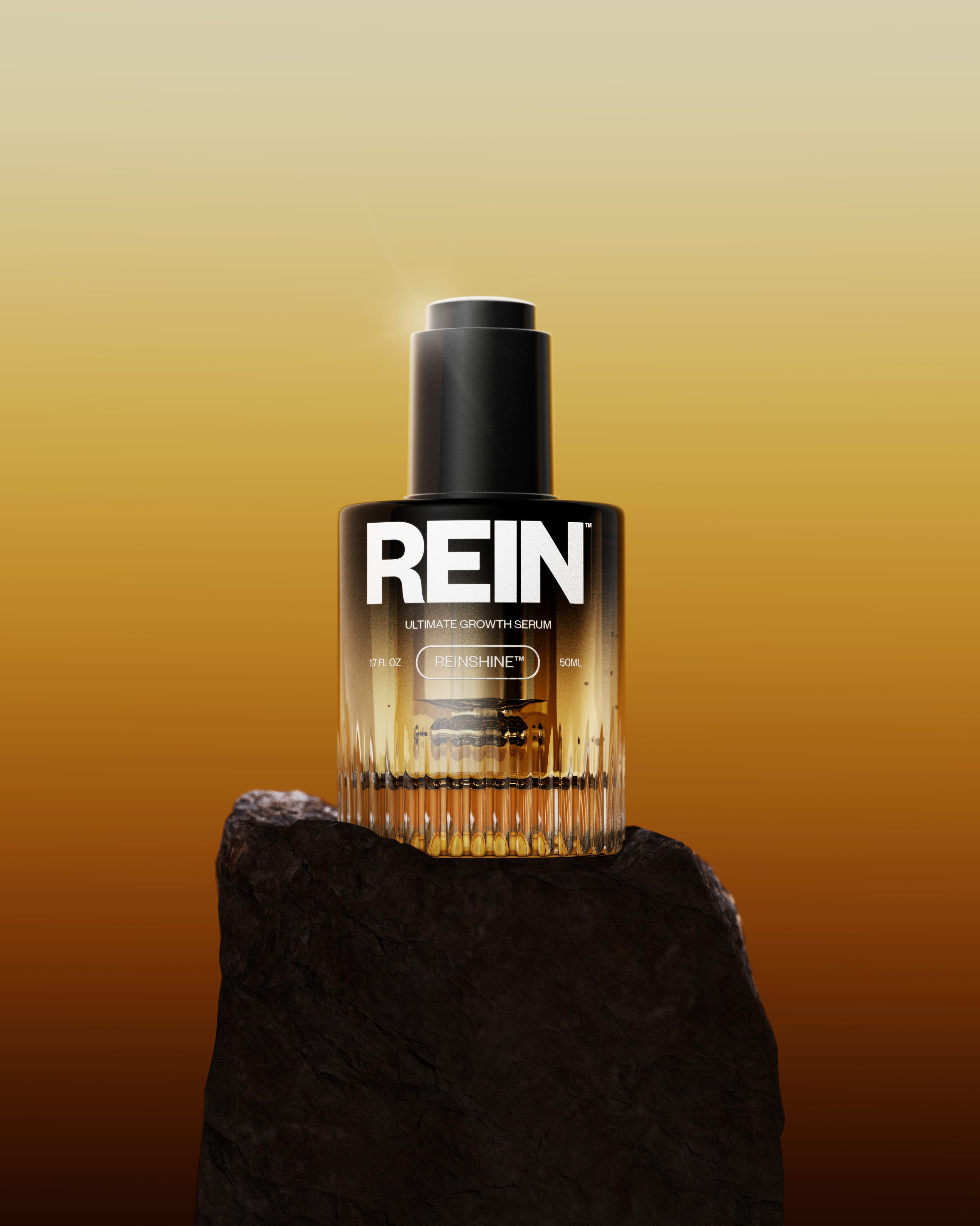
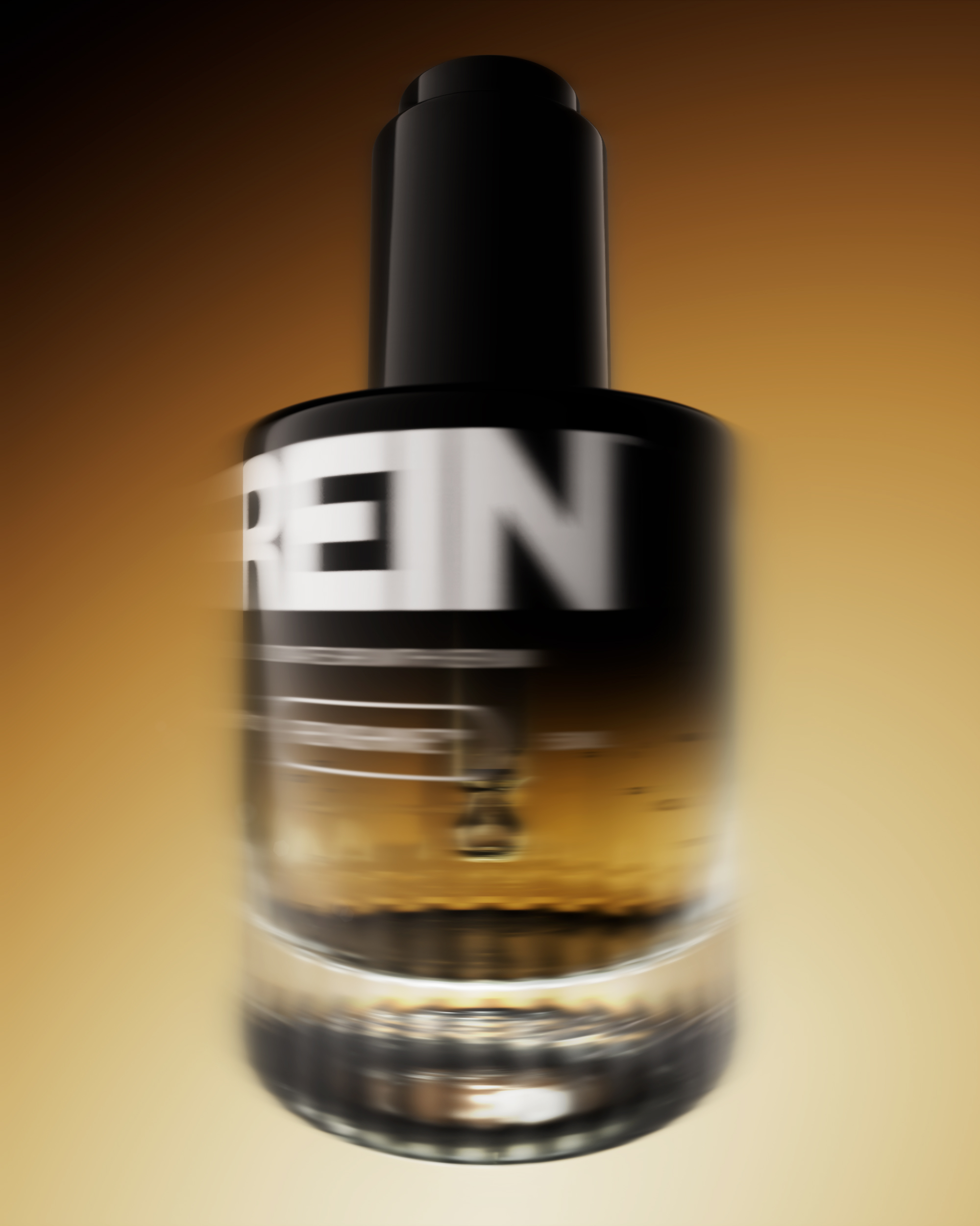
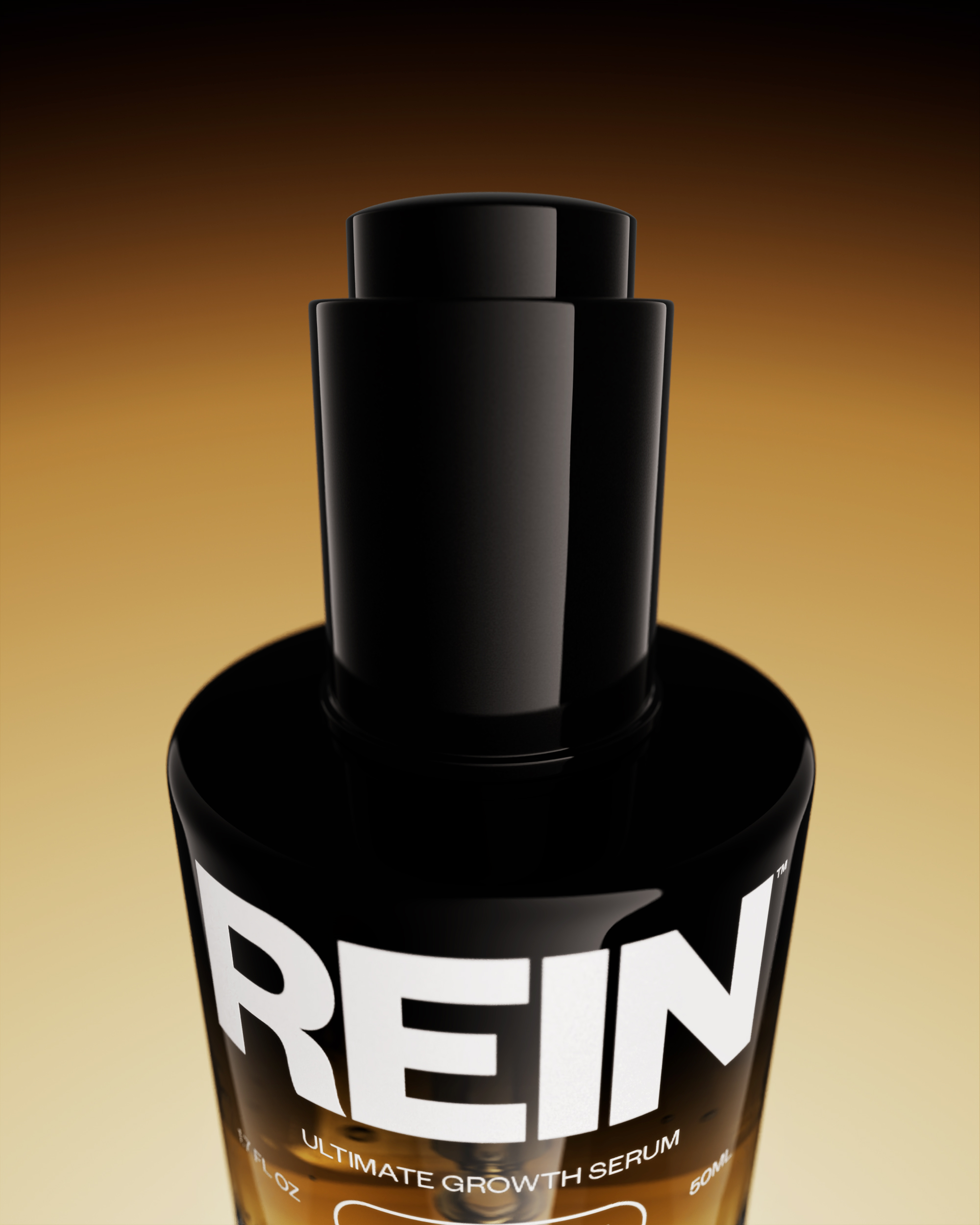
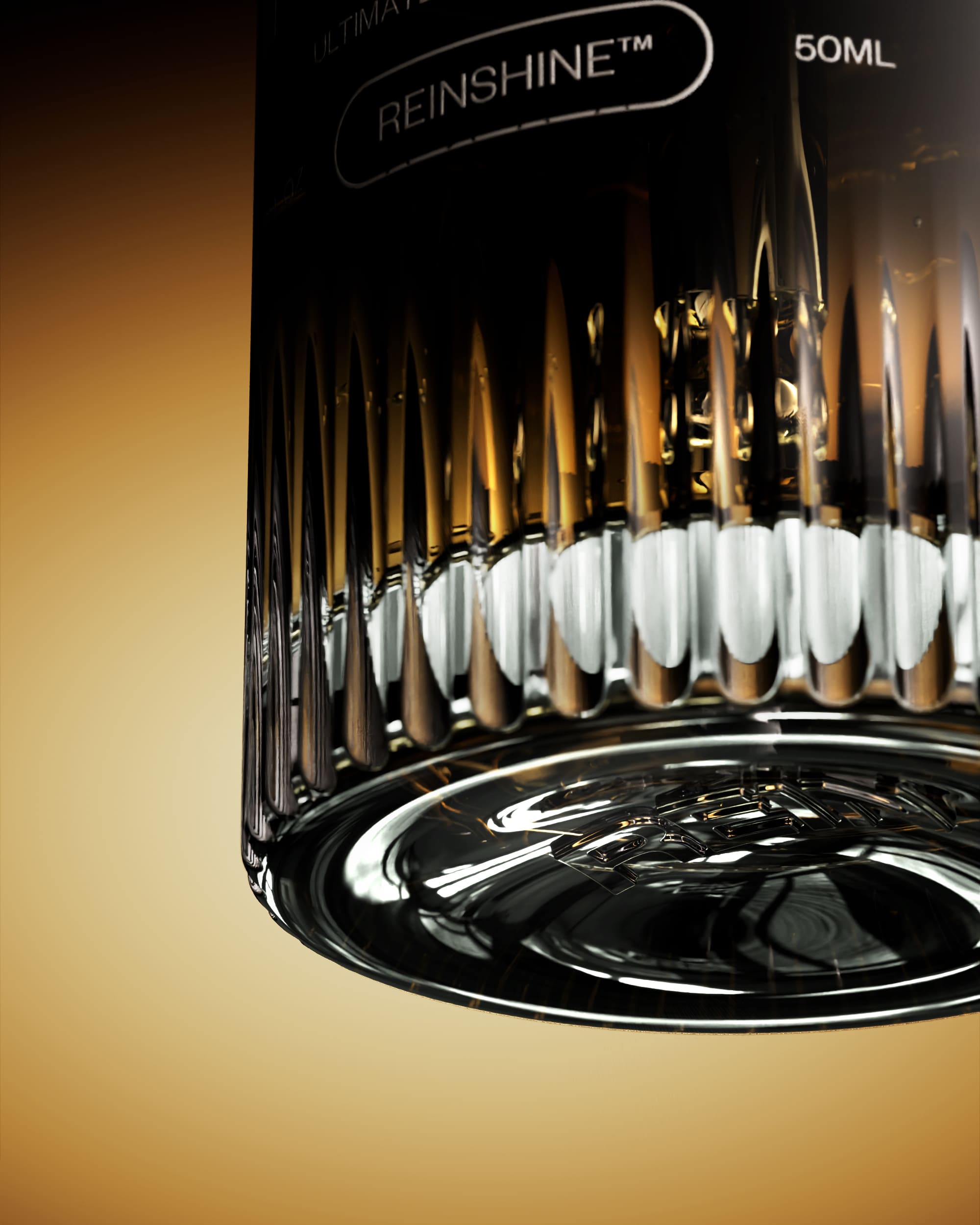
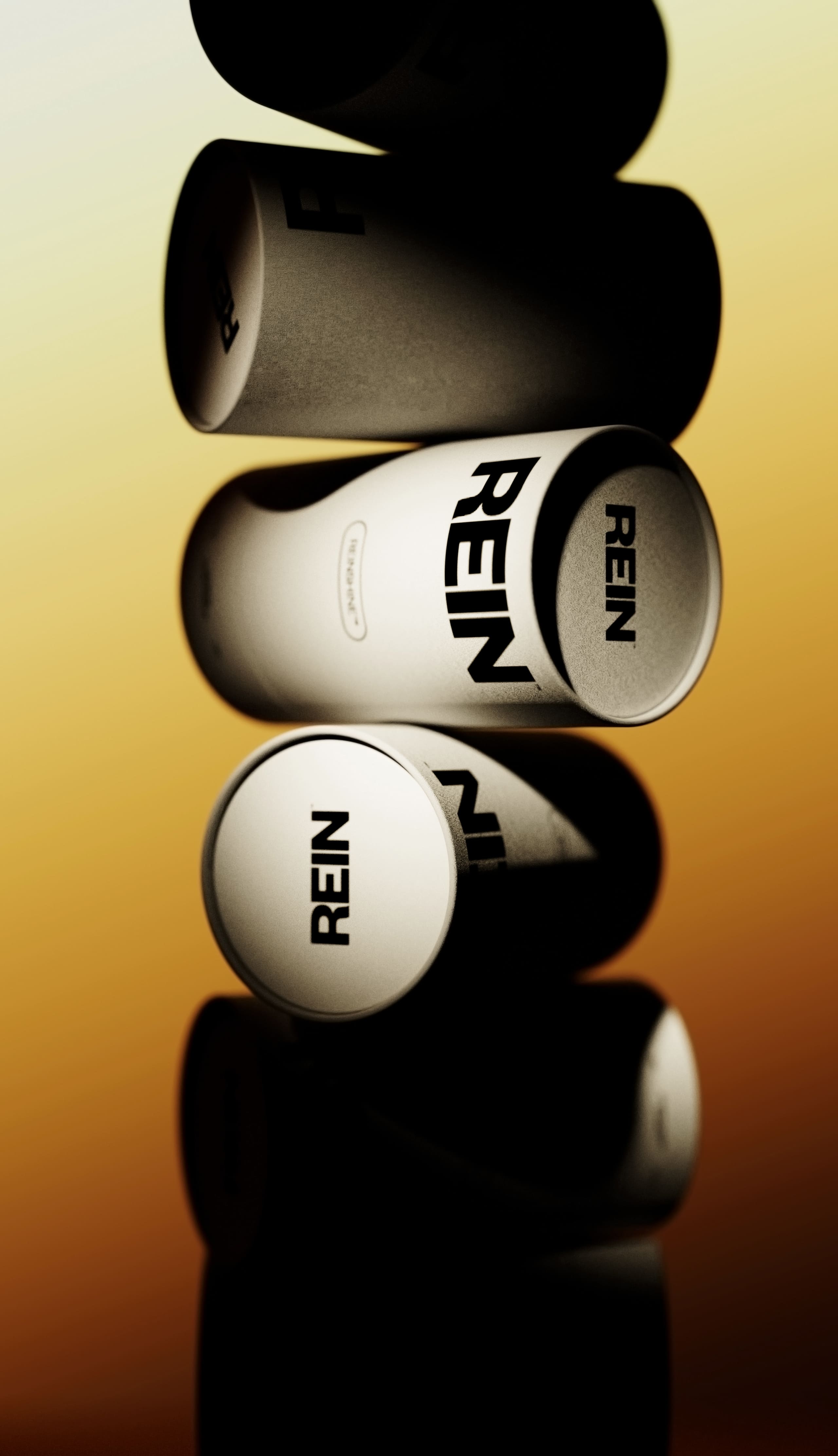
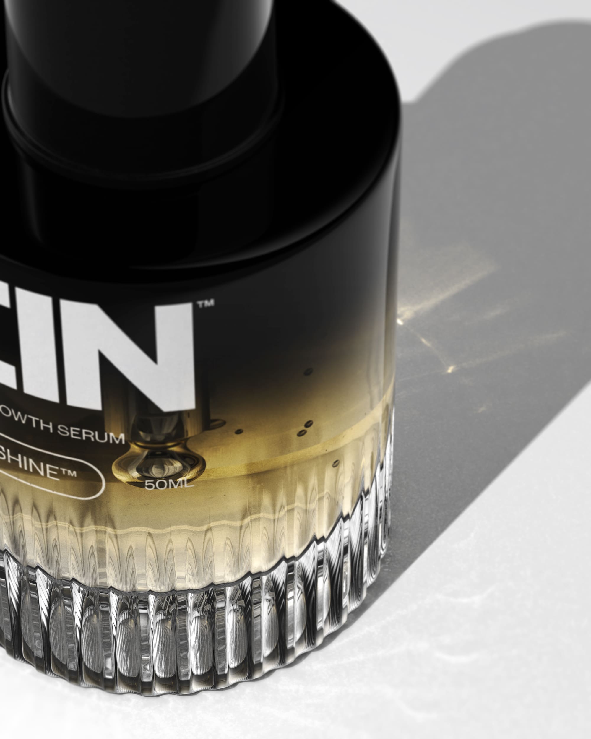
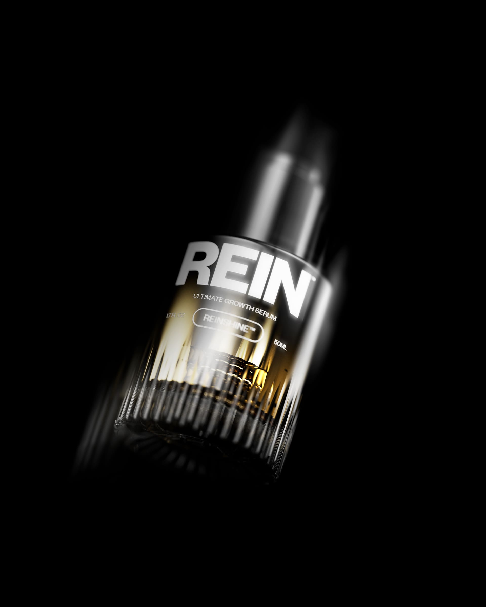
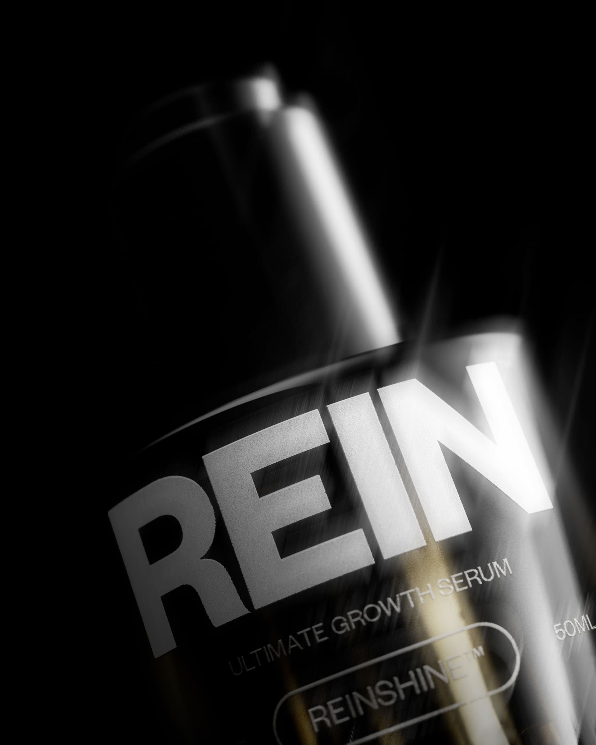
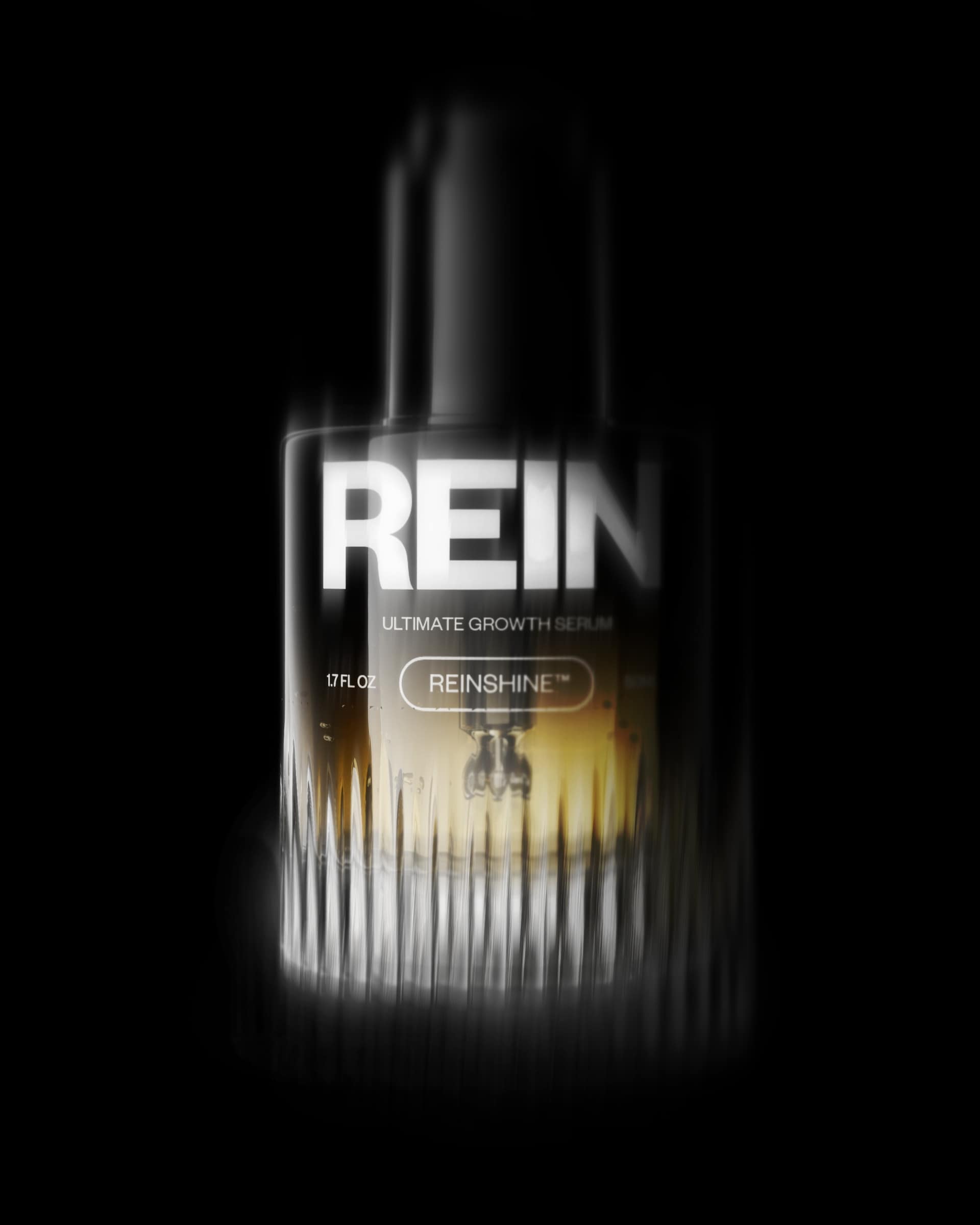
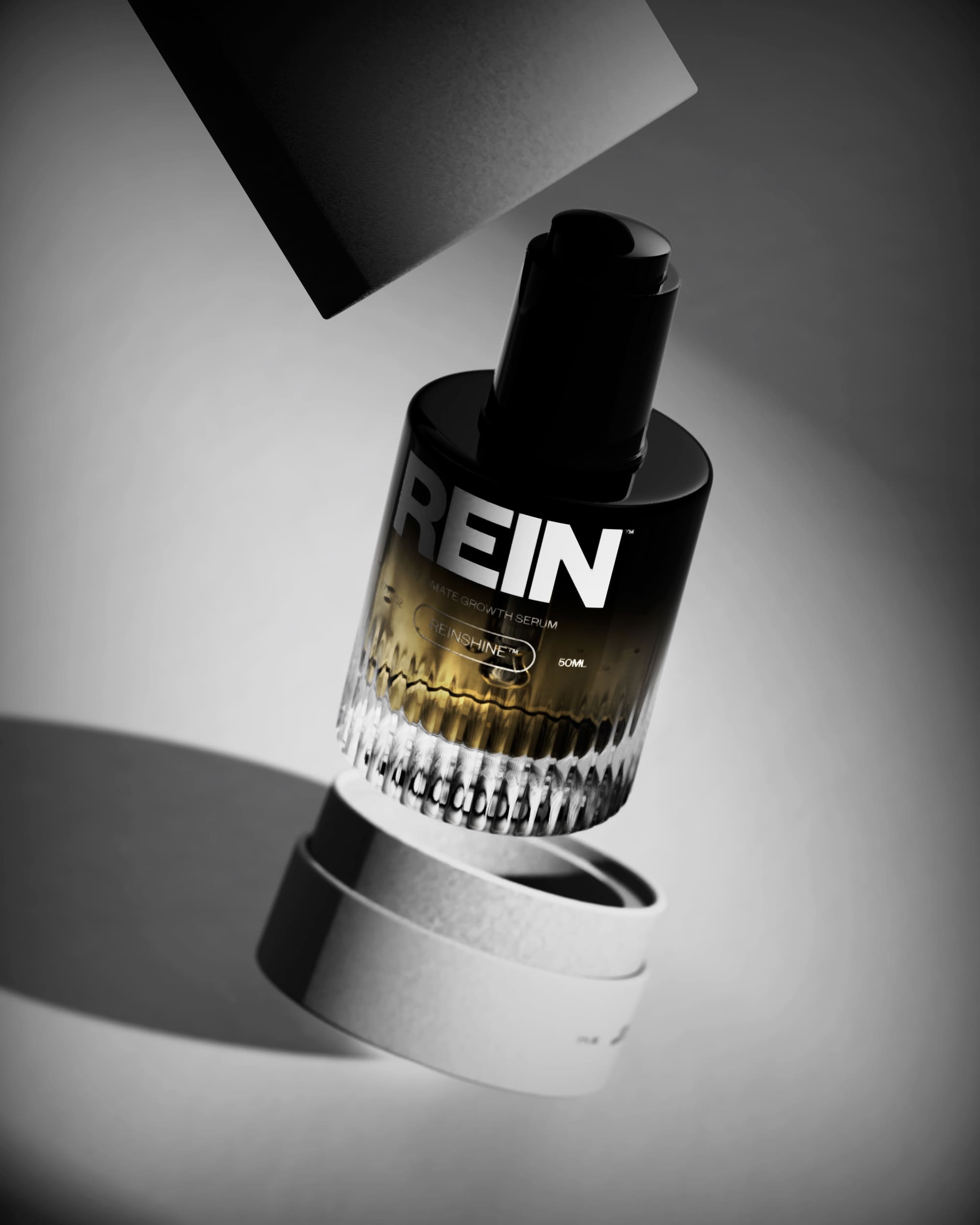
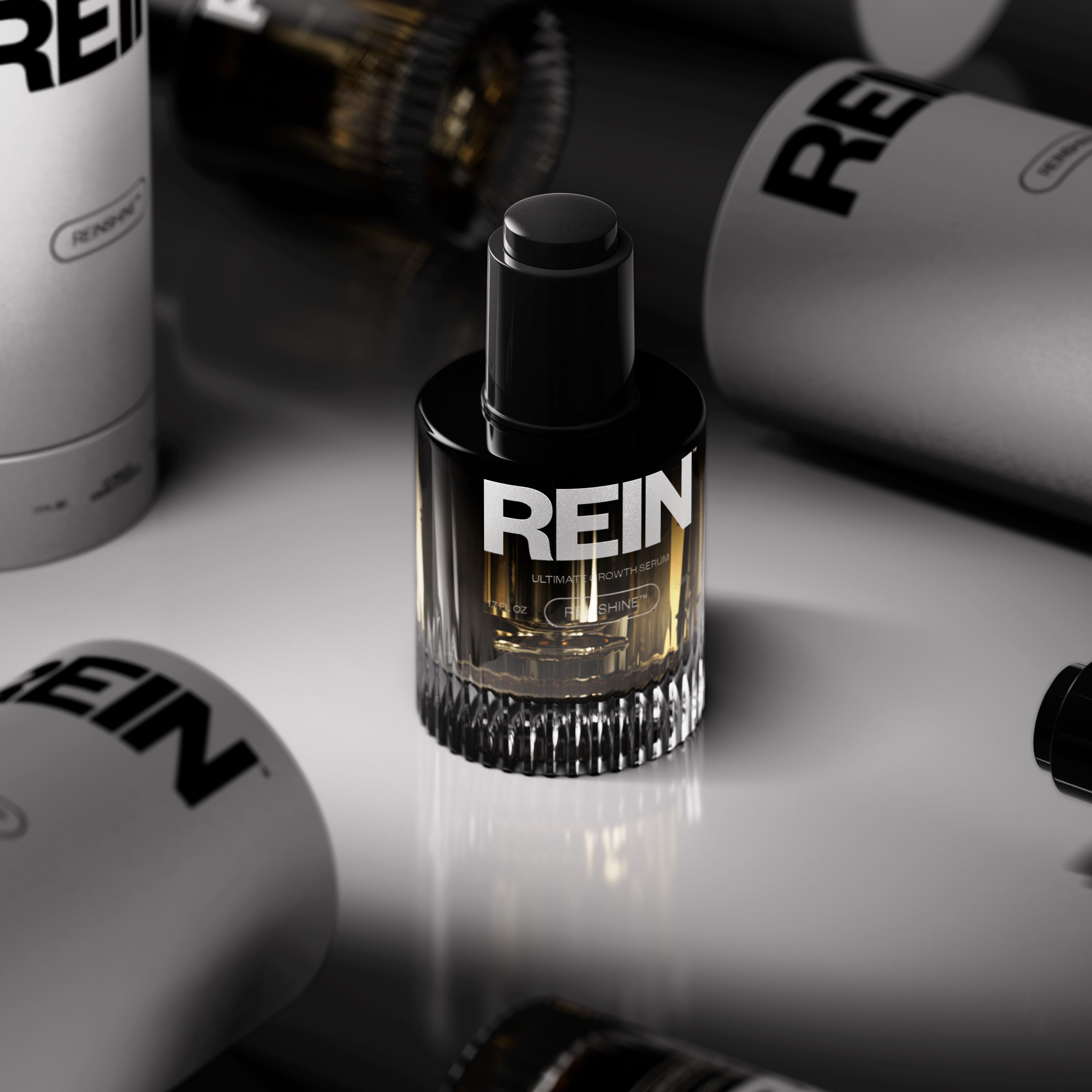
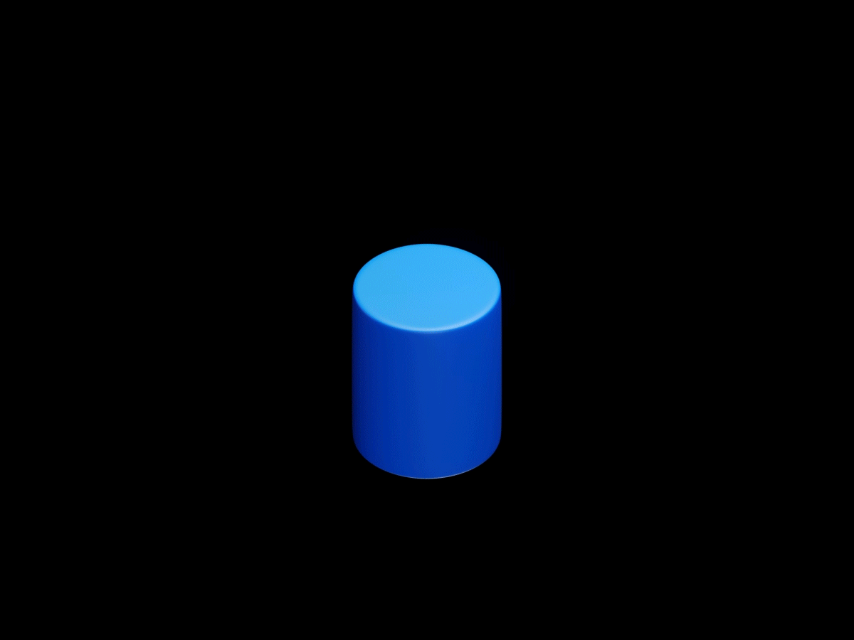
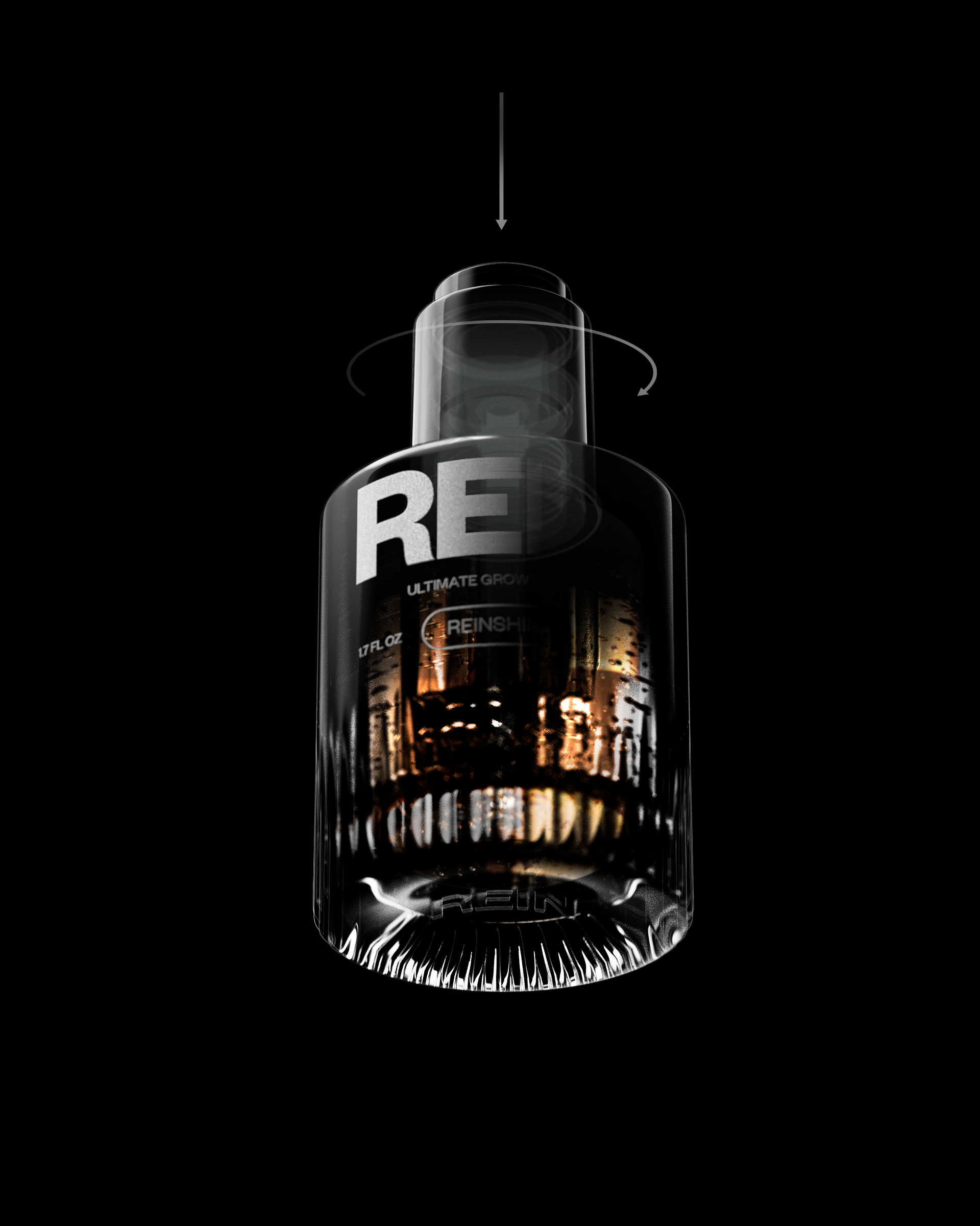
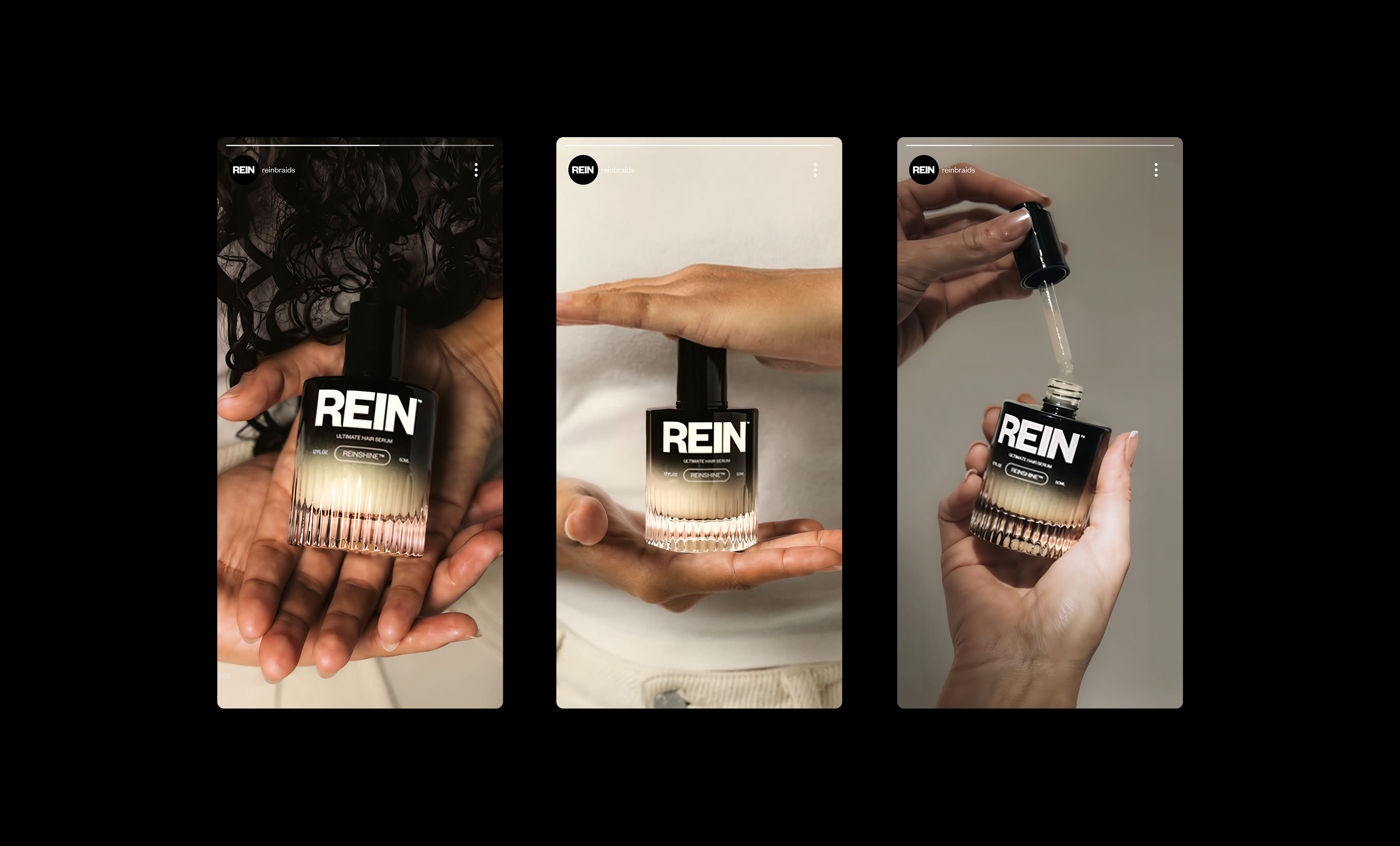
REIN is a high-end hair care brand, known for its excellent efficacy and unique brand image. We designed the iconic hair care essence bottle. This hair care bottle design reflects a restrained power, combining delicate touch with elegant visual effects. The bottle body design transitions from a grooved bottom to a smooth and thick glass bottle body to a reverse gradient from opaque black to transparent. Every detail is designed to convey the brand concept of transformation, growth and purity.
REIN is a premium haircare brand built on performance and presence. Our design for REIN's signature hair serum bottle embodies a quiet strength, blending tactile detail with visual refinement. From a fluted ba-se that dissolves into smooth, thick glass, to a reverse gradient that fades from opaque black to clear, every element was crafted to reflect transformation, growth, and clarity.
Client - REIN
Designed by - NOI Creative
CGI - Gian Luigi Singh, Bianca Furtunescu
OUR VISION
Create a high-end hair care experience to show elegance and confidence/Designing a Premium Hair care Experience with Quiet Confidence
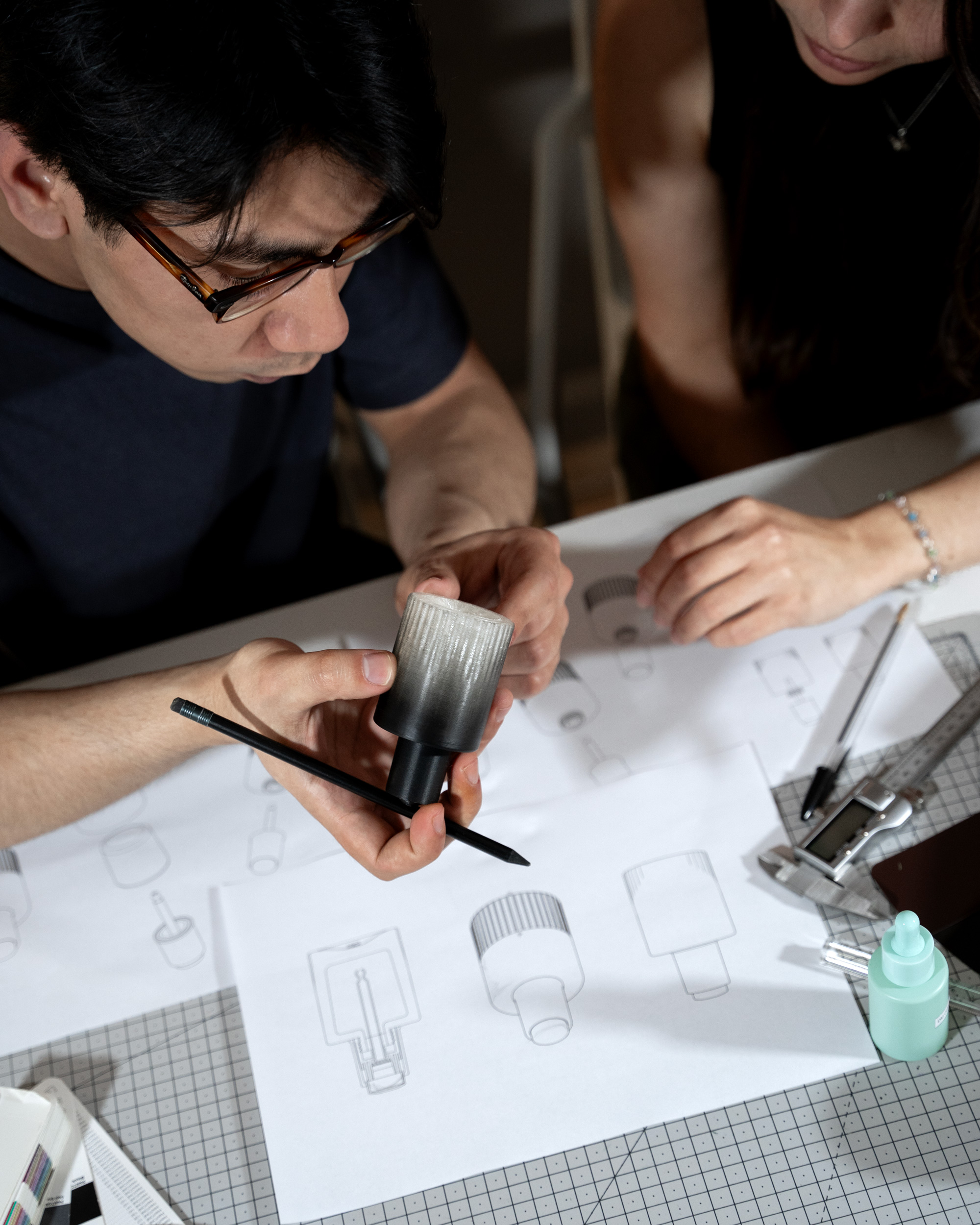
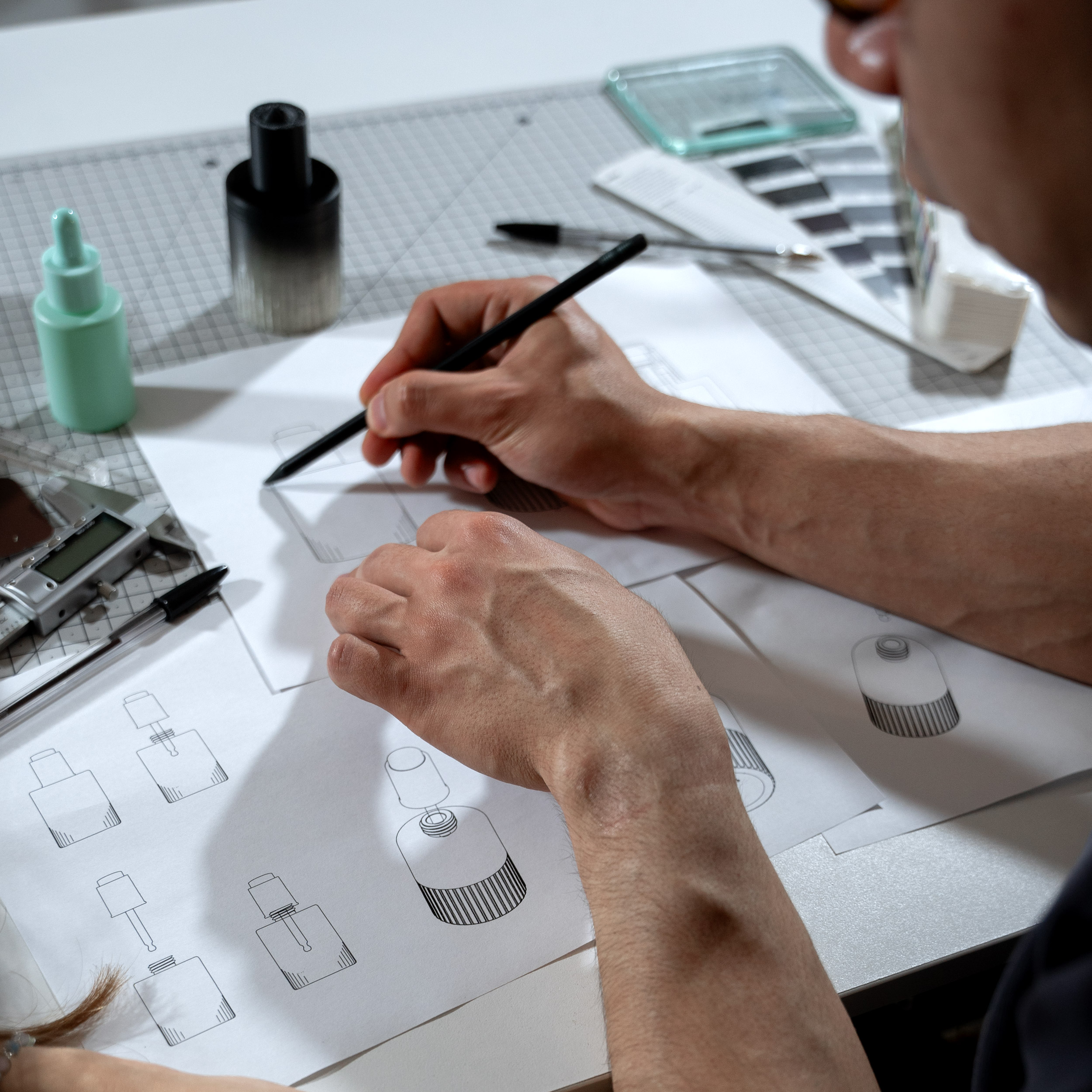
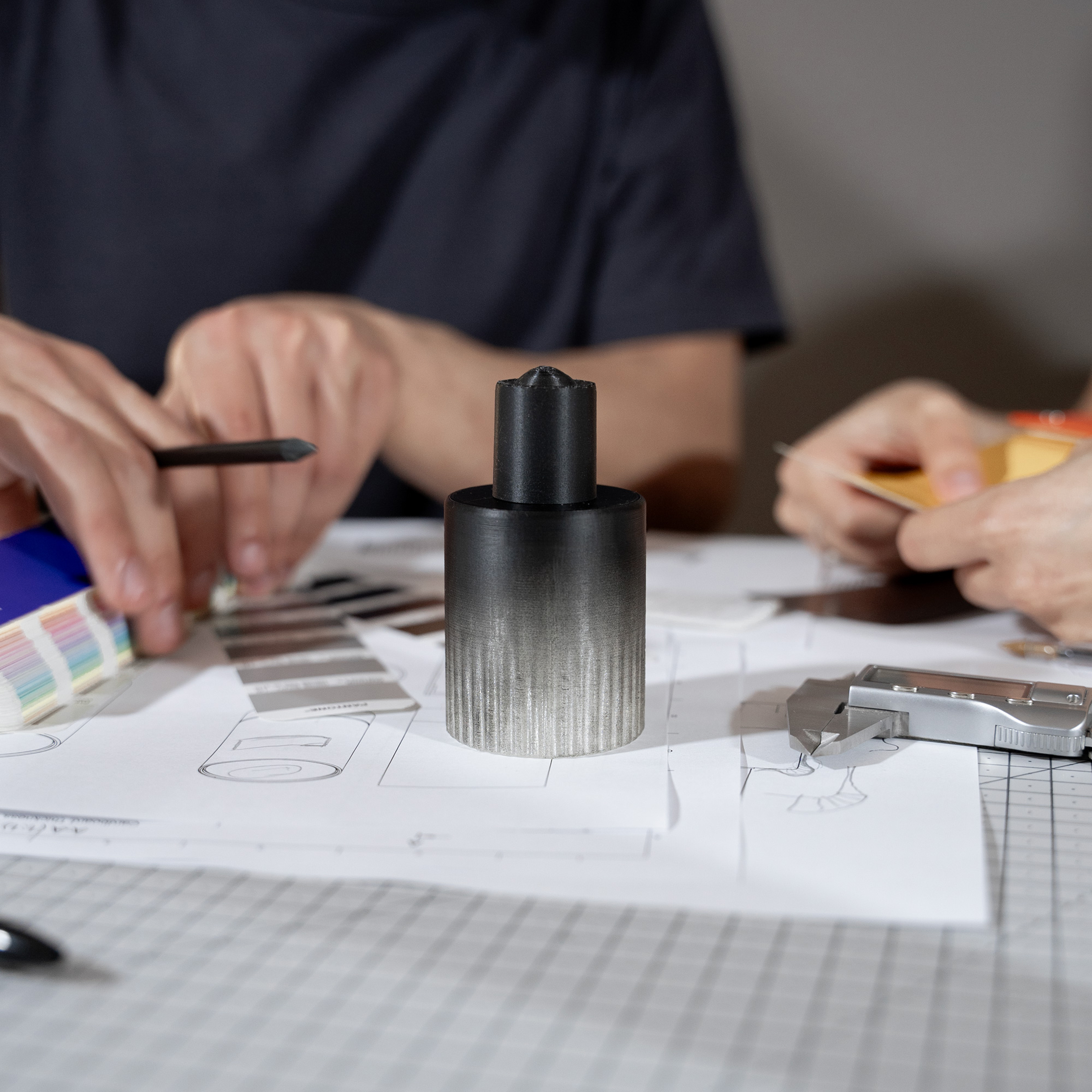
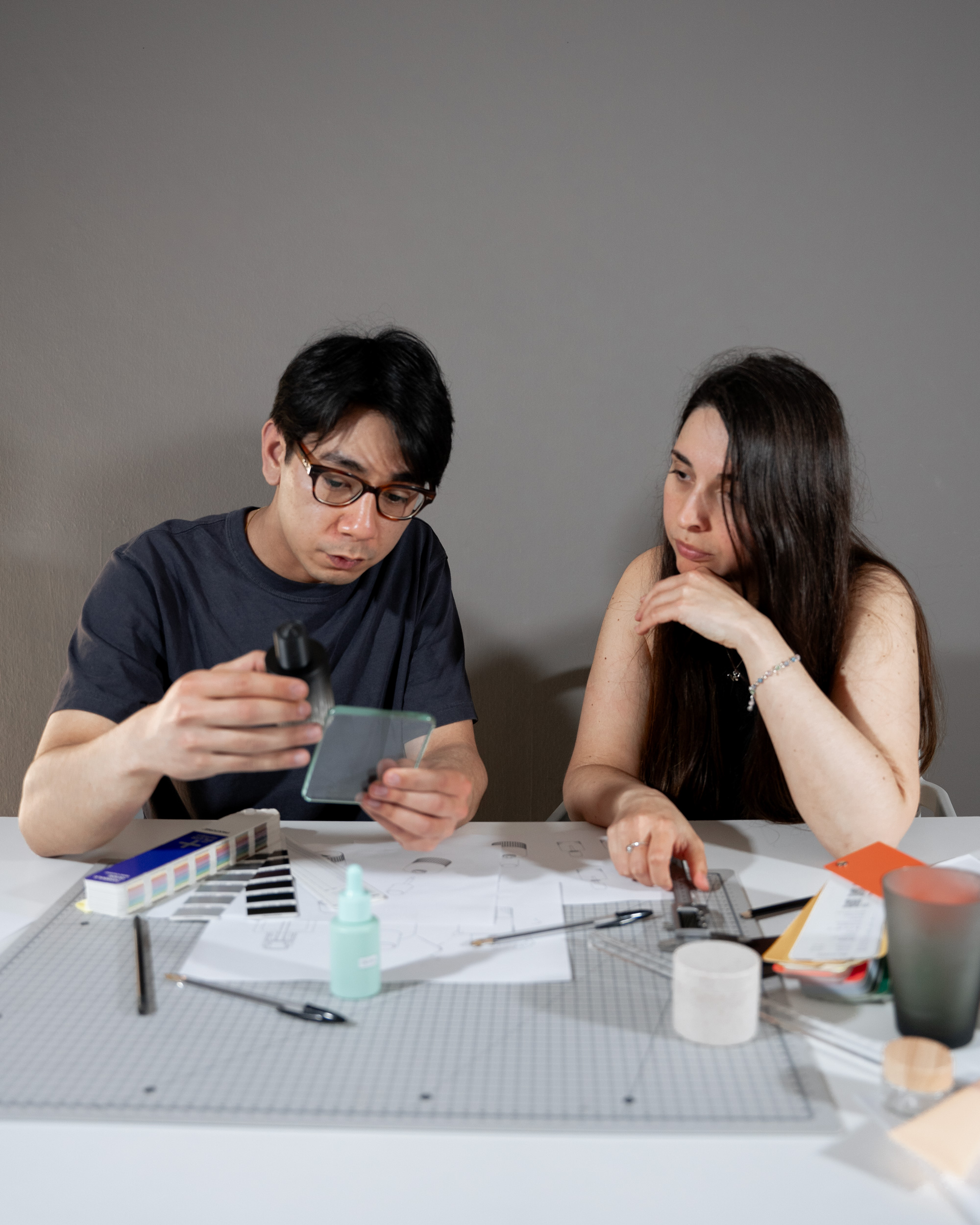
NOI Creative believes that excellent packaging design can enhance brand image and user experience. The packaging design created for REIN abstracts the essence of the brand throughout the product, packaging and digital platforms. The final product is not just a bottle, but a symbol of low-key luxury, simple but not simple, and ingenious design stands out in the highly competitive self-care market.
At NOI Creative, we believe exceptional packaging design should elevate both the brand story and the user experience. For REIN, we distilled the brand's core values into a cohesive system that spans product, packaging, and digital touchpoints. The result is more than a bottle; it's a statement of quiet distinction, where minimalism meets meaning, and subtle design choices set the brand apart in a crowded self-care market.

CHALLENGE
minimalism and impact in a saturated self-care space
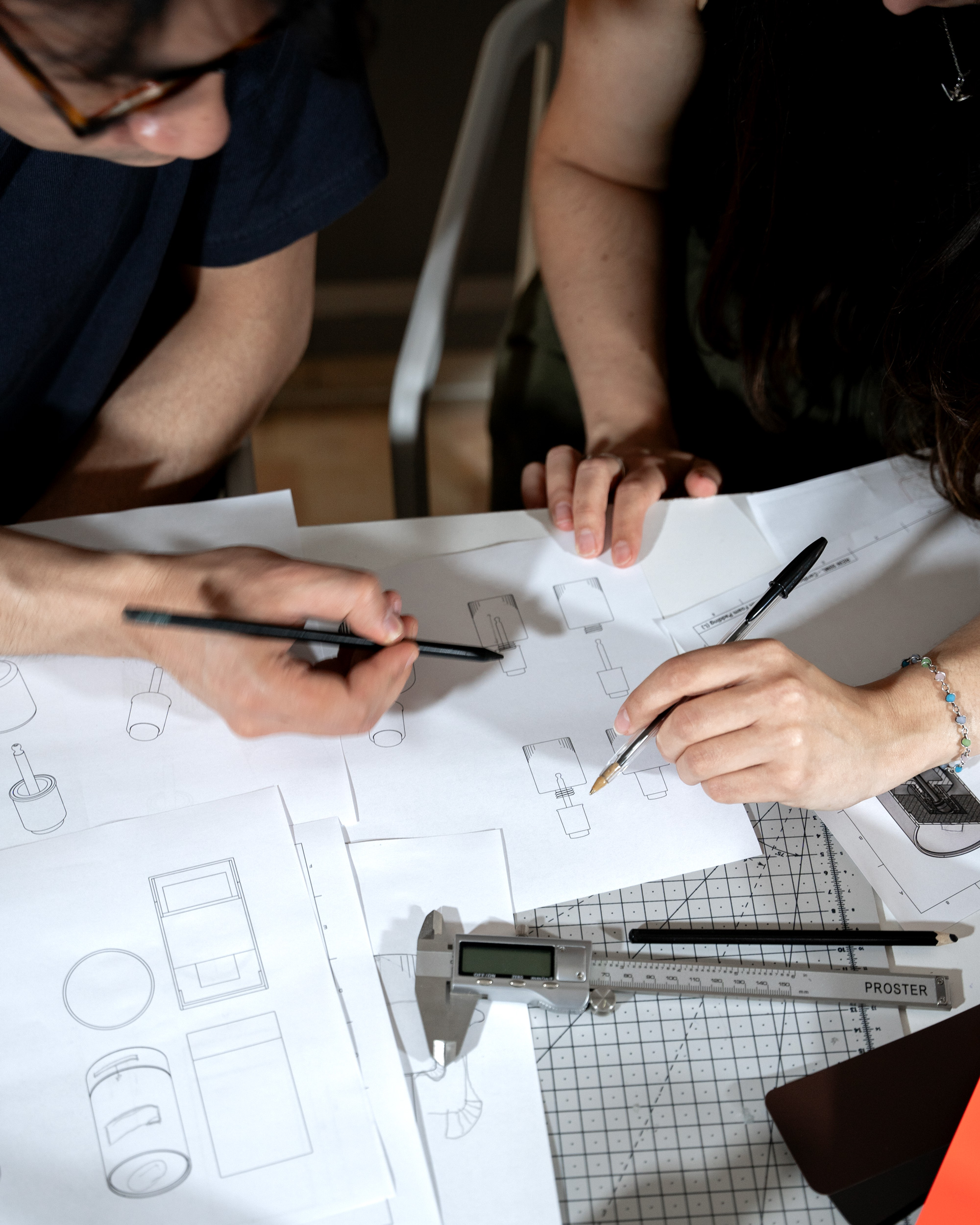
Skin care and beauty market competition is fierce, many brands pursue simple and low-key, but often lack of personality. Our goal is to create a simple and exquisite, bold and unique brand. This requires striking a balance between restraint and attractiveness, and ensuring that the visual language is consistent across products, packaging and digital platforms, with every detail carefully designed and value for money.
The hair care and grooming landscape is crowded with clean, understated brands, often at the expense of distinctiveness. Our challenge was to create something that felt elemental and refined, yet carried a bold, unmistakable presence. It meant finding the right tension between subtlety and shelf appeal, and ensuring that this visual language could translate seamlessly across product, packaging, and digital touchpoints in a process of reduction, where every detail had to earn its place.

OUTCOME
A hair care product system built for impact
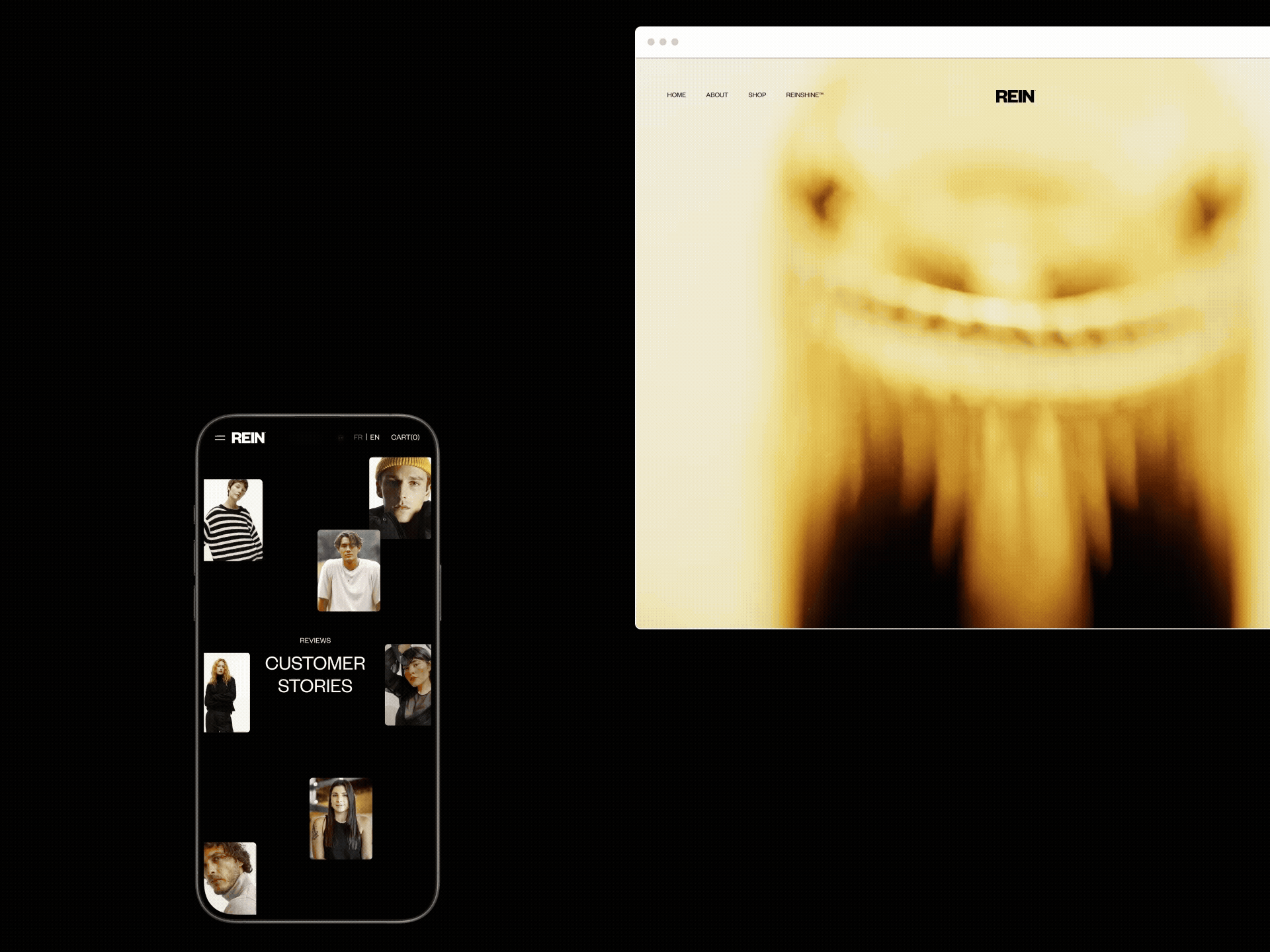
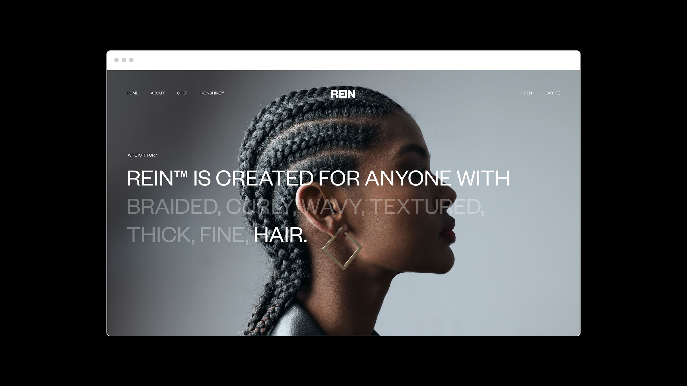
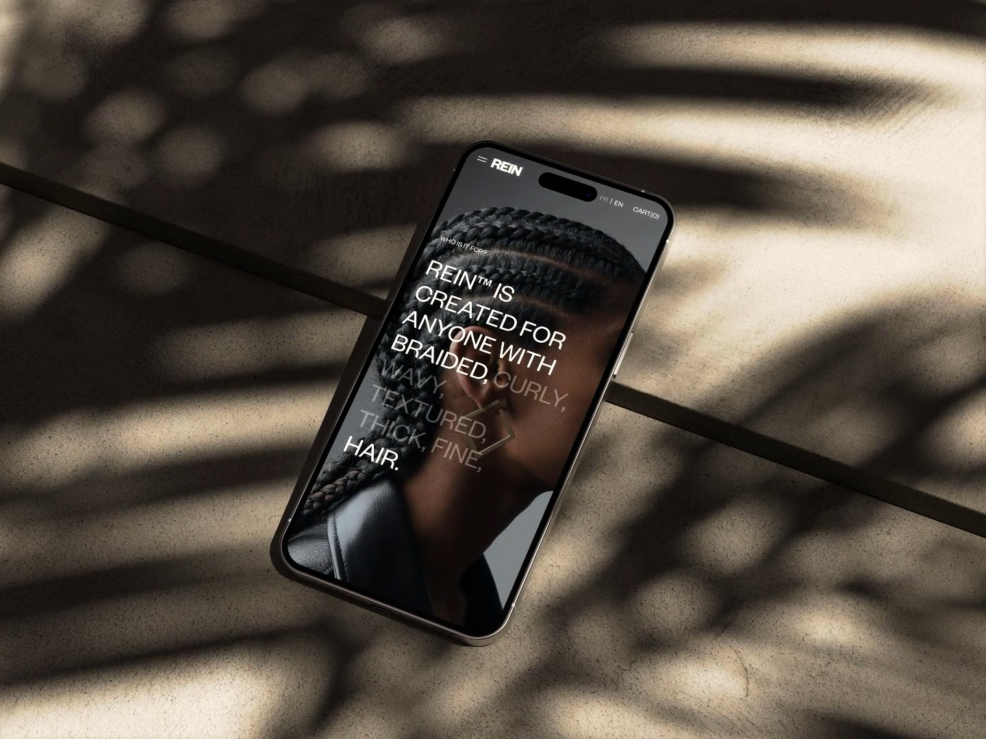
The end product is not just an independent product, but an ecosystem that can survive confidently in the market. The product design fits perfectly with the brand promise, and the digital platform ensures a seamless experience from discovery to purchase. Whether it is the touch of the product or the simple and easy-to-use landing page, the perfect integration of online and offline experience strengthens the connotation of REIN brand: stability, refinement, low-key and full of power.
The final result is more than a standalone product, it's a system built to live confidently in the market. The physical design delivers on the brand promise, while the digital touchpoint ensures a seamless path from discovery to purchase. From the tactility of the product to the clean and intuitive landing page, both physical and digital realms work together in synergy to reinforce REIN's identity and commitment: grounded, refined, and quietly bold.

本作品版权归 NOI Creative 所有,禁止匿名转载及个人使用,任何商业用途均需联系原作者。

新用户?创建账号
登录 重置密码
请输入电子邮件以重置密码。


really, really good
Perfect
it looks very good