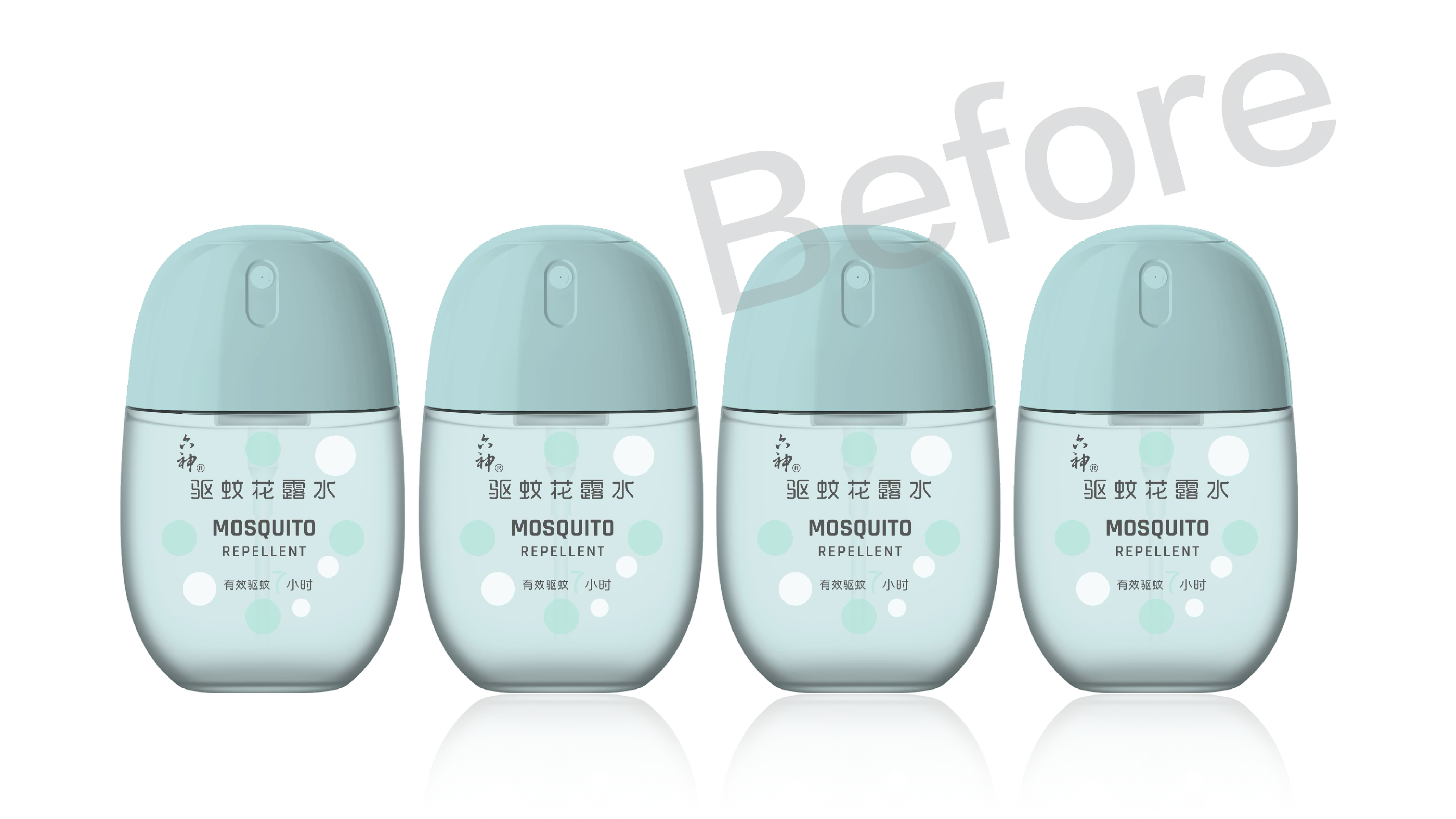
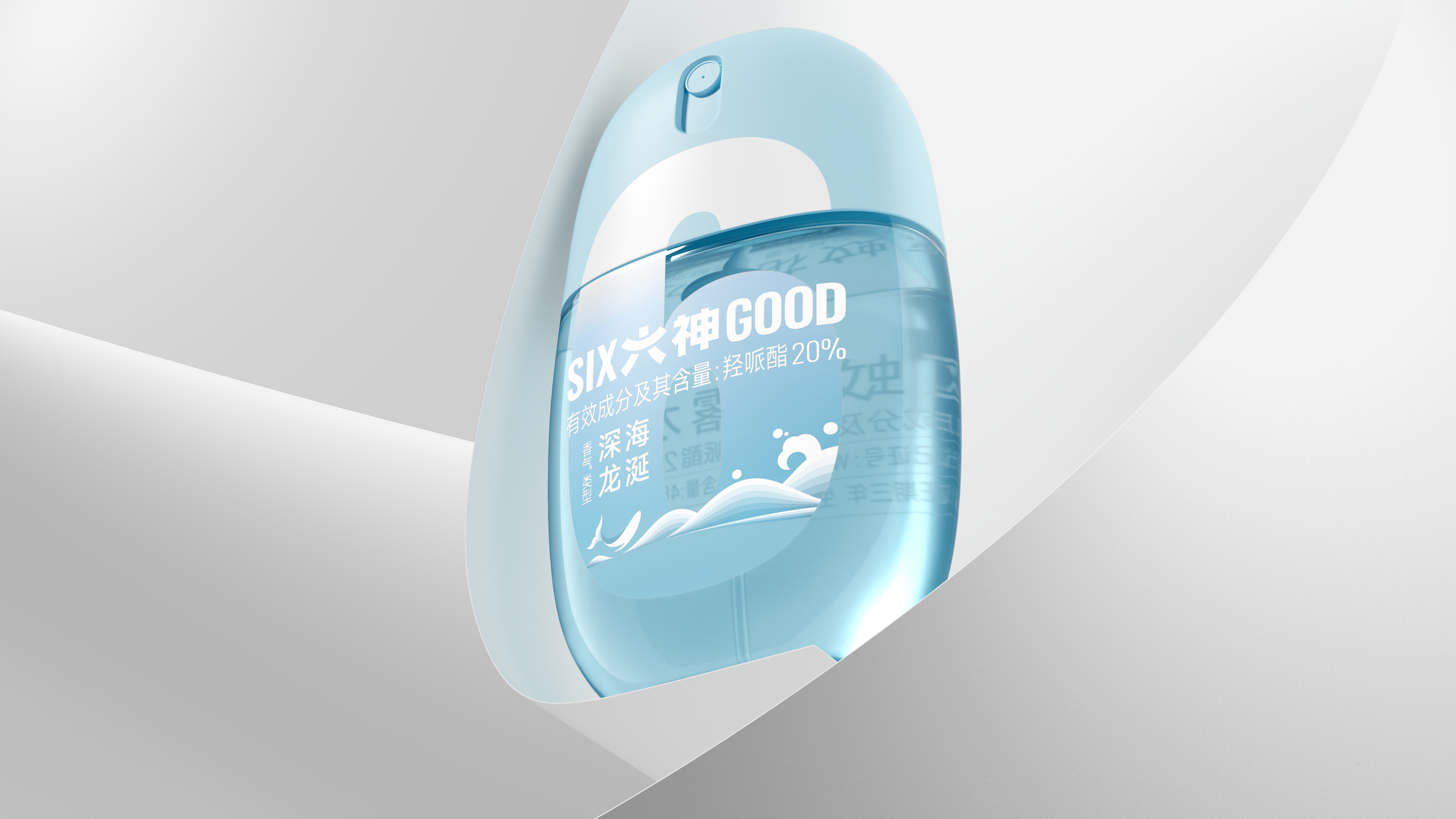
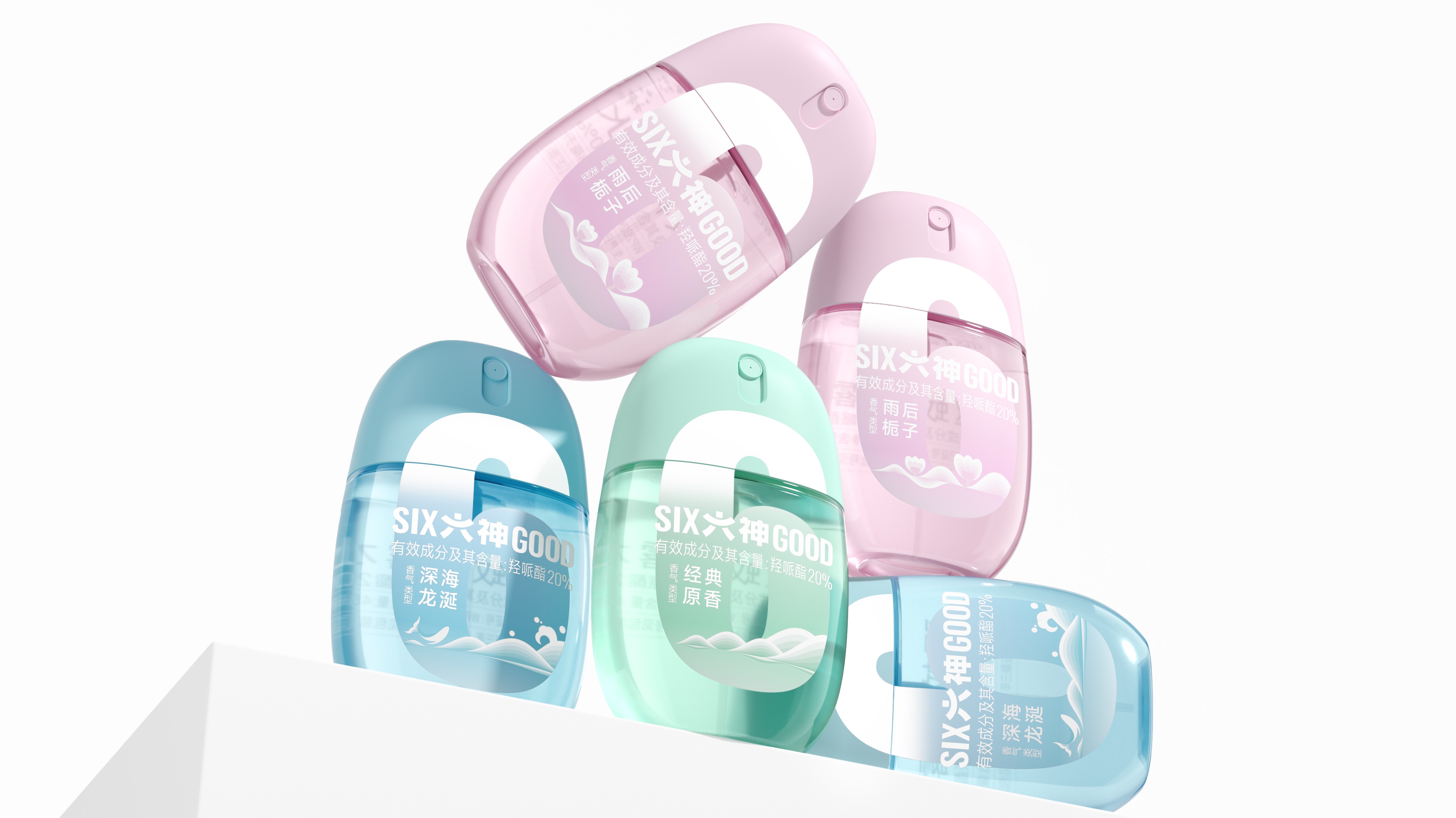
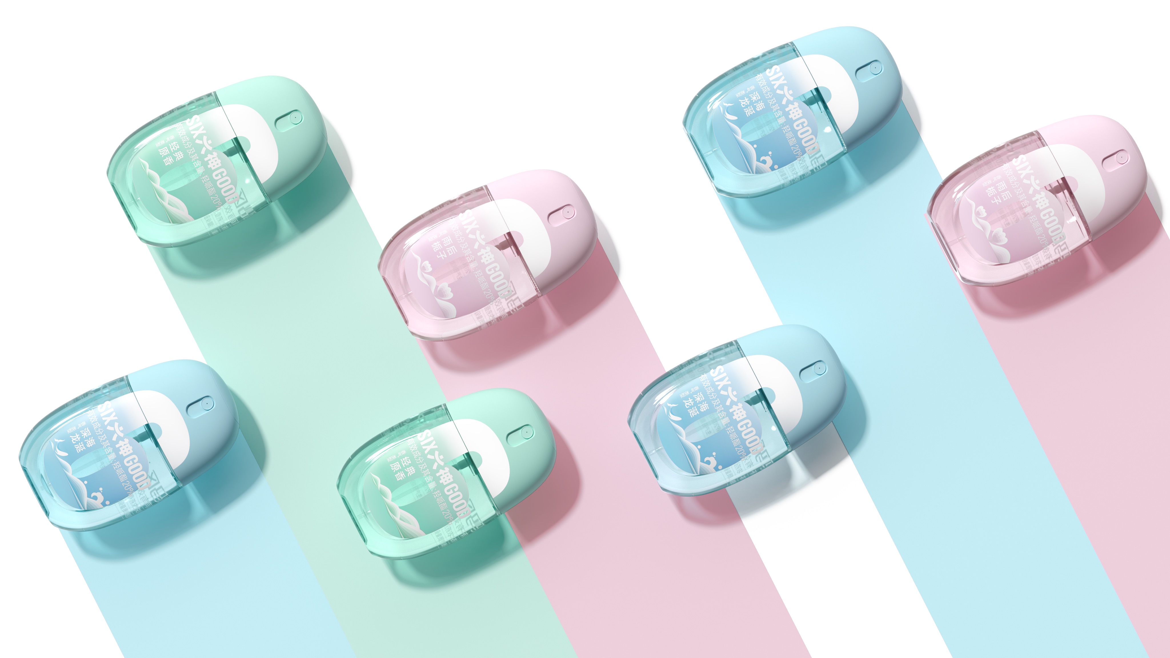
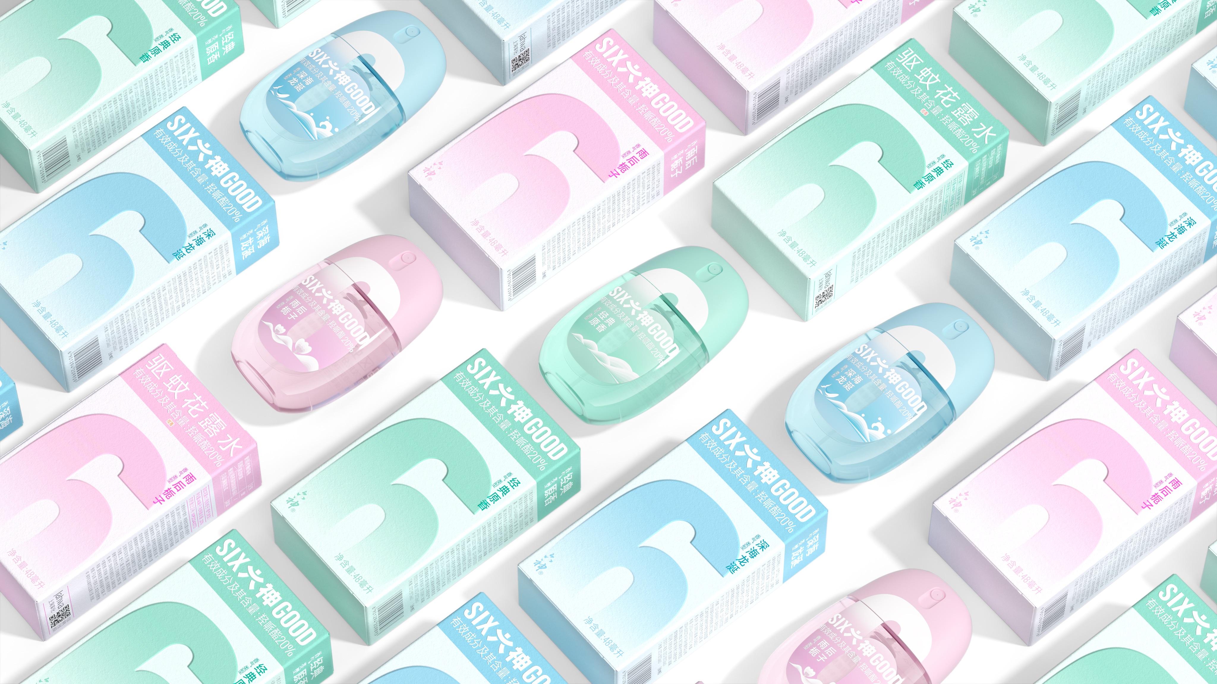
As a national daily chemical brand that has accompanied Chinese families for 30 years, Liushen has always guarded national life with herbal wisdom, actively seeking changes and continuously promoting product upgrades and brand rejuvenation construction, and the "Liushen Portable Eggs" series of products came into being.
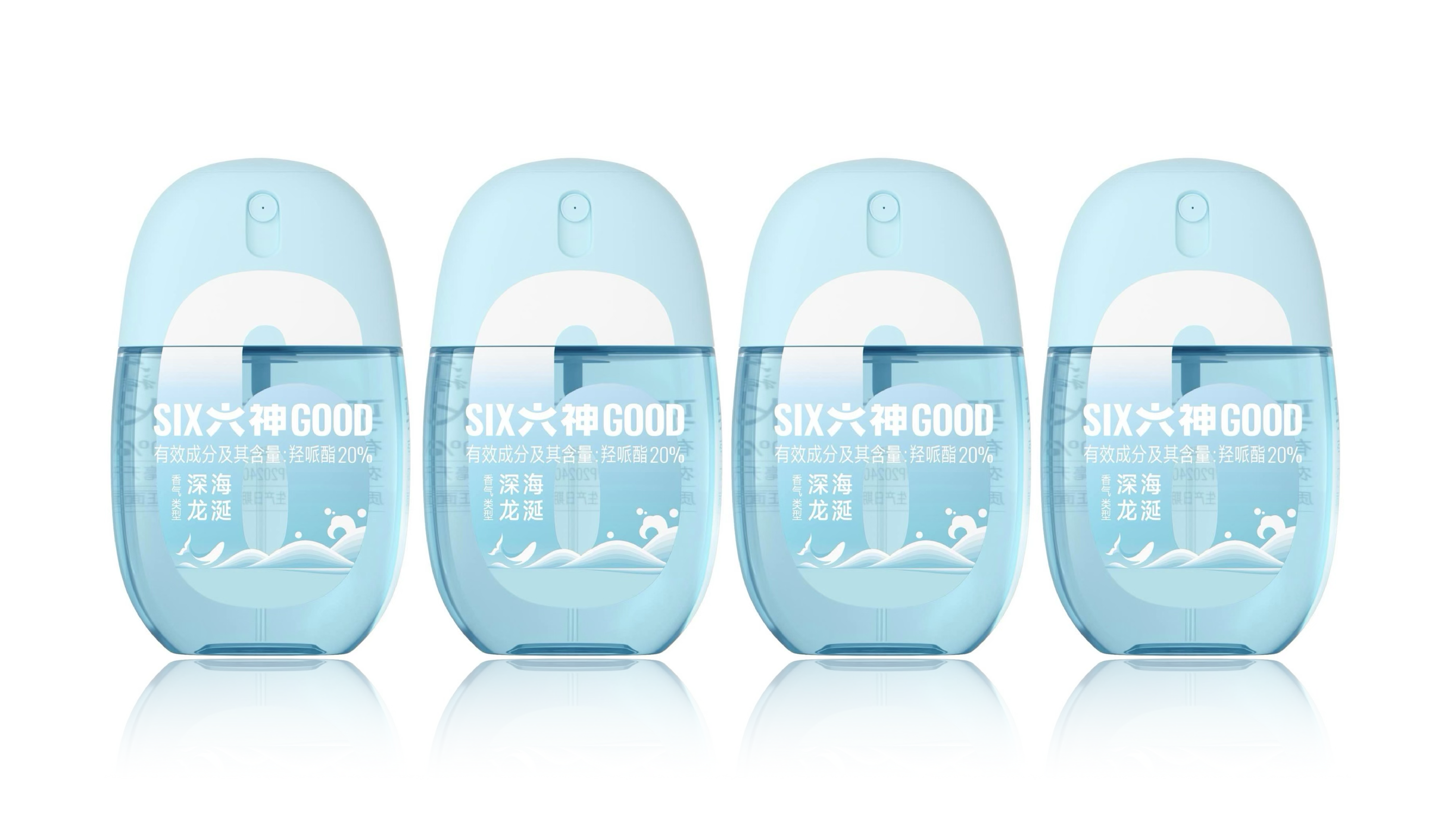
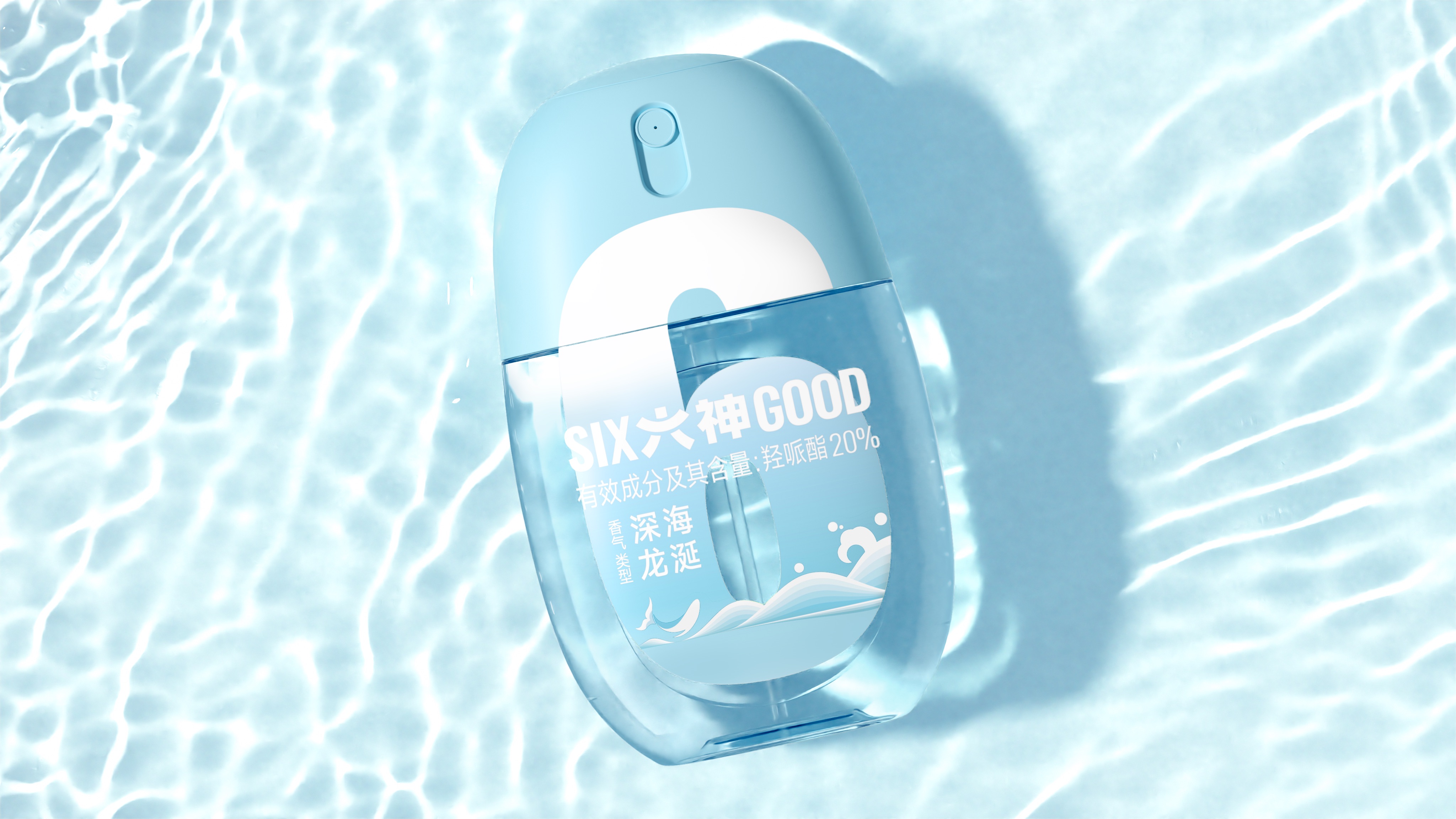
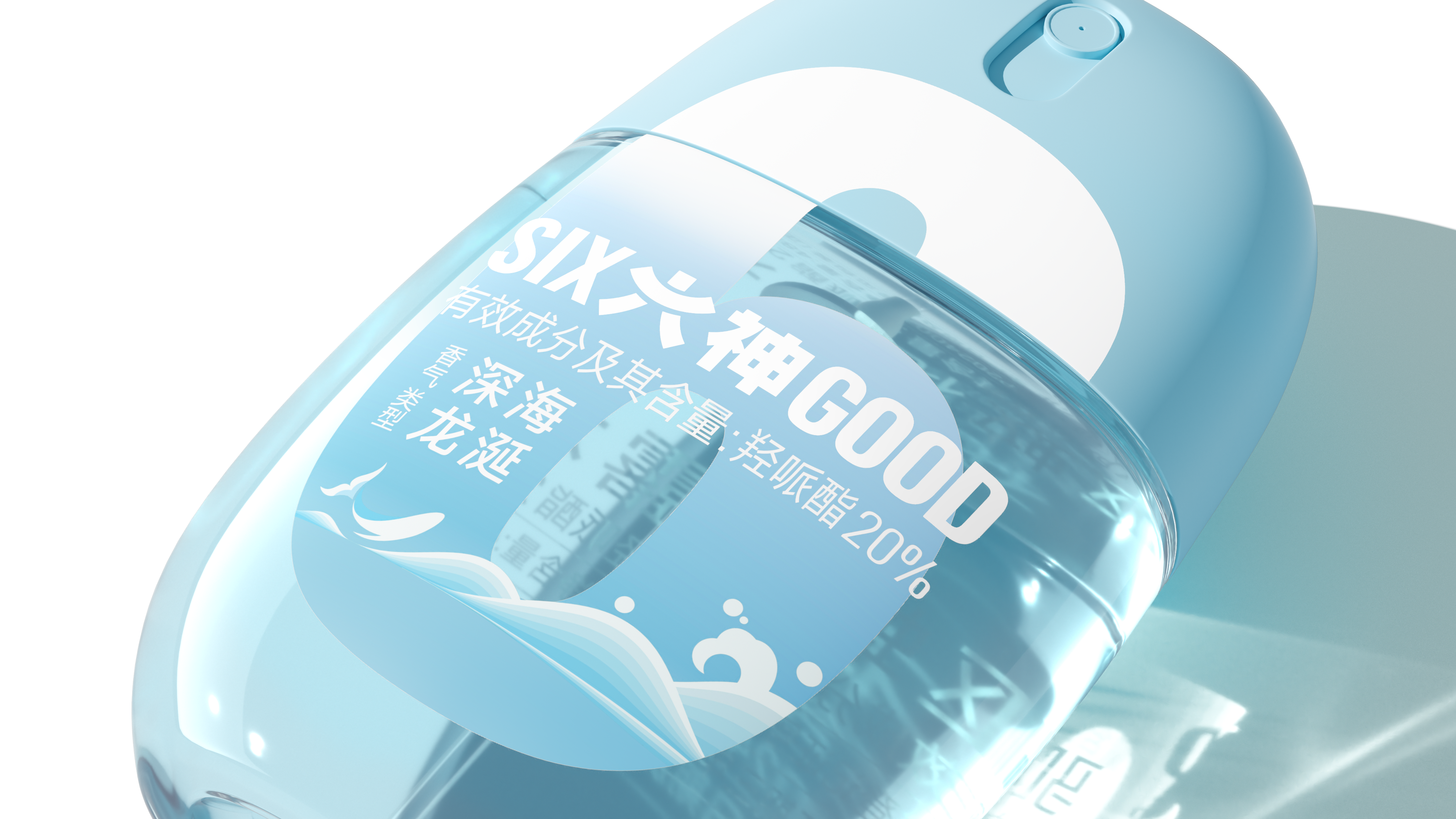
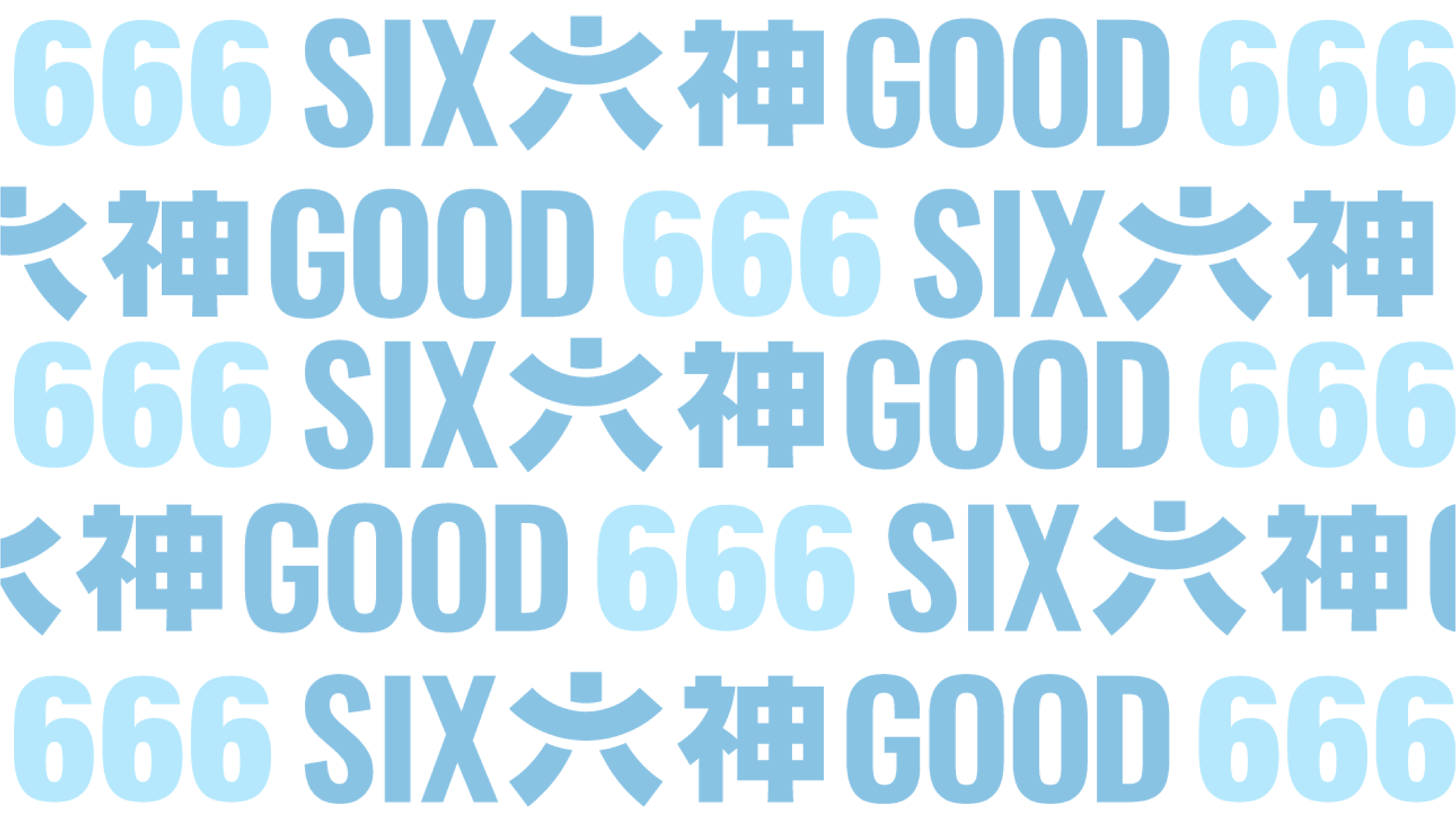
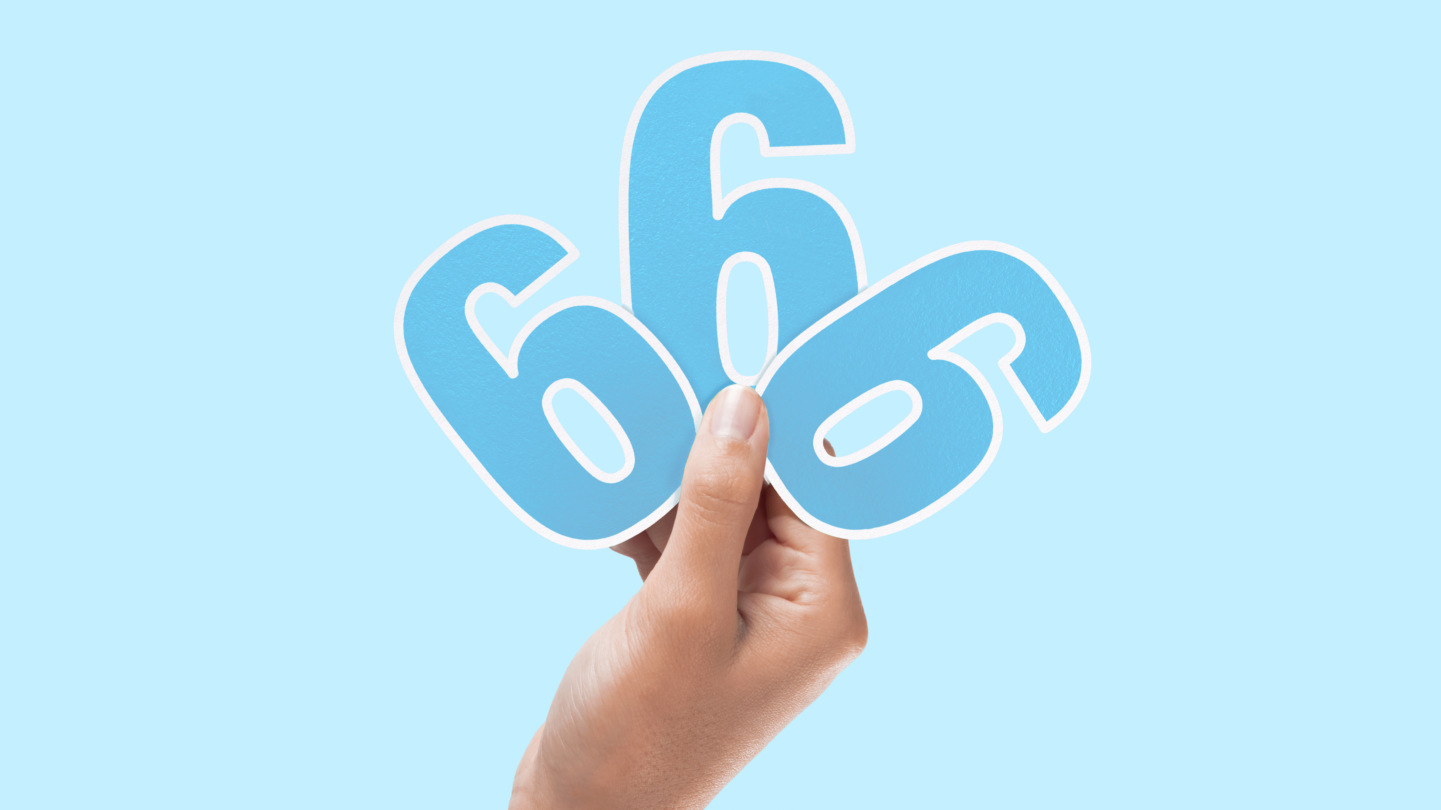
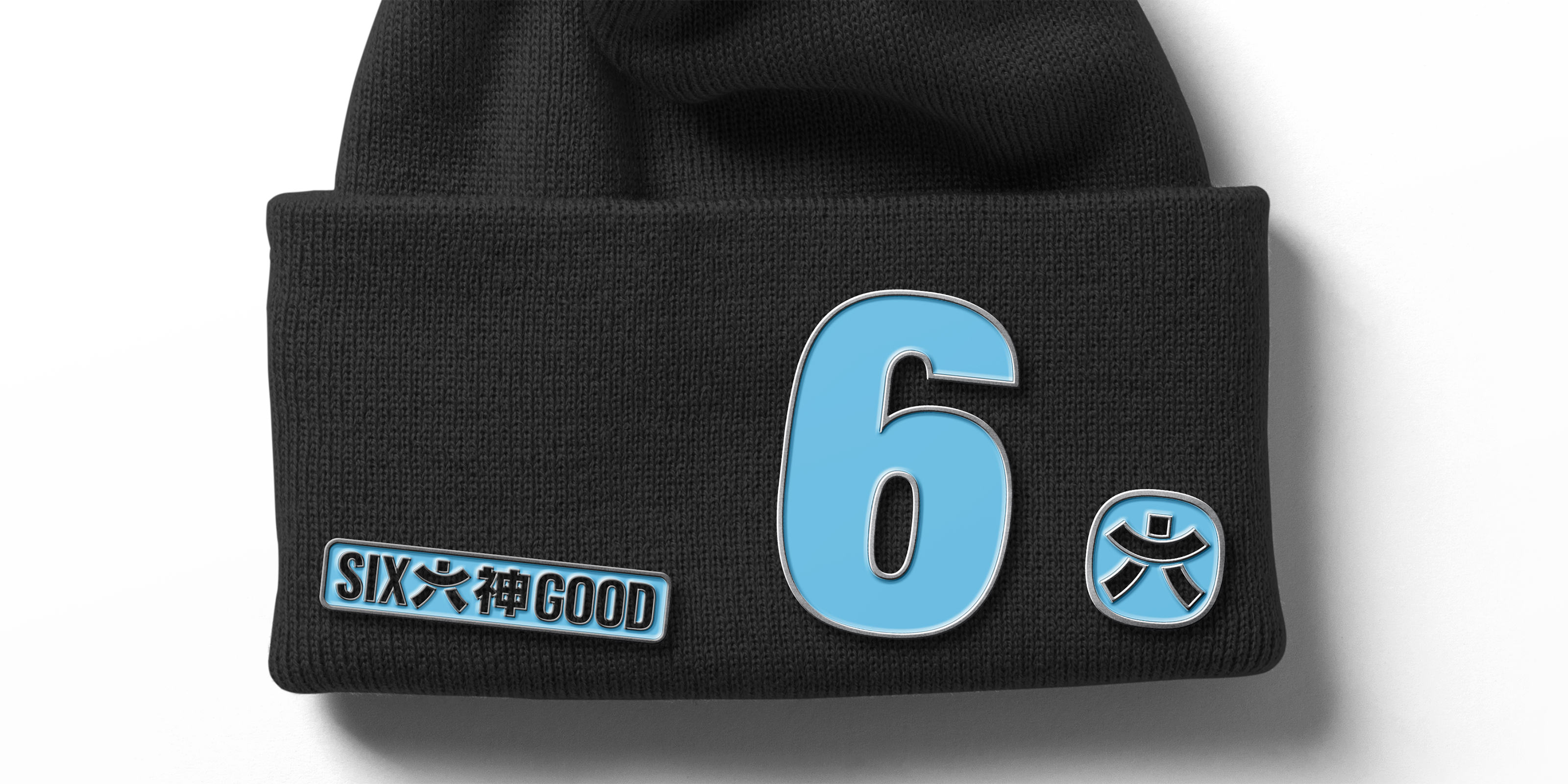
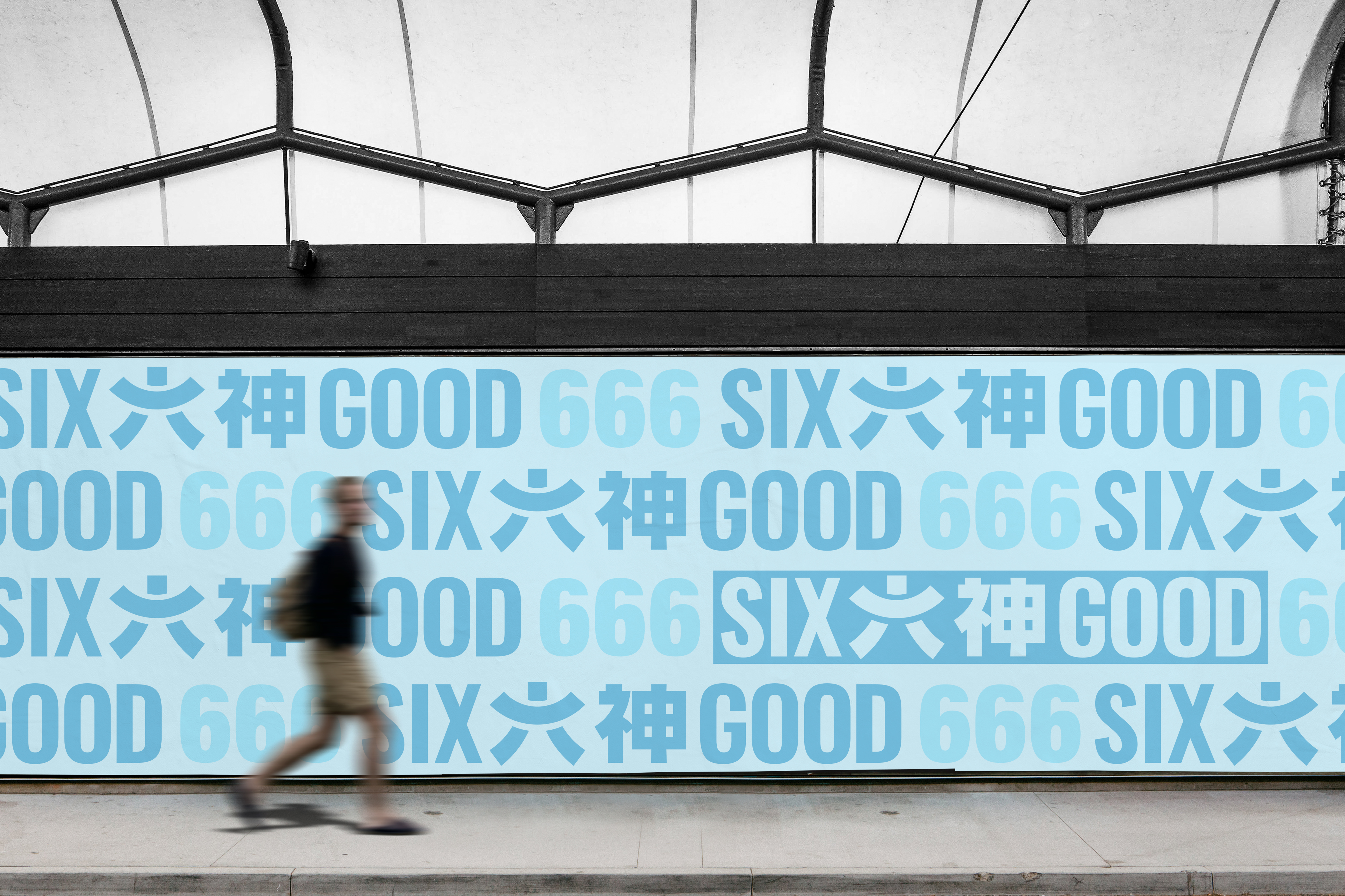
This design breaks through the traditional toilet water "function first" industry inertia, to design as a medium to awaken the emotional value of the national brand. By deconstructing the digital symbol "6" in the national memory, it is transformed into an egg-shaped language with a sense of the times, and the brand dimension from functional tools to emotional carriers is realized in a micro-scale, and a dialogue bridge between a new generation of consumers and traditional herbal culture is constructed.
Name of Work | Six Gods Brand Remodeling/Six Gods Carry-on Egg Packaging Design
Brand Holding | Shanghai Jahwa United Co., Ltd
Original Design | Tiger Pan
Executive Design | Xia Xue Dan Yuan Wen Hao
Visual Presentation | Zhu Yuling Wang Qichang
Process Design | Xie Zhangkun and Lu Miaorong
Project Management | Youhua
Media Relations | Xiang Lingli
Shooting | Hu Ye Tong Zhou Yaoli
Mirror | Ye Jiafeng

本作品版权归 潘虎设计实验室 所有,禁止匿名转载及个人使用,任何商业用途均需联系原作者。

新用户?创建账号
登录 重置密码
请输入电子邮件以重置密码。


Does "six gods" mean "great god"? Very interesting, why these two words are not the same height? Is it a design difference......
Like yuan god start
Yes, I 'd like to buy it even more.
A nice visual upgrade
Change the logo. No one knows it's related to the six gods.
It feels quite ordinary, just render it better.
The feeling is not as good as the previous classics, completely abandoning the previous "earthy flavor", but there is no recognition degree
I 'd like to buy a bottle of toilet water to try if it looks like this.
Visual first-class
Has God become good?
Full Score Design
It's so refreshing
I really like the appearance